
Mortgage lending app, from application to every task
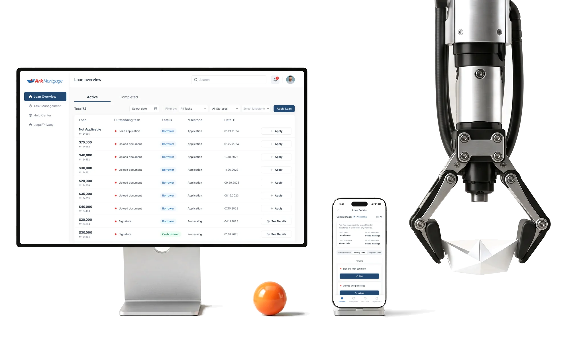
Ark Mortgage’s borrower portal is where homebuyers apply for a loan and follow it to closing.We designed it for the web and phones.
- 100
- screens across the web portal and the mobile app
- 3
- people from competitor research to developer handoff
Project summary
Ark Mortgage, Inc. lends to homebuyers and runs its own loan-origination system for its staff. Its borrowers needed a place of their own: to apply, then to follow the loan and answer what it asks for. We designed the borrower portal for the web and for phones , from competitor research to the developer handoff and the store listings, over four milestones.
How the work ran
- Milestones
- Four: research, flows and the first web wireframes; moodboards, three visual directions and the mobile wireframes; the web and mobile UI with its kits; the last application screens and delivery.
- Our part
- Product design: research, architecture, UX and UI, the clickable prototype, the design system and the handoff to the client’s implementation team.
- Boundary
- Borrowers only. The lender’s loan-origination system and its later mortgage-agent CRM, Sail, are separate products, and this case covers neither.
- Sign-off
- The client approved the final milestone in March 2024.
What a borrower goes through
One chain, from an invitation to a closed loan:
-
Account
- Invitation
- Sign-up
- Log in
-
Application
- Seven steps
- Save and exit
- Declarations
-
Loan
- Stage
- Loan officer
- Loan information
-
Tasks
- Uploads
- Signatures
- Done
-
Profile
- Contacts
- Employment
- Access
-
Notifications
- Status
- Requests
- Preferences
- Thorough and Bearable
- Every question a lender must ask, in steps a borrower can finish and come back to.
- Progress and Promises
- An honest stage for the loan, with nothing that reads as approval.
- Monitor and Phone
- The same loan and tasks, read in a table or within a thumb’s reach.
One loan, read top to bottom
- Found
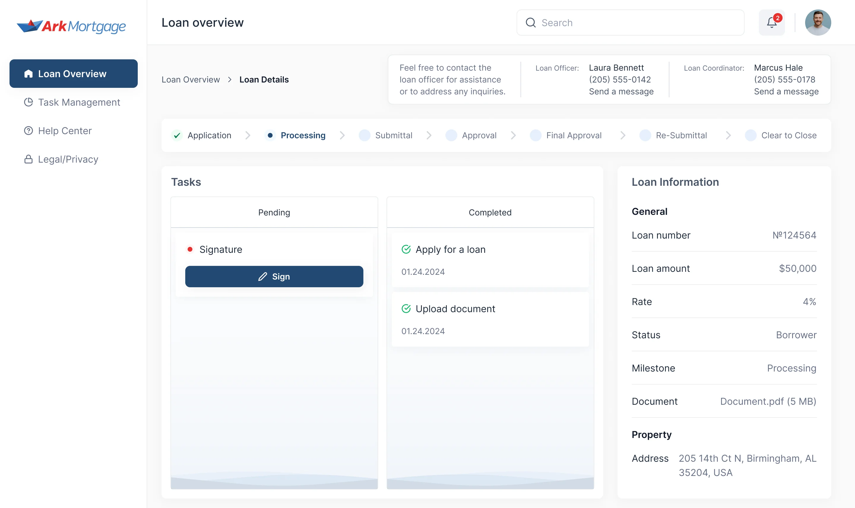
- A borrower opens a loan to learn three things: where it stands, what it needs from them, and whom to call. None of it may read as a promise.
- Decided
- One details page: the people to contact on top, the stages as a line, pending and completed tasks side by side, and the loan’s own facts in a column on the right.
- For the user
- A borrower sees the one thing to do next and who to ask about it, without calling to find out.
-
Who to ask, and where the loan is
The loan officer and the coordinator on top, then seven stages from Application to Clear to Close, the current one marked.
-
What it needs from you
Pending tasks with their action, completed ones with their date.
-
What the loan is
Number, amount, rate, status, milestone, document and the property, in a column on the right.
How the work progressed
Four milestones in one engagement: research and flows first, then the look, then every screen on both platforms, then the handoff.
-
Discovery
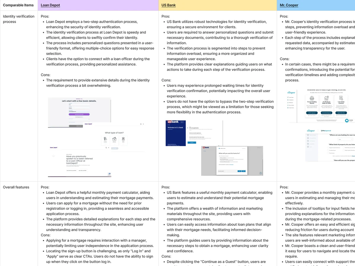
What borrowers get from established mortgage portals: identity checks, applications, tasks and support
Artifact Competitor research with pros, cons and what to take for Ark
-
User Flow
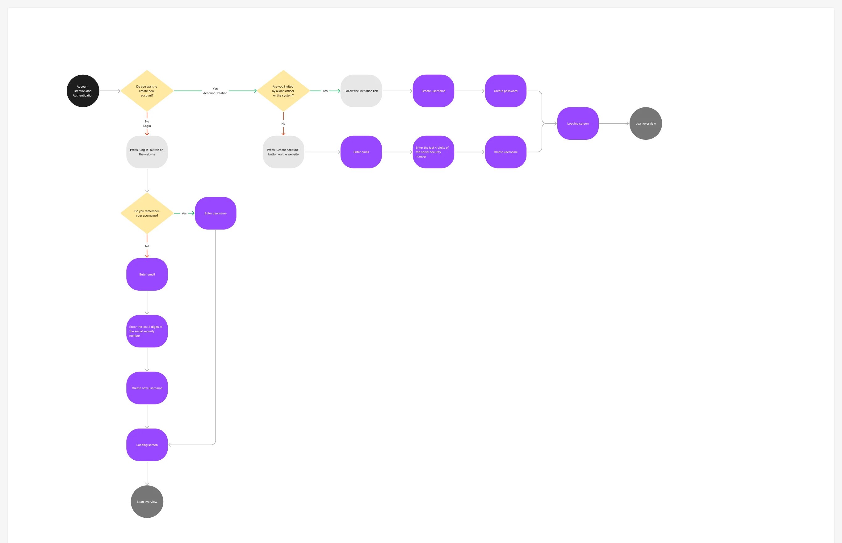
Every path from an invitation or a cold sign-up to a loan and its tasks, down to the error states
Artifact Information architecture and user flows for each area
-
Wireframes
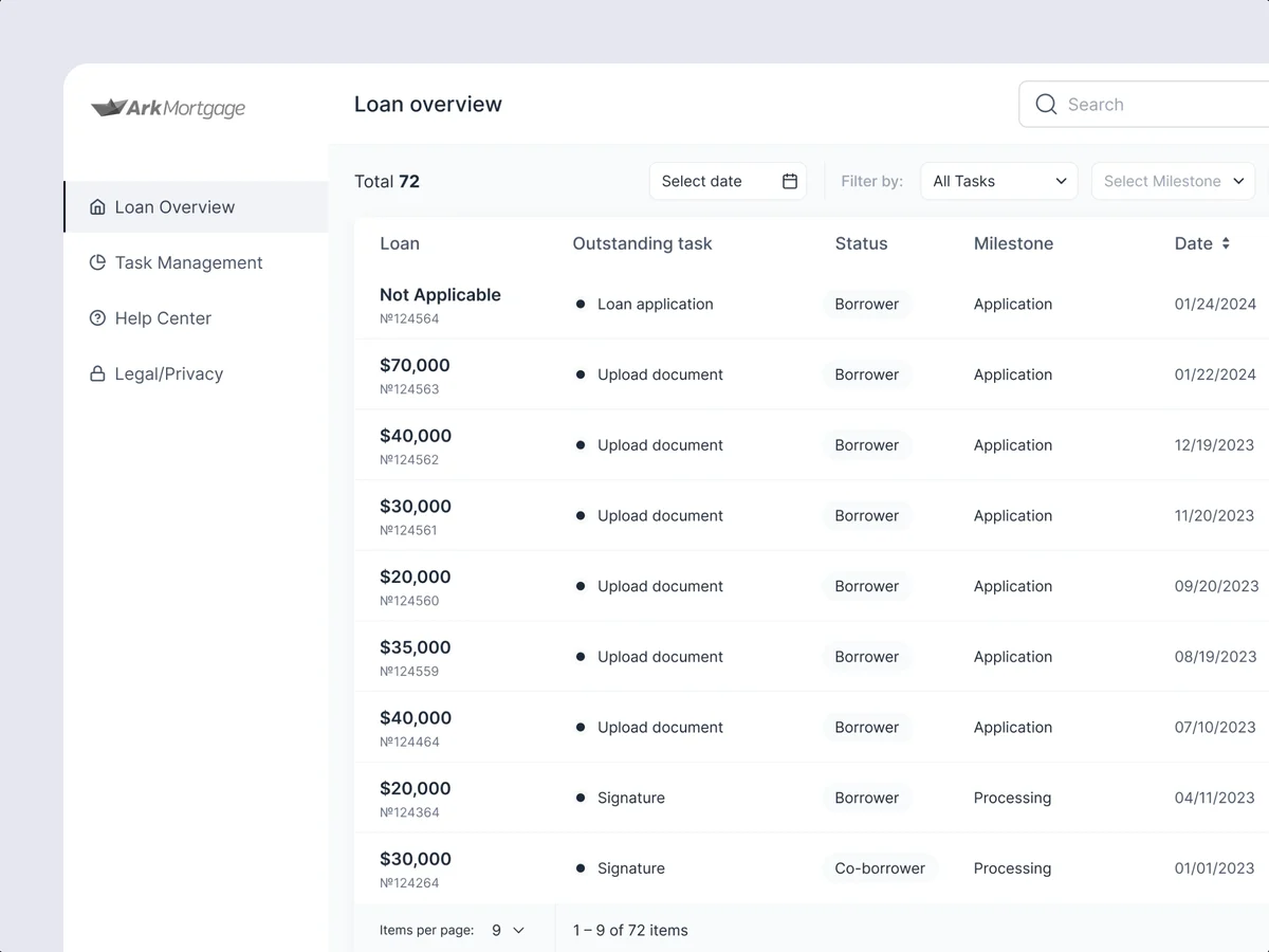
Where the application steps, the loan table and the task list sit, before any style
Artifact Web wireframes, then mobile wireframes
-
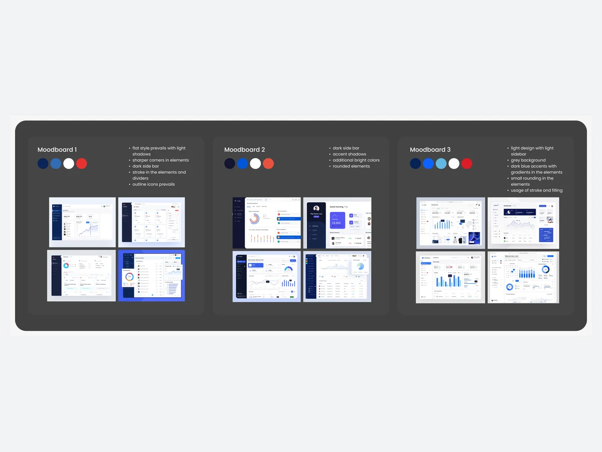
Moodboards
How the portal should feel next to the Ark Mortgage brand
Artifact Moodboards and three visual directions
-
UI & Design system
Every screen and state on the web and the phone, from one set of components
Artifact High-fidelity UI, a clickable prototype, desktop and mobile UI kits
-
Adaptives
The same loan on a monitor and on a phone
Artifact Responsive web layouts and the mobile app screens
-
Delivery
What the developers and the store listings needed
Artifact Screen maps, the developer handoff, App Store and Google Play assets
Every account change, drawn to its last state
- Found
- Borrowers change details mid-loan: a new email, a new password, fewer messages. Each change can fail, and a borrower stuck on one ends up calling the loan officer.
- Decided
- Each area of the portal got its own flow before any screen: sign-up, the application, loans, tasks, profile and notifications, every action with its default, active, error, filled and success states.
-
Changing the username
From the profile to the form, the check of the current username, its error, and back to the updated profile.
Open the full map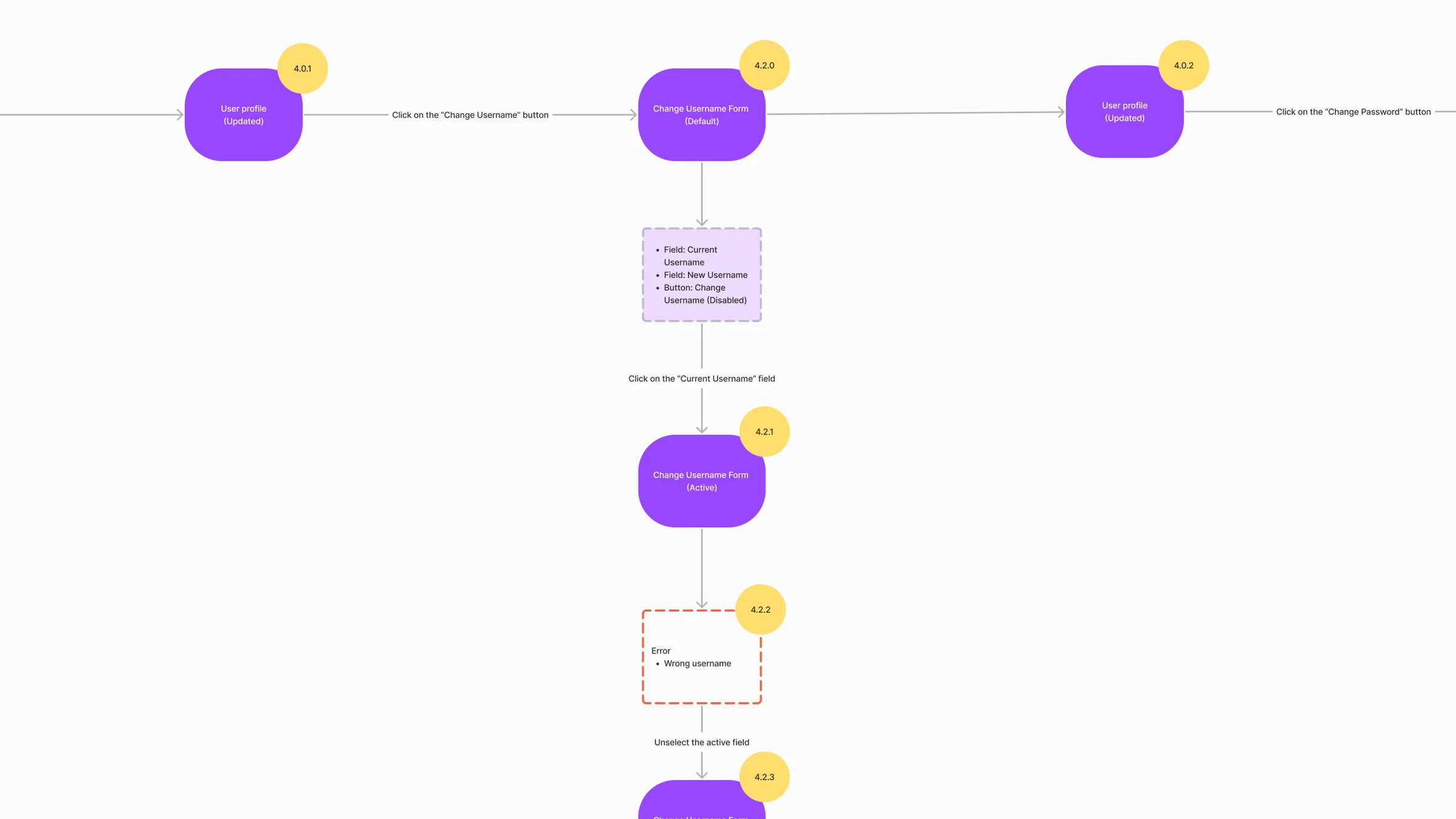
-
Email and notifications
The email change with its password check and error, then every notification toggle a borrower can set, grouped by what it’s about.
Open the full map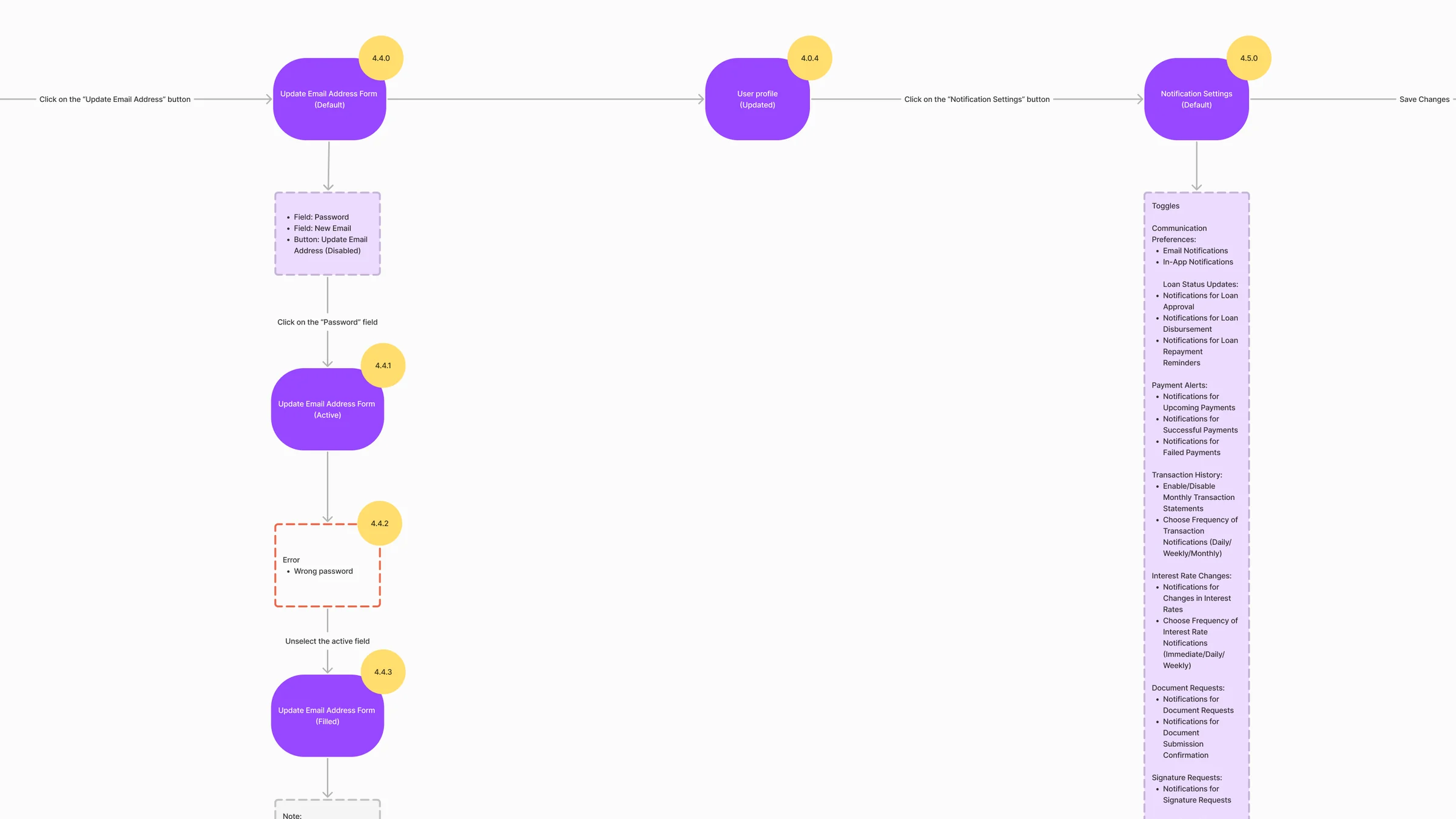
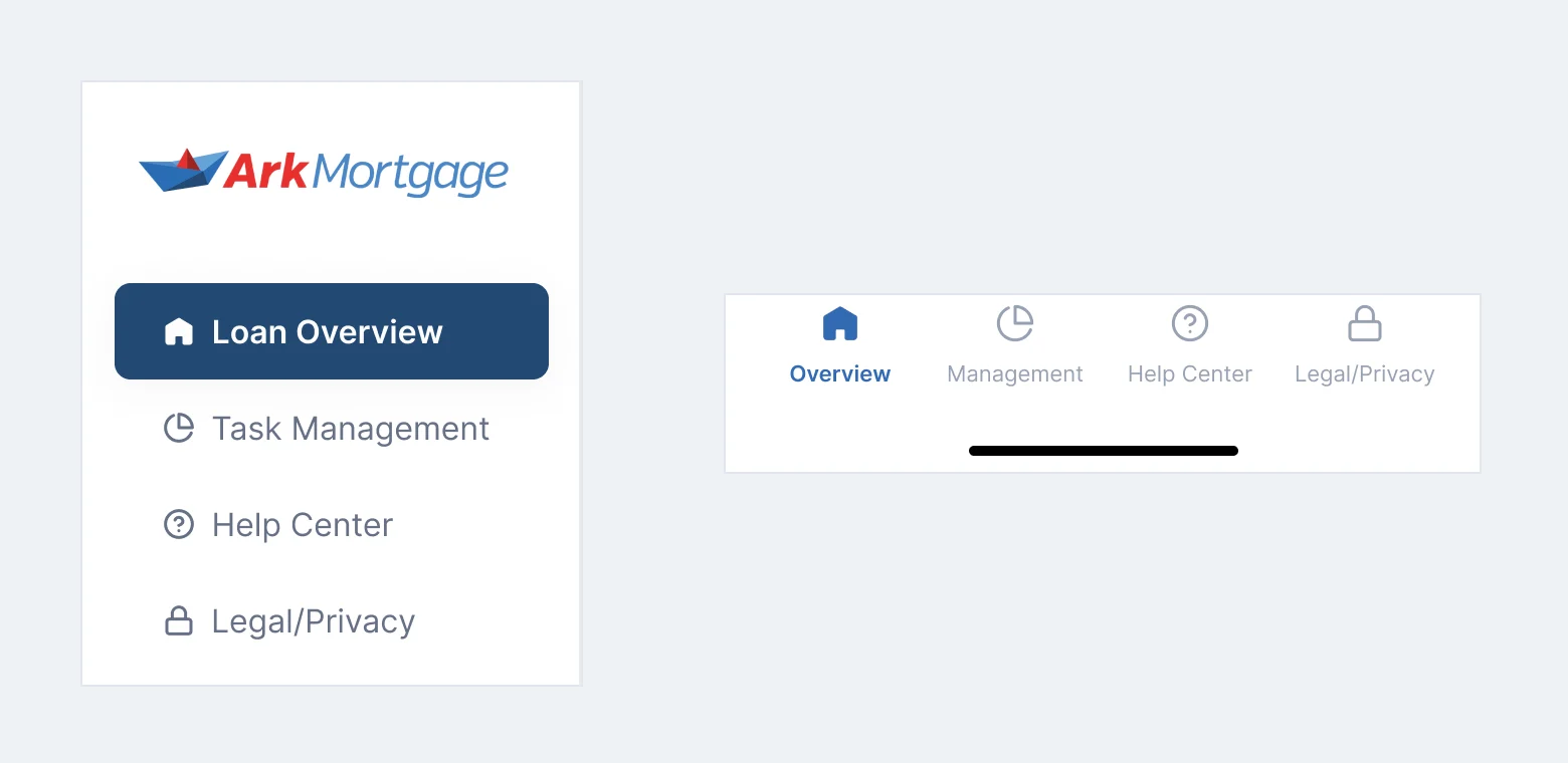
Six jobs, from the first question to the last signature
The application first, where a borrower spends the most effort. Then the loan and its tasks, where they keep coming back.
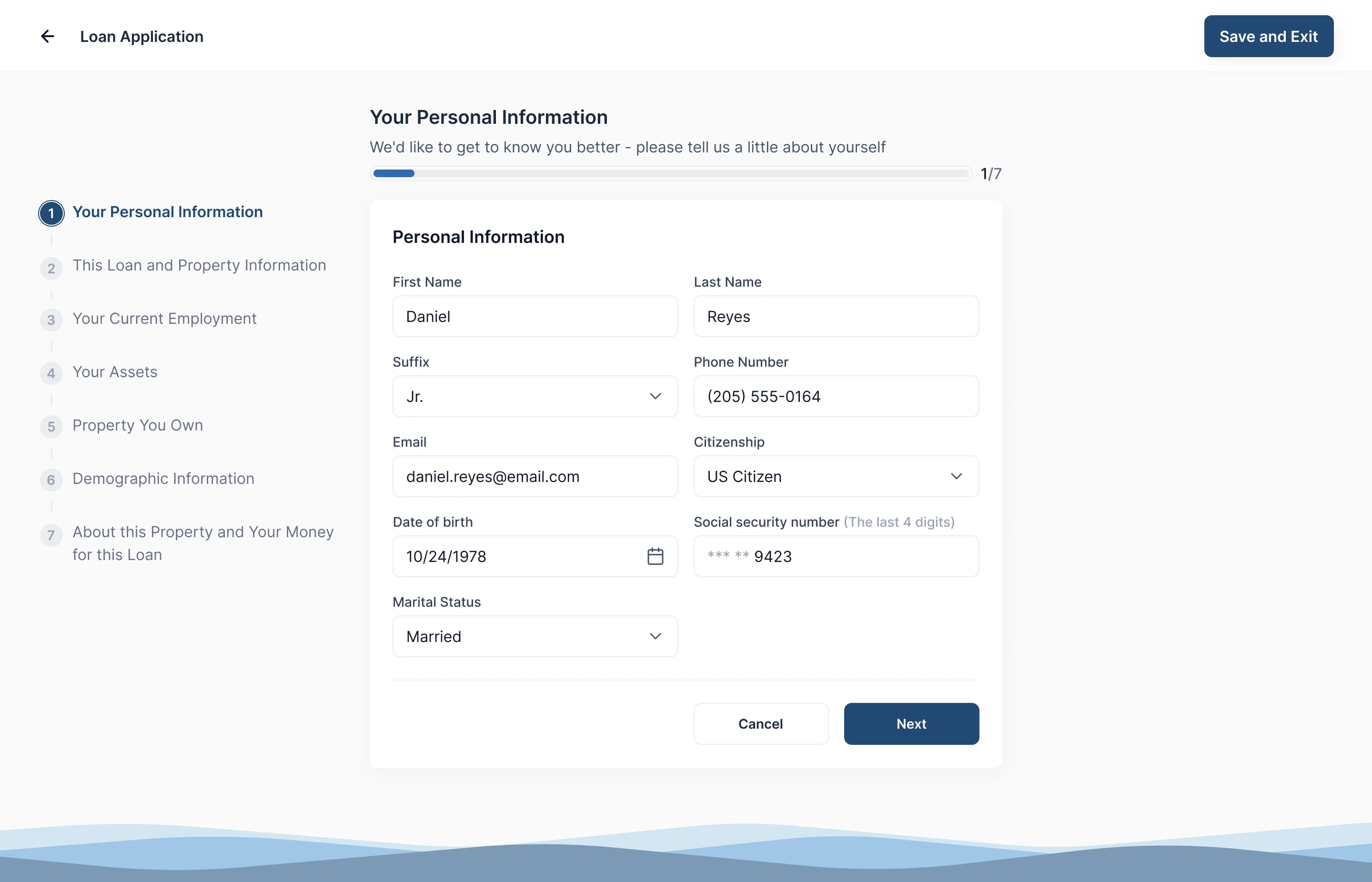
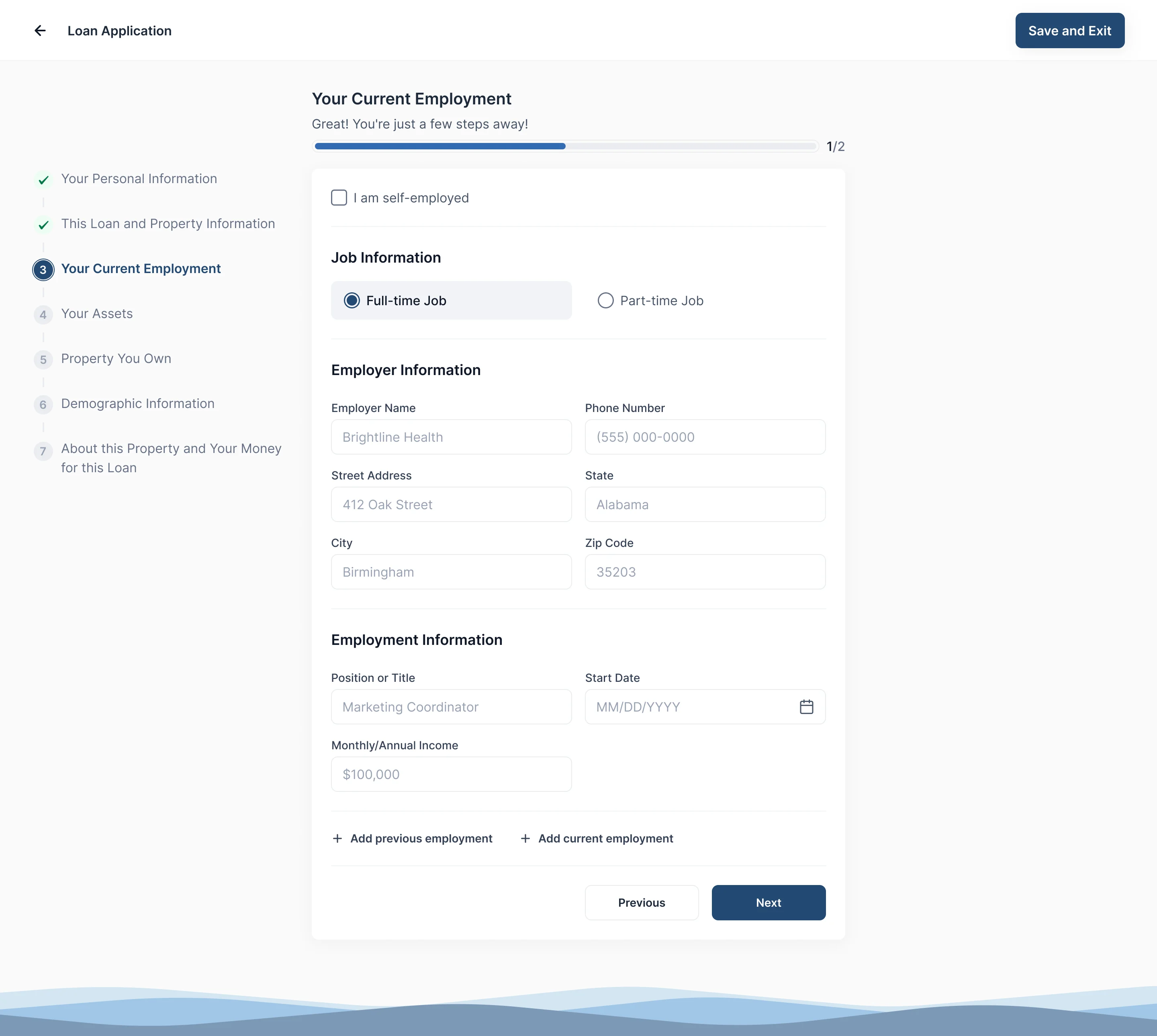
An application in seven named steps
- Found
- A mortgage application asks about the person, the loan and property, employment, assets, other property, demographics and declarations. On one page it reads as a wall.
- Decided
- Seven named steps down the left, the current one marked and the finished ones ticked, a progress bar inside each step, and Save and Exit always in the corner.
Leave now, finish later
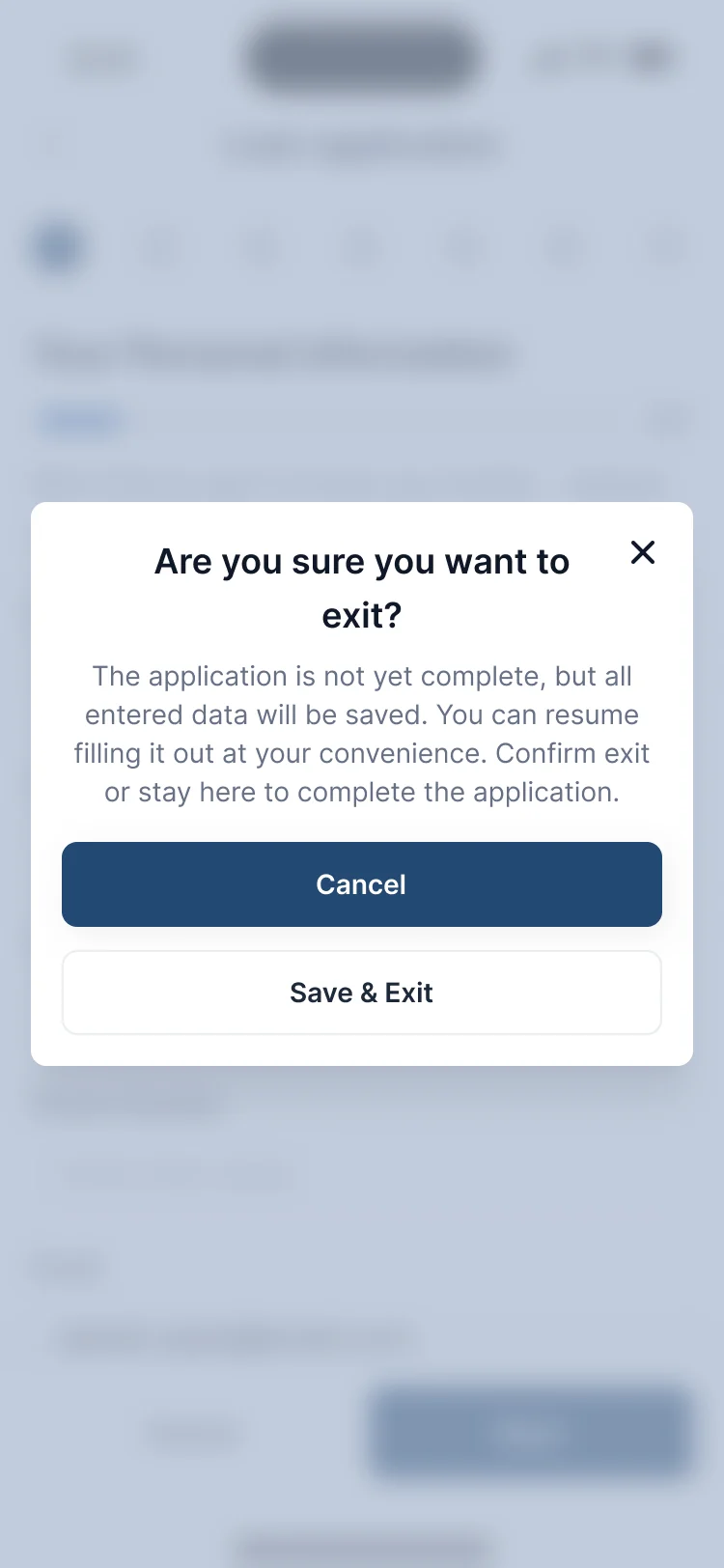
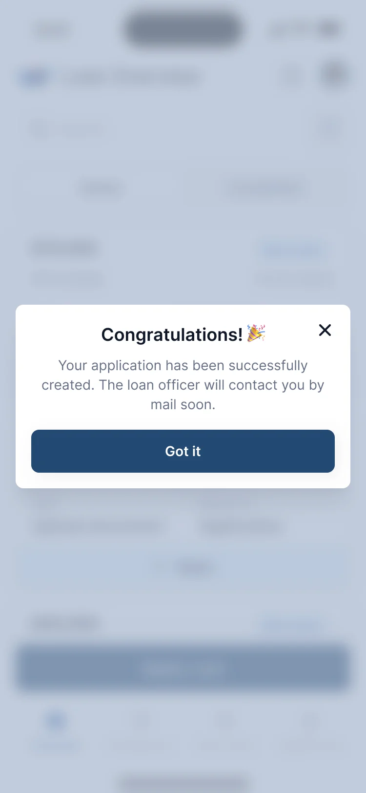
- Found
- Nobody has every pay stub at hand. A form that loses answers when someone steps away gets started twice or not finished at all.
- Decided
- Leaving asks once and keeps every answer, so the application reopens where it stopped. Once it’s sent, the borrower is told who gets in touch next.
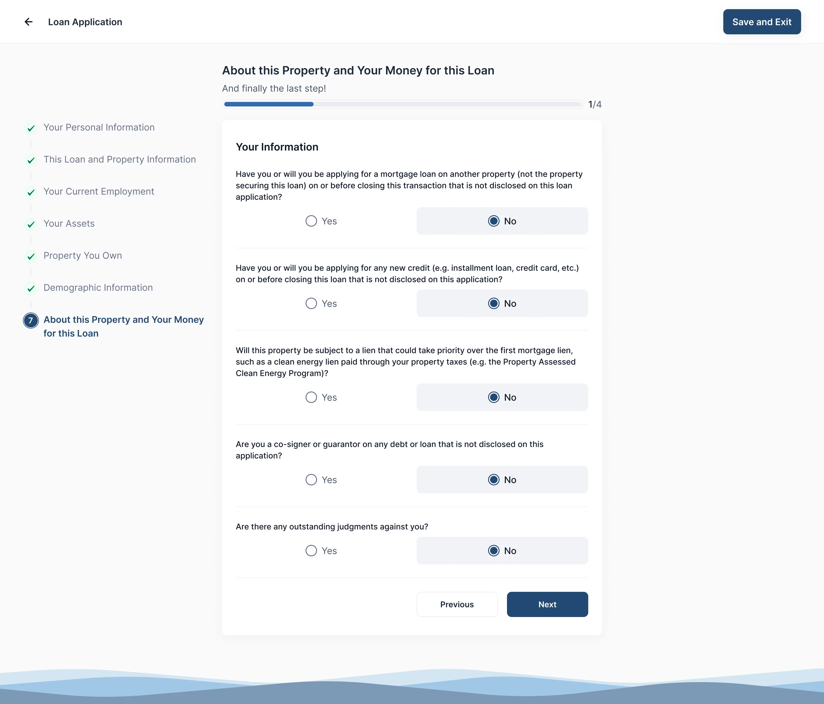
Declarations, one answer each
- Found
- The declarations are legal questions about other loans, liens and judgments. One left unanswered comes back later as a question from the lender.
- Decided
- Each question on its own, with Yes and No as two wide targets and the chosen one filled, and the co-applicant’s copy of the same questions after the borrower’s.
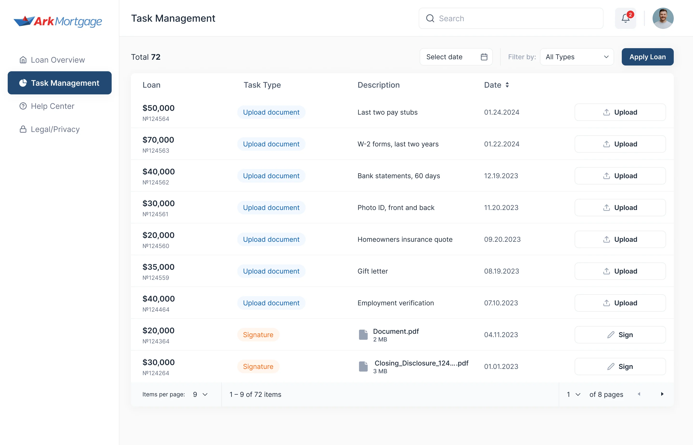
Tasks that say what they need
- Found
- “Upload document” doesn’t say which document, and a vague task turns into an email to the loan officer.
- Decided
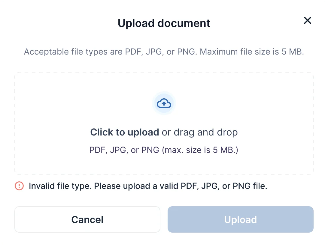
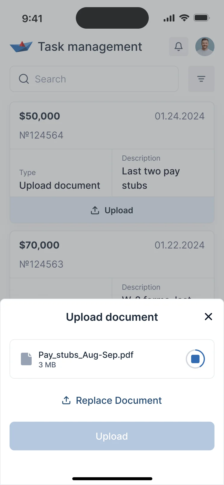
- One task list across a borrower’s loans: the loan, the task type, exactly what’s needed, the date and one action. The upload says up front which files fit, and why a file was refused.
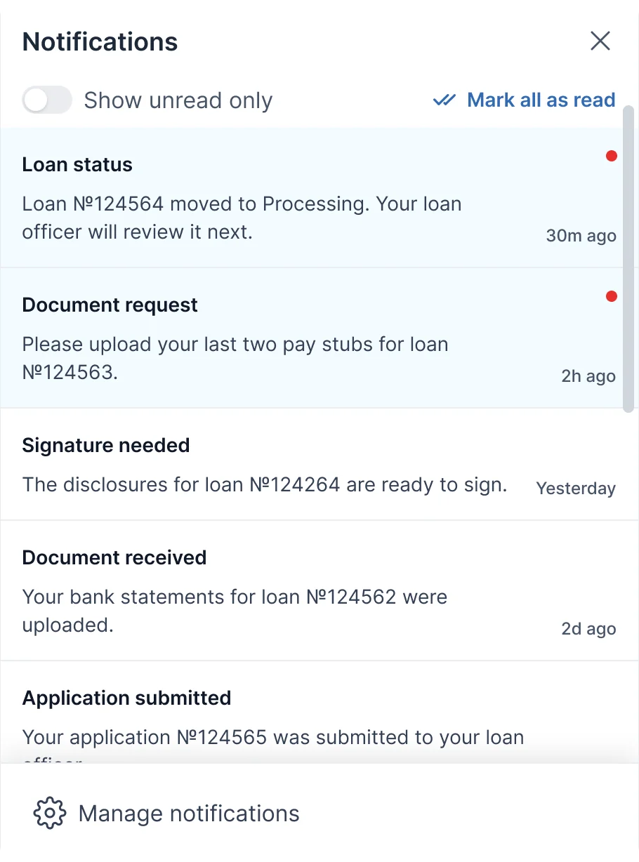
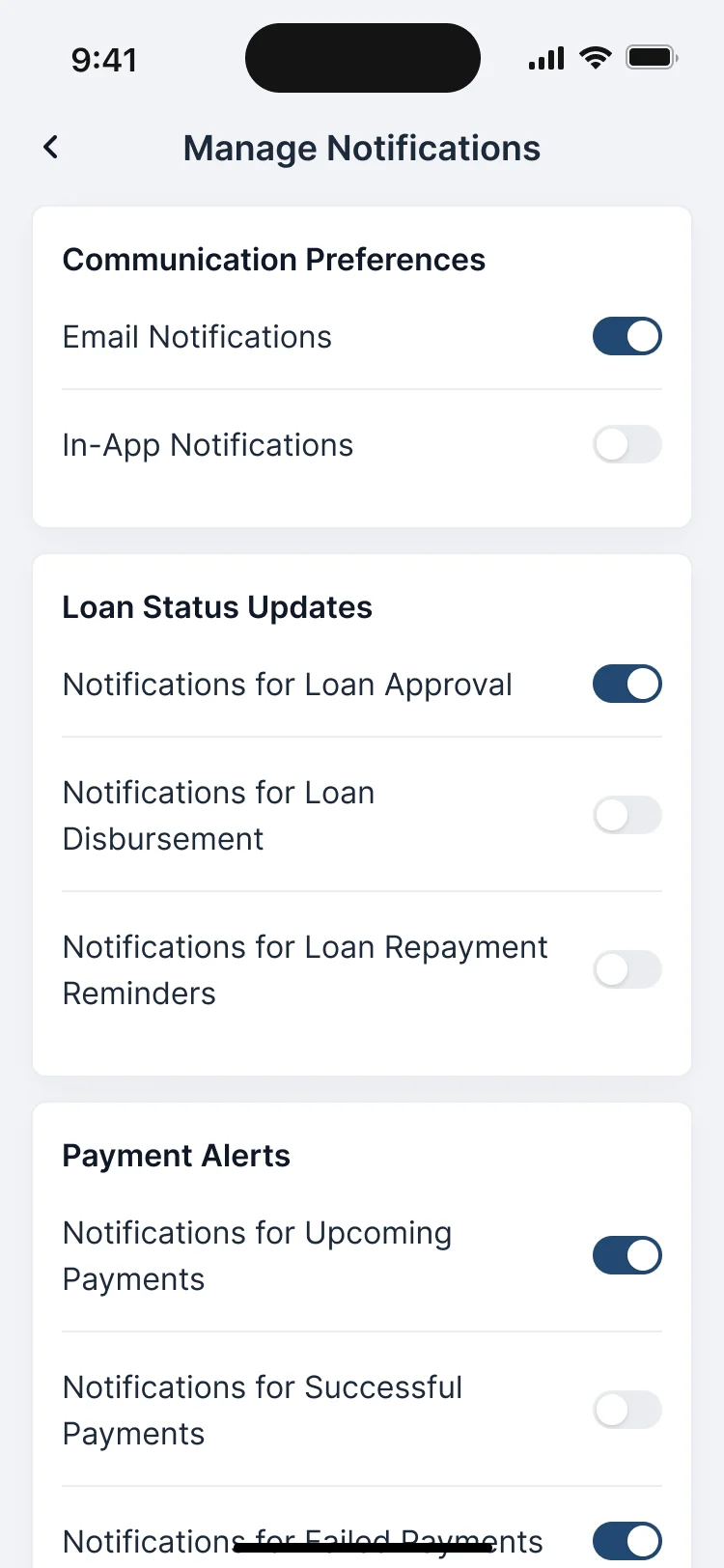
Notifications that match the tasks
- Found
- A borrower waits on the lender as much as the lender waits on them, and silence reads as bad news.
- Decided
- A notification for every status change, request, signature and received document, the unread ones marked, and settings per topic for email and the app.
Account and security in one place
- Found
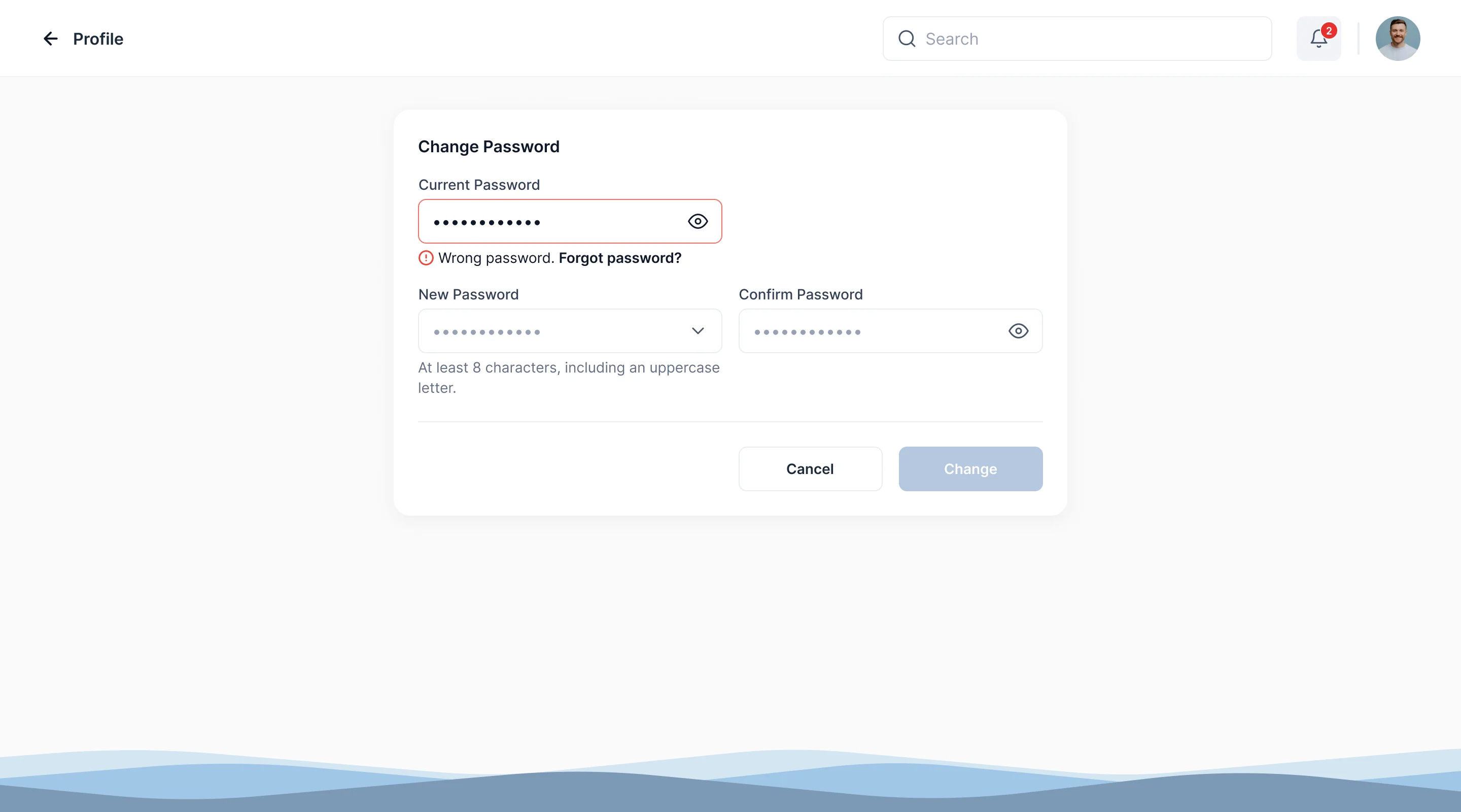
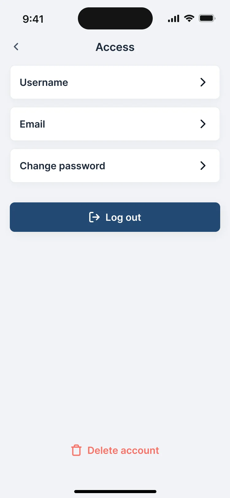
- Borrowers change emails and passwords mid-loan, and a mistake there shouldn’t mean a phone call.
- Decided
- Username, email, password, log out and account deletion together, each change checked against the current password, with the error beside the field and a way to reset it.
One kit for the web and the phone
- Found
- Two platforms drawn apart drift apart: a task or a field ends up looking and behaving differently on the phone than on the web.
- Decided
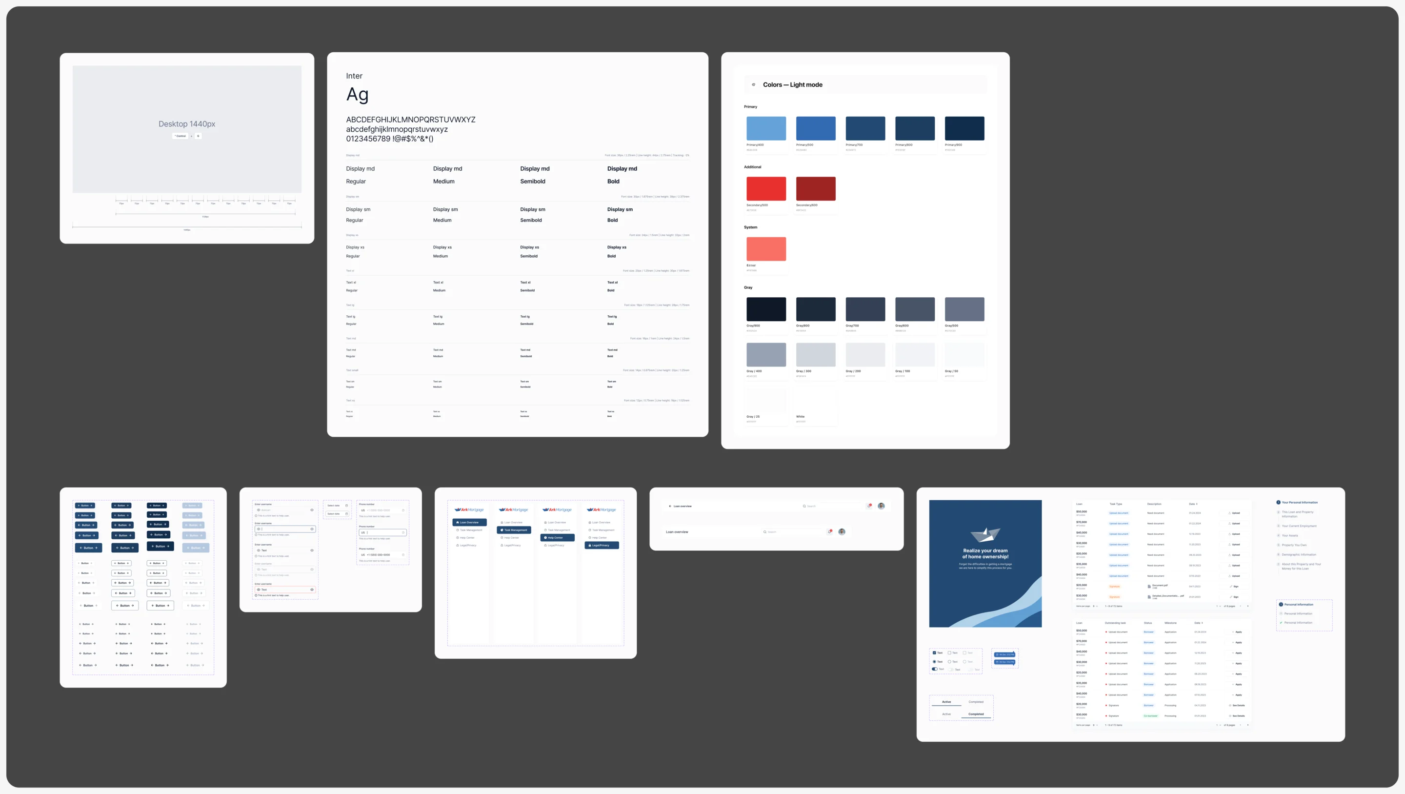
- Desktop and mobile UI kits built on the same colours, type and components, with every field and task drawn in each state it can take.
The same task on a desk and a phone
One pending task from the kit: the same marker, name and action, a card on the web and a full-width card on the phone.
-
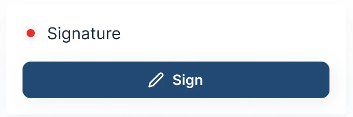
Web: In the loan’s pending column. -
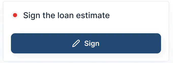
Phone: The same task, full width.
Every field in every state
Empty with a hint, filled, and in error with the reason and a way out, the same on every form of the portal.
-
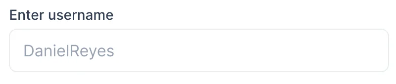
Empty -
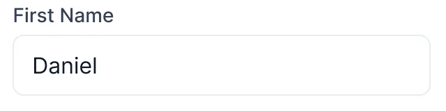
Filled -
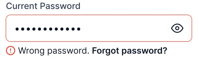
Error
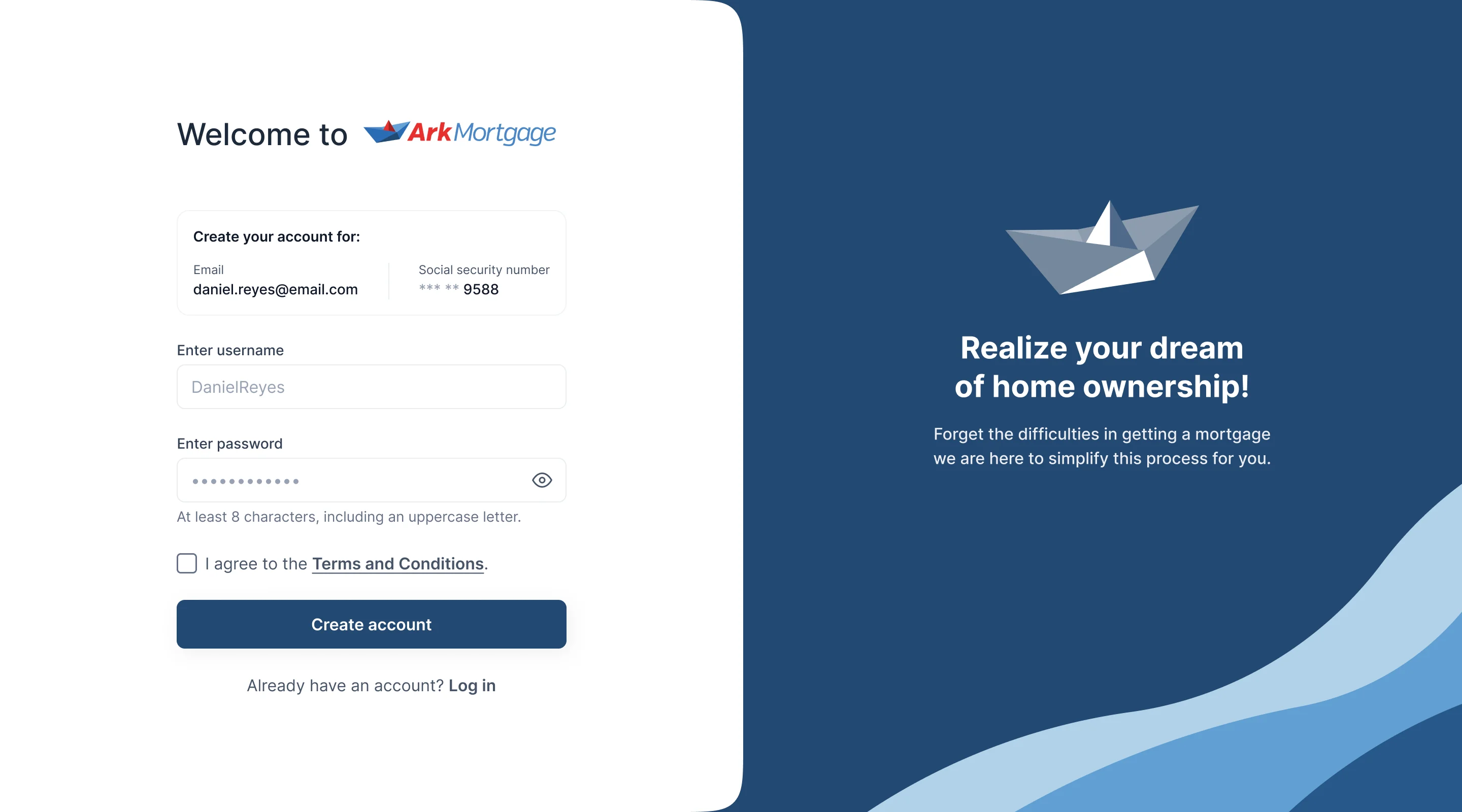
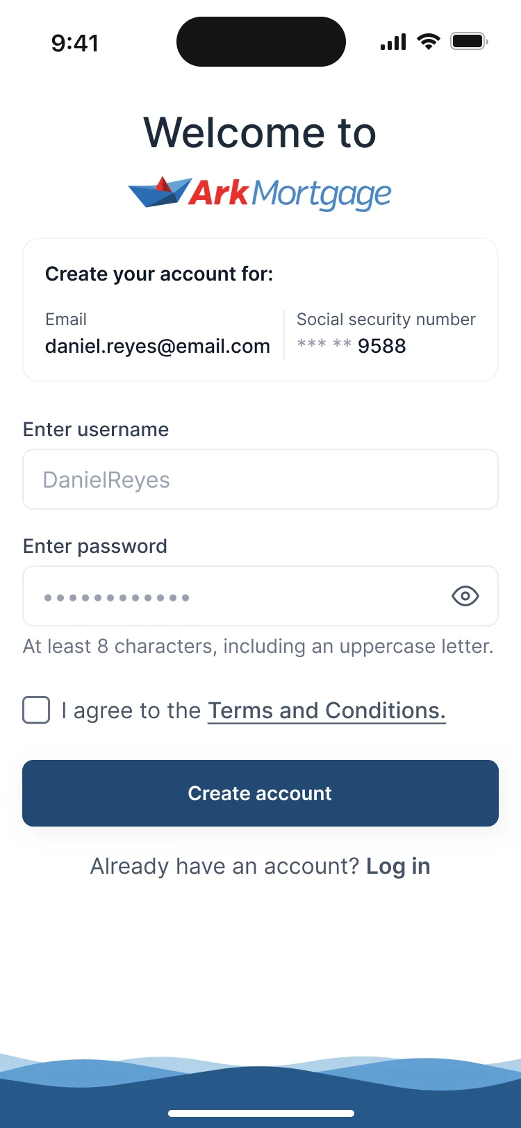
The same sign-up on a desk and on a phone
- Kept
- The invitation’s email and the last digits of the Social Security number, the username, the password with its rule, the terms and one button.
- Changed
- On the web a brand panel sits beside the form; on a phone the form takes the whole screen under the logo.
Listings for both app stores
- Found
- The mobile app needed store listings that say what it does before anyone installs it, on the App Store and on Google Play.
- Decided
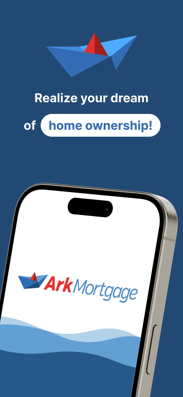
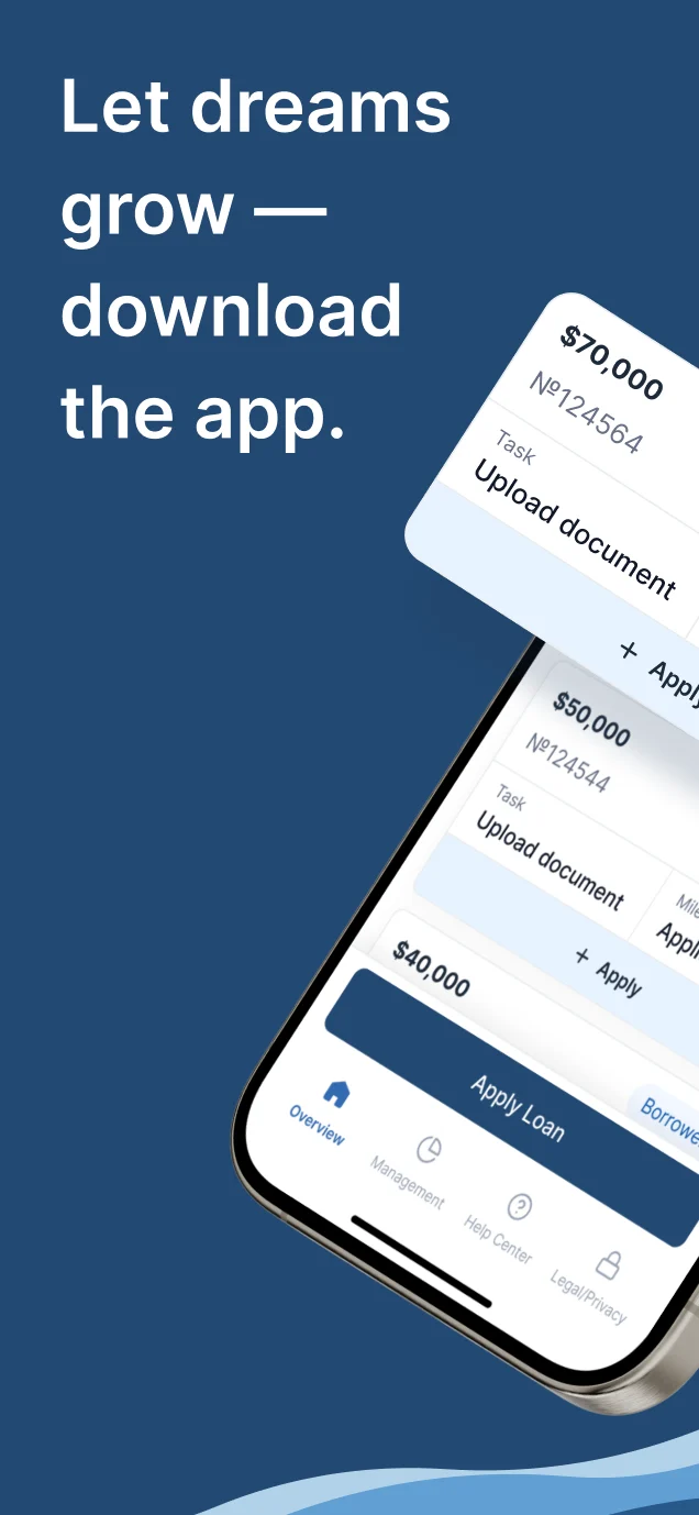
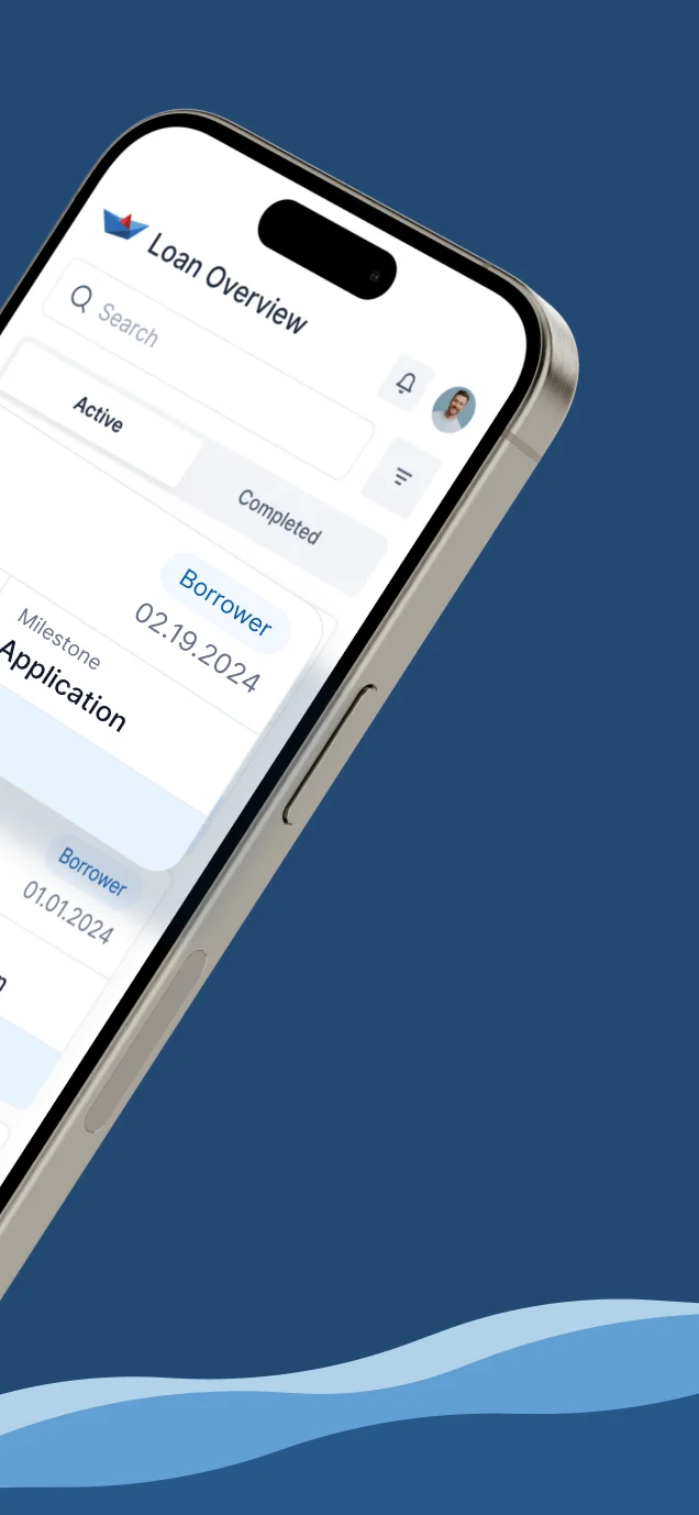
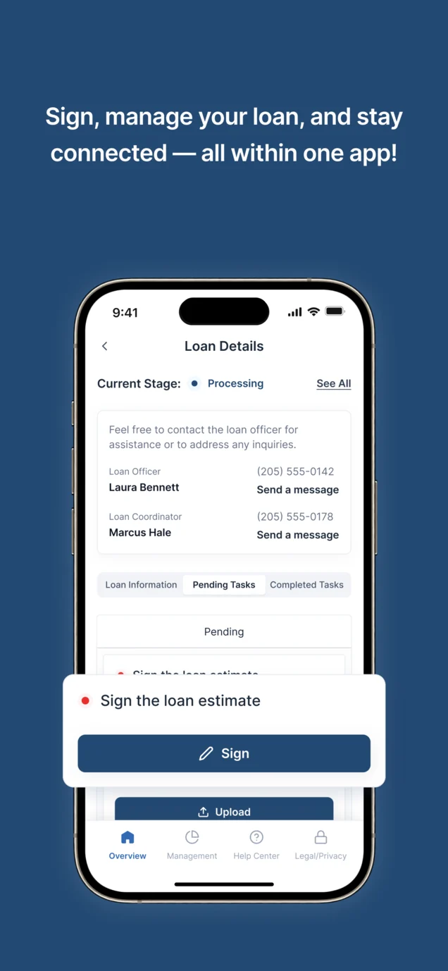
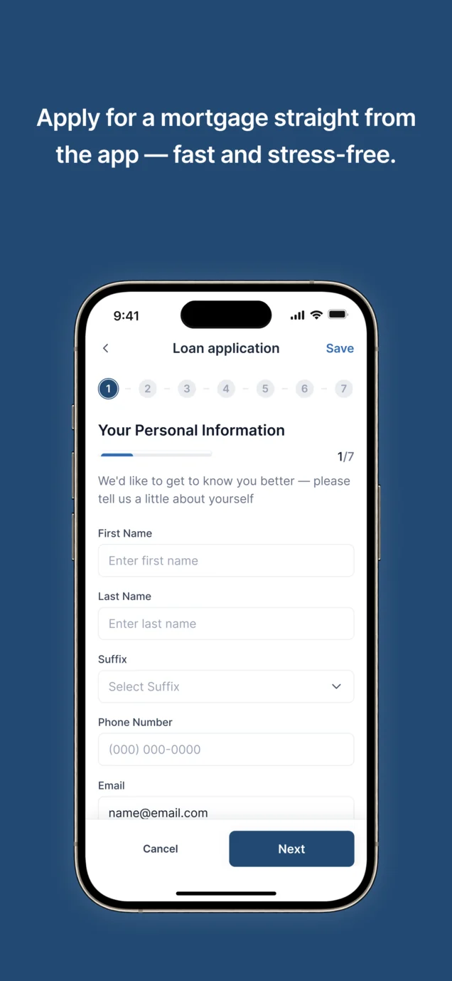
- Store screenshots built from the real screens in the brand’s blue: the promise first, then the loan list, signing and the application, each with one line of copy.
The App Store set
All five screenshots; the Google Play set follows the same story at its own size.
-
App Store set
Five screenshots at the iPhone listing size, from the brand promise to the application.
-
Google Play set
The same five, laid out for the Android listing.
-
Publication
We designed the listings; publishing them is not part of this case.
What the developers received
One Figma file the client’s team could build from: every flow mapped, every screen on both platforms, and the kits the screens are made of.
- Information architecture
- Every area of the portal as a flow, with its branches.
- Screens and states
- Web and mobile, with errors, empty, loading and success.
- Clickable prototype
- The main journeys, clickable end to end.
- UI kits
- Desktop and mobile, from the same tokens.
- Store assets
- App Store and Google Play sets.
Flows in the handoff
- Wireframes for the web and the phone
- Moodboard and three style directions on key screens
- Web app: the application, loans, tasks and account
- Mobile app: the same journeys on a phone
- UI kit: the components behind every screen
- App Store and Google Play assets
Where the product ended up
A borrower portal designed end to end for Ark Mortgage, on the web and on a phone. The client approved the final milestone in March 2024.
- screens across web and mobile
- 100
- people on the team
- 3
- milestones, one engagement
- 4
In the client's words
The design connects the mortgage manager’s view with the borrower’s next steps. What we appreciated is the attention to document requests, case status and role-specific screens, so the two sides of the process can be discussed as one experience.

Building web and mobile from one design?
At Ark Mortgage, one set of kits and flows had to carry a borrower portal onto the web and a phone without the two drifting apart. Send us your product, and we’ll show how to hand it to your developers so they don’t have to guess.
More work like this
Three more products with long forms, money decisions, or web and mobile together.
-
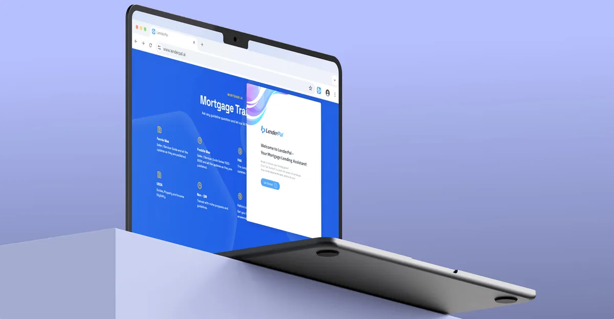
Chrome extension · Real Estate
LenderPal
Fitted a full mortgage workflow for real-estate agents into a Chrome extension.
- 150+ Screens designed
- 4 Experts on the pod
-
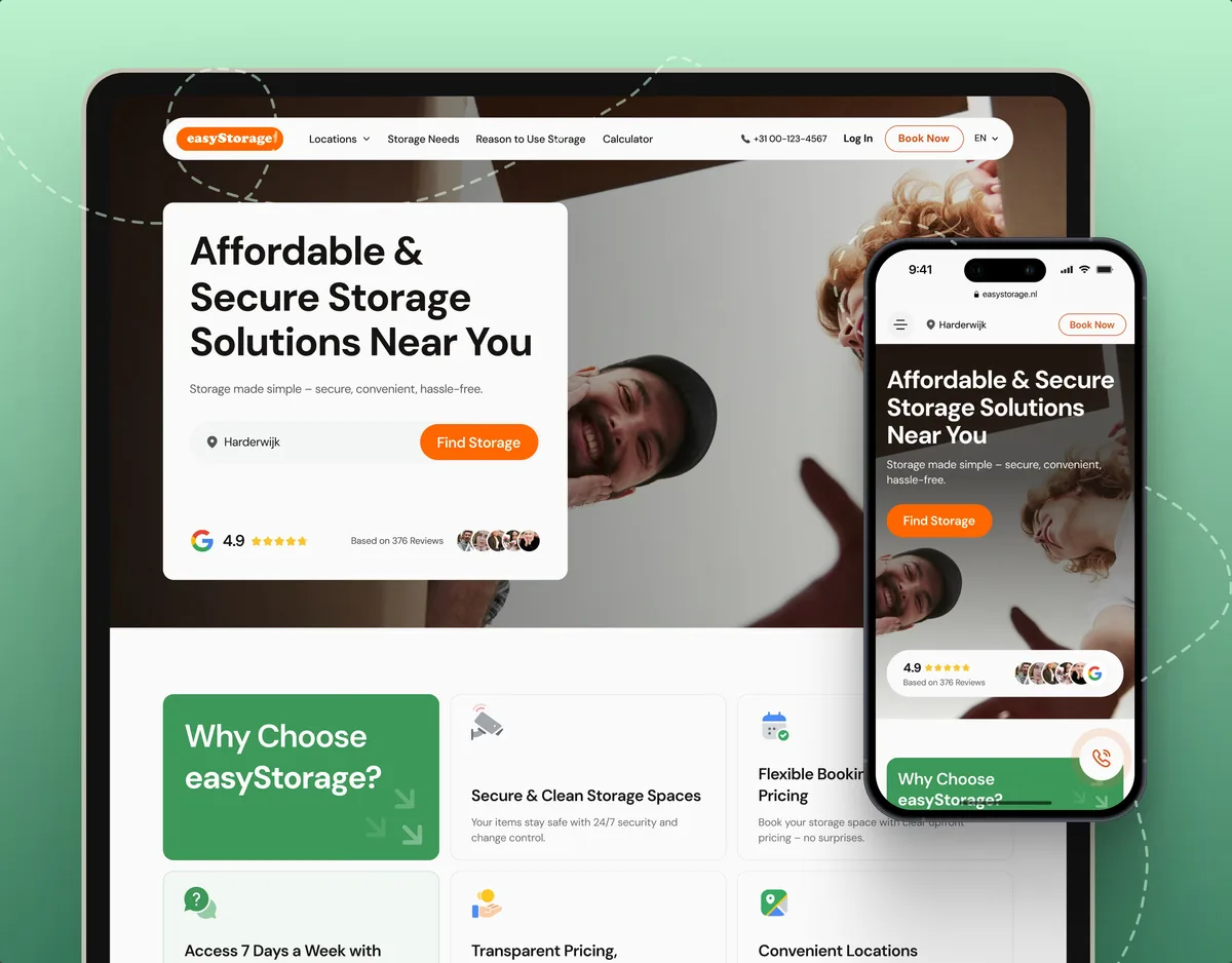
E-commerce · Website
easyStorage Netherlands
Designed and built a self-storage website and redesigned the booking app behind it.
- 300+ Screens designed
- 880+ Project hours
-
Wellness · Healthcare
Clearwater Wellness Co.
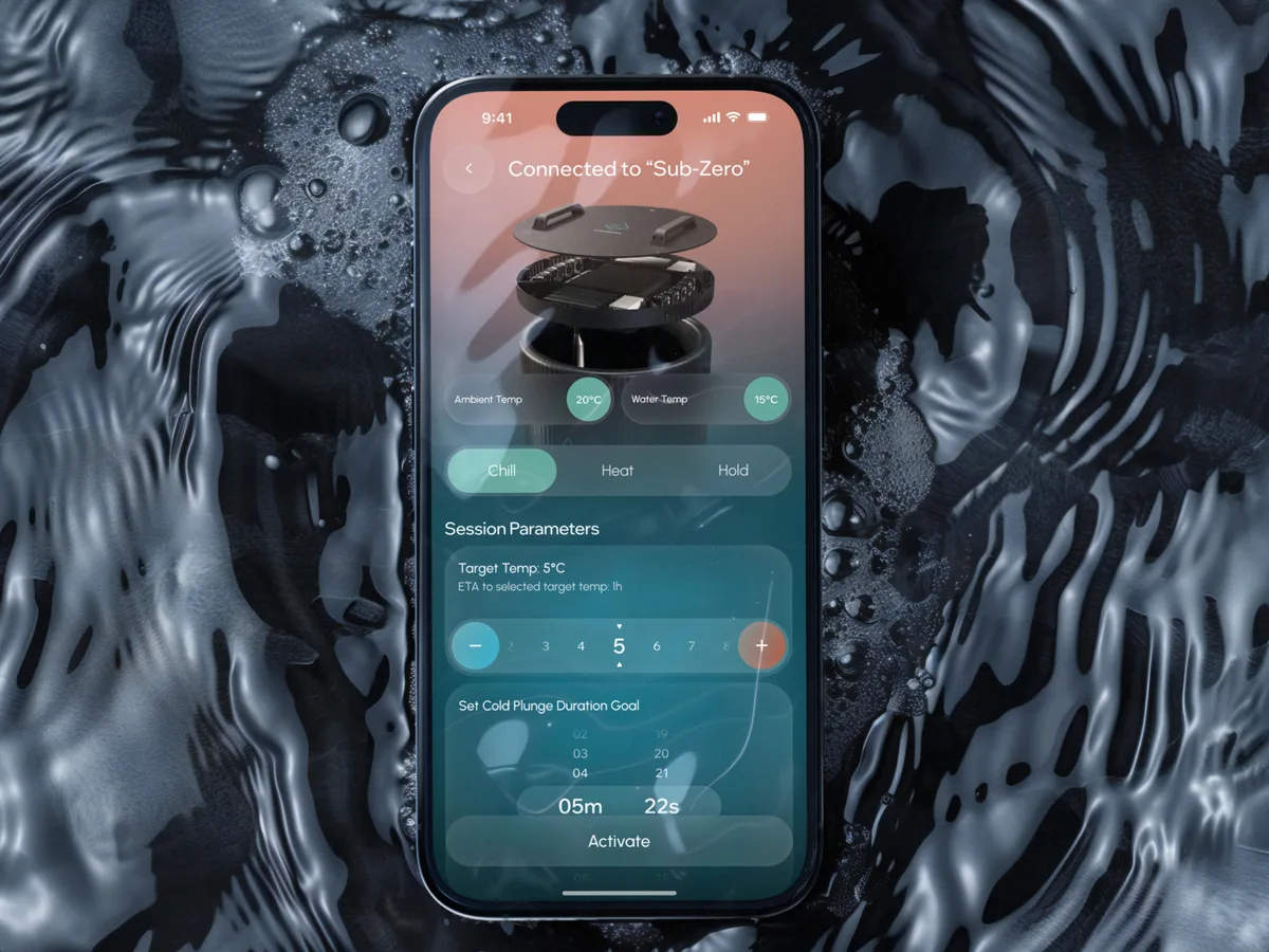
Designed a cold-plunge wellness app from scratch: bath control, session tracking and a community around the ritual.
- 306 Screens designed
- 4 Experts on the team