In short
Mcommerce is buying and selling through a phone: a mobile store, an app, a wallet payment, a checkout inside a chat. It is not ecommerce with a smaller screen. People shop on the move, get interrupted and give up fast, so mobile commerce is won on speed, compact information, trust at payment and a cart that survives the interruption. This guide covers what counts as mcommerce, what the mobile journey needs, when an app is worth it and the mistakes that quietly cost sales.
In this article
- What counts as mcommerce
- Mcommerce vs ecommerce
- Why mobile shopping is not desktop shopping on a smaller screen
- What a mobile store needs to get right
- Where design fits in mcommerce development
- Mobile web or app?
- The complete mobile journey: variants, payment and the order after it
- Weak networks, accessibility and store-assisted shopping
- Blackdove: commerce connects to an ongoing product
- What to measure
- The mistakes that quietly cost mobile sales
- How to start
- Mobile commerce release checklist
Mcommerce, or mobile commerce, is buying and selling through a mobile device: a store opened in a phone’s browser, a shopping app, a wallet payment, a purchase inside a chat or a social feed. What makes it its own discipline is not the device. It is the situation: a person with one hand free, a few minutes, a patchy connection and a notification about to steal their attention.
Most mobile stores we look at were never designed for that situation. They are the desktop catalogue, squeezed. Same long product page, same checkout form written for a keyboard, same surprise at the last step. The traffic arrives on phones, the conversion does not, and the team concludes that mobile shoppers “just browse”. They don’t. They leave, because the store made buying harder than walking away.
What counts as mcommerce
Mobile commerce includes shopping tasks performed on a phone, including journeys that continue later on another device. In practice it takes a handful of forms, and most businesses use more than one:
- A mobile web store. Your store in the phone’s browser. It is where new customers arrive, because it needs nothing installed.
- A shopping app. A dedicated app for repeat customers: saved details, order history, reordering, alerts.
- Mobile payments. Wallets on the phone that pay in a tap, in your store or in someone else’s.
- Social and messaging commerce. Buying from a post, a live stream or a chat, without visiting a store at all.
- In-app purchases. Paying for something inside an app: a subscription, an upgrade, credits.
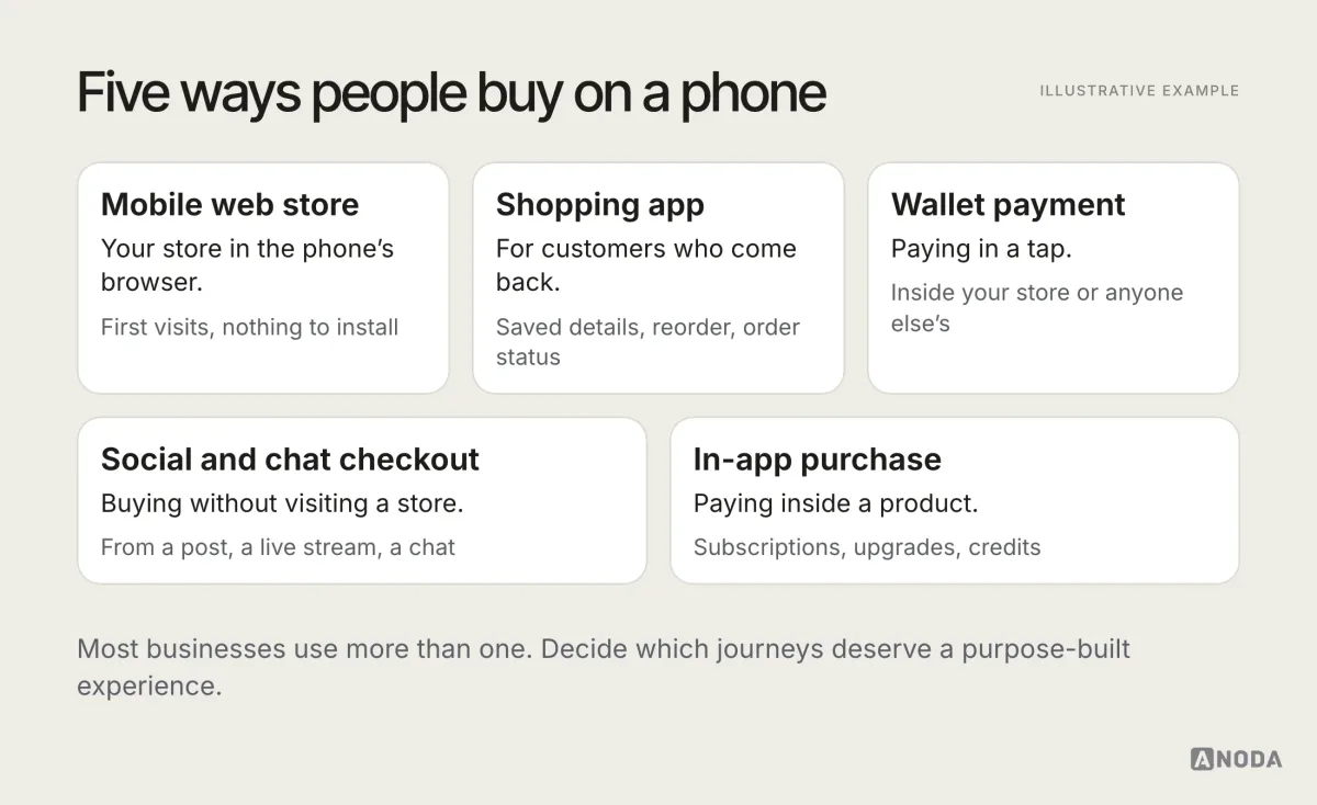
The question for a business is not “do we do mcommerce”. Your customers already do it for you, on whatever you give them. The question is which of these journeys deserve a purpose-built experience, and which are fine as a solid responsive flow.
Mcommerce vs ecommerce
Mcommerce is part of ecommerce, not a rival to it. The products, the stock and the payment rails are the same. What differs is the context of the purchase, and that is what the design has to answer.
| Desktop ecommerce | Mcommerce | |
|---|---|---|
| Where it happens | At a desk, with time | On the move, in short bursts |
| Input | Keyboard and mouse | One thumb, autocorrect |
| Screen | Room for comparison | One decision at a time |
| Payment | Card typed in | Wallets, saved details |
| Focus | Mostly steady | Constantly interrupted |
| Return visits | Bookmarks, search | Home screen, links, notifications |
A team that treats these as the same channel ends up optimising the desktop store and hoping the phone version keeps up. It rarely does.
Why mobile shopping is not desktop shopping on a smaller screen
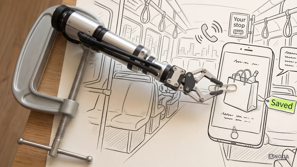
A desktop shopper is sitting down. A mobile shopper is standing in a queue, on a bus, on the sofa with the TV on. The phone store is a petrol-station kiosk, not a hypermarket: people come in for a few things, want to find them fast, pay and get back on the road. Nobody wants the full tour of aisle seven.
That changes four things:
- Attention is short. Every extra screen is a chance for a call, a message or a stop announcement to end the session.
- Space is tiny. What fits in a desktop sidebar pushes everything important below the fold on a phone.
- Typing is expensive. Every field is a thumb workout with autocorrect as a bonus.
- Trust is fragile. Typing a card number into an unfamiliar site on a small screen feels riskier than it does at a desk.
None of this is exotic. It is simply what shopping on a phone is like, and a mobile store either respects it or fights it. Friction on mobile is death by a thousand cuts: no single field kills the sale, all of them together do.
What a mobile store needs to get right
We audit mobile funnels regularly, and the same handful of decisions separates the stores that sell on phones from the ones that only get visited on them.
Speed before everything else
A mobile shopper judges the store before it finishes loading. Heavy hero images, a stack of scripts and a font that blocks the text make the first impression a blank screen on a train. Compress and size images for the phone, load the product information before the extras, and show the page’s shape while the rest arrives. Speed is not a technical nicety here. It is the first step of the funnel, and the one most teams never look at.
The essential information, first
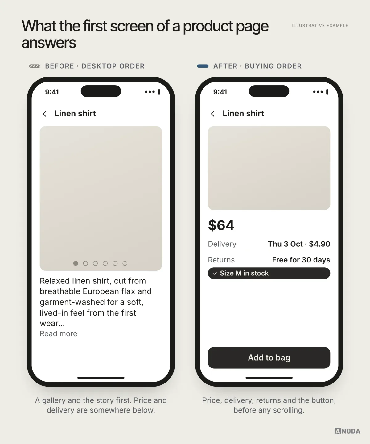
On a phone, the first screen of a product page has to answer the buying questions: what it is, what it costs, when it arrives, and whether you can send it back. Long descriptions, reviews and specifications come after. A desktop layout that puts price and delivery halfway down the page makes a mobile shopper scroll to find out whether they can afford it.
Search and filters built for a thumb
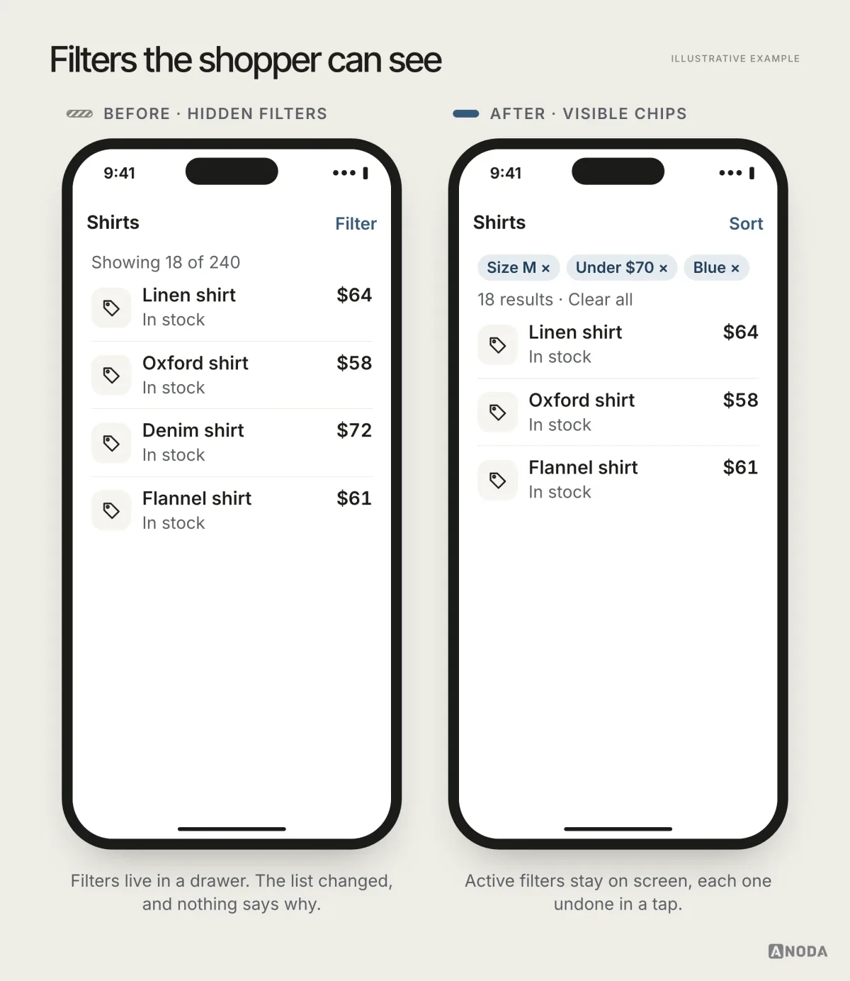
Mobile shoppers search more and browse less, because browsing on a small screen is slow. Search has to forgive typos and suggest early. Filters have to be one tap away and stay visible once chosen, so people can see why the list changed and undo it.
Built for one thumb
Most people hold the phone in one hand and shop with their thumb. Size selectors, quantity steppers and the “Add to bag” button have to be big enough to hit without zooming and low enough to reach without the second hand. Keep the main action at the bottom of the screen and keep it there while the page scrolls. Keep “Remove” well away from “Checkout”. A mis-tap at a desk is a click undone. On a phone it is the wrong size in the bag and a return a week later.
A cart that survives interruption
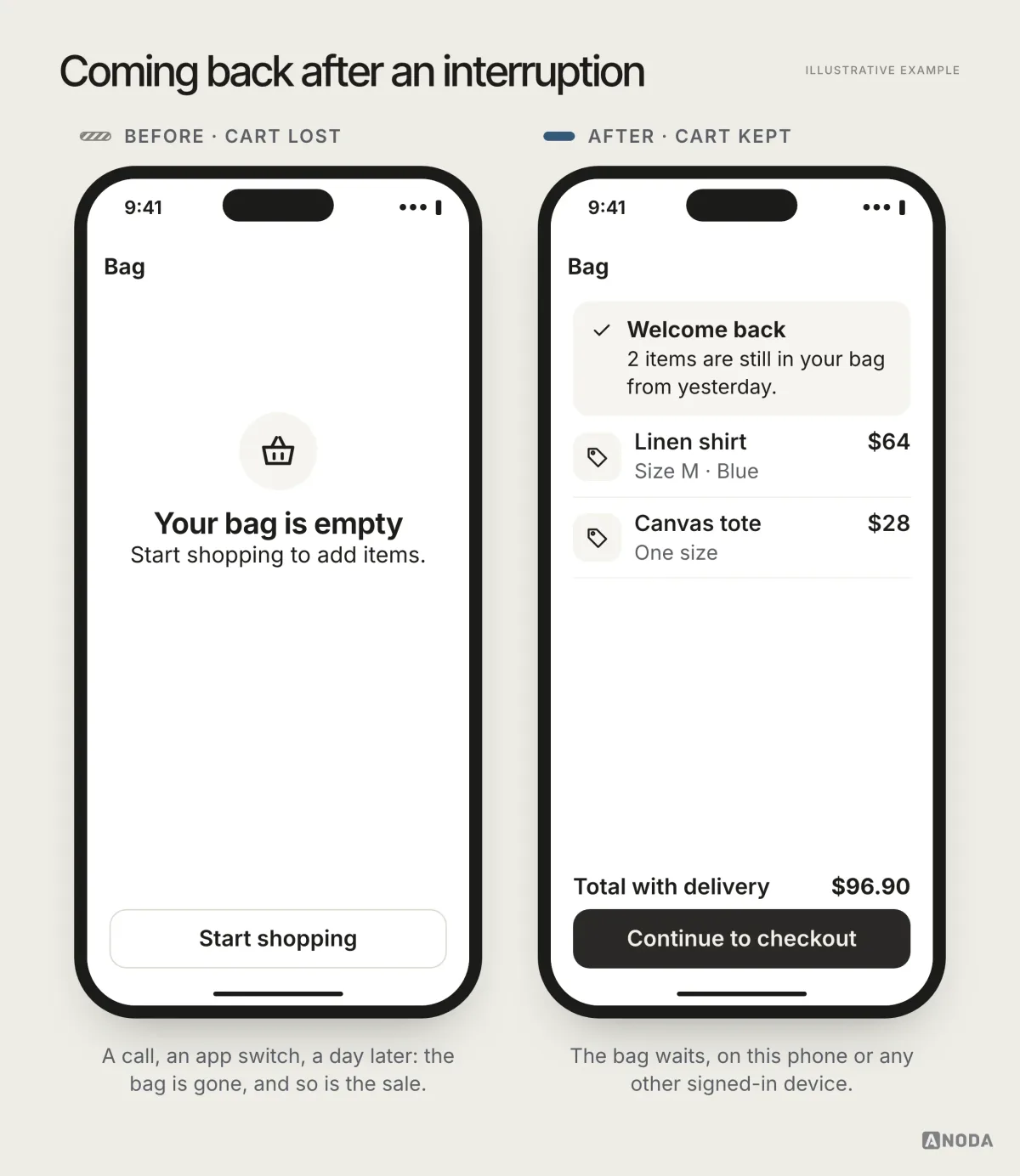
People add to cart, get interrupted and come back later, sometimes on another device. If the cart is gone, so is the sale. Keep the cart, keep the half-filled checkout, and welcome people back to exactly where they left off. A bird in the hand is worth two in the bush: a saved cart is a customer you already won once.
Checkout without the typing
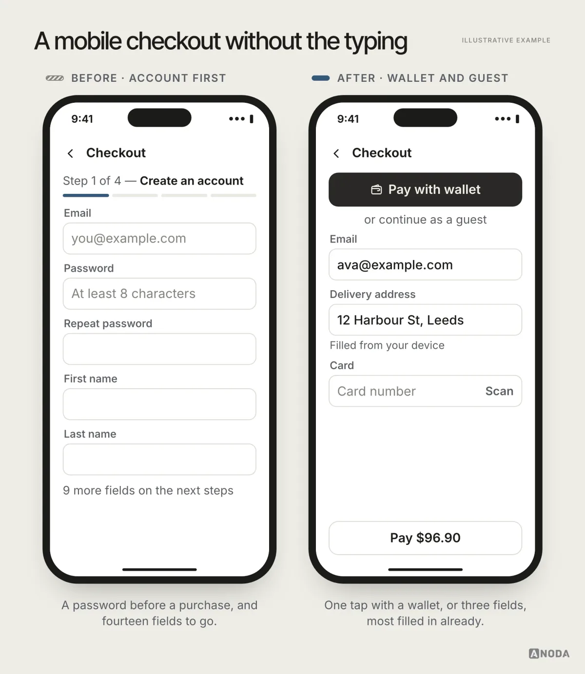
A mobile checkout should ask for as little as possible and fill in the rest: guest checkout without forced account creation, wallet payments in one tap, address autofill, the right keyboard for each field. An account can be offered after the purchase, when the customer has a reason to want one.
Trust at the moment of payment
The payment step is where a mobile shopper decides whether your store is real. Familiar wallet buttons, a known payment provider, clear returns and a visible way to contact you do more for trust than any badge. A bare card form on an unfamiliar site, on a phone, is where people suddenly remember they can buy the same thing somewhere they already trust.
No surprises at the last step
The fastest way to lose a mobile sale is to reveal the real price at the end: shipping, fees, taxes, a minimum order. It is the restaurant that mentions the cover charge when the bill arrives. Show delivery cost and the total as early as you can calculate them, ideally on the product page and certainly in the cart.
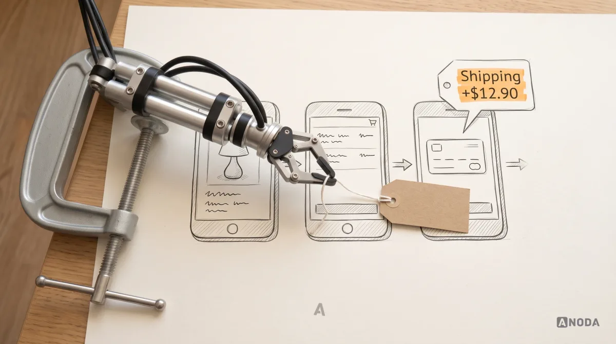
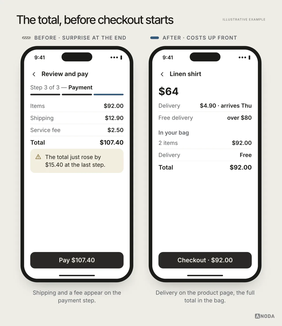
It looks like bait and switch even when nobody meant it that way, and a shopper who feels tricked does not come back to find out.
Audit check
Buy something from your own store on a phone, one-handed, on mobile data, and let a message interrupt you halfway through checkout.
Failure evidence
Price or delivery below the fold. An empty cart after coming back. A forced account. A total that changes at the last step.
Correction pattern
Put buying information first, keep the cart and the form, remove fields and offer wallets, and show the full cost before checkout.
Where design fits in mcommerce development
Mcommerce development usually gets scoped as a build: a platform, a theme, a payment integration, perhaps an app. Those matter, but the decisions that decide whether the store sells on phones come before any of them. What does the first screen of a product page show? How do filters behave? What happens to a cart after a call? How many fields does checkout ask for, and which ones fill themselves?
Make those decisions in a prototype and test them on a real phone, and the build gets a clear brief. Leave them to whatever the platform does by default, and you get the desktop store again, only responsive. Moving a button in a prototype takes minutes. Moving it after launch takes a release, a regression test and a week of lost sales in between.
Mobile web or app?
Most commerce businesses do not need an app to sell on mobile. They need a mobile web store that works. An app earns its place when it makes repeat customers’ lives meaningfully easier, not because it looks serious in the pitch deck.
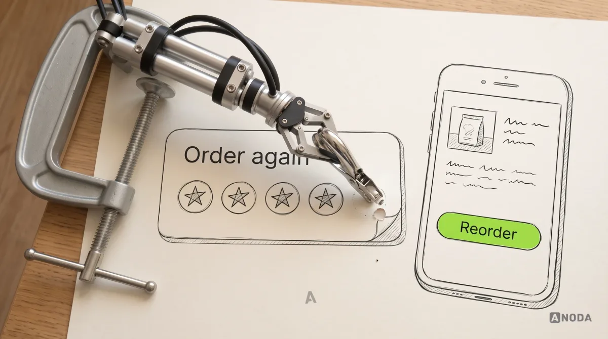
If you build one, define the recurring job it improves from day one. Saved accounts, addresses, orders and baskets can work on the web too; an app needs a tested advantage in the complete task, device integration or continued product use. An app that opens to the same catalogue as the website, and asks them to log in again, is a second store to maintain for no extra reason to visit.
An app tends to be worth it when:
- Customers buy often. Groceries, pharmacy, food, pet supplies: the weekly shop, where saved baskets and one-tap reorder save real time.
- The phone adds something the browser can’t do well. Scanning, location, a connected device, offline access.
- Alerts are genuinely useful. Order status, a restock, a delivery at the door, the ones customers would ask for.
- Loyalty is part of the model. Points, subscriptions, member prices that live in one place.
A loyalty card at the corner shop is worth carrying only if you shop there every week. The same goes for an app on the home screen. If most of your customers buy once a year, invest in the mobile web store first. We go through the full build-or-not decision in our guide to whether your ecommerce business needs an app.
The complete mobile journey: variants, payment and the order after it
A product page needs more than a prominent price. Keep the selected variant, quantity, availability and delivery promise attached to the purchase action. If a size is unavailable, show the state before the customer puts it in the cart; if a variant changes the price or delivery date, update both visibly. A promotion must show its eligibility and effect on the total, including any minimum purchase. Do not leave the customer to reconstruct the real price from a crossed-out number and a banner.
Forms need persistent labels, appropriate keyboards and errors beside the field. Autofill should help where available, while manual entry remains usable. Preserve a safe draft after a call or session interruption, and recheck price and stock when the customer returns. Cross-device continuity needs an identified account or an explicit recovery mechanism; do not promise that an anonymous cart follows a person automatically.
Wallets and saved payments can shorten input, but payment still has authentication and failure states. When a wallet is cancelled, return to the same checkout with its data intact. When authorization is pending or the network drops after submission, check the result before inviting another payment. Show the order reference, what happened and what to do next. A disabled duplicate-submit action should also explain that the first attempt is being checked.
After payment, show order confirmation, selected items, delivery address and the actual fulfillment status. Cancellation, a split delivery, an unavailable item and a refund need their own next steps. Returns should keep the order and item attached to the request, explain eligibility and the next handoff, and show where the customer can track the refund. Support should receive the same reference rather than asking the customer to start again.
Weak networks, accessibility and store-assisted shopping
Test the same purchase on a slow connection and with a connection drop before and after payment. Show which information is loading, which is cached and which needs a fresh check. An offline basket can retain choices without pretending that stock or a live price is confirmed. Let people retry a failed image or request without discarding their other work.
Check product selection and checkout with large text, screen readers and keyboard navigation where supported. Labels, totals, errors and selected variants must remain readable and correctly announced. Sticky purchase controls must not cover delivery information, a focused field or a validation message. Keep promotional motion from blocking the shopping task.
If customers also shop in a physical store, define the handoff: reserve an item, collect an order, scan a product or ask staff for help. Show which store the information belongs to and when stock was checked. Camera and location requests should appear when the customer invokes the task; a denied permission needs a usable alternative. Separate order updates from marketing notification choices, and keep critical order information available without push permission.
Blackdove: commerce connects to an ongoing product
In Blackdove, the storefront is one part of a larger mobile experience. ANODA designed a Shopify storefront, a responsive web app and a mobile app on one system, and built the storefront. The client’s developers built the apps.
A buyer configures a Digital Canvas and chooses a plan; the continuing product lets them discover moving art, keep collections, pair displays and control playback from a phone. The configurator’s running total and subscription line need to remain clear before purchase. Pairing and device status then support a different task after it. This is why commerce and the ongoing app need one connected journey rather than the same catalogue copied onto two surfaces.

ANODA connects the sale to the experience after it. Blackdove needed the storefront, subscription choice and display controls to tell one consistent story; we designed those surfaces on one system and built the Shopify storefront. For your store, that means solving the buying journey rather than putting a new theme over the same checkout friction.
For a shopping journey, ecommerce design owns the complete discovery-to-service scope. The ecommerce app decision guide decides whether a dedicated app has a recurring job; the mobile app guidelines cover native navigation and device behavior.
What to measure
Mobile commerce is easy to misread from a single conversion rate. A few numbers tell you where the journey actually breaks:
- Conversion by step, mobile vs desktop. Product page to cart, cart to checkout, checkout to payment. The step with the biggest gap is where to start.
- Checkout completion. How many people who start checkout on a phone finish it.
- Returning carts. How many shoppers come back to a saved cart and buy.
- Time to purchase. How long a returning customer needs to reorder something they bought before.
- Repeat purchase rate. The number that decides whether an app would pay for itself.
Watch these by device, not blended. A healthy total can hide a mobile funnel that leaks at every step, propped up by desktop customers who have more patience.
The mistakes that quietly cost mobile sales
When a mobile store underperforms, the cause is rarely dramatic. It is usually a pile of small decisions that each looked reasonable at a desk:
- The desktop page, shrunk. Same content order, same density, now three times longer.
- Pop-ups on arrival. A newsletter, a cookie wall and a chat bubble fighting over a screen the size of a playing card.
- Forced accounts. Asking for a password before the customer has decided to buy.
- Tiny tap targets. Size selectors and quantity steppers designed for a mouse pointer.
- Lost progress. A cart or a form that resets after a call or a switch to another app.
- Surprise costs. Shipping and fees revealed at the end.
- An app nobody asked for. Install banners on every page for a store people visit twice a year.
Each one is small. Together they turn phone traffic into bounce rate. Fixing them usually costs less than the ads that keep sending shoppers into the same leaky funnel.

UI/UX design
Your traffic is on phones. Your sales should be too.
We walk your mobile funnel the way your customers do, find where it leaks, and design the store, the checkout and, only if it pays off, the app.
How to start
You do not need a rebuild to improve a mobile store. Start with the journey that brings the most revenue and walk it on a phone:
- Walk it yourself. One-handed, on mobile data, with an interruption halfway. Note every moment you had to hunt, type or wait.
- Look at where people drop. Compare mobile and desktop at each step of the funnel. The biggest gap is your first fix.
- Fix the buying information. Price, delivery and returns on the first screen of the product page.
- Protect progress. Keep carts and forms through interruptions and across devices.
- Shorten checkout. Guest checkout, wallets, autofill and fewer fields.
- Show the full cost early. No surprises at the last step.
- Only then consider an app, for the customers who come back often enough to want one.
Prioritise the essential task on the smallest screen. Keep the cart and the form. Make the price and the delivery obvious. And build an app only when it makes your customer’s life meaningfully easier, not yours. For more practical guides like this one, browse the ANODA UX blog.
Mobile commerce release checklist
| Task | Ready when |
|---|---|
| Find and evaluate | Search and filters preserve selection; variants, availability, delivery and returns are understandable on the small screen |
| Review the cart | Prices, promotions and delivery costs recalculate visibly; safe cart state survives interruption |
| Complete checkout | Guest and account paths fit the business rules; keyboards, autofill, inline errors and authentication have working alternatives |
| Pay and recover | Duplicate attempts are controlled; cancelled, pending and failed payments explain whether an order exists and how to continue |
| Receive and return | Confirmation, tracking, cancellation, partial fulfillment, support and refund states carry the same order reference |
| Use under constraint | Slow and offline states, large text, screen readers and permission denial preserve a usable task |
| Learn after release | Funnel events identify failure reasons; product and operations owners review payment, fulfillment and support outcomes together |
Frequently asked questions
What makes mobile commerce UX different from desktop commerce?
The shopping task runs through small screens, touch input, interruptions and variable connectivity. Prioritize product and total-cost clarity, an accessible checkout and safe recovery rather than shrinking a desktop layout.
Do mobile shoppers need an app?
No. A responsive storefront can support discovery and purchasing without installation. Consider PWA or native only when a recurring customer task and tested device capabilities justify acquisition and ongoing maintenance.
What should happen when a mobile payment is interrupted?
Preserve safe checkout context and check the payment result before offering another attempt. Tell the customer whether the order is confirmed, pending or failed, with a reference and a safe next action.
How do you measure mobile commerce UX?
Break the funnel into discovery, product choice, cart, checkout, payment and post-purchase tasks. Segment by device and returning status, record failure reasons and review successful fulfillment, support demand and returns alongside purchase completion.
Written by