
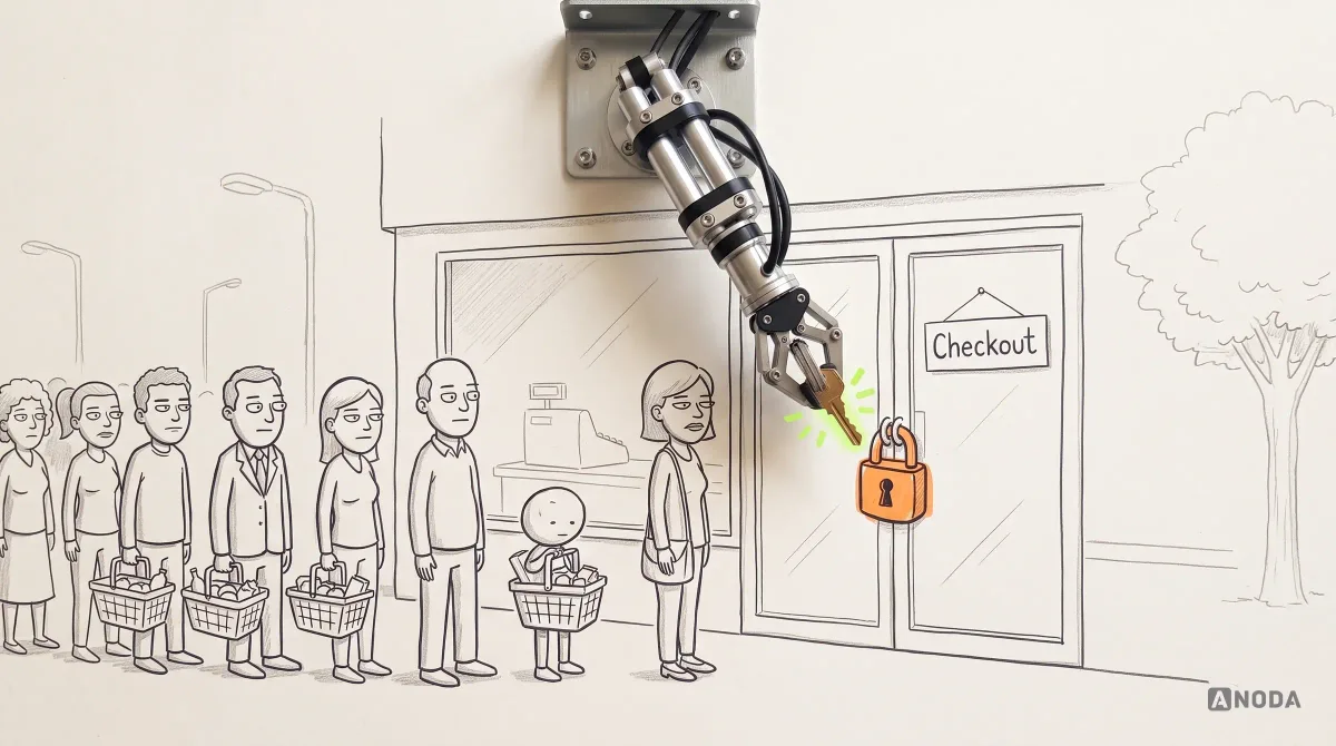
Ecommerce UX Best Practices for Higher Conversion
Improve ecommerce UX across product discovery, navigation, mobile, product pages and checkout. Learn what to fix, test and measure for conversion.
Design the store your shoppers move through — how they find a product, what convinces them on its page, the subscription they keep and the checkout they finish — on the web and in your app.

A store shoppers find their way through, from the first search to the order they repeat.
Many sellers in one market: listings, payouts, disputes.
Ecommerce Product Design
One brand selling its own products, end to end.
Not included
What we design for an online store, from the first search to the repeat order.
Categories, collections and search, built around how your shoppers look for things.
What a shopper needs to decide: images, options, price, delivery and returns.
From the cart to the confirmation, and the order history people come back to.
Plans, pauses, skips and renewals a customer can manage without writing to support.
You receive
Ecommerce UX design meets sizes that sell out, codes that fail and parcels that run late. Each state below has a screen that keeps the shopper moving.
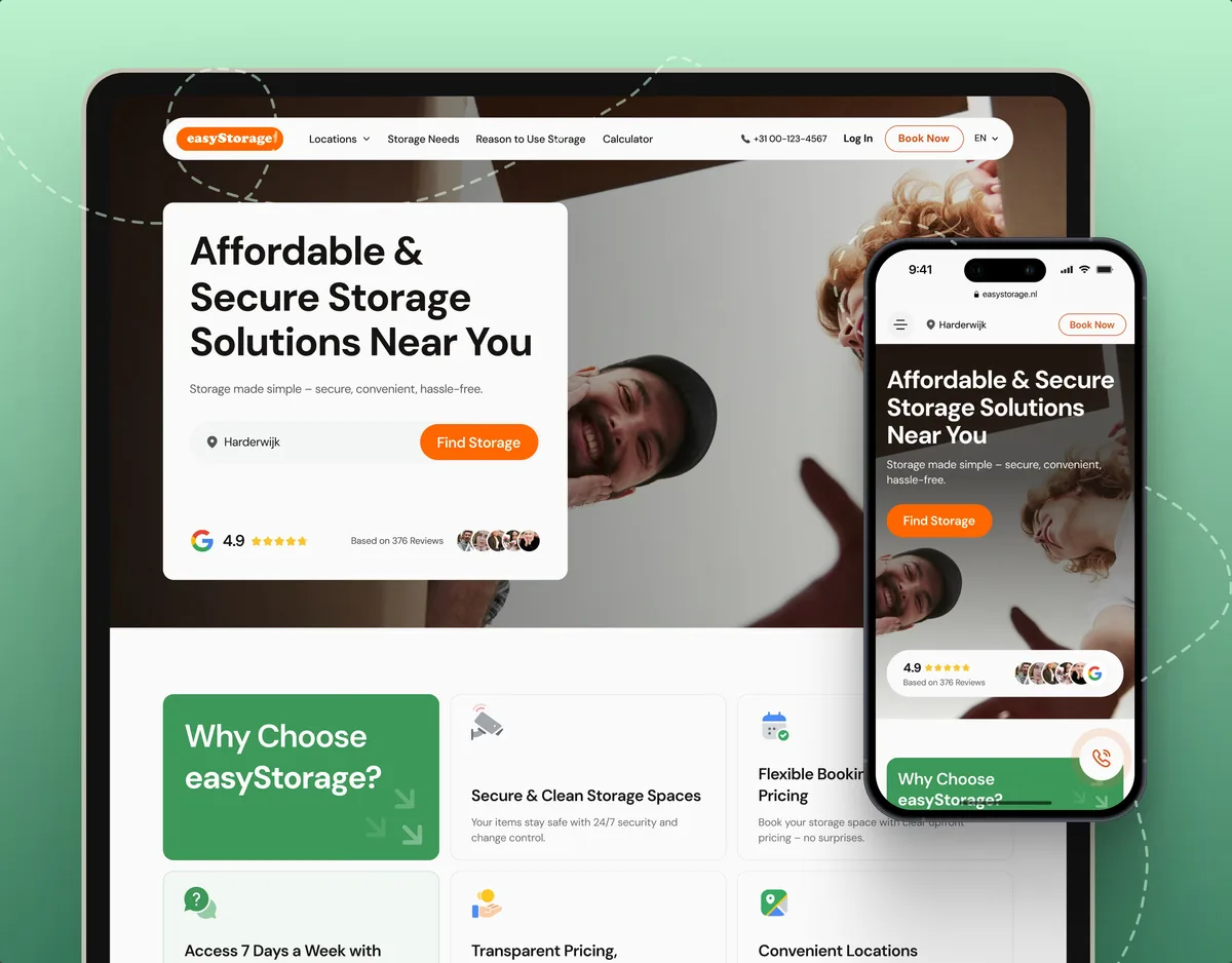
A digital art storefront with curated subscriptions, and a self-storage store you book and pay for online.

Digital Art · Streaming · Web + Mobile
Designed a digital art platform for web and mobile — the storefront for canvases and curated subscriptions, collections, artist pages and sending art to a screen on the wall.
E-commerce · Website
Designed and built key pages of a self-storage ecommerce website — clearer options, honest pricing and a booking flow with secure sign-up — live on Webflow.
It fits when you sell your own products online and the journey, not the catalogue, is what needs work.
A brand or retailer selling direct, D2C or alongside stores, not a platform for other sellers.
People browse, add to cart and drop off, and nobody can say exactly where or why.
Subscriptions, reorders or collections matter as much as the first order.
The store runs on the web and in an app, and they should feel like one shop.

Tell us what you sell, to whom, and where shoppers give up. Expect a reply naming the page or step we would start with.
Store work is contracted per service, and the first one you pick carries the terms.
The design work treats discovering art and displaying it as connected parts of the same experience. We appreciated the consistent visual language across the web and mobile screens, while keeping the artwork central to the product.
Tell us what you sell, on which platforms, and what your analytics and support already show.
Message received.
Within 15 minutes, we’ll email you initial feedback and follow-up questions.
Improve ecommerce UX across product discovery, navigation, mobile, product pages and checkout. Learn what to fix, test and measure for conversion.
What Is Mcommerce: practical guidance, examples and decision criteria from ANODA. Learn how the topic applies to your product and team.
Ask to see whole journeys, not hero banners: how a shopper finds a product, what the product page answers, what happens when a size is gone or a code fails, and how a subscription is paused. Ask which of those screens went live and which designers drew them. Be wary of a portfolio of homepages alone — shoppers decide on the search results, the product page and the checkout.
Usually a store map, discovery and search, collection and product pages, cart, checkout and account, subscriptions where you sell them, the states in between, a prototype and the UI for web and mobile. The size of the catalogue and its options, the number of platforms, whether the store is new or live, and how much evidence you already have all move the cost and the schedule. Stores are not priced from a menu: the first service sets a scope for your catalogue, and dates follow once access and platform limits are clear.
First-time visitors, returning customers, subscribers, gift buyers and the support staff who answer them. The journeys are browsing and search, filters and collections, product pages with options, the cart and checkout, account and order history, subscriptions, skips and renewals, back-in-stock alerts, returns and refunds, and moving between phone and laptop mid-purchase. A D2C brand usually adds its own layer: the story behind the product, bundles, and a subscription that has to feel easy to leave.
UI/UX & Product Design for a new store or shopping product, a UX Audit when a live store loses shoppers, and UI Redesign when it has outgrown its template. Mobile App Design covers retail app design, and Website Design covers D2C website design, where the brand site and the store have to work as one. Marketplaces with many sellers, point of sale and payment products each have their own page.
Your legal team decides how prices, taxes, delivery terms, returns and consent must be shown in each market, and your payment provider sets what its checkout requires; we design how each appears and where it sits in the journey. We design to recognised accessibility guidelines and flag what needs testing. If returns or tax display differ between countries, your team gives us the list and each market's store shows its own version. Our files show where each rule lives on the page; certifying that the store complies is not something a design team can do.
A test account with past orders on the live store or staging, the catalogue and its options, analytics, search terms, returns reasons and support themes, someone who owns product decisions, and contact with engineering and your platform, payment and delivery providers. The words shoppers type into your search box tell us a lot.
Blackdove, a digital art platform with a storefront for canvases and curated subscriptions: 300+ unique screens across 2 platforms, web and mobile, for digital canvases from 32 to 98 inches. And easyStorage Netherlands, a self-storage ecommerce website where we designed and built the key pages, pricing and booking flow. Each project's figures stay with that project; neither carries a conversion figure, and we do not borrow one.
Yes. Most ecommerce work starts from a store customers already buy from, where a change must not cost a day of sales. Designs respect what your store platform can and cannot do; we use your files and design system, work with your product, engineering and marketing people, and you own everything we produce. We can start with one journey — often search or checkout — and extend from there. Opening a new market, language or app later means new screens made from the same product cards, filters and checkout parts.