
Medical ecommerce website that explains first
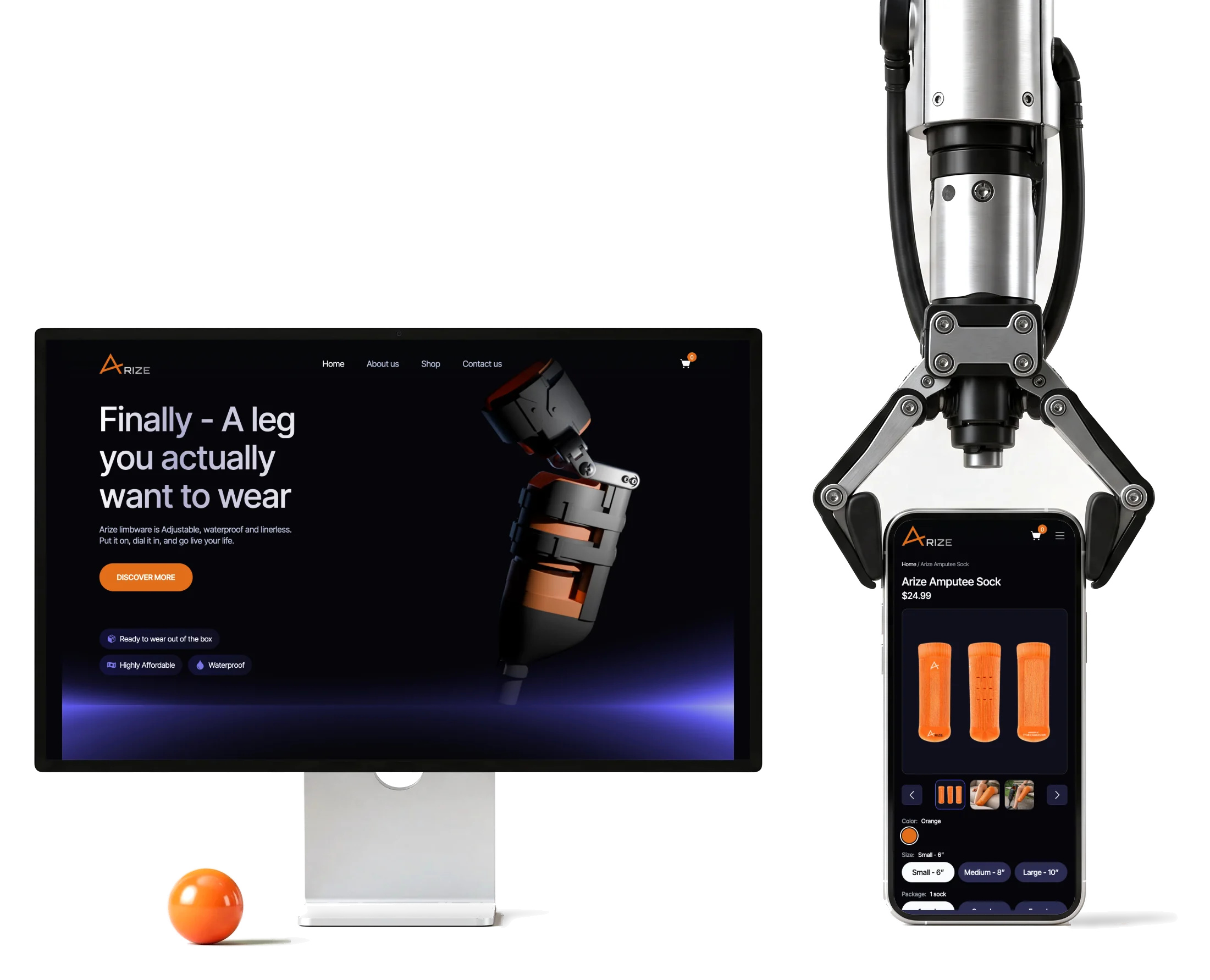
Arize is building limbwear: a prosthetic leg meant to be bought like footwear, for lower-limb amputees.We researched, designed and built its website and store.
- WordPress
- + WooCommerce the whole implementation, by ANODA alone
- 3D
- interaction specified for developers across responsive layouts
- 3
- surfaces the website, the store and the investor deck
Project summary
Arize is creating limbwear for lower-limb amputees: a prosthetic leg sized like footwear and sold direct, and an amputee sock that is on sale now. It had to be understood by amputees, their families and clinicians, and shown to investors. We did the research, UX and UI , specified the 3D product presentation, designed the investor deck, and built the whole site in WordPress and WooCommerce .
How we worked together
- Start
- Product and market research, and a review of competitors
- Structure
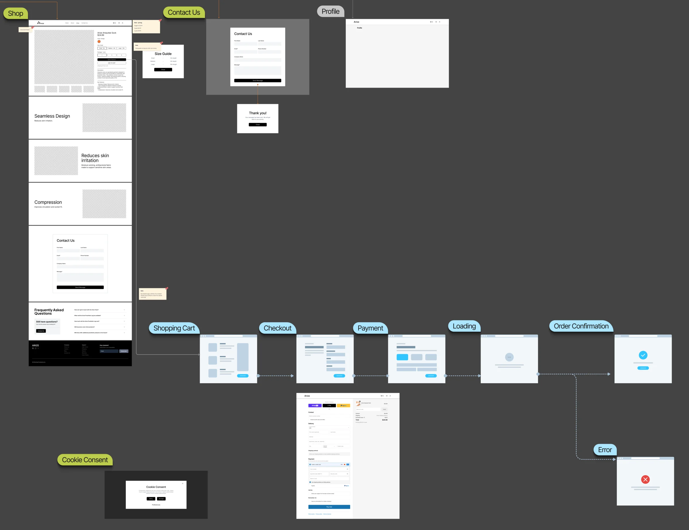
- Information architecture, user flows, wireflows and screen maps
- Look
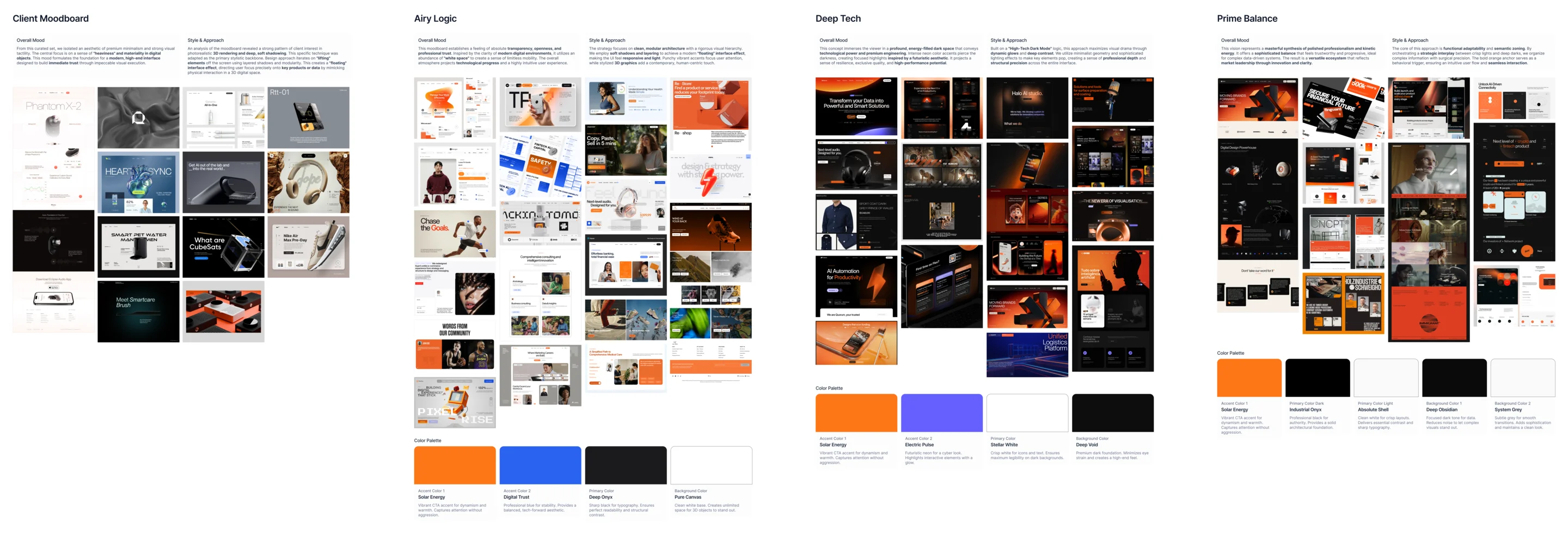
- Visual directions from the client’s moodboard, one chosen, then a full design system
- Platform
- Planned on Shopify, moved to custom WordPress and WooCommerce when the 3D experience proved too costly there
- Build
- The complete WordPress and WooCommerce implementation, by ANODA alone
- Also
- An analytics event map for the purchase funnel, and the investor pitch deck
From “what is this?” to a paid order
Every visitor, from a prosthesis user to a clinician, follows the same path, at their own depth:
-
Home
- What Arize is
- Who it’s for
-
Product
- How it’s built, in 3D
- Benefits and sizing
-
Configure
- Colour and size
- Pack quantity
-
Cart and checkout
- WooCommerce
- Order confirmation
-
About and contact
- The mission
- Waitlist and contact
- Human and technical
- A warm, personal story and precise product specifications on the same page.
- 3D and speed
- The 3D view explains the product without slowing the path to buying it.
- One product and many variants
- Colour, size and pack chosen clearly, without turning one product into a catalogue.
The product page, read in the order of doubt
- Found
- Visitors arrive unsure what the product is, whether it fits them and what to choose.
- Decided
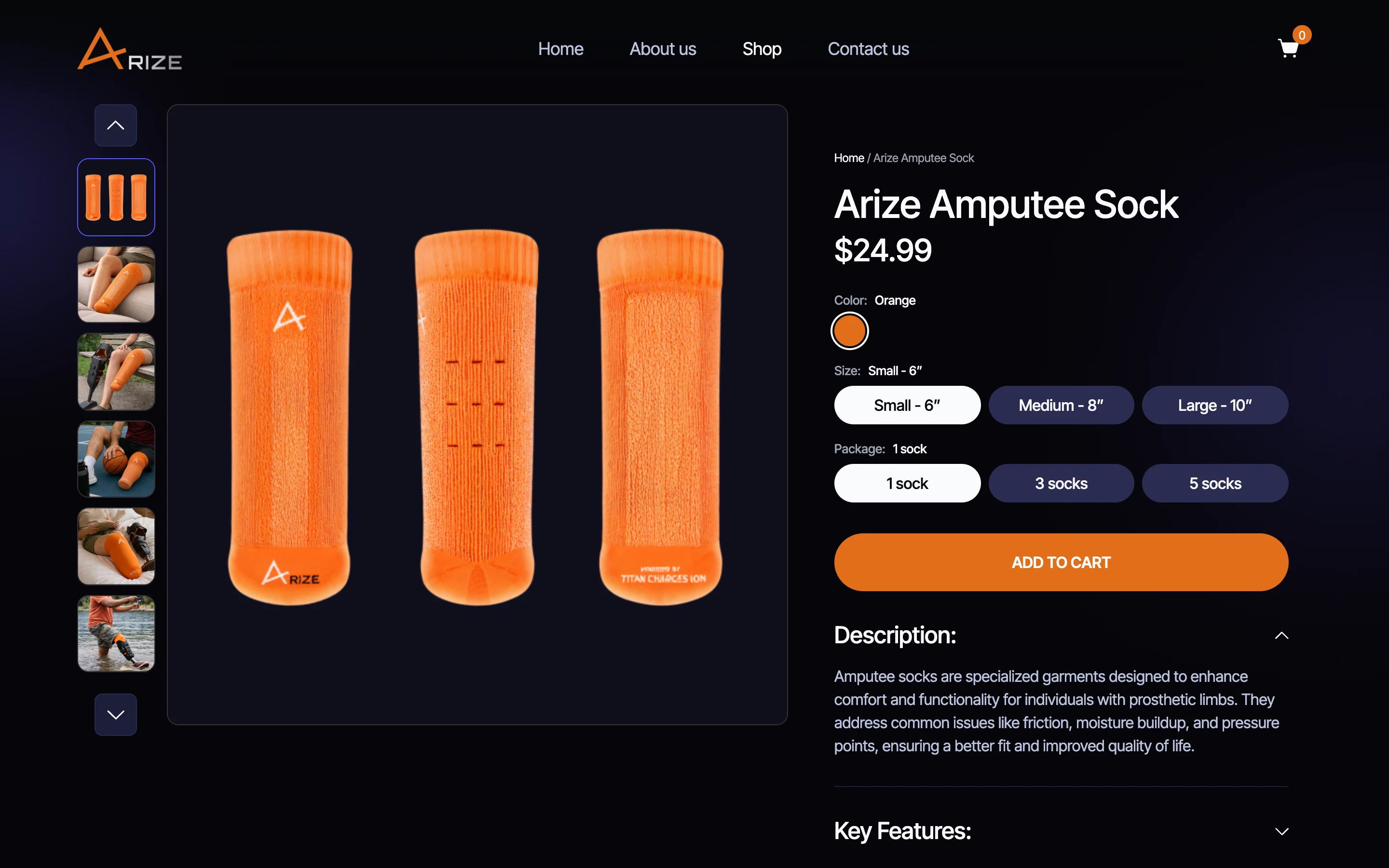
- What it is, then the choices, then one button, with the description and features folded below.
- For the user
- A first-time buyer sees the product, picks a size and pack, and only then reads the details.
-
What it is, what to choose
The name and price, then colour, size and pack, each choice named above its row.
-
Then act, then read
One orange button, then the description and key features, folded.
From research to a store that runs
One team from the first research to the WooCommerce store.
-
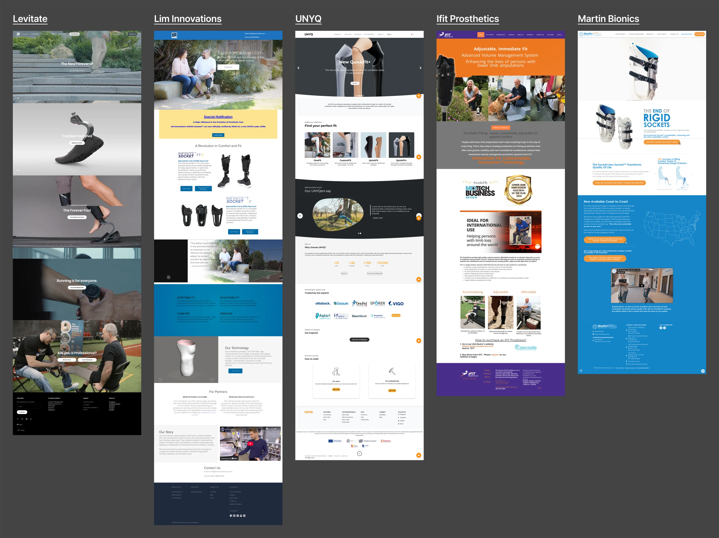
Research
Who the visitors are and how comparable products are sold.
Artifact Product and market research, and a competitor review.
-
UX
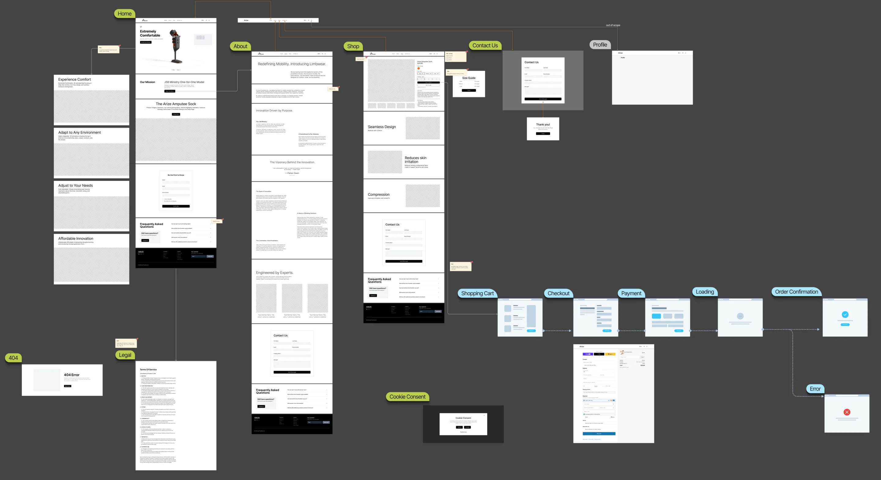
The path from first visit to checkout, for each kind of visitor.
Artifact Information architecture, wireflows, screen maps and a clickable responsive prototype.
-
Visual system
How Arize looks, chosen from the directions we explored, and the components everything is built from.
Artifact Final visual system, full design system and UI kit.
-
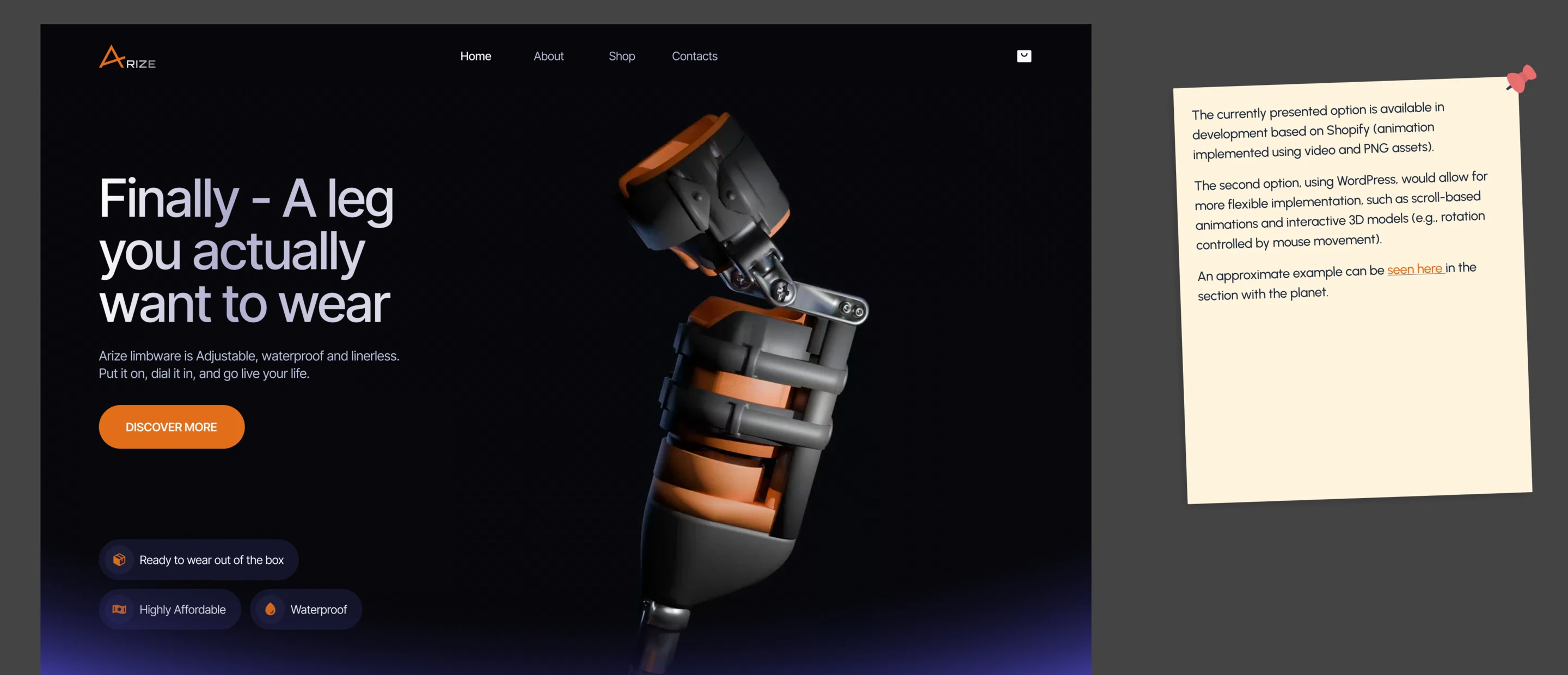
3D and interaction
How the product turns, zooms and explains itself, at every screen size.
Artifact 3D presentation and interaction specifications, and essential feedback animations, for developers.
-
Build
A working store with the bespoke product story inside it.
Artifact The complete WordPress and WooCommerce implementation, with the analytics event map.
-
Pitch deck
The same story, told to investors.
Artifact A branded investor pitch deck.
One product, three kinds of visitor
- Found
- A prosthesis user, a caregiver and a clinician look for different things on the same site.
- Decided
- One path through the product, with depth where each needs it: the story, the construction, the specifications.
-
Understand
From the 3D hero to the mission, the product and the questions people ask.
Open the full map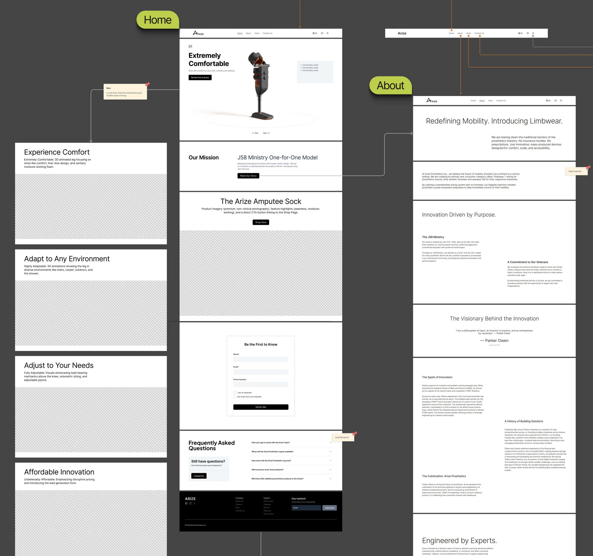
-
-
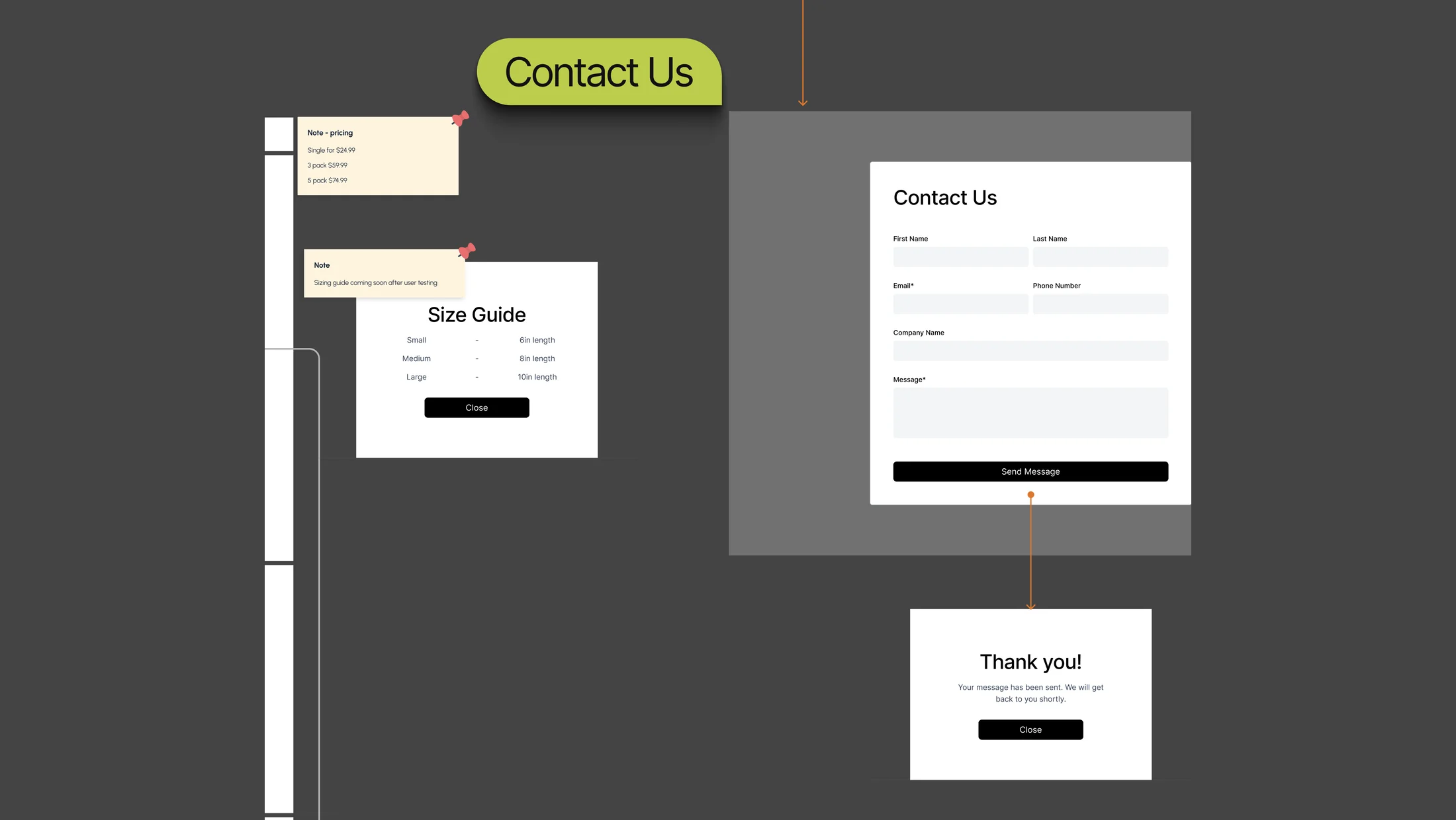

What Arize’s site does
The 3D story first, then choosing and buying.
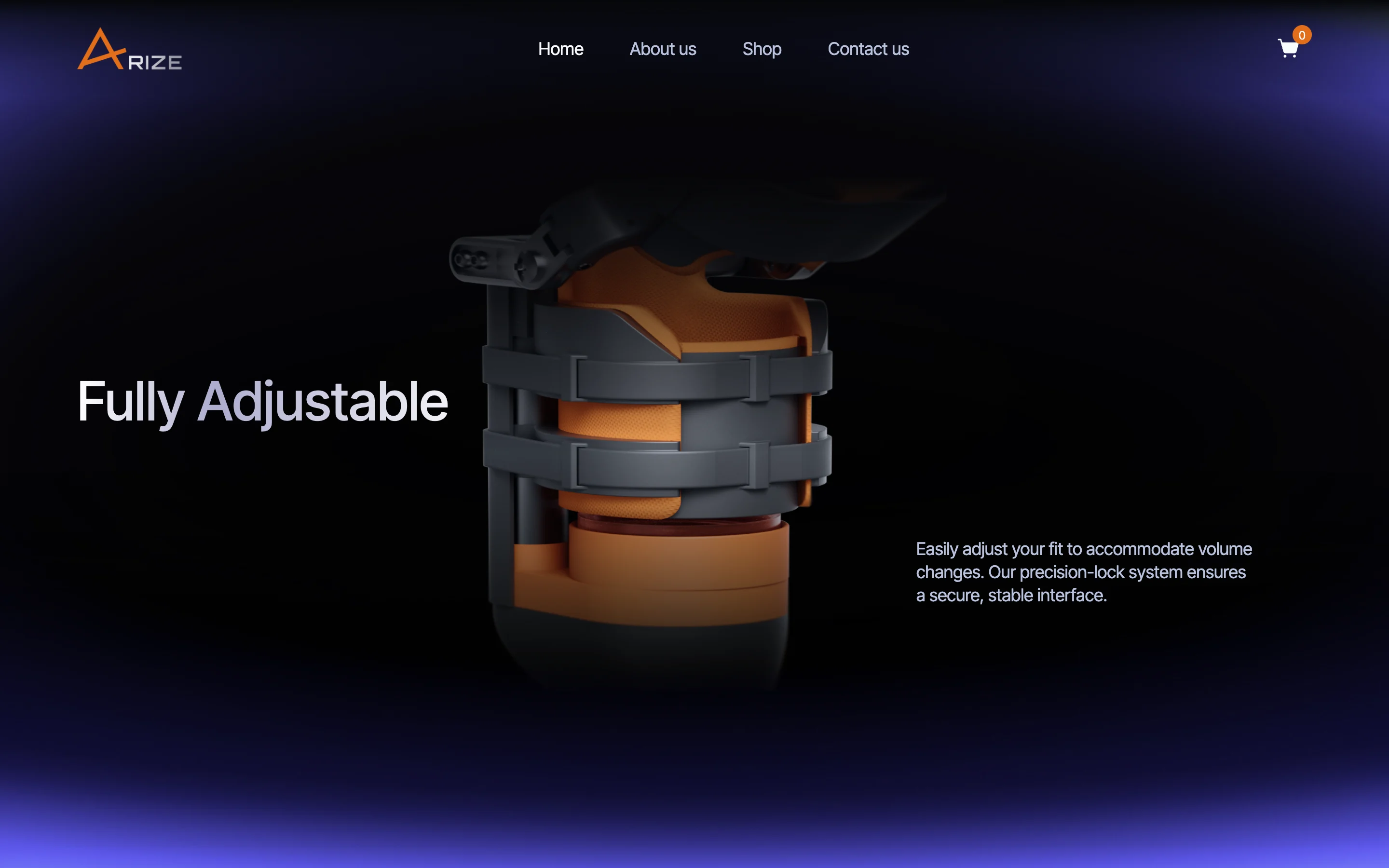
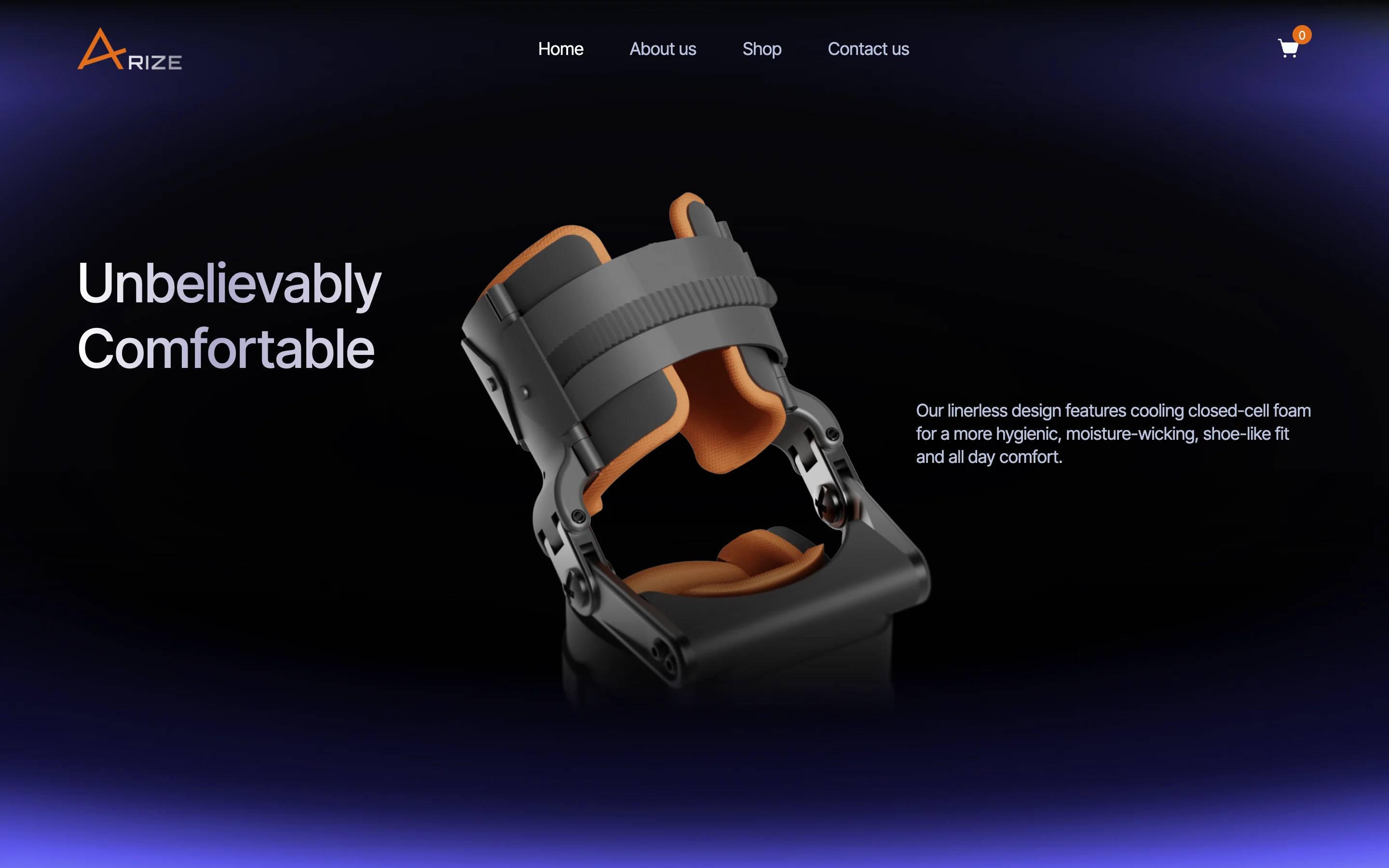
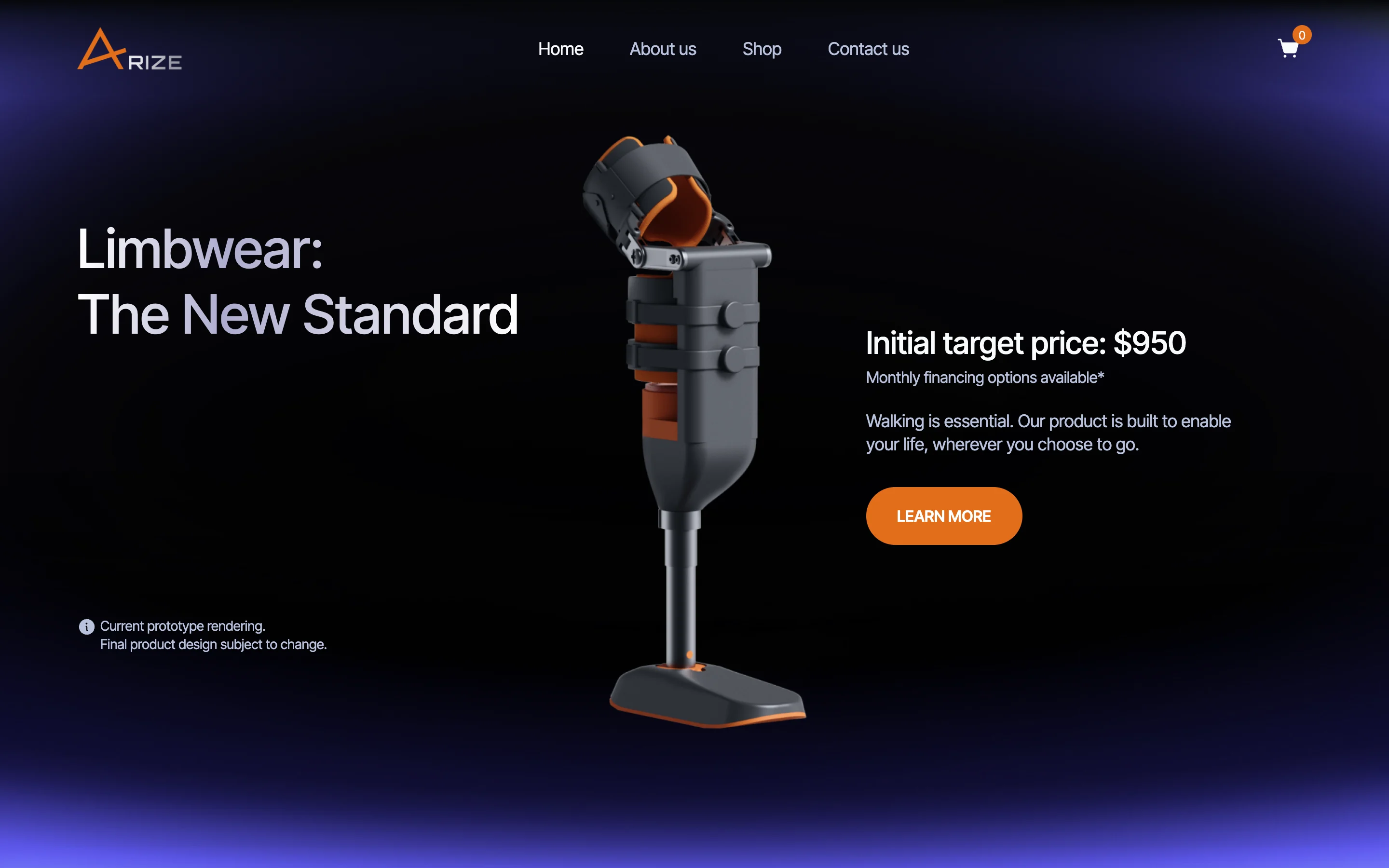
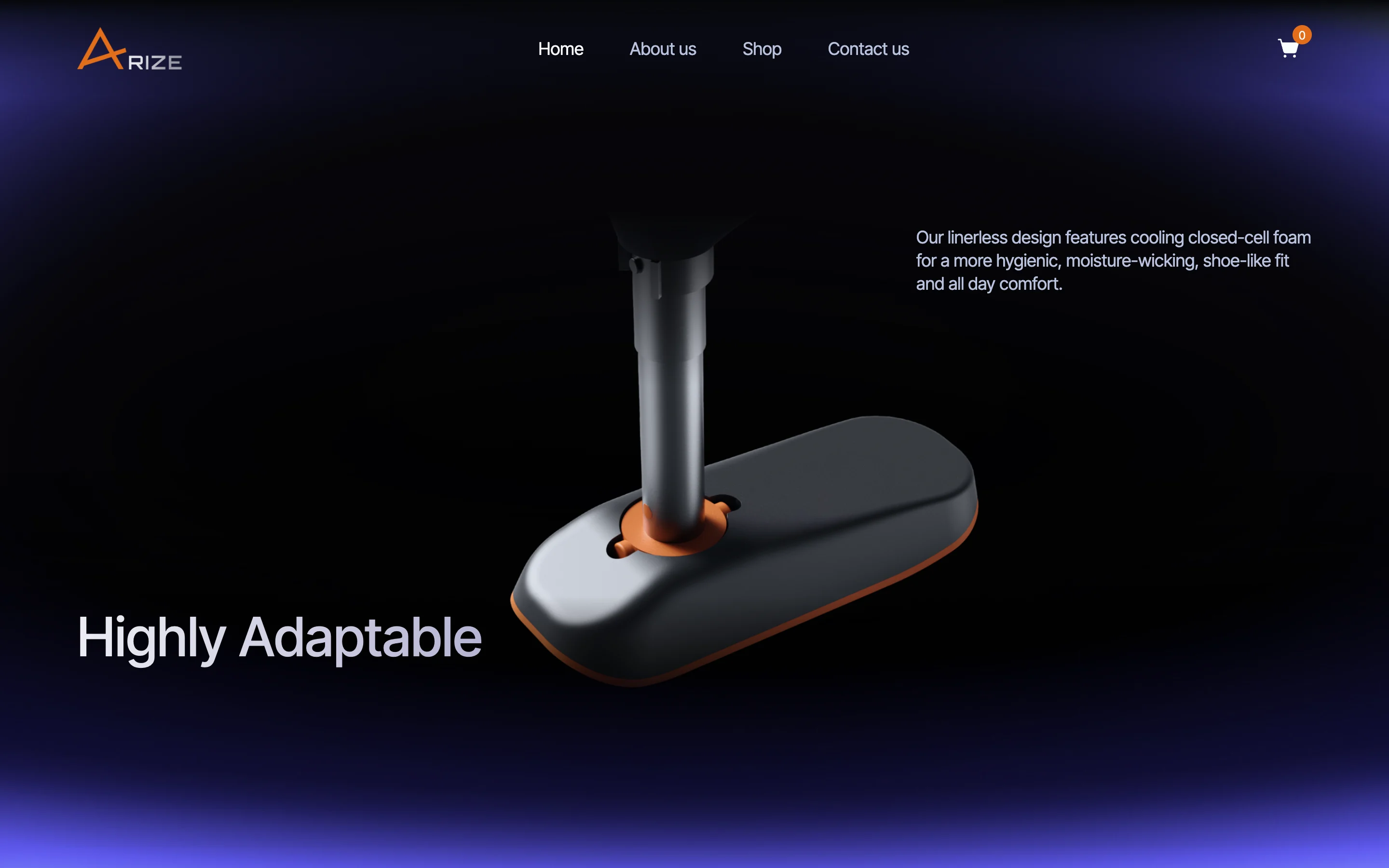
The product in 3D
- Found
- A photograph can’t show how the product is built around a prosthesis.
- Decided
- A 3D leg that turns and opens as the visitor scrolls, one benefit per step, specified state by state for the developers and built on the live site.
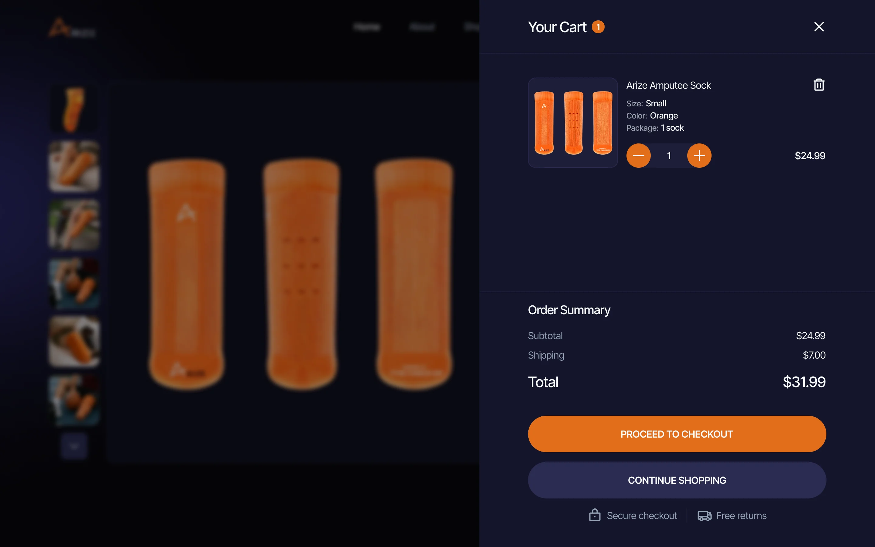
Colour, size and pack
- Found
- One product with several variants can confuse a first-time buyer.
- Decided
- Each choice shown on its own on the product page, and the configuration repeated line by line in the cart.
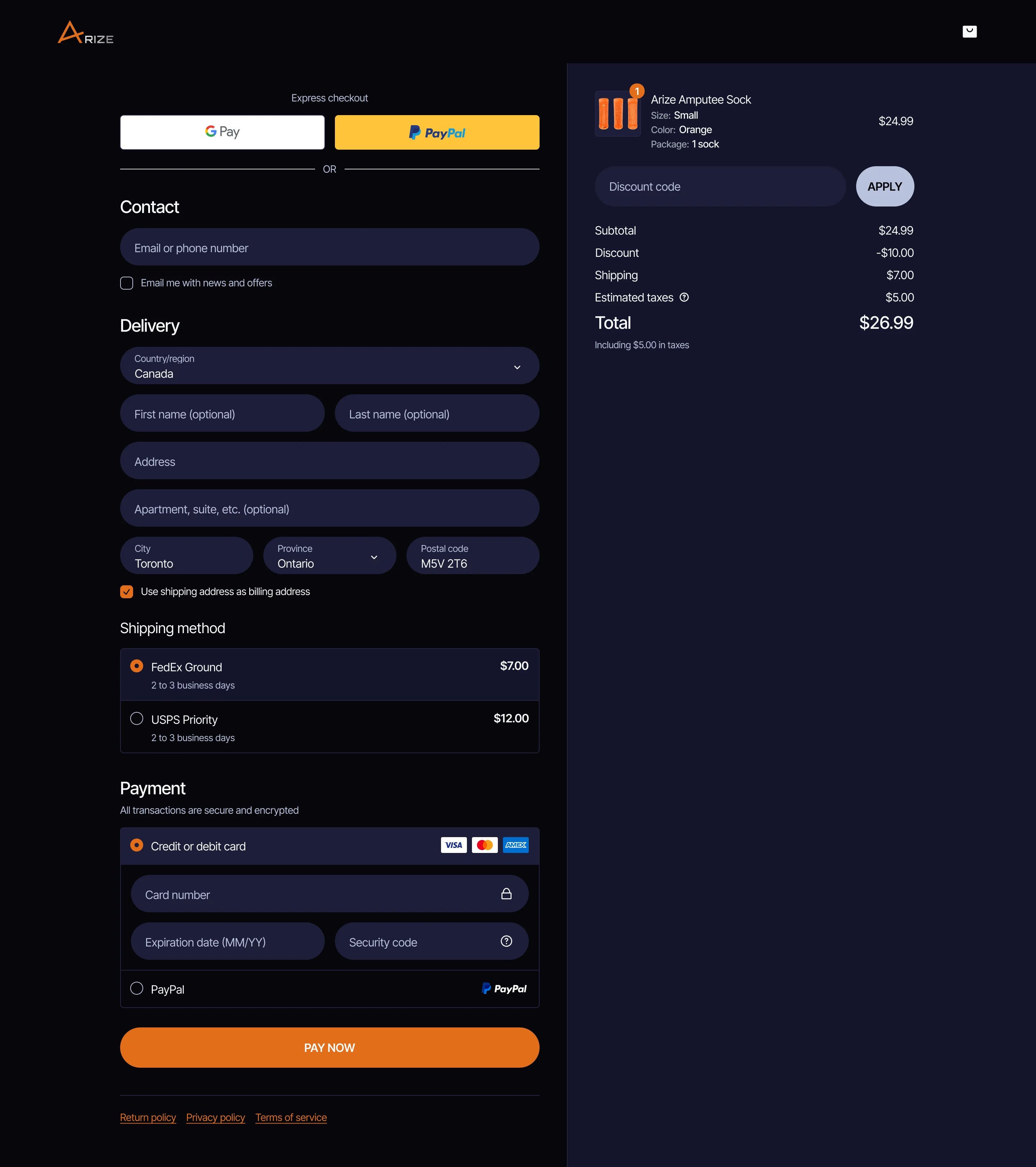
Checkout
- Found
- A bespoke product story still has to end in a standard, trustworthy checkout.
- Decided
- WooCommerce checkout in the site’s own design: express pay first, then contact, delivery, shipping and payment.
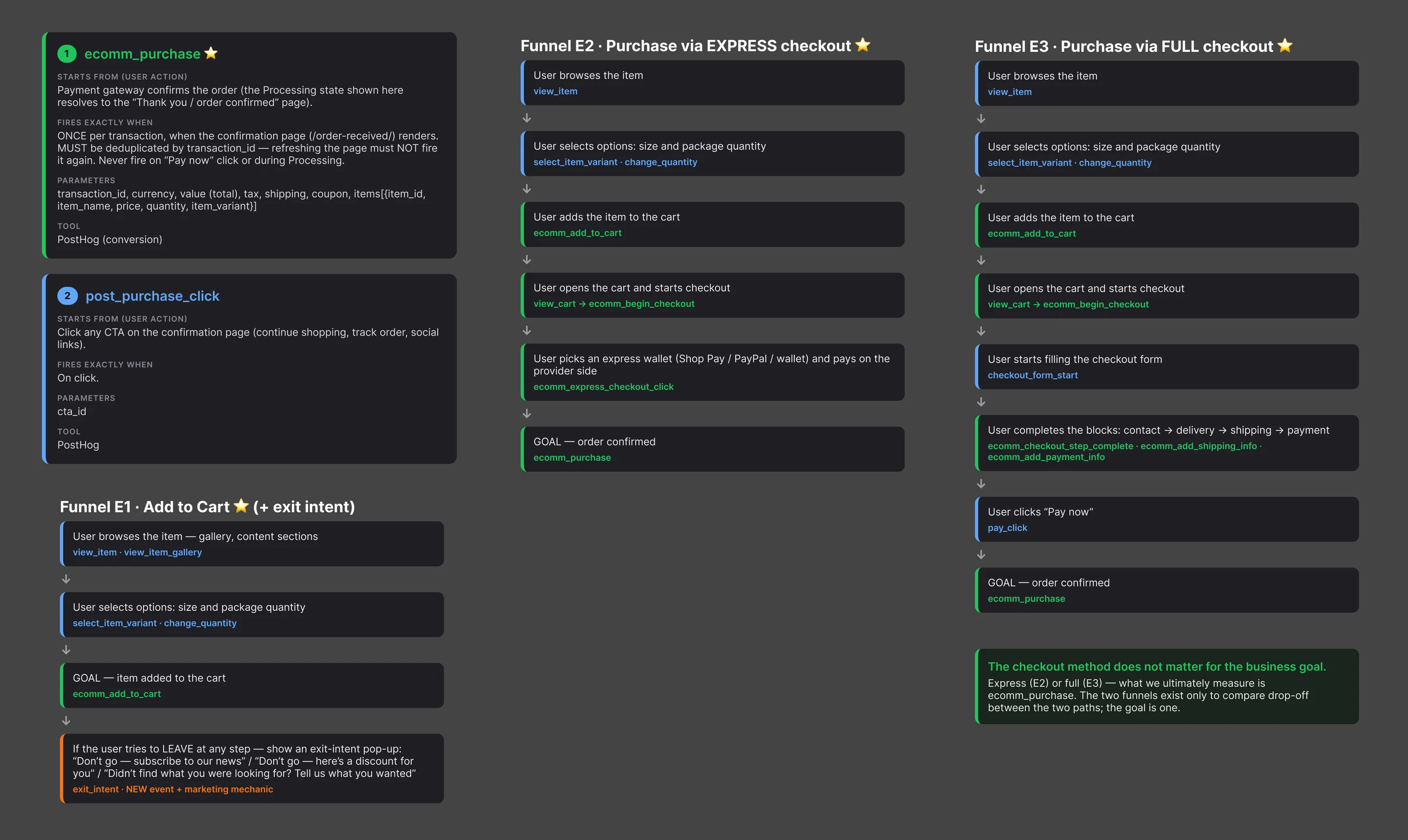
Measured from the first visit
- Found
- The team needed to see where visitors drop between landing and purchase.
- Decided
- An event map for the site and the ecommerce funnel, each event with its trigger, parameters and tool.
One visual system for the site, the store and the deck
- Found
- A website, a checkout and an investor deck can easily look like three companies.
- Decided
- A full design system: components, logo treatment, spacing, icons, header and footer, photography and prosthesis assets, loading states.
The choice, carried from the page to the cart
What the buyer picks on the product page comes back in the cart in the same words, with a stepper for the quantity.
-

Option rows: Size and pack as pills, the chosen one in white and named above its row. -

Cart line: The product, its size, colour and pack, and the quantity stepper.
While the order goes through
Between Pay now and the confirmation, the buyer sees the order being processed, not a frozen page.
-

Order processing
The investor deck, in the same language
- Found
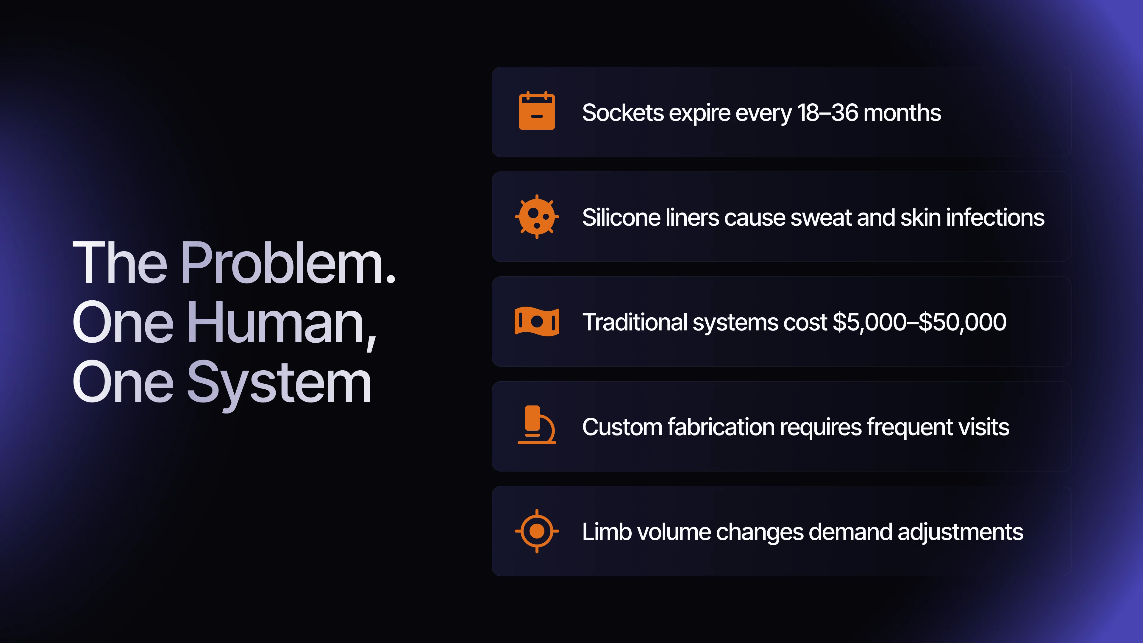
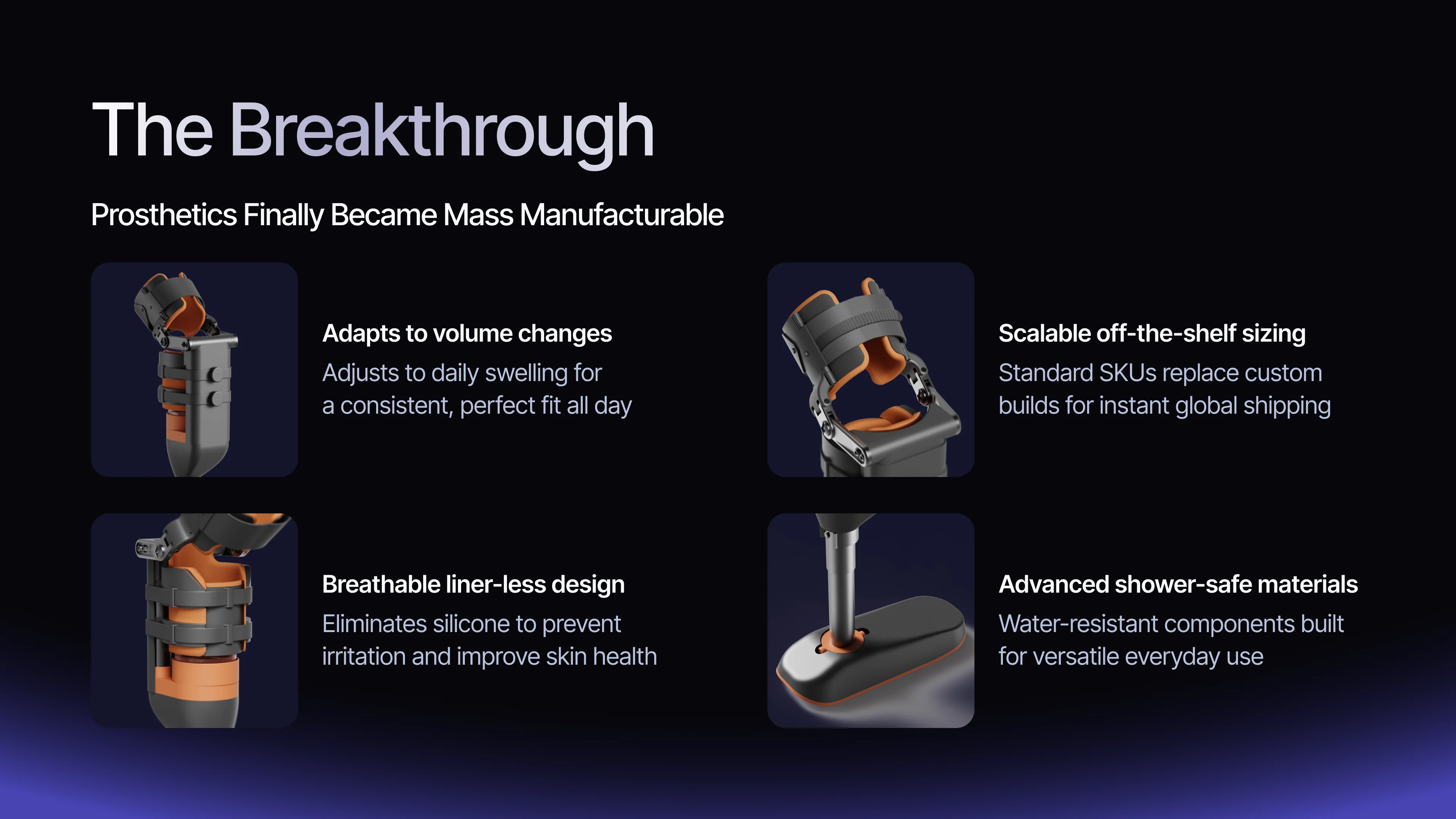
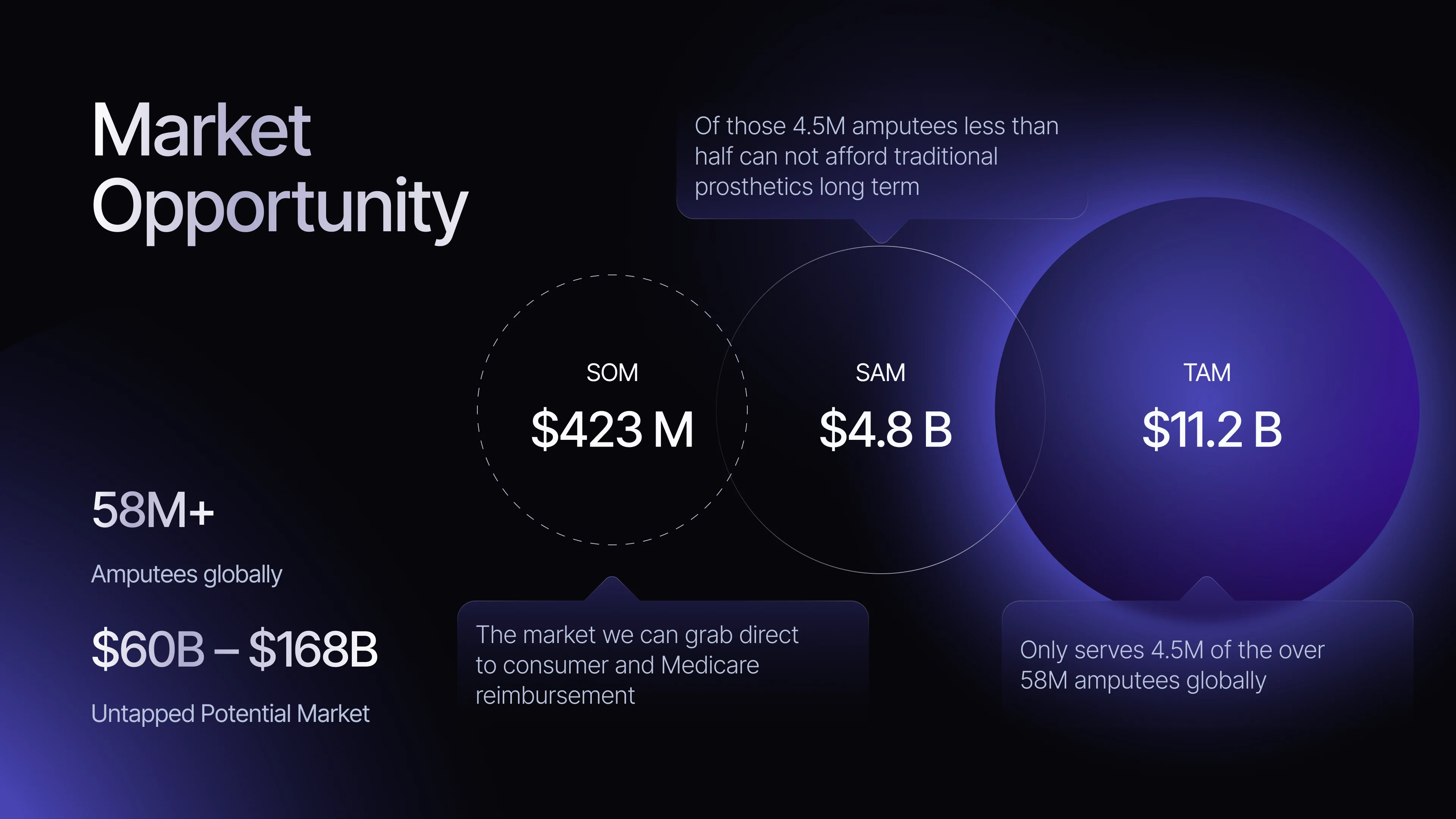
- Investors needed the same product story, told for a different decision: how big, how it reaches people, and what it earns.
- Decided
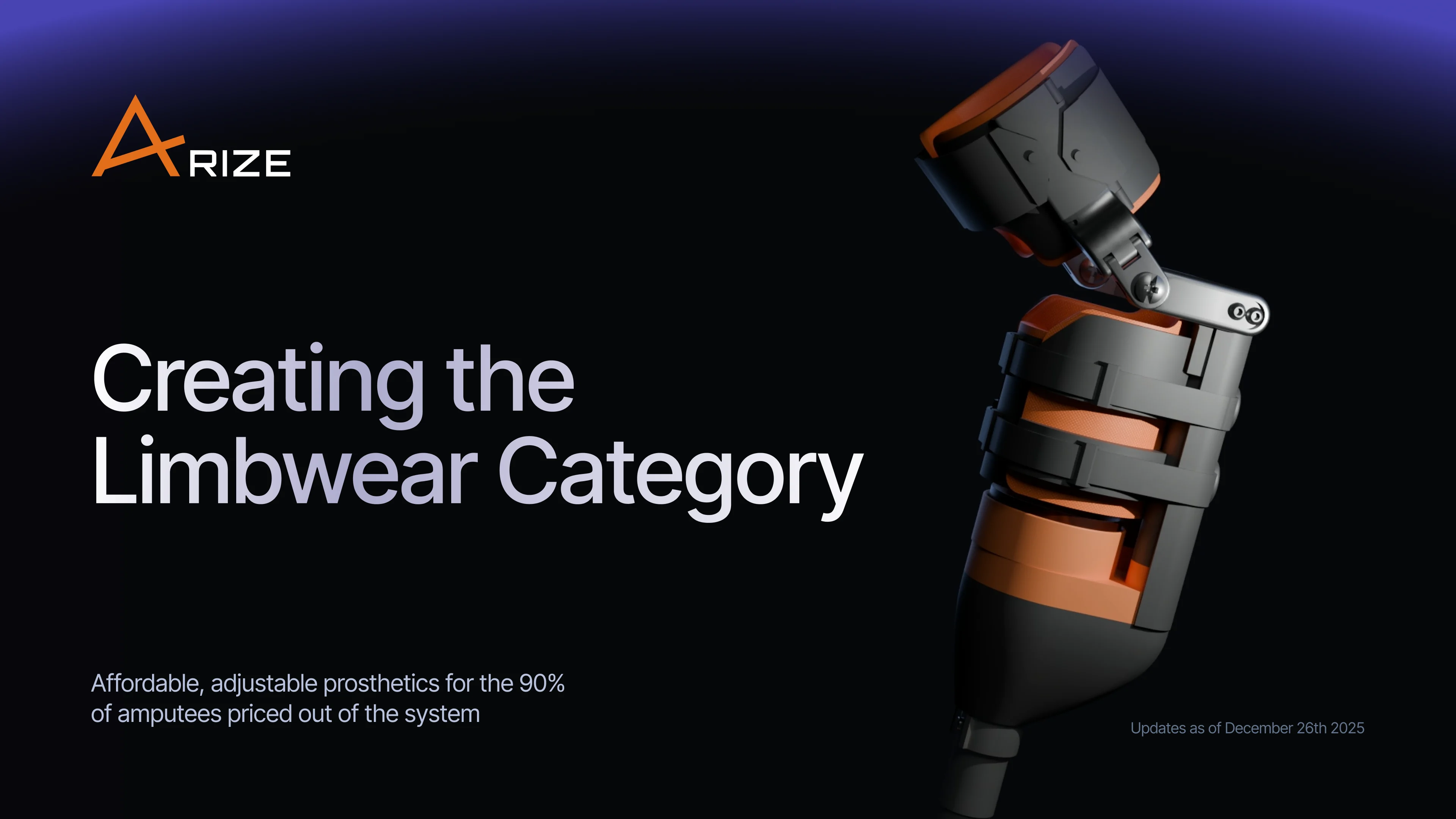
- A 40-slide pitch deck in the site’s visual system, from the problem and the product to the market, the channels, the unit economics and the ask.
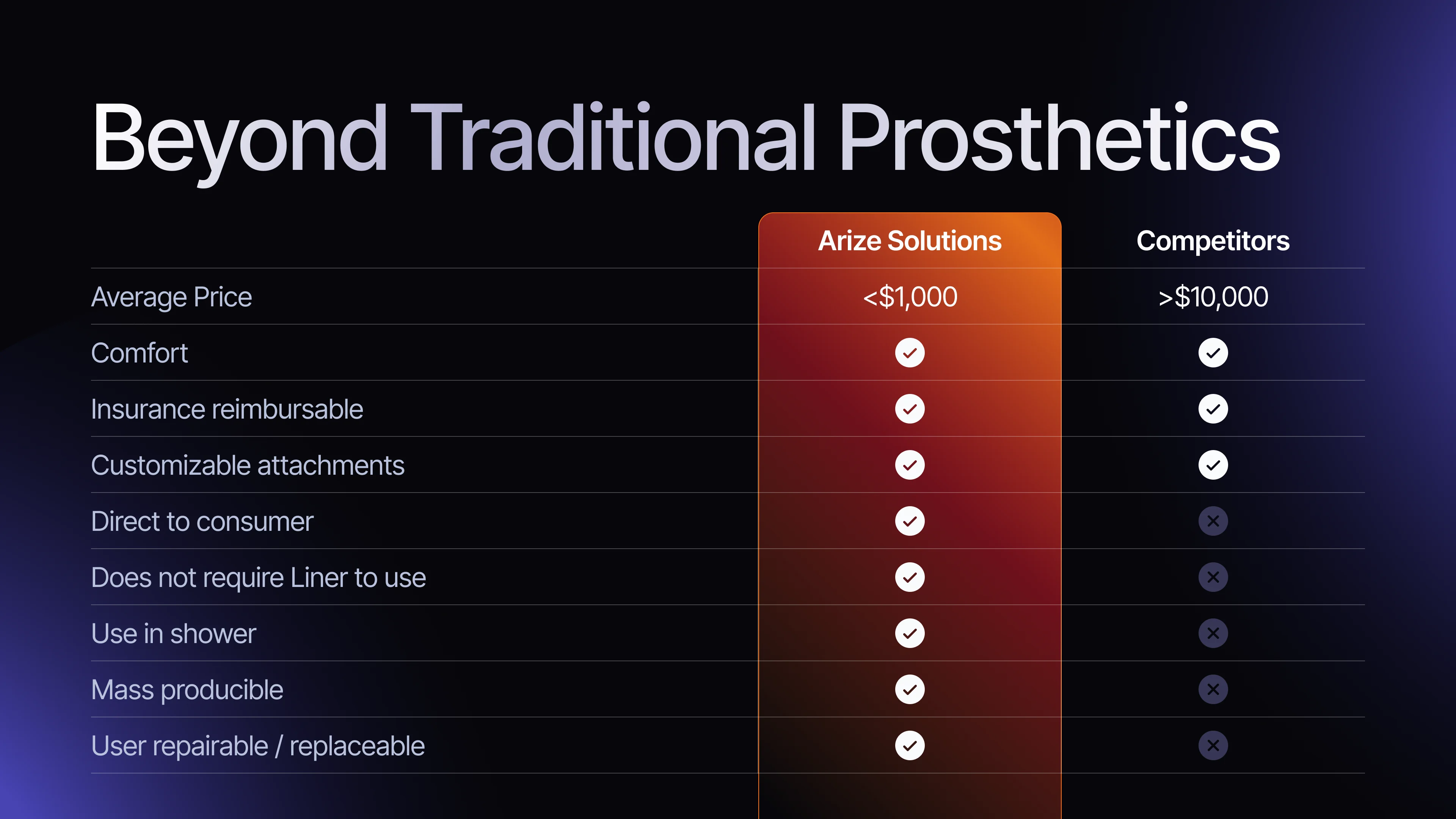
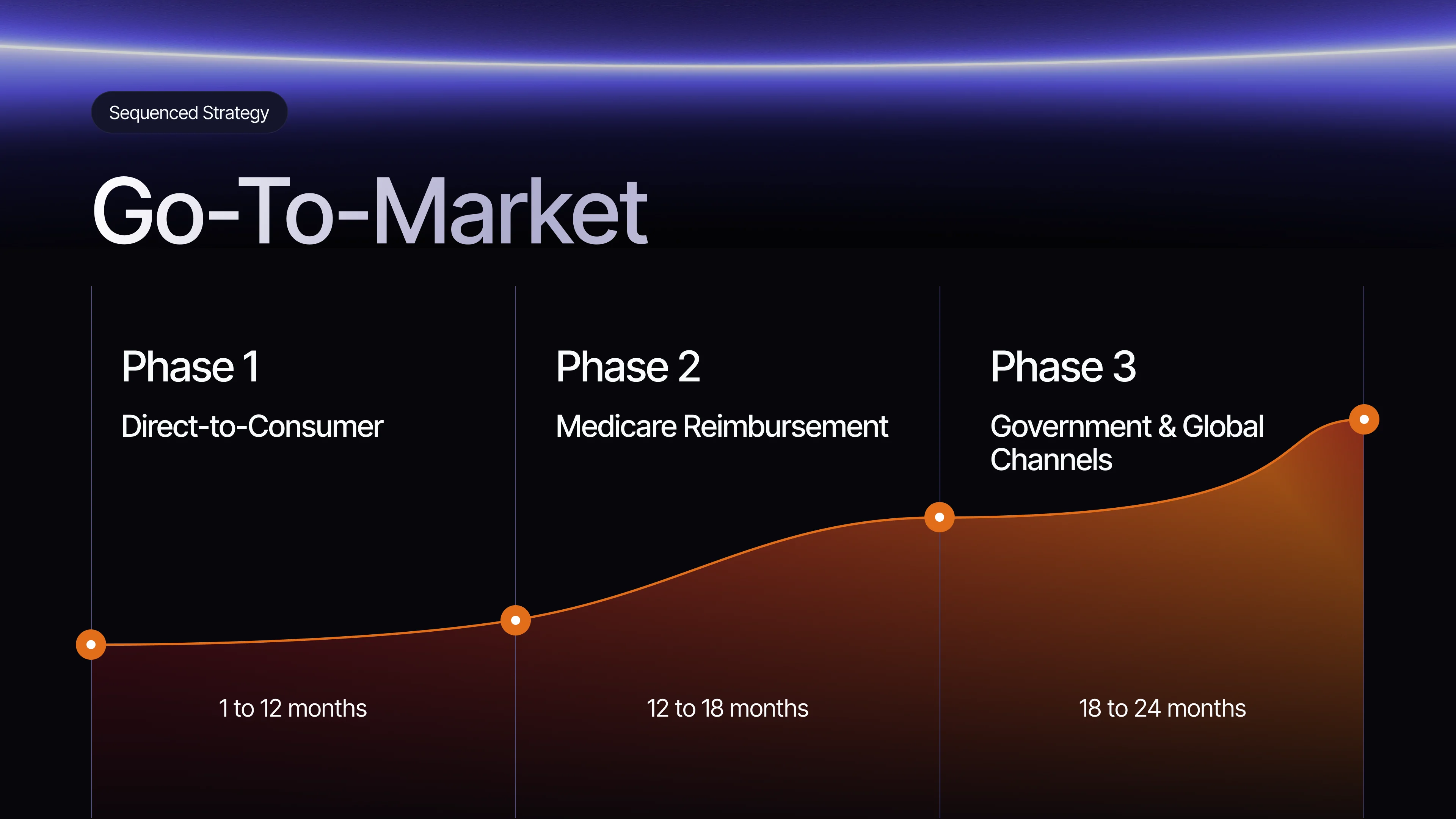
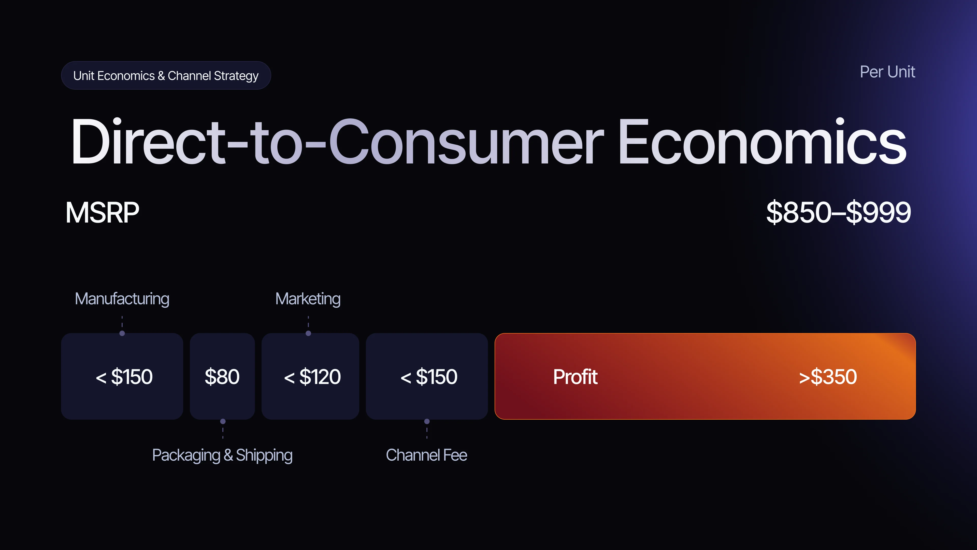
-
Investor pitch deck
40 slides in Figma Slides, in the site’s visual system
A store designed and built by one team
Arize runs its website and WooCommerce store at arizelimbwear.com: the 3D leg story on the home page, the amputee sock on sale, the analytics mapped and an investor deck in the same visual language.
- team from research to build
- 1
- surfaces in one visual system
- 3
Launching a product people don’t understand yet?
Tell us what makes it new. We’ll design the story, the store and the build around it.
More work like this
Other products where trust comes before the first click
-
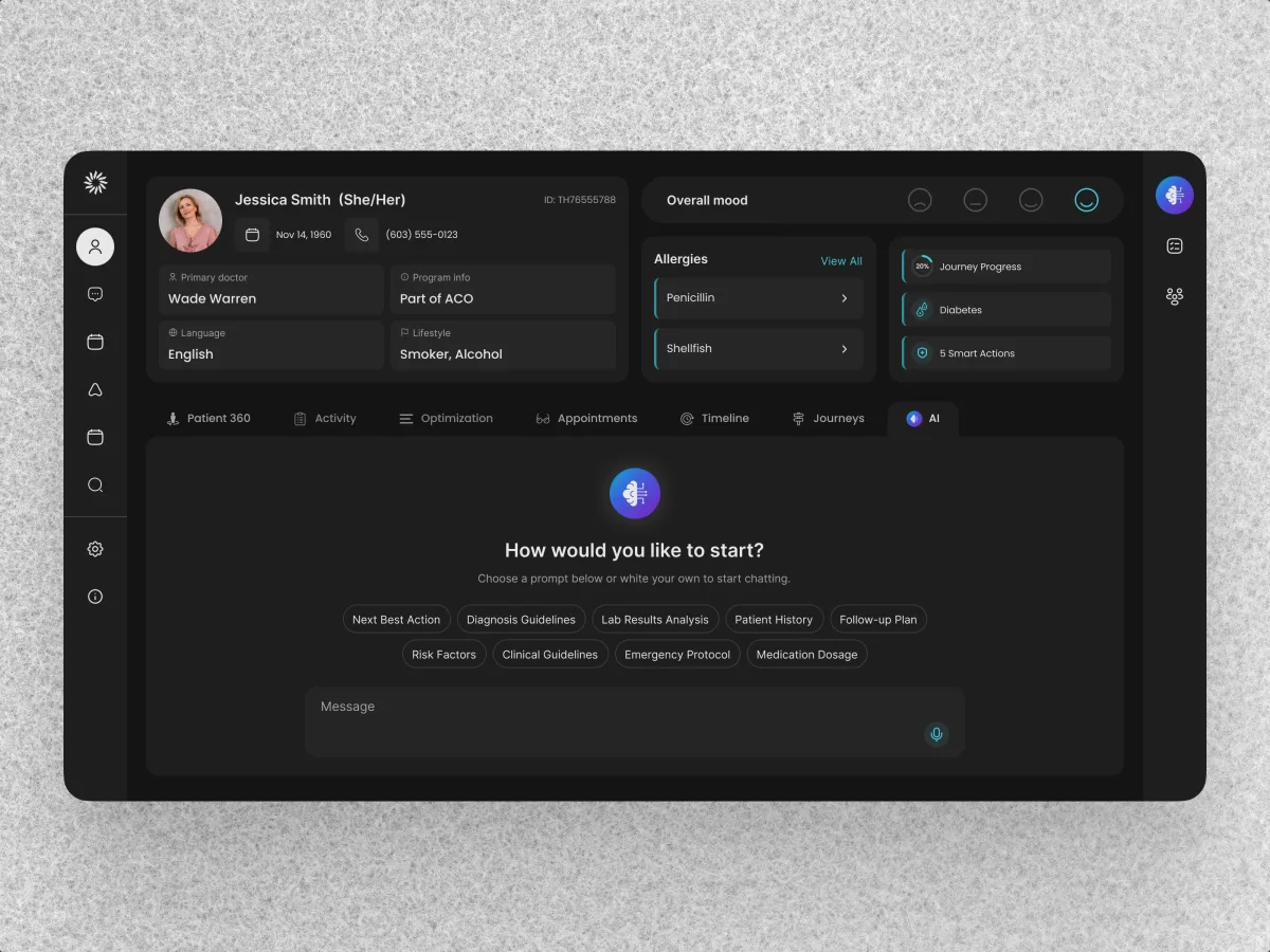
HealthCare · AI SaaS · Web + Mobile
Clay
Redesigned a care-team CRM and designed its patient app on the same system.
- 342 Unique screens
- 5 Experts on the team
-
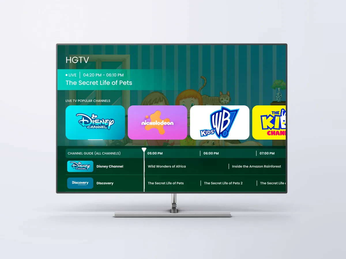
Healthcare · Streaming · TV app
HyperSign LifeVue
Designed a hospital TV app for a four-arrow remote, in three modes.
- 68 Unique screens
- 126h Of design work
-
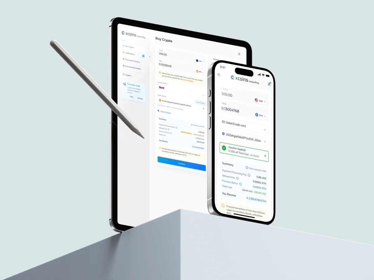
Crypto · FinTech · Web + Mobile
Xcoins
Redesigned a crypto buy journey so rate, fees and limits sit in plain view before payment.