Healthcare CRM design, one care journey, both sides
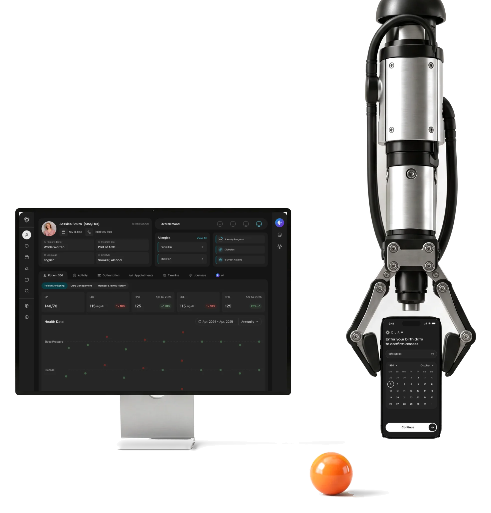
Clay is a care-management platform for care teams and their patients.We redesigned the care-team CRM and designed the patient app from scratch.
- 342
- screens and states for the care team’s web app and patient app
- AI
- assistance assistant, chat in the record, suggestions to confirm
- 5
- experts
Project summary
Clay is a care-management platform : nurses, care guides and clinicians run patient journeys and conversations in a web app, and their patients book visits from a phone. We audited the clinician product and redesigned its workflows for desktop, tablet and mobile, designed the patient app for iOS, Android and desktop, and tied both to one design system in dark mode, with a refined logo and brand guidelines.
How the engagement ran
- Our part
- Research, the audit, flows, wireframes, the UI of both products, the design system and the brand refinement.
- Platforms
- The care team’s responsive web app; the patient app on iOS, Android and desktop.
- Build
- Implemented by ANODA’s development partners from our screen maps, prototypes and Zeplin specs.
- Later
- A UX and UI audit of Clay’s website, with recommendations, as its own workstream.
What one care journey asks of two products
The patient’s side first, then the care team’s, around the same appointments and messages:
-
Book
- A link by text message
- Date-of-birth check
- Provider and time slot
-
Join
- Activation and login
- Profile
- Health information
-
Talk
- Chat and attachments
- Calls and video
- Notifications
-
Follow up
- Upcoming and past visits
- Rescheduling
- Care programs
-
Find
- Patient lists
- Filters and search
- Patient 360
-
Act
- Journeys and timeline
- Tasks and care gaps
- Notes, labs and orders
- The whole record and A readable screen
- Everything about a patient stays one click away, but only what matters for the next call is open.
- Faster with AI and The clinician decides
- Suggestions and generated drafts are marked as such and wait for a person to accept them.
- Desktop depth and Tablet and phone
- The patient list, its controls and the menu keep working when the care team leaves the desk.
Patient 360: the whole record, one level at a time
- Found
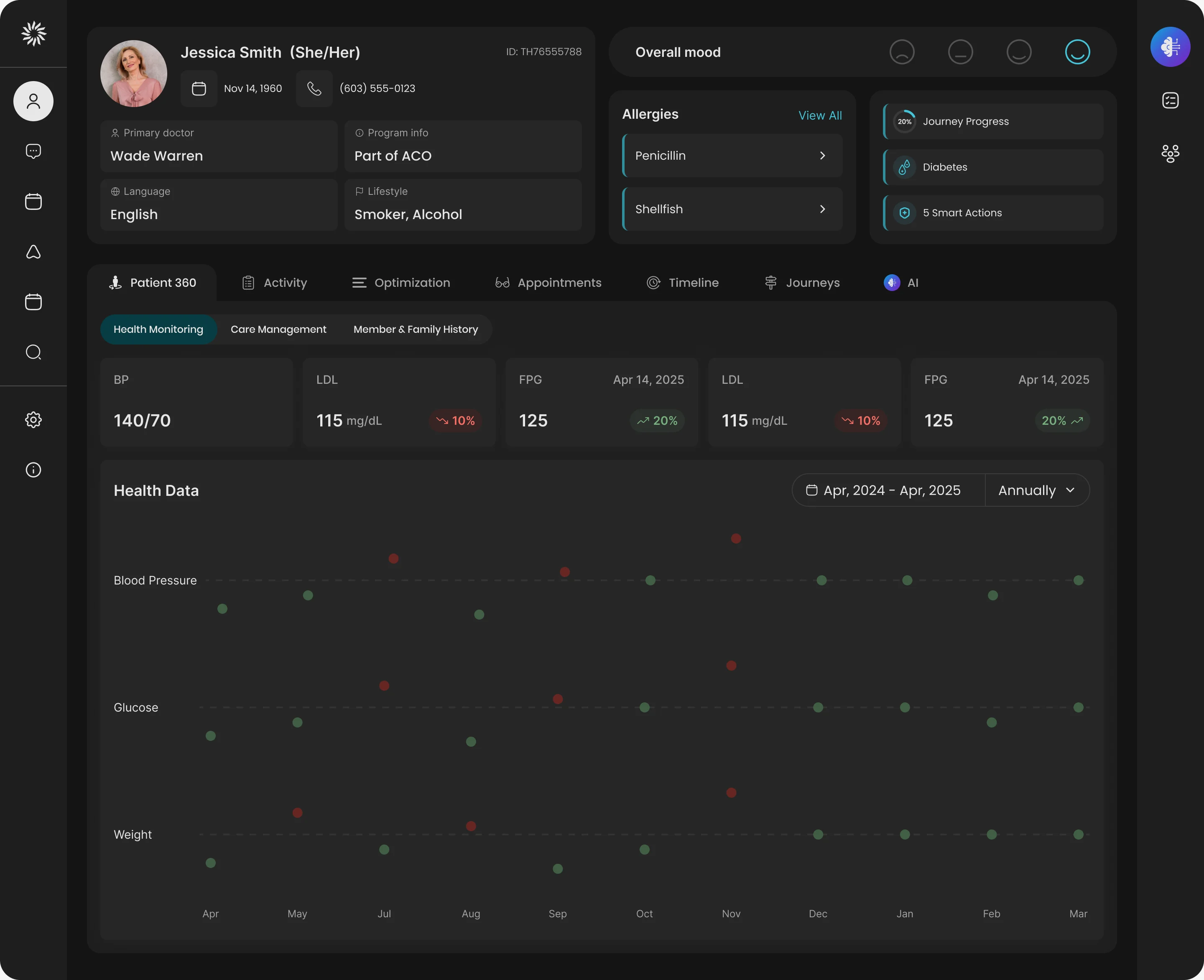
- Demographics, allergies, mood, programs, journeys, tasks, health data, notes, appointments and care gaps all belong to one patient, and a care guide has a few minutes before a call.
- Decided
- Who the patient is and what is risky stays pinned at the top, with where care stands beside it; the rest of the record lives in tabs that open one at a time without leaving the page.
- For the user
- Before a call, the care guide sees the patient’s allergies and journey progress without opening a second screen.
-
Who the patient is
Details, allergies, mood and journey progress.
-
One record, several tabs
Activity, appointments, timeline, journeys, AI.
-
The record itself
The health data for the tab in view, opened without leaving the page.
How the work progressed
From competitor research and an audit of the running product to two sets of UI, one system and a handoff the development partners could build from.
-
Discovery
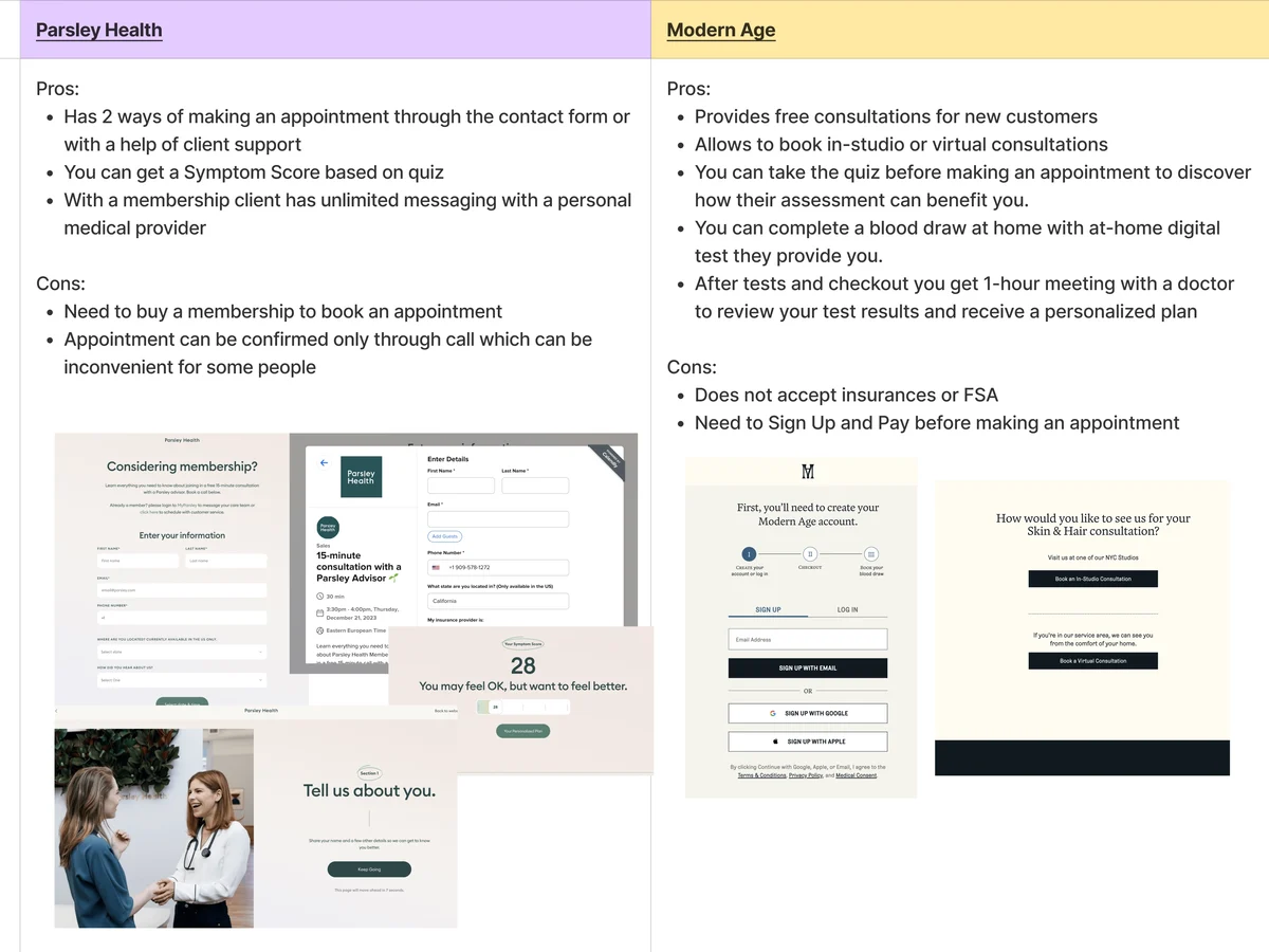
How other healthcare products handle booking, care and support, before anything was drawn
Artifact Competitor research and the first information architecture
-
UX audit
Where the care team’s existing product slowed them down
Artifact An audit of the running workflows, each finding with a recommendation
-
User flow
Every path through appointments, journeys, care gaps and messages, for each role
Artifact Multi-role user flows
-
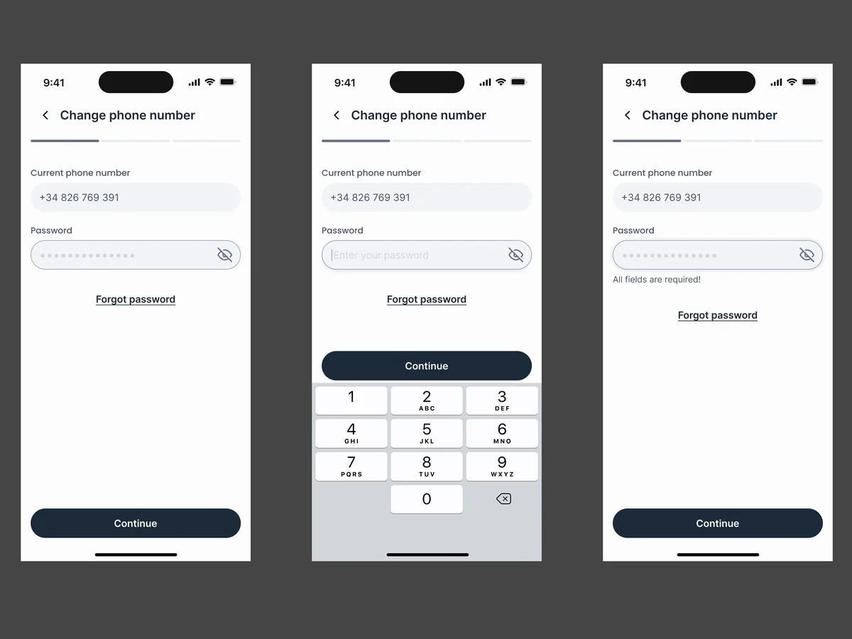
Wireframes
What each patient and care-team screen holds, before colour
Artifact Wireframes for the patient app and the clinician web app
-
UI — Web CRM
A dense clinical workspace that still reads calmly in dark mode, with AI inside the work
Artifact Moodboards, visual directions and the final UI at desktop, tablet and mobile sizes
-
UI — Patient app
A patient app that speaks plainly, on the phone and at a desk
Artifact The patient app for iOS, Android and desktop, with every message state
-
Delivery
What the development partners needed to build without guessing
Artifact Screen maps, clickable prototypes, UI kits and a Zeplin export
The path from a text message, mapped before a screen was drawn
- Found
- A patient arrives from a text message; a nurse arrives from a long list of patients. Both end up at the same appointment, and either path can fail halfway.
- Decided
- The patient’s way in was mapped screen by screen with its failures first: a date of birth that doesn’t match, a wrong entry on the keypad. Then one navigation per product.
-
From the text message to the date-of-birth check
The link in the message, the date-of-birth field with the keypad and the calendar, the wrong-entry branch, and the loading states before the provider step.
Open the full map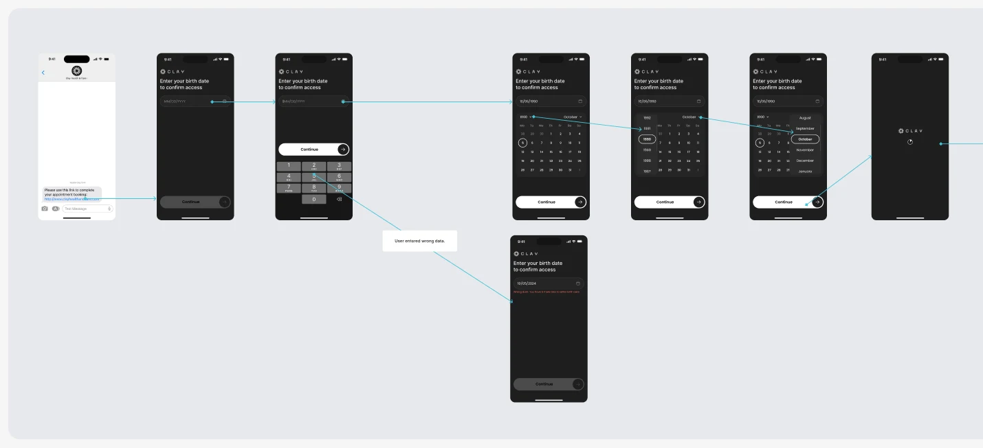
-
Picking a time, and a slot that’s already gone
The specialist’s calendar, a date, a time slot, then the case where another patient took it first and the app has to say so.
Open the full map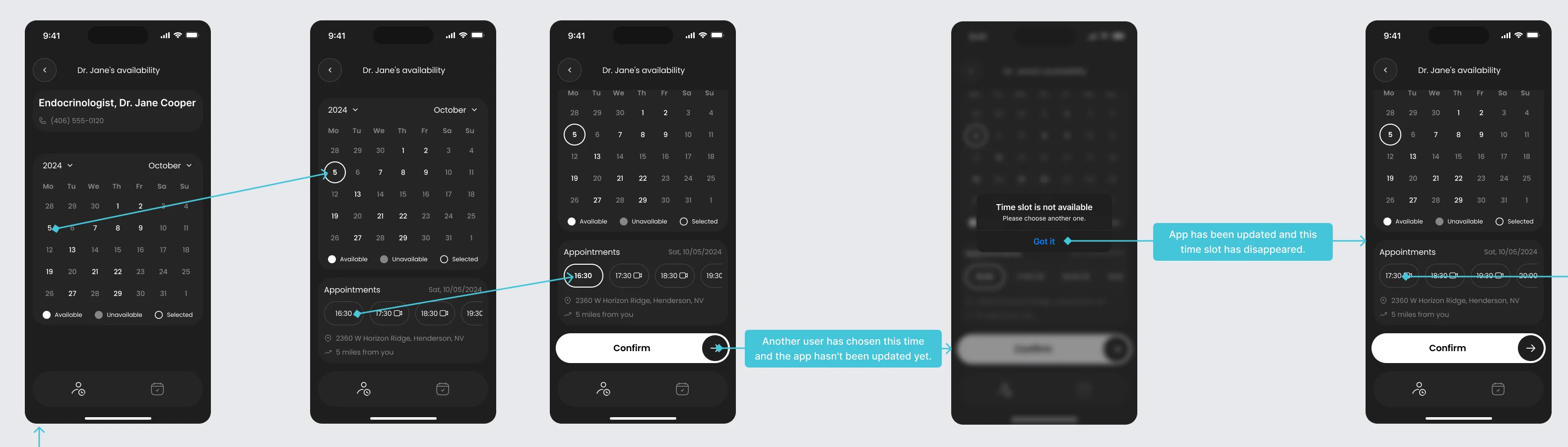
-
Care gaps, from an empty record to a disease page
The care team’s side: no chronic diseases yet, the drawer that adds one, then a controlled or uncontrolled disease, each with its own clinical guidelines.
Open the full map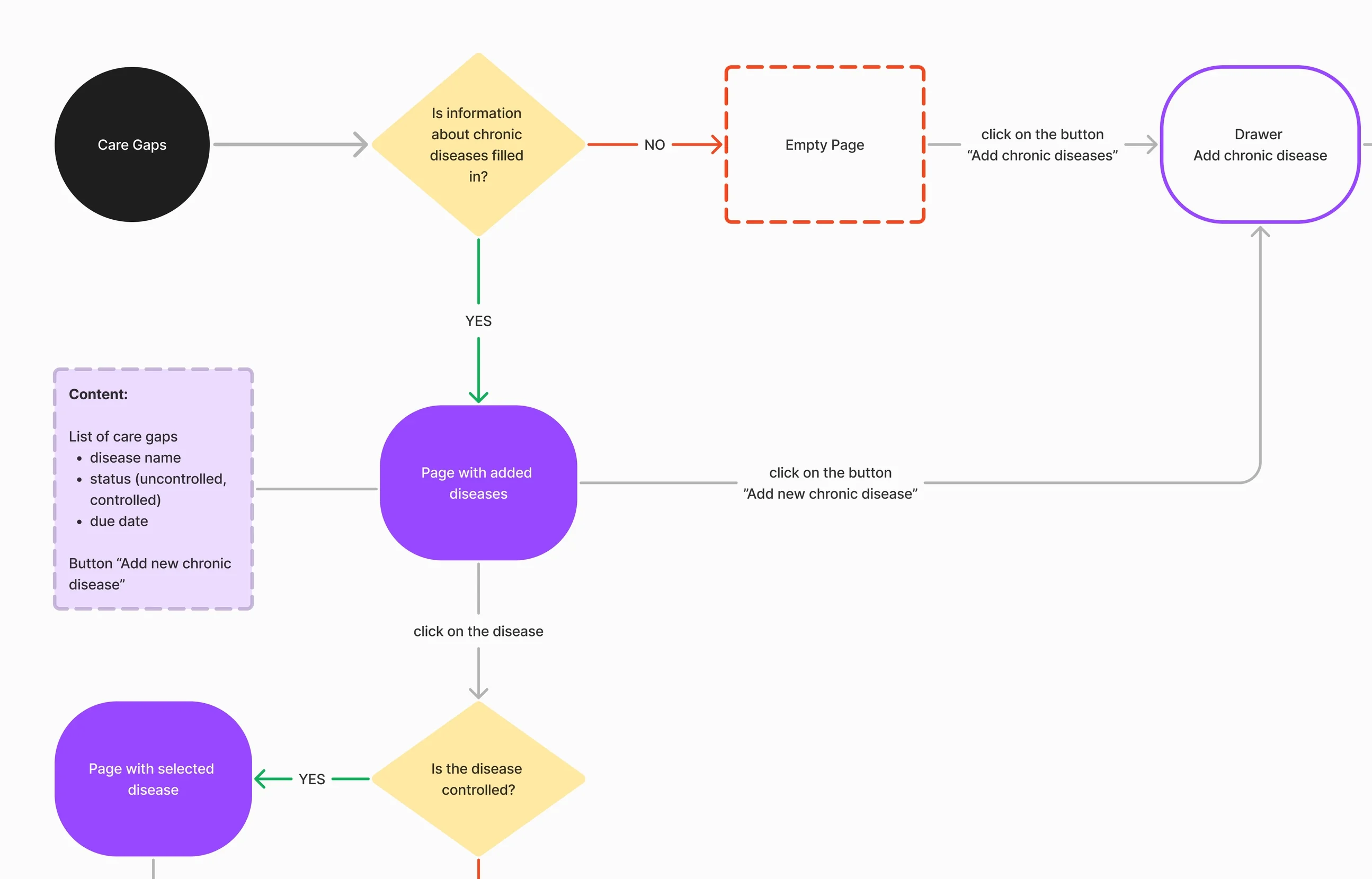

Six jobs across the two products
The AI help first, then the care team’s day, then the patient’s side of it.
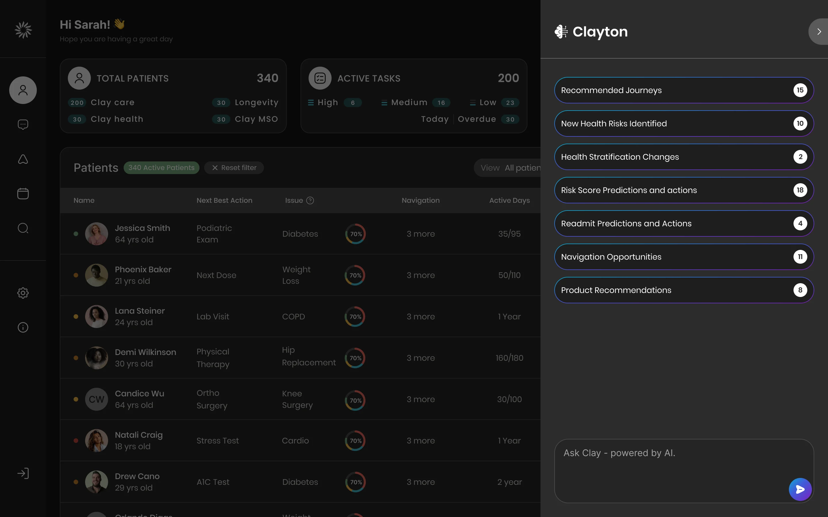
An assistant that counts the day’s work
- Found
- A nurse with hundreds of patients cannot open each record to find out who needs attention first.
- Decided
- Clayton opens beside the patient list with what needs attention, counted: recommended journeys, new health risks, readmit predictions, navigation opportunities. A field below takes a question in plain words.
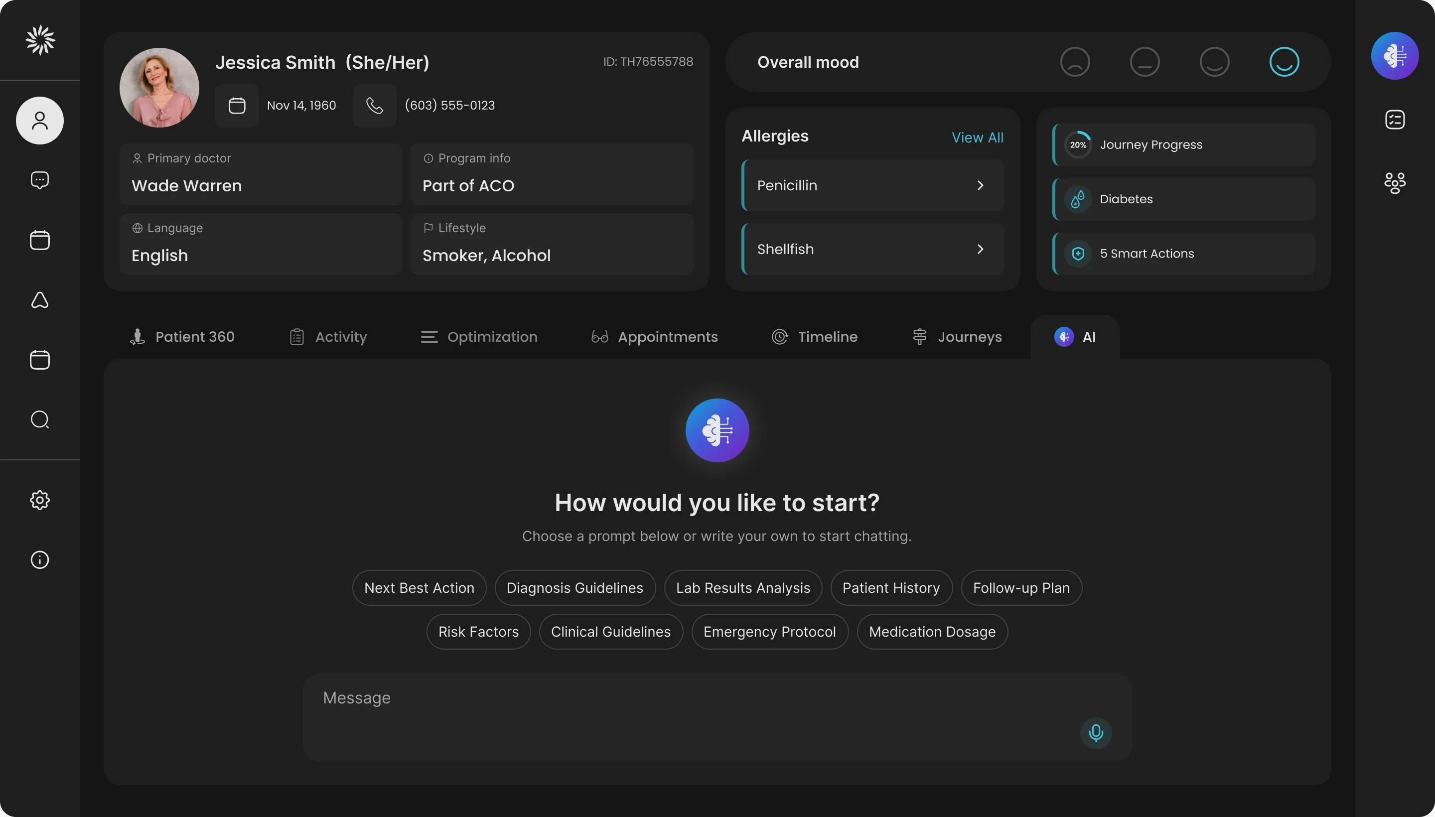
Asking inside the record
- Found
- Once a clinician is in one patient’s record, the next question is about that patient, and a blank chat box asks too much of a busy person.
- Decided
- An AI tab inside the record with starting prompts (next best action, lab results, follow-up plan, risk factors) and a message field, so the first question is one tap.
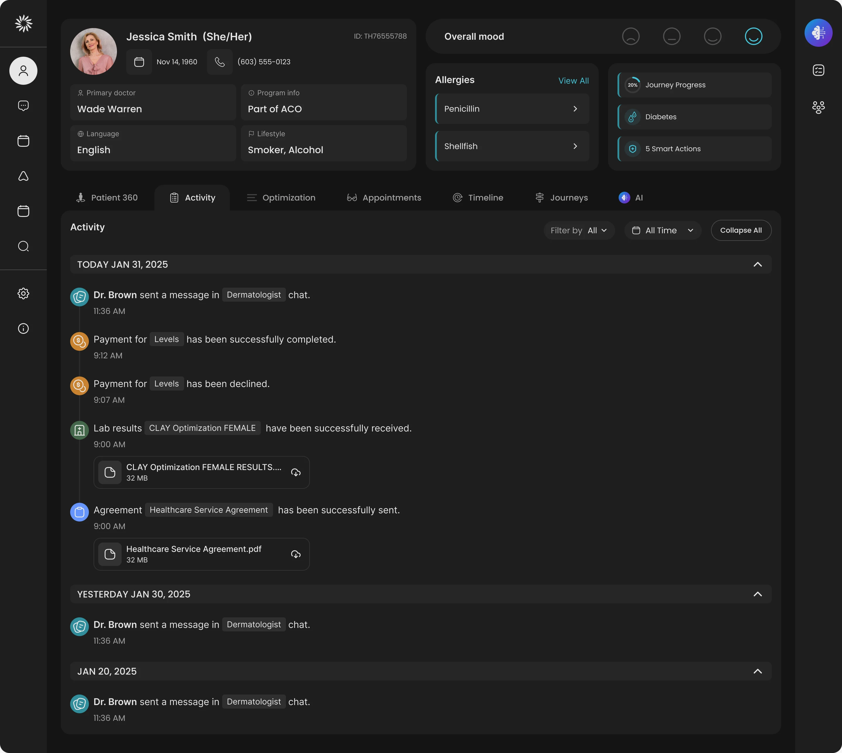
Everything that happened, in one feed
- Found
- Messages from the care team, payments, lab results and agreements arrive in different places, and nobody can tell what happened to a patient this week.
- Decided
- One activity feed per patient, grouped by day, with a filter and a time range, and each file attached to the event that produced it.
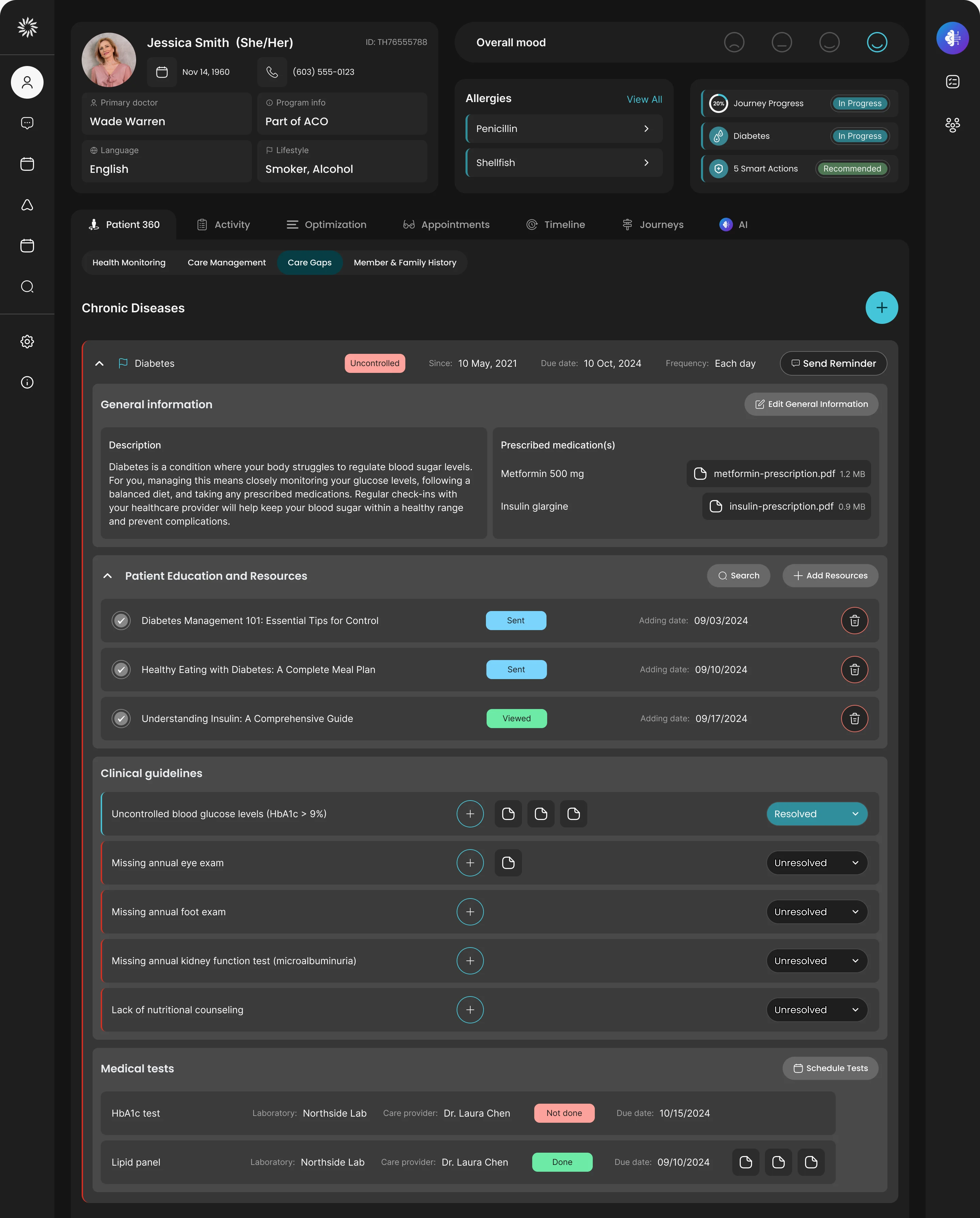
Care gaps and the notes that close them
- Found
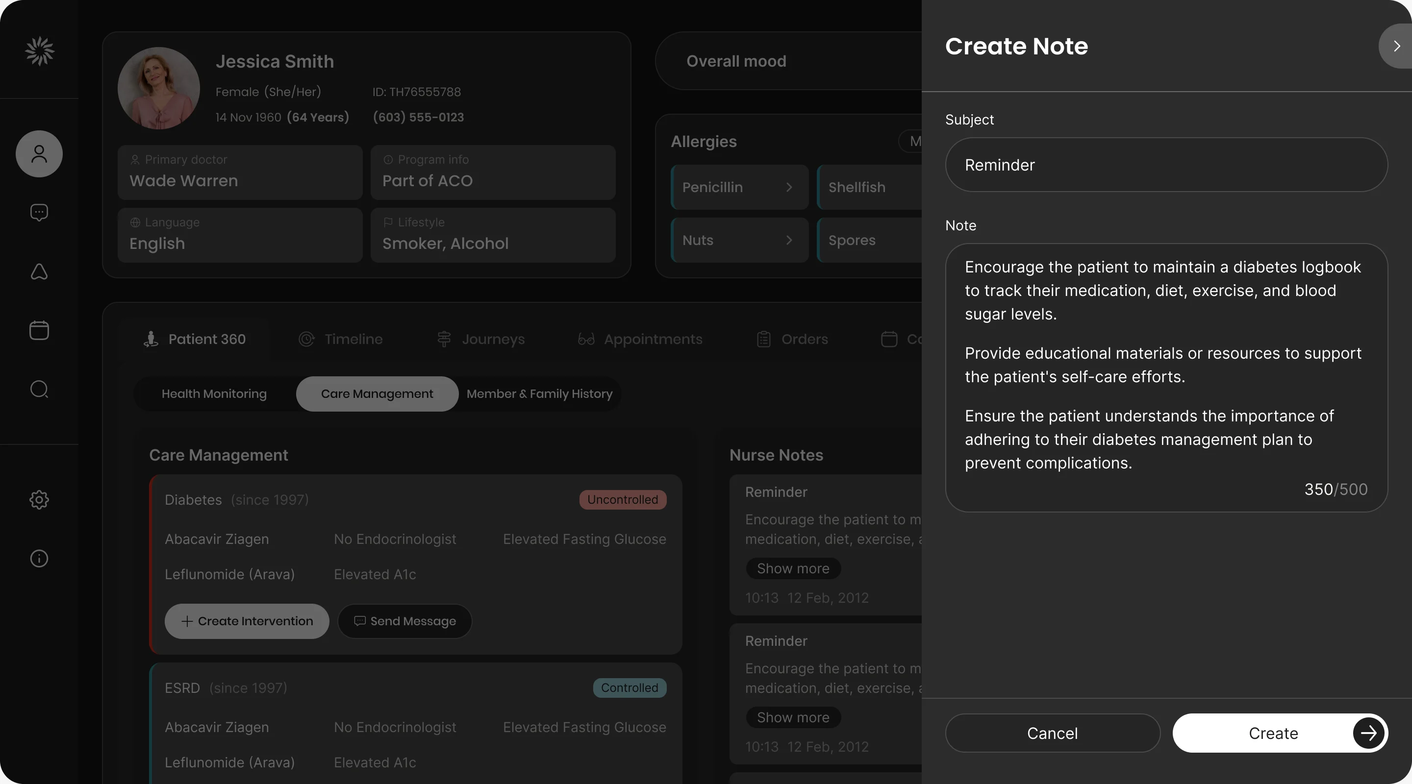
- A patient with several chronic conditions has a long list of open items, and a care guide has to see which condition is uncontrolled and what is missing for it.
- Decided
- Each condition opens into its description, medication, education material, clinical guidelines and tests, with the unresolved gaps marked in red. Notes open in a side drawer, so the record stays in view.
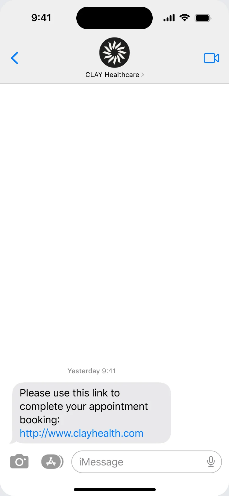
Booking from a text message
- Found
- A patient opens a link on their phone and has to prove who they are, find a provider and pick a slot, and any wrong turn ends in a phone call to the clinic.
- Decided
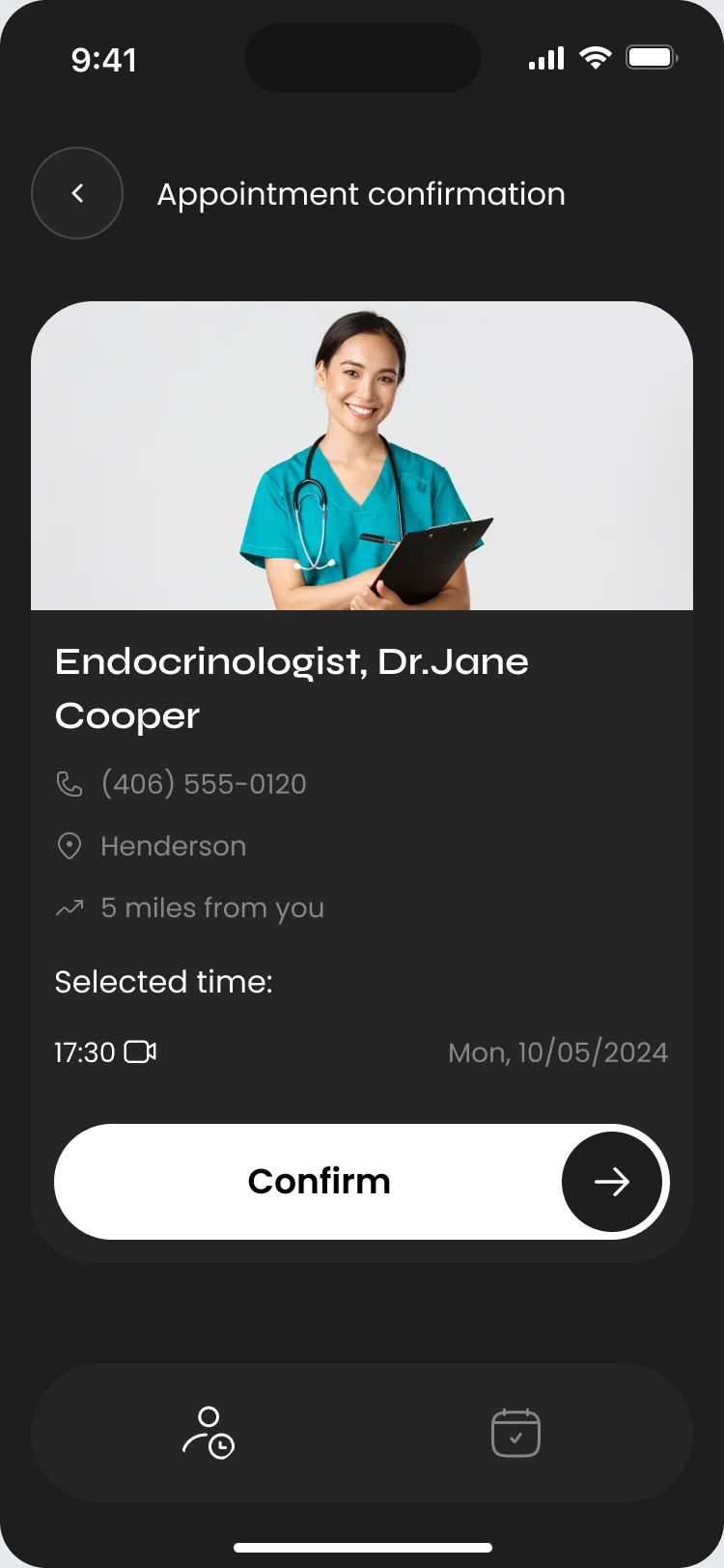
- A short path from the text message to a confirmed visit: a link, a date-of-birth check, the provider’s available times and a confirmation.
The patient app between visits
- Found
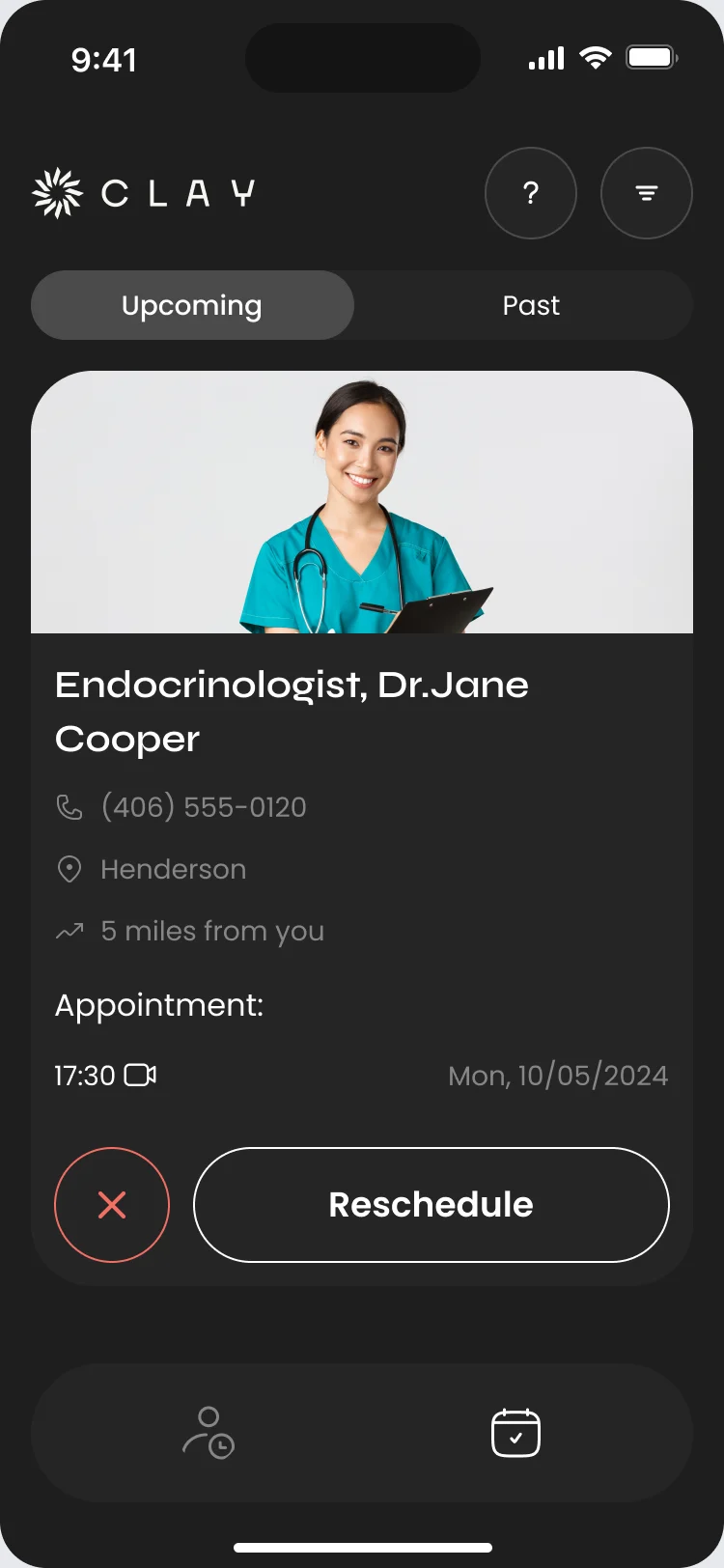
- After booking, patients need to find their next visit, change it or cancel it without calling anyone.
- Decided
- Upcoming and past visits in two tabs, each visit with its time and provider and a way to reschedule, and a plain confirmation before anything is cancelled.
One brand on both screens
- Found
- A patient’s phone and a care team’s dense dark workspace could easily read as two companies that happen to share a logo.
- Decided
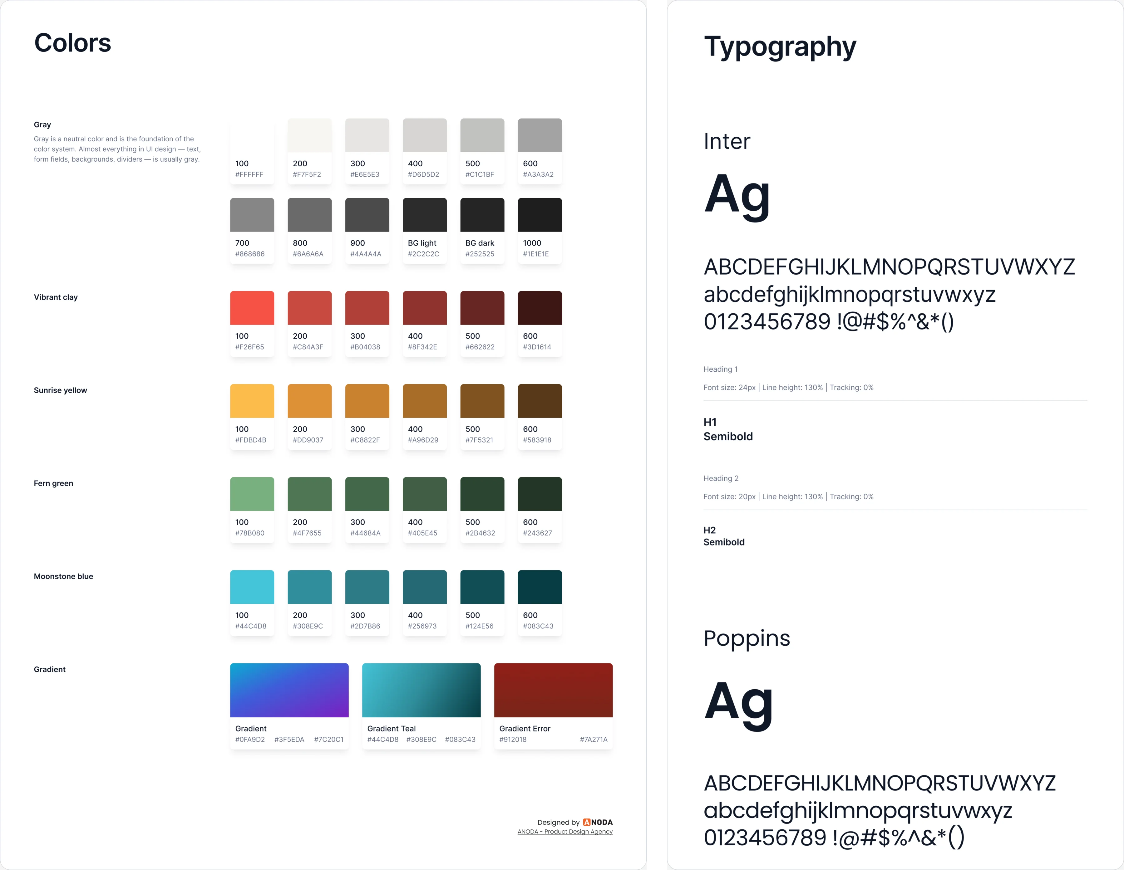
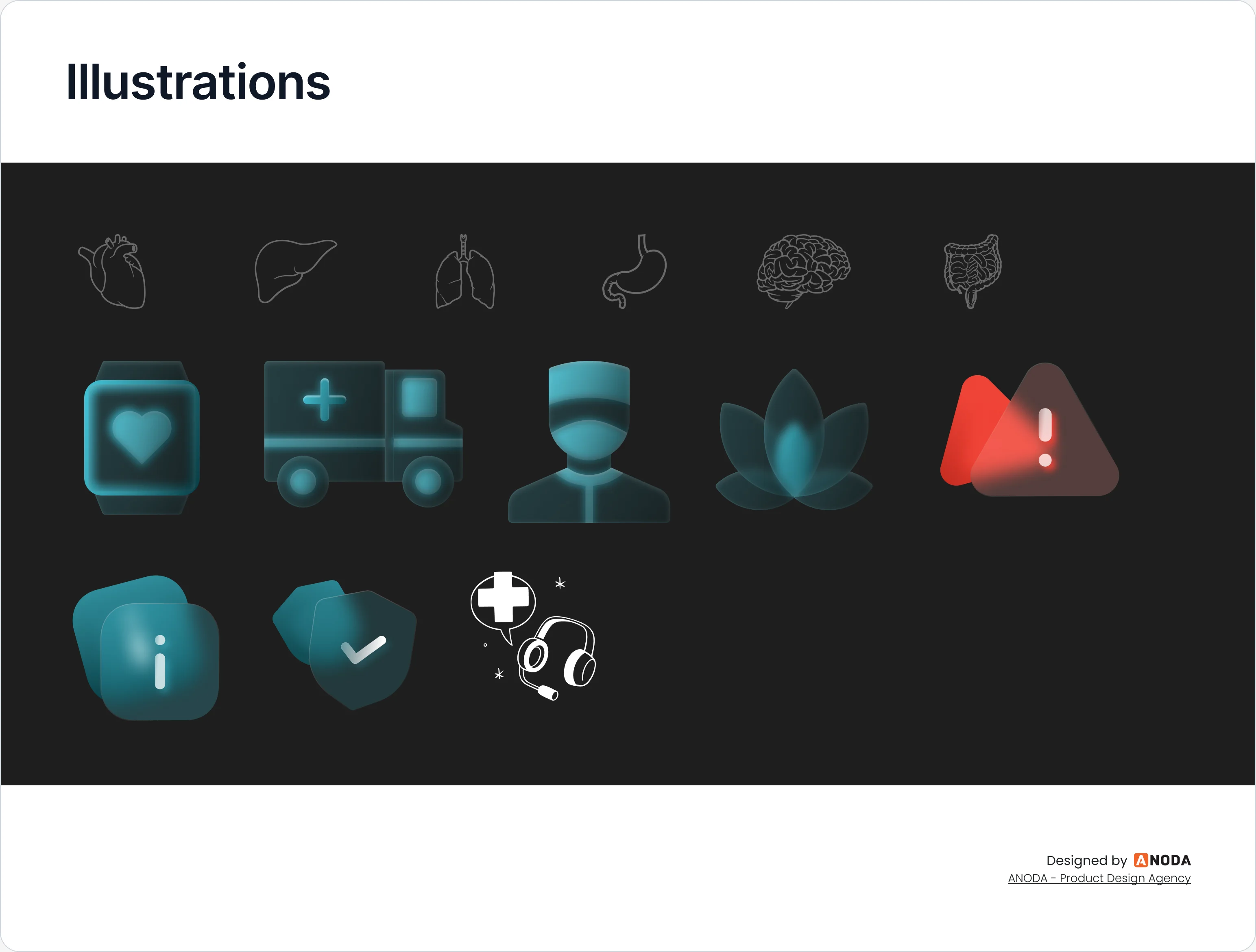
- The brand guidelines went into the UI kit as sheets both products draw from: the logo on the dark background, colour families with their shades, Inter for headings and Poppins for the rest, and one set of health illustrations.
One system for the clinic and the patient
- Found
- Two products for two audiences could easily drift into two looks, and a dark theme doubles every colour decision.
- Decided
- A standalone design system with a UI kit for the web app and one for the mobile app, built from the same tokens and parts, dark mode first.
The same provider card, before and after booking
One card for the provider in the patient app: on the confirmation screen it ends in Confirm, on the upcoming list in Reschedule.
-
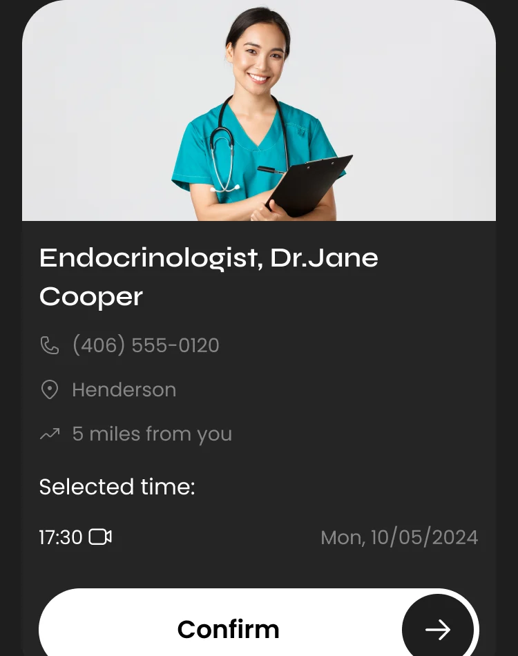
Confirmation: The card with the selected time and a Confirm button -
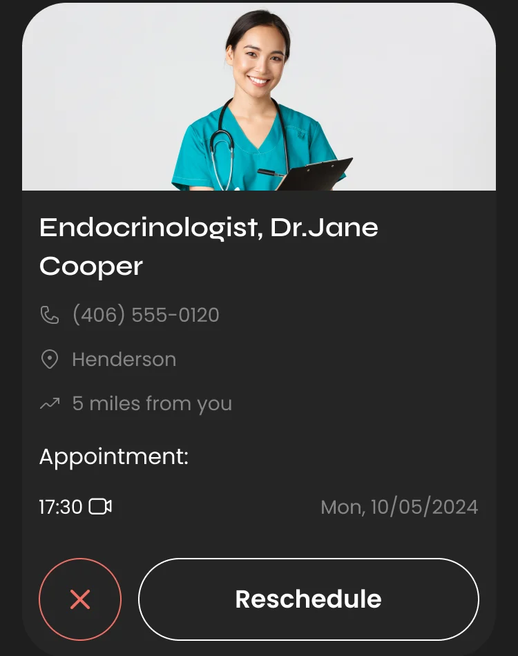
Upcoming: The same card with the appointment time, a cancel button and Reschedule
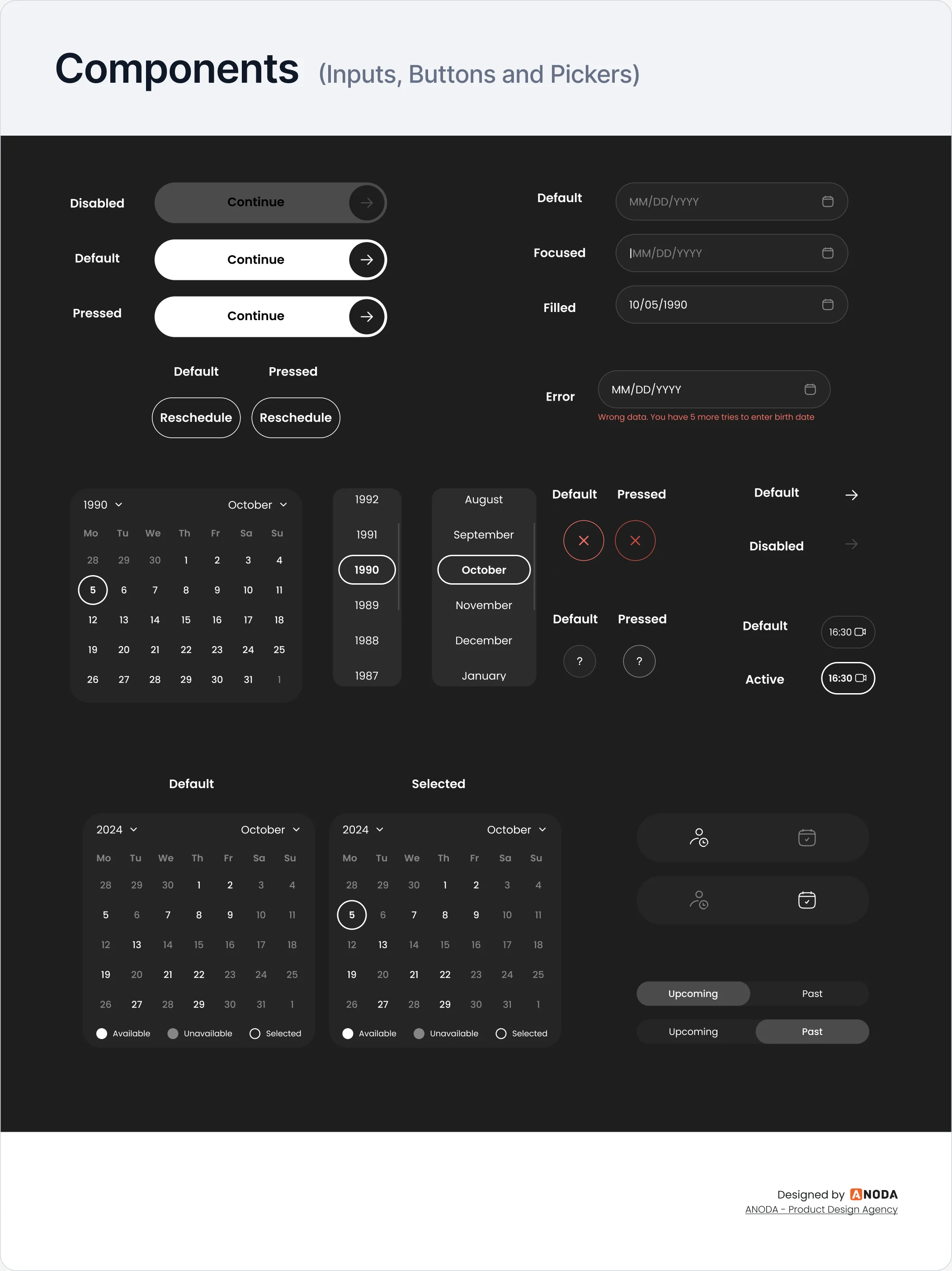
Every control drawn in every state
The kit lays out each control in its states: disabled, default and pressed; default, focused, filled and error; an available day and a selected one.
-
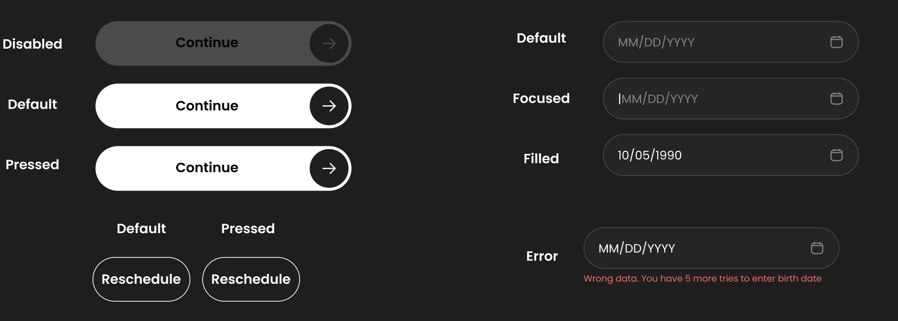
Buttons and date fields -
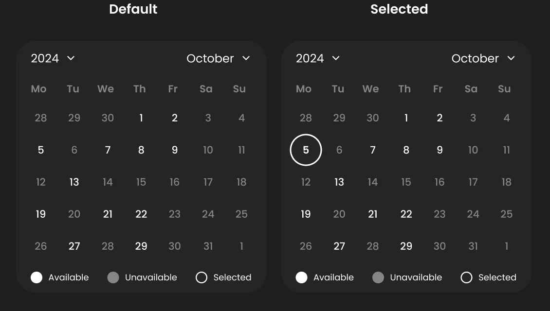
Calendar -
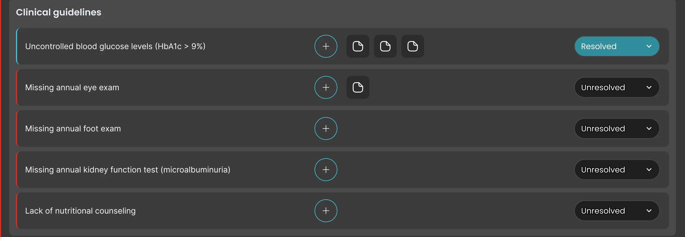
Clinical guidelines
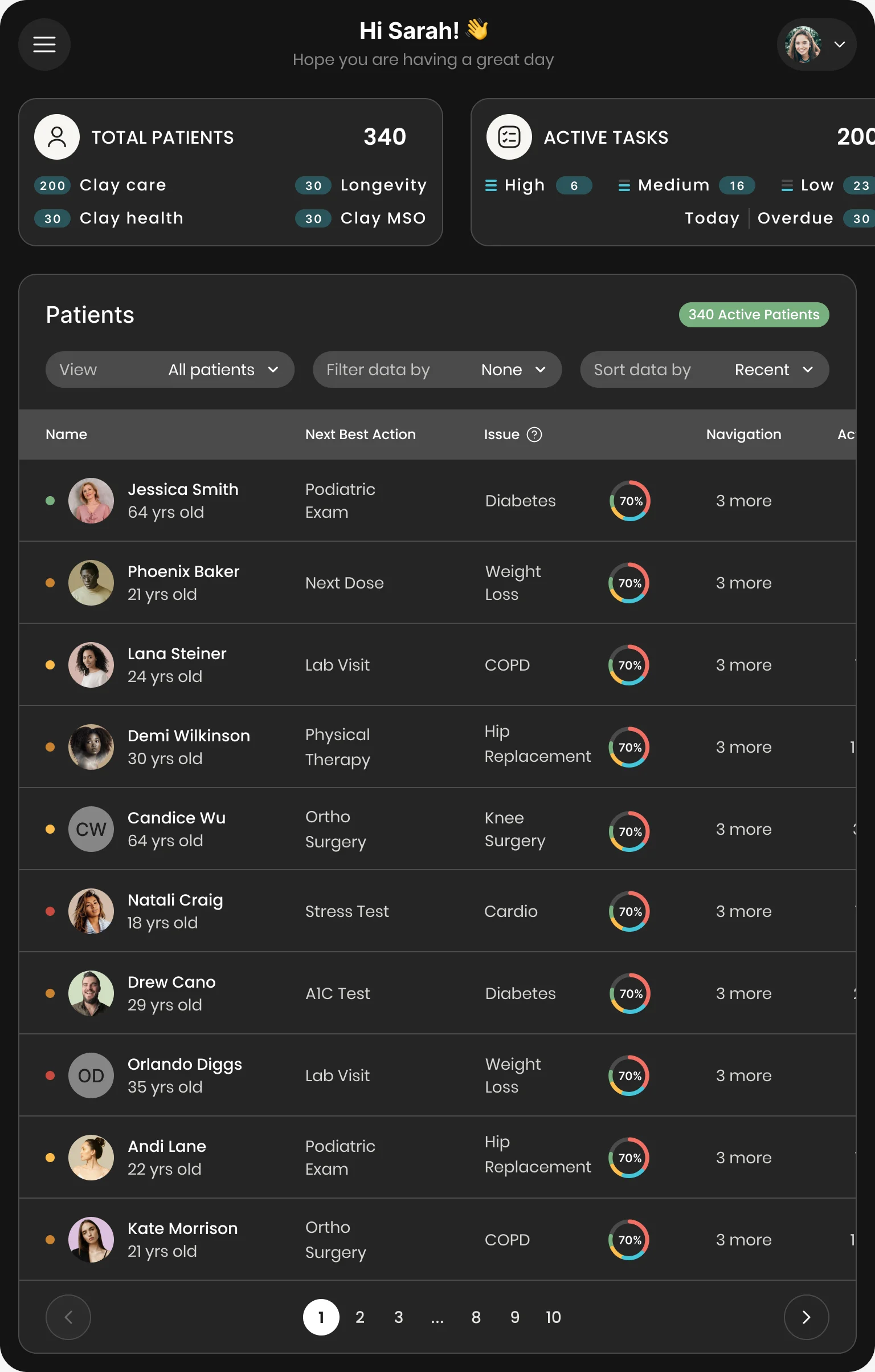
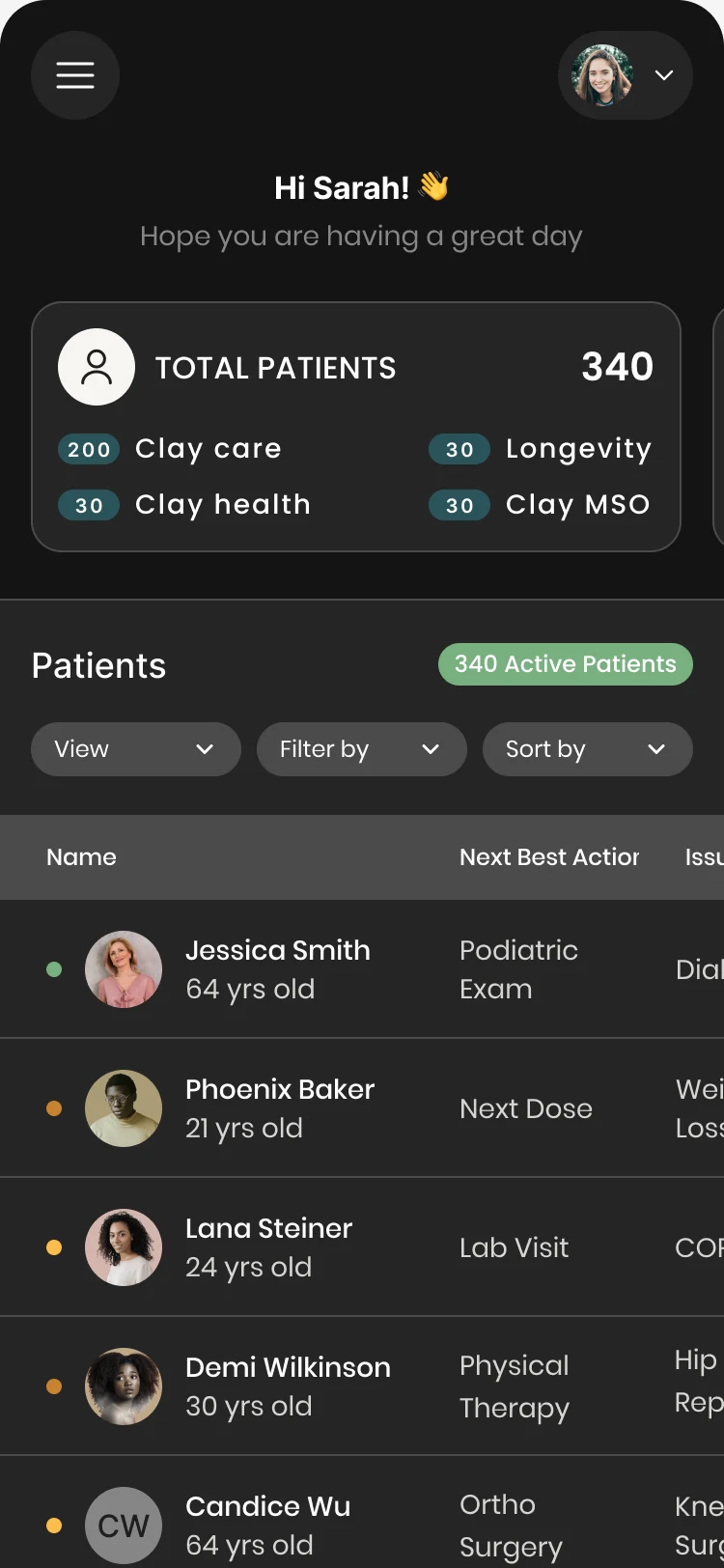
The care team’s app away from the desk
- Kept
- The patient list itself: the same controls above the table and the same columns in the same order.
- Changed
- On a tablet the stat cards and the table scroll sideways; on a phone the controls sit in one row above the table and the menu moves behind a button.
What the development partners received
The product was built by ANODA’s development partners from screen maps, prototypes, UI kits and Zeplin specs.
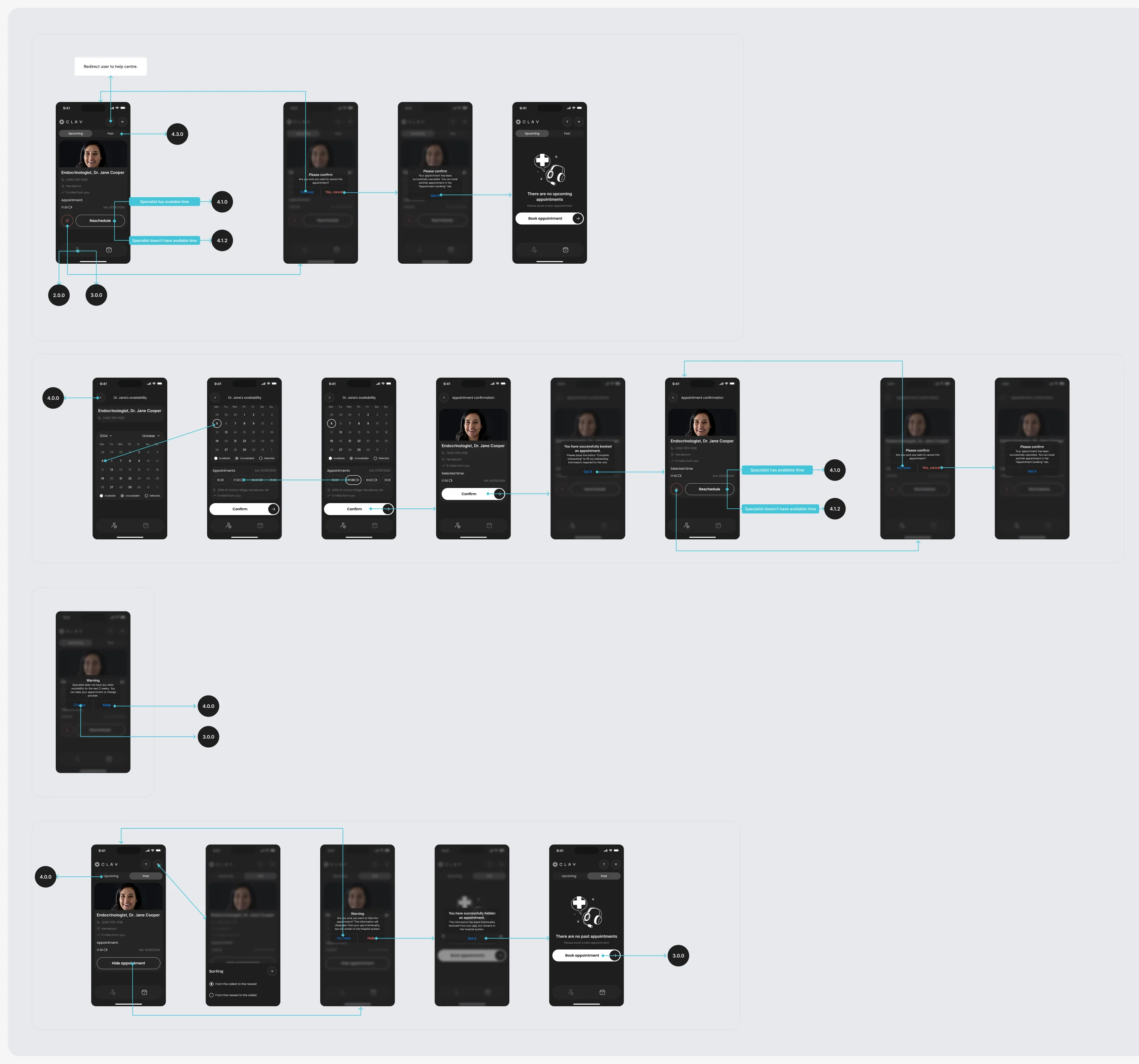
- Screen map
- The appointment flow, every screen placed and every transition drawn.
- Clickable prototypes
- Appointment booking, and the patient app with its message states.
- UI kits
- Component sheets for the web app and the mobile app, in dark mode.
- Design system
- A standalone system the two kits are built from.
- Brand guidelines
- The refined logo and how it is used.
- Zeplin export
- Specs and assets for the developers.
Flows in the handoff
- Moodboard
- Wireframes: the care-team web app and the patient app
- Care-team web app: the redesigned desktop UI
- Patient app: the UI between visits
- Appointment booking: UI, screen map and clickable prototype
- UI kit: components and their states, in dark mode
Where the product ended up
One design for both sides of care: a clinician workspace redesigned around the patient record and AI help that stays a suggestion, a patient app for booking and appointments, and one system in dark mode behind both. Later, a separate audit of Clay’s website followed.
- screens and states across both products
- 342
- experts on the team
- 5
In the client's words
ANODA took the time to understand how we coordinate care for VIP patients and what each person involved needs from the product. Our care team needs to stay aligned on each patient’s care, while patients need a personal, discreet and straightforward experience. They understood how the CRM supports the work behind the scenes and how the mobile experience carries that service through to the patient. That understanding gave us confidence in their recommendations throughout the design process.
Will your premium promise survive inside the product?
Clay’s promise is personal attention, and it has to hold for the member and for a care team that can’t afford to retype what it already knows. Here that meant one record both sides read, AI that suggests while a person decides, and one system underneath. Show us your product, and we’ll show you where the promise gets lost.
More work like this
Three more products where AI, dense data and a second audience had to share one design.
-
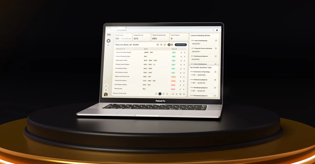
EdTech · SaaS
Moka
Designed an AI study assistant for students and the web tools their instructors and schools run it from.
- 200+ Screens designed
- 4 Experts on the team
-
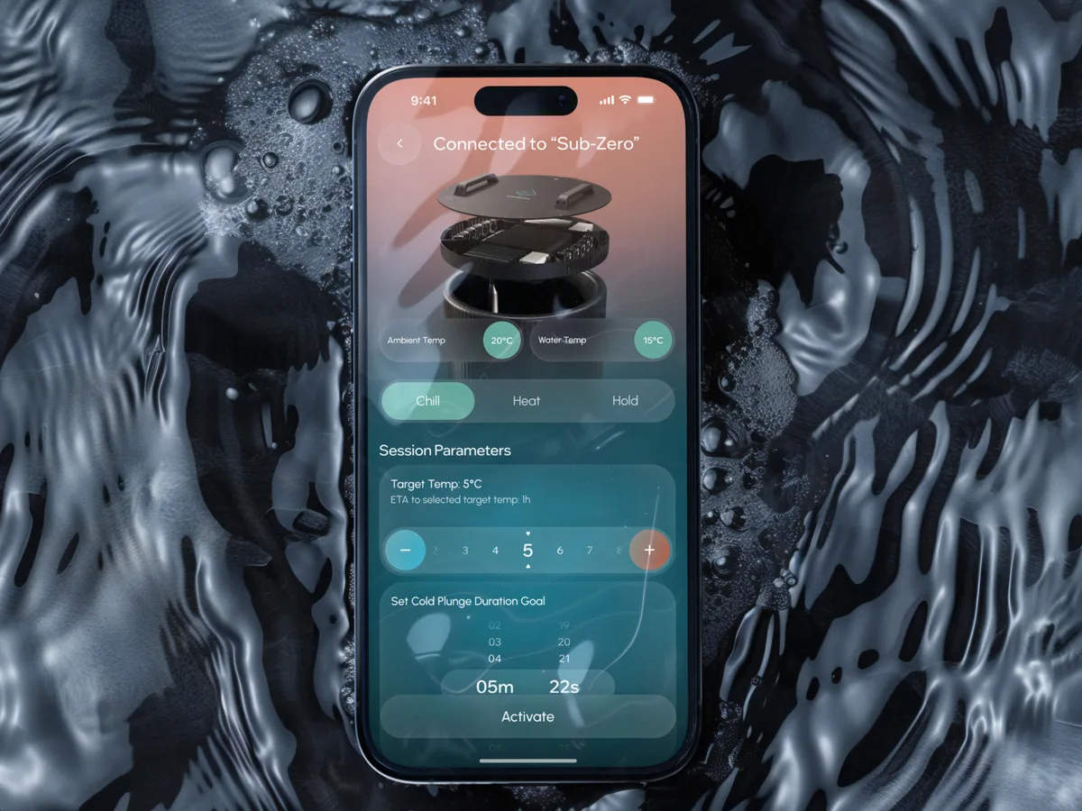
Wellness · Healthcare
Clearwater Wellness Co.
Designed a connected cold-plunge app and the schedules, challenges and crews that keep people coming back.
- 306 Screens designed
- 4 Experts on the team
-
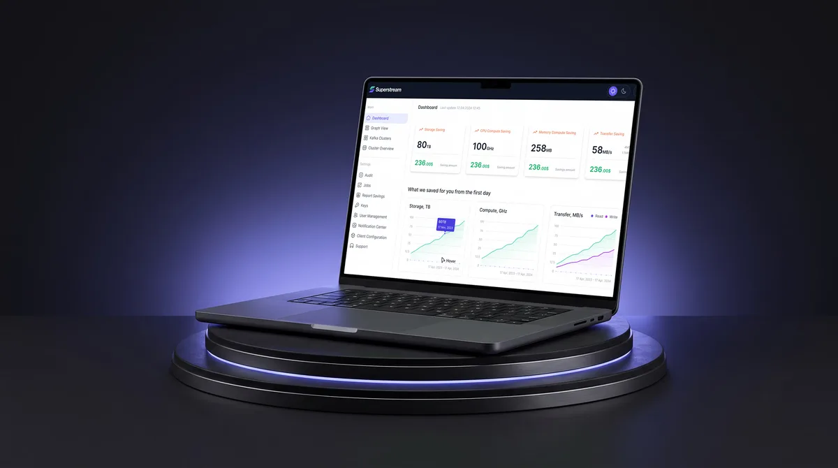
AI Hi-Tech · SaaS
Superstream
Redesigned a Kafka management product with AI insights as one calm system, in light and dark.
- 3000+ Screens designed
- 1500h+ Design hours