Hospital TV app: four arrows, one button
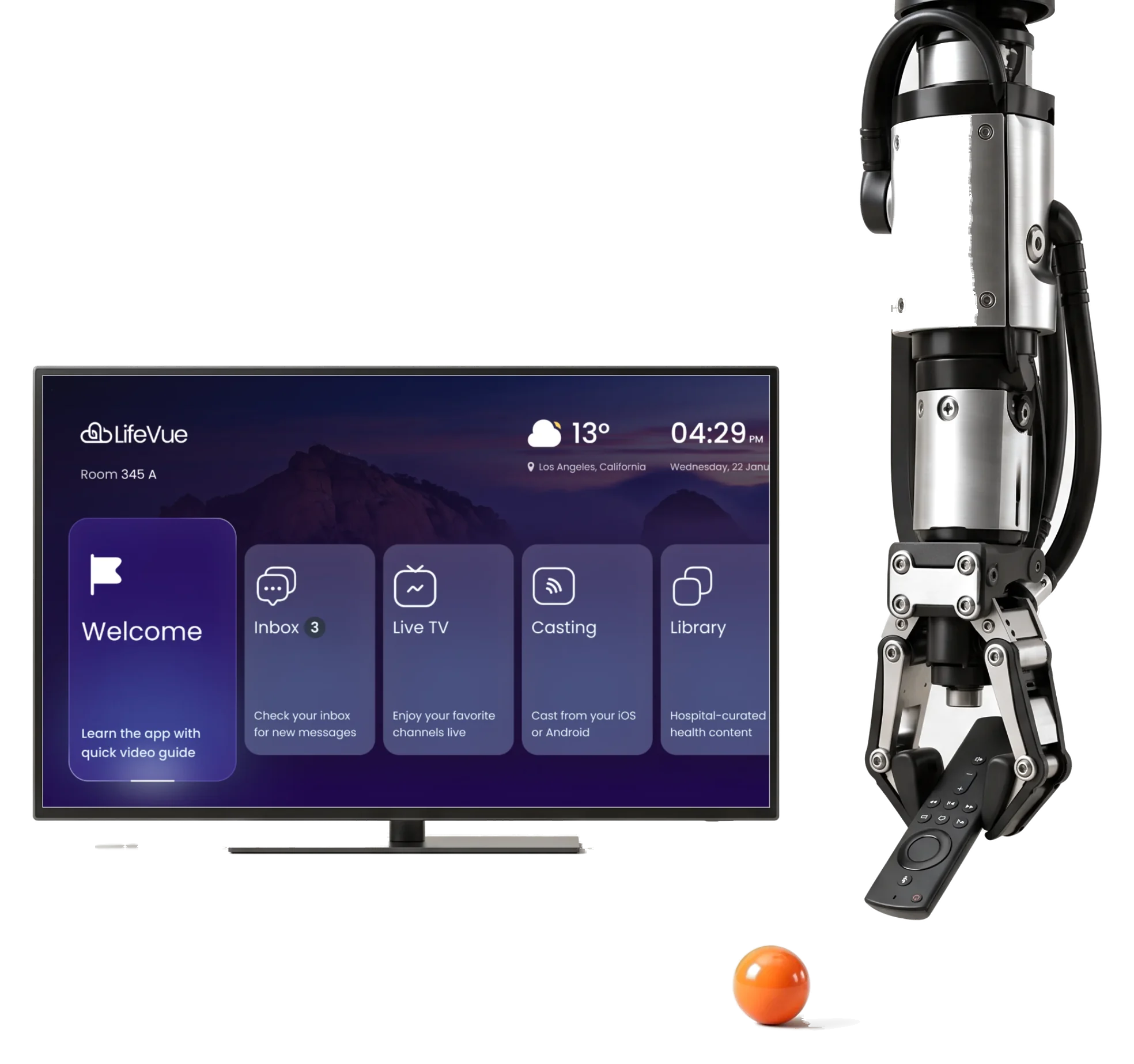
HyperSign’s LifeVue is the television app patients use from a hospital bed.We designed it for a four-arrow remote, in three modes.
- 3
- modes adults, kids and an accessibility mode on one system
- D-pad
- only every screen is reached with four arrows, select and back
- 68
- screens in three modes, and a prototype for hospital demos
Project summary
HyperSign makes visual-communication and digital-signage products for hospitals and more. Its patient-room product, LifeVue, is now shown by HyperSign as InRoom Patient. We did the UX and UI design for it: an adult, a kids and an accessibility-oriented interface, a design system and a clickable Figma prototype, then an HCA-branded theme and the design of HyperSign’s own website.
How the work ran
- Our part
- Competitor research, information architecture, flows, wireframes, visual directions, the adult, kids and accessibility-oriented interfaces, the design system, a clickable prototype, a screen map, an HCA theme, HyperSign’s website and handoff.
- Outside our scope
- The LifeVue brand, which HyperSign supplied, and everything past the design: the software, its deployment, hospital integrations and any accessibility or compliance certification.
- The rhythm
- A test task first, then a kick-off in January 2025 and one long relationship: the adult interface, then kids and accessibility, the HCA theme and the website.
- Delivery
- Figma files with the flows, the screens, the prototype and the system, ready for HyperSign’s presales and engineering.
What the patient can reach
One chain, in the order the home screen offers it:
-
Home
- Welcome
- Room and time
- Weather
-
Watch
- Live TV
- Casting from a phone
-
Learn and unwind
- Library
- Scenes
-
Eat
- Menu
- Dish details
-
Hear
- Inbox
- Messages from the care team
-
Adjust
- Language
- Themes
- Screen preferences
- Bed and Remote
- Nothing is small, and nothing needs a pointer.
- Adult and Child
- The same places, told differently: a mascot instead of a menu.
- Hospital and Home comfort
- Health content sits next to something to switch off to.
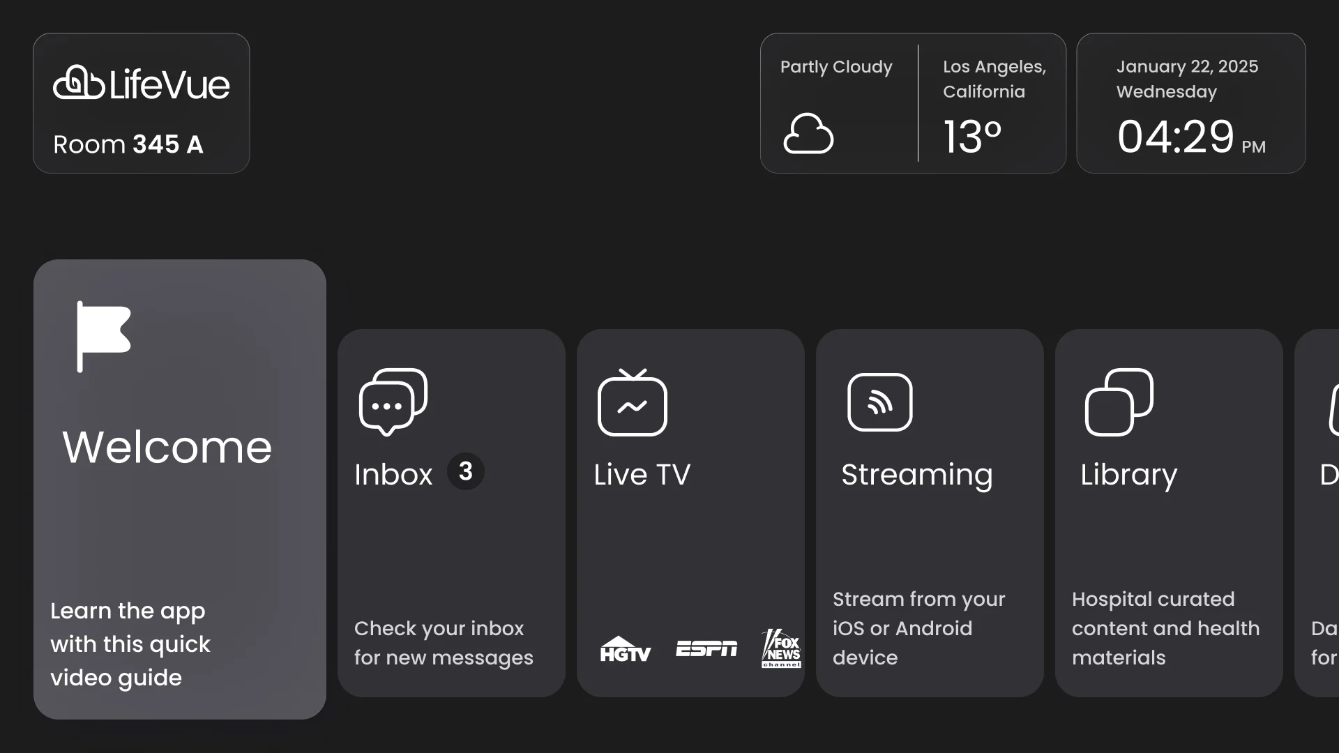
One home screen, and one thing in focus
- Found
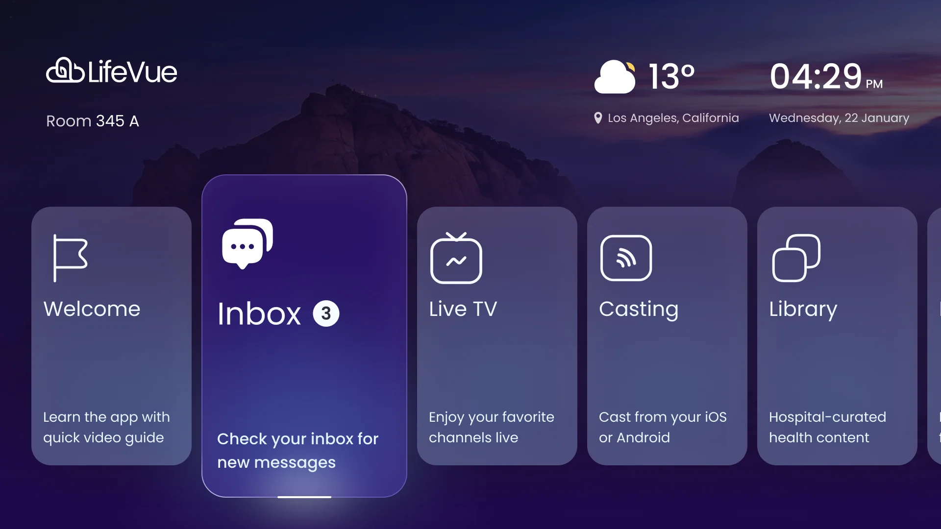
- With no pointer, whatever is in focus is the only thing a patient can act on, so the home screen has to say where you are, what is next to it and what pressing select will do.
- Decided
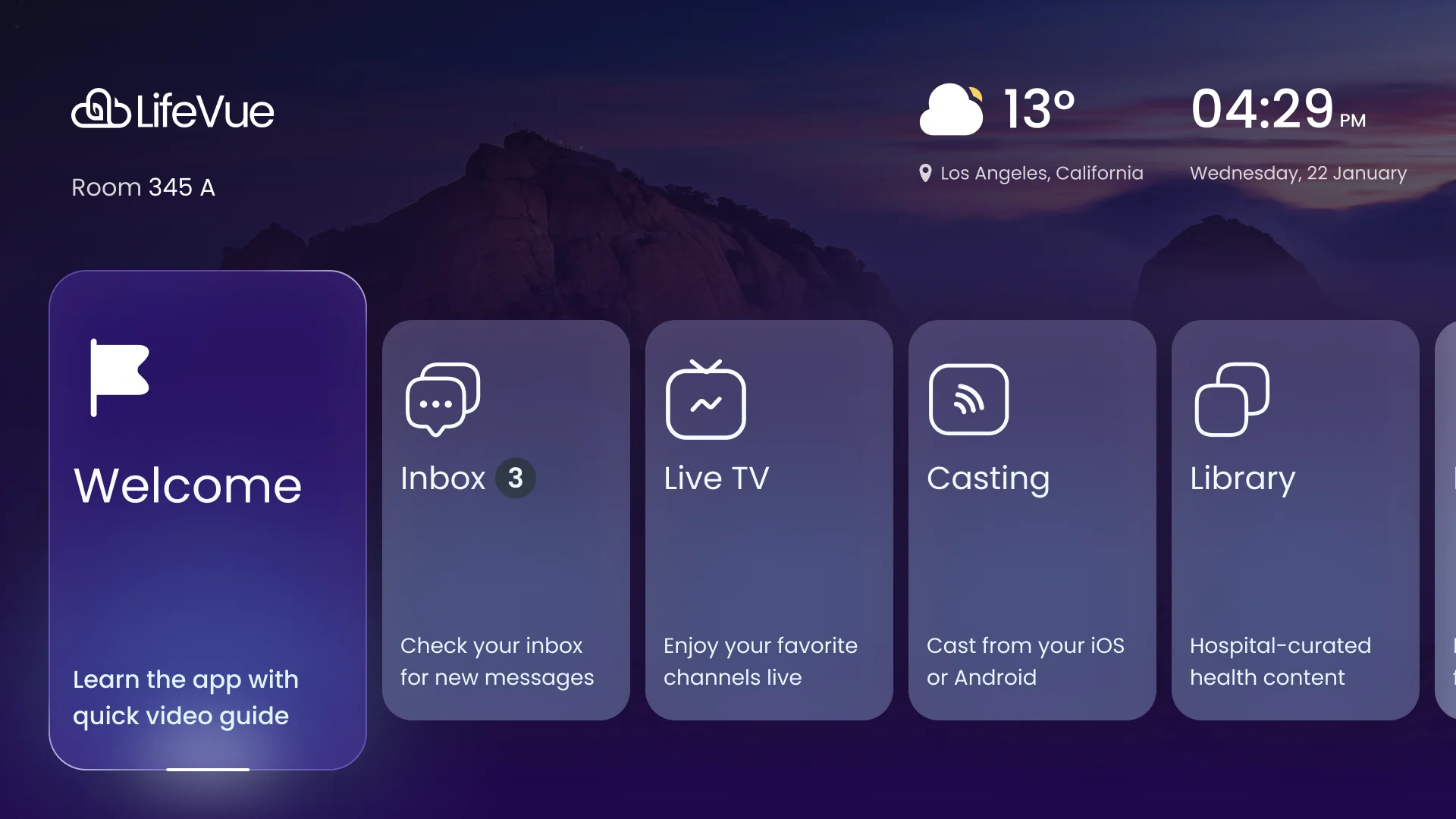
- The focused card lifts, grows and carries a longer line of text; the neighbours stay quiet and in a fixed order; room, weather and time sit apart at the top.
- For the user
- The patient sees at once where the remote is and what one press to the right will do.
-
Where you are
The product, the room, the weather and the time, kept in the corners.
-
What is in focus
The raised card: taller and brighter than its neighbours, with the count that matters.
-
What pressing will do
A line at the foot of each card, longest on the one in focus, and an underline that says it is selected.
How the work progressed
126 hours of design: a look at other patient-room and TV apps, then flows drawn press by press, then wireframes, then the interface in three modes on one system, then a prototype and files HyperSign could sell and build from.
-
Discovery
Who holds the remote in a hospital room, how long they can focus, and what television apps already teach them
Artifact Competitor research on patient entertainment and TV interfaces
-
User Flow
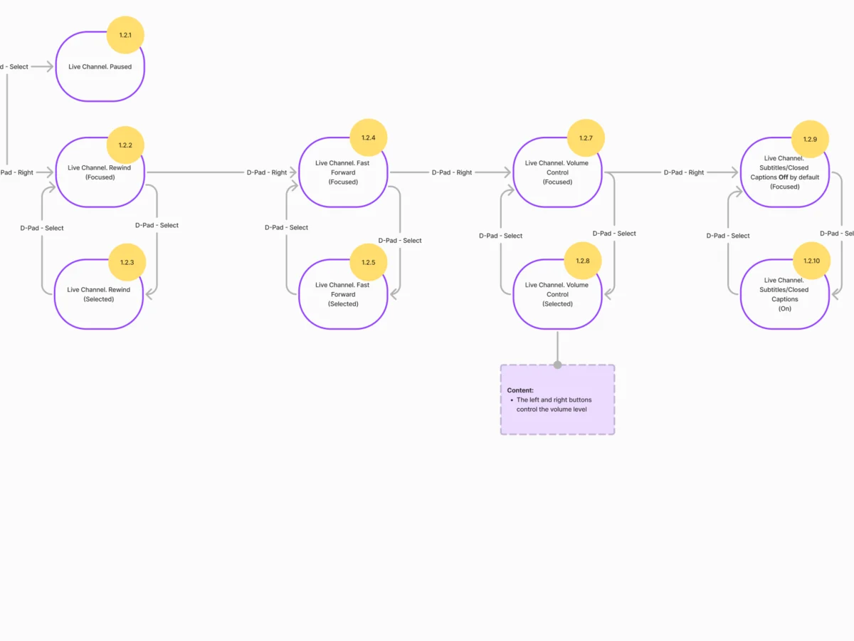
Every press between the home screen and a playing channel, with the state each press lands in
Artifact Information architecture and end-to-end flows for each area of the product
-
Wireframes
Where everything sits on a screen you read from a bed, before any colour or image
Artifact Wireframes for the hub, Live TV, casting, library, dining, inbox and settings
-
UI & Design System
One look for three modes, a focused state for every element and content that can change per hospital
Artifact The adult interface, the kids mode, the accessibility-oriented mode, an HCA theme and the design system
-
Delivery
Something HyperSign could put in front of a hospital, and hand to engineers afterwards
Artifact A clickable Figma prototype, a screen map and the files behind them
Drawn one press at a time
- Found
- On a remote there is no shortcut: every place is a sequence of presses, and a sequence with a dead end leaves a patient stuck.
- Decided
- Each area was drawn as a flow before any screen: which press leads where, what each screen holds, and what happens when something goes wrong. The maps below call casting by its early name, streaming.
-
Home to a live channel
Right along the hub, select into Live TV, then into a channel and its controls.
Open the full map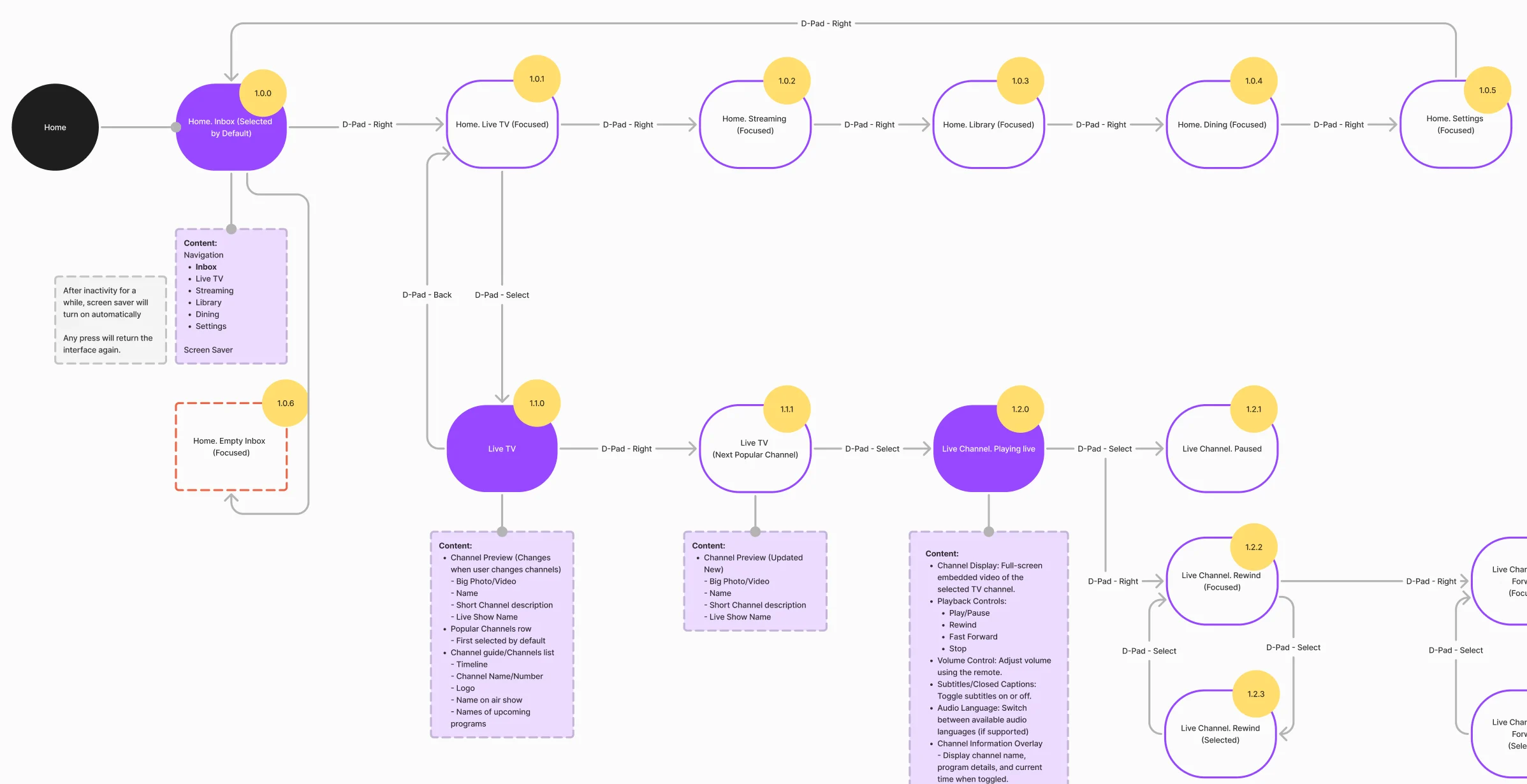
-
Casting from a phone
Pairing, loading, playback controls, the two failure paths and the accidental-press guard.
Open the full map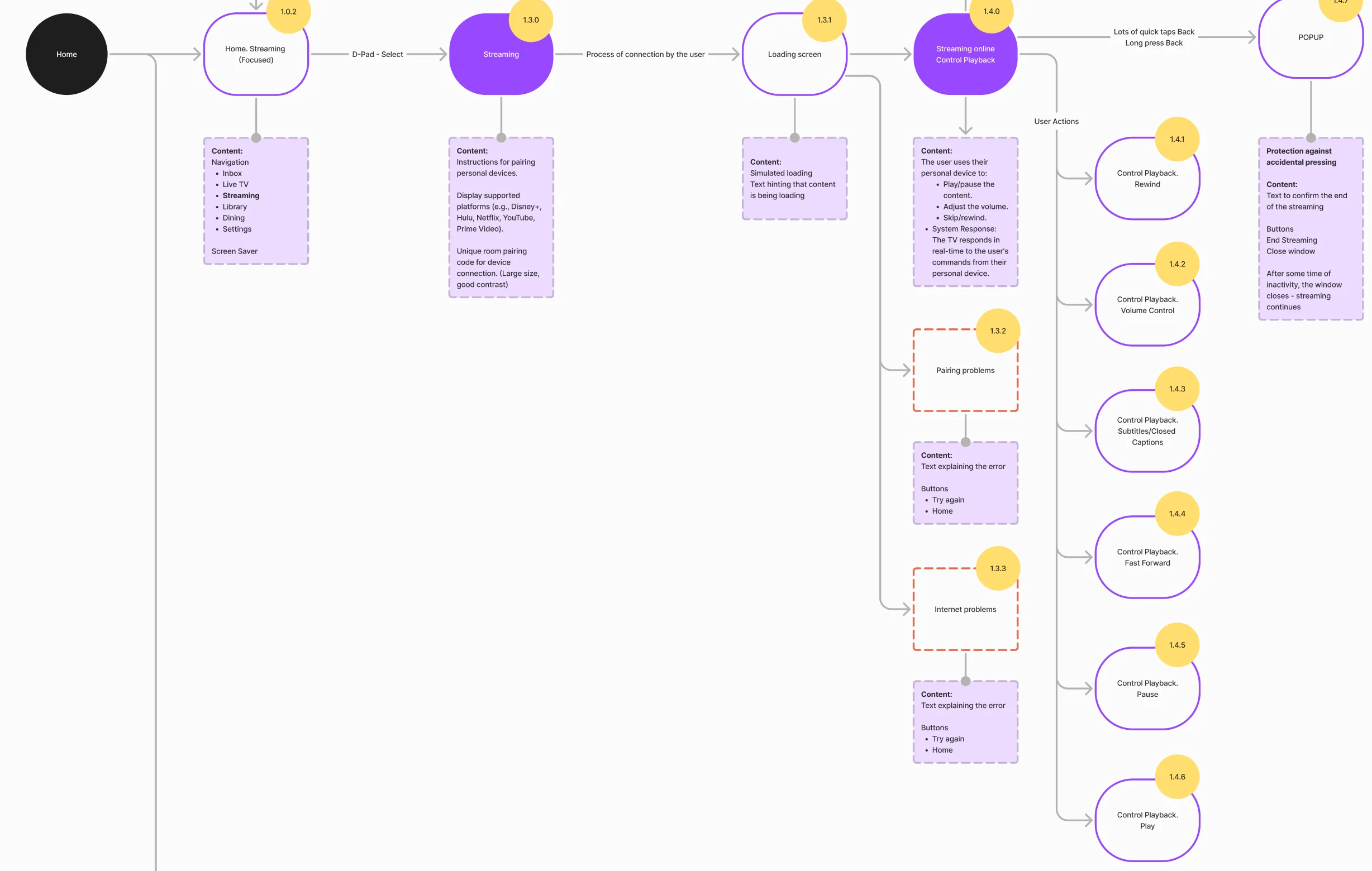
-
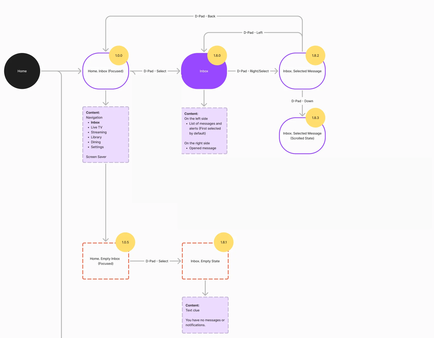
Nine jobs, from the first channel to a child’s bedtime story
Watching first, then casting and what happens when it fails, then the hospital’s own content, then comfort and the kids mode. Names, messages and meals on these screens are sample data.
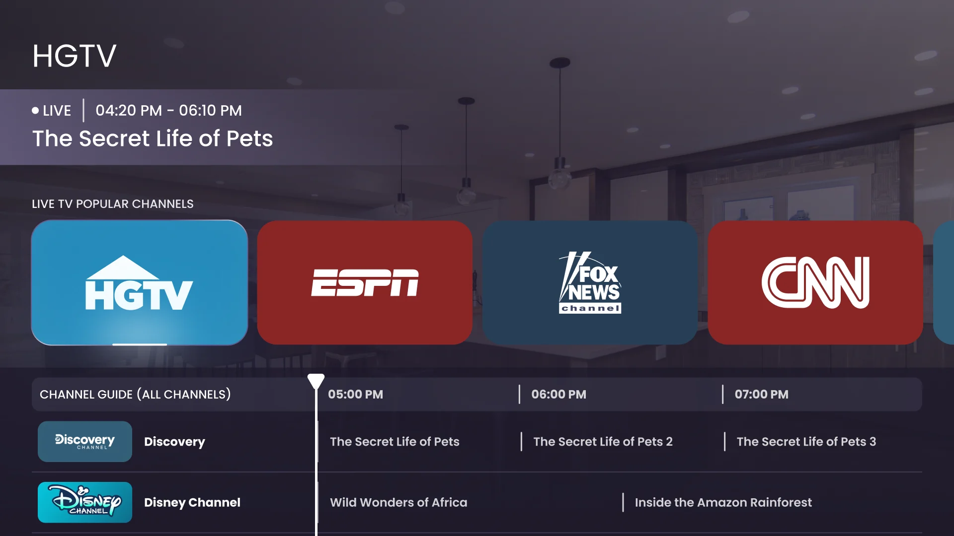
Live TV that starts on a channel
- Found
- A channel guide built for a mouse asks a viewer in bed to hunt for something to watch.
- Decided
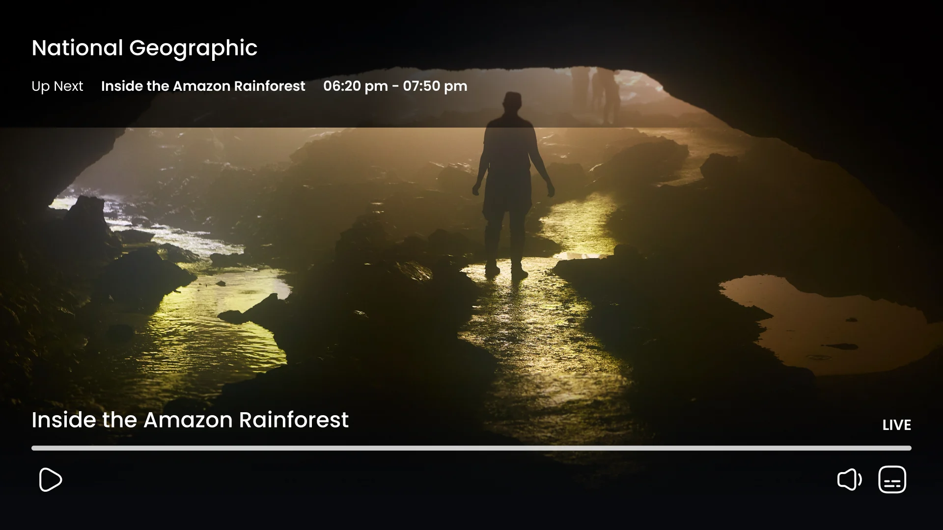
- A preview of the current channel, a row of popular channels with the first one selected, and the guide below; one press to the right moves along the row, select goes full screen, and the controls fade after a while and come back with any press.
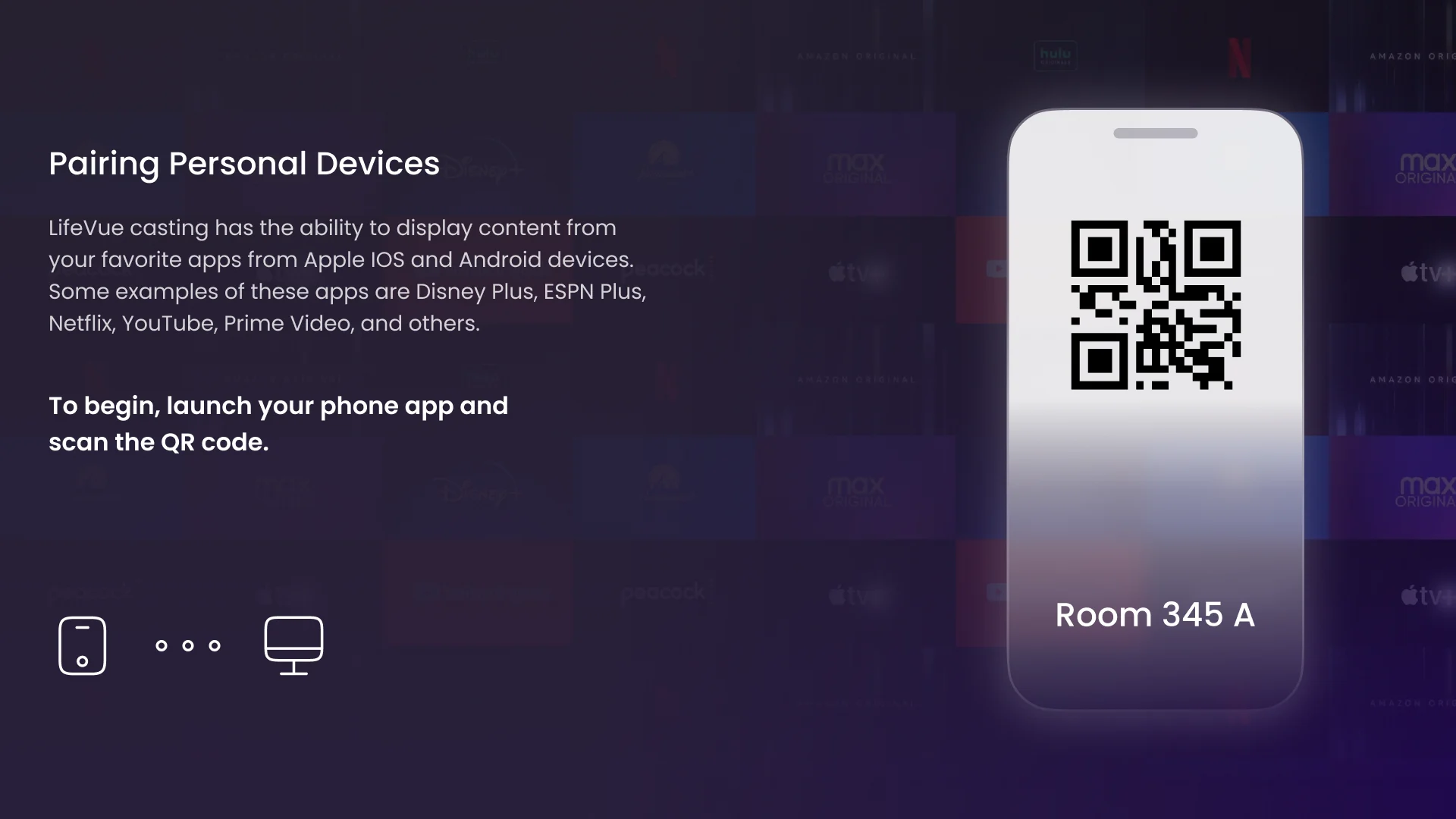
Casting from your own phone
- Found
- Patients want their own apps on the big screen, and a pairing step that needs a manual will not get done from a bed.
- Decided
- One screen with a QR code and the room’s name on a phone drawing, one line on what to do, and a plain confirmation when the phone has connected.
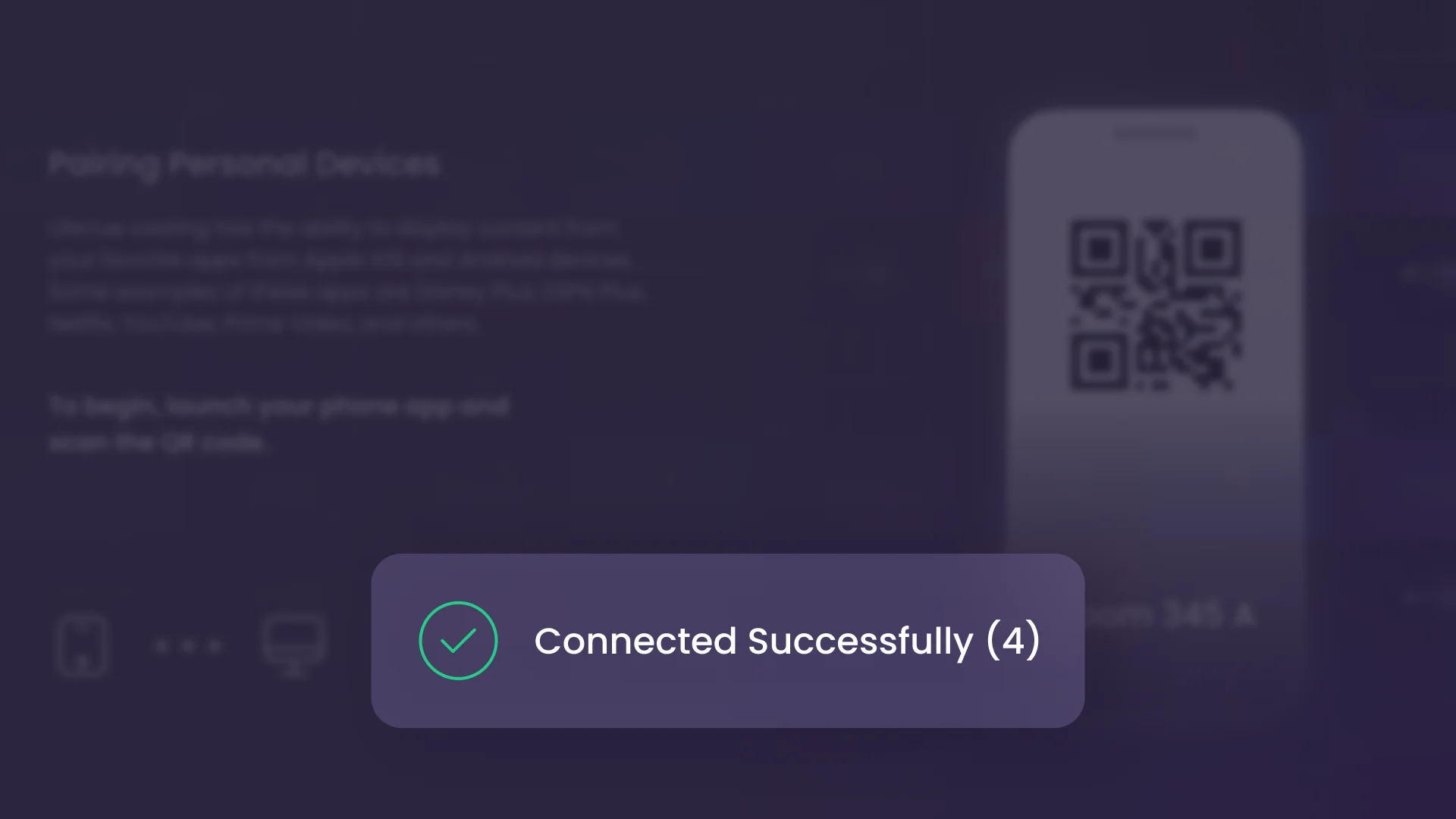
When the connection fails
- Found
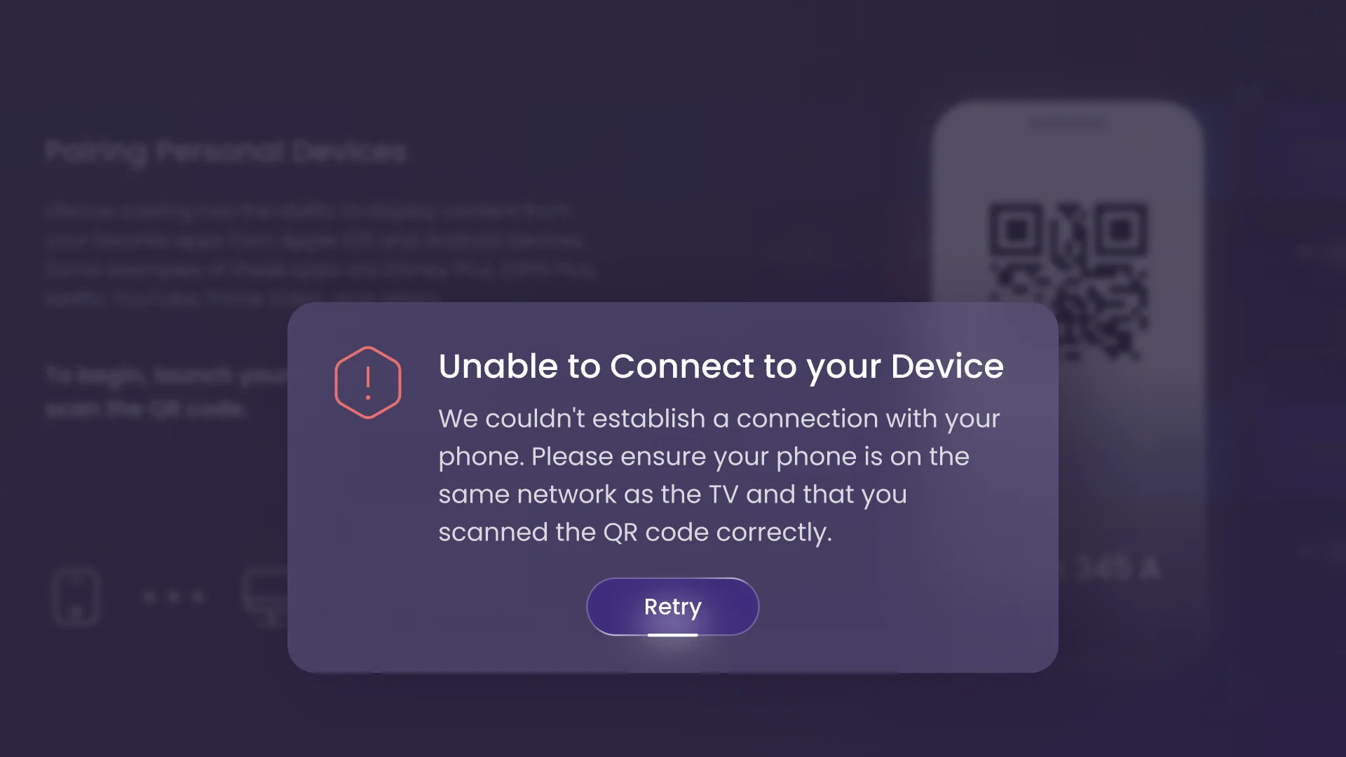
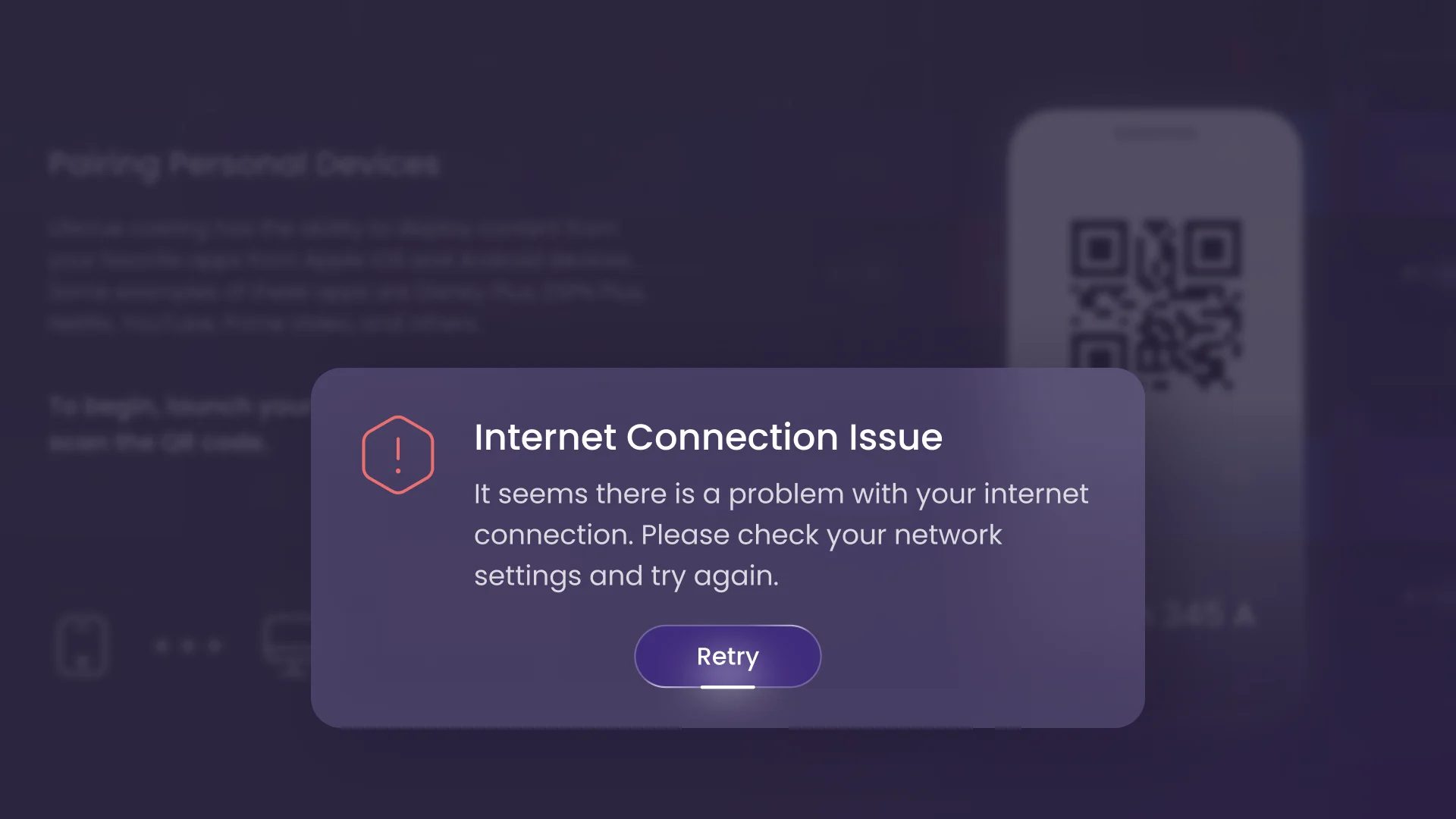
- A failed cast that says nothing leaves a tired patient guessing, and a child pressing every button can end a session by accident.
- Decided
- Each failure has its own plain message and one way out, over the pairing screen so the patient keeps their place. A run of quick Back presses asks before it ends the session.
Health content, not a video shelf
- Found
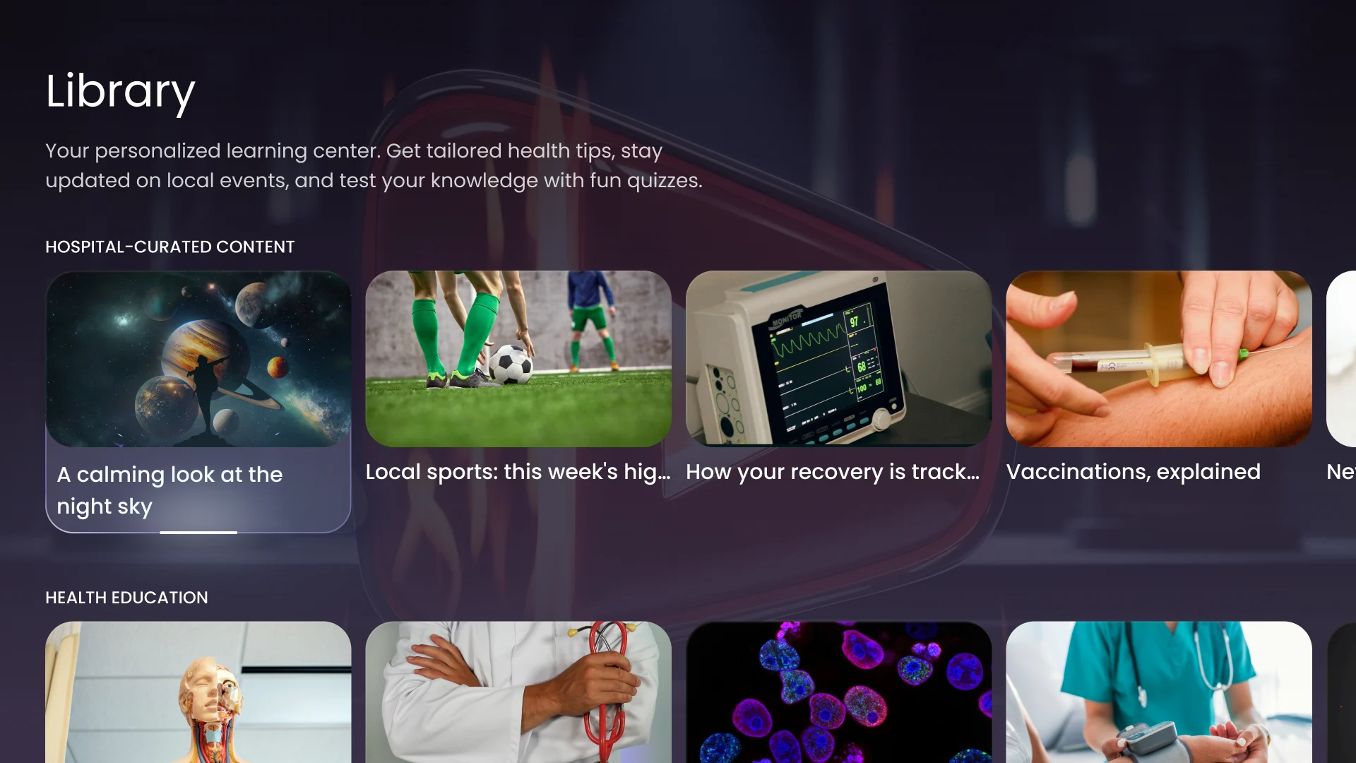
- Folders on a television mean going back and starting again every time, which on a remote is a small punishment.
- Decided
- Horizontal rows instead of folders: hospital-curated content first, health education next, so changing category is one press up or down.
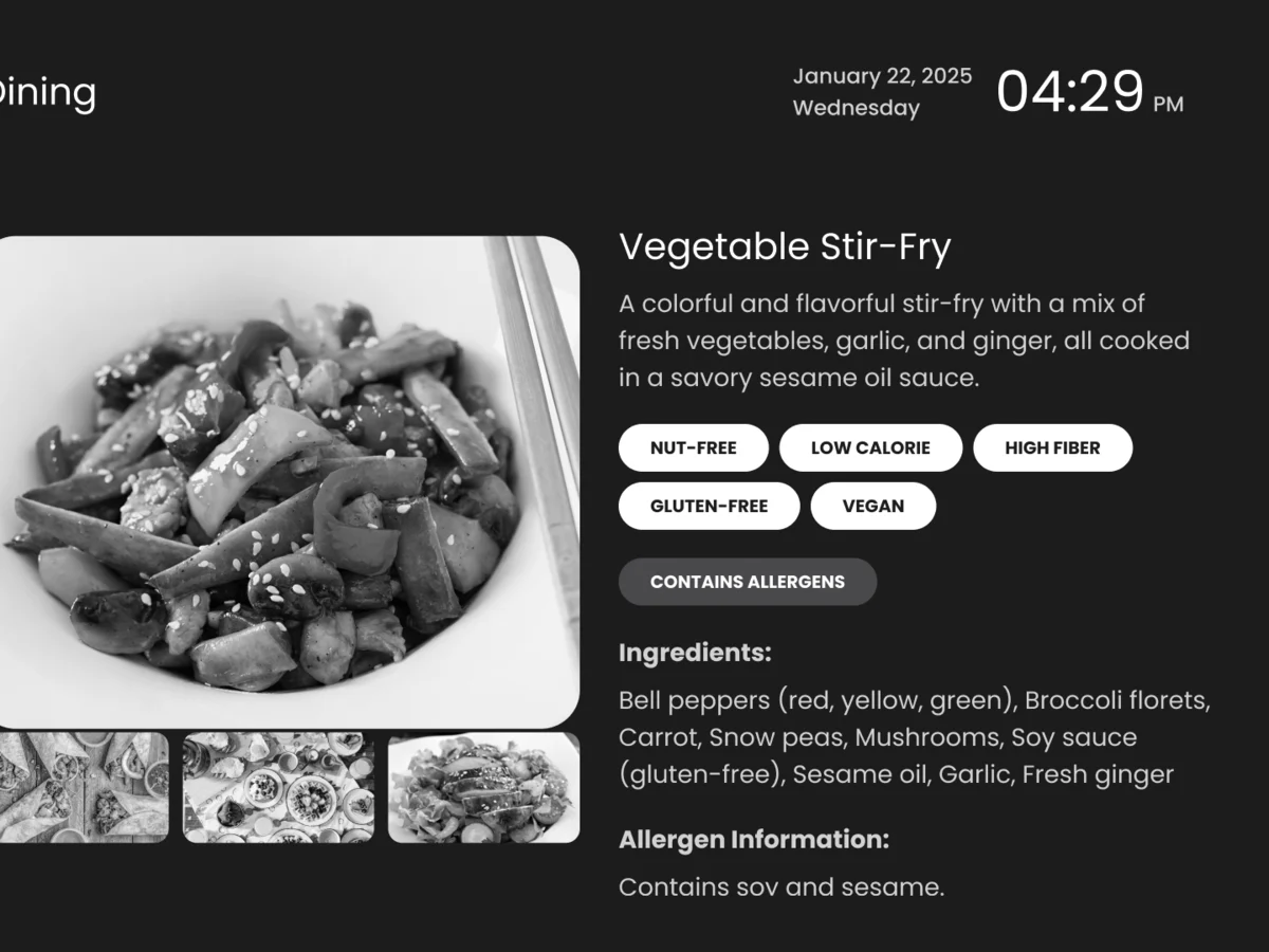
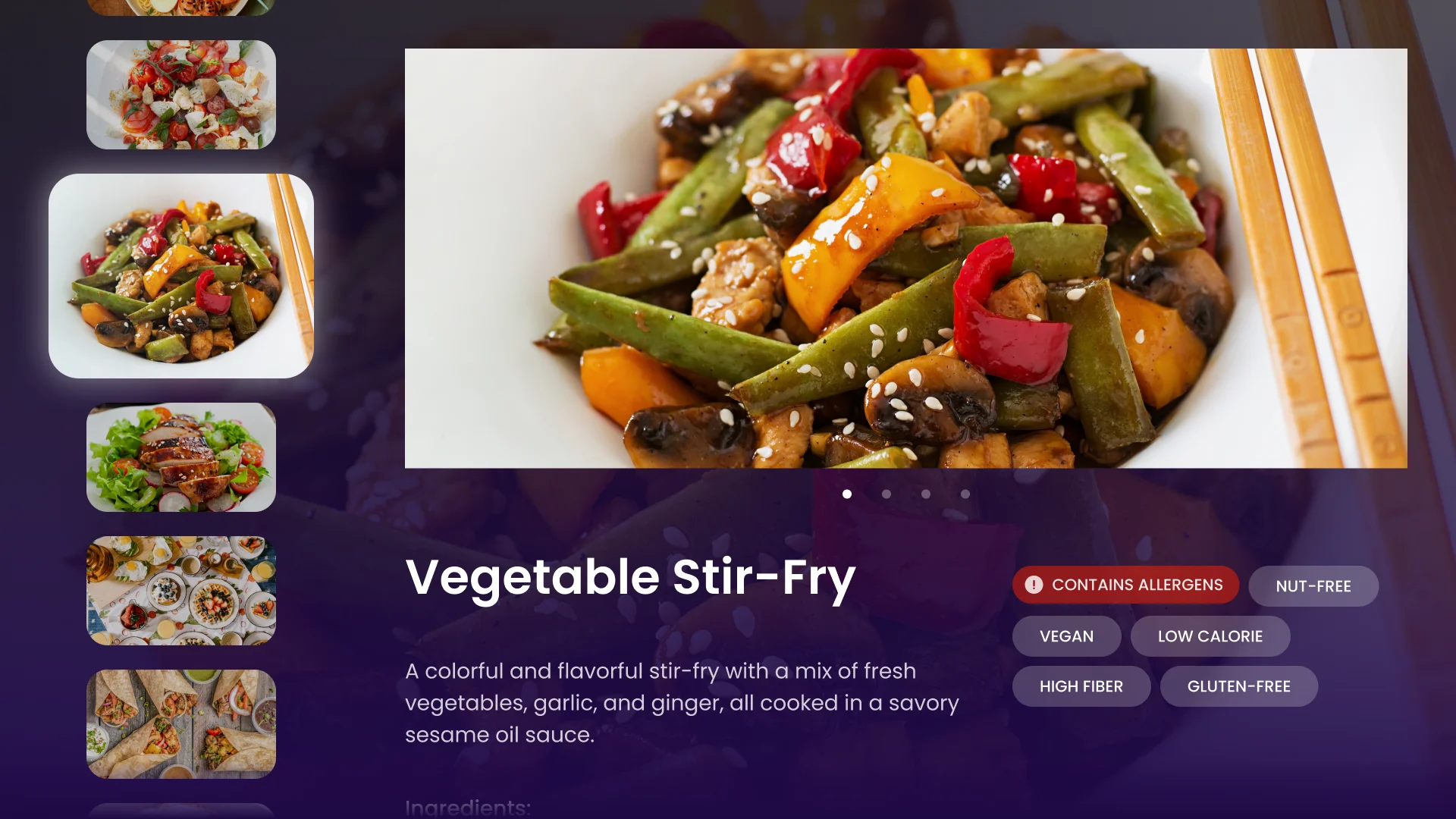
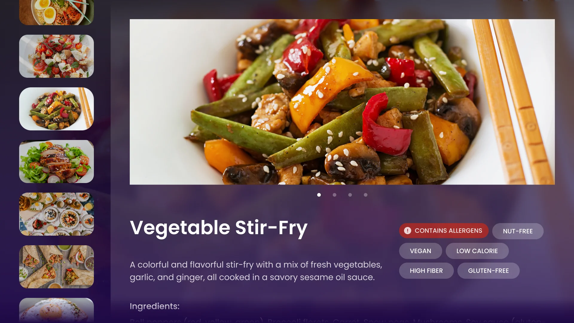
Meals with what a patient needs to know
- Found
- A menu on a screen has to say what is in the dish and what to avoid, not just show a photo.
- Decided
- A column of dishes with one selected, a large photo and tags for allergens and diets; a details screen with ingredients, allergen information and recommendations and contraindications, scrolled with the down arrow.
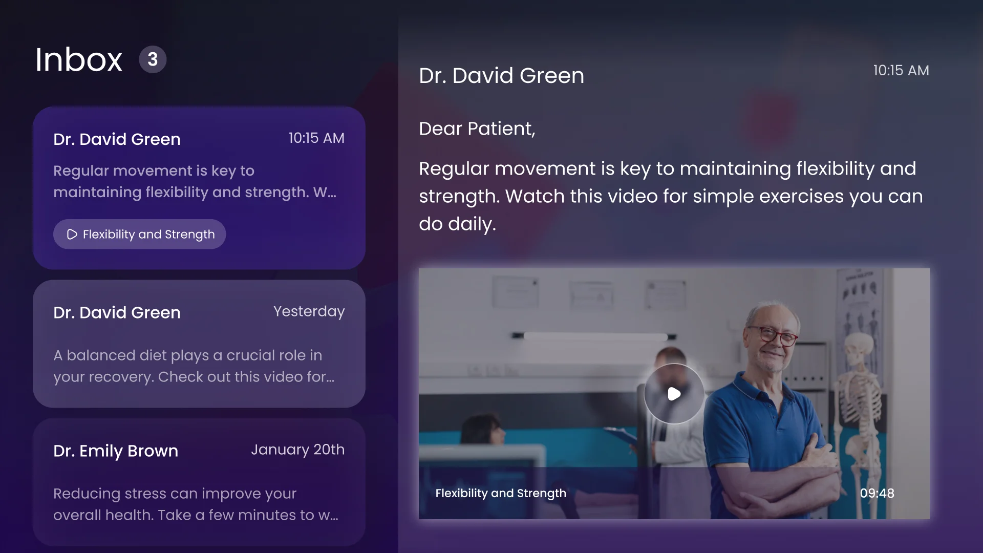
Messages from the care team
- Found
- A message on a television is read from a distance, by someone who may be worried, and it has to be found without hunting.
- Decided
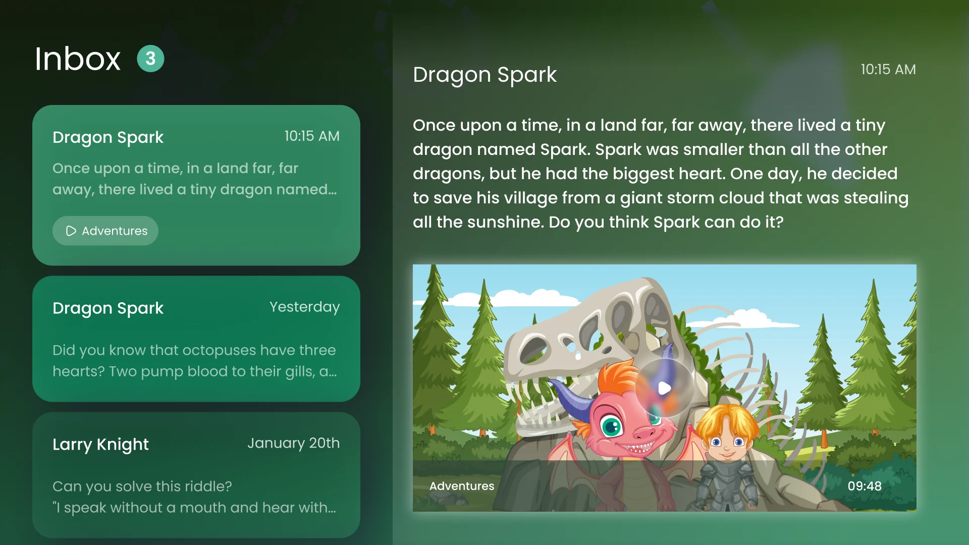
- The list on the left, the open message on the right, and the first message selected by default; the message can carry a video with it.
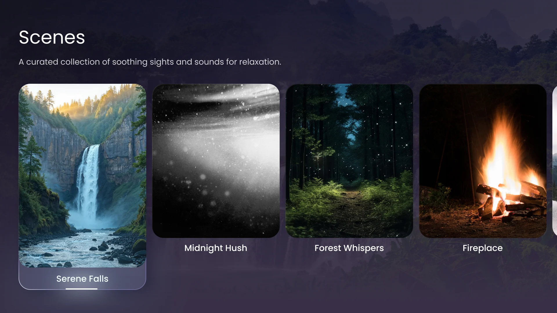
Something calm to look at
- Found
- A hospital room has a screen that is on for many hours, and not all of them are for watching something.
- Decided
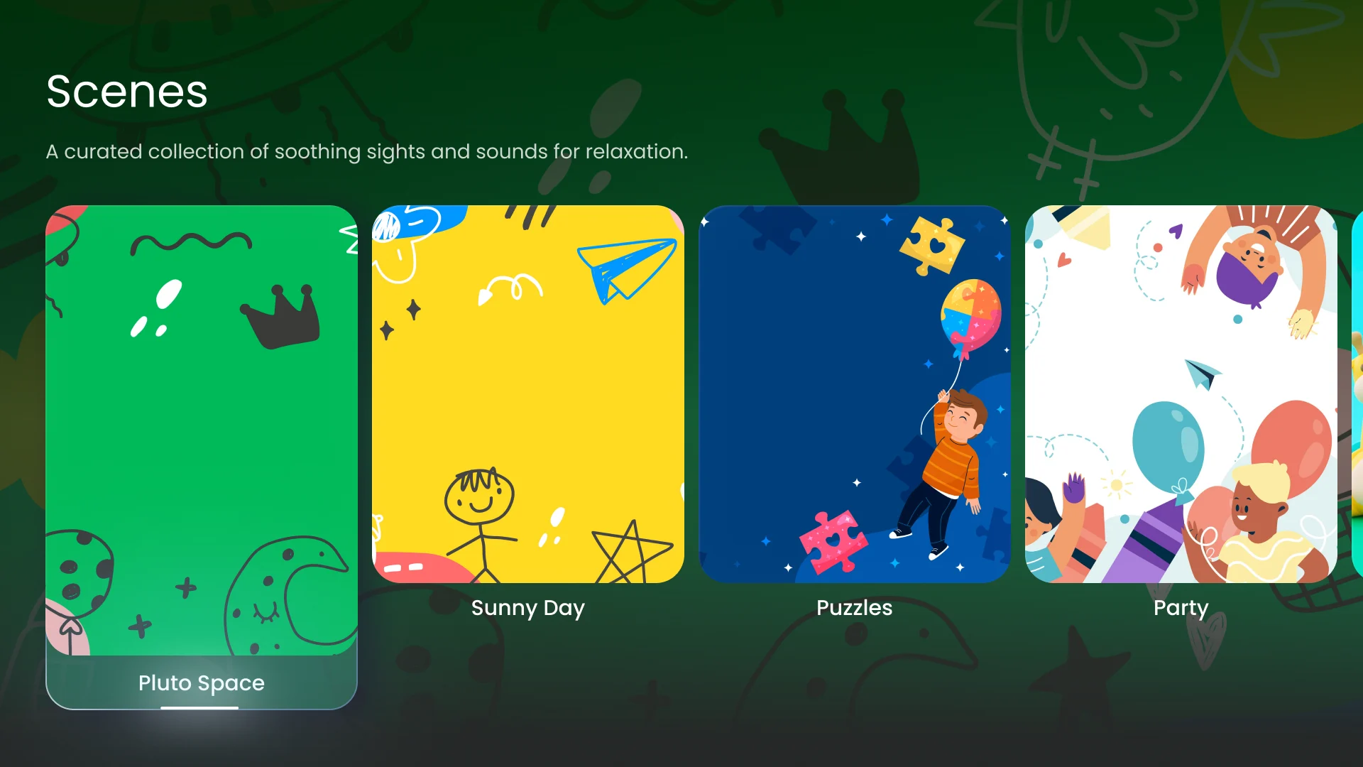
- Scenes: a curated collection of soothing sights and sounds, browsed as large tiles the same way as everything else.
Comfort settings a patient can reach
- Found
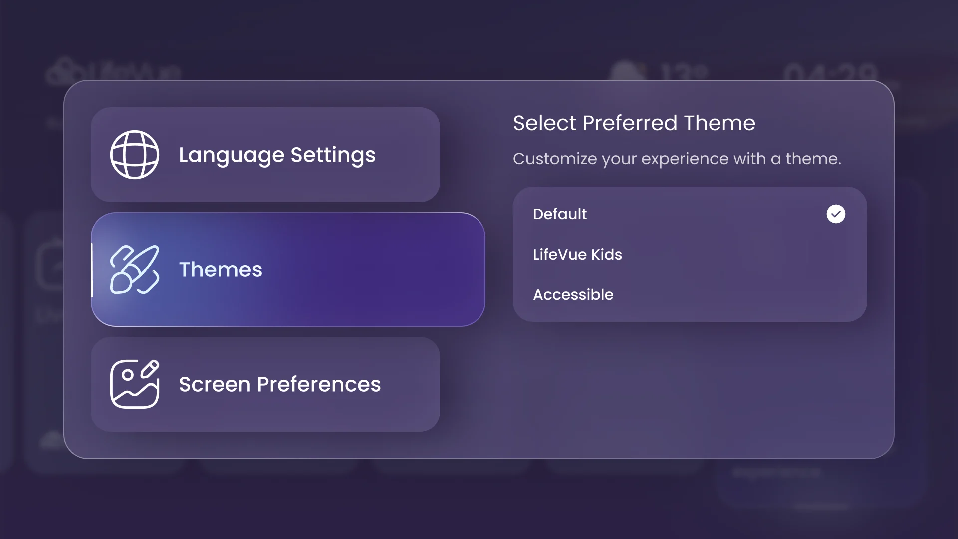
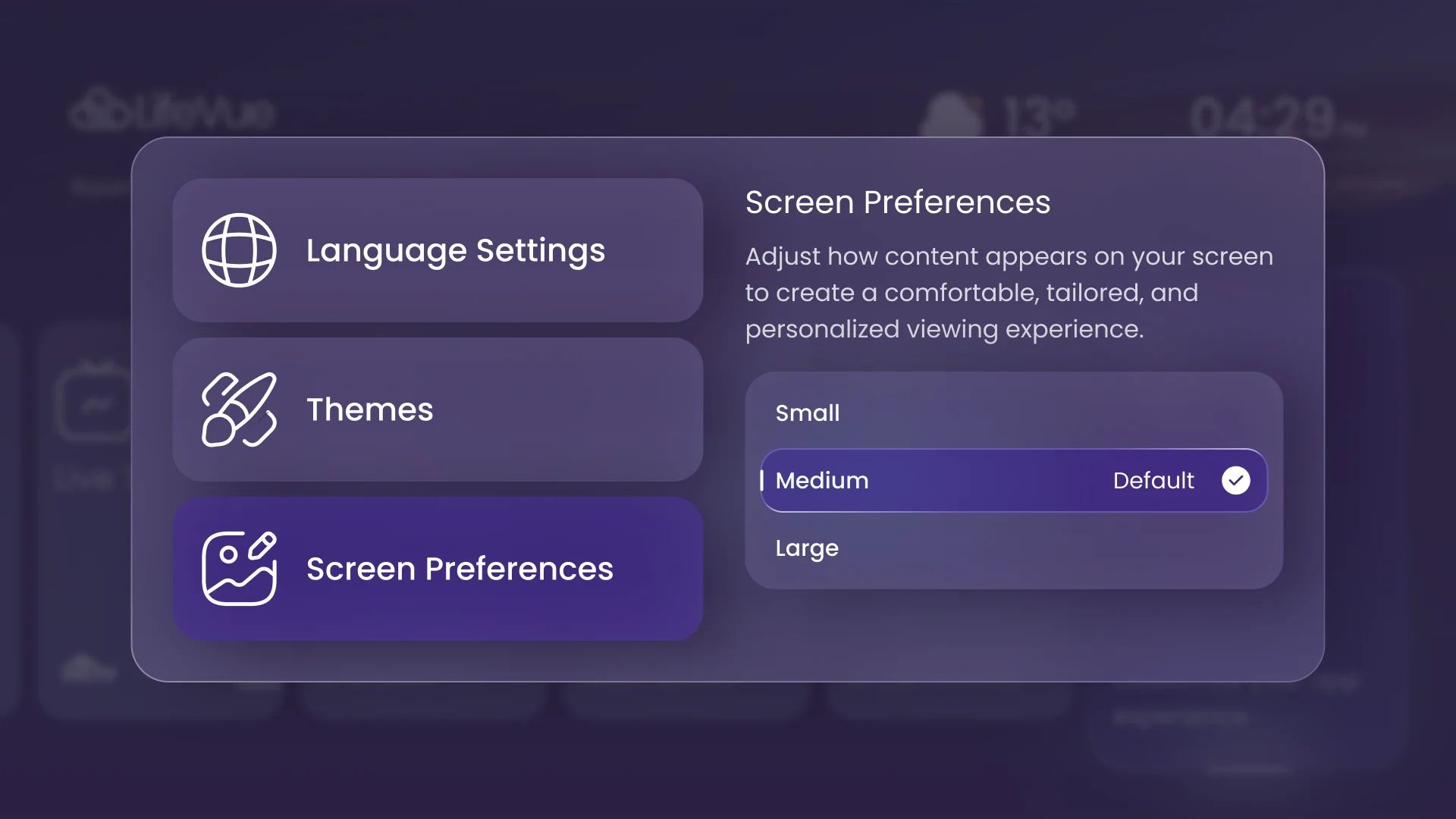
- Text that is too small and a language that is not yours turn a screen into a chore, and a settings page built for a mouse is out of reach.
- Decided
- Three tabs on the left and their options on the right, each option a step of one arrow: language, a theme (default, kids or accessible) and a text size from small to large, each with a confirmation before it changes.
A kids mode with a guide
- Found
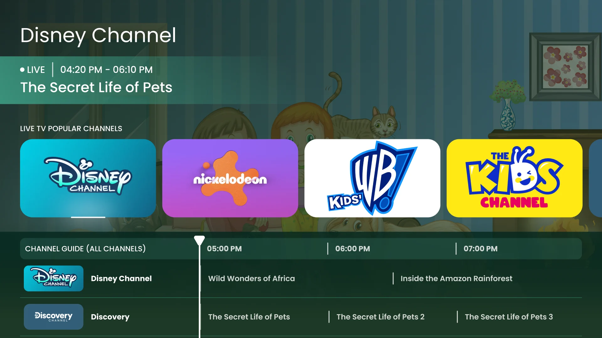
- A child in a hospital bed can use a remote but will not read an adult menu, and a parent does not want to explain it.
- Decided
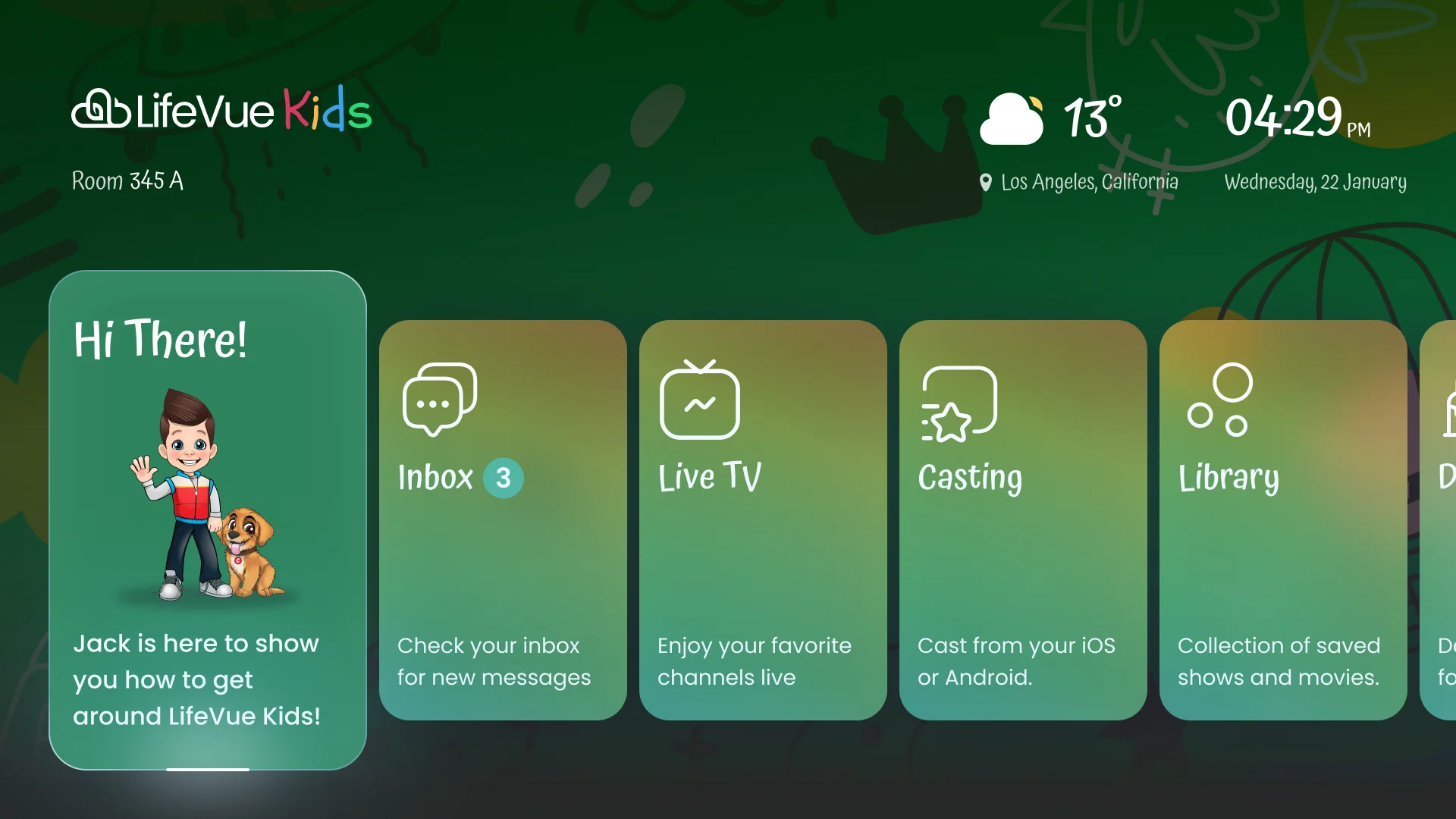
- The same places in the same order, but greener and softer, with a mascot to show how to get around, kids’ channels, stories in the inbox and illustrated scenes.
One system for three modes and one remote
- Found
- An adult, a kids and an accessibility-oriented interface were designed on one product, all driven by focus alone; without shared parts they would have drifted into three.
- Decided
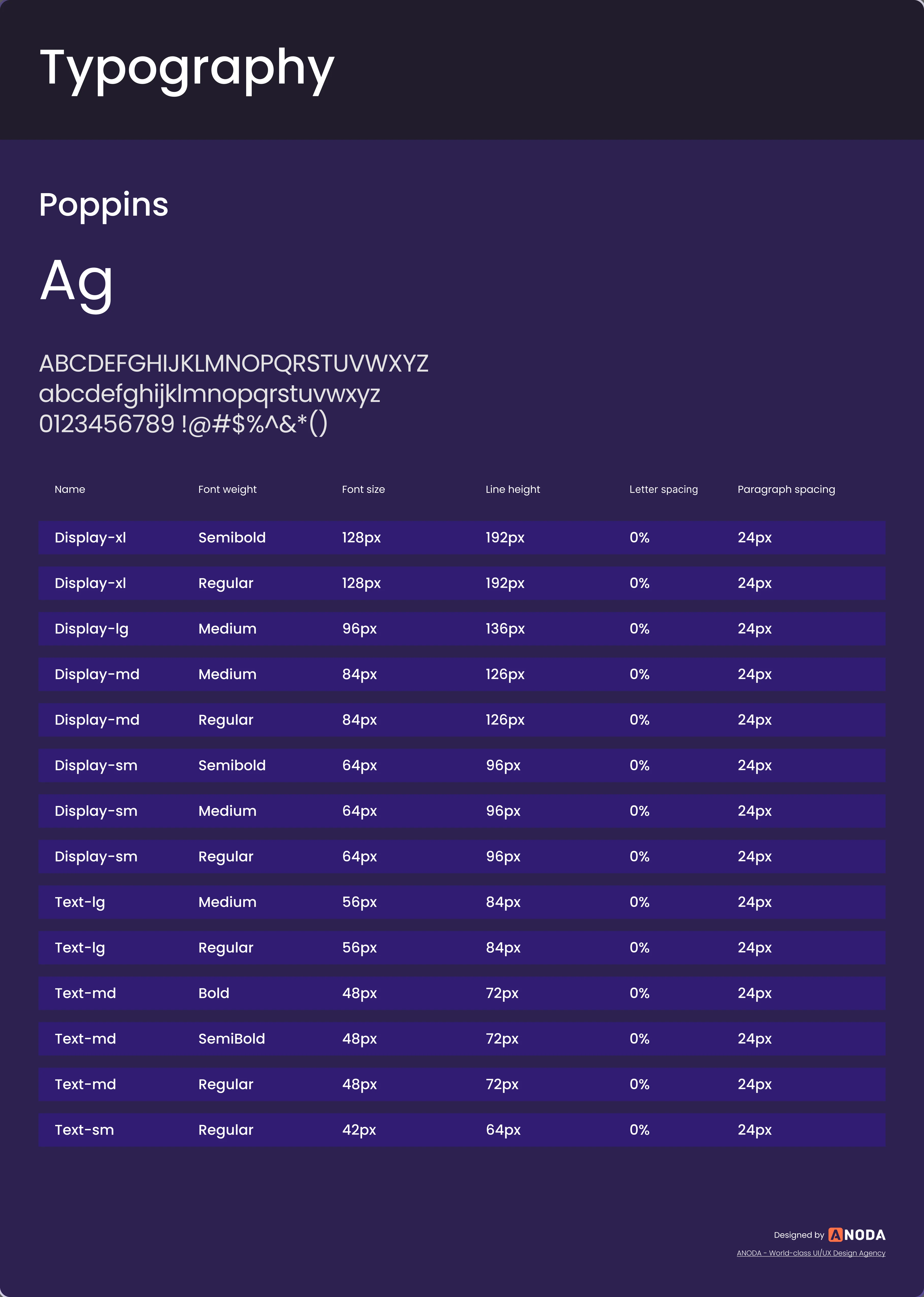
- A shared kit: one typeface, navigation buttons with a focused state, channel cards in default, focused and small sizes, and pop-ups, so a mode is a look on the same parts.
The same parts in every mode
Focus is an underline and a glow on the element, not a colour, so it survives every theme.
-
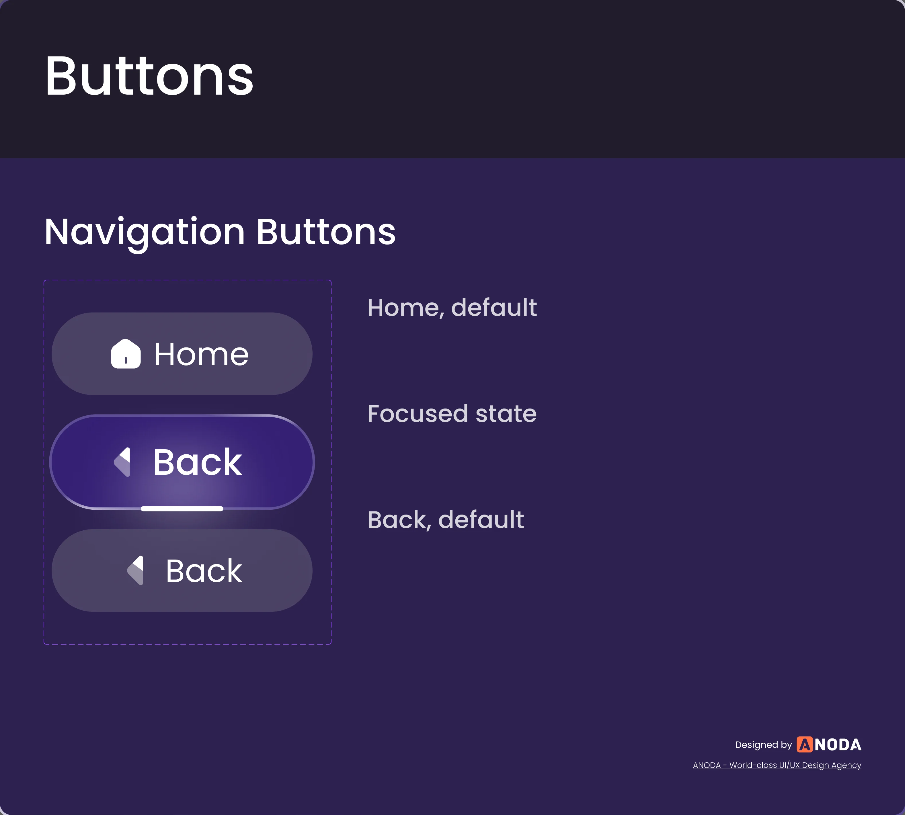
Navigation buttons: Home and Back, default and focused. -
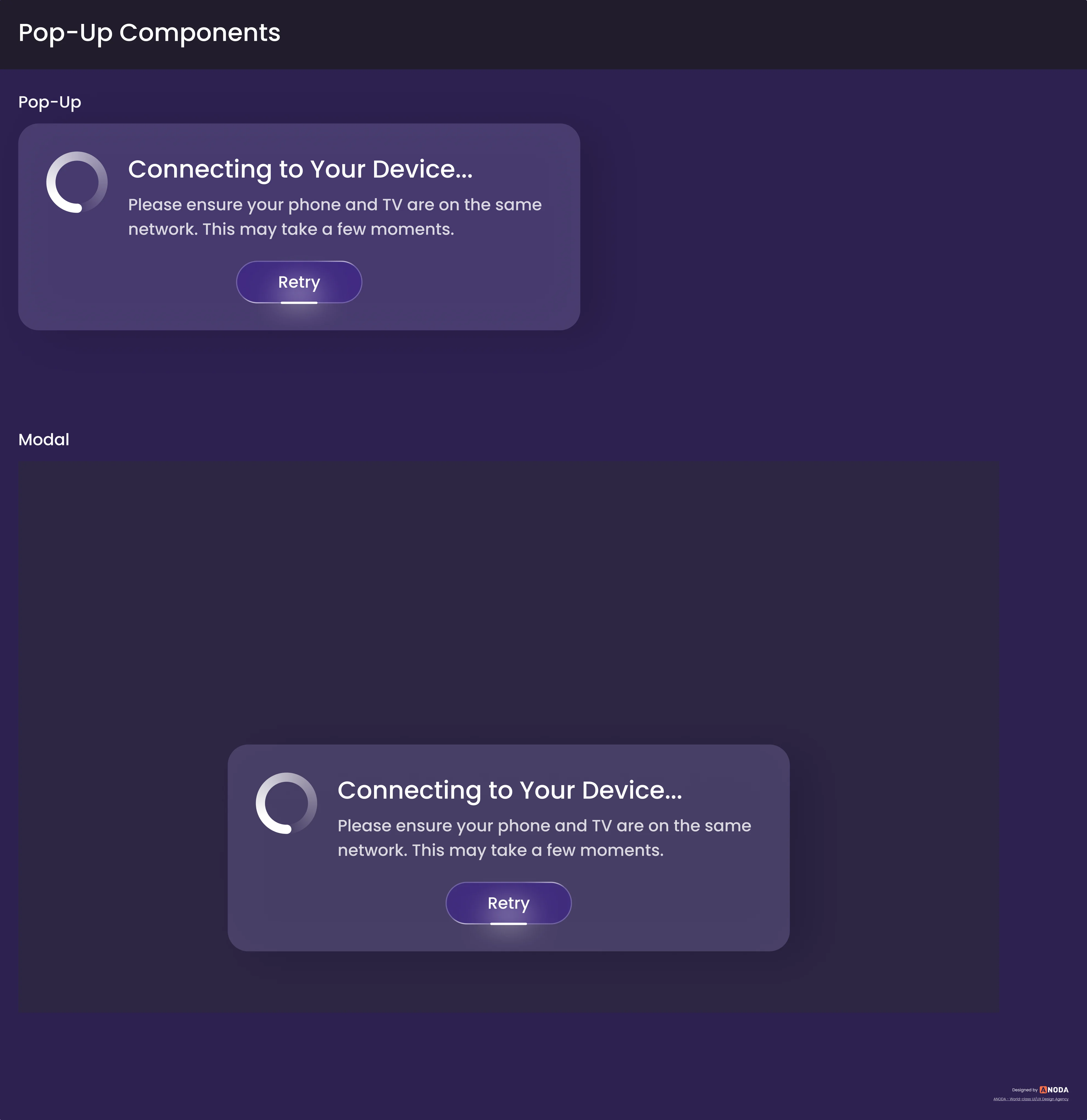
Pop-ups: One dialog, as a pop-up and over a screen.
A channel card, in every state
Default, focused and small, for every channel logo.
-
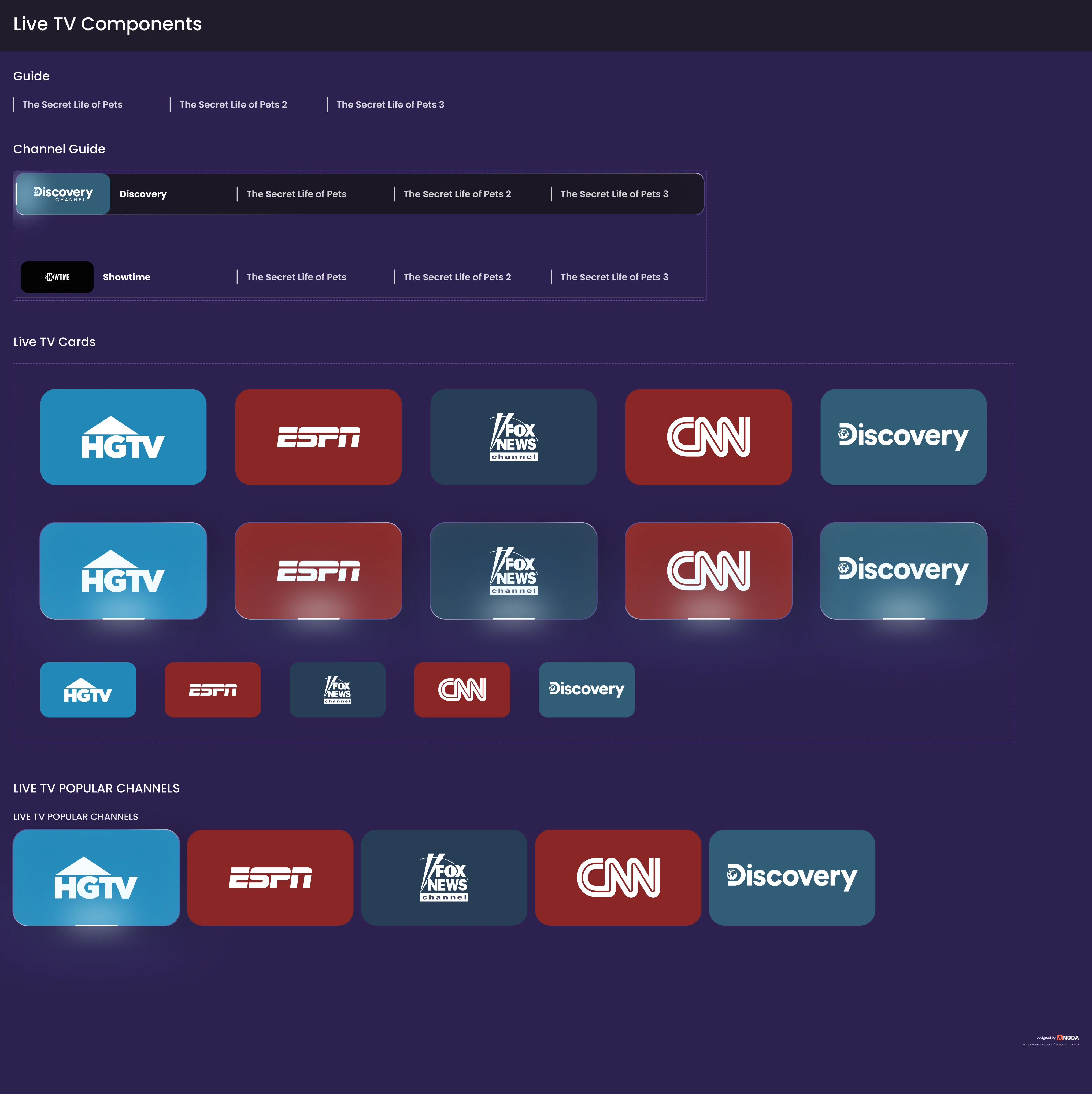
Live TV cards
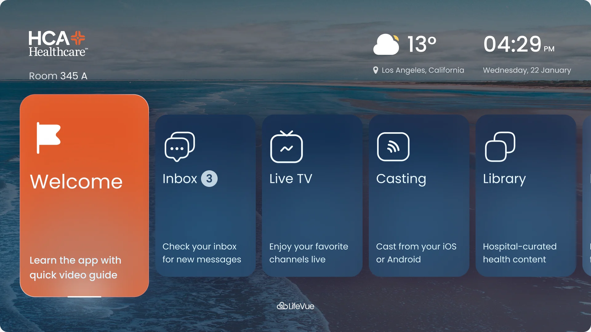
Three looks, one home screen
The adult mode, the kids mode and the HCA-branded theme, on the same hub.
Files a presales team and an engineering team could use
HyperSign needed one thing to show hospitals and another to build from, so the work ended in a prototype and a set of organised Figma files, not a folder of screens.
- Design system
- Type, navigation buttons, cards, pop-ups and their focused states.
- Flows and screen map
- Every area drawn press by press, with the states each press lands in.
- Clickable prototype
- The home hub and each area, walked with an on-screen remote.
- Implementation notes
- The flows carry what each screen holds and what happens when something fails.
Flows in the handoff
- Wireframes: every area, press by press
- Adult interface in 4K: live TV, casting, health content, meals and messages
- Kids mode in 4K
- HCA-branded theme
- Clickable prototype with an on-screen remote
- Website: three style directions

Where the work ended up
A design for a patient-room television: live channels, casting from a phone, hospital-curated content, meals, messages from the care team, calming scenes and comfort settings, in an adult, a kids and an accessibility-oriented mode on one system, all driven by a remote with four arrows and a select button.
It went to HyperSign as a clickable prototype and organised files. Building and deploying the software was outside our scope, and the design makes no claim of accessibility or compliance certification.
- interface modes on one system
- 3
- the only input every screen assumes
- D-pad
- screens across the three modes
- 68
Designing for a screen with no mouse?
For HyperSign we designed a hospital TV interface that works with a remote, in three modes. Bring us your remote-driven or hard-to-reach product, and we’ll show you where the focus gets lost.
More work like this
Three more products where a screen, a stream or a patient had to be served without friction.
-
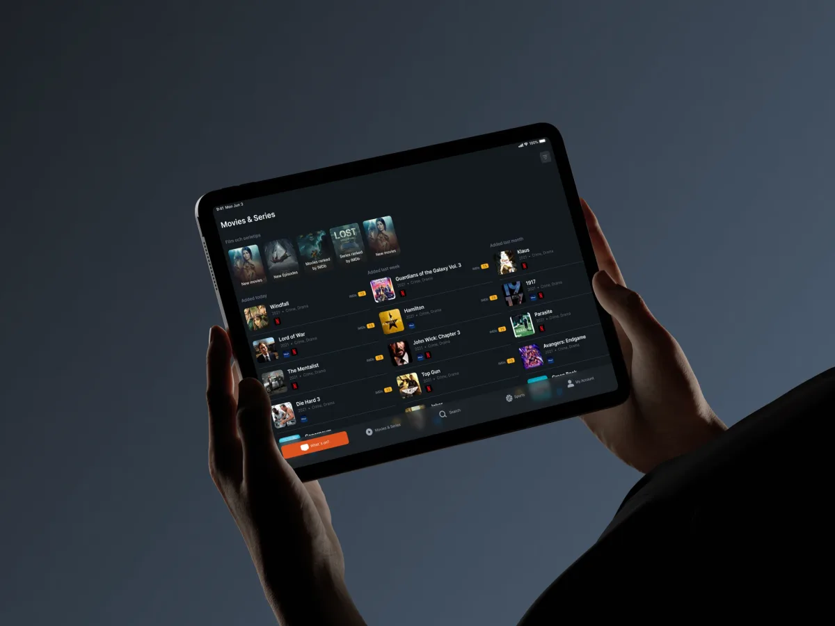
TV guide · iOS & Android · Phone & tablet
TV24
Redesigned a TV guide for phones and tablets: set-up by provider and region, schedules with the right channel numbers, and reminders.
- 79+ Screens designed
- 3 Experts on the team
-
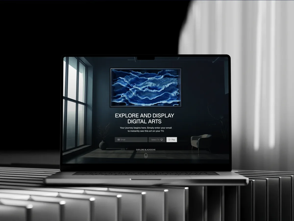
Digital Art · Streaming · Web + Mobile
Blackdove
Designed a moving-art streaming product across a shop, a web app and a phone, with pairing to the screens on the wall.
- 300+ Unique screens
- 2 Platforms — web & mobile
-
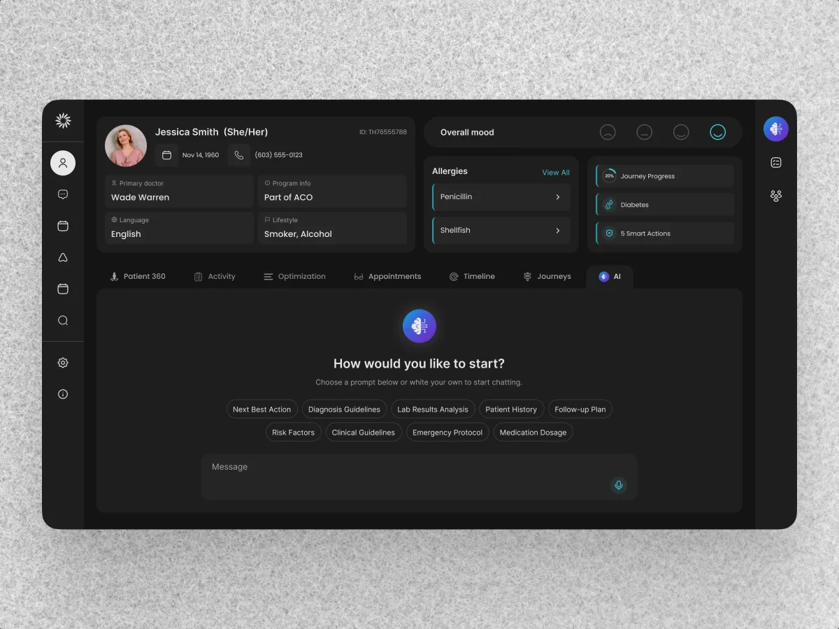
HealthCare · AI SaaS · Web + Mobile
Clay
Designed a healthcare ecosystem: a web CRM for care teams and patient and provider apps, grounded in a UX audit.
- 342 Unique screens
- 5 Experts on the team