
A calmer bug tracker, just as dense
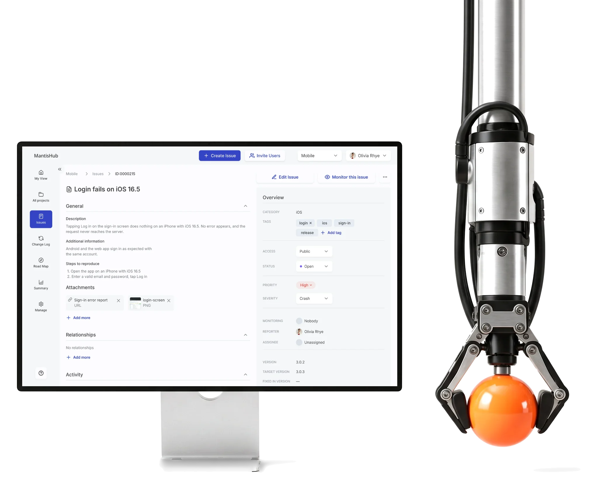
MantisHub is a hosted issue tracker on open-source MantisBT, for teams that fix bugs.We redesigned its busiest workflows, keeping the density.
- 52
- screens in the redesigned workflows
- 3
- people on the ANODA team
- 2
- design phases the redesign, then change requests
Project summary
MantisHub is a hosted, subscription issue tracker built on the open-source MantisBT, used by teams that report, fix and ship software every day. We did a targeted UI redesign of its busiest web workflows, as SaaS product design for four roles, with a design system for the redesigned scope .
What a day in MantisHub runs through
One chain, from a project to the last note on an issue:
-
Projects
- All projects
- Status
- Owner
-
Issue list
- Search
- Columns
- Group actions
-
Filters
- Saved
- Custom
- Applied criteria
-
Issue
- Overview
- Attachments
- Relationships
-
Activity
- Notes
- History
- Monitoring
- Dense and Calm
- Every field experienced users rely on stays; spacing and hierarchy do the calming.
- Familiar and Modern
- Selected workflows reworked; the rest of the platform left as its users know it.
- Public and Private
- Access cues stay unmistakable on issues, in notes and in lists.
An issue list that reads in order
- Found
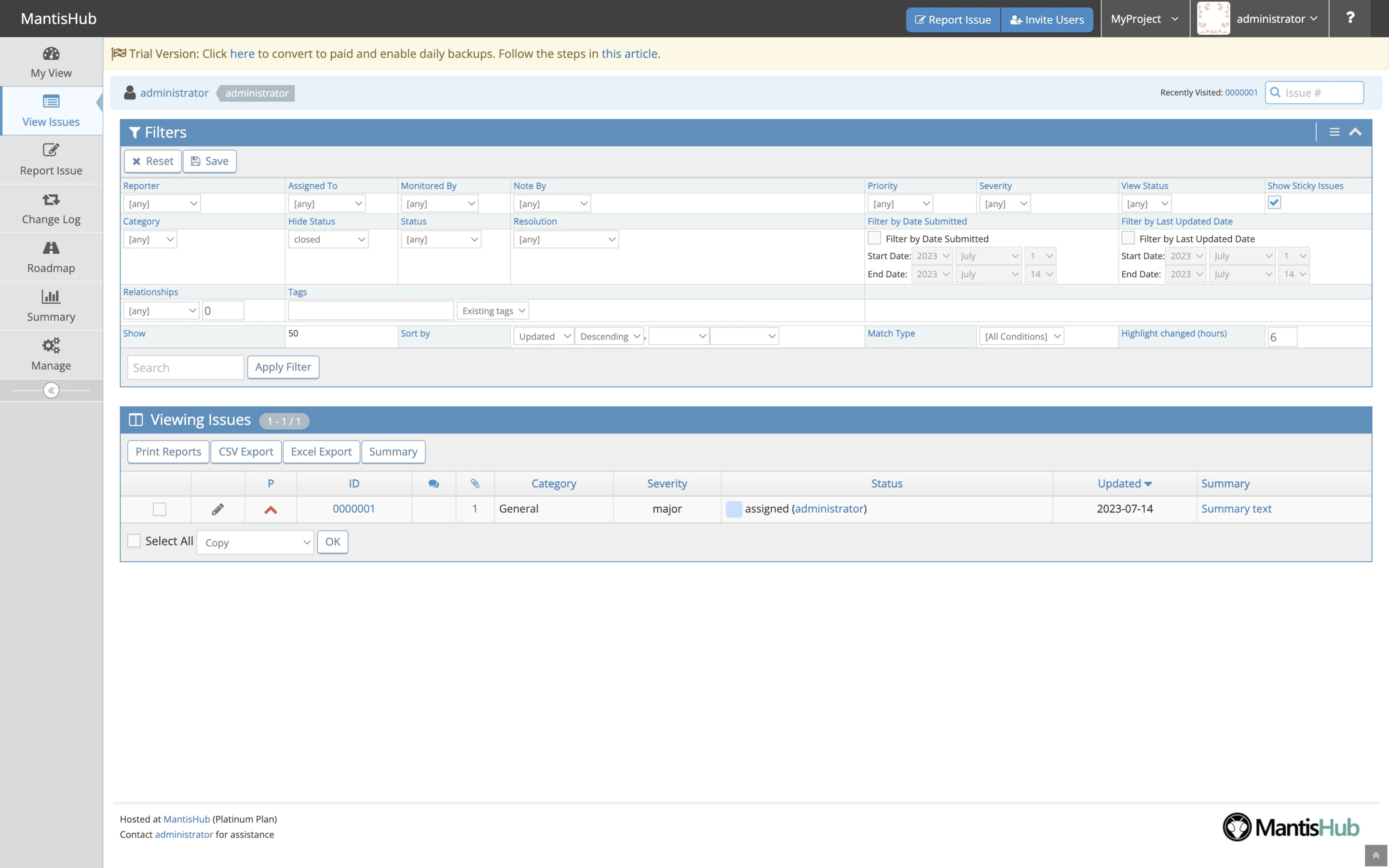
- The old View Issues page opened with a wall of filter fields above the table, and priority, status and severity were all the same small text.
- Decided
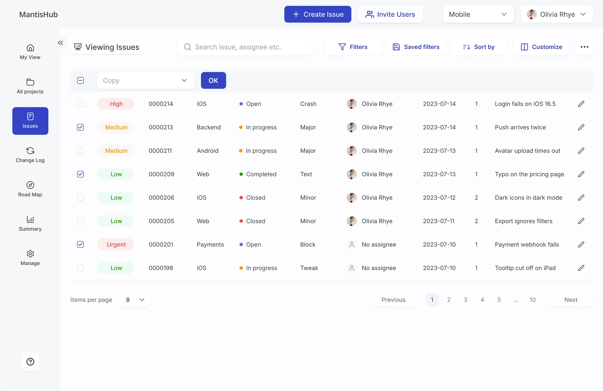
- Filters moved into one panel behind a button, the list got the page, and priority, status and assignee became things you spot: a coloured chip, a status dot, an avatar.
- For the user
- A developer or manager sees what’s urgent and whose it is before reading a single summary.
- In the way
- Twenty filter fields above one issue, and the only colour on the page in the section headers.
-
Find and shape
The project switcher and Create Issue, then search, filters, saved filters, sorting and columns.
-
Spot, then act
Priority chips, status dots and avatars to scan; tick issues to copy, assign or close them at once.
-
Move on
Items per page and the pages.
How the work progressed
Research and a direction first, then wireframes and the interface, then a second phase of change requests before handoff.
-
Discovery
What other trackers do with dense issue data, and how calm MantisHub could look
Artifact Competitor research across Jira, Asana, Redmine and Plan.io, Bugzilla, Trello and Monday, and moodboards
-
Wireframes
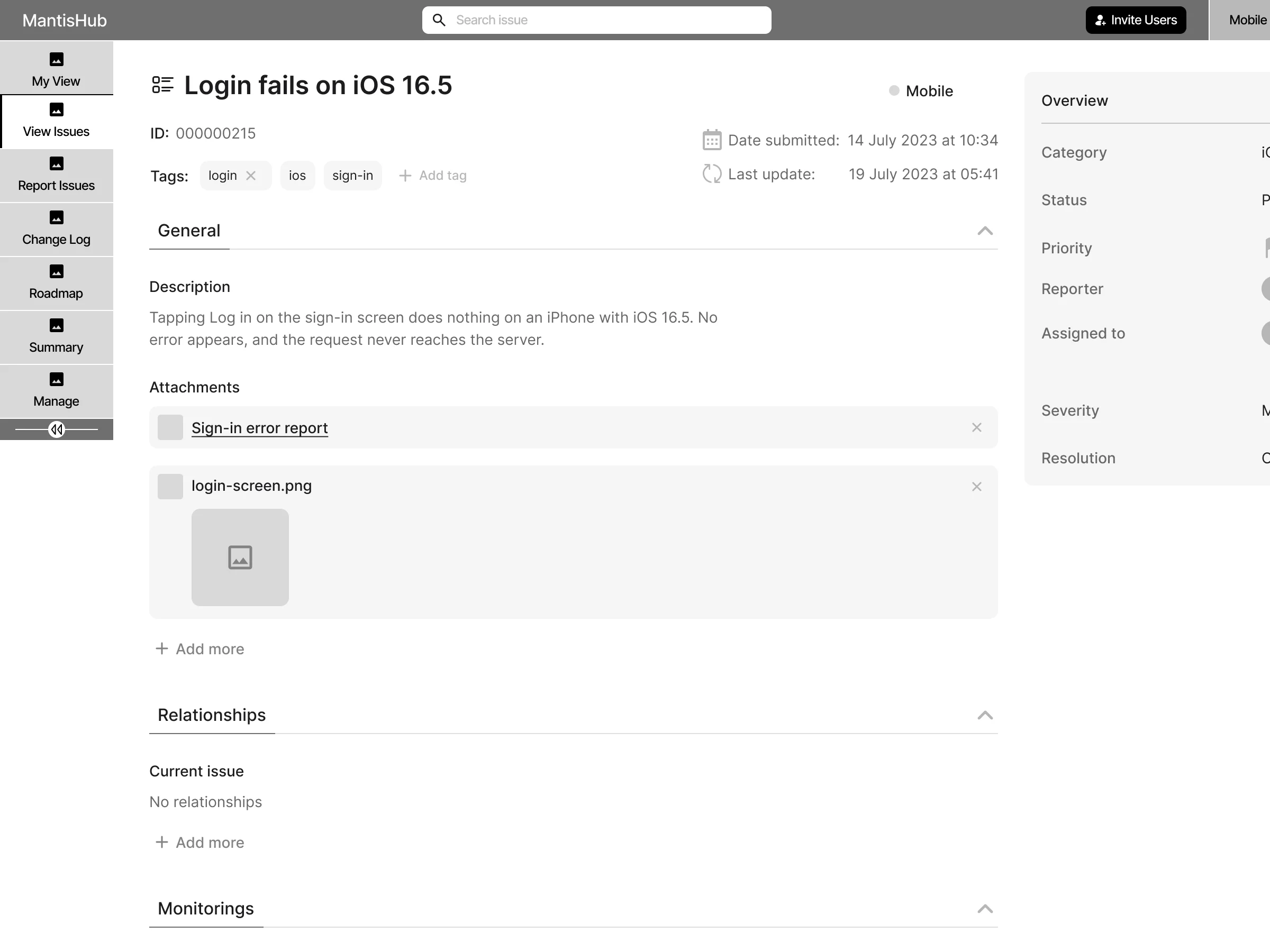
Where every field of an issue lives, before any colour
Artifact Wireframes of the issue page, the issue list and the filters, in iterations
-
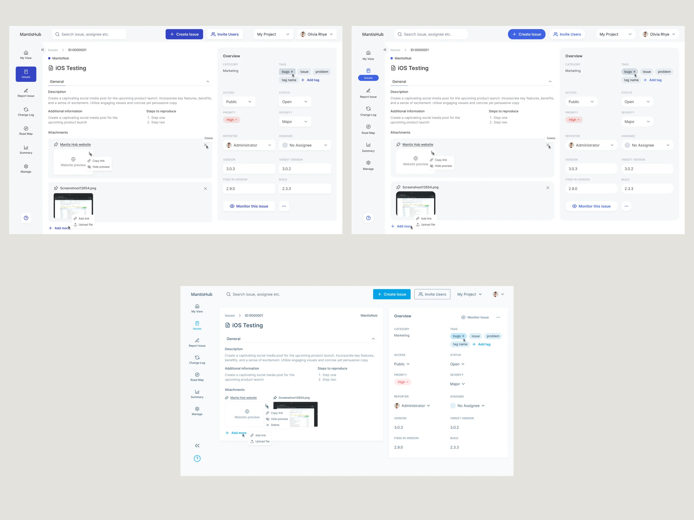
UI & Design System
Which of three visual directions suits a dense tracker, and the parts it’s built from
Artifact Three directions, the final interface for the redesigned workflows, a design system and a UI kit
-
Delivery
What the developers needed to build it, and what the change requests refined
Artifact Screen maps, a clickable prototype and handoff, then second-phase refinements of projects, filters, tables, relationships and notes
One path through an issue, and filters out of the way
- Found
- The old tracker put a full grid of filters above every list, and gave every part of an issue the same weight on the page.
- Decided
- The paths were wireframed first, over three passes: an issue became one page read from the description down to its activity, with the overview beside it, and the filters were grouped by what they filter.
-
Reading an issue
The last wireframe pass: back to the list, the project and ID, then description, steps, attachments and relationships, with the overview at the side.
Open the full map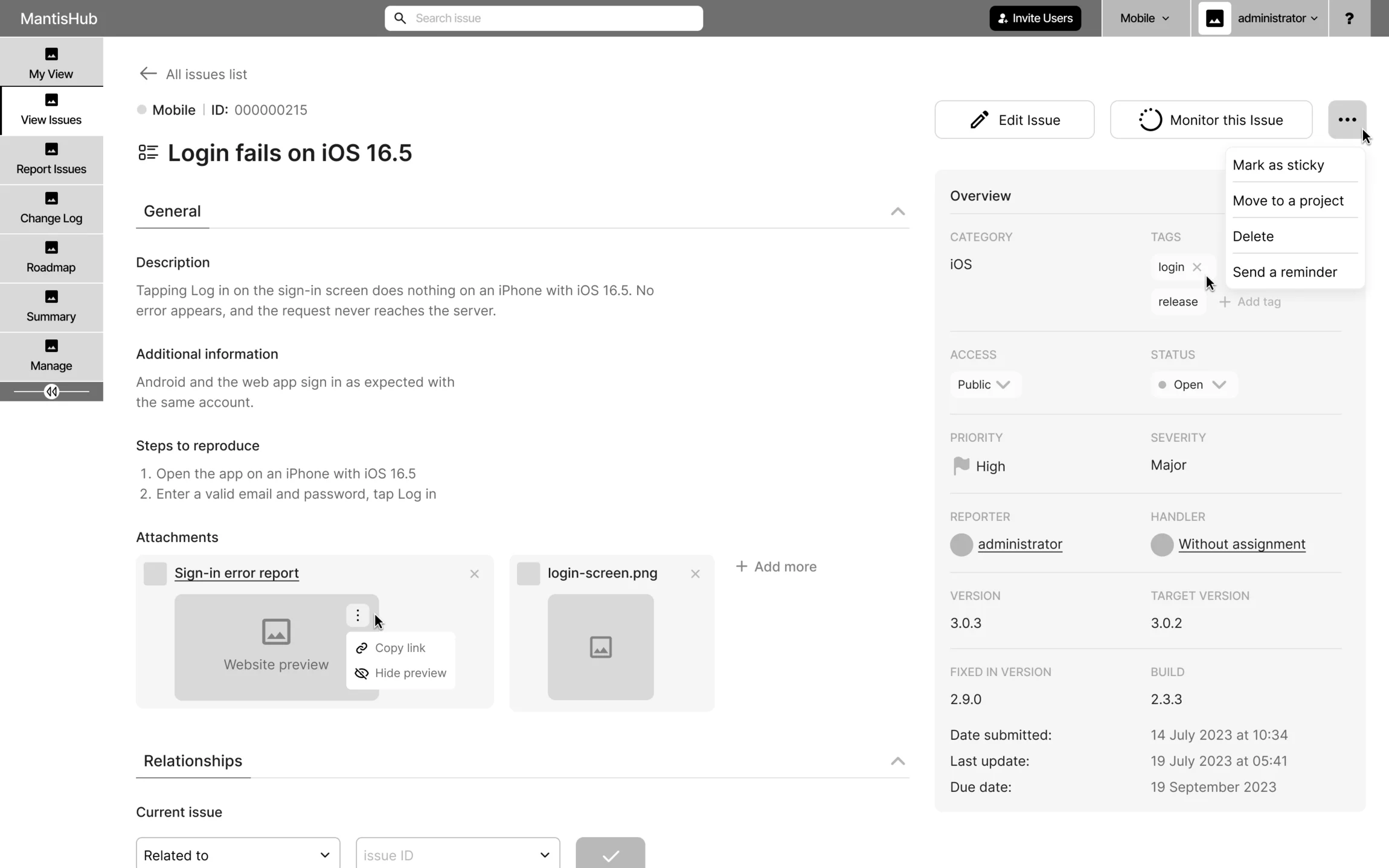
-
Finding an issue
In this pass the filters still sat above the list, grouped into tabs; the final design moved them into their own panel.
Open the full map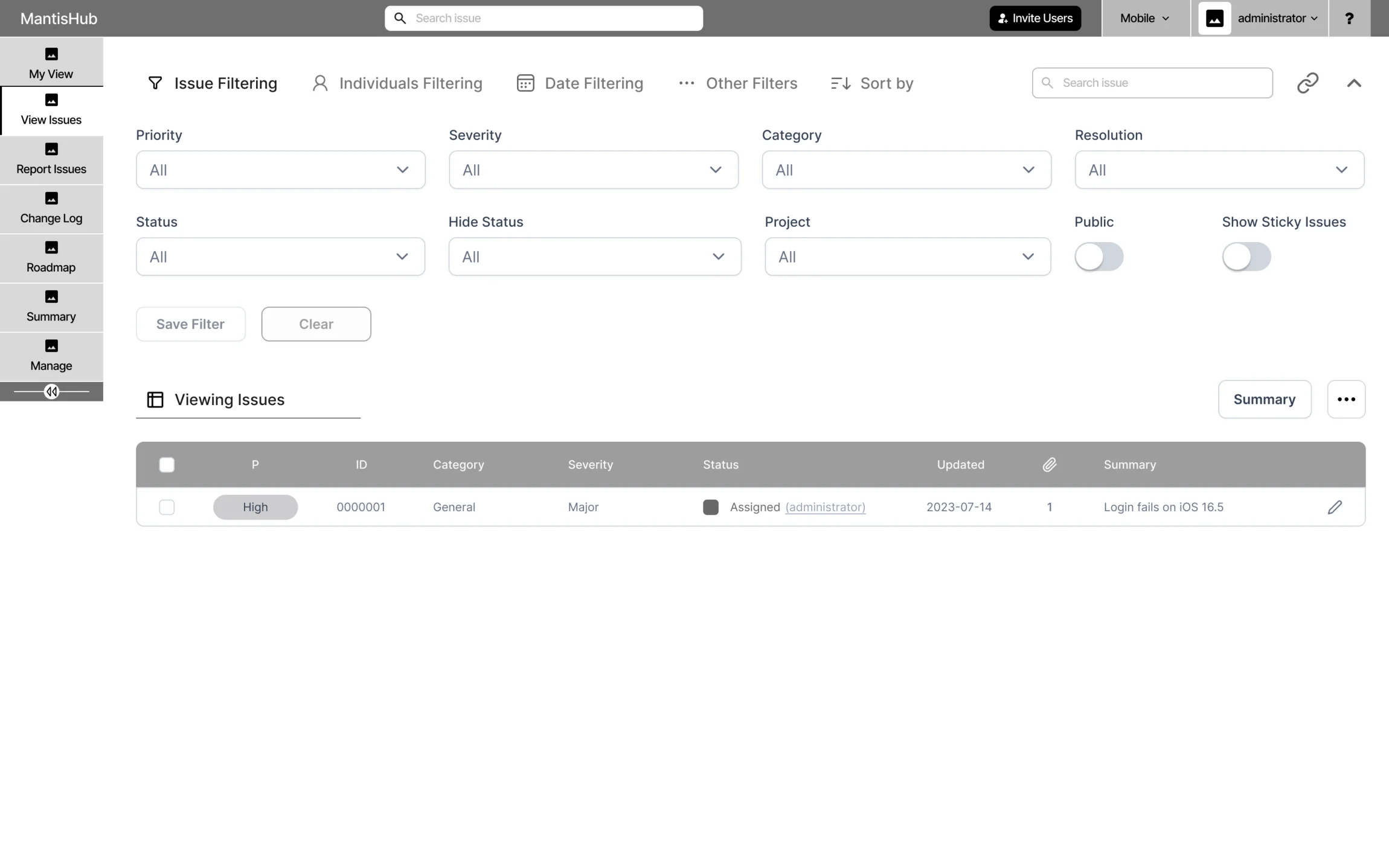
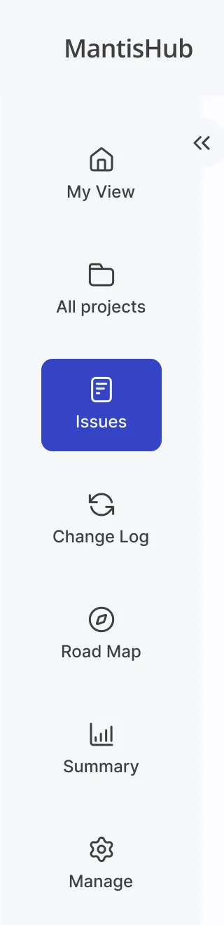
Five jobs, from a project to the last note
In the order a team meets them: find the project, narrow the list, report a new issue, connect it to others, talk it through. Every name and figure on these screens is example data.
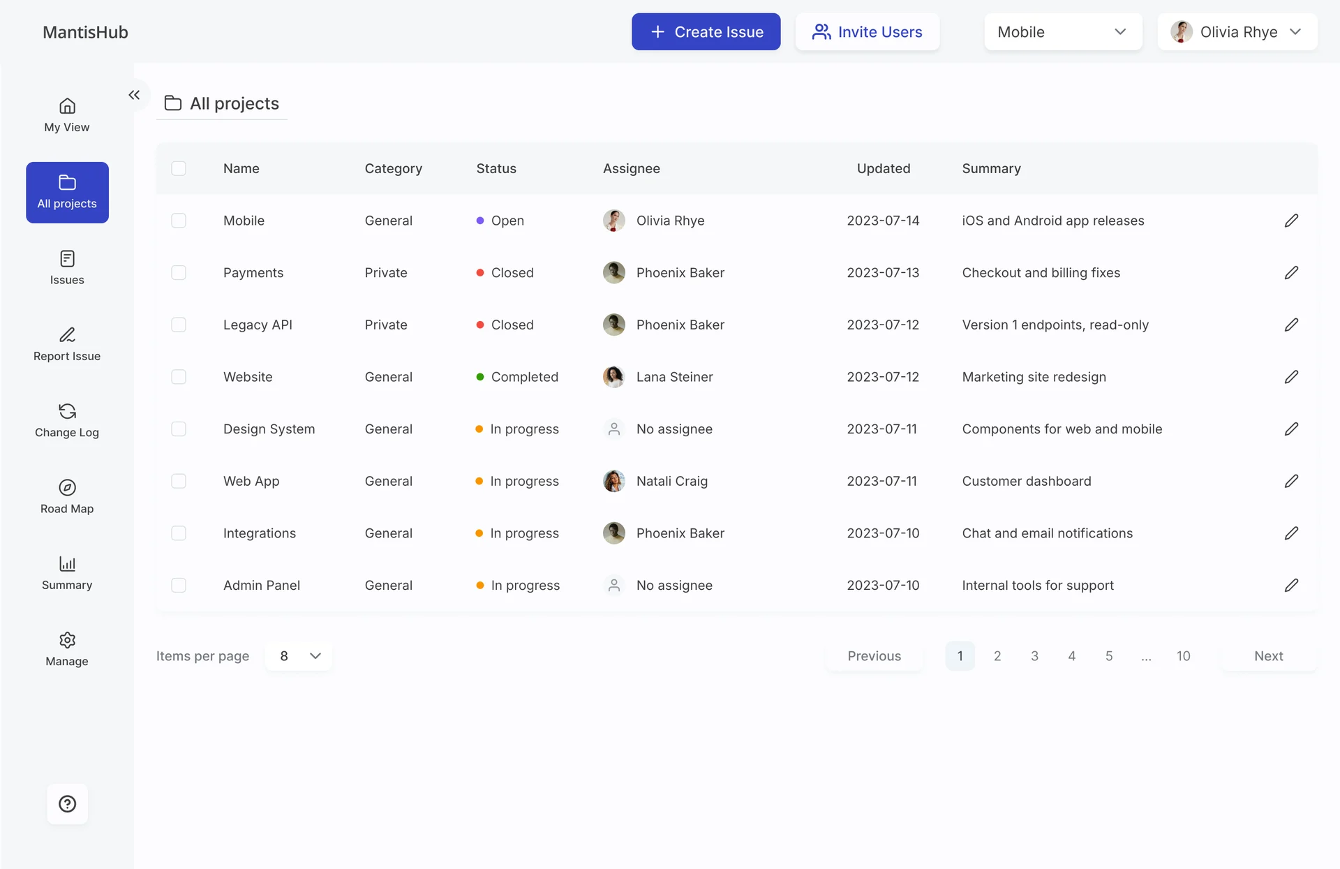
Every project in one table
- Found
- A team runs many projects at once, and moving between them shouldn’t mean remembering which one is still active or who owns it.
- Decided
- An All projects table with category, status, owner, last update and summary; a row opens that project’s issues.
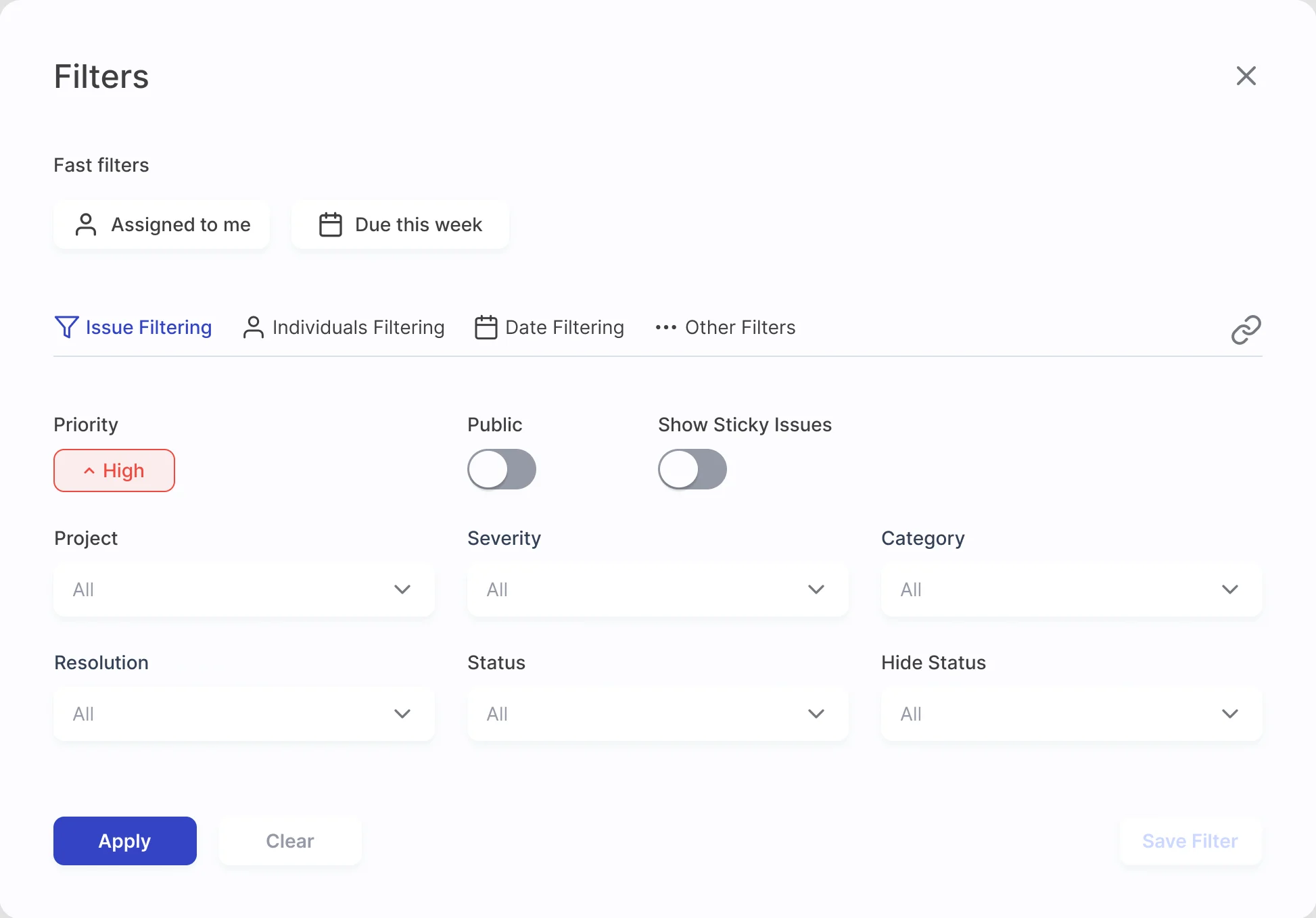
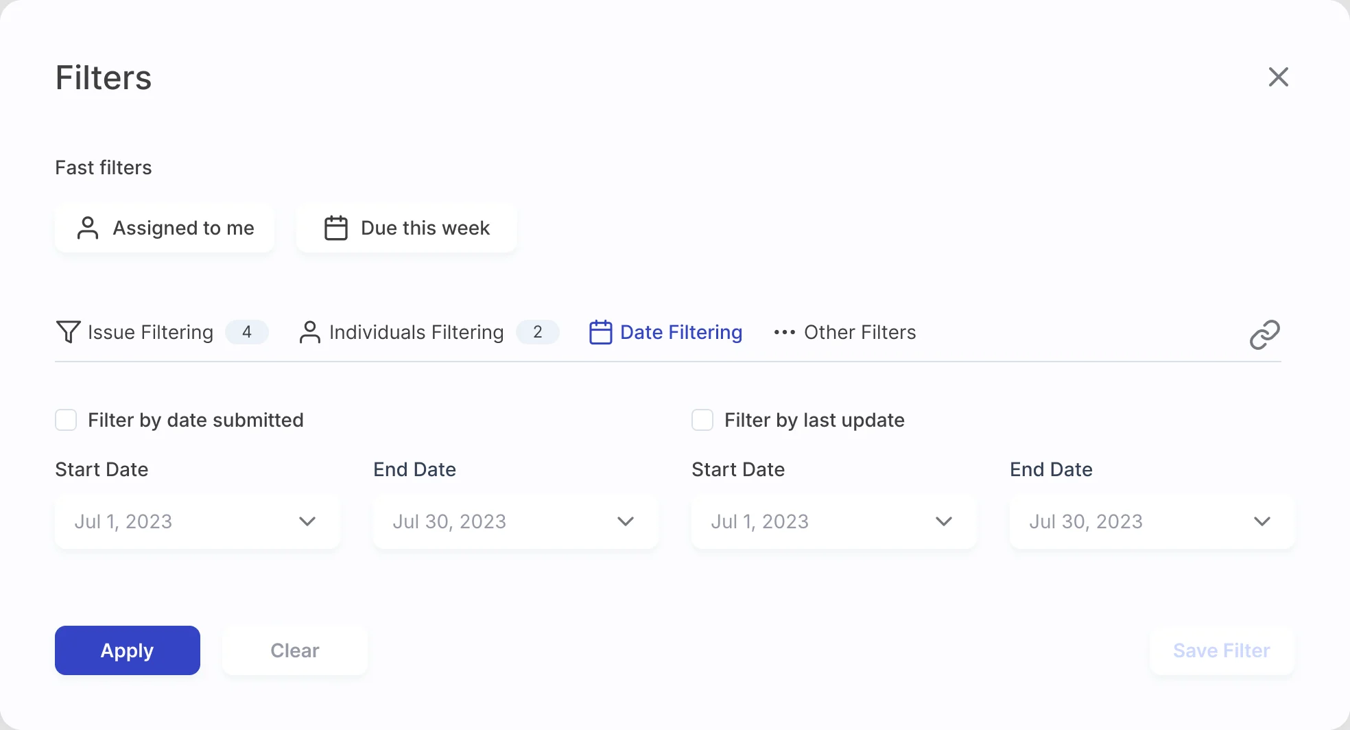
Filters that wait until they’re needed
- Found
- Saved, custom and active filters were powerful, but they filled the top of every list with fields and hid which ones were applied.
- Decided
- One Filters panel: fast filters for the usual cases, then issue, people, date and other criteria in tabs, each tab counting the criteria applied, with Clear and Save Filter below.
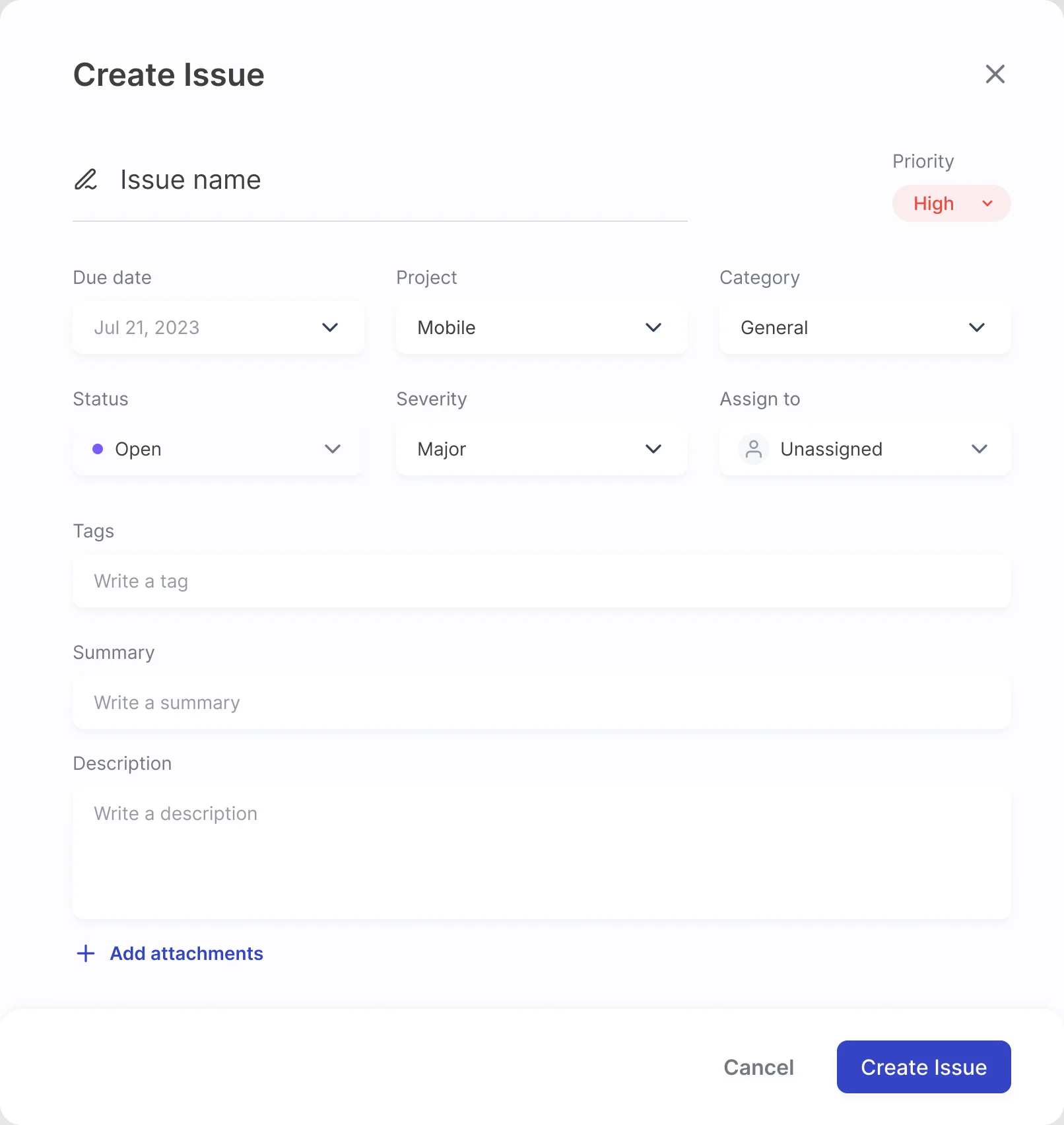
A new issue in one dialog
- Found
- A good bug report needs a dozen fields, and a long page of them invites half-filled reports.
- Decided
- Create Issue opens from any screen: the name and priority first, then due date, project, category, status, severity and assignee in one grid, then tags, summary, description and attachments.
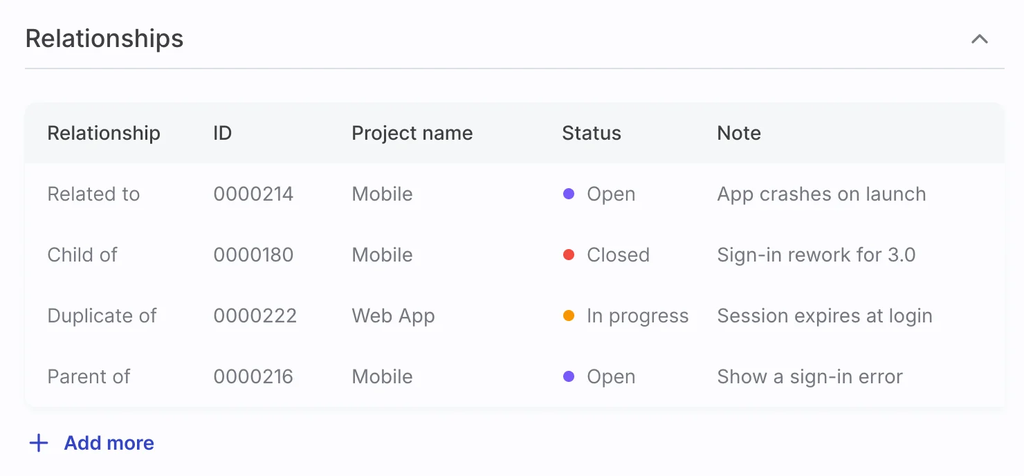
Relationships you can read
- Found
- Duplicates, parents and related issues were a line of IDs, and each had to be opened to learn what it was.
- Decided
- A relationships table on the issue: the type, the ID, the project, the status with its colour and a short note, with Add more below.
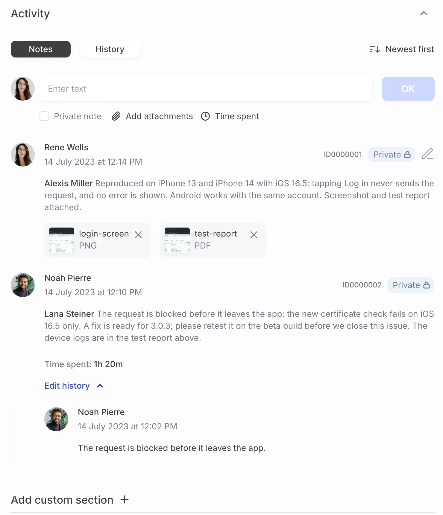
Notes and their history in one place
- Found
- Long issues collect notes, private remarks and field changes, and the thread gets hard to follow.
- Decided
- An Activity block with Notes and History tabs and newest first; each note shows its ID, a Private badge where it applies, mentions, attachments, time spent and its edit history.
One set of parts for dense screens
- Found
- A calmer look can’t come from dropping the status colours, warnings and badges that dense tables depend on.
- Decided
- A design system and UI kit for the redesigned scope: chips for priority and tags, status dots, avatars, pickers and inline fields, each drawn once and reused.
One people picker, two jobs
The same list, with avatars and a check, mentions a teammate in a note and adds a watcher to an issue.
-
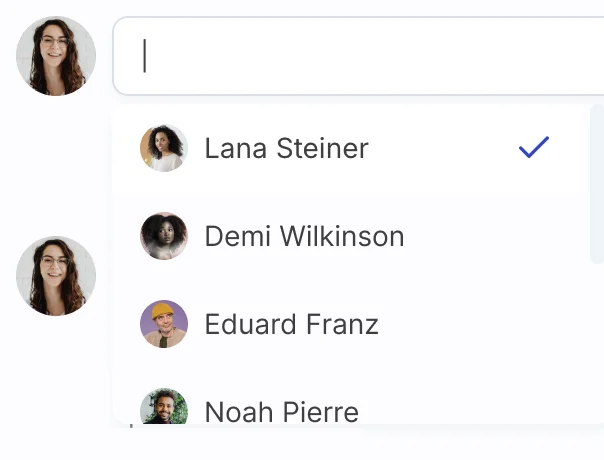
Notes: Mentioning a teammate. -
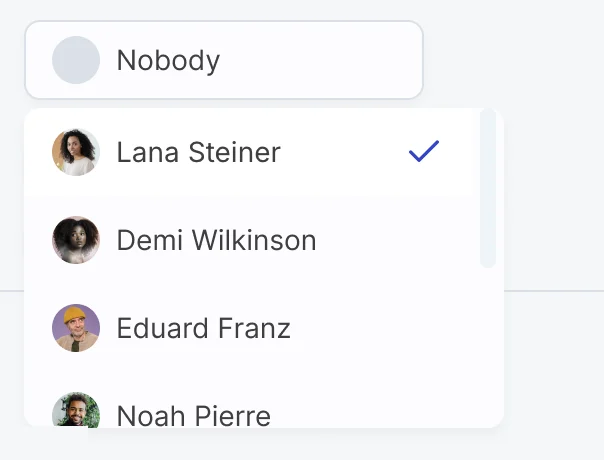
Monitoring: Adding someone who follows the issue.
Adding an attachment, step by step
An empty link field, a pasted link ready to add, and a file uploaded next to the rest.
-
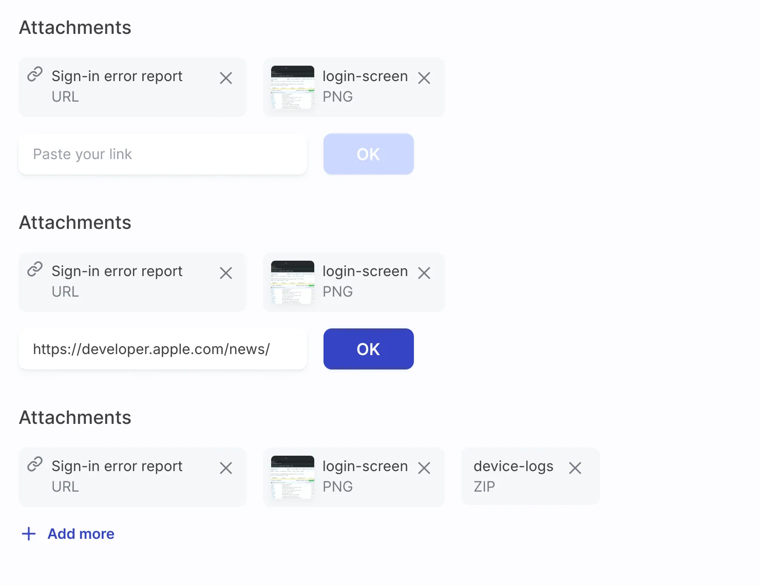
Empty, pasted, uploaded
Where the product ended up
MantisHub’s busiest web workflows redesigned in a calmer look that keeps the density experienced users rely on: projects, the issue list and its filters, reporting, and the issue page with its relationships, attachments, notes, history and monitoring.
Delivered with screen maps, a clickable prototype, and a design system and UI kit for the redesigned scope, then refined through a second phase of change requests and handed to MantisHub’s developers.
- screens
- 52
- people on the ANODA team
- 3
- design phases
- 2
Afraid a cleaner UI will cost your power users?
In MantisHub, the busiest issue workflows got a calmer look without losing the fields experienced users read at a glance. Bring us your densest screen, and we’ll show you what to calm down and what to keep.
More work like this
Three more products people already worked in every day, redesigned without starting over.
-
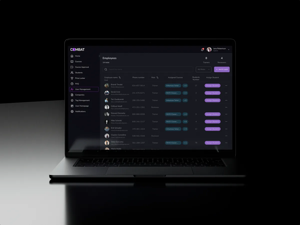
Sales training · Desktop web platform
Combat Sales
Reworked a sales-training platform for five roles in the look its users already knew, and designed new features into it.
- 80+ Final desktop screens and interaction states
- 5 Roles in one platform
-
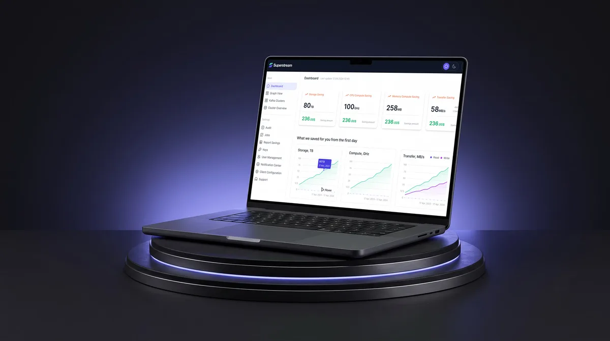
AI Hi-Tech · SaaS
Superstream
Turned a Kafka management platform’s dense technical data into one calm, consistent interface for DevOps teams.
- 3000+ Screens designed
- 1500h+ Design hours
-
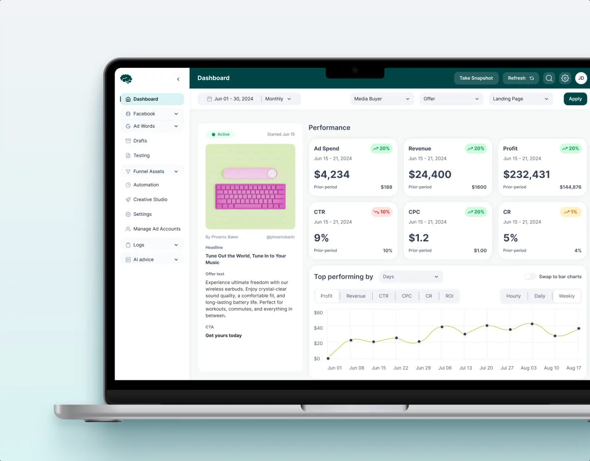
MarTech · Ads analytics · Web SaaS
Concussion Media
Audited a paid-traffic SaaS and rebuilt its modules around the numbers its teams act on.
- 400+ Screens and states
- 11 Modules designed and approved by the client