
Kafka management UX design, complexity tamed
Clusters, Optimizations and AI Insights redesigned as one calm product system, on web and tablet.
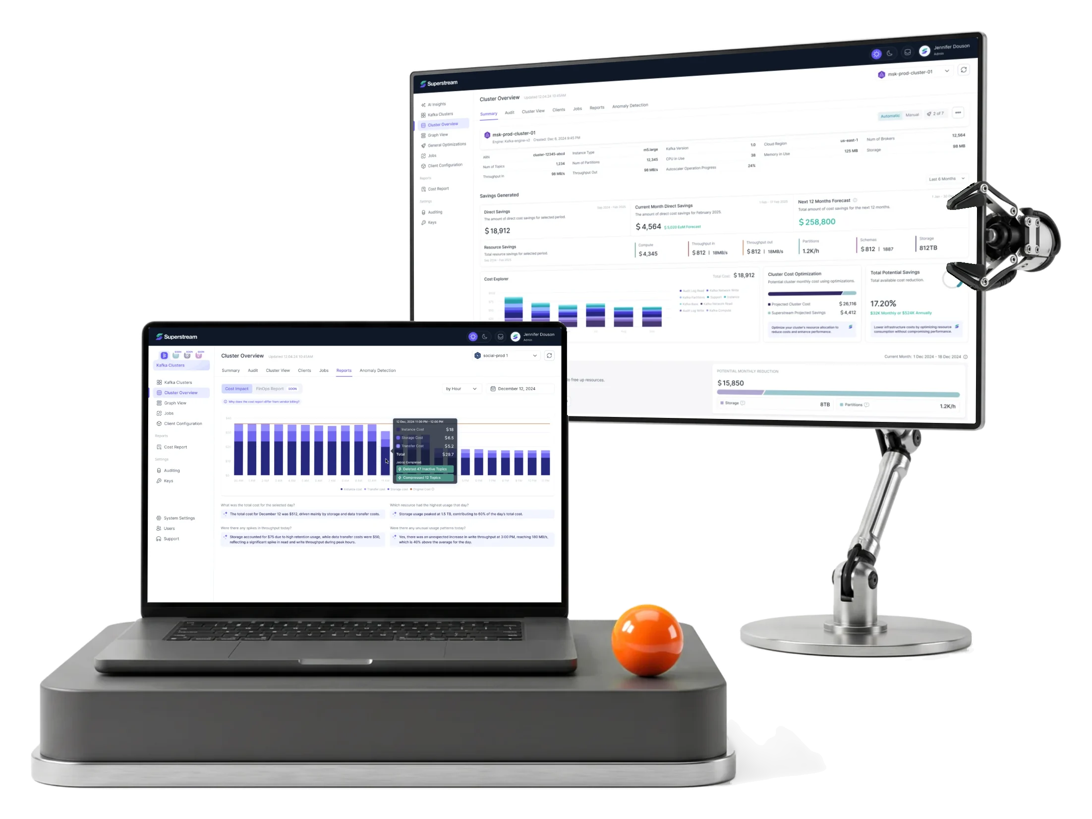
- 67%
- faster to the aha moment: median time to first savings insight
- 3,000+
- screens and states for web and tablet, in light and dark mode
- 1,500h+
- of design work
- 4
- experts PM, lead, UX and UI designers
Project summary
Superstream is a Kafka management and optimization platform for DevOps and infrastructure teams. It came to us with developer-assembled screens and no product design. We built the UX, UI and design system from scratch — research, information architecture, flows, wireframes and handoff — for Clusters, Optimizations and User Management, on web and tablet, in light and dark mode .
How we worked together
- Duration
- February 2024 – December 2025
- Our team
- PM, lead designer, UX designer, UI designer
- Their team
- CPO, front-end developer, PM
- Start
- Kickoff in a week and a half; five 90-minute workshops on the product and its business logic
- Rhythm
- Flows reviewed with the CPO every week; design updates delivered every two weeks
- Delivery
- Phase by phase, each through Zeplin, a numbered screen map and a clickable prototype
- Tools
- Figma, FigJam, Slack, Jira, Loom
- Today
- Live at superstream.ai and growing. Our scope is done; the Superstream team builds on the system we left.
One product, many technical decisions
Cluster monitoring, infrastructure costs, optimization opportunities, configuration and user management. Each was useful alone; together they made a dense place to decide.
People needed to see what was happening, where attention was needed, and what to do next.
-
Clusters
- Connected clusters
- Topics and throughput
-
Health
- Status and usage
- Anomaly detection
-
Optimizations
- Idle topics, compression
- Producer batching
-
Costs and savings
- Cost explorer
- Savings to date
-
Action
- Manual approval
- or automatic apply
- Dense data and clear action
- Technical information stays precise without making the interface intimidating or hard to scan.
- Separate views and one product
- Clusters, Optimizations and Users feel like parts of one system, not three tools side by side.
- Product depth and consistent behaviour
- Thousands of screens, two layouts and dark mode share one set of components, states and rules.
The same Kafka data, before and after
- Found
- A cluster screen could hold status, usage, costs, savings, configuration and history at once. At equal weight, nothing stood out.
- Decided
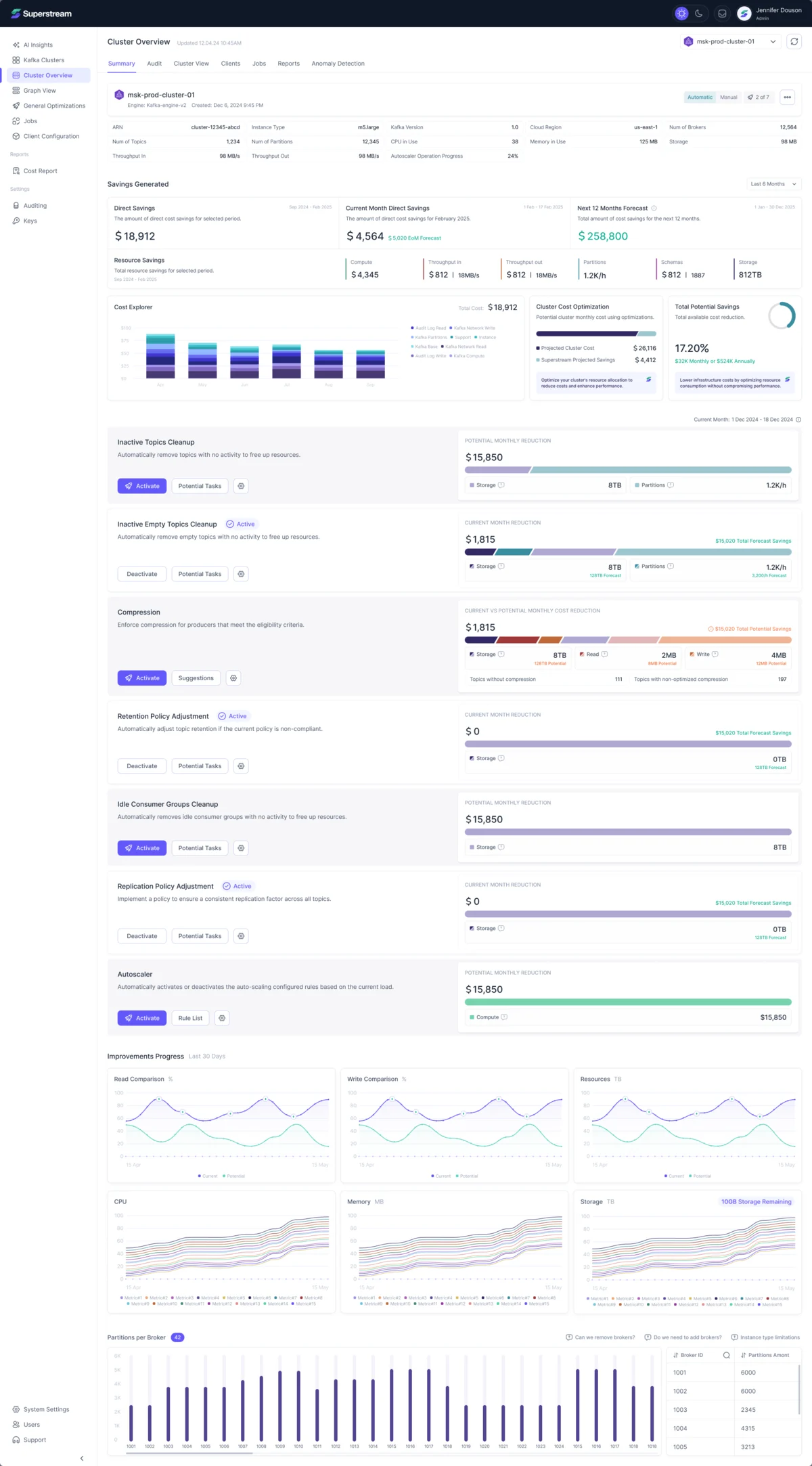
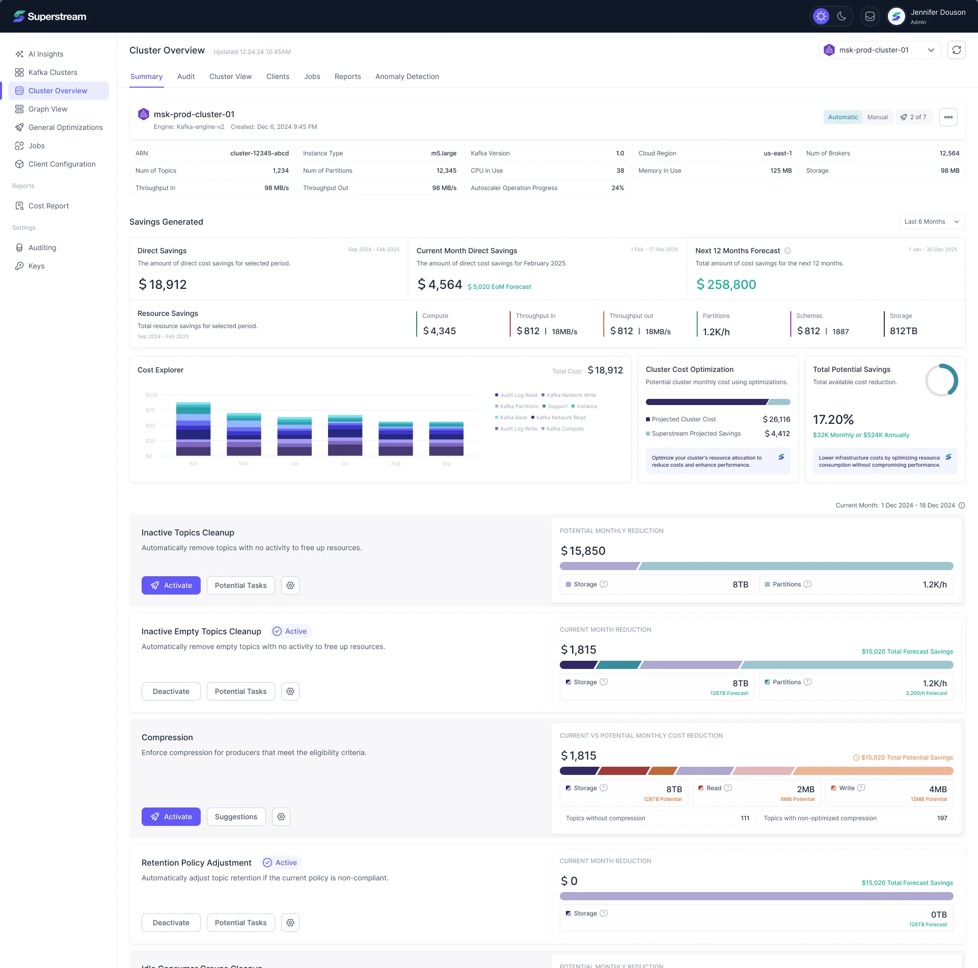
- One order on every overview: the cluster’s state first, then what it saves and costs, then each optimization with its action beside it.
- For the user
- A team sees where the cluster stands and what it can save before reading a table, and acts from the same card.
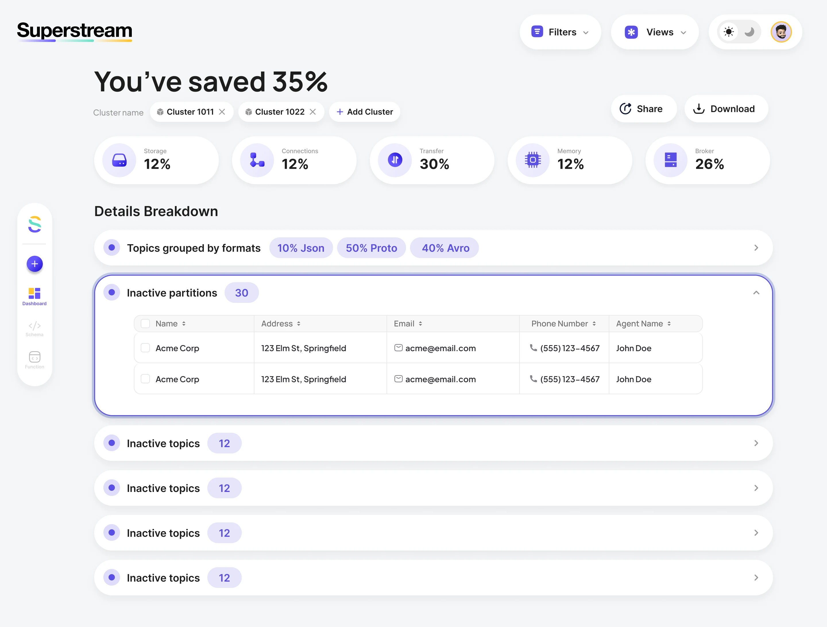
- In the way
- Savings came as percentages with no amounts, every finding was a collapsed row of equal weight, and nothing on the page said what to do next.
-
Where the cluster stands
Engine, brokers, topics, partitions, throughput and storage in one band at the top.
-
What it saves and costs
Savings to date, this month and the year ahead, then the cost explorer and the projected total.
-
What to do next
Each optimization states its reduction and carries its own action: activate it, see its tasks, or leave it running.
How the work progressed
Six phases, each closing a question the product had and leaving something the team could check and build on.
-
Discovery
15 hrs
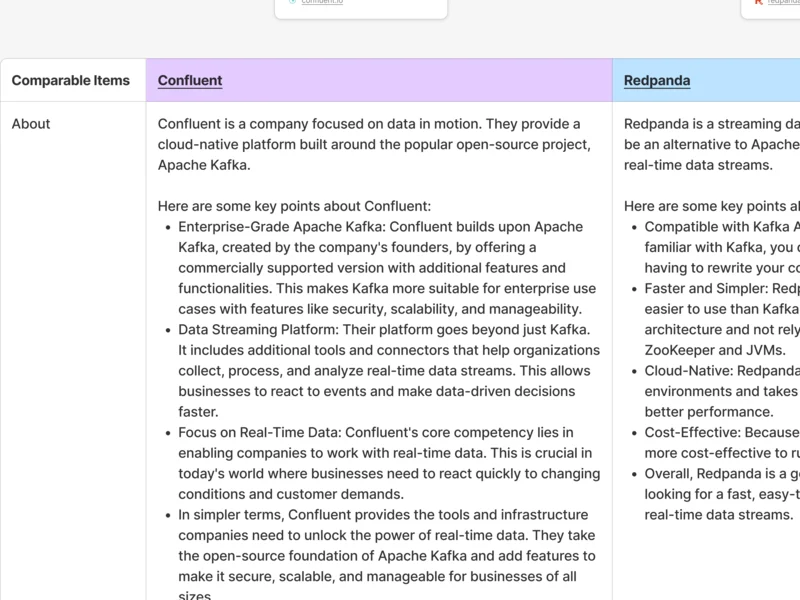
How Kafka management works, and how other tools surface its data
Artifact Five 90-minute domain workshops with the client, then competitor research
-
User Flow
200 hrs
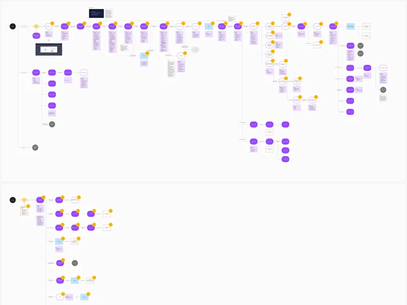
Three views with their own logic, joined into one way through
Artifact Information architecture, flow and journey maps
-
Wireframes
300 hrs
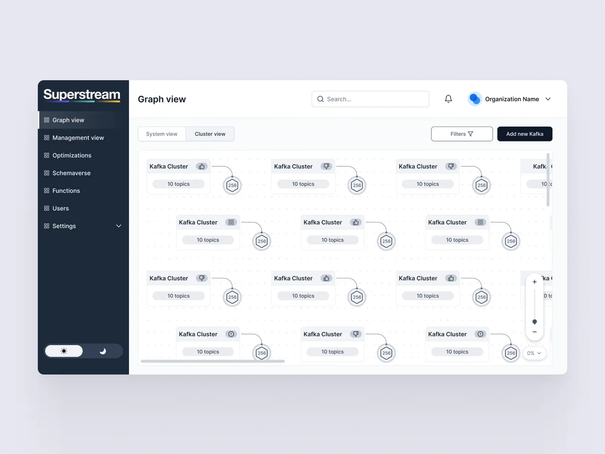
A structure for dense data and navigation, before any visual choice
Artifact High-fidelity wireframes
-
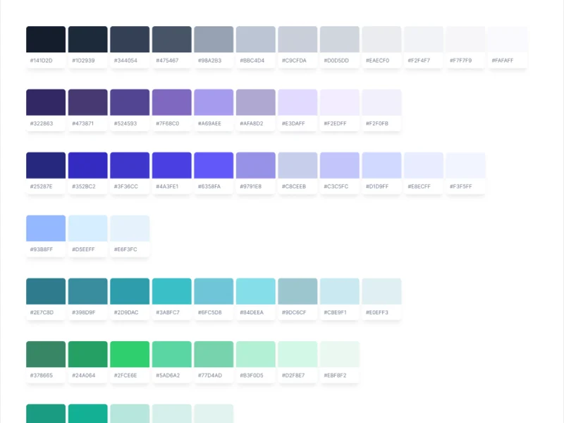
UI & Design System
700 hrs+
A visual language that keeps data readable, in light and in dark
Artifact UI and a design system, simple and extended
-
Adaptives
200 hrs
The same product holding its layout and legibility on tablet
Artifact Responsive layouts for web and tablet
-
Delivery
80 hrs
A build the engineers could follow without guessing
Artifact UI kit, numbered screen map, clickable prototype, Zeplin export
From separate views to one navigable product
- Found
- Dashboard, Optimizations and Kafka management each showed a different kind of technical data, but people moved between them as one job.
- Decided
- A shared information architecture and one navigation model that connect the three without flattening what makes each different.
-
Dashboard
A first-time user meets the setup one step at a time: welcome, an empty state that says what to do, then connecting a data plane in a stepper.
Open the full map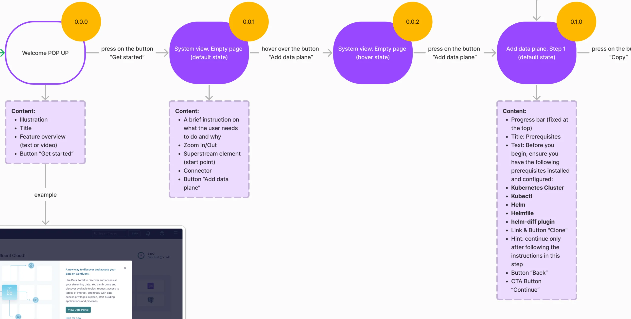
-
Optimizations
One summary for every cluster, split into compute, storage, transfer and reliability, so savings read by category before the table.
Open the full map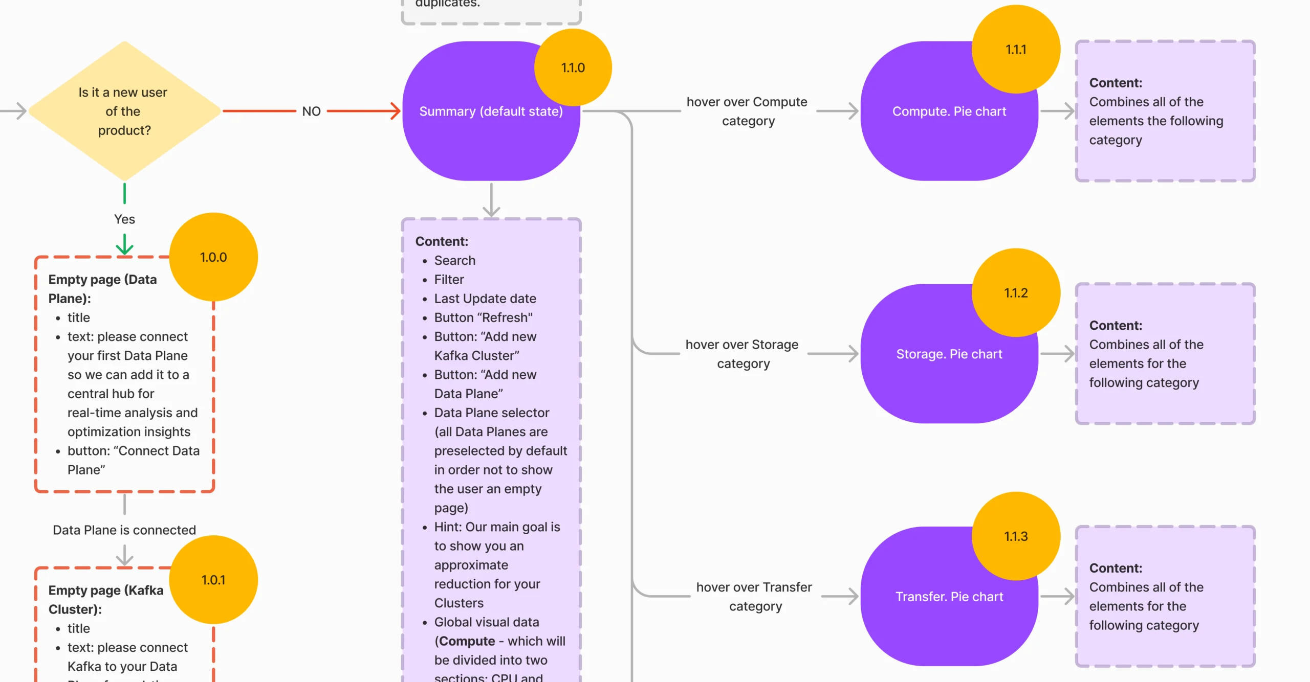
-
Kafka management
Every cluster in one list, with its health up front: an unhealthy cluster says why, and search and filters end in a clear no-result state.
Open the full map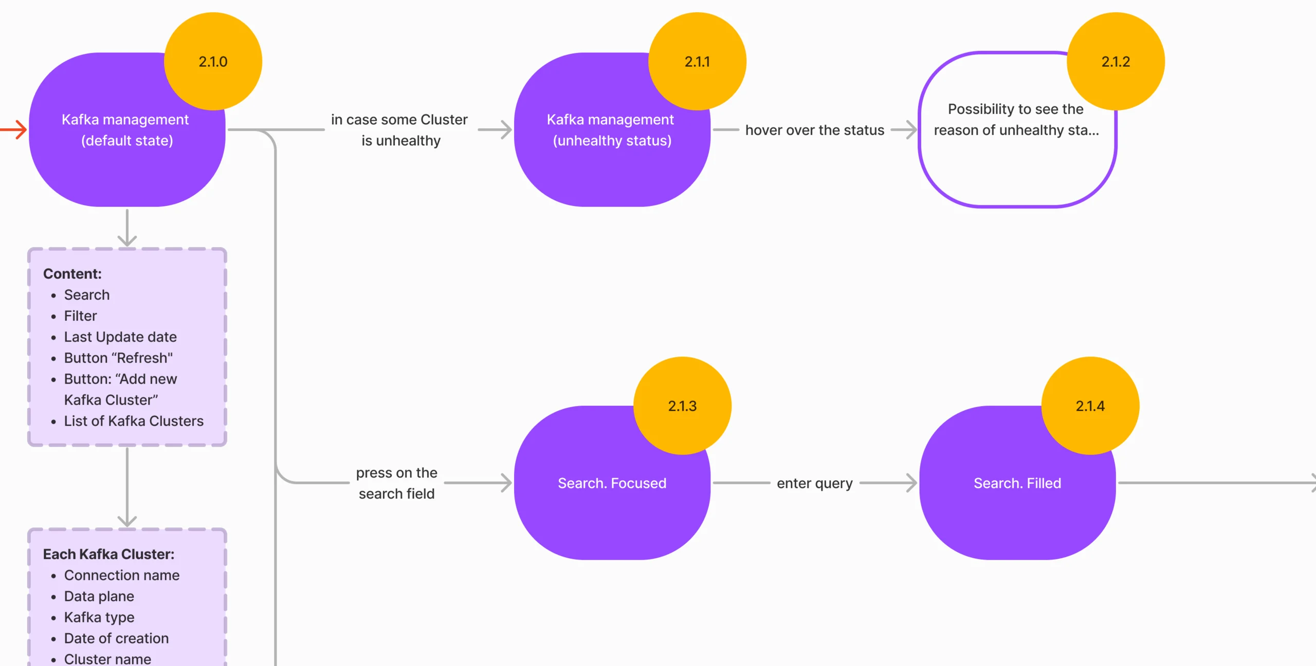
Five jobs a DevOps team comes to Superstream for
From the first connection to asking the product itself, in the order a team meets them.
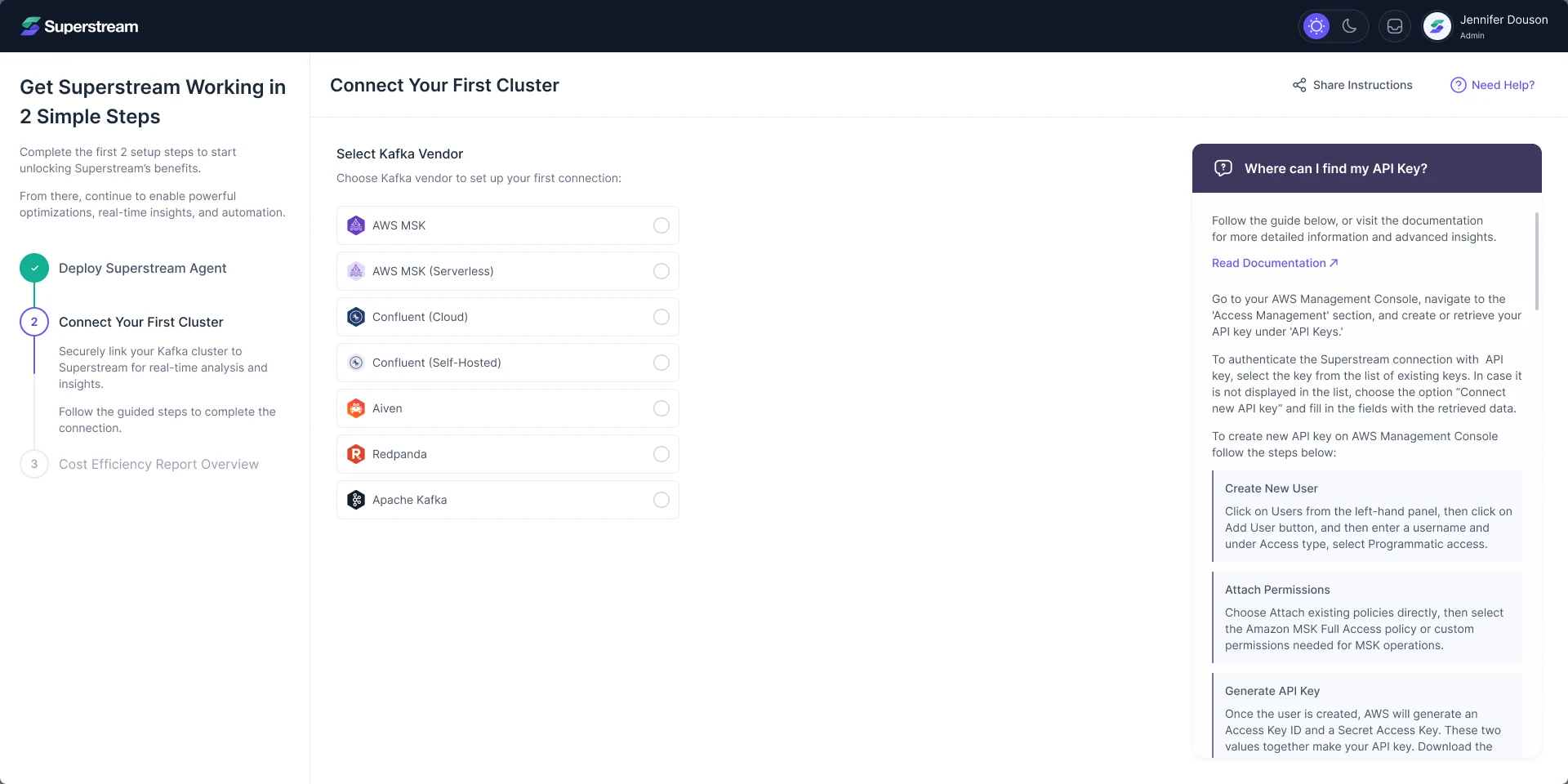
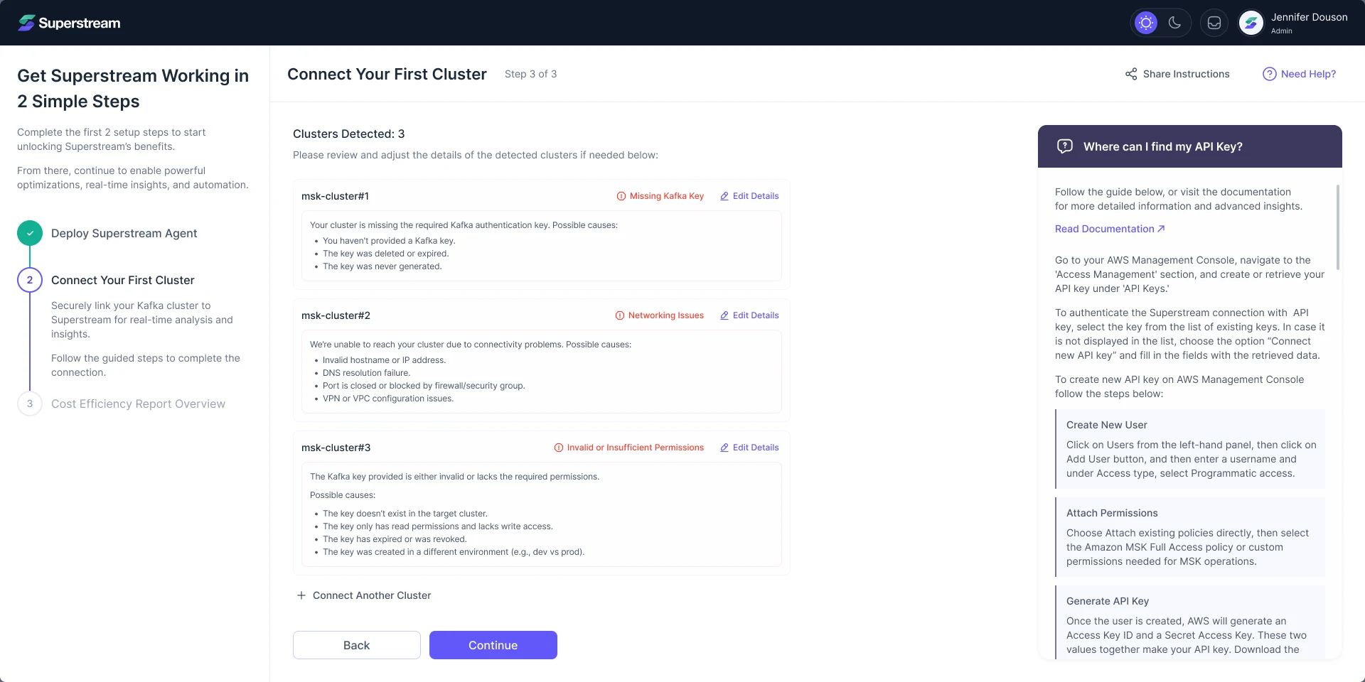
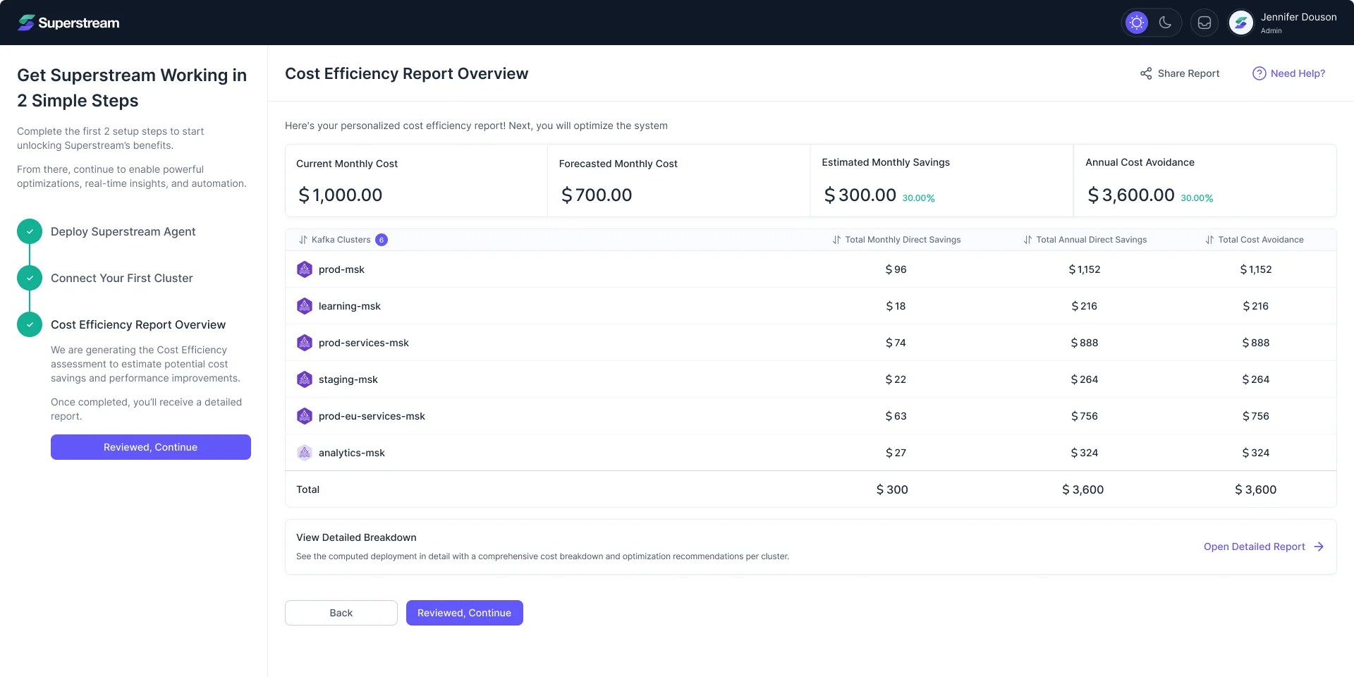
Connecting a cluster
- Found
- Every Kafka vendor asks for different credentials, and a failed connection usually ends in a vague error and a support ticket.
- Decided
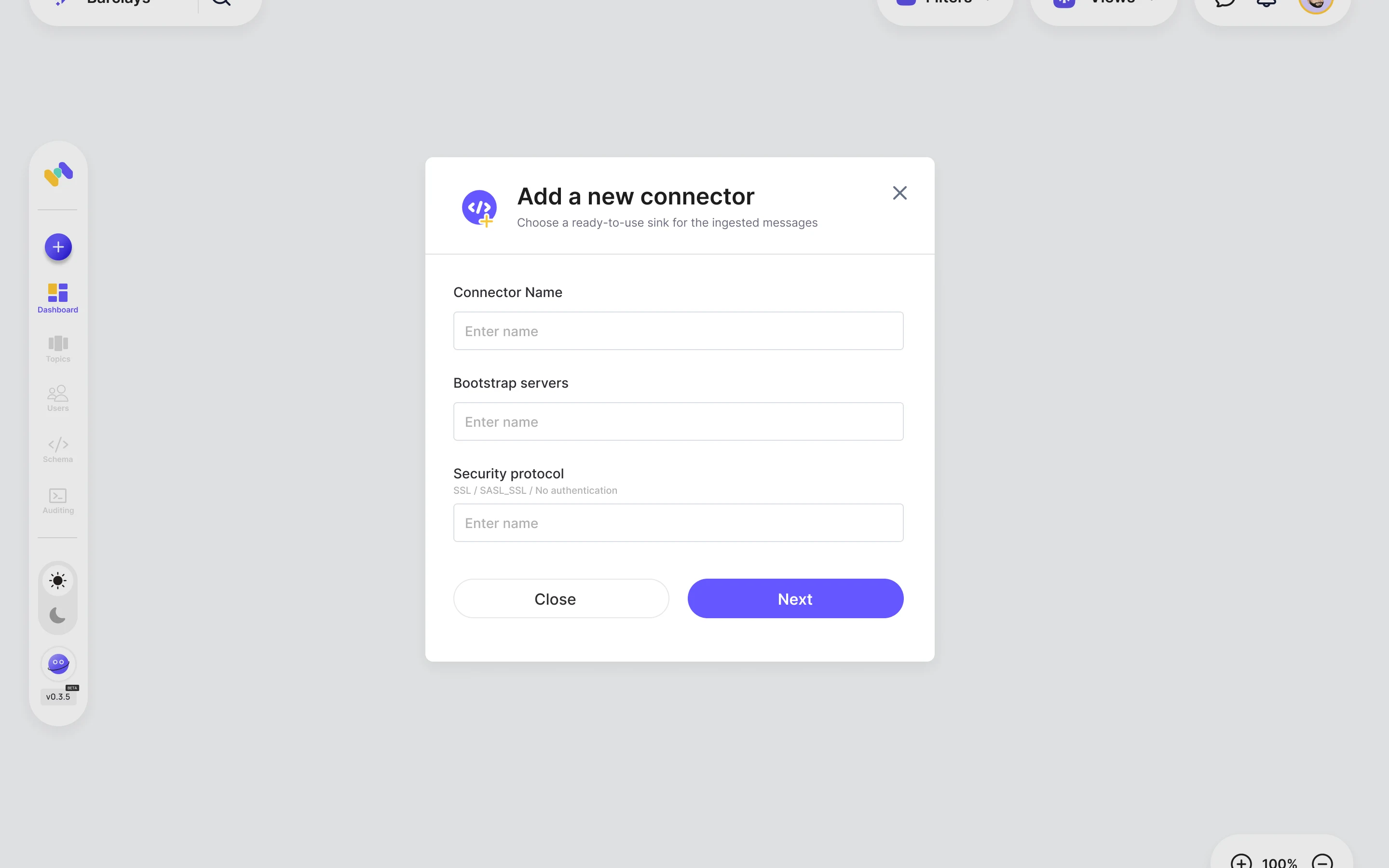
- One guided flow for seven vendors, with setup help beside the form. Detected clusters name what is missing in place, and the flow ends on the savings Superstream expects to find.
Seeing the whole account
- Found
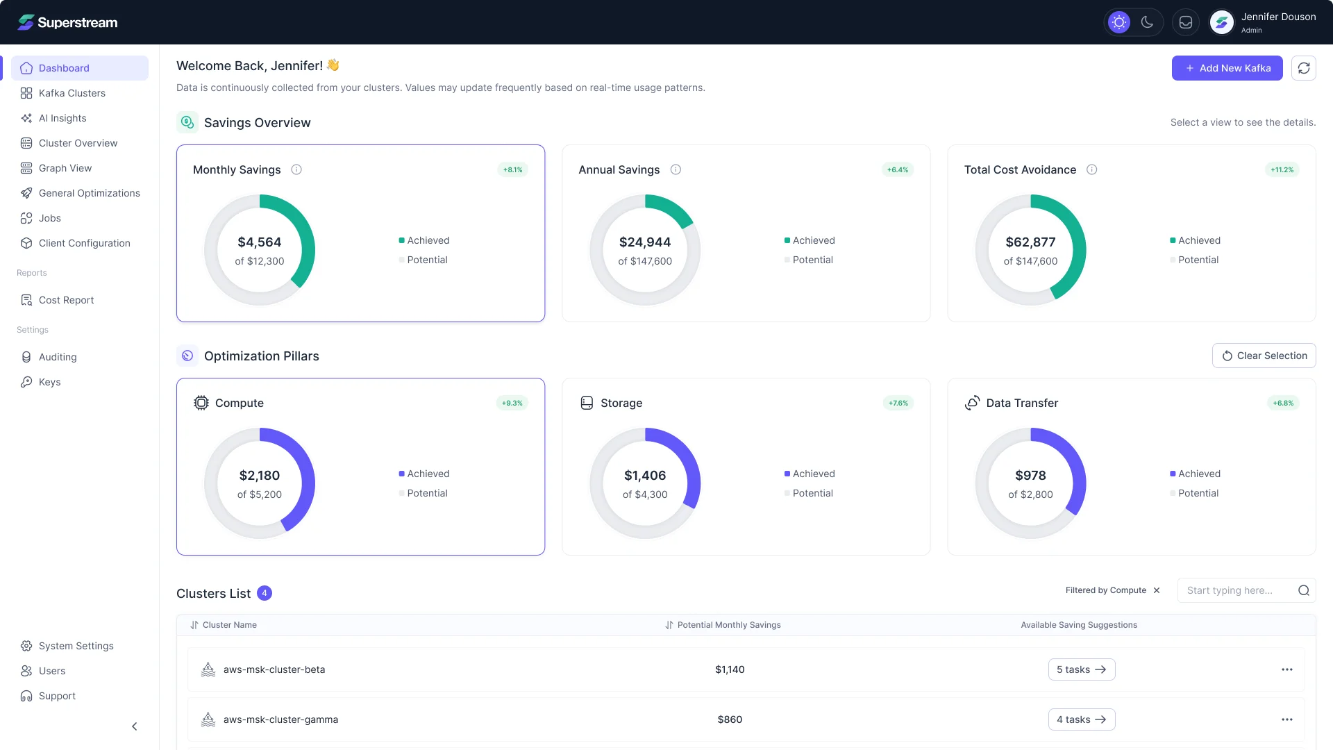
- Savings lived inside each cluster, so no one could see where the account as a whole was losing money.
- Decided
- The dashboard adds savings up across clusters, achieved against potential, and splits them into pillars: compute, storage, data transfer. Picking a pillar filters the cluster list to where it applies.
Running an optimization
- Found
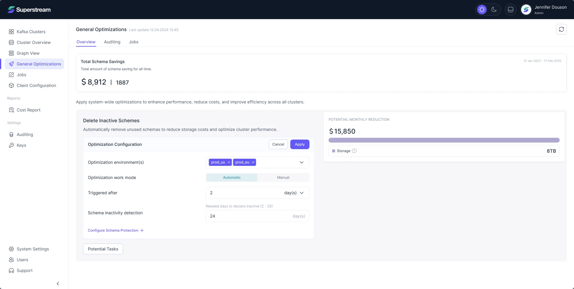
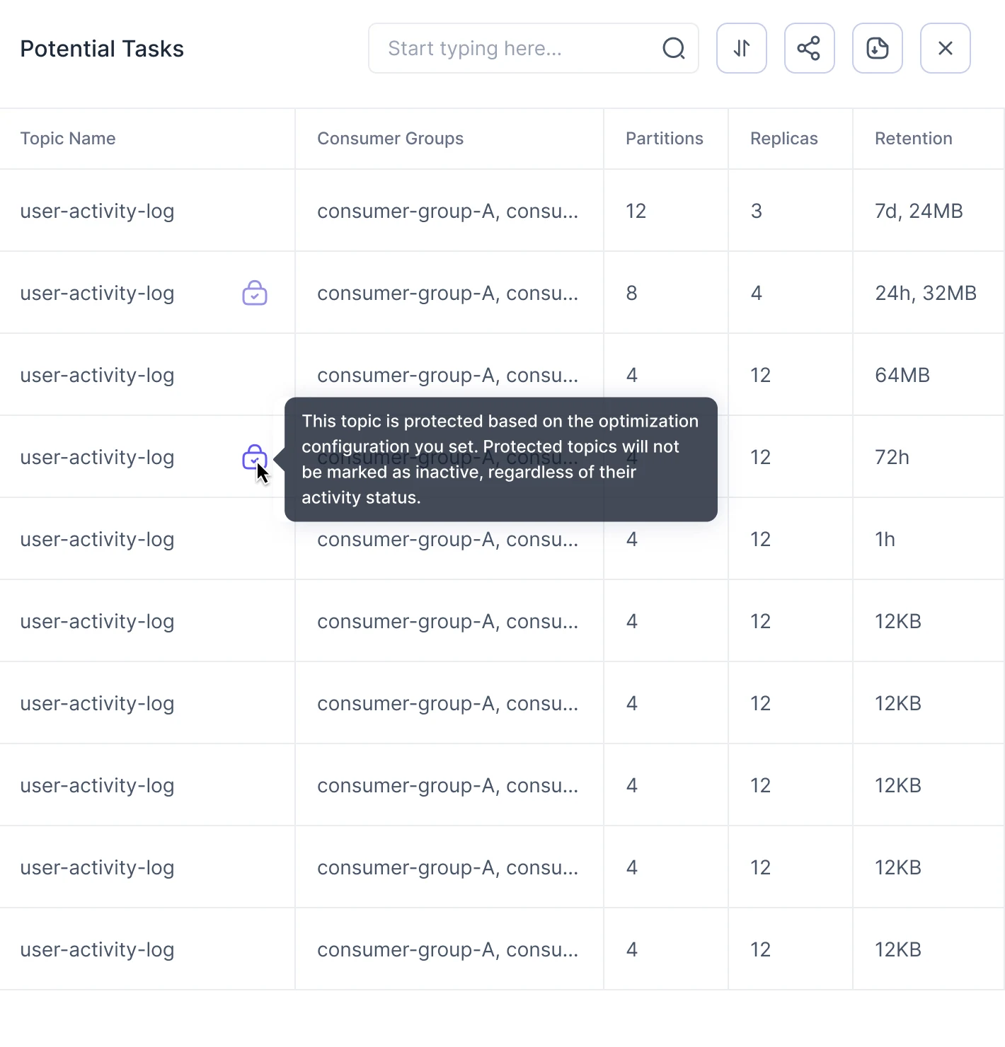
- Optimizations change live topics and consumer groups. Teams won’t switch on what they can’t inspect first.
- Decided
- Every optimization shows its monthly reduction, its settings and the exact topics it would touch before it runs. Protected topics are marked and left alone.
Proving the savings
- Found
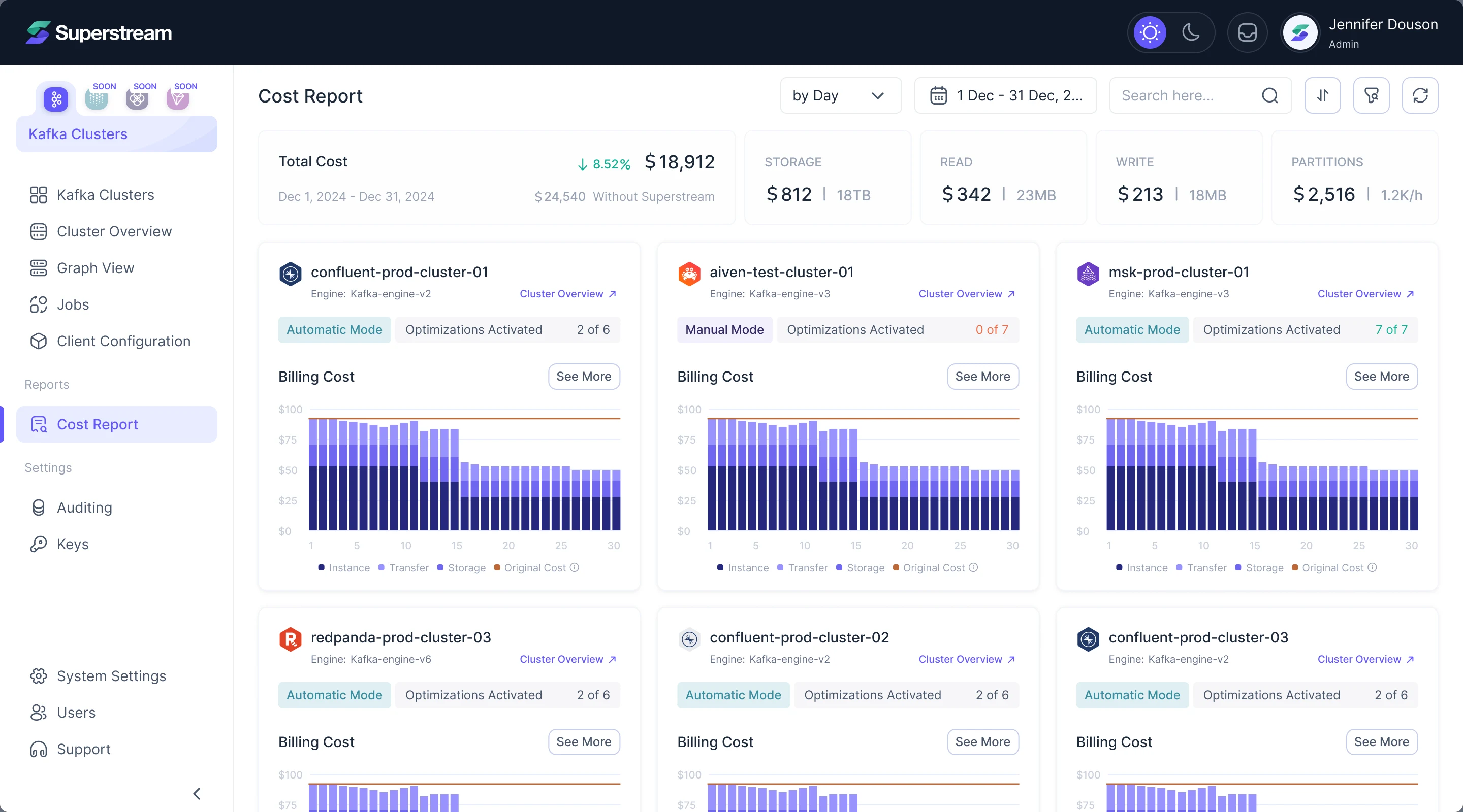
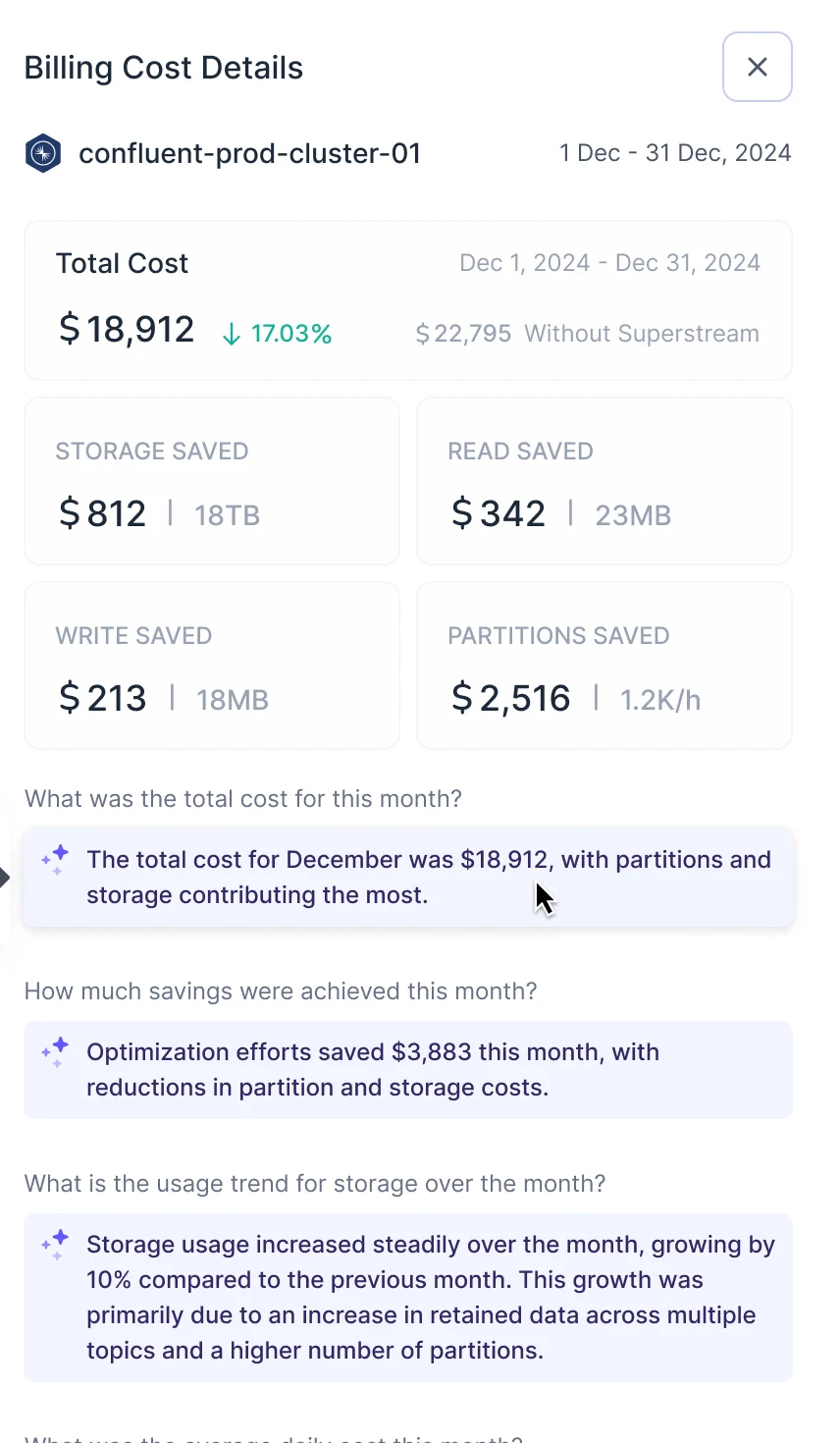
- Vendor bills show a total, not which cluster or resource made it grow.
- Decided
- Cost per cluster by hour, day or month, split by resource, with the original cost drawn for comparison. The details answer plain questions, and insights written by AI are marked as such.
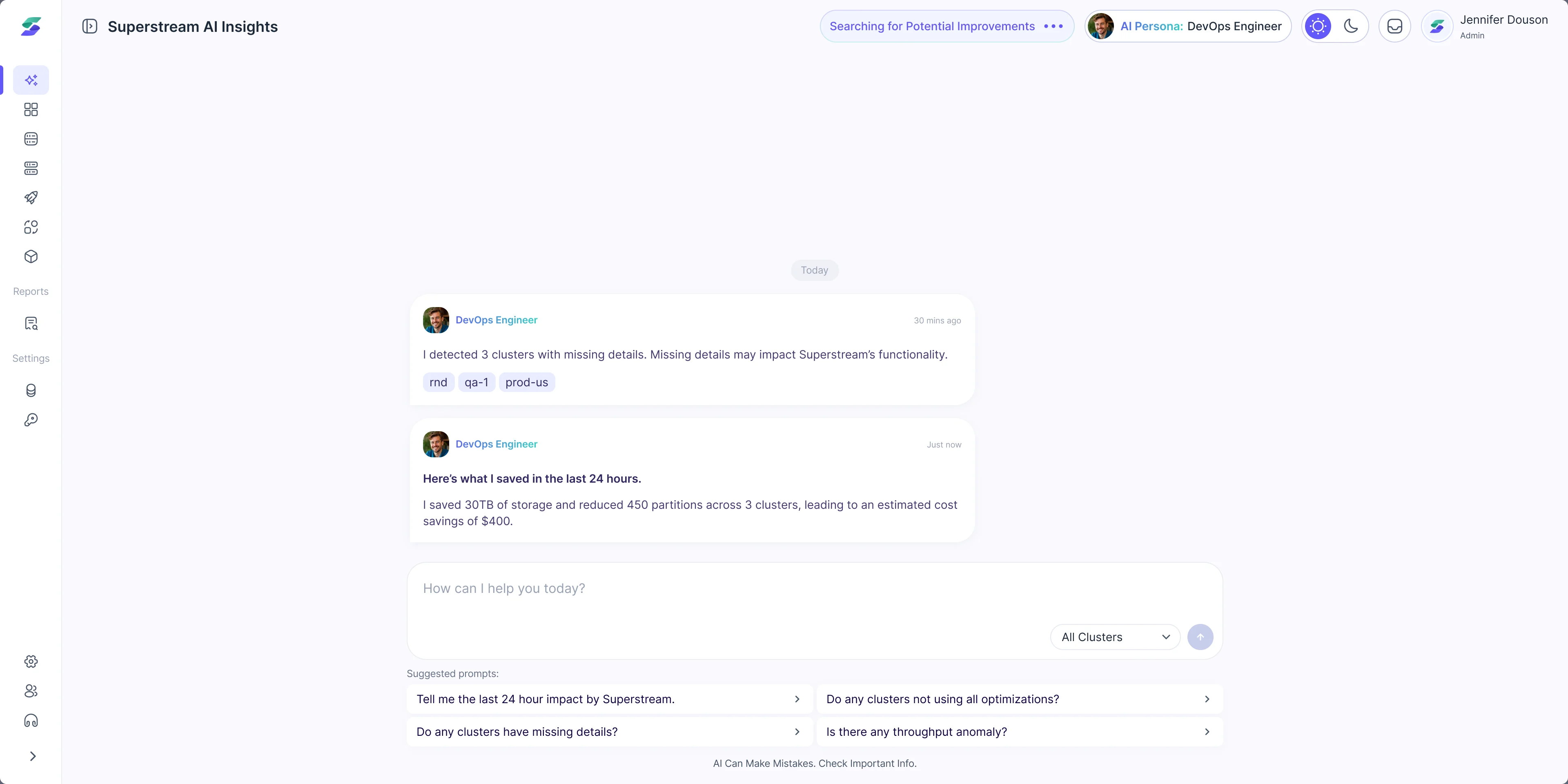
Asking the product itself
- Found
- Clear screens still left the team to go looking: open each cluster, compare the numbers, work out what changed overnight.
- Decided
-
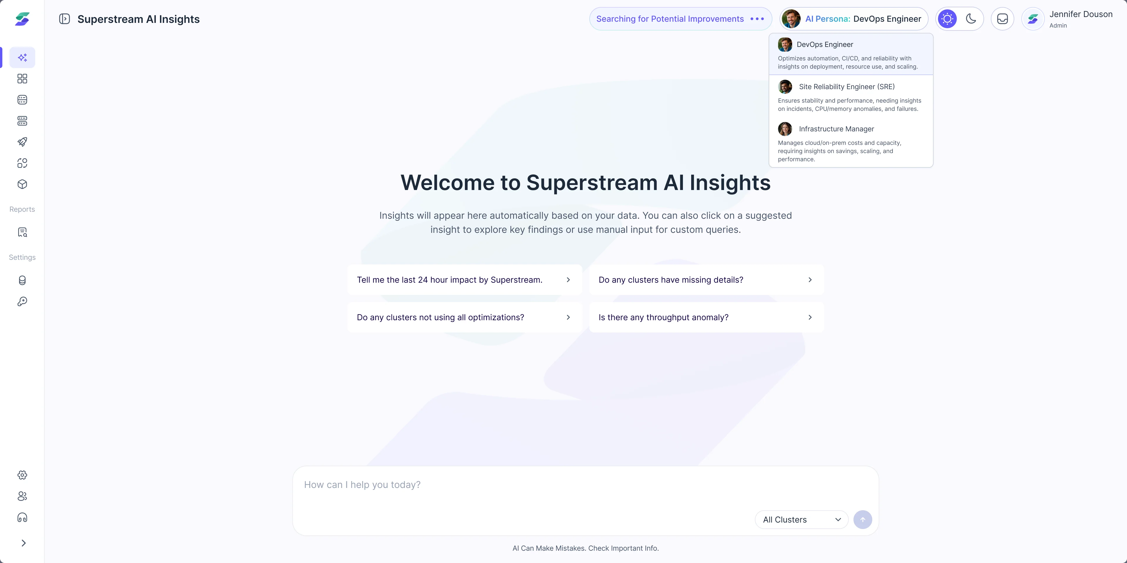
An AI assistant reads the clusters on its own and reports what it found and what it saved. Teams pick a persona (DevOps engineer, SRE or infrastructure manager) so the insights match their role.
Suggested questions start the conversation, and the screen says plainly that AI can make mistakes.
One design system behind 3,000+ screens
- Found
- Developers had put the screens together from an off-the-shelf kit. The same saving, status or empty chart looked different from one area to the next.
- Decided
- We built the system from scratch around Superstream’s data: one way to break a cost down, one set of statuses, and every card drawn for empty, failed and loading data too.
Every saving breaks down the same way
Storage, read, write and partitions, whether it is the account’s total or one optimization’s share.
-
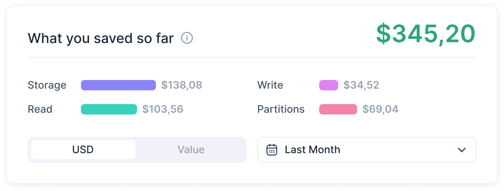
Cost report: What the account has saved so far. -
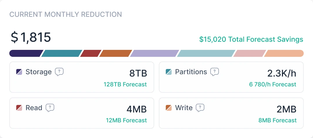
Optimizations: What one optimization takes off the monthly bill.
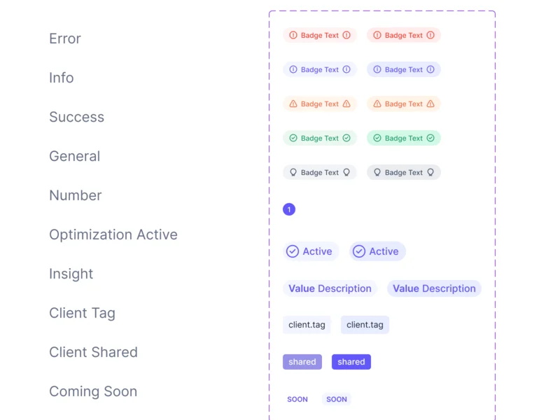
One card, every state
Cluster cards were drawn for data that is missing, broken or still on its way, not only for the good case.
-
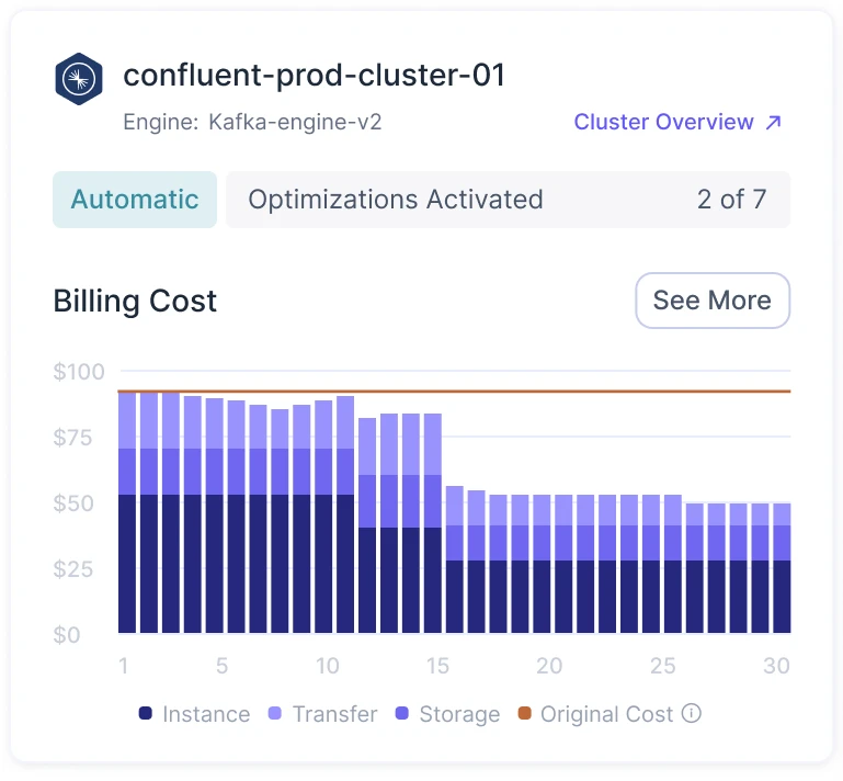
Default -
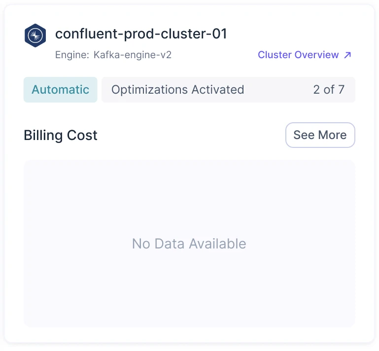
No data -
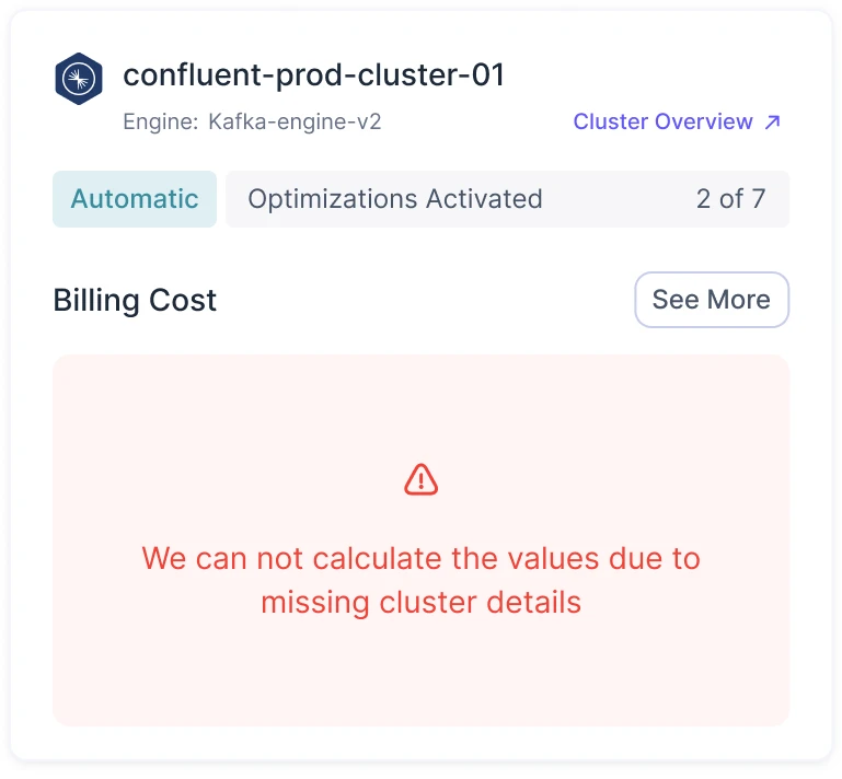
Error -
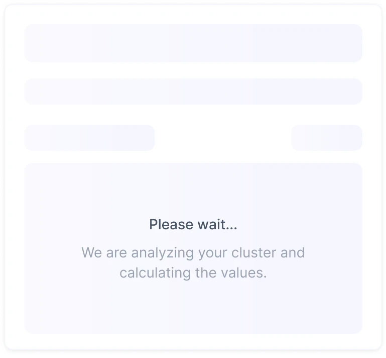
Loading
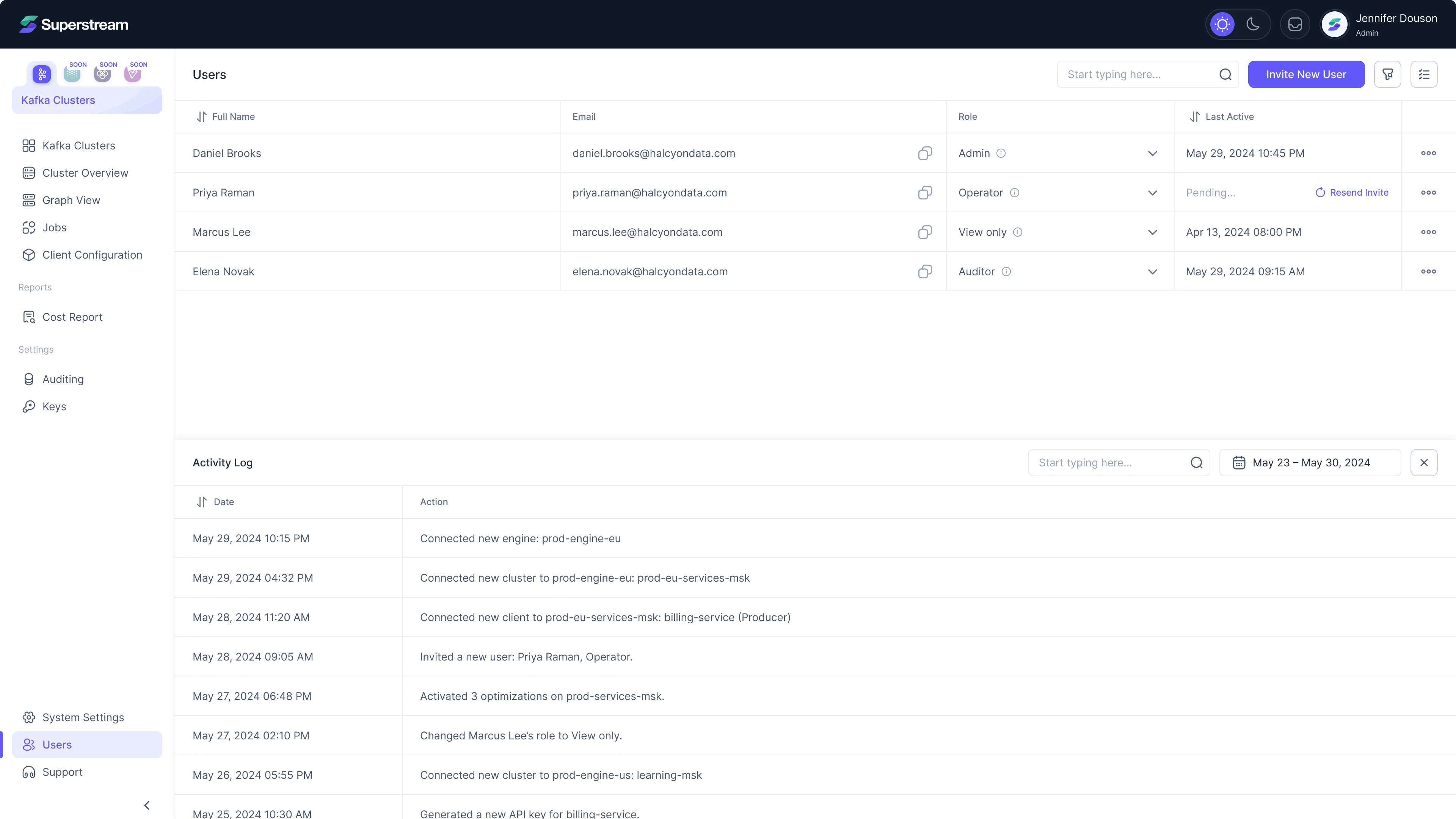
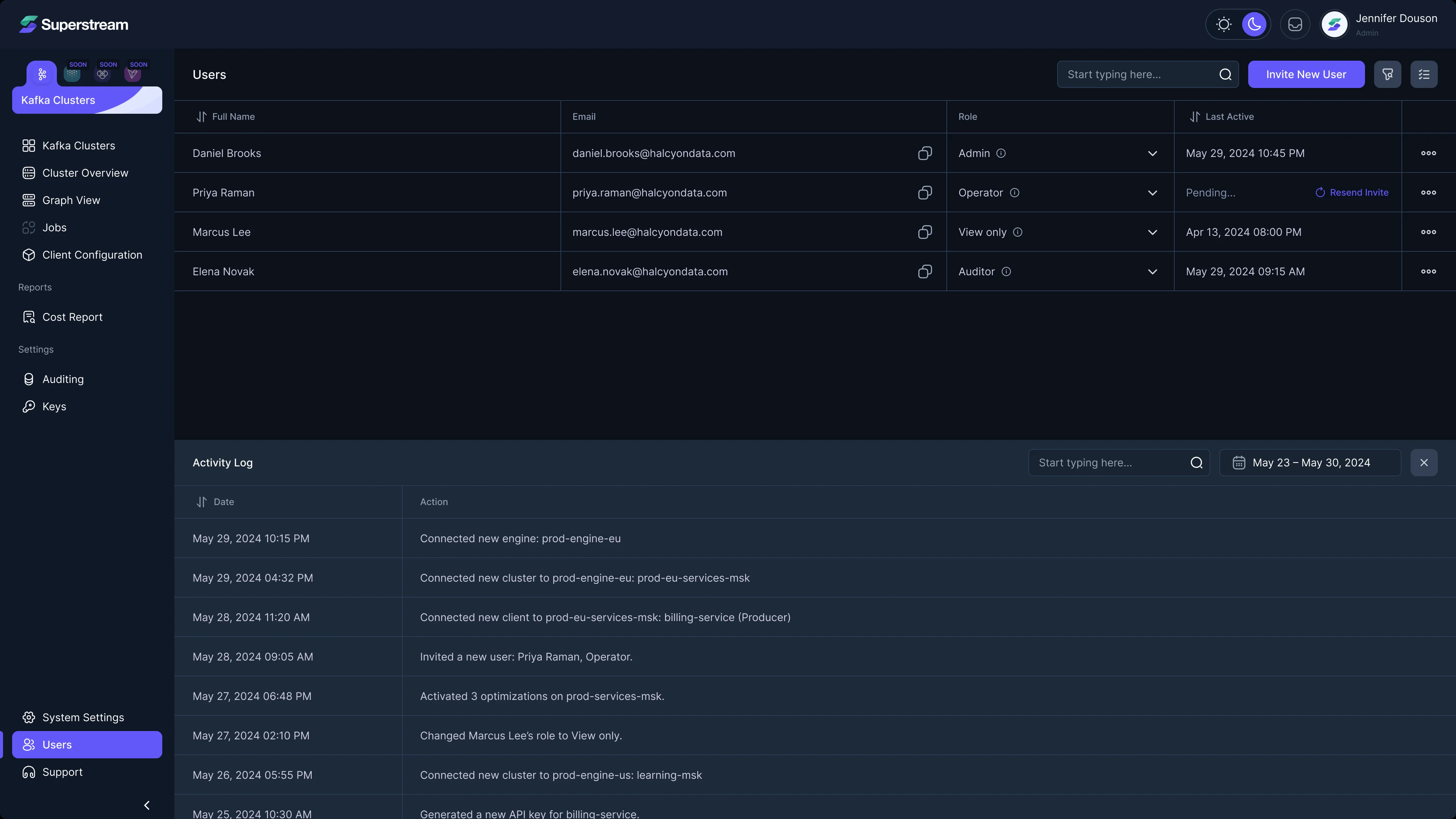
Light and dark themes
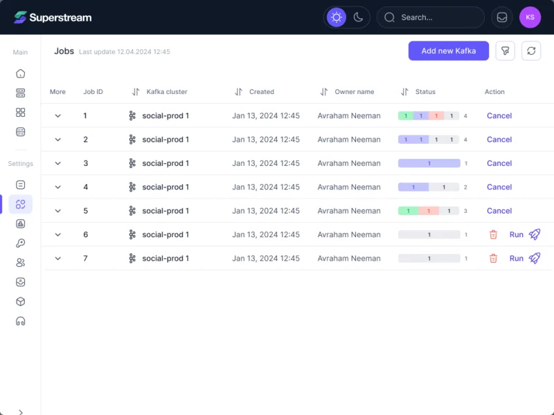
The product runs in both themes; tables, roles and statuses stay readable on dark.
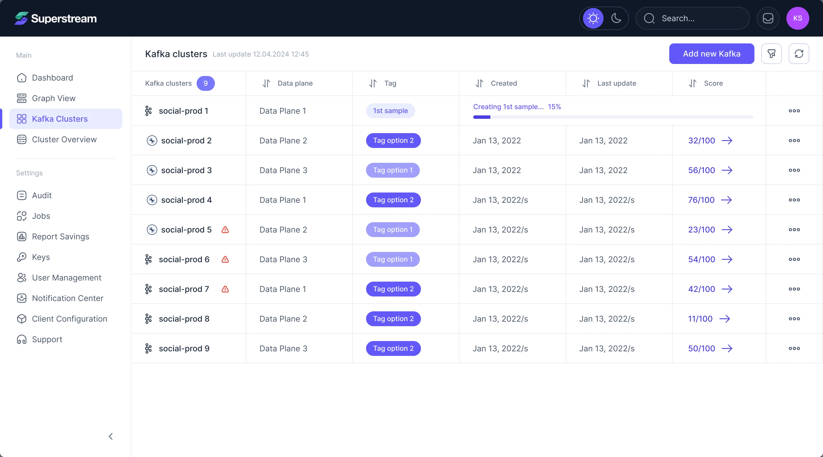
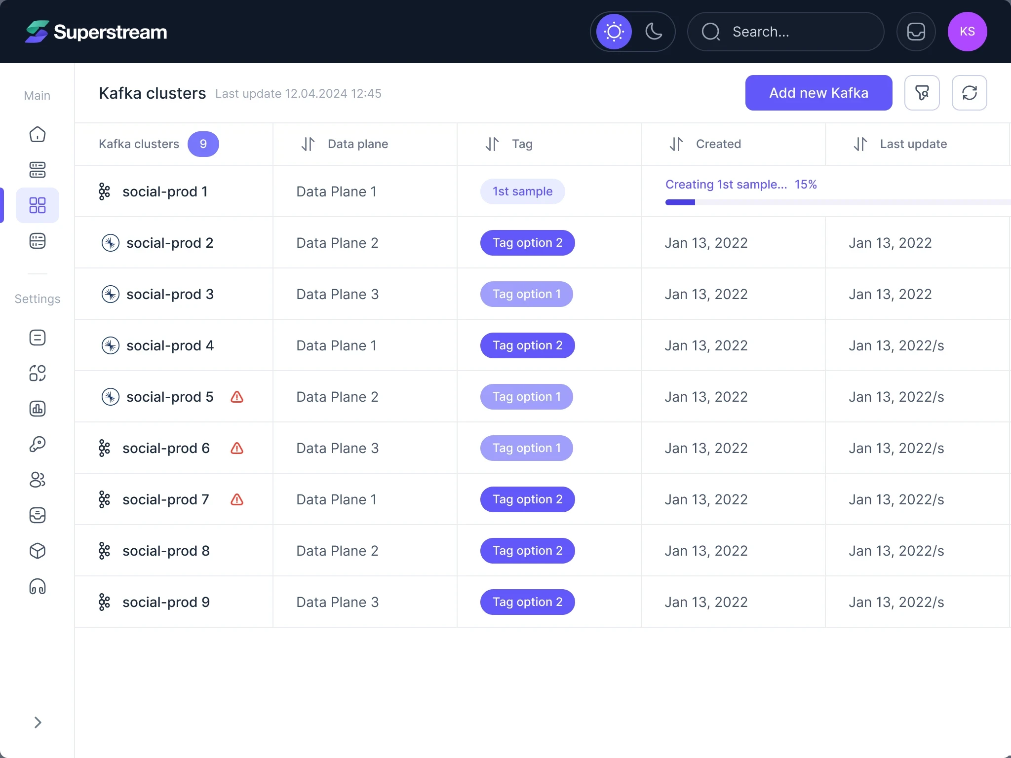
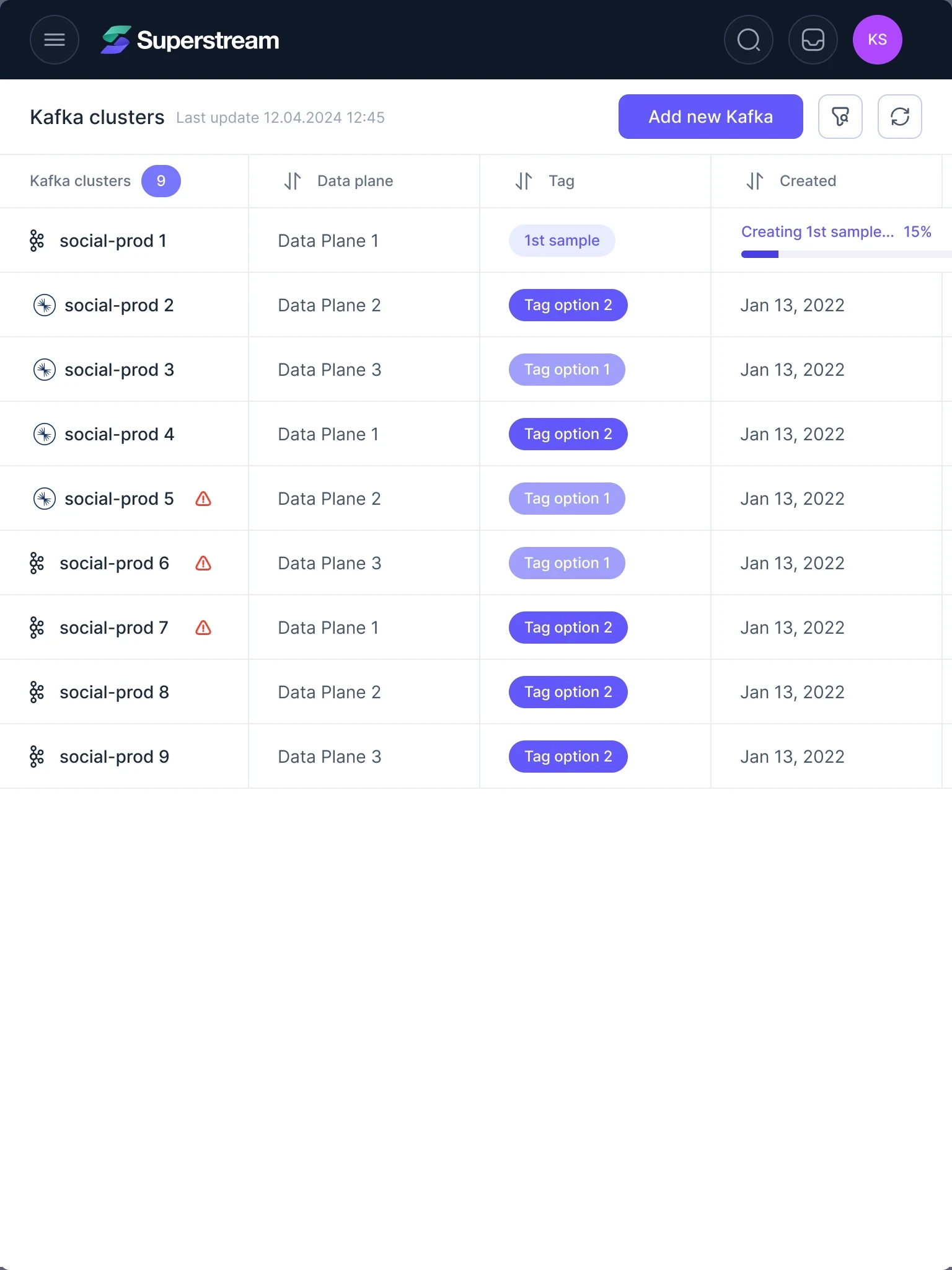
One layout logic from desktop to tablet
- Kept
- The page title, the main action and the table order: cluster, data plane, tag, dates, score.
- Changed
- The menu folds from full labels to icons to a menu button, and the table scrolls sideways instead of squeezing its columns.
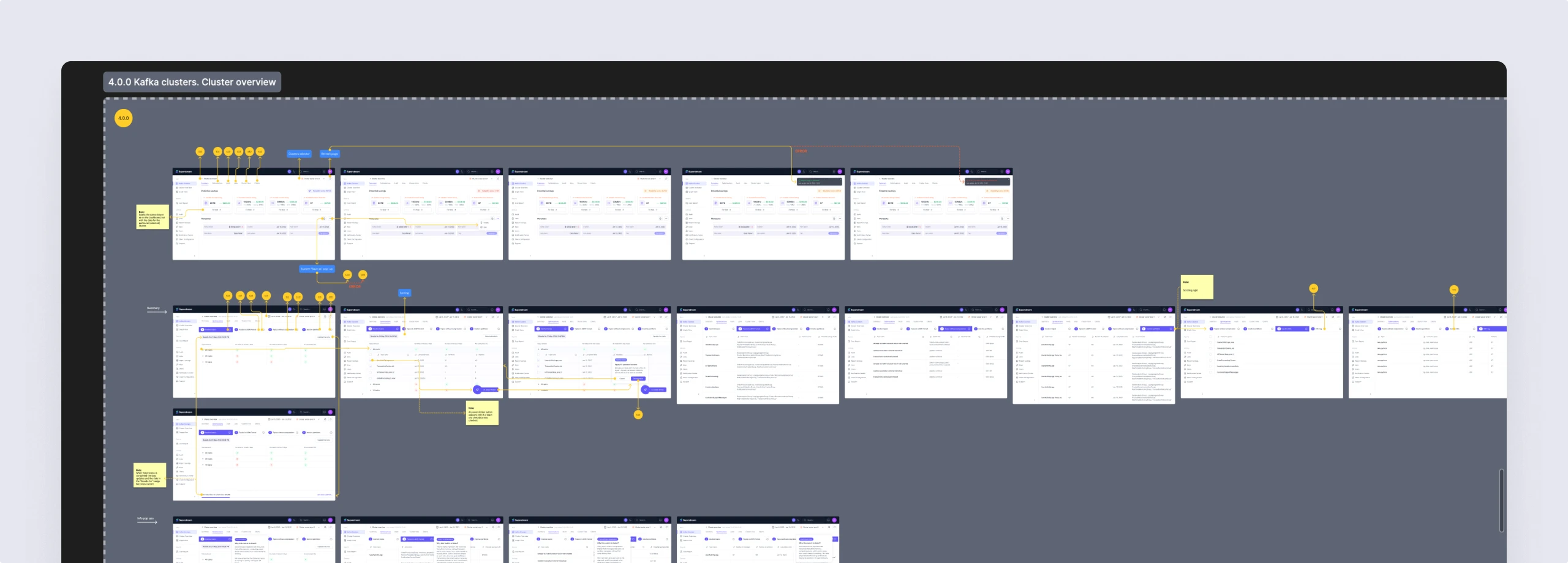
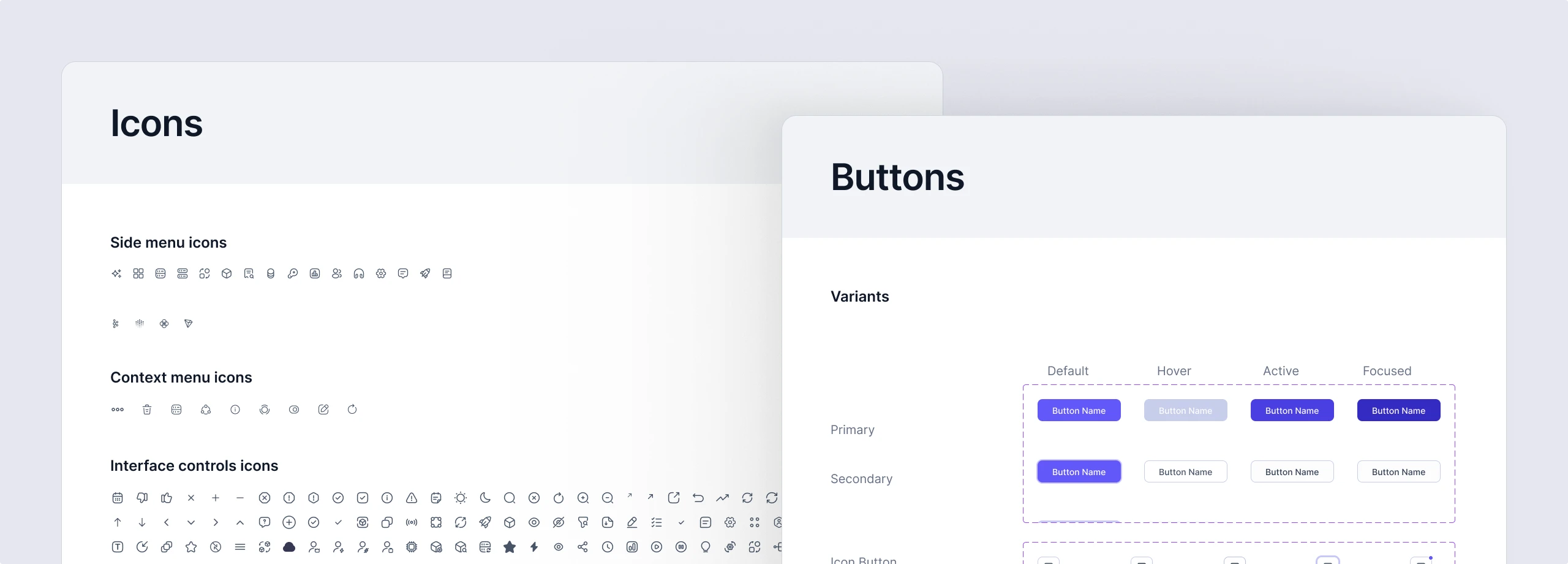
A handoff engineering could build from
The work ended in one organised file rather than a folder of screens.
- UI kit
- The components, colours, type and states every screen is built from.
- Screen map
- Each flow numbered and laid out in order, with notes where behaviour needs explaining.
- Clickable prototype
- The linked flows, clickable end to end.
- Zeplin export
- Specs and assets for the engineering team.
Flows in the handoff
- Sign-up, log-in and onboarding: connecting the first cluster
- Dashboard: savings across every cluster, by pillar
- AI Insights: the day’s findings for each role
- Kafka clusters and Cluster Overview: status, savings and costs per cluster
- Graph view
- Optimizations and jobs: running an optimization and tracking it
- Cost report, billing and savings to date
- Auditing
- Users, keys and client configuration
- Notifications and the notification center
- Design system
Kafka management that finally feels calm
Clusters, optimizations, costs and users now work as one product: one navigation, one way to show costs and statuses, the same layouts from desktop to tablet, and a dark theme that keeps every chart readable.
67% faster to the aha moment Median time to a team’s first savings insight, old product against new
- screens and states designed
- 3,000+
- themes from one system
- Light + dark
- layouts
- Web + tablet
- of weekly work together
- 2 years
In the client's words
What stood out was how ANODA took the time to understand our business and the people using Superstream. Engineering teams need to keep Kafka running reliably, while platform leaders need visibility into infrastructure costs and where optimisation will make a difference. ANODA understood how those priorities connect, what each role needs to know, and where users need control over automated decisions. That understanding shaped their design recommendations and gave us a team we could work through product decisions with.

Too technical to hand to designers?
Kafka clusters, partitions, consumer groups: we learned Superstream’s domain from the product, its documentation and its competitors, so the team didn’t lose weeks explaining it. Bring us yours, and we’ll come back speaking it.
More work like this
Two more data-heavy products we redesigned.
-
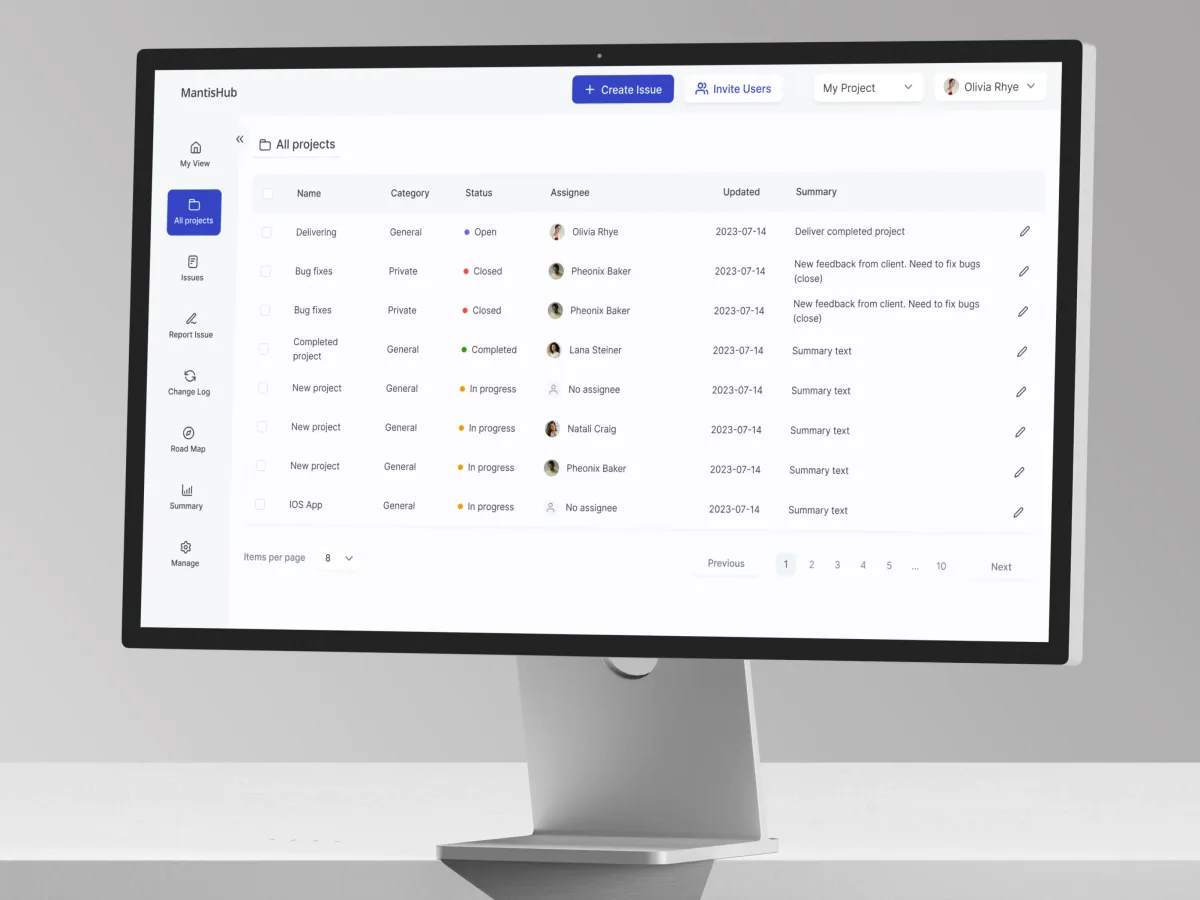
DevTools · Bug tracking · Web SaaS
MantisHub
Gave a hosted bug tracker’s dense issue lists, filters and notes a calmer interface.
- 52 Unique screens
- 3 Experts on the team
-
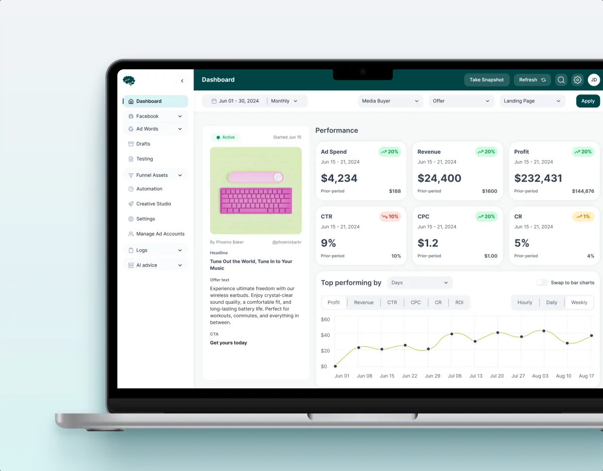
MarTech · Ads analytics · Web SaaS
Concussion Media
Audited a paid-traffic SaaS and rebuilt its modules around the numbers its teams act on.
- 400+ Screens and states
- 11 Modules designed and approved by the client
What we brought to Superstream
The product’s structure
The interface and its system
- Dashboard & data visualization design Savings, costs and cluster health ranked so the next action stands out.
- Web app design 3,000+ screens for desktop and tablet, light and dark.
- Design systems The UI kit every screen was built from, handed to engineering.
- AI product design An assistant that reads the clusters and reports what it found and saved.