
An AI academic assistant students actually open
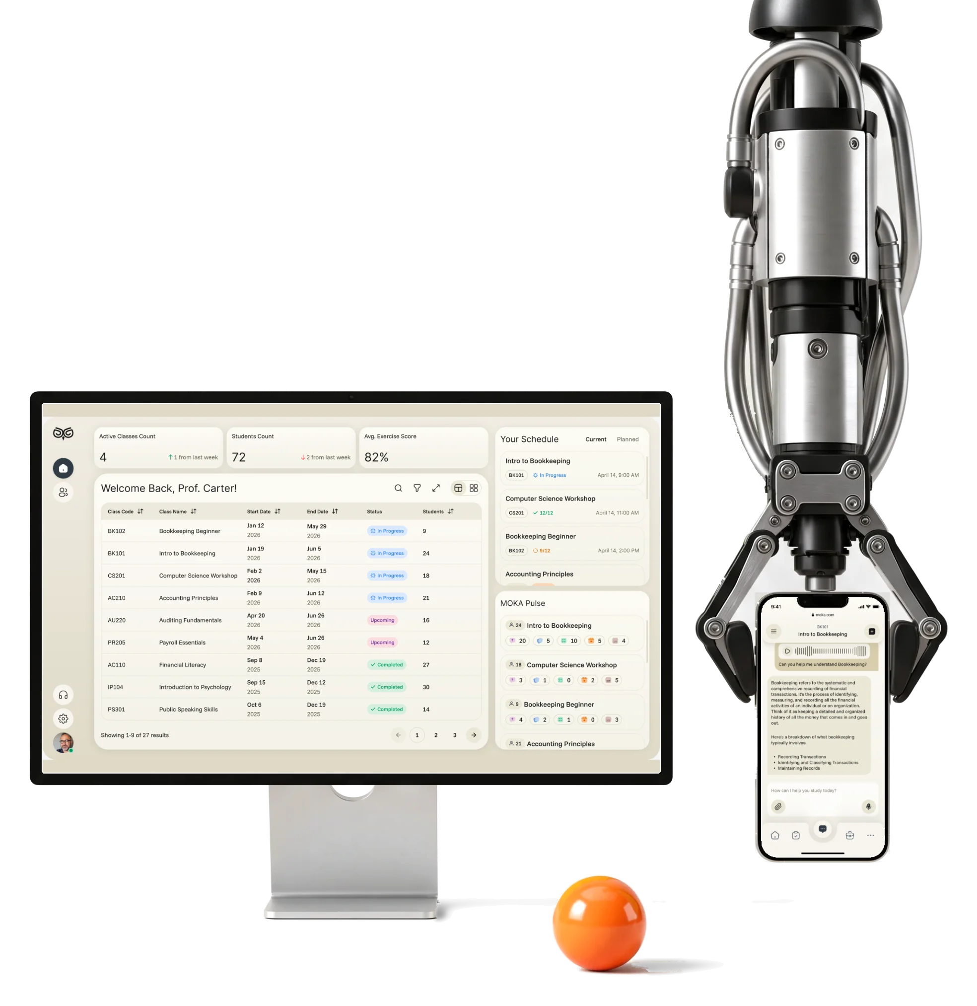
An AI assistant that studies each student’s own courses with them, and the web tools their instructors, curriculum teams and school admins run it from.
- 200+
- screens for the student app and the staff web tools
- 312h
- of design from the role map to the screen map
- 4
- roles student, instructor, curriculum, admin
- 4
- experts on one team from discovery to handoff
Project summary
Moka is an AI academic assistant for schools: middle- and high-school students study their own courses with it on the phone, while instructors, curriculum developers and school administrators run classes, programmes and reports on the web. We designed the student’s mobile app and the web product for the three staff roles , across 200+ screens. Development and the AI itself stayed with the client.
Who uses Moka, and for what
One product, four jobs. From the student’s phone to the school’s reports:
-
Student
- Ask the assistant
- Flash cards and quizzes
- Schedule and progress
-
Instructor
- Classes
- A student’s activity
- Exercise results
-
Curriculum
- Programmes
- Courses
- Exercises and curriculum
-
Admin
- Engagement reports
- Campuses
- Staff
- Engaging and Serious
- Colour, progress and small rewards, in a product teachers trust with a class.
- Dense and Readable
- Every activity and number a student needs, with a clear order on a small screen.
- One product and Four roles
- One visual language, each role with its own navigation and density.
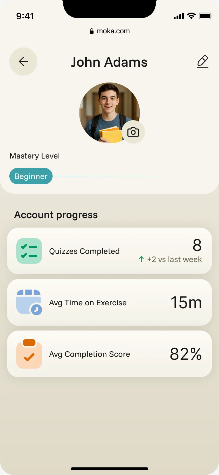
Everything a student needs, on one calm screen
- Found
- Schedule, progress, recent work and the assistant all wanted the first screen of a small phone.
- Decided
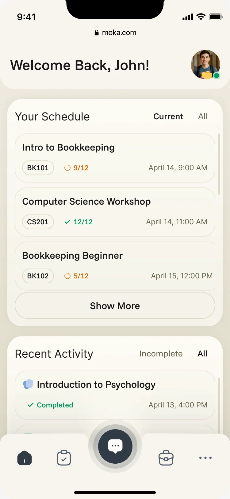
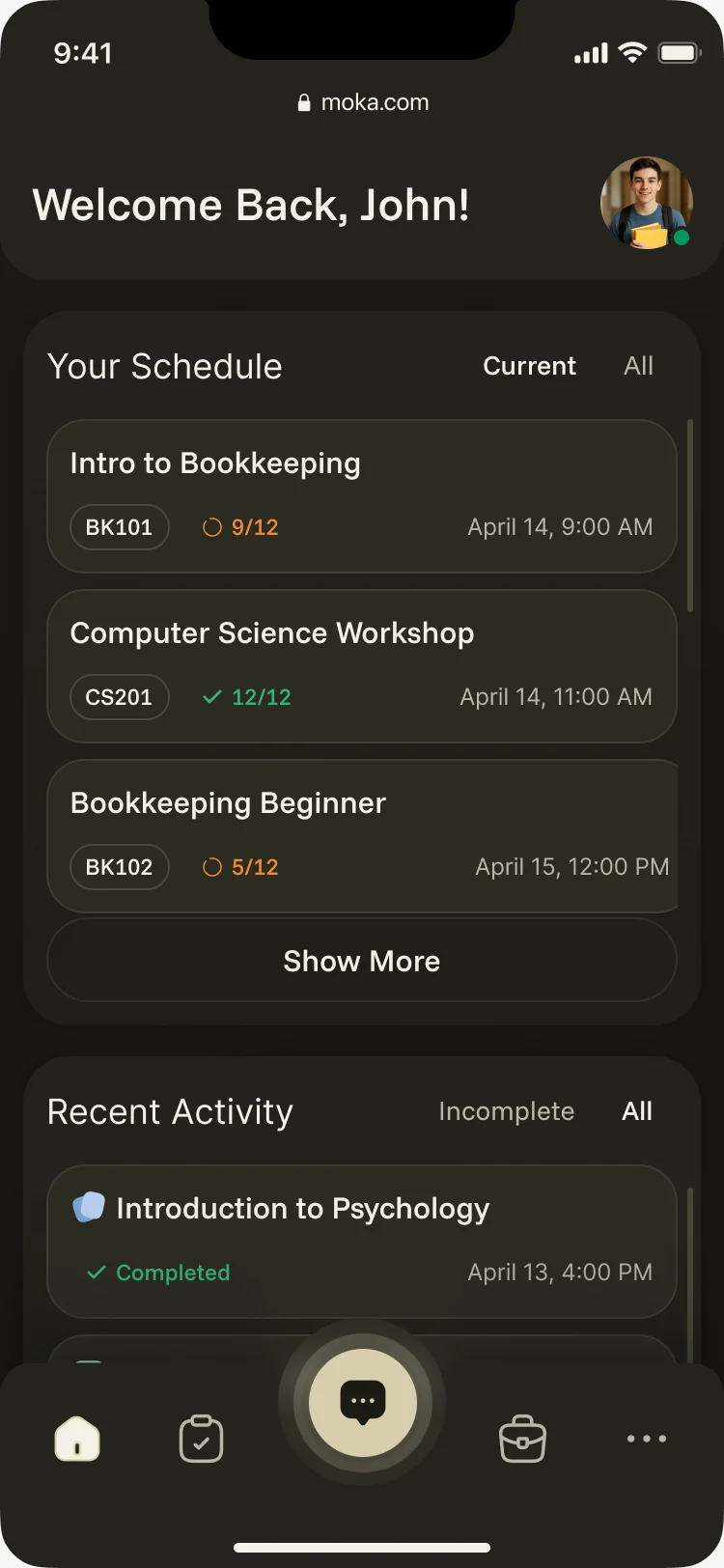
- One order down the home screen: who it’s for, today’s classes with progress in each, then what the student did last, with the assistant one tap away in the tab bar.
- For the user
- A student opens the app between classes and sees where they are without searching.
-
Who and when
The student’s name and photo, the way back to their profile.
-
Today
The day’s classes with their code, time and progress, current or all.
-
What I did
Recent activities with their result, incomplete or all.
-
Ask
The assistant in the middle of the tab bar, from anywhere.
How the work progressed
From four roles on a board to one product system, a question at a time.
-
Discovery
Who the four roles are and what each needs from the product first
Artifact Role map and information architecture for students, instructors, curriculum teams and admins
-
User flows
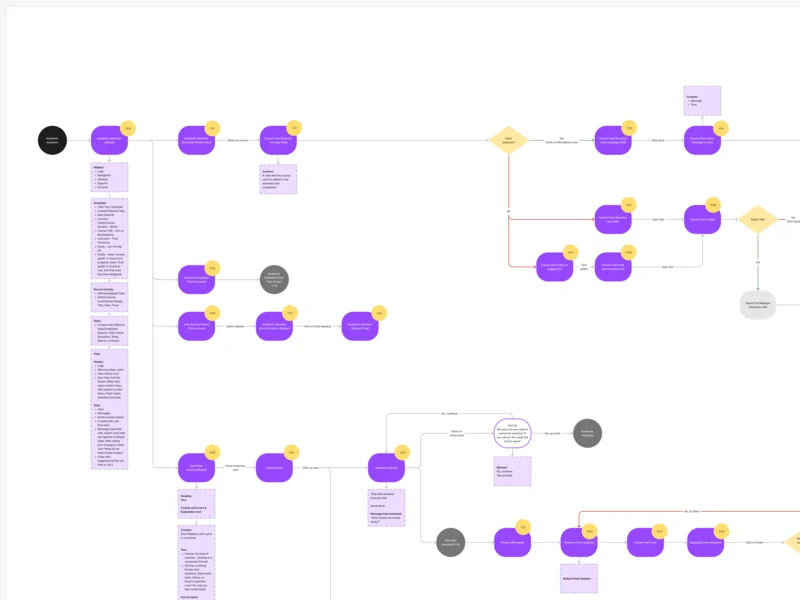
How each role moves through its jobs, including the errors along the way
Artifact End-to-end flows for every role, each screen’s content beside its node
-
Wireframes
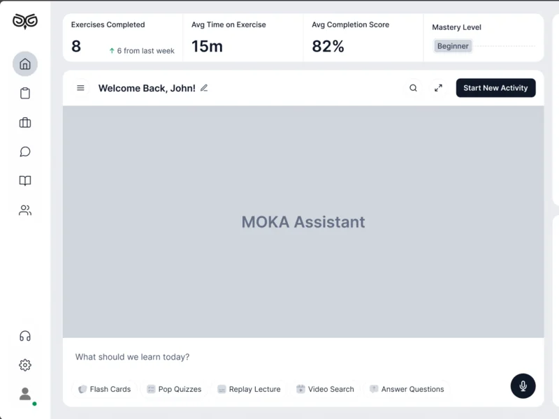
Where the assistant, the schedule and the activities sit before any colour
Artifact Desktop wireframes for the assistant and every activity
-
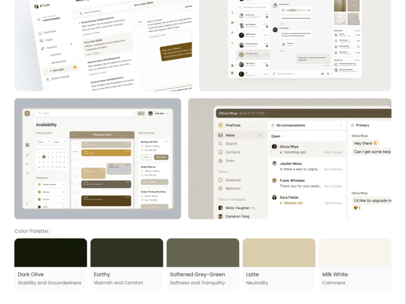
Moodboards
What a calm place to study should feel like
Artifact Three moodboards; Deep Focus, in olive and latte, was chosen
-
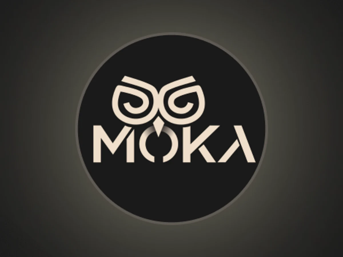
Logo
A mark that reads at icon size in a sidebar
Artifact The owl logomark used across the app
-
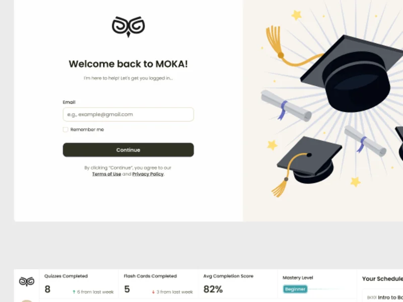
UI & design system
One interface for four roles, in the style the moodboards settled
Artifact The final UI and a design system with its states
-
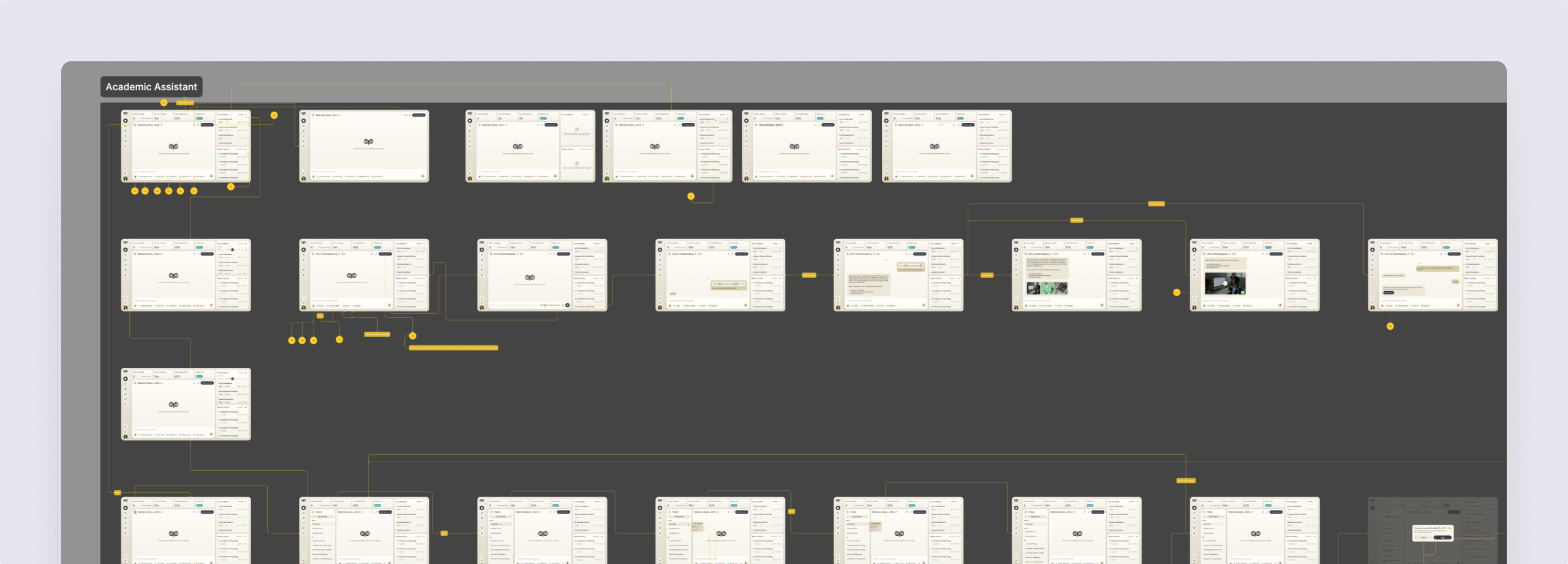
Delivery & handoff
How a developer finds every screen and state
Artifact A screen map and an organised design file
Four roles, mapped before they were drawn
- Found
- A student, an instructor, a curriculum developer and an admin need different things from the same courses.
- Decided
- Every role’s flows were mapped end to end first; each role then got its own sidebar in one shared shell, with only the sections it uses.
-
Student: asking the assistant
Voice, typed or suggested questions, files attached, and what happens when an upload fails.
Open the full map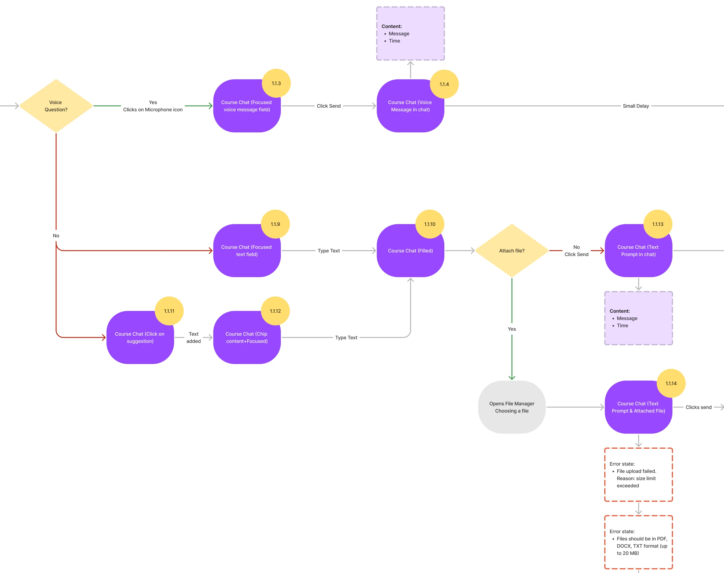
-
Instructor: from a class to one answer
Create a class, assign students, then open the class, a student and one exercise’s answers.
Open the full map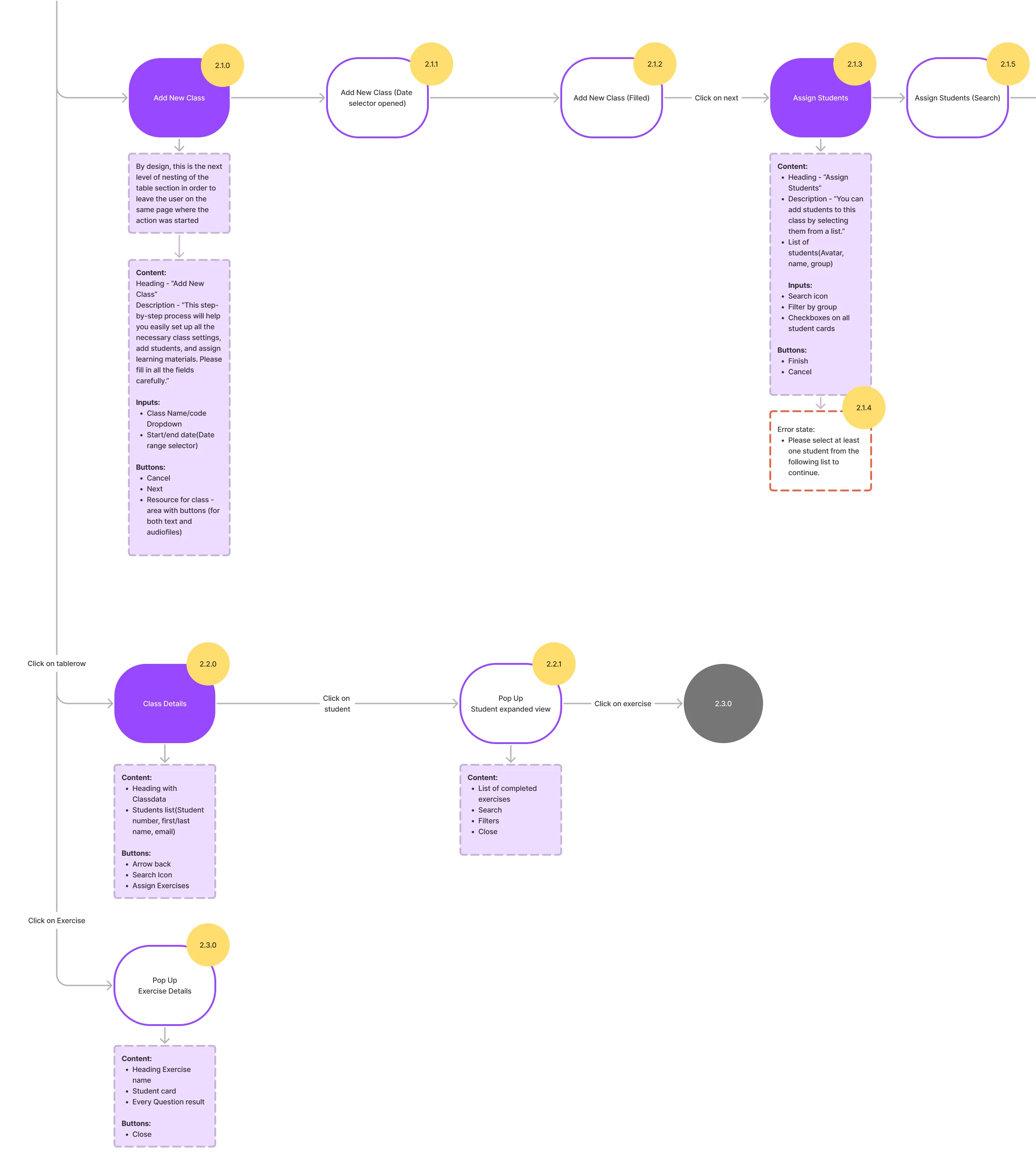
-
Curriculum developer: building a course
A course with its instructor, added to programmes, then its exercises and an uploaded curriculum.
Open the full map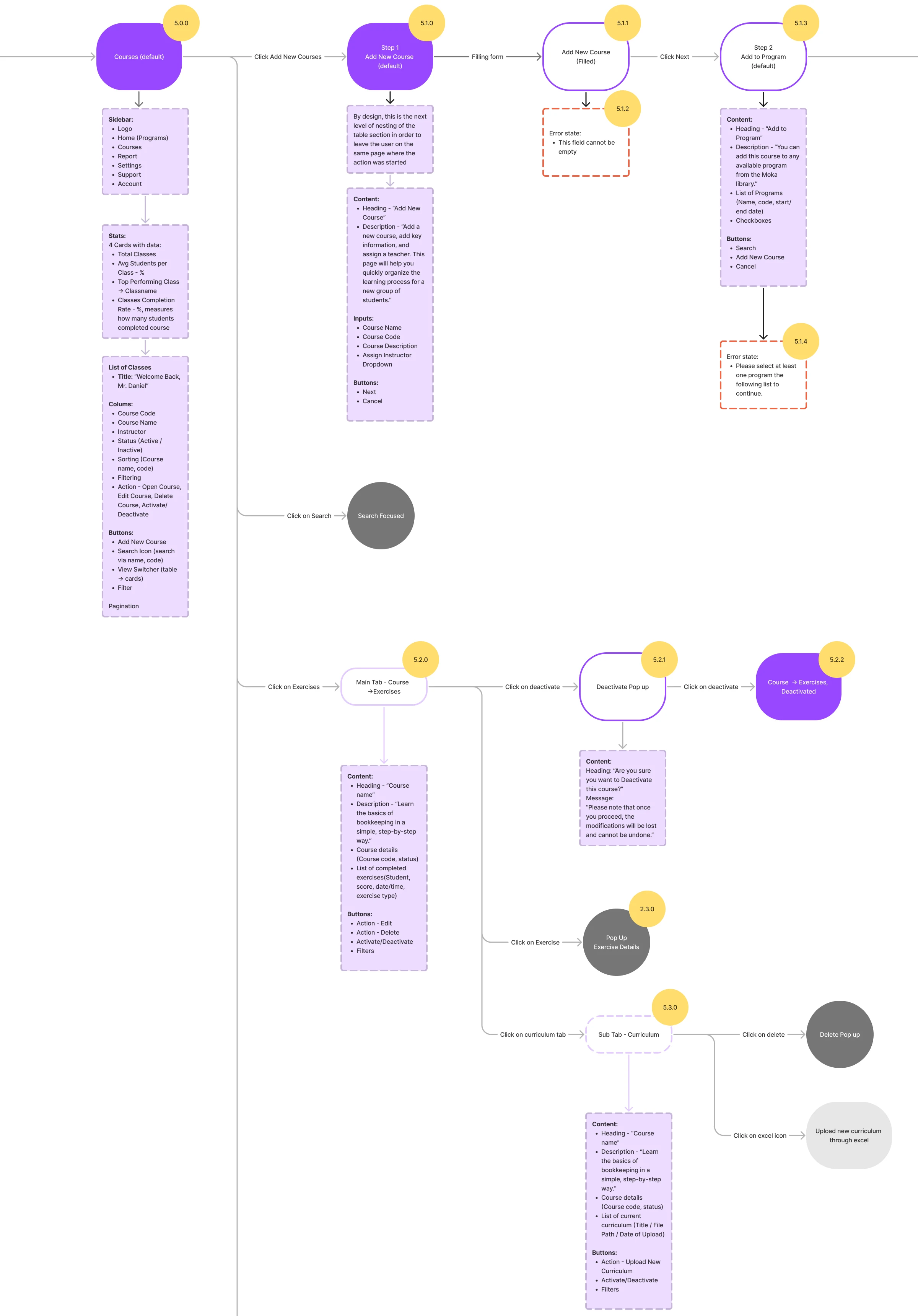
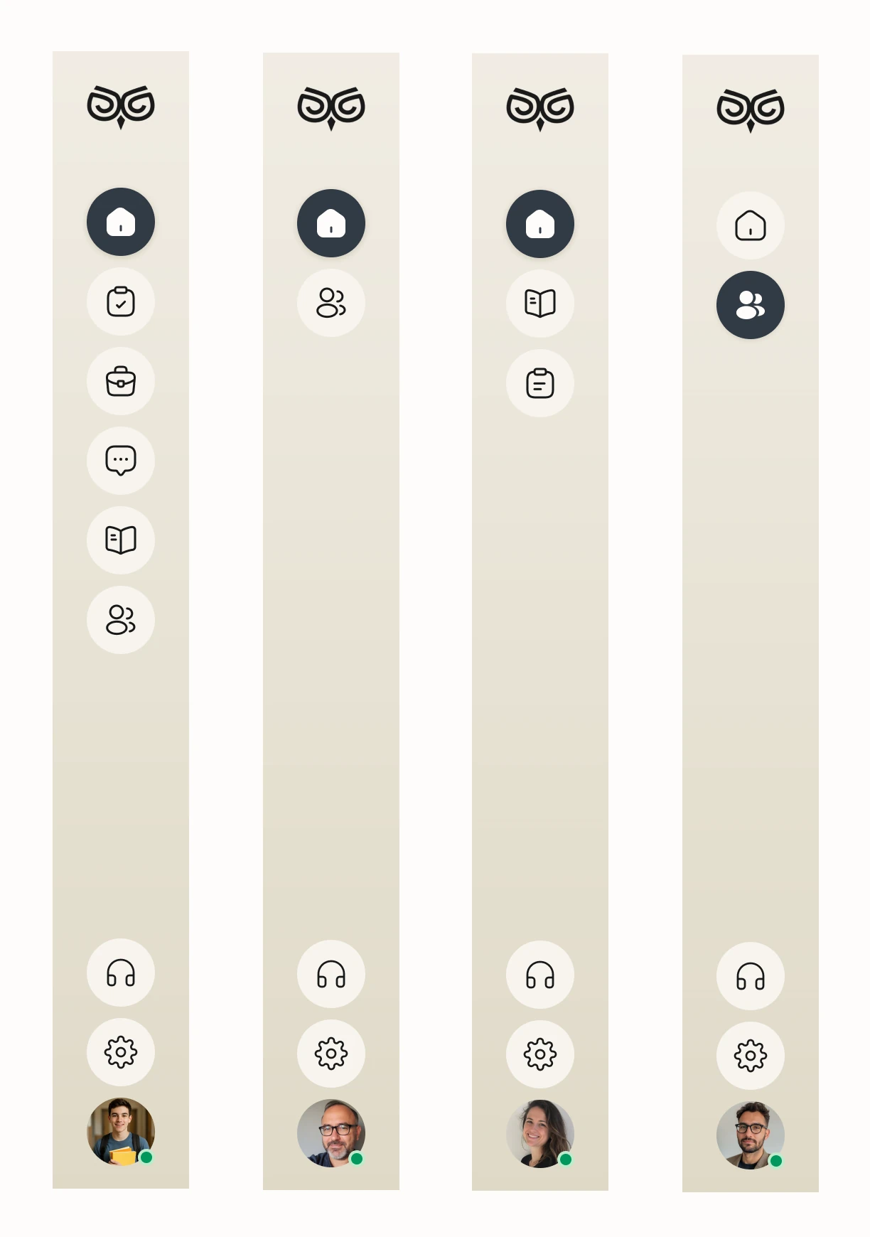
Seven jobs across four roles
The student’s assistant and activities first, then the instructor, the curriculum team and the school.
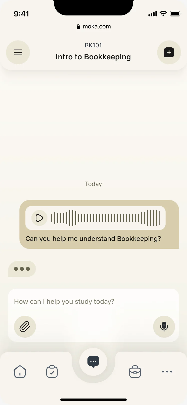
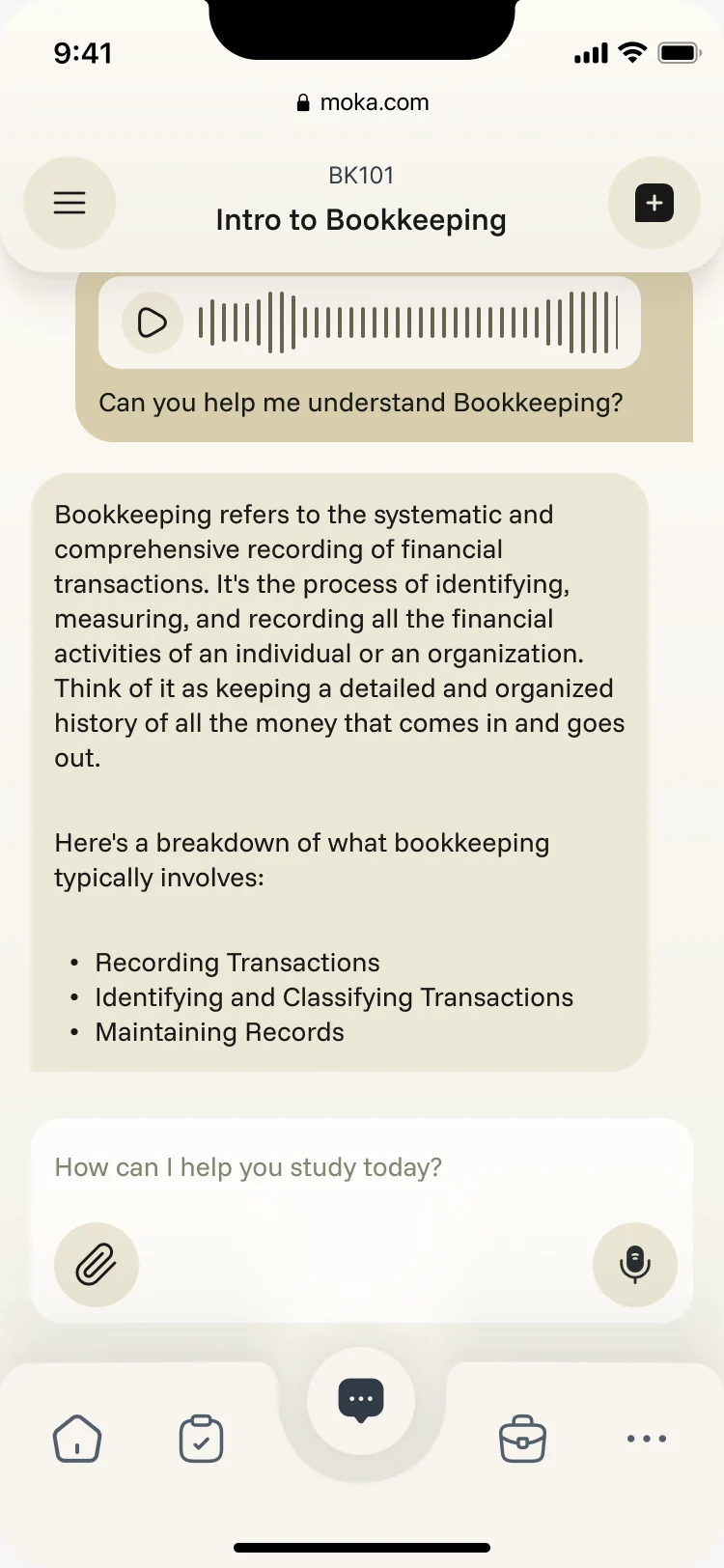
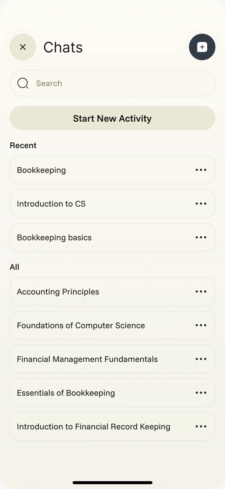
An assistant that studies the student’s own courses
- Found
- A general chatbot knows nothing about the class a student is taking, and a student can’t tell where its answer comes from.
- Decided
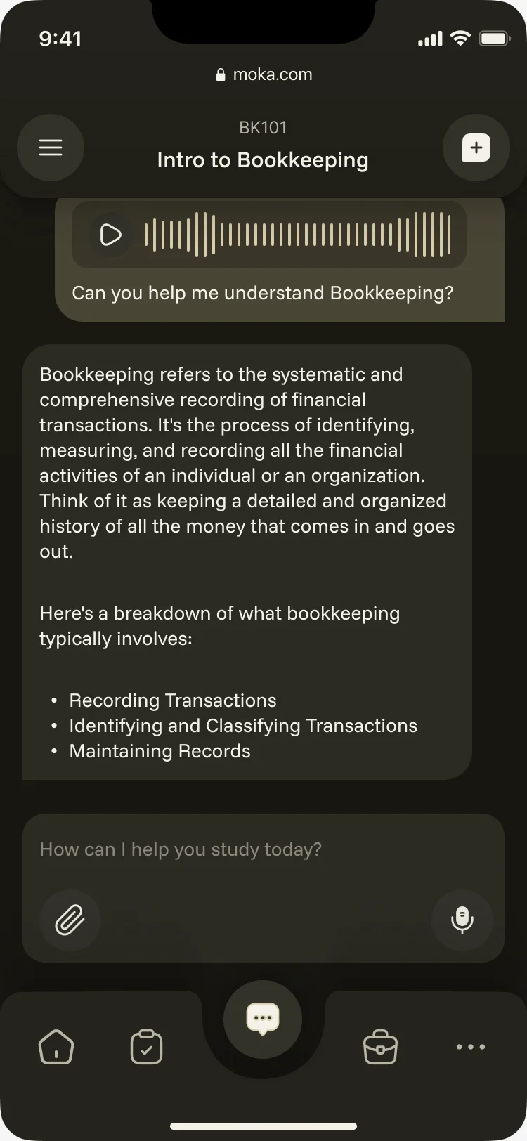
- Every chat opens inside a course, so the answer stays on the syllabus. Students type, speak or attach a file, get a structured answer, and come back to any chat from the history.
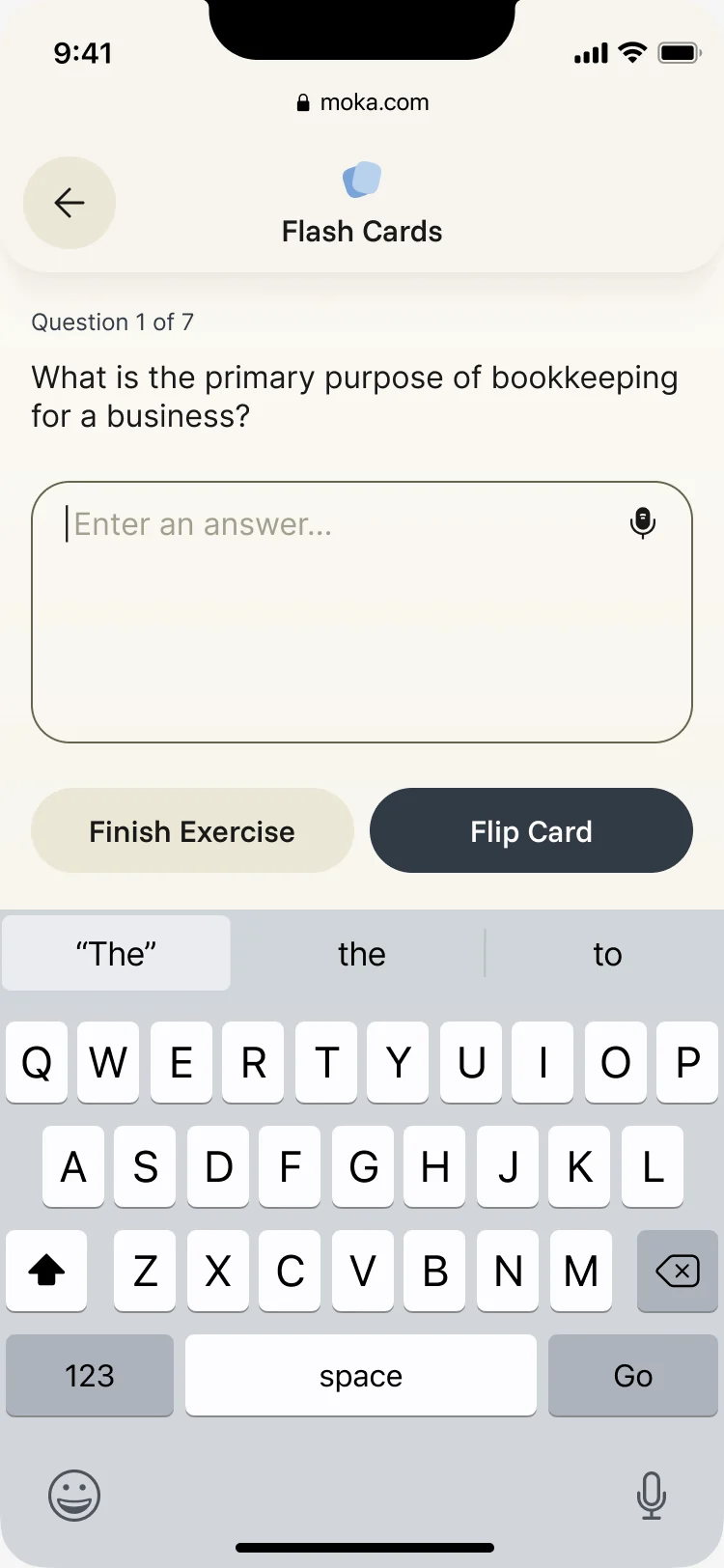
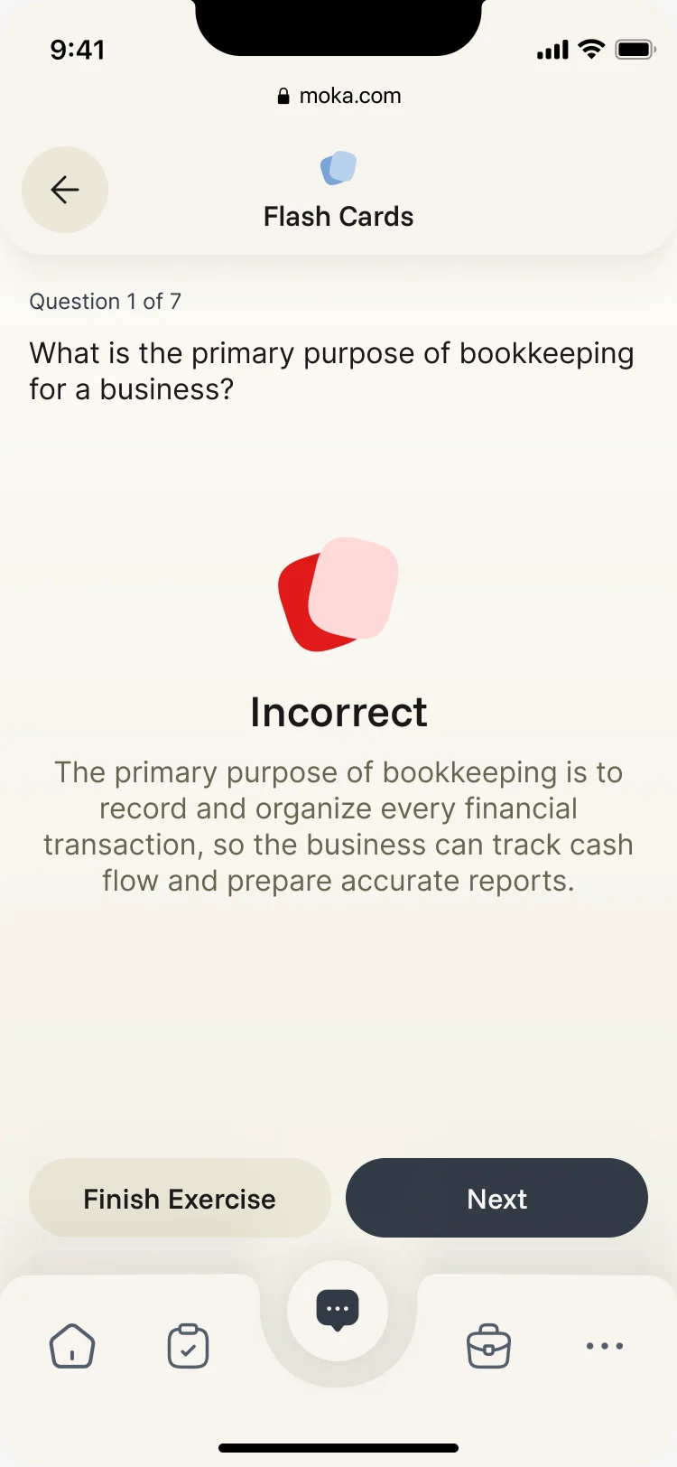
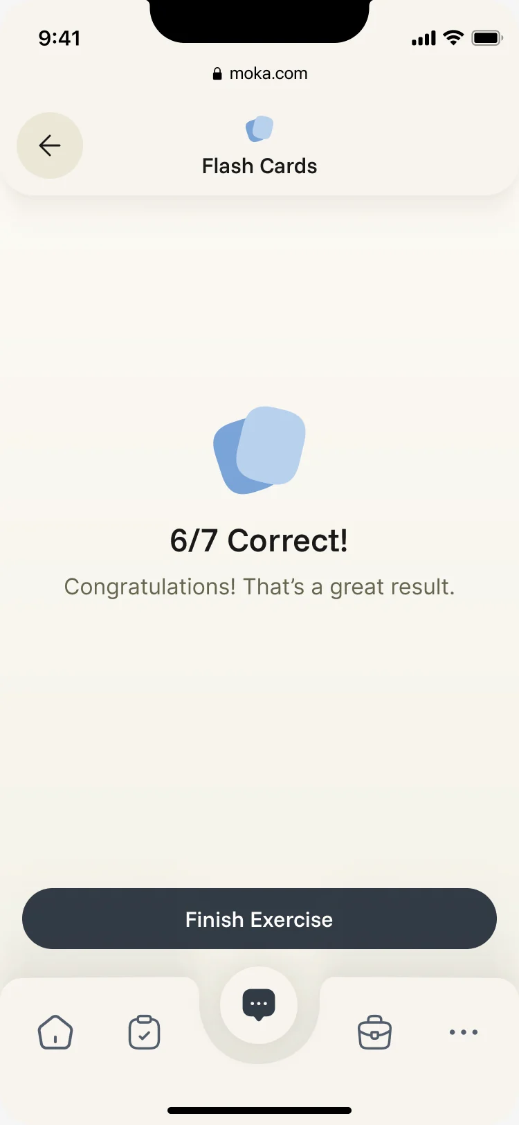
Flash cards that answer back
- Found
- Revising from notes is dull, and a wrong answer with no explanation teaches nothing.
- Decided
- Any chat can turn into an activity. Flash cards ask one question at a time, explain a wrong answer in plain words, and end with a score worth sharing.
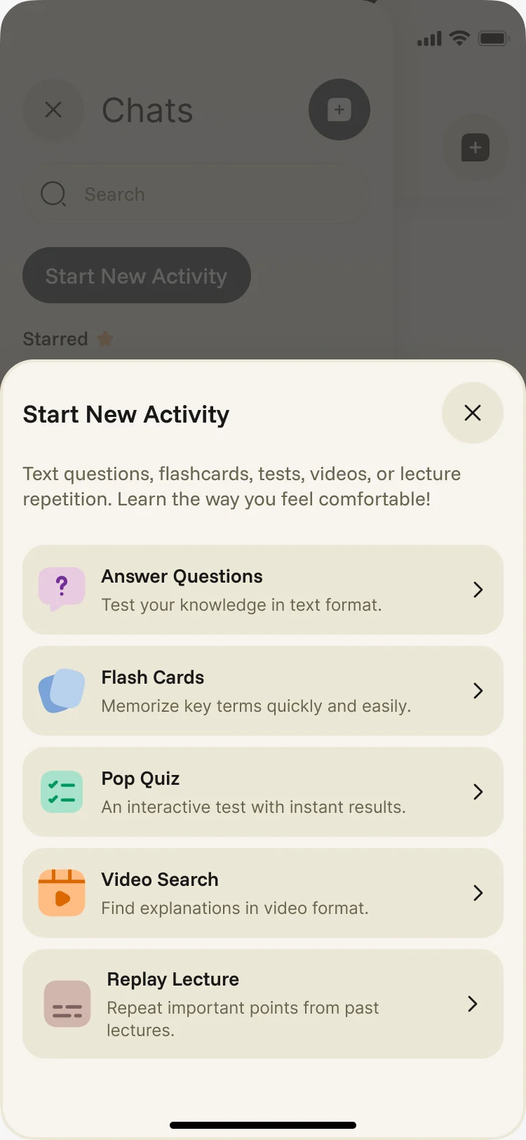
Quizzes, videos and lectures around the same course
- Found
- Students learn in different ways, and every extra app between them and the material is one more reason to stop.
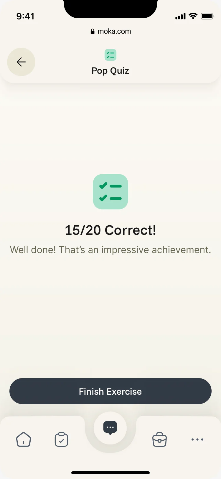
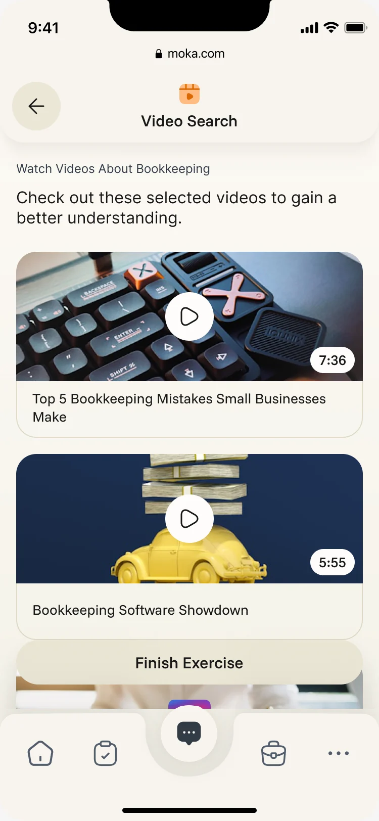
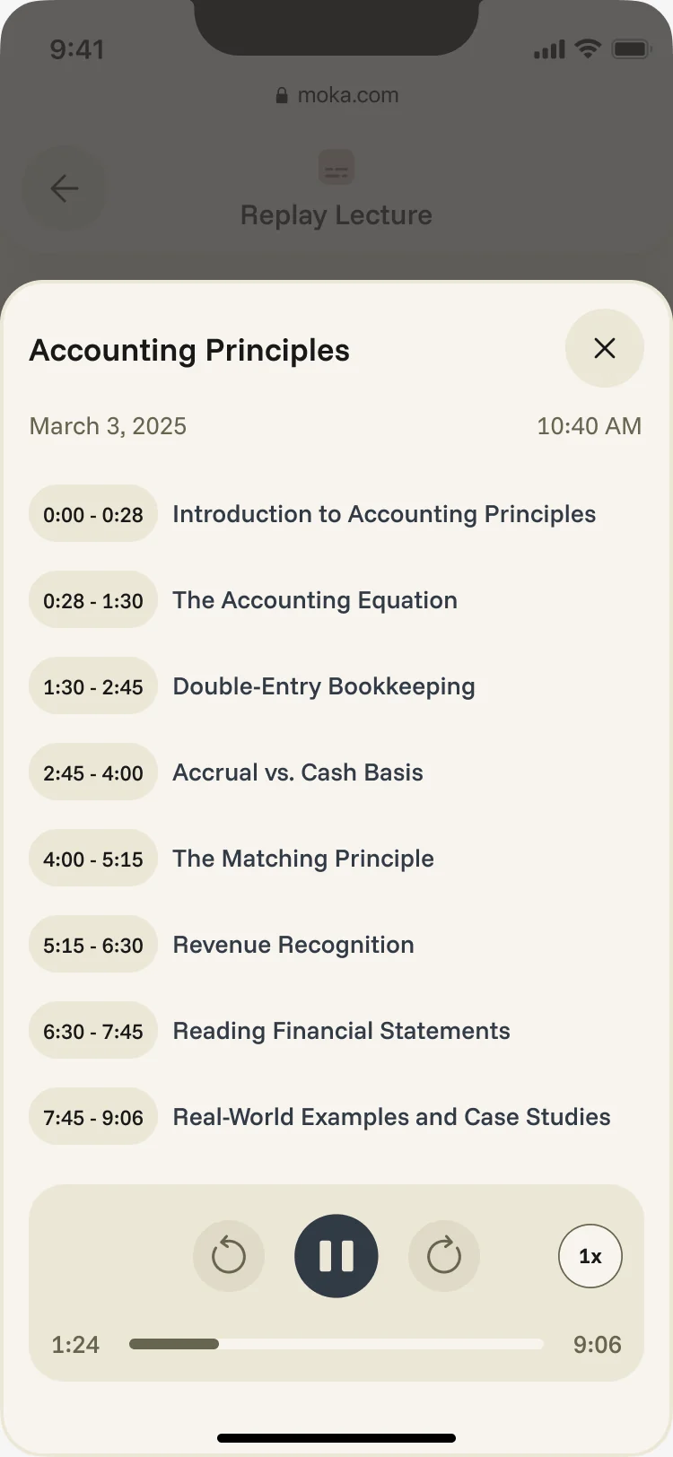
- Decided
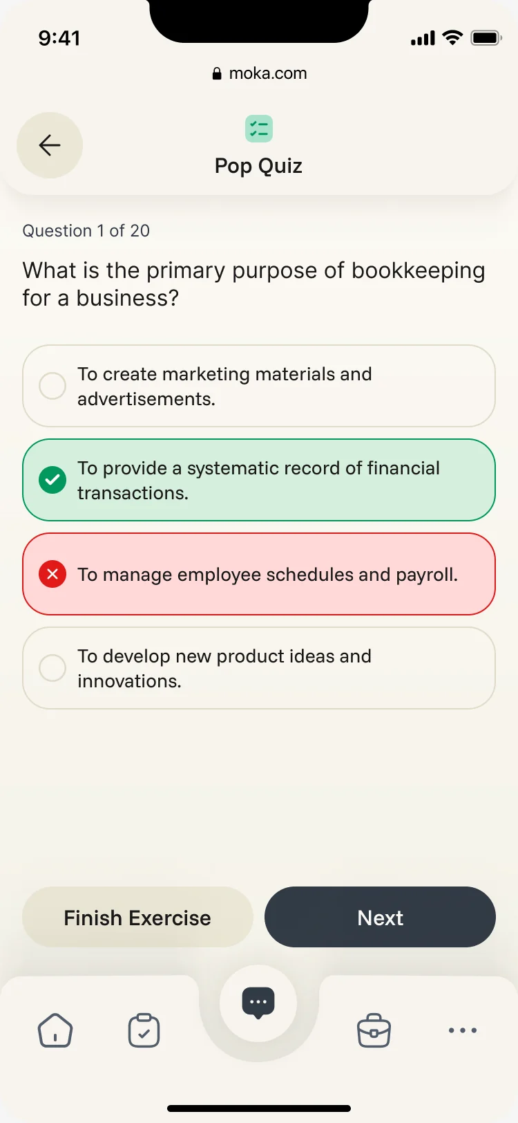
- Pop quizzes that show the right answer at once, video search inside the course’s topic, and past lectures by chapter, all in the same shell as the chat.
A week the student can see
- Found
- Classes, deadlines and progress lived in different places, so nobody saw the week whole.
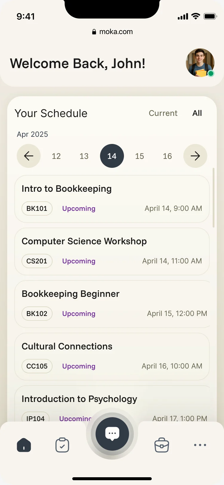
- Decided
- A schedule by day with every class’s code and status, and a profile that shows the level reached and how the week went.
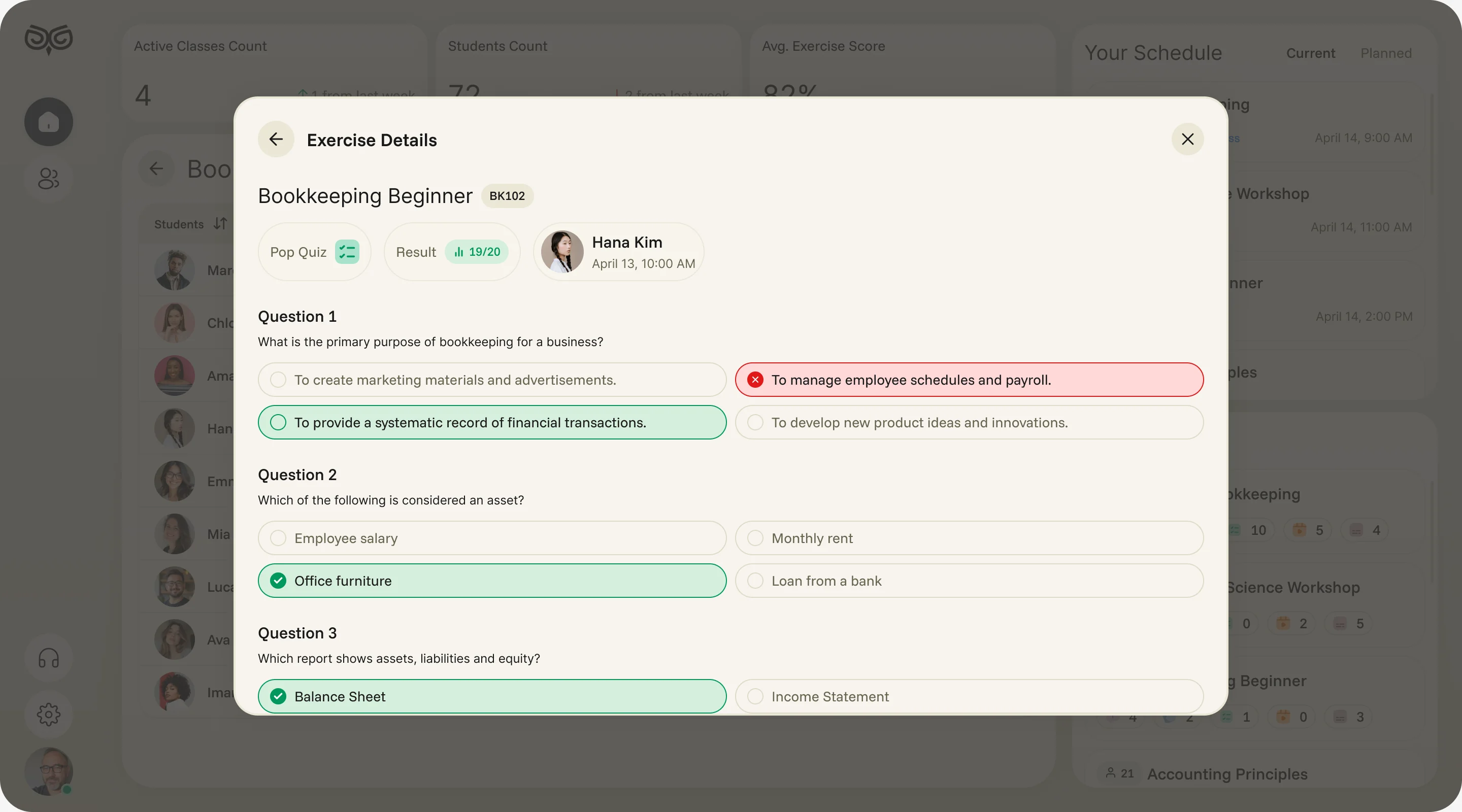
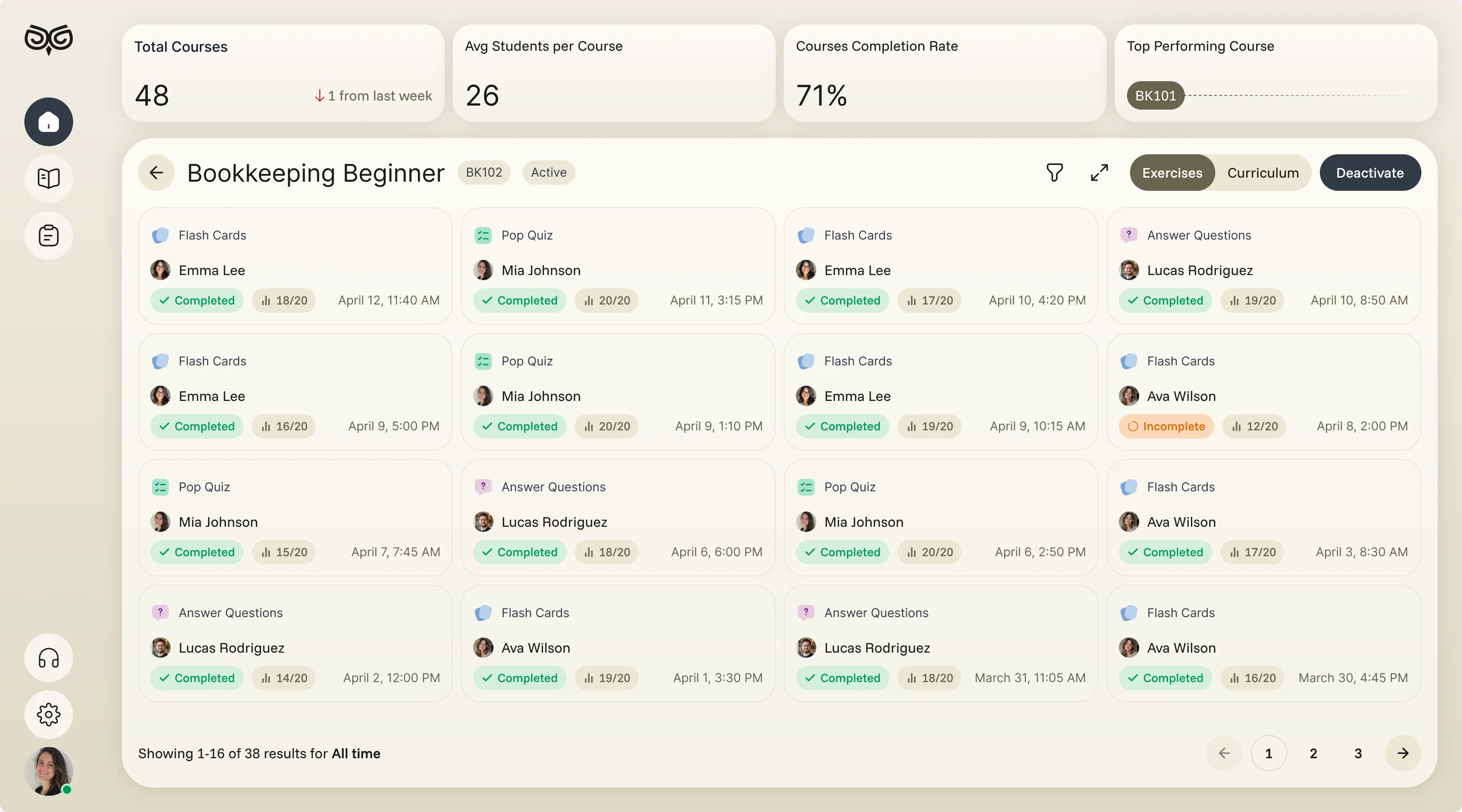
From a class to one student’s answer
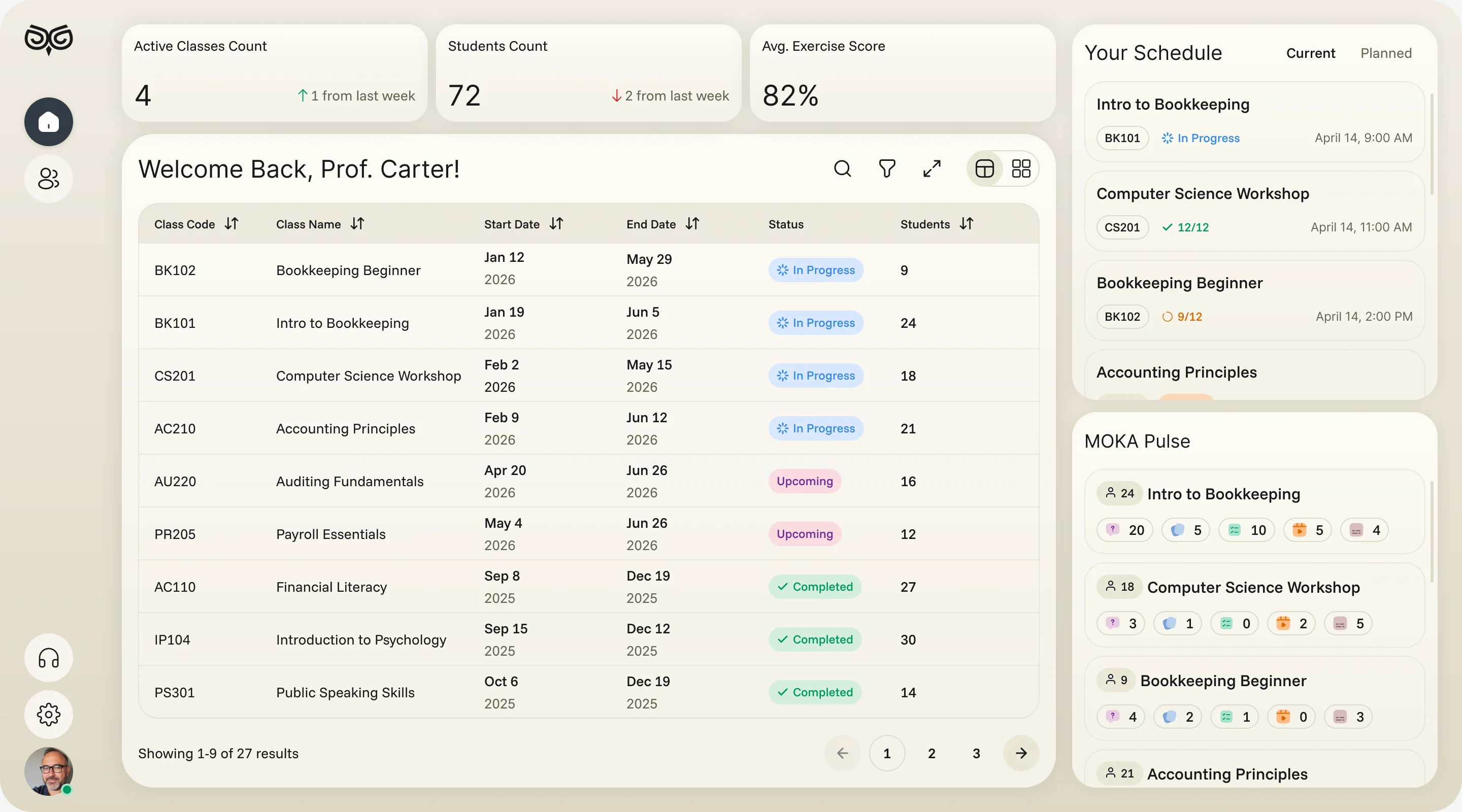
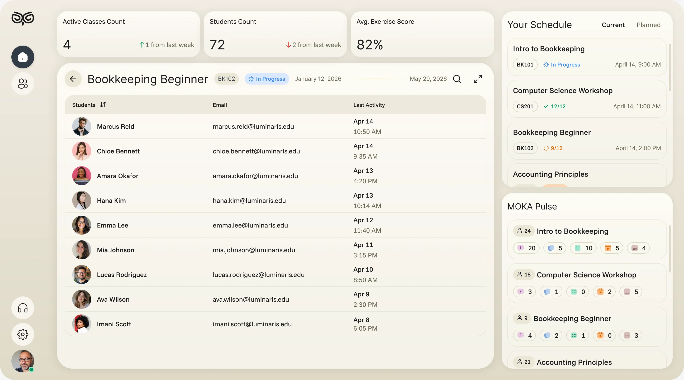
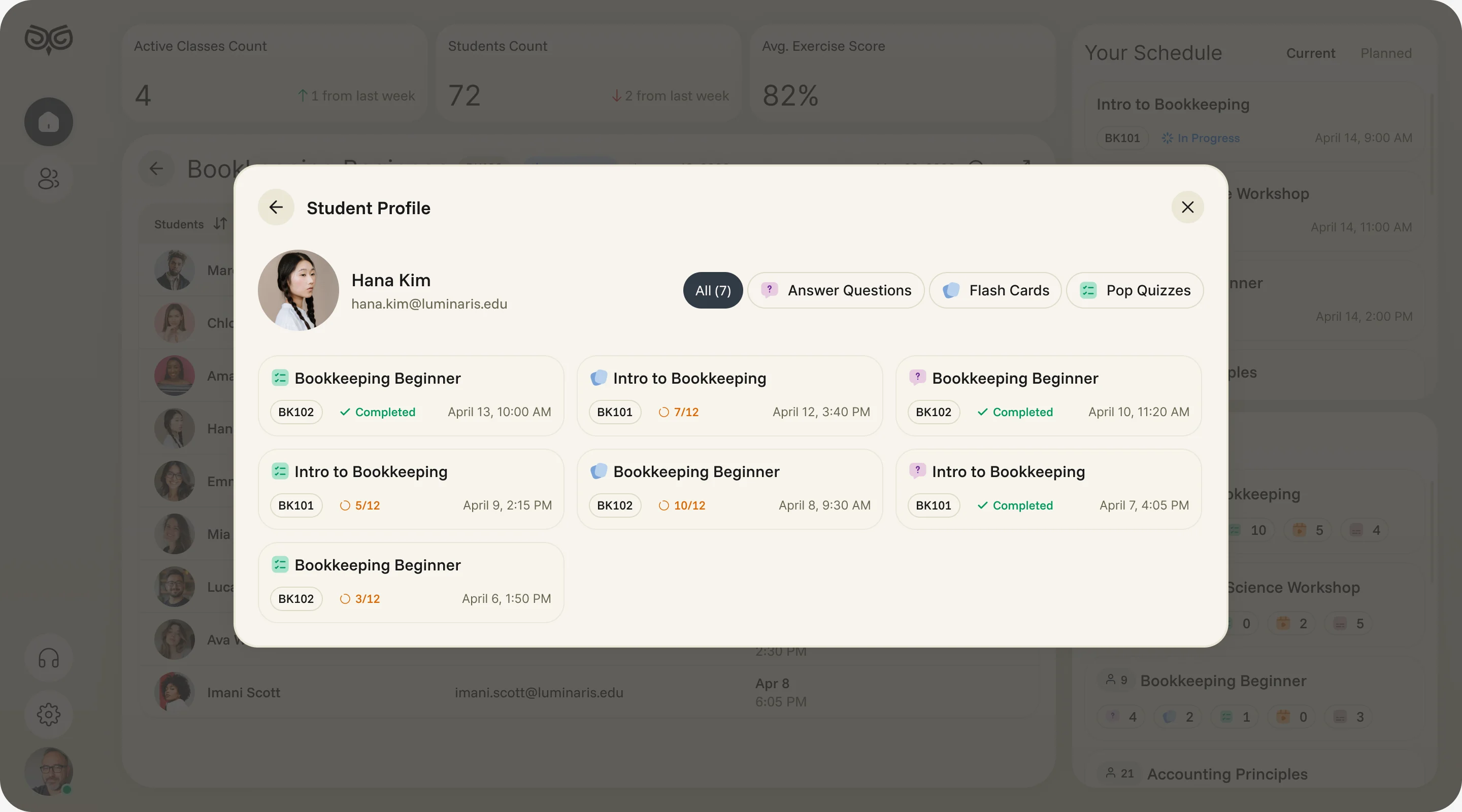
- Found
- Instructors saw classes as rows of numbers, and getting to what one student actually answered took several tools.
- Decided
- A dashboard of classes with today’s schedule and activity per course, then one path down: a class, a student’s exercises, and the answers to one quiz.
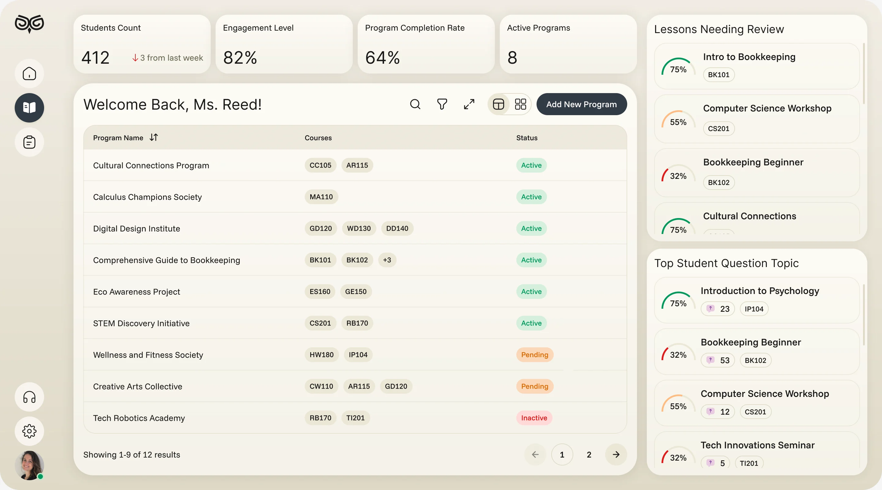
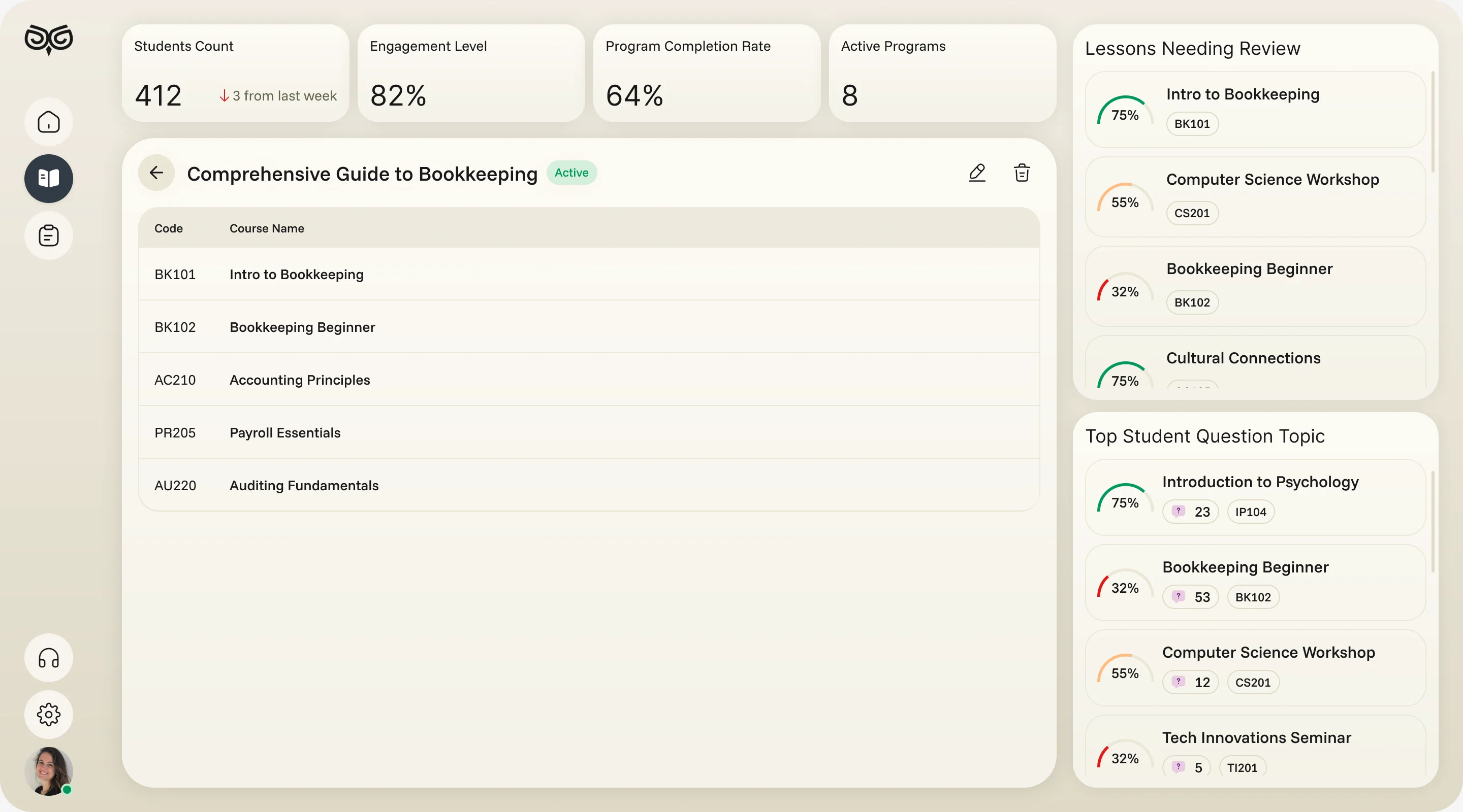
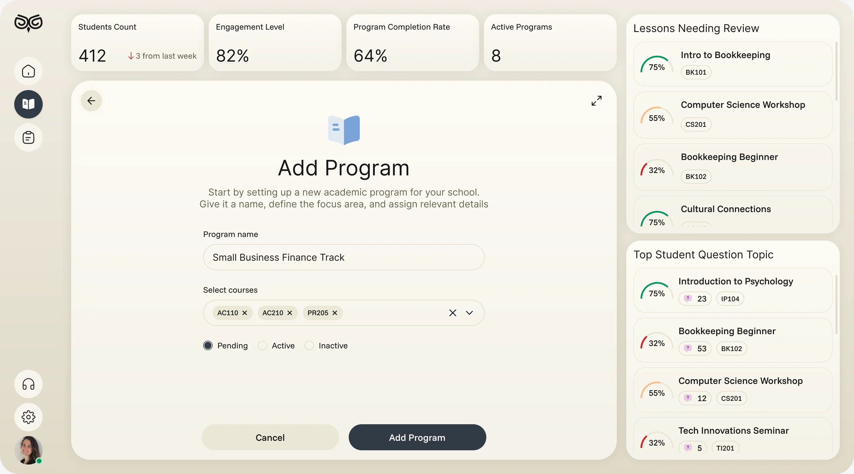
Programmes built the school’s way
- Found
- Every school structures its teaching differently, and a rigid template forces curriculum teams to bend their method to the software.
- Decided
- Programmes made of courses, courses made of exercises and an uploaded curriculum, each created and reordered by the team, with lessons that need review shown beside them.
Reports a school can act on
- Found
- Engagement data across campuses and courses meant little until someone turned it into a next step.
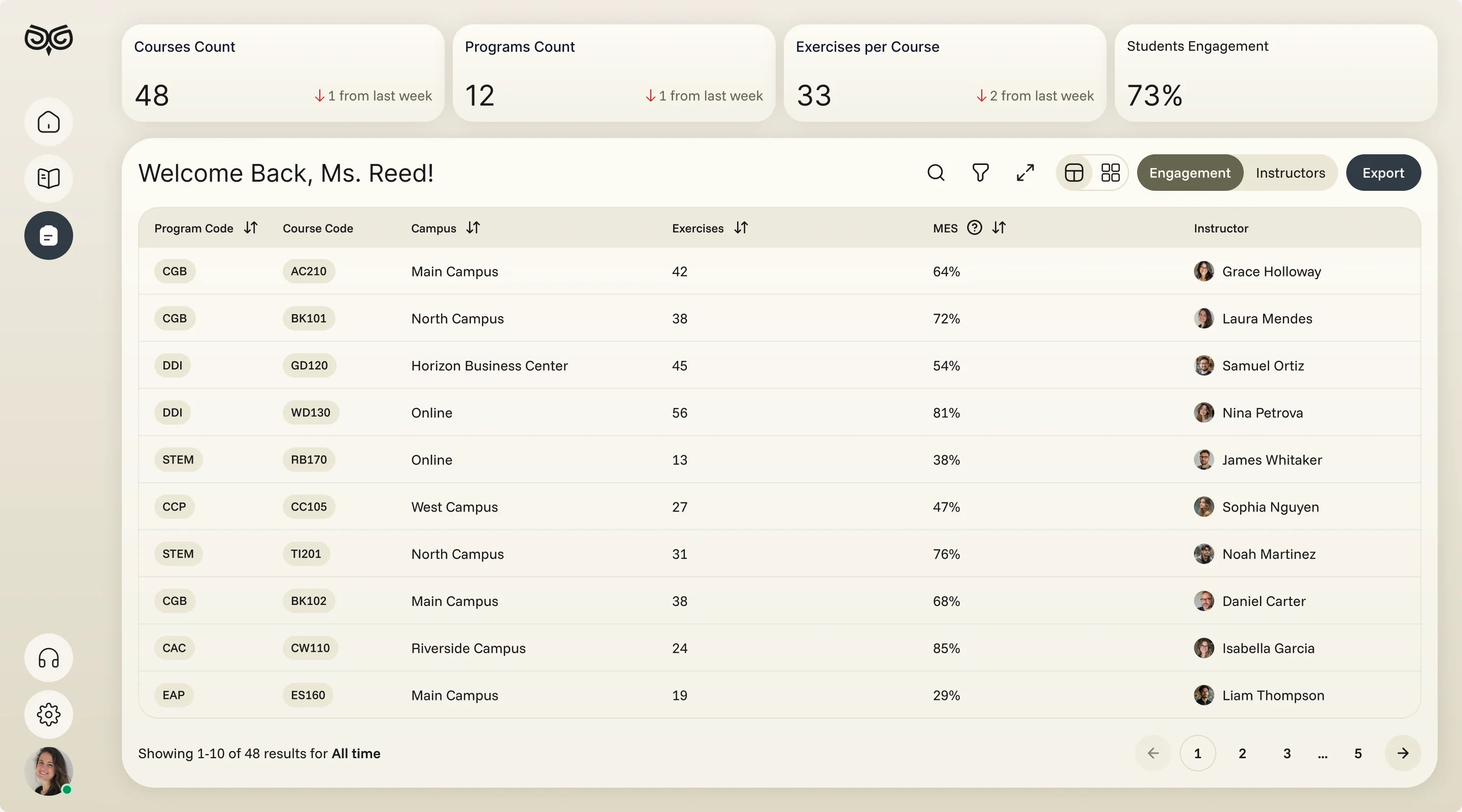
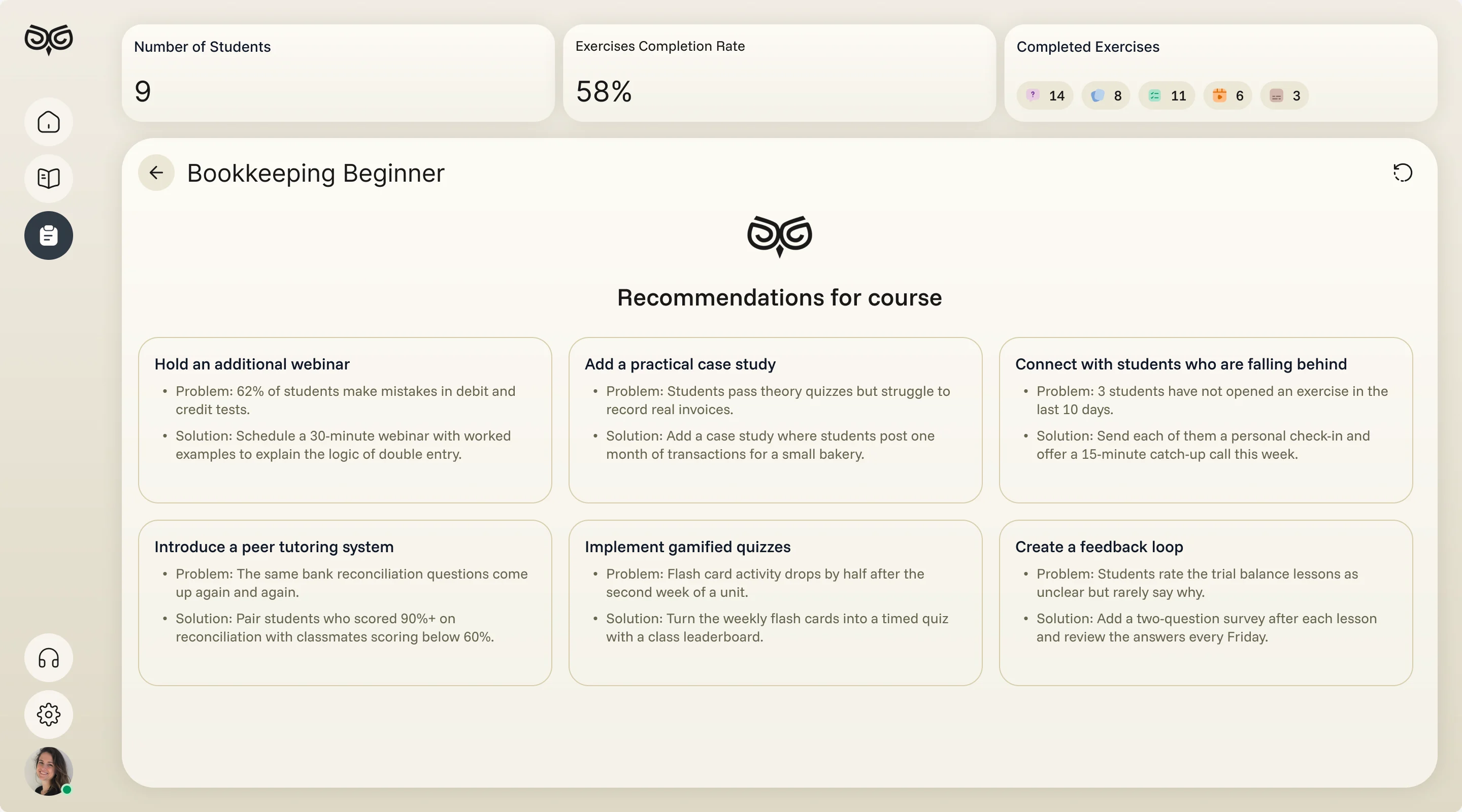
- Decided
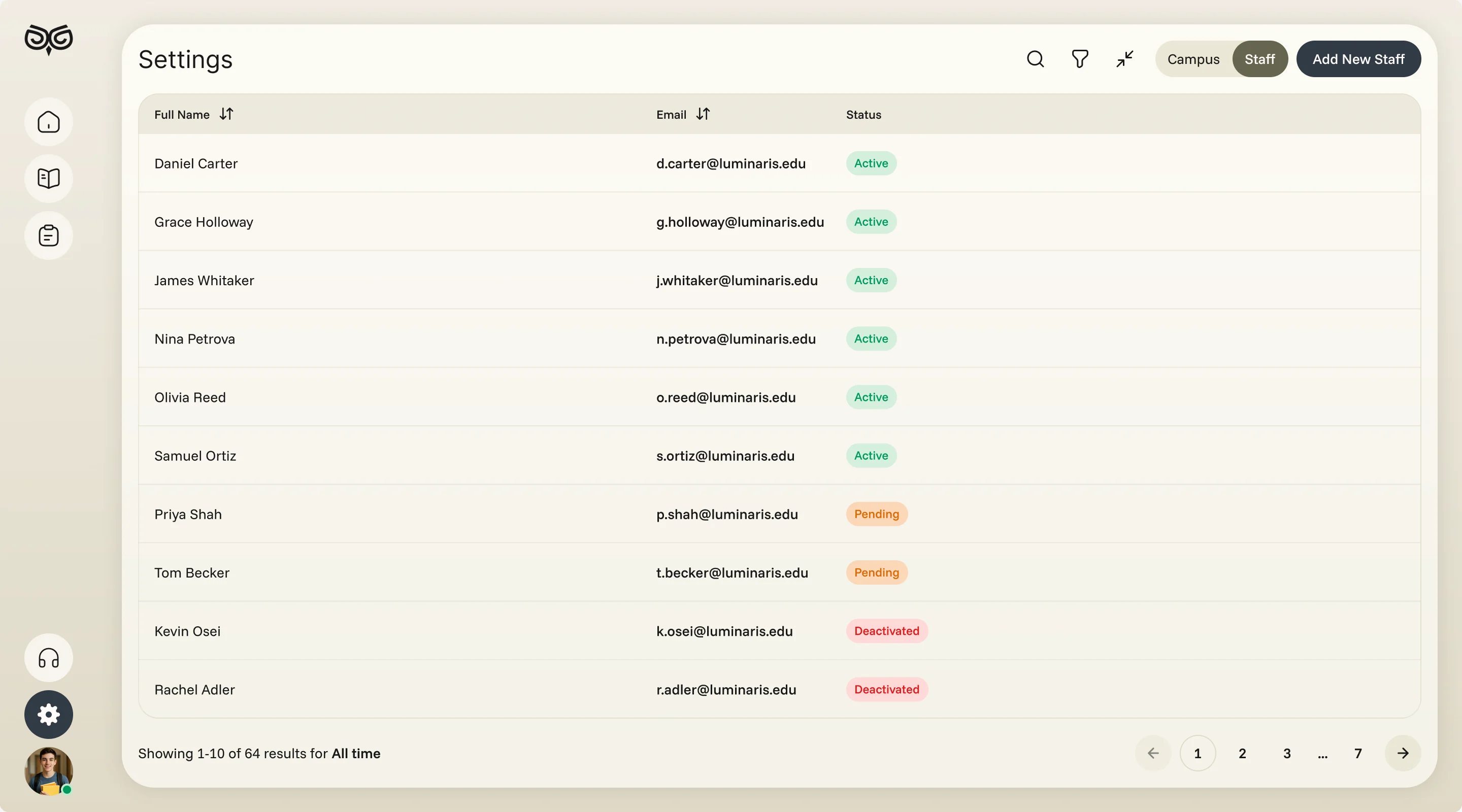
- An engagement report by programme, course, campus and instructor with export, AI recommendations that pair each problem with a practical fix, and staff and campuses kept in settings.
One system for a phone and three dashboards
- Found
- Four roles on two platforms could easily have ended up as four products that only share a logo.
- Decided
- One component system: the same metric cards, tags, tables and sheets on web and mobile, each drawn for empty and error states, and the phone in light and dark.
A number reads the same for every role
Label, value and change against last week, whether an instructor counts classes or a curriculum team counts students.
-

Instructor: Classes, students and the average score. -

Curriculum: Students, engagement, completion and programmes.
Drawn for the moments that go wrong
Nothing scheduled yet, a file too large, an answer not chosen: each says what happened and what to do.
-
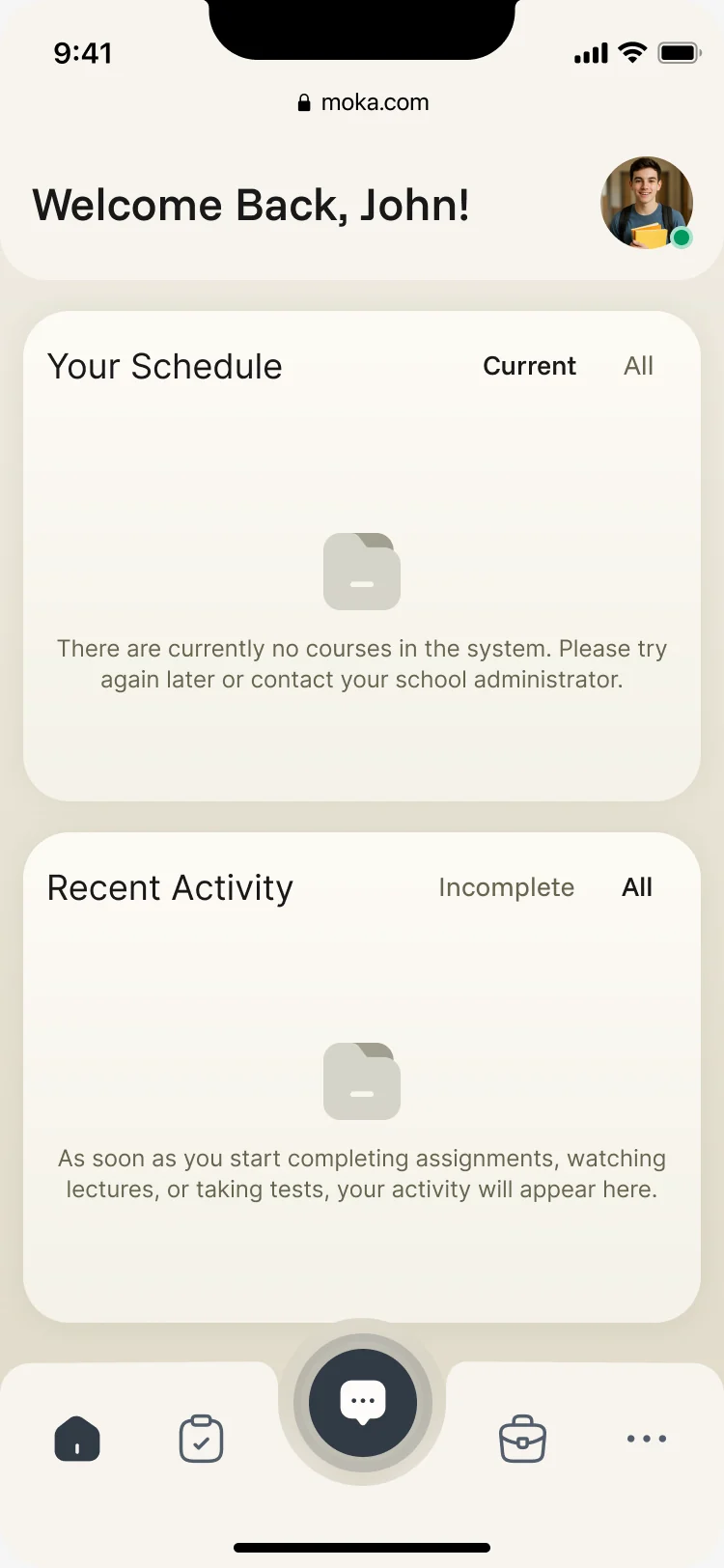
Nothing yet -
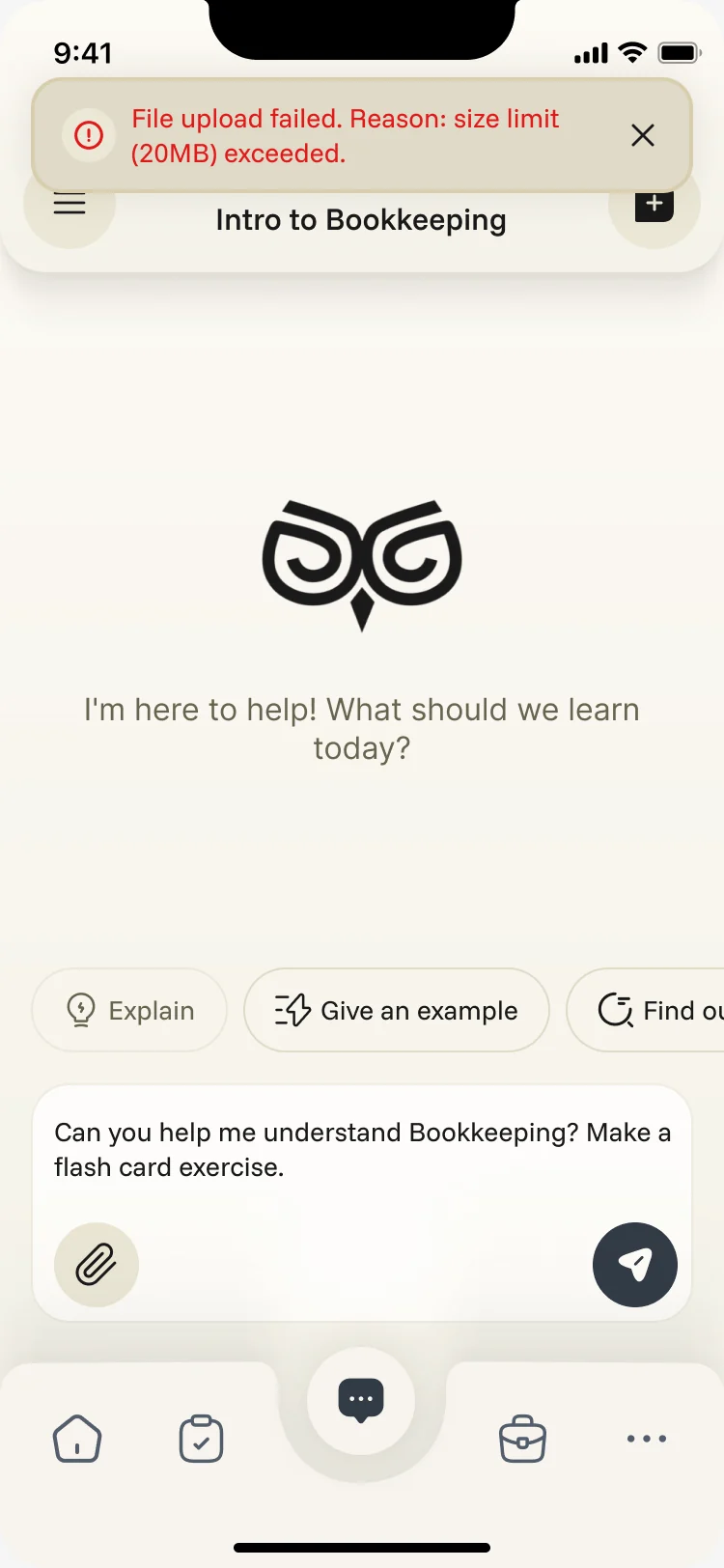
Upload failed -
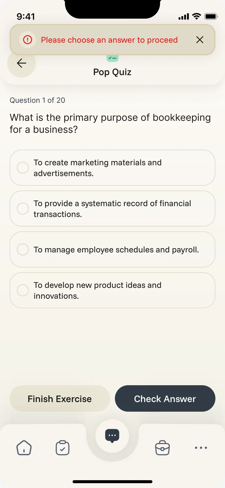
No answer chosen
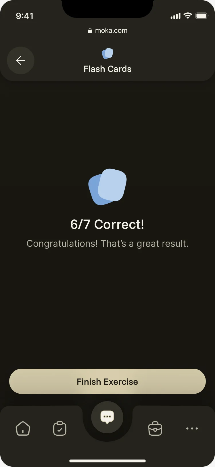
The phone, in dark too
The student app has a dark theme, drawn from the same Deep Focus palette as the light one.
Where the product ended up
One design for the whole product: a student’s assistant that works inside their courses, the learning activities around it, and web tools for instructors, curriculum teams and admins, in one visual system from the owl logo to the last state, delivered with a screen map and an organised file.
- screens across web and mobile
- 200+
- roles in one product
- 4
In the client's words
This was a large design project in which these guys excelled. Their expertise as a UX agency was evident throughout — especially in the attention to detail in user testing and seamless user flows. Will definitely be hiring again.

Afraid students won’t open it?
Moka had to interest teenagers and still work for the teachers behind them. Show us your learning product, and we’ll show you where it loses each of them.
More work like this
Three more products with several roles, AI inside, or a large system.
-
FoodTech · SaaS
Glimix
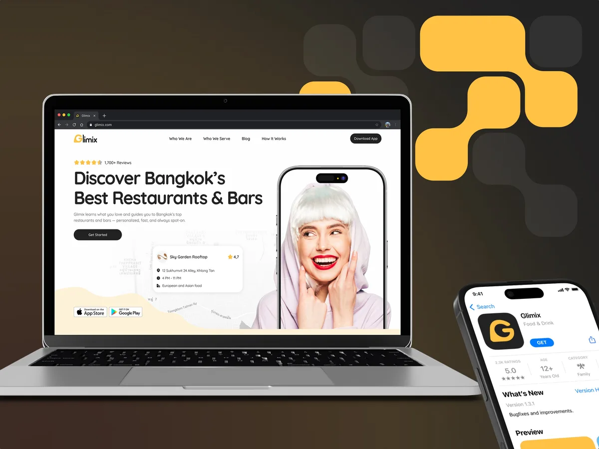
Redesigned a two-sided hospitality app for diners and venue owners, with an AI assistant, a receipt scanner and a new brand.
- 200+ Screens designed
- 5 Experts on the pod
-
Wellness · Healthcare
Clearwater Wellness Co.
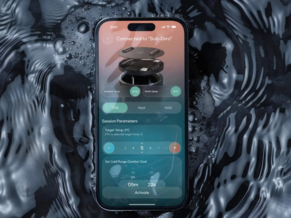
Designed a cold-plunge wellness app from scratch: bath control, session tracking and a community around the ritual.
- 306 Screens designed
- 4 Experts on the team
-
AI Hi-Tech · SaaS
Superstream
Turned a Kafka management platform’s dense technical data into one calm, consistent interface for DevOps teams.
- 3000+ Screens designed
- 1500h+ Design hours