How to Build a Cohesive Brand System
Learn what a brand system includes, how it differs from identity and guidelines, and how to build governance that keeps product and marketing consistent.
One visual identity for your digital product — logo, type, colour and imagery — designed for the screens people meet it on, from the app icon to the website.

One identity your product and website share, with the rules to keep it that way.
Designs the product's screens and components.
Brand Identity Design
Designs the identity those screens carry.
Not included
Every part is drawn for screens first, then everything else.
A logotype, a mark and an app icon that stay clear at small sizes.
The system around the logo, each part with a job to do.
Your own app screens and web pages, shown in the new identity.
Rules your team can follow, and every file, yours to keep.
You receive
Digital product branding is judged on screens: an app icon among forty others, a button, a chart, a sign-in page. So we answer a few questions first, then design two or three routes from the same answers and try each one where people will actually see it.
How: Positioning inputs Founders, marketing and sales, with your customers' own words
Why: An identity is judged against the other options in its category, never on its own.
How: A one-line brand promise Agreed with the people who approve the brand
Why: Every visual choice is checked against it, so taste is not the tiebreaker.
How: Two or three routes: close, distinct and stretch What must stay — a name, a colour, a habit customers rely on
Why: Seeing how far the brand could go makes the choice a decision, not a drift.
How: Tests on real screens An app icon among forty others, the sign-in page, a chart, the website, a sales deck
Why: A mark that works on a poster can fail at 32 pixels or in dark mode.
How: Guidelines and source files Clear space and sizes, type scale, colour roles in light and dark mode, contrast checked against WCAG, right and wrong use
Why: Written rules keep the next screen, and the next hire, on brand without asking us.
Reviews and decisions. The people who approve the brand — usually a founder, marketing and the product lead — review each direction together, on real screens. Feedback is gathered in one place, and the number of review rounds is set in the proposal, so the choice is made rather than drifted into.
Brands designed for digital products, then carried into the apps and sites that wear them.
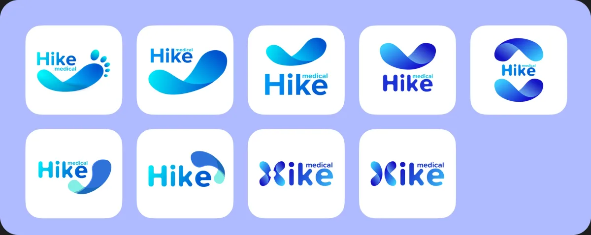
Workplace foot health · Branding · iOS app + HR admin
Designed the identity for a workplace foot-health platform — a soft wave in the medical blues over the Hike wordmark — and, as a separate scope, the employee app and admin portal built on it.
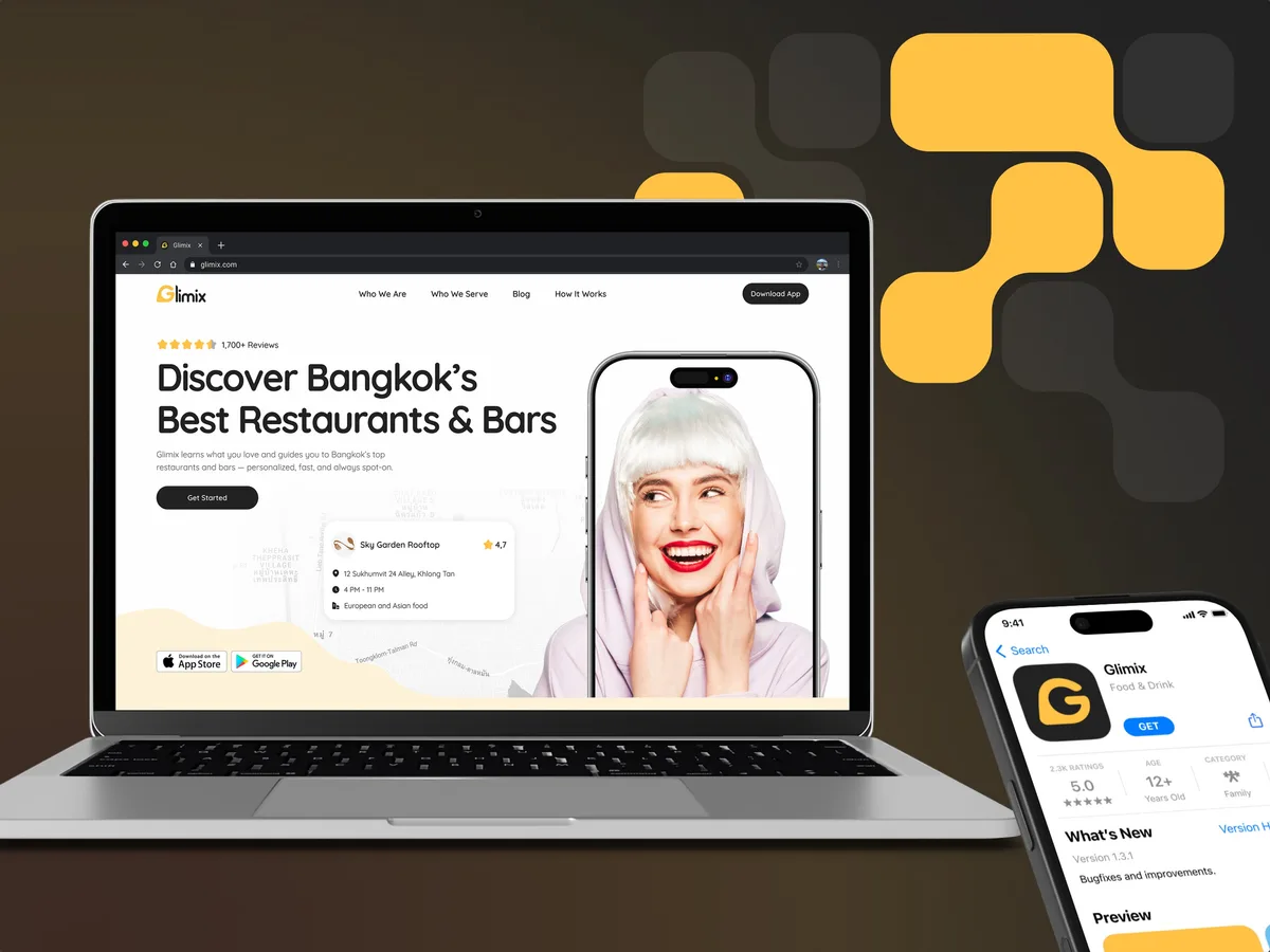
FoodTech · SaaS
Gave a foodtech app its face — logo concepts and moodboards, then the full identity: mark, colour, type, iconography and imagery rules, written up as a brand book and carried into the app, the landing page and the store assets.
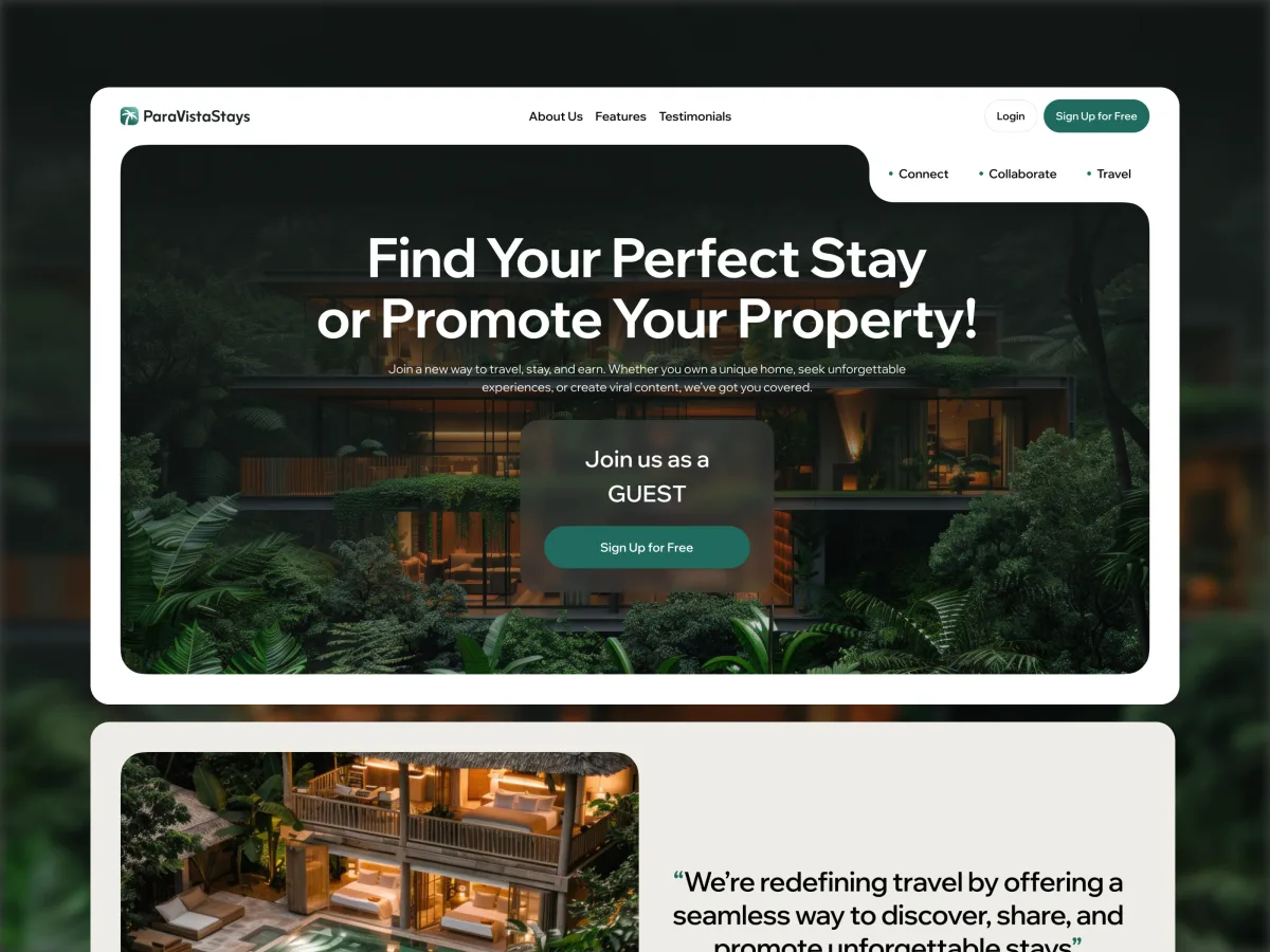
Travel · Marketplace · Mobile-first web + Admin + Landing
Built a new identity for a villa-rental marketplace around one idea — a palm mark and wordmark that stay legible on a photograph, at app-icon size and in a single colour.
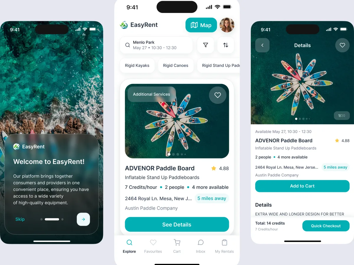
Marketplace design · Water sports
Explored mark and wordmark concepts and three visual directions for a water-sports rental marketplace, alongside the product it names.
It fits when the product is clear and its look is not. Four signs it is the right step now.
The product goes public soon, and the app icon, site and deck need one face.
A logo made in a weekend, colours chosen screen by screen, a site that looks like another company.
You can say who the product serves and why it is different, even roughly.
The people who approve the brand can join reviews and settle a direction.
Tell us what the product is, who it is for and what already exists. We will come back with a useful scope and a realistic next step.
Scope, review rounds and who approves are agreed before the first direction.
As a startup, we needed to move quickly and bring the whole business to life. ANODA helped us do that across our brand identity, app, website and even our exhibition booth. They understood what we needed to get started, helped us prioritise, and kept everything moving without losing attention to detail. Having one team connect all those pieces made a real difference—we could focus on building the business while they gave Hike a cohesive, professional presence from the start.
Tell us about the product, its audience, and the logo, colours or site you have now.
Message received.
Within 15 minutes, we’ll email you initial feedback and follow-up questions.
Learn what a brand system includes, how it differs from identity and guidelines, and how to build governance that keeps product and marketing consistent.
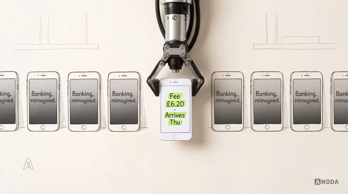
Build a fintech brand strategy that earns trust, clarifies the product and stays consistent across marketing, onboarding and the financial experience.
Ask to see identities applied to real products, not only logos on mock-ups: the app icon, the sign-in screen, a dense page of data. Ask how directions were chosen and who in the team did the work. A team that designs products as well as brands will show how type, colour and contrast hold up in an interface, which is where a digital product's identity is used every day.
Positioning inputs, two or three directions, and the chosen identity: logo, mark and app icon, typography, colour and imagery, applied to your own product screens and web pages, with guidelines and source files. If customers already know your logo, we can keep it and rebuild the system around it rather than start again. Messaging, naming and campaigns are separate pieces of work.
How settled your positioning is, how many directions are explored, how many screens, pages and other places the identity is applied to, whether an existing brand has to be kept or migrated, and the number of review rounds. We set a custom scope and estimate in the proposal, fixed or phased, and agree the timeline once scope, access and dependencies are clear.
Start with the identity when the product is clear but its look is not, or when a launch needs one face across app, site and deck. If the product works and only its screens need refining, UI Design comes first. If the identity is settled and the site is the problem, Website Design. If you are not yet sure who the product is for, Product Discovery.
Access to the product or site as it stands, your audience, competitors and promise — written down, or settled with us in the first sessions — the current logo, colours and fonts, and the people who approve the brand, available for each review. If the positioning is still loose, the first sessions settle it before any direction is drawn, so the time goes into choices rather than guesses.
Brand guidelines, the logo, mark and app icon in every format you need, type and colour specifications, imagery and icon rules, your product and web screens shown in the new identity, and the organised source files. Everything is handed over with a walkthrough and belongs to you. Commercial font licences, where a typeface needs one, are bought in your name.
Trademark search and legal clearance, naming, messaging strategy, marketing campaigns, and building the product interface or website. The identity does not promise sales or market results. Product screens and the site can be redesigned in the new identity with us or your own team, scoped separately.
Our Hike Brand Identity case shows a full identity system for a workplace foot-health platform. The identity was one piece of work; the employee app and admin portal that carry it were designed as a separate scope, and the case shows both — from the mark exploration to the colour and type in the app's onboarding and the portal's dashboard, so you can see the identity at work rather than only presented. Glimix shows a full identity built for a foodtech app, ParaVista a palm mark made to work from photographs down to app-icon size, and EasyRent the mark exploration for a rental marketplace.