
Music running app: pick the run, music follows
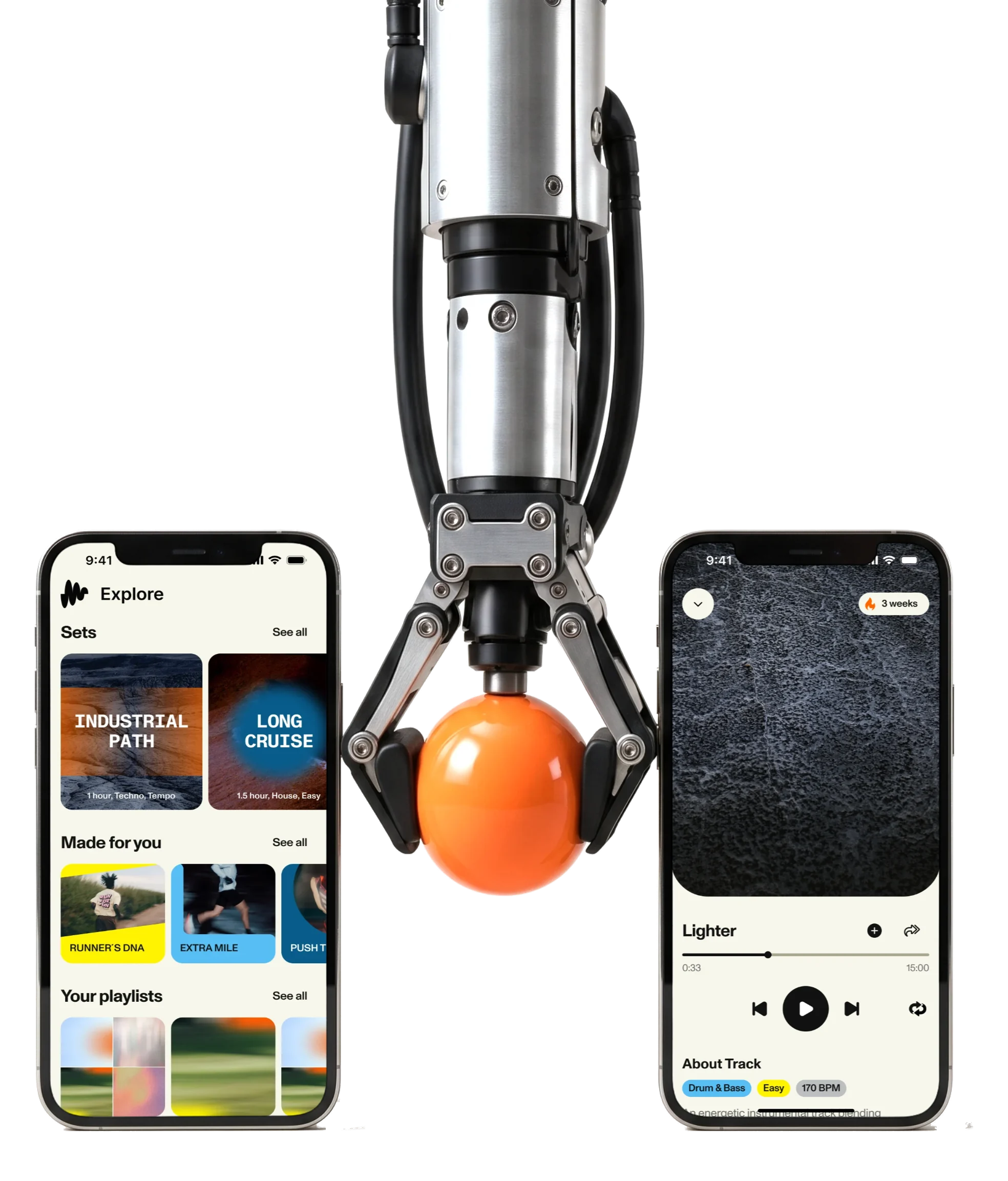
RUNNERS HIGH makes its own long-form music for runners, chosen by effort or cadence.We designed its iPhone app, and designed and built its site.
- 86
- screens from sign-in to subscription
- 5
- experts from research to the Webflow build
- Webflow
- site and the voucher flow, designed and built by us
Project summary
RUNNERS HIGH is a subscription app of music made for running: long-form sets produced in-house and chosen by the effort of the run or by cadence. It tracks nothing. The client came with the music, the brand and early drafts. We designed the iPhone app from research to handoff, with its UI kit , then the marketing site, designed and built in Webflow , and later a voucher flow for partner members.
How we worked together
- Start
- Kickoff on 28 March 2025, from the client’s music, brand and early drafts
- First scope
- Research to handoff for the iPhone app, on a five-week schedule
- Our team
- Five experts, from research to the Webflow build
- Came back for
- Explore, sets and playlists, recent listening and a new paywall; then the website and a partner voucher flow
- Built by us
- The marketing site in Webflow, and the Webflow side of voucher redemption, with its Firebase Cloud Function
- Built by their team
- The iPhone app, its backend and content admin, by the client’s development agency
- Today
- RUNNERS HIGH is on the App Store for iPhone; the live app has grown past the scope shown here
What a runner meets, from first launch to a run
One path, from the first screen to a set playing:
-
Start
- Value screens
- Google, Apple or Facebook
- Referral code
-
Set up
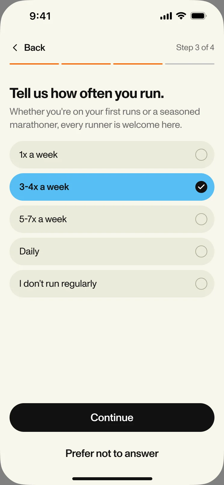
- How often you run
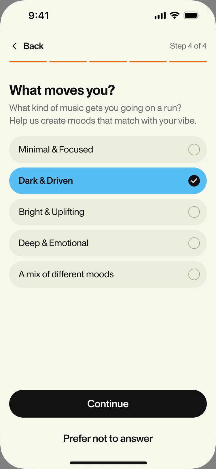
- What moves you
- The first set
-
Explore
- Sets
- Made for you
- Your playlists
-
Library
- Genre
- Easy and Tempo
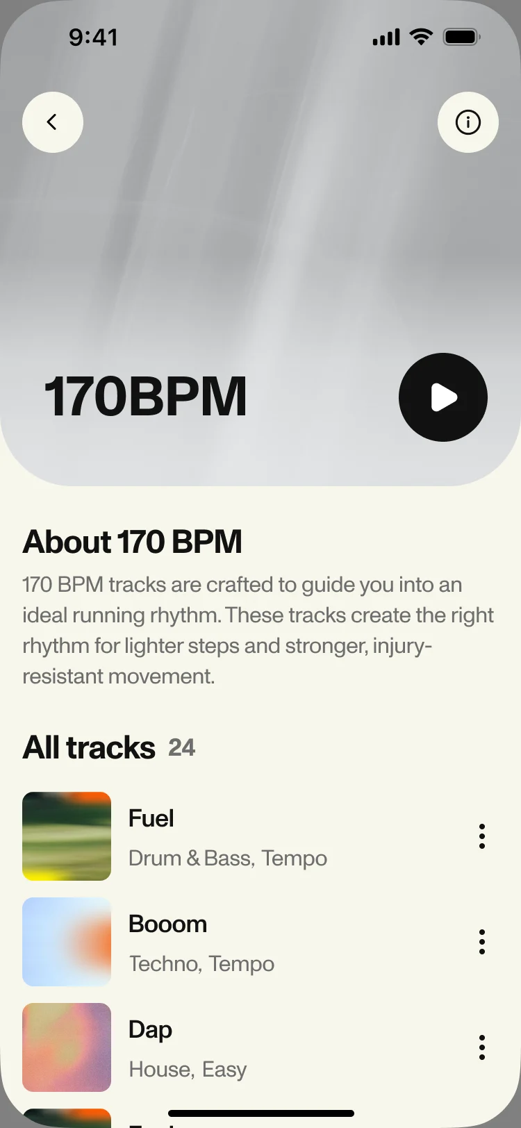
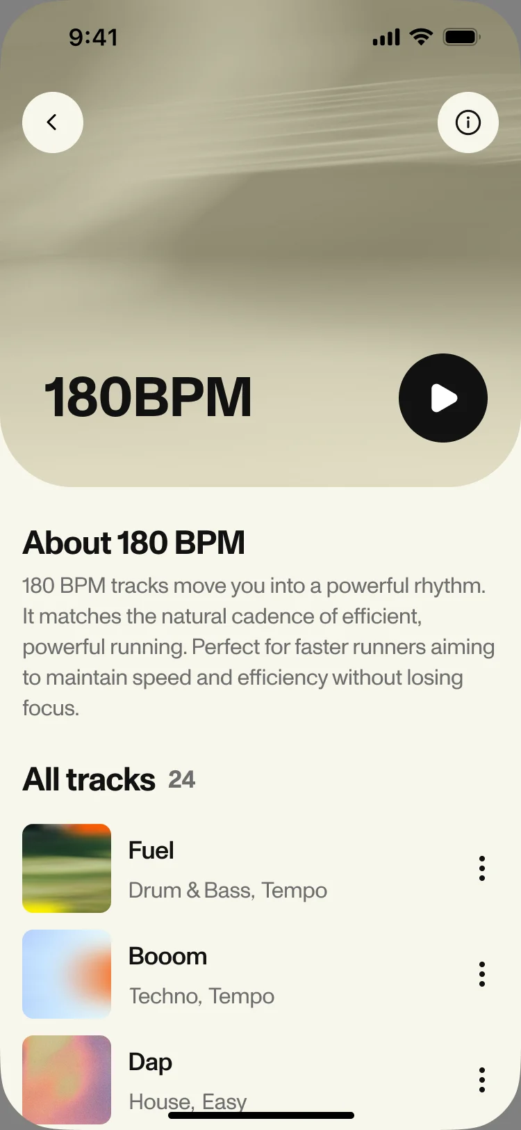
- 170 and 180 BPM
-
Listen
- Player
- Downloads
- Share
-
Yours
- Playlists
- Recently listened
- Subscription
- Music and Training
- A music app first, with the training reduced to two plain questions: how hard, and how fast your feet move.
- Catalogue and The start line
- A growing library of sets and tracks, and the right one still found without browsing before a run.
- Free and Paid
- What’s locked, what the trial unlocks and when it ends, said before anyone pays.
Three ways to choose, in one screen
- Found
- Genre is how people choose music; effort and cadence are how RUNNERS HIGH wants them to choose it. Mixed together, they would read as one long list of categories.
- Decided
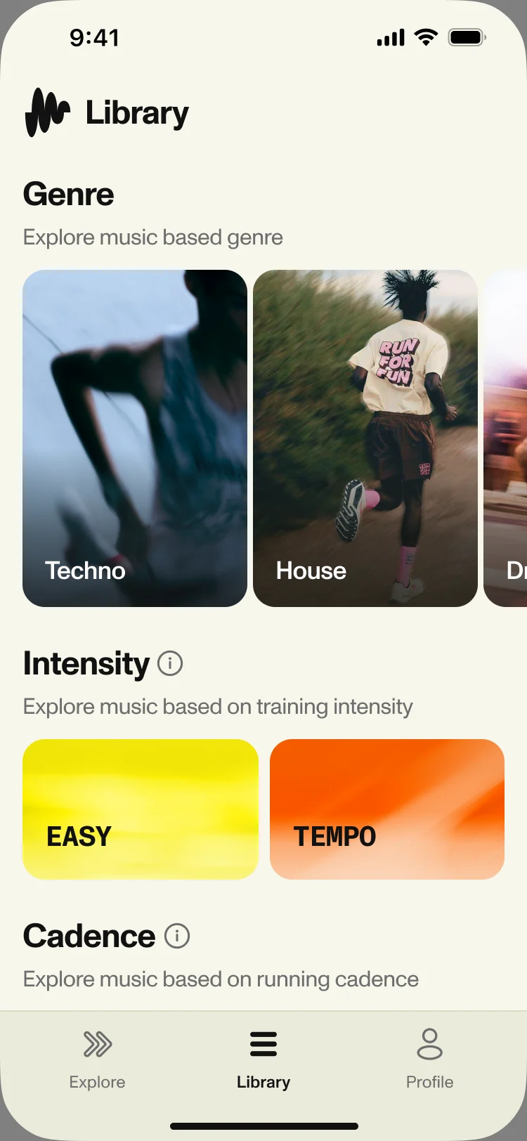
- The Library stacks them in order: genre first, the familiar way in; then intensity as two large cards, Easy and Tempo; then cadence as 170 and 180 BPM. Each carries one line that says what it is for.
- For the user
- A runner who knows only that today is an easy day finds the right music without learning what cadence is first.
-
Genre
The familiar way in, by the sound.
-
Intensity
Easy or Tempo: how hard today’s run is.
-
Cadence
170 or 180 BPM, with a hint on what cadence means.
-
Tabs
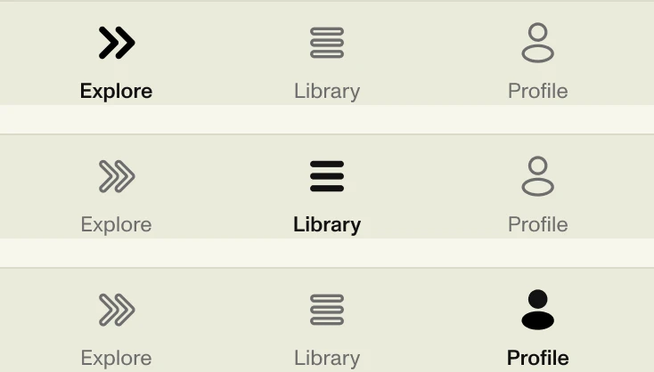
Explore, Library and Profile, always in reach.
How the work progressed
The first release from research to handoff, then the site and the voucher flow, one question closed at a time.
-
Discovery
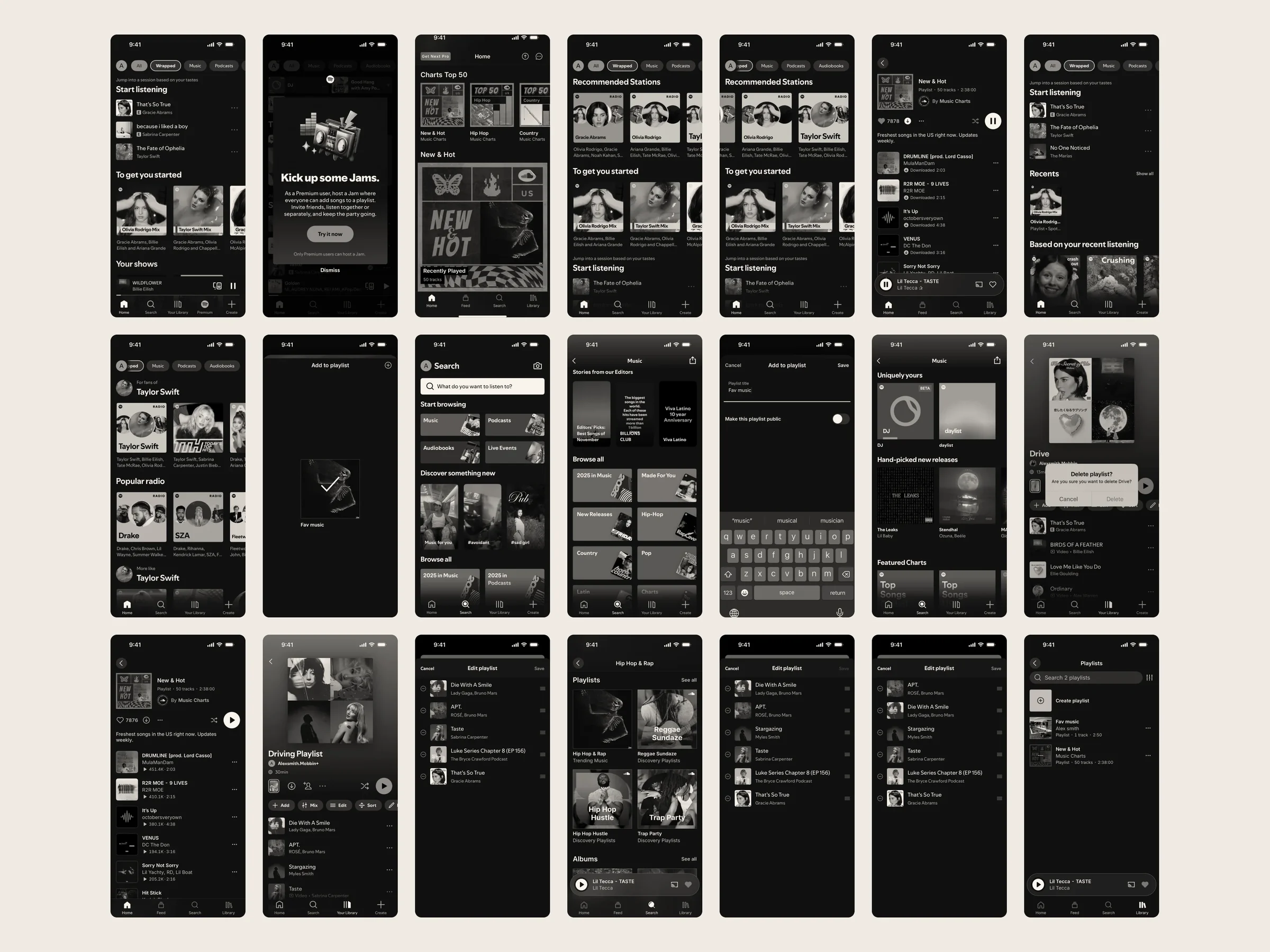
Where the product had to differ from streaming apps and running trackers, and what the client’s early drafts already settled
Artifact Competitor and market research for the first release
-
User Flow
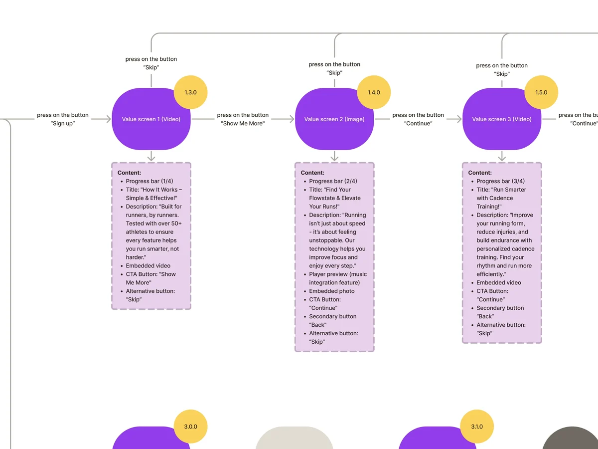
Every path from the first launch to a playing set: sign-in, the set-up questions, the first set, the library and the profile
Artifact Information architecture and end-to-end user flows
-
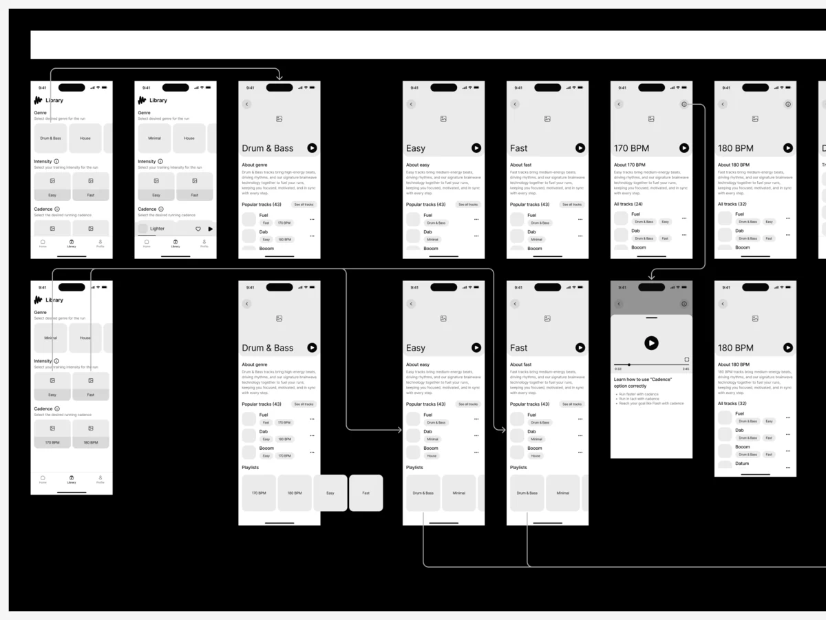
Wireframes
What each screen holds before colour and photos: the library by genre, effort and cadence
Artifact Wireframes for onboarding, home, library and profile
-
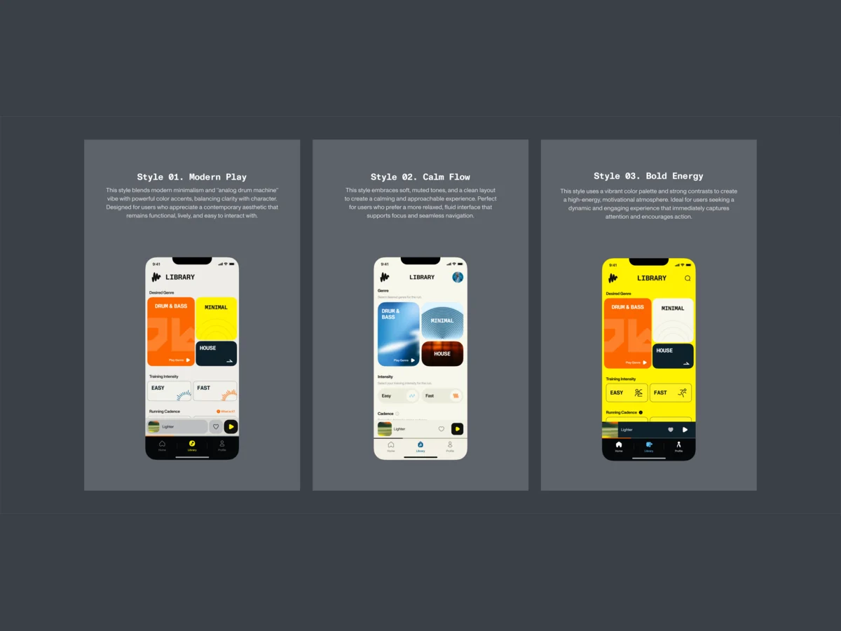
UI & Design System
A look inside the client’s own brand, chosen from three styles, then one kit for every screen
Artifact Three visual styles, the final UI and a UI kit
-
Delivery
What the client’s developers needed to build the app without guessing
Artifact A numbered screen map, a clickable prototype and the handoff
-
The website
How the product explains itself before the download, and how partner members get from a code to the app
Artifact The responsive site and its Webflow build, then the voucher flow
From first launch to a playing set, mapped first
- Found
- Sign-in, set-up questions, a referral code and the first set all come before a runner hears a note; one dead end there and the app is deleted.
- Decided
- Every path was mapped end to end in a numbered screen map before it was drawn, each error included. The app settled on three tabs: Explore to play, Library to choose, Profile for what’s yours.
-
First launch
Value screens, sign-in with Google, Apple or Facebook, and an optional referral code with its errors.
Open the full map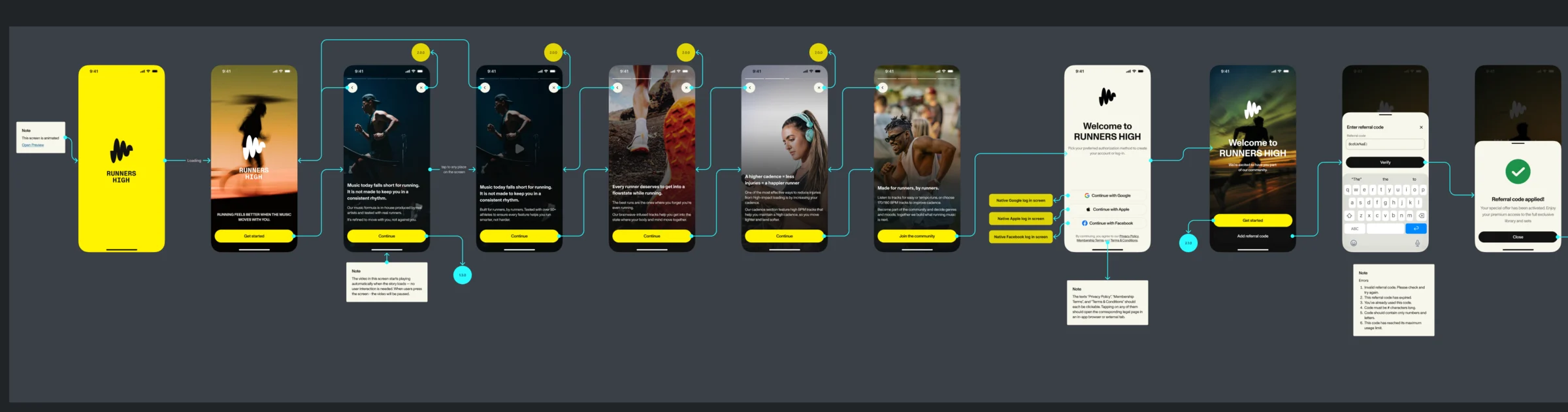
-
Profile and settings
Settings, personal details with every validation message, logging out and About.
Open the full map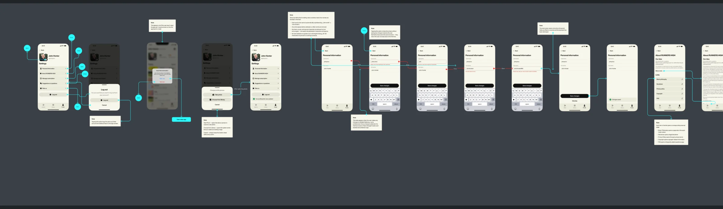
Five jobs the app does before and between runs
The first set, then choosing by effort or cadence, Explore, playlists of your own, and the subscription.
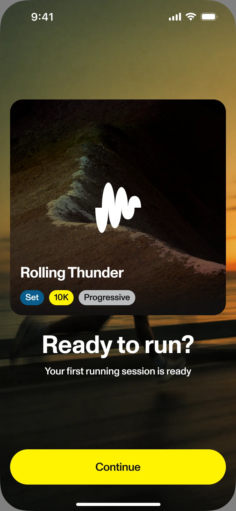
A first set before the first run
- Found
- A new runner arrives with no playlists and no idea what 170 BPM means; an empty library at that moment loses them.
- Decided
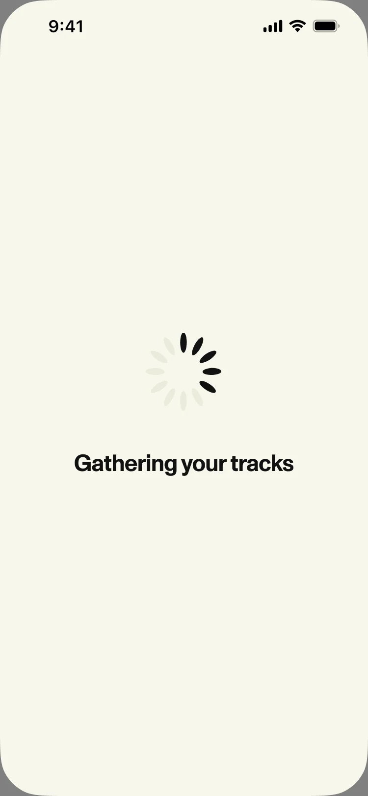
- Four short set-up questions, each with a way to skip it, then a loading step that says what is happening, and a first set ready to play.
Choosing by effort or by cadence
- Found
- Runners know whether today is easy or hard; far fewer know their cadence. Both had to be a choice, not a setting.
- Decided
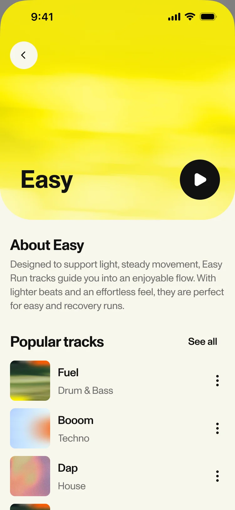
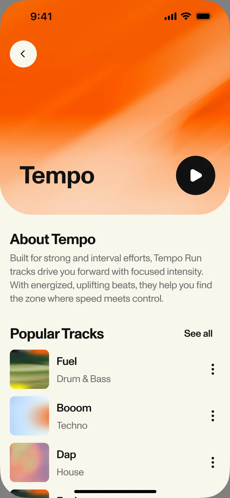
- Two plain ways in from the Library: Easy or Tempo for effort, 170 or 180 BPM for cadence. Each opens a page that says in one paragraph what it is for, then plays.
Explore, ready when the app opens
- Found
- A returning runner wants to press play, not browse a catalogue.
- Decided
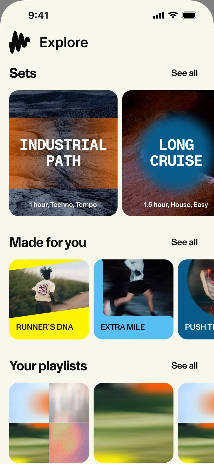
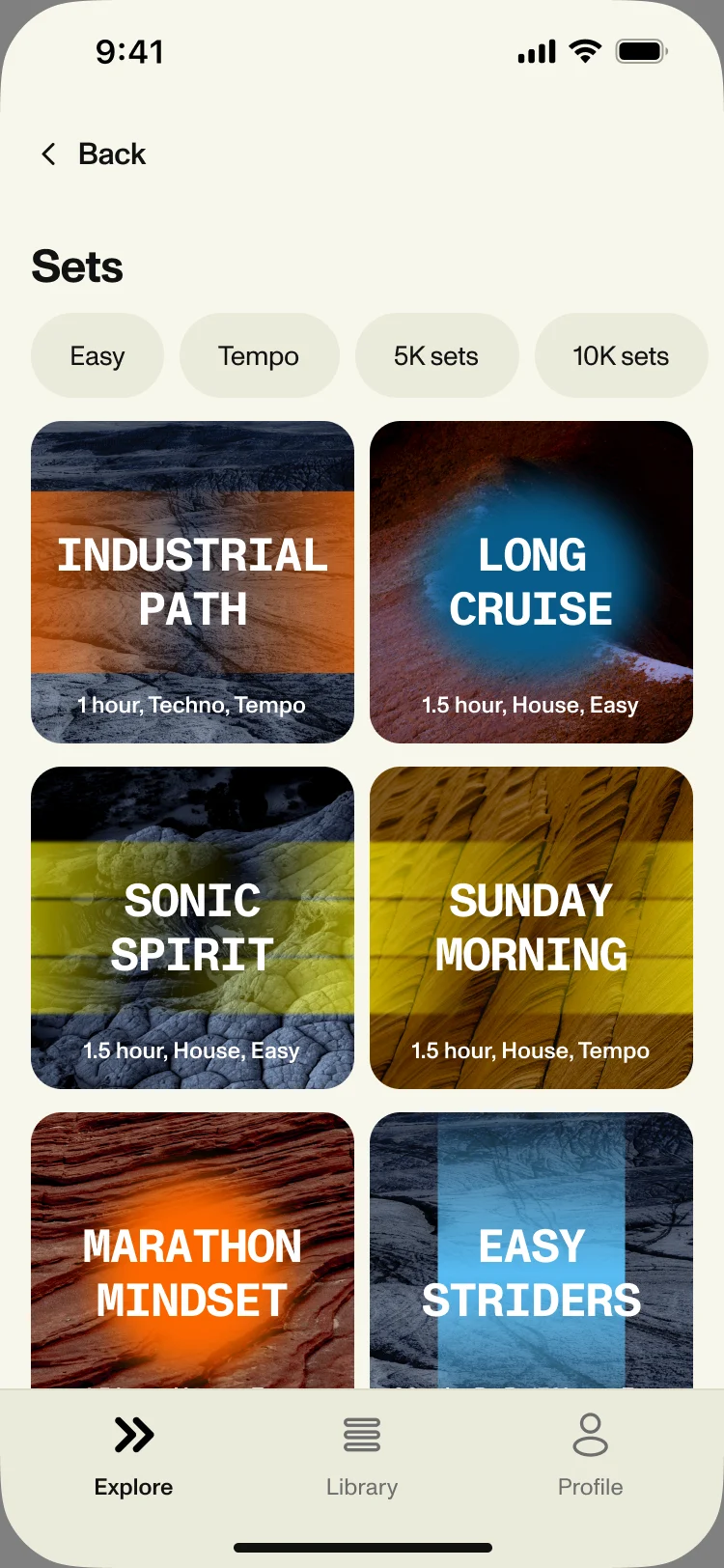
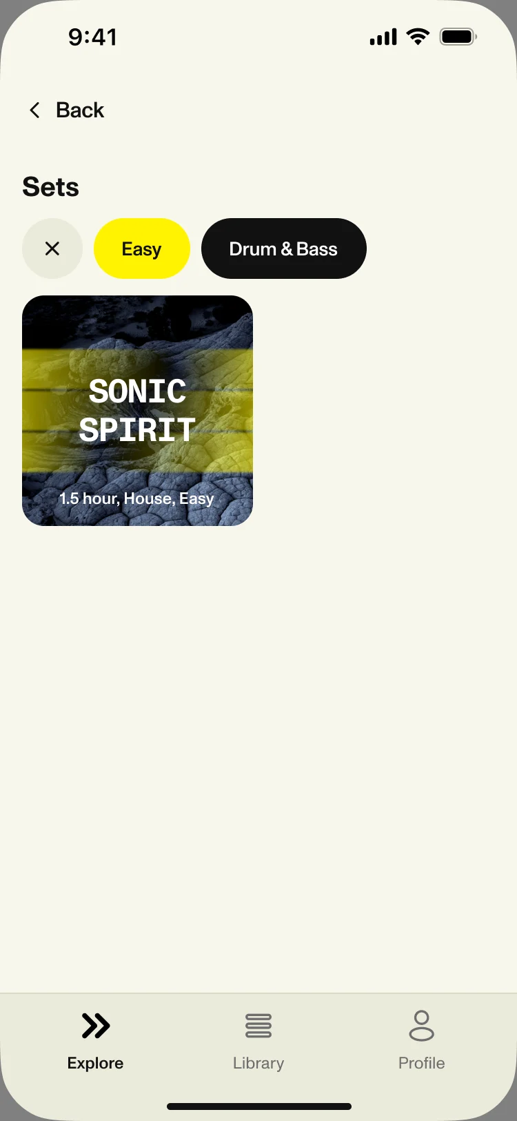
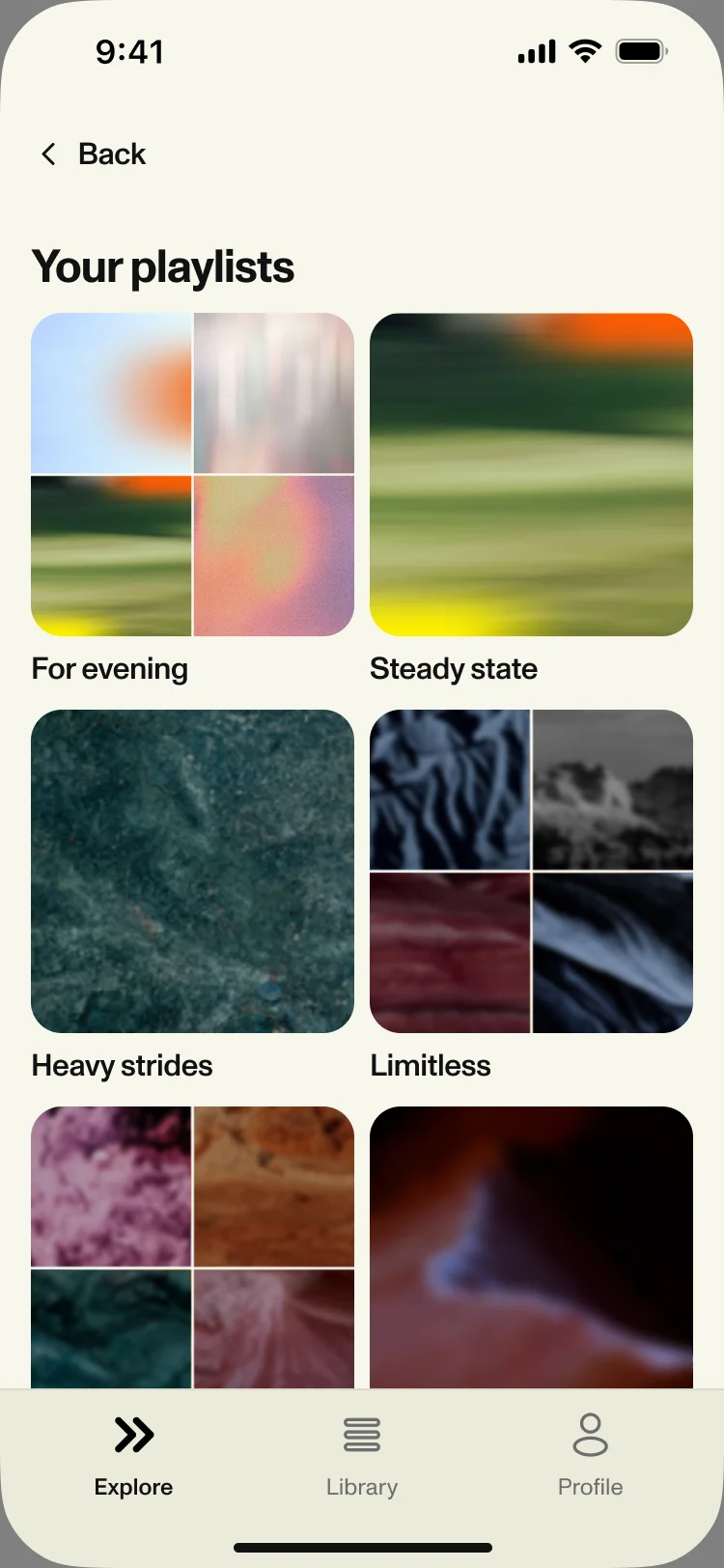
- Explore leads with long sets, then sets made for you and your own playlists. The sets page filters by effort, genre and distance, and says so when one set is left.
Playlists of your own
- Found
- Sets are long and fixed; some runners want their own mix, and a fiddly playlist editor loses them.
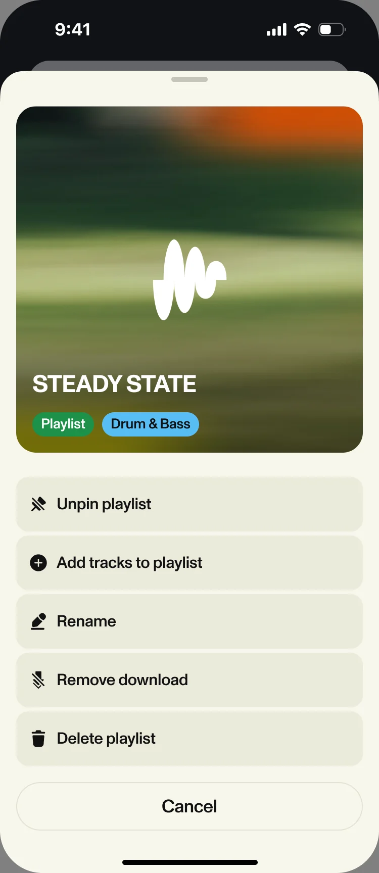
- Decided
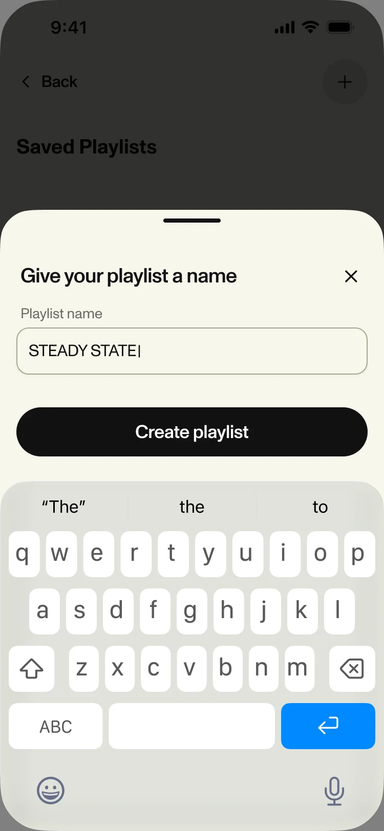
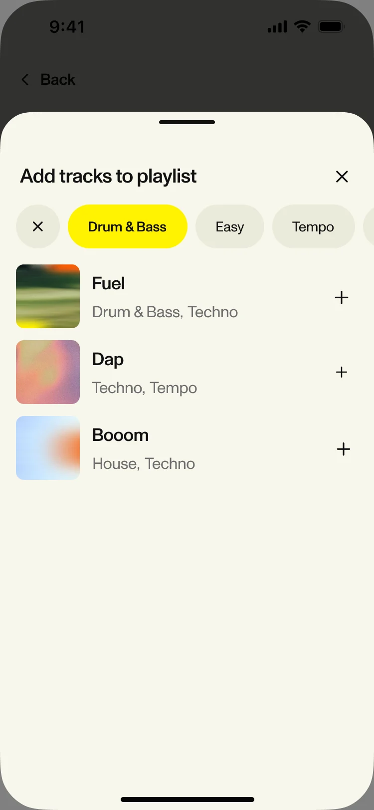
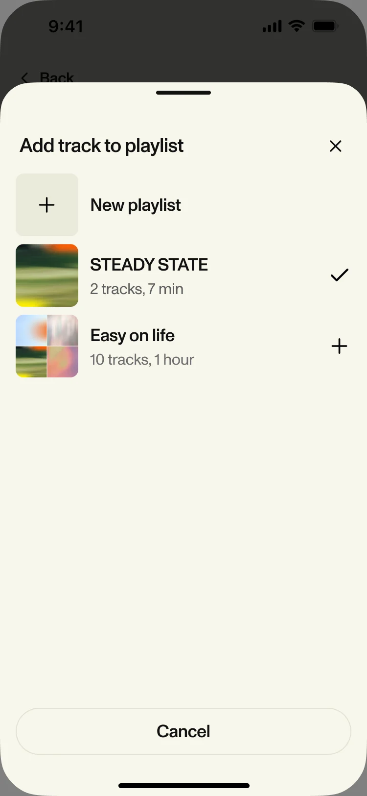
- Name it, add tracks with the same filters as the library, and run it from one sheet: pin, rename, remove the download, delete. A track can also go into a playlist straight from what you just played.
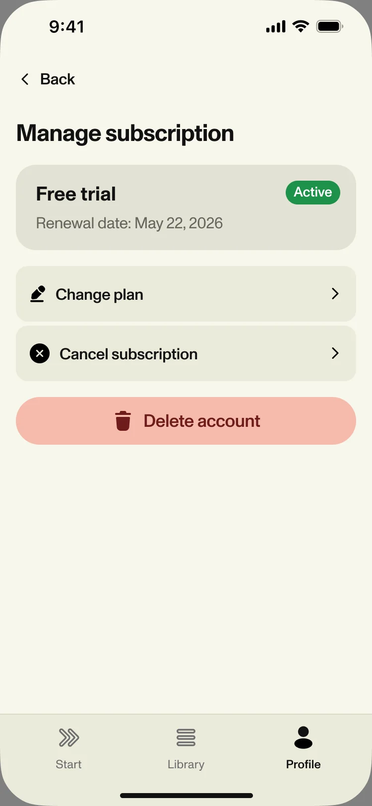
What’s free, and what the trial unlocks
- Found
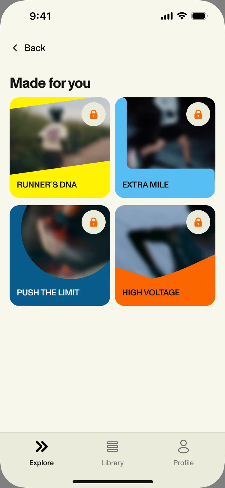
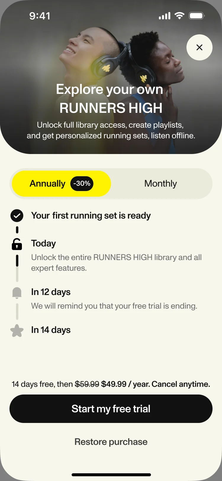
- A subscription app loses people twice: when locks appear without a reason, and when a trial ends as a surprise.
- Decided
-
Locked sets show a lock, not an error.
The paywall lays the trial out as a timeline, from today to the reminder to the day it ends, with the yearly plan selected. Profile shows the plan and its renewal date.
One kit for music, effort and cadence
- Found
- Effort and cadence appear in set-up, on Explore and in the Library; drawn differently in each place, they would read as different features.
- Decided
- One UI kit: the effort and cadence cards in two sizes, one track row, one player, and the same sheets and toasts everywhere, delivered with the design.
The same four choices, two sizes
Easy, Tempo, 170 BPM and 180 BPM as one component, set in the kit at a large size and a compact one for the Library.
-
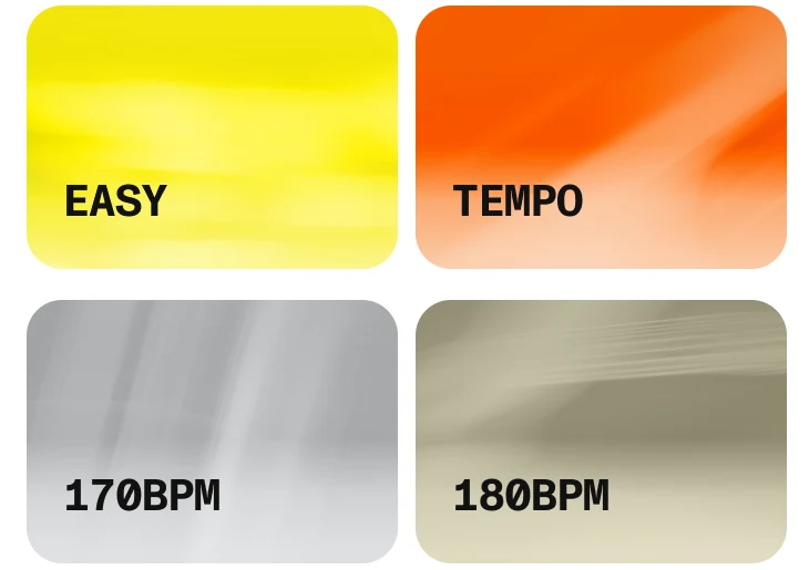
Large: The home-screen size. -
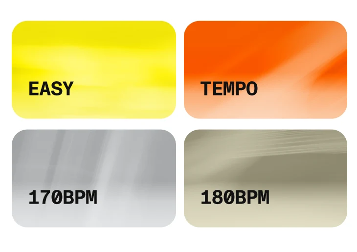
Compact: The Library size.
The moments in between
Downloads for runs without signal, and removals with a way back: each says what happened in place.
-
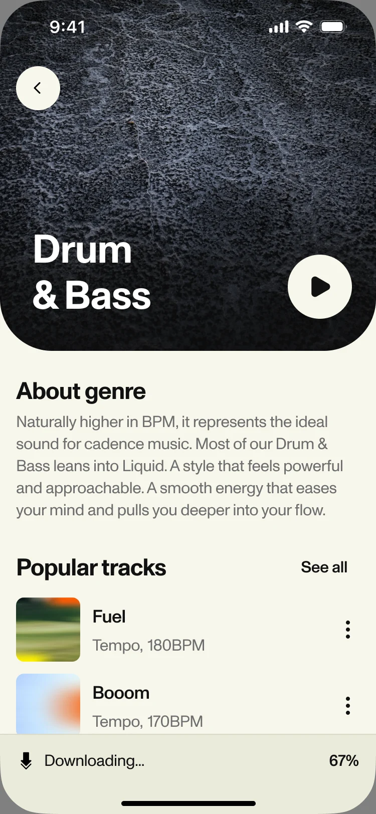
Downloading -
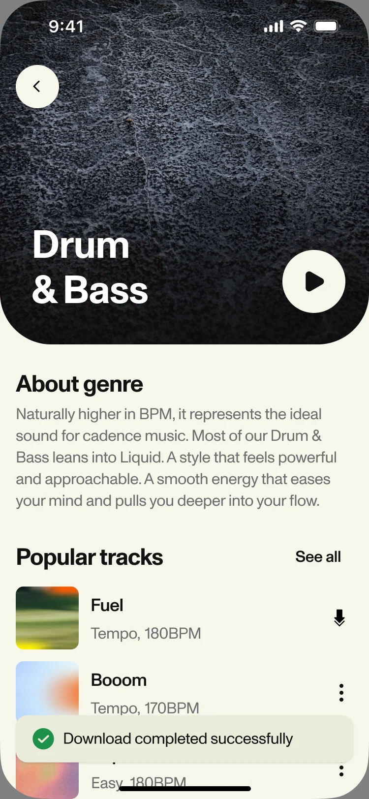
Downloaded -
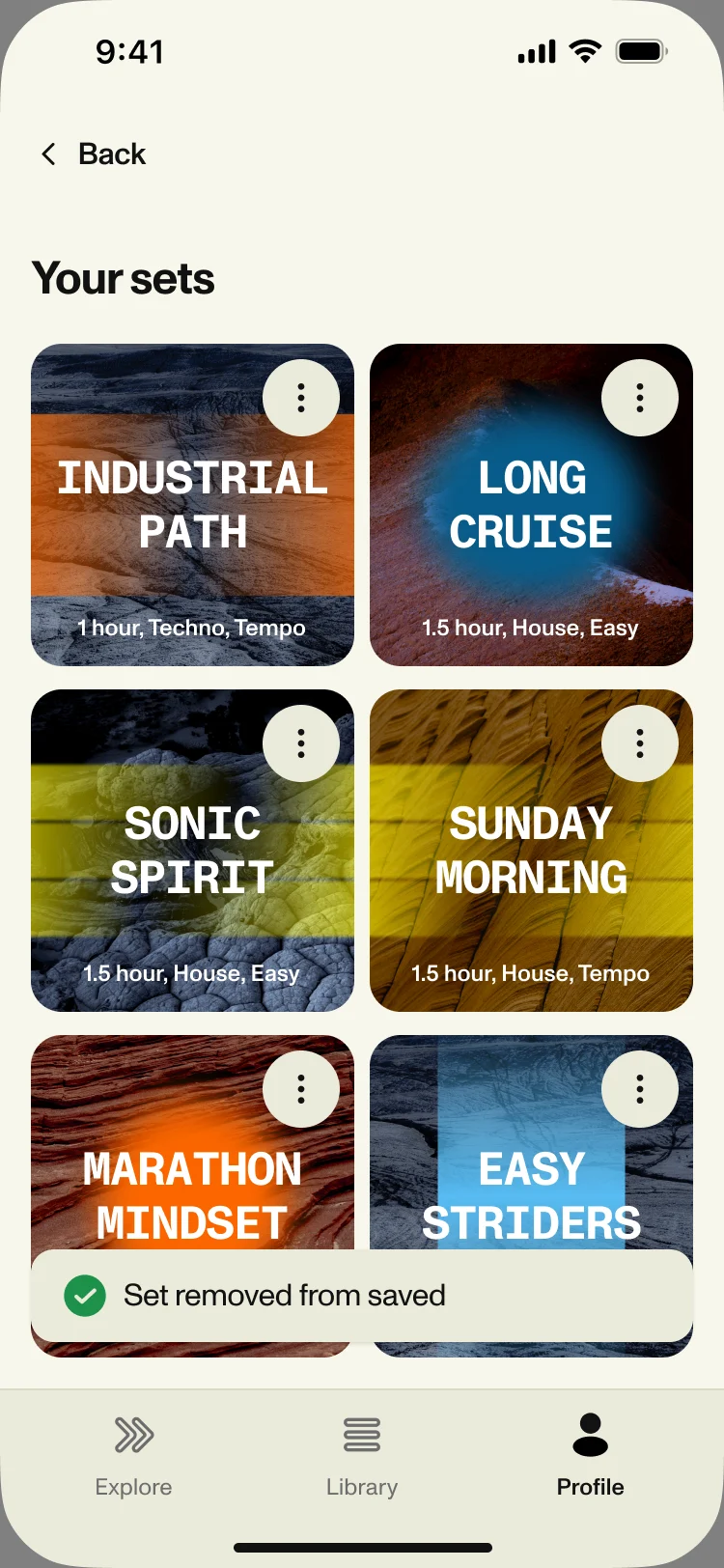
Set removed -
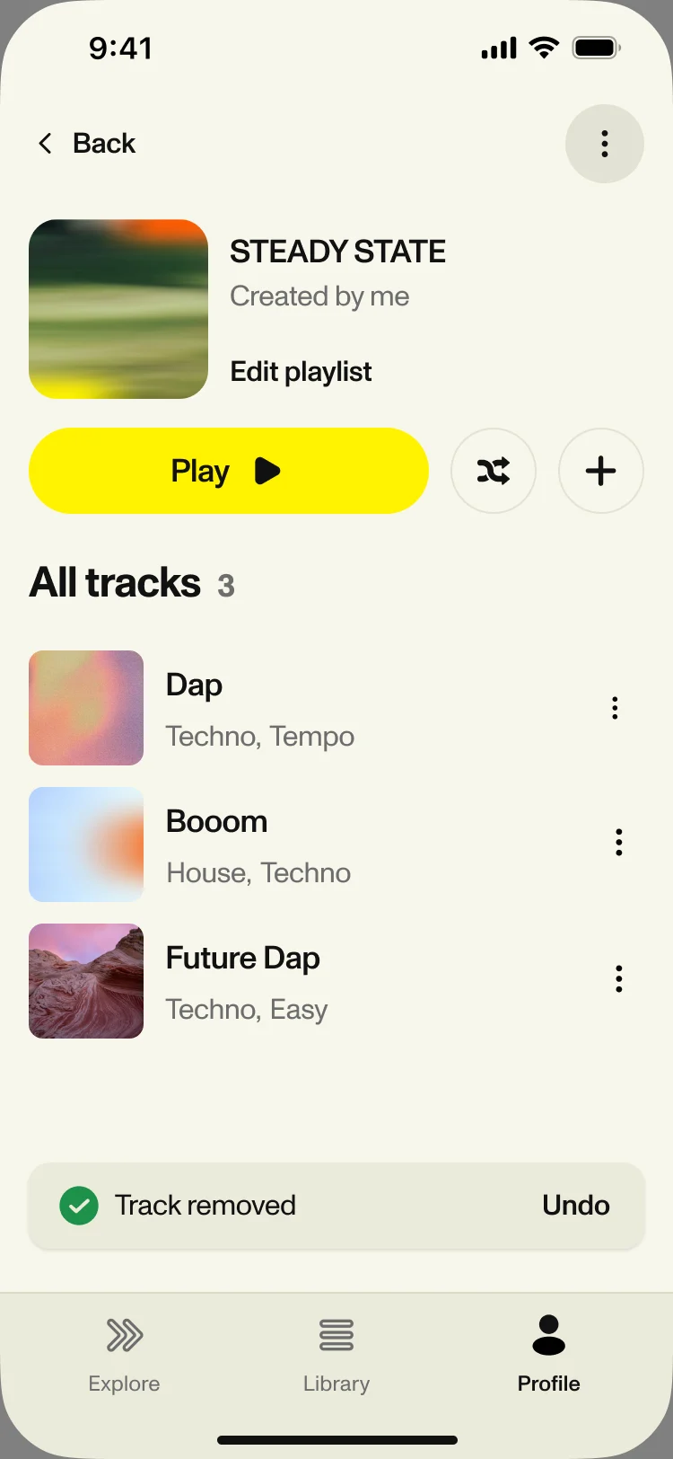
Track removed, with undo
The website, and a voucher flow for partners
- Found
- The site had to explain music made for running before the download, and partner members had to get from a voucher code to access in the app without getting lost on the way.
- Decided
We designed the site at desktop and phone sizes and built it in Webflow for the client’s team to edit.
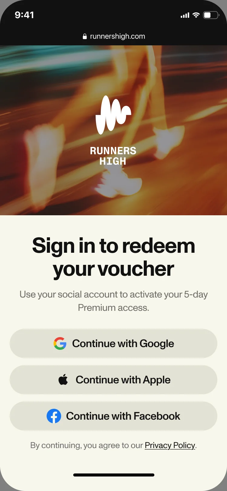
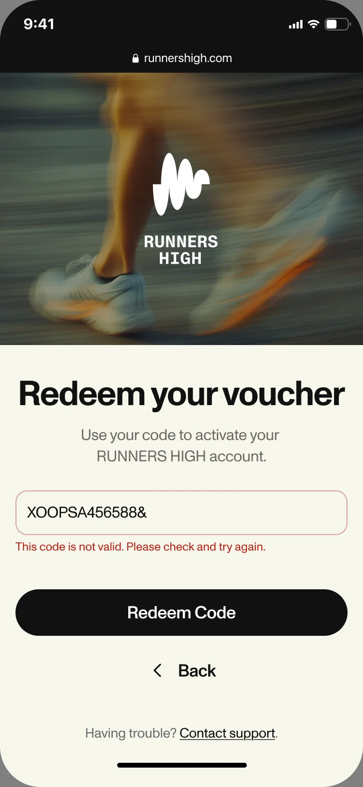
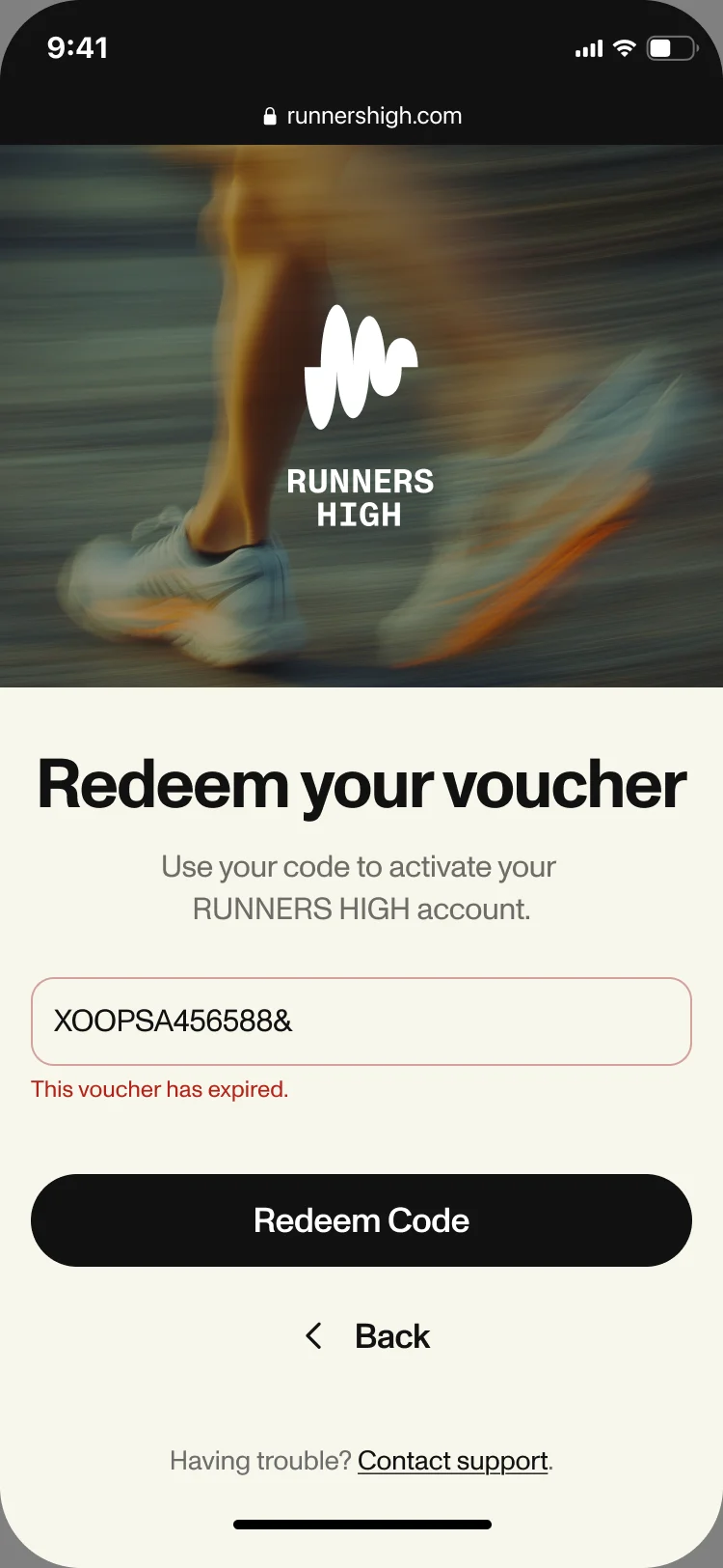
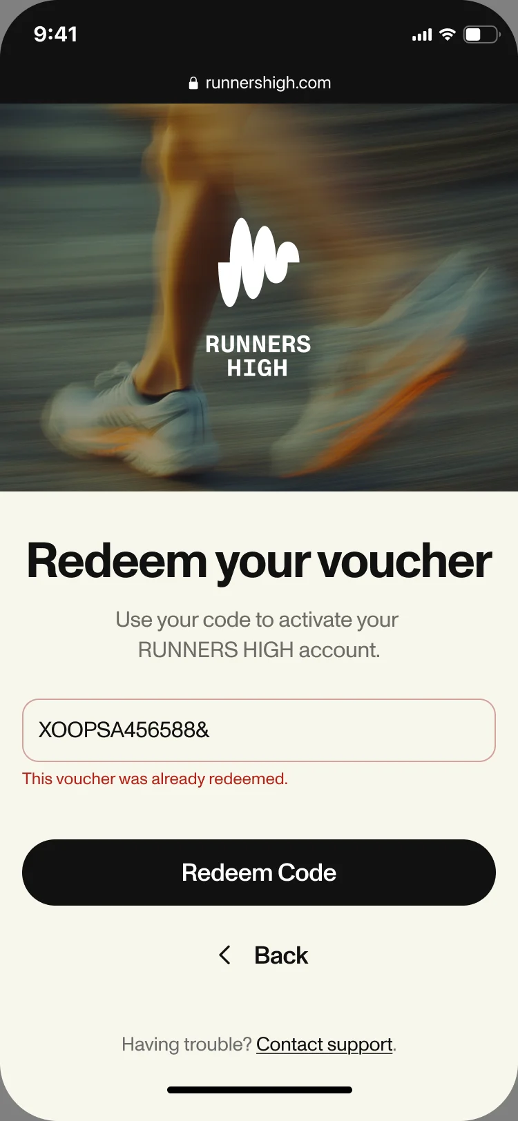
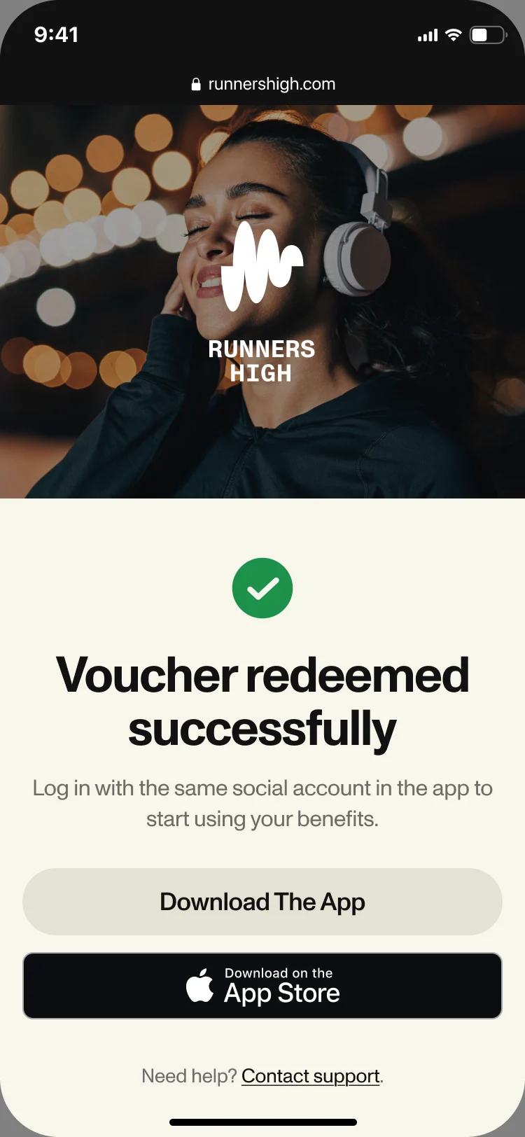
For partners: a voucher page, social sign-in, a code step with its own message for every failure, and a success page that sends people to the app. We connected it to the client’s backend through a Firebase Cloud Function.
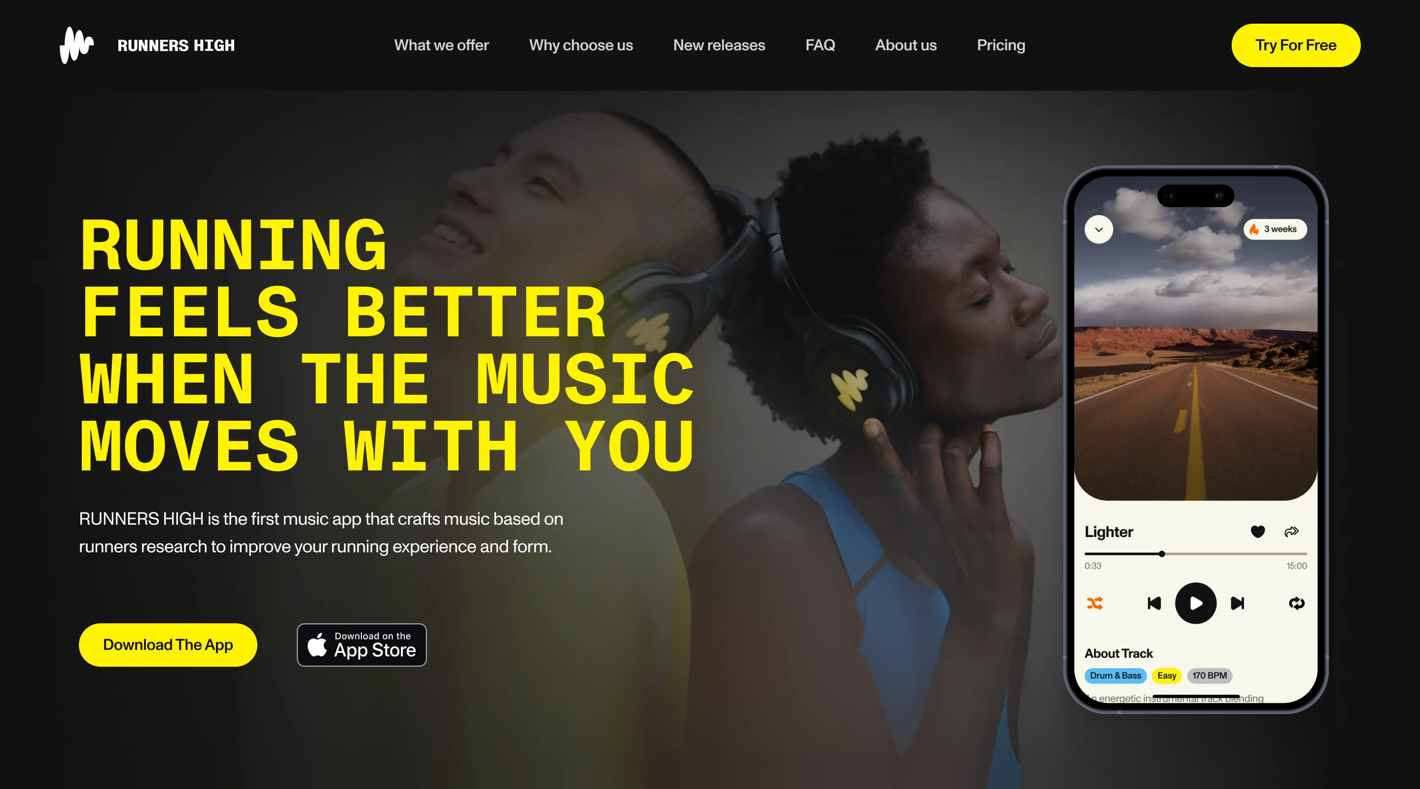
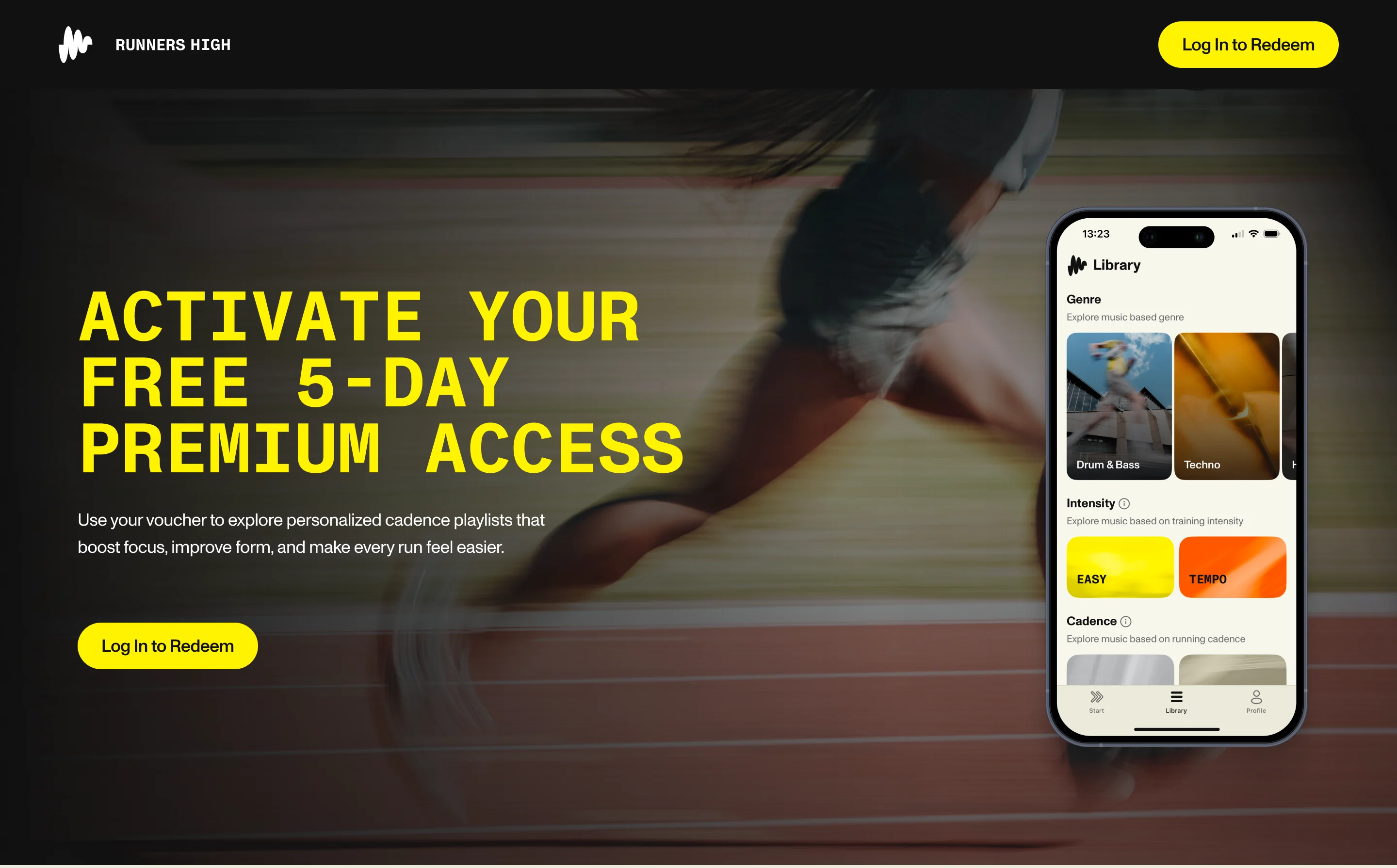
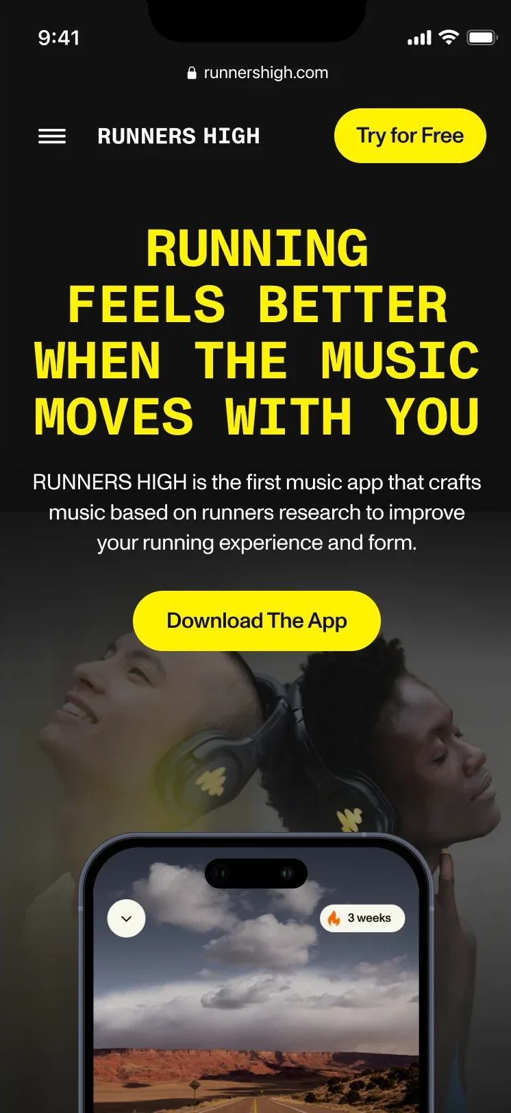
Redeeming a voucher
Sign in first, then the code, with a plain message when it is invalid, expired or already used, and a way to the app at the end.
-
Webflow build
Responsive pages the client’s team edits themselves, content and pricing included, with guidance for their editors.
-
Firebase Cloud Function
The Webflow side of voucher redemption, built by us to the client’s agency’s documentation.
-
The rest of the site
Pricing, About, support and FAQ, legal pages, a newsletter pop-up and a 404.
Where the product ended up
An iPhone app designed from research to handoff: set-up with a first set, Explore, a library by genre, effort and cadence, playlists of your own, downloads and a subscription laid out plainly, on one UI kit, with a numbered screen map and a clickable prototype.
Around it, a marketing site and a partner voucher flow we designed and built in Webflow and connected to the client’s backend. The client’s agency built the app; RUNNERS HIGH is on the App Store for iPhone.
- screens in the design
- 86
- experts on the team
- 5

Afraid your product will be mistaken for the one next to it?
RUNNERS HIGH had to read as music made for running, not another streaming app or tracker, from the first screen. Show us what makes yours different, and we’ll show you where the interface hides it.
More work like this
Three more consumer products, and a website we built as well as designed.
-
Wellness · Healthcare
Clearwater Wellness Co.
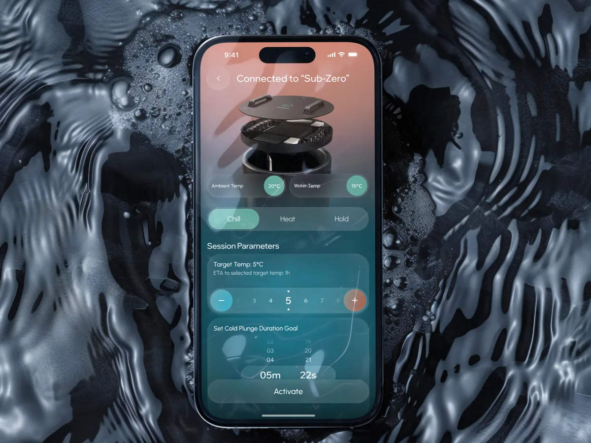
Designed a cold-plunge wellness app from scratch: bath control, session tracking and a community around the ritual.
- 306 Screens designed
- 4 Experts on the team
-
FoodTech · SaaS
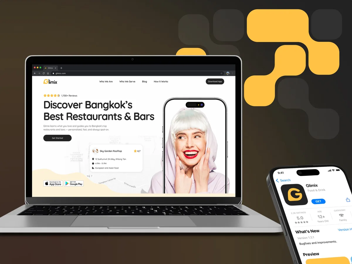
Glimix
Redesigned a two-sided hospitality app for diners and venue owners, with an AI assistant, a new brand and the landing page.
- 200+ Screens designed
- 5 Experts on the pod
-
E-commerce · Website
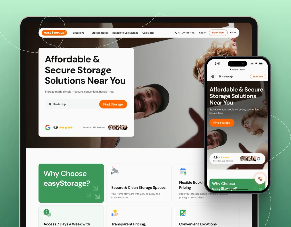
easyStorage Netherlands
Designed and built a self-storage website and redesigned its inherited booking app, from a map pin to a booked unit.
- 300+ Screens designed
- 880+ Project hours