
Mobile TV guide, faster than the ad break
TV24 is a TV guide for viewers in the UK, Ireland and the US.We redesigned it for phones and tablets, from research to handoff.
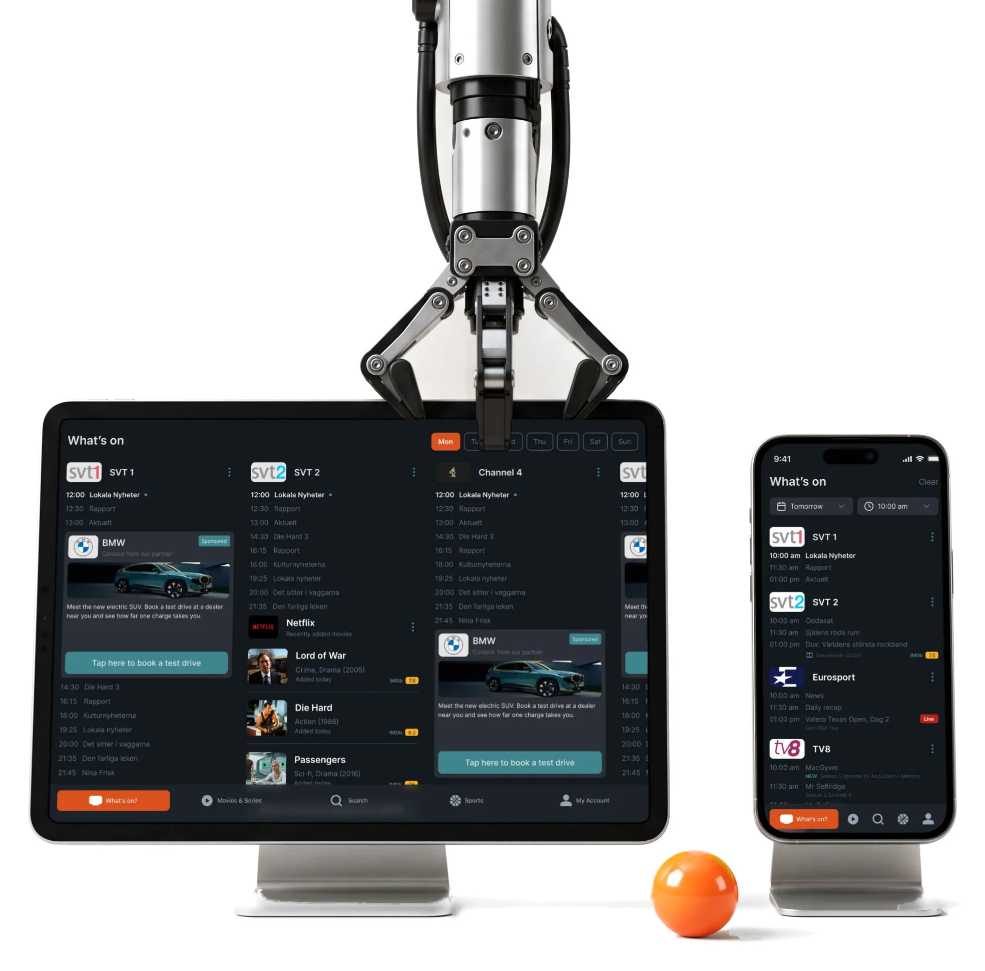
- 79+
- screens phone and tablet, from set-up to settings
- 18,000+
- channels in the US line-ups the guide had to keep readable
- 3
- experts from research to handoff
Project summary
TV24 helps people in the UK, Ireland and the US decide what to watch. The client asked for the guide to be redesigned and rebuilt from scratch. We did the design: the phone and tablet apps for iOS and Android, from research and user flows to a new logo , a dark and light interface with one design system , a clickable prototype and developer handoff.
How we worked together
- Client
- TV24 Group, the company behind tv24.co.uk
- The ask
- Redesign the TV guide apps from scratch, for phones and tablets
- Our team
- Three experts, from research to handoff
- Designed by us
- Research, user flows, wireframes, the logo, the dark and light UI, the design system, a prototype and the screen map
- Not ours
- Building the apps, the schedule data and everything behind them
- Today
- TV24 is on the App Store and Google Play; the apps were rewritten in December 2025, so the store screens are not all ours
What a viewer meets, from set-up to a reminder
One path, from the first launch to never missing a match:
-
Set up
- Postcode
- TV provider
- Streaming services
- Channels
-
What’s on
- Now
- Any hour
- Any day of the week
-
Channel
- Today’s schedule
- Live progress
- Next channel
-
Programme
- On TV
- On streaming
- Cast and ratings
-
Find
- Search
- Sort
- Filter
-
Mine
- Saved
- TV calendar
- Reminders
- All channels and My channels
- Thousands of channels exist; each viewer sees only the ones they get, in the order they chose.
- Broadcast and Streaming
- One programme page says where it is on TV and where it is streaming now, instead of two separate guides.
- Listings and Sponsors
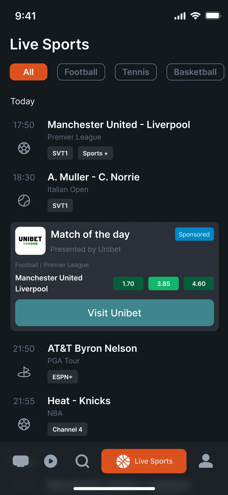
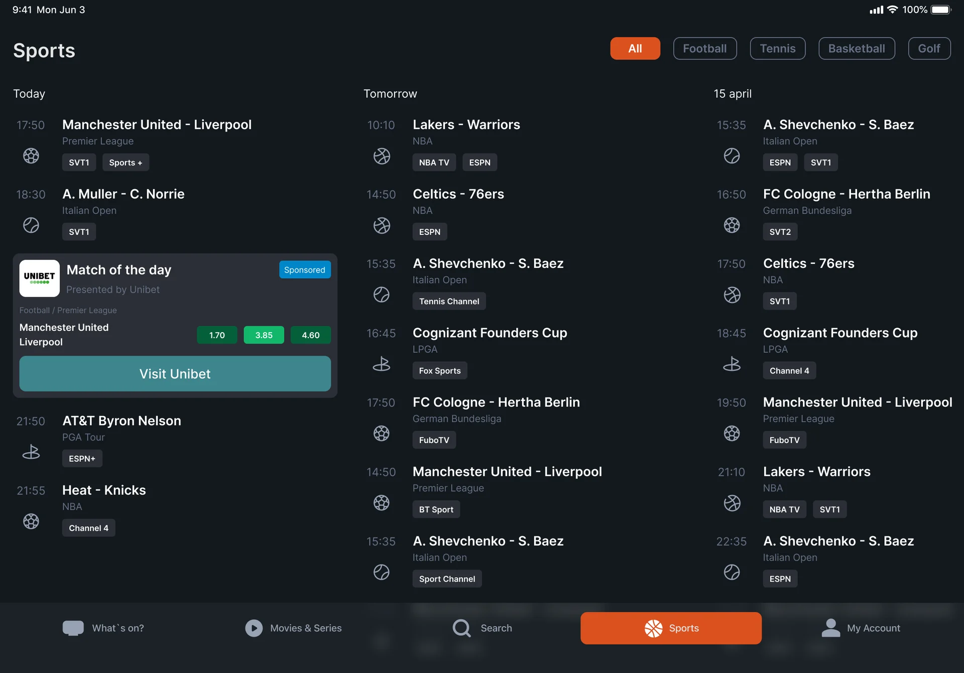
- The app is free and supported by ads, and sponsored cards sit between channels, marked, without pushing schedules off the screen.
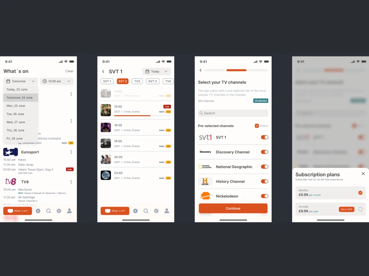
One channel’s day, in the order you read it
- Found
- A day on one channel is a long list of times and titles. Without an order, what is on now looks the same as what finished at lunchtime.
- Decided
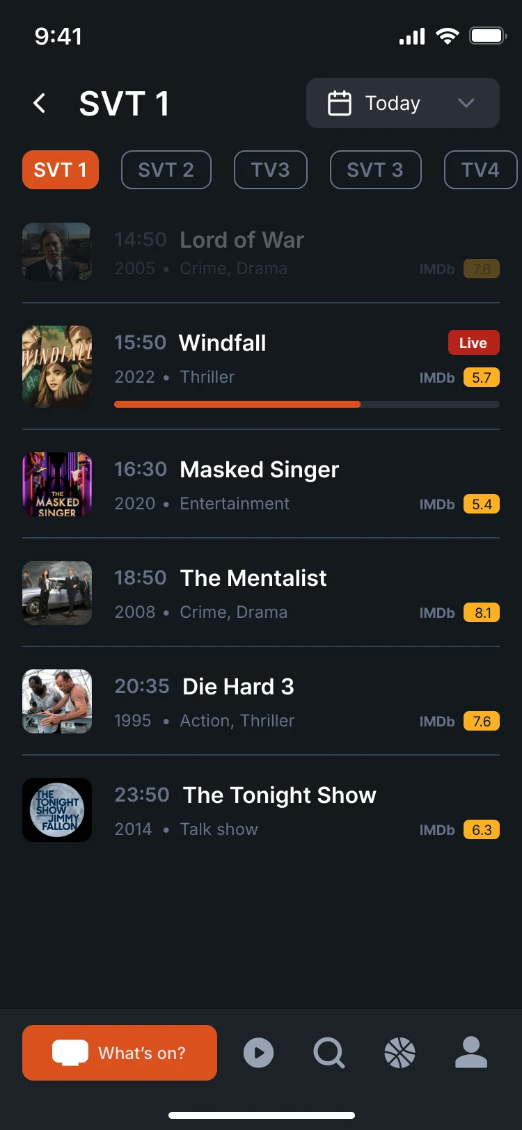
The channel and the day sit on top, the next channels one tap away, and the list runs from what has finished, dimmed, to what is on now, marked Live with a progress bar, to the rest of the evening.
Each row carries the time, title, year, genre and rating.
- For the user
- A viewer sees in one glance what they missed, what is on now and how long it has left.
-
Channel and day
Which channel and day, with the next channels one tap away.
-
Finished
Dimmed, still there to check.
-
On now
Marked Live, with how far it has run.
-
Later tonight
Time, title, year, genre and rating on every row.
-
Tabs
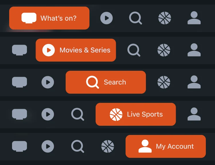
What’s on, films and series, search, sports and your account.
How the work progressed
From how people choose tonight’s TV to a system developers could build, one question closed at a time.
-
Discovery
What a viewer needs to answer “what’s on?”, and how line-ups differ by country, provider and postcode
Artifact Competitor and product analysis of TV guides
-
User Flow
Every path from set-up to a reminder: provider, services, channels, schedules, programmes, search and the account
Artifact Information architecture and user flows
-
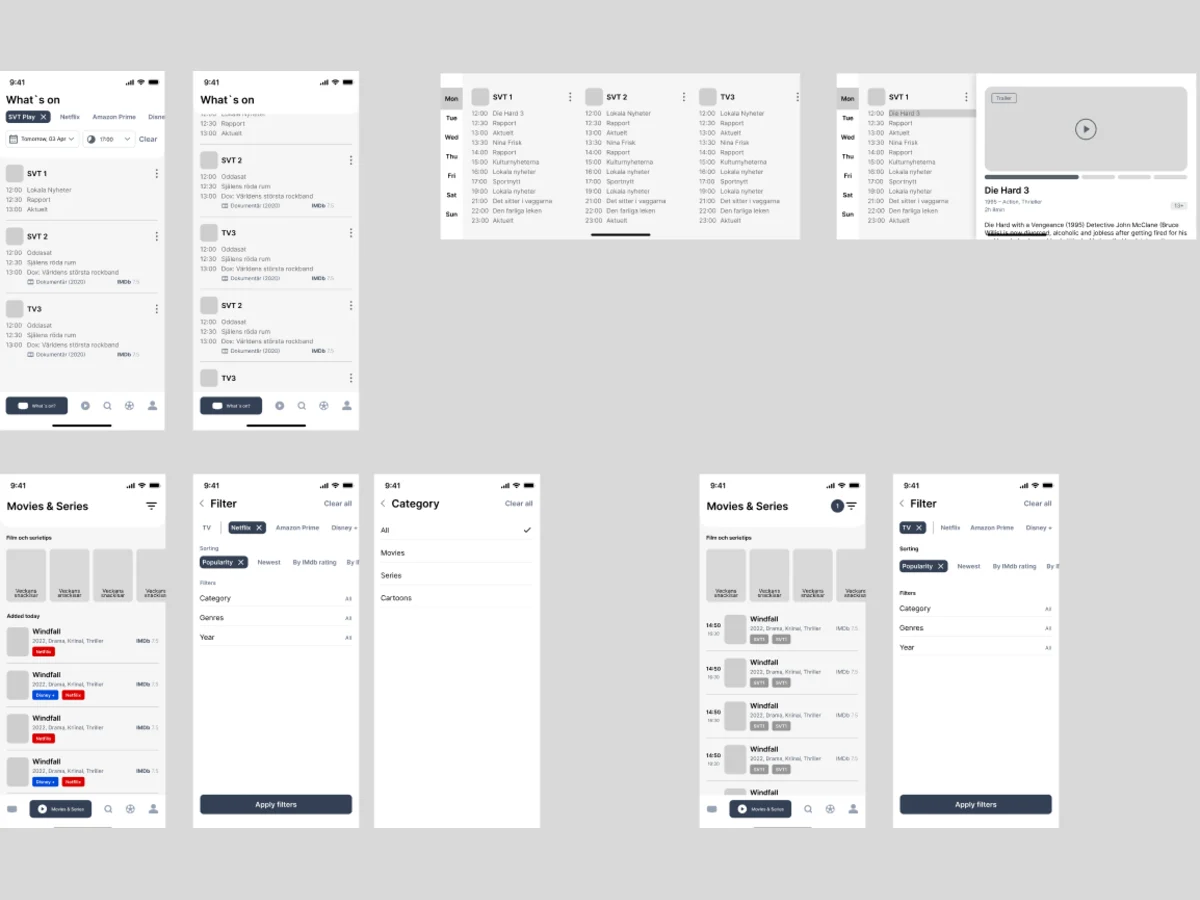
Wireframes
What each screen holds before colour: the schedule, the channel page, the programme page and the account
Artifact Phone and tablet wireframes
-
Branding & Logo
A mark that says TV at app-icon size, and a colour the whole interface could share
Artifact The TV24 logo and app icon
-
UI & Design System
One look out of three directions, then one set of components for phone and tablet, dark and light
Artifact Three visual directions, the final UI and the design system
-
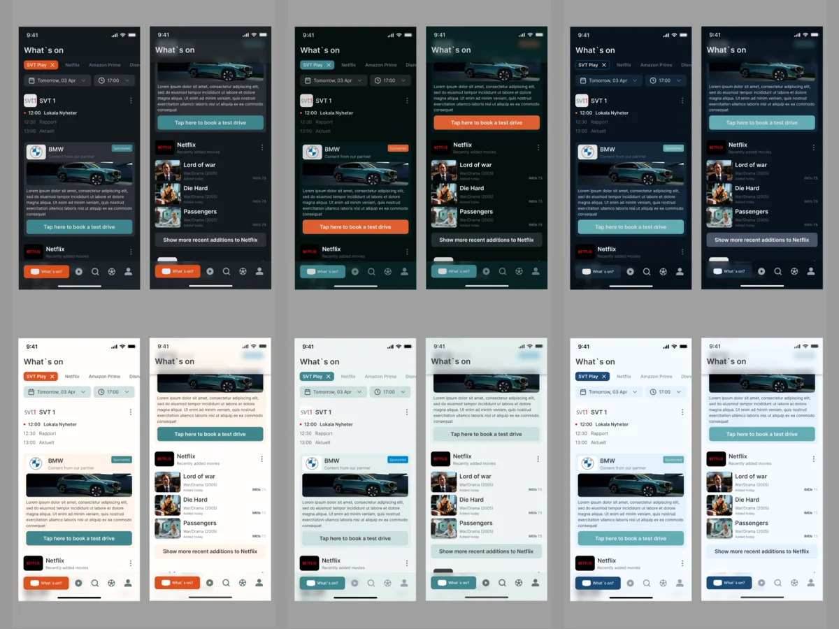
Palette revision
Where the accent colour looked weak or lacked contrast in light mode, and two ways to fix it
Artifact Two palette options, the second recommended
-
Delivery
What the client’s developers needed to build both apps without guessing
Artifact A screen map, a clickable prototype and the handoff
Set-up and settings, mapped before they were drawn
- Found
- Set-up decides whether the guide is right at all: the wrong provider or a missing channel and every schedule after it is wrong for that home.
- Decided
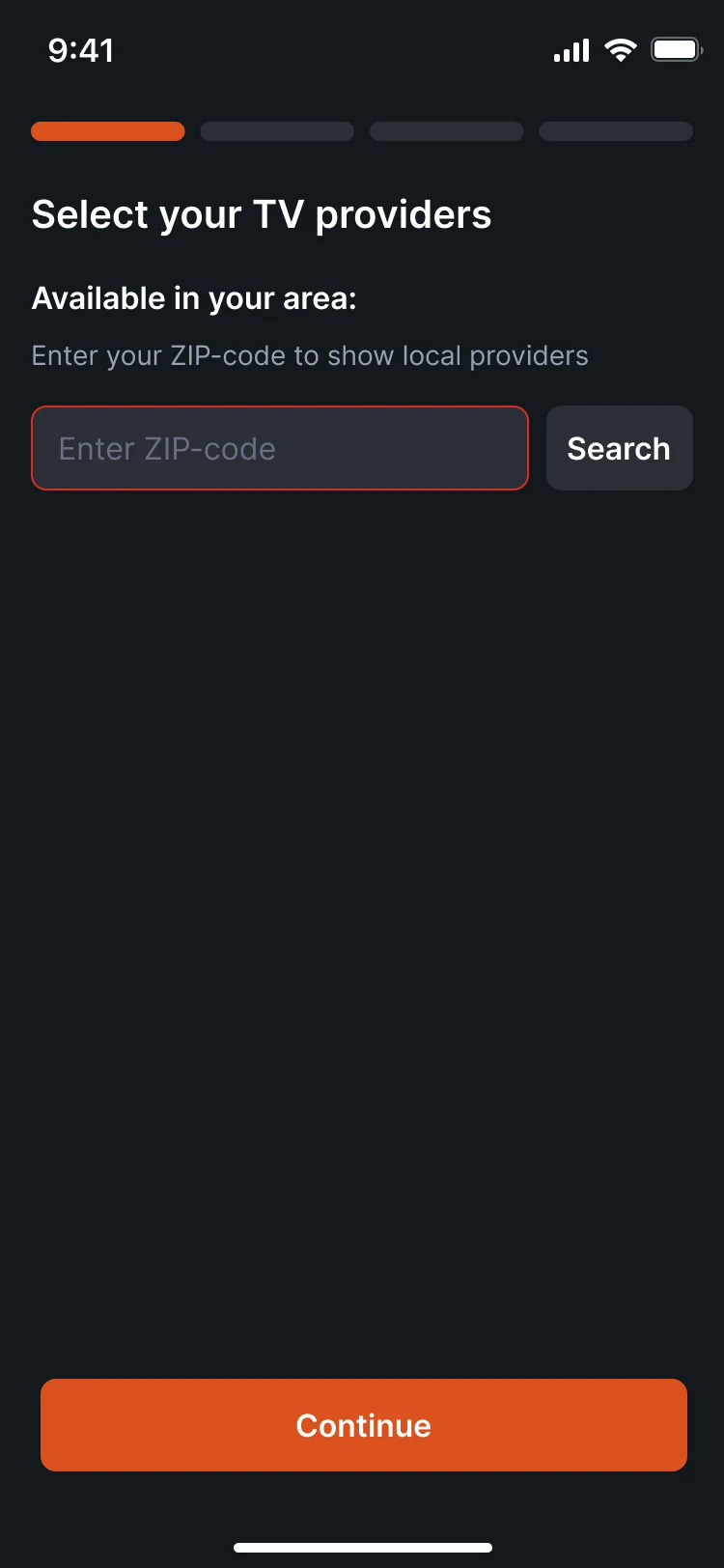
- Set-up became a few short steps: postcode and provider, streaming services, then the channels, with the popular ones already on. Everything set there can be changed later in Settings, including the order of the channels. Five tabs hold the rest of the app.
-
First launch
A welcome, then provider by postcode, the streaming services you pay for, and a channel list with the popular ones pre-selected.
Open the full map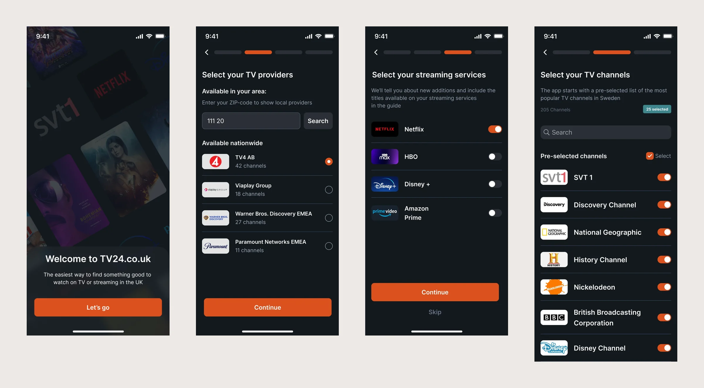
-
Settings
The provider, services and channels chosen at set-up, all changeable, and the channel order you see on What’s on.
Open the full map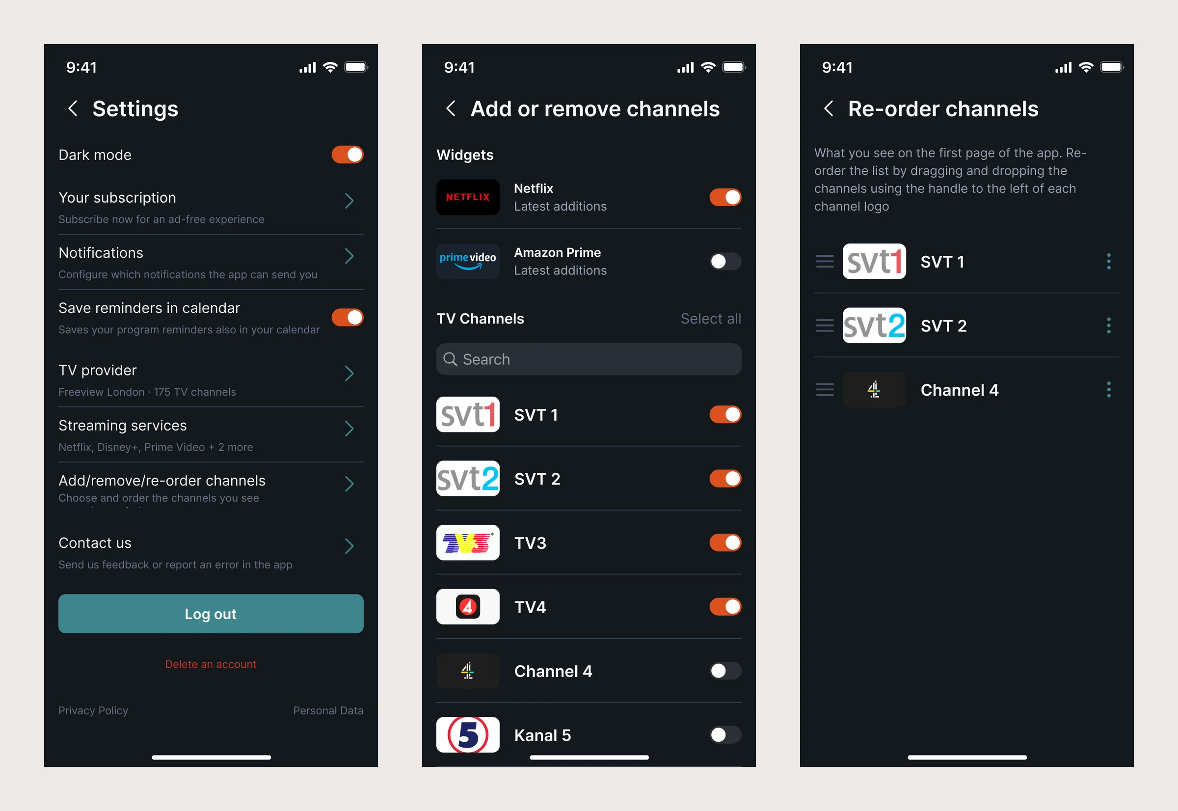
Three jobs the guide does every evening
Find something to watch, know where and when it is on, and never miss it.
Finding something to watch
- Found
- Viewers arrive with a vague idea: something at nine, that film from last week, anything good on Netflix. Scrolling a grid of thousands of channels answers none of it.
- Decided
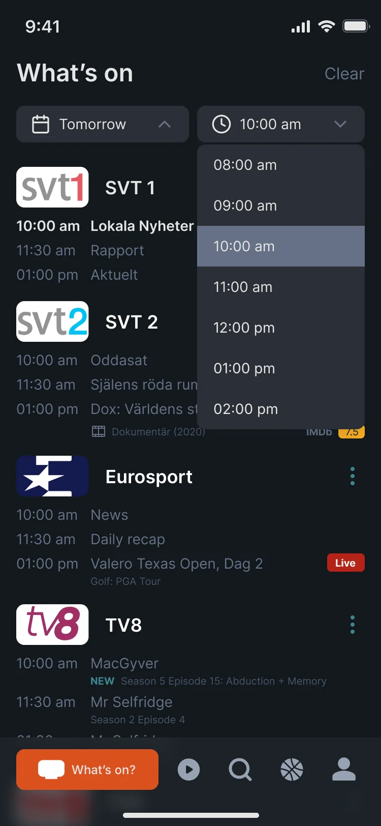
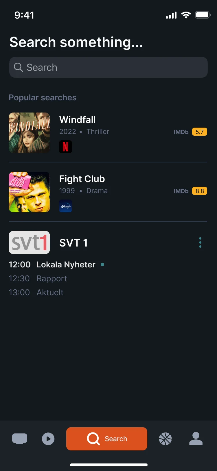
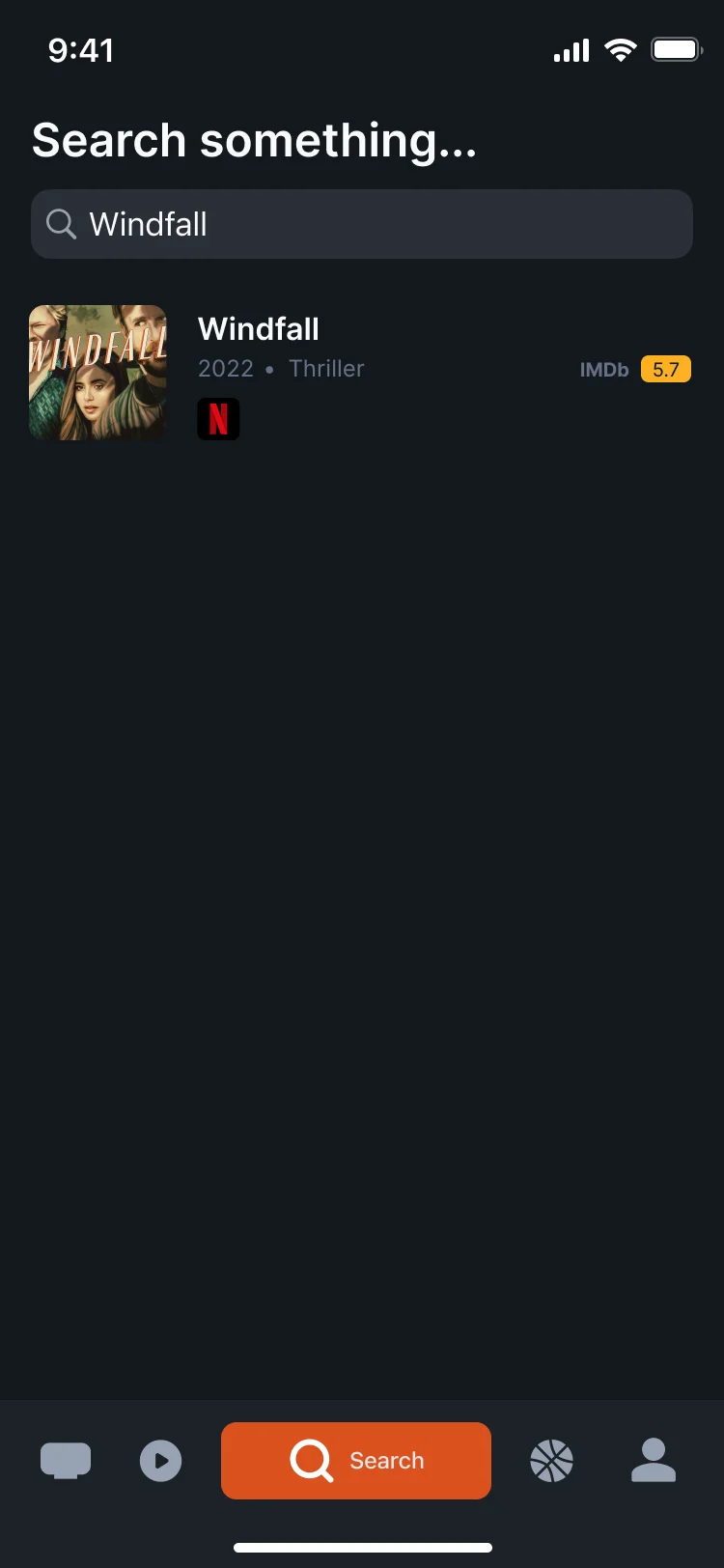
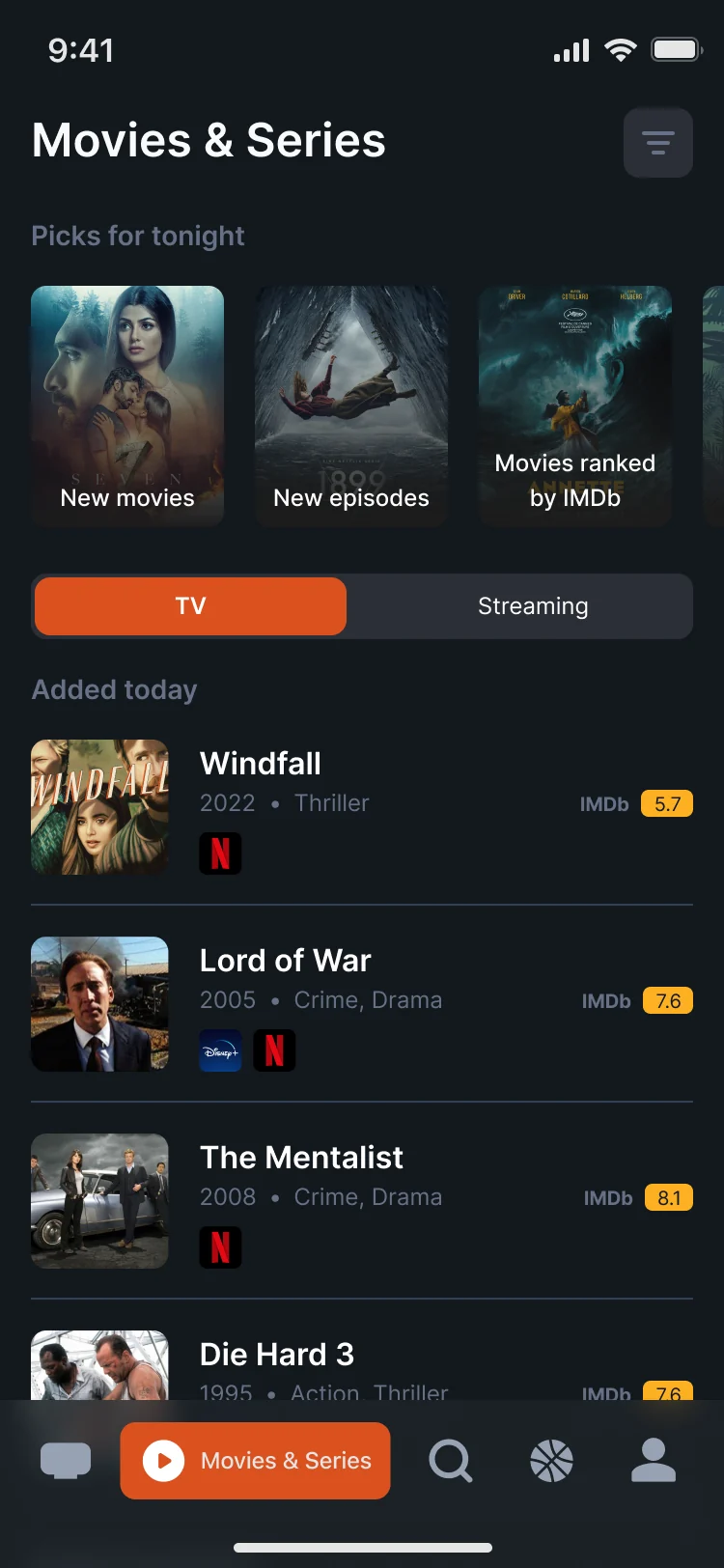
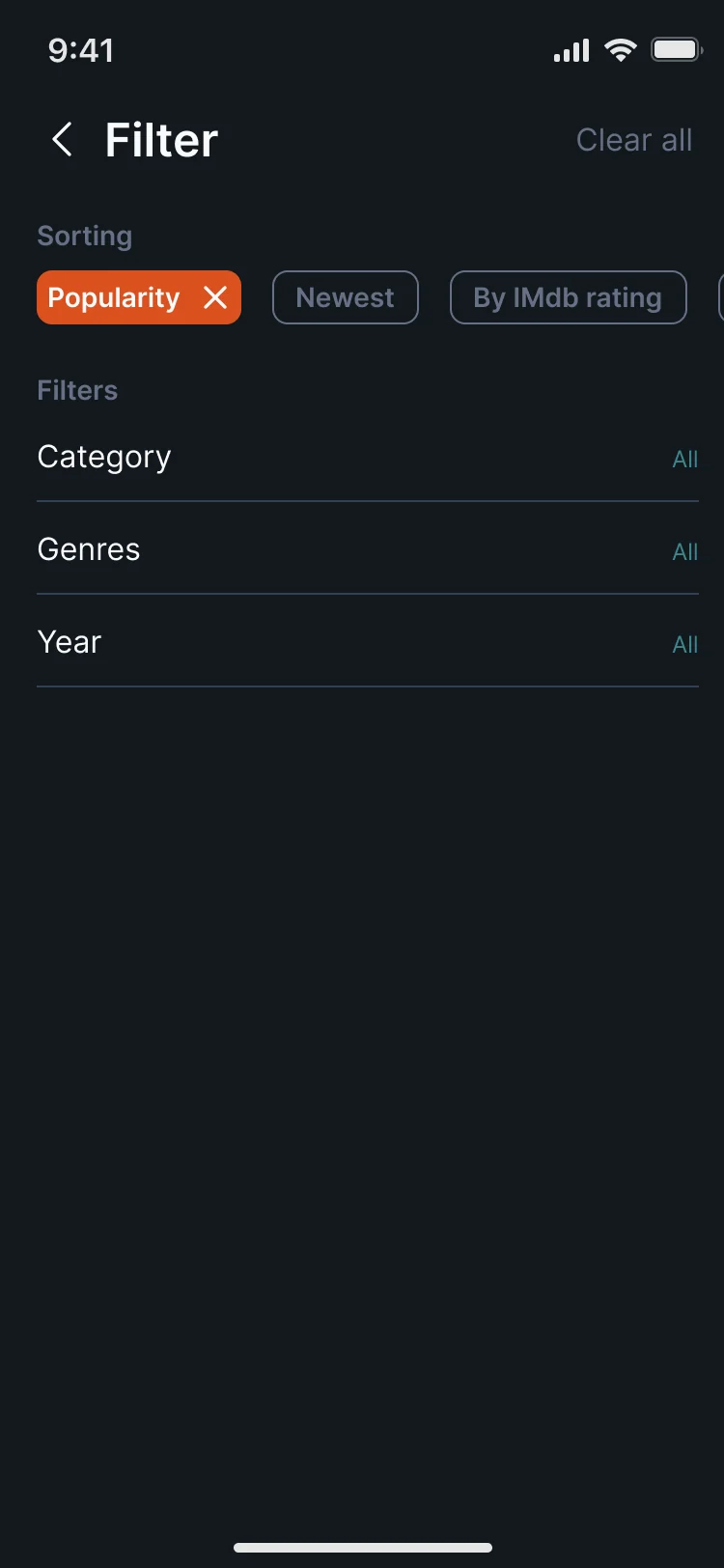
- What’s on jumps to any hour and any day. Search starts with what others look for and matches as you type, across films, series and channels. Films and series open on today’s additions, on TV or streaming, and sort by popularity, date or rating and filter by category, genre and year.
One page for where and when
- Found
- A programme can be on three channels this week and on two streaming services right now. Viewers used to check each one.
- Decided
-
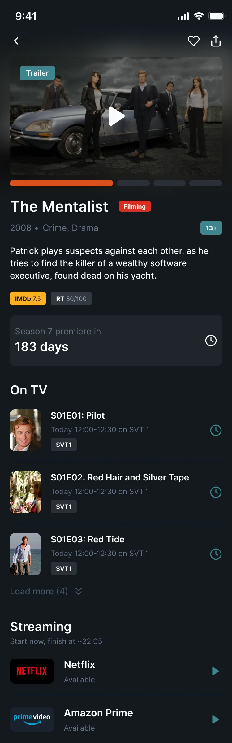
A programme page opens with the trailer and the essentials, then lists every showing on TV with its channel and a reminder button, and the services streaming it now.
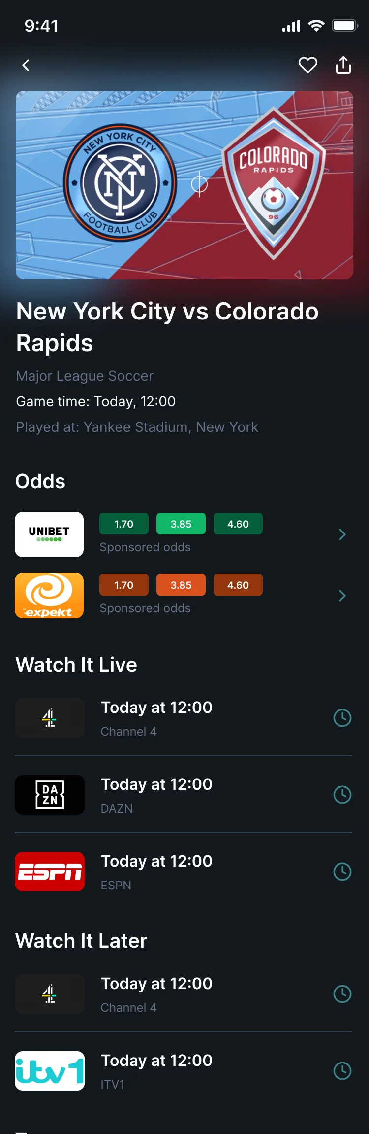
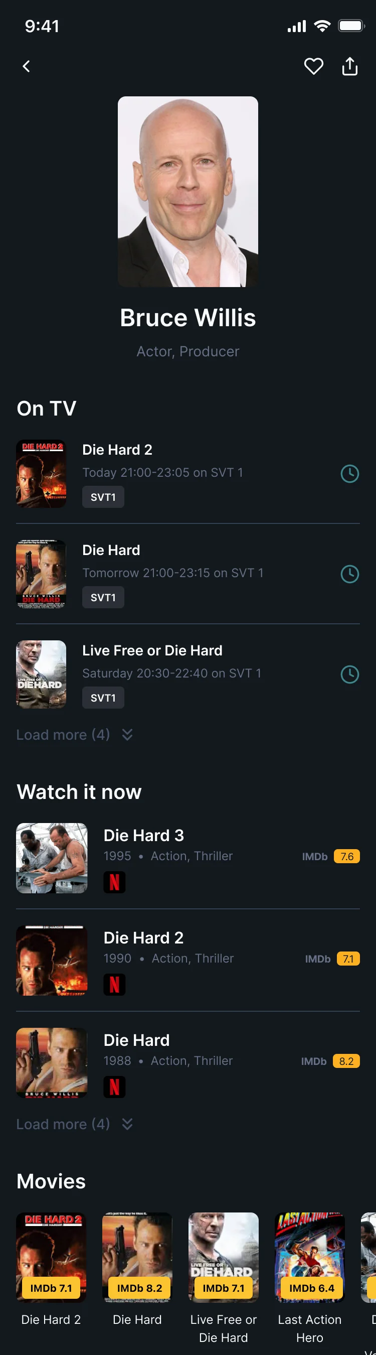
A match page does the same for sport: where to watch it live, where later, and the teams. An actor’s page lists their films on TV this week and where they stream.
Never missing it
- Found
- Finding a programme is useless if the viewer forgets it by Thursday; too many alerts and they turn them all off.
- Decided
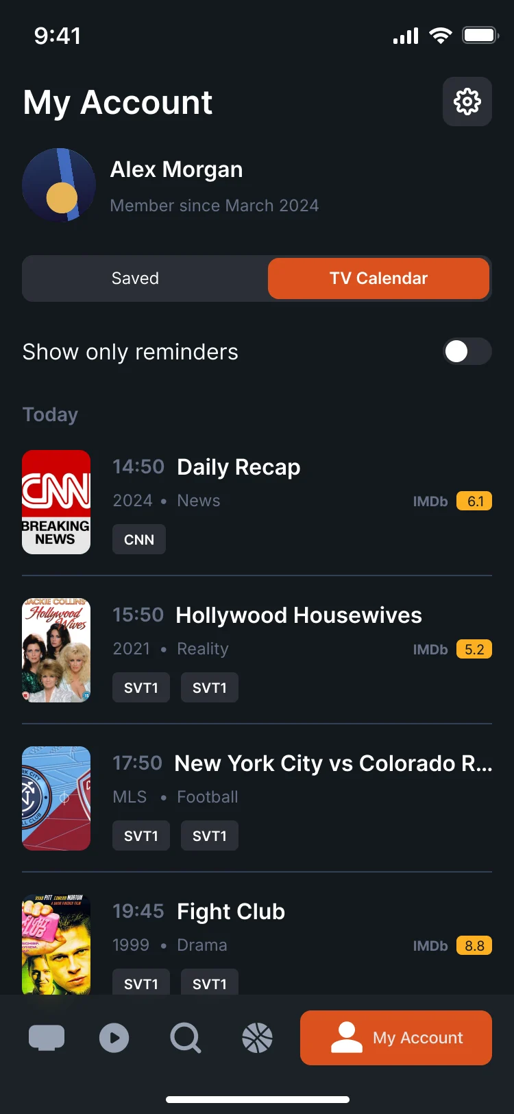
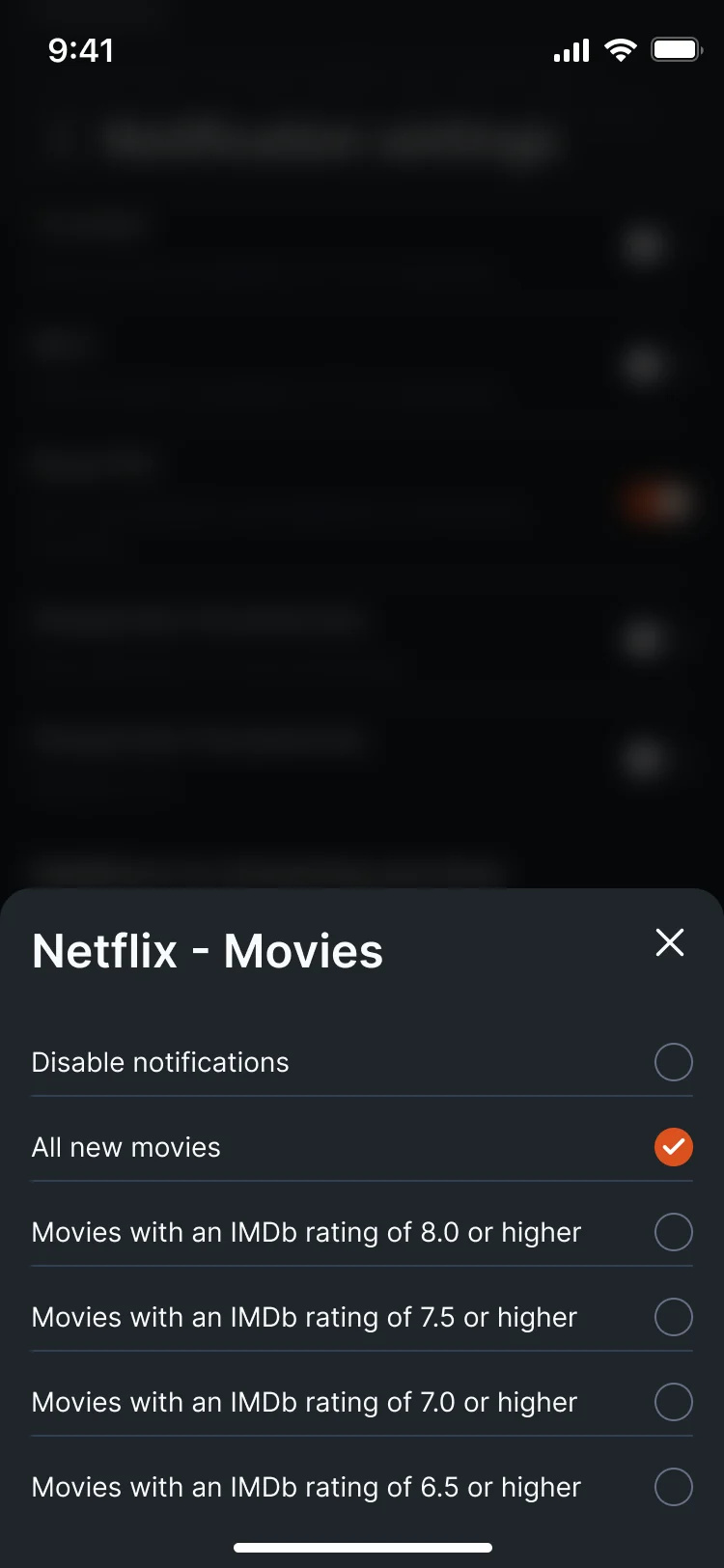
- Saved programmes and reminders land in a personal TV calendar, which can show only the reminders. Notifications are set per source: new films on Netflix, for example, only when they are rated 7.5 or higher.
A logo that reads as TV at icon size
- Found
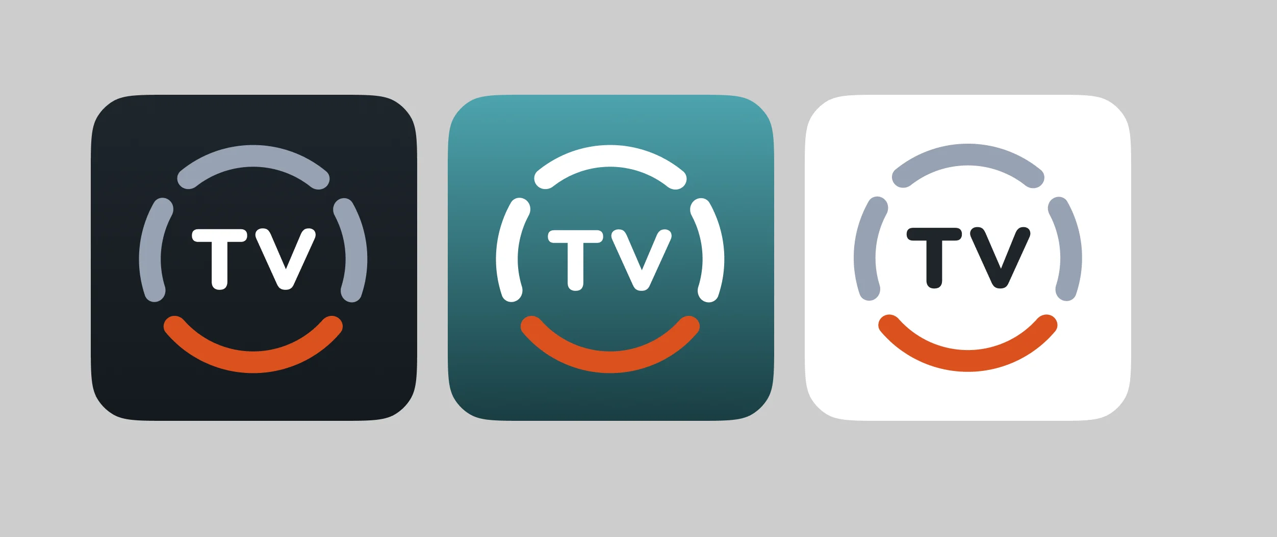
- The redesigned app needed a mark that works as a tiny app icon on a crowded home screen, and a colour the interface could carry.
- Decided
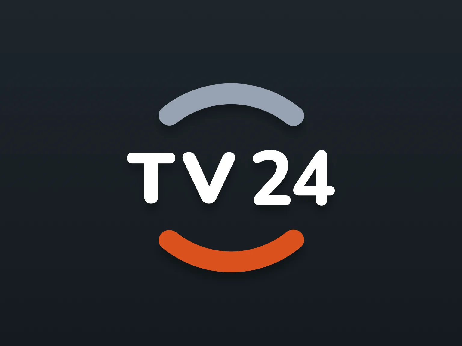
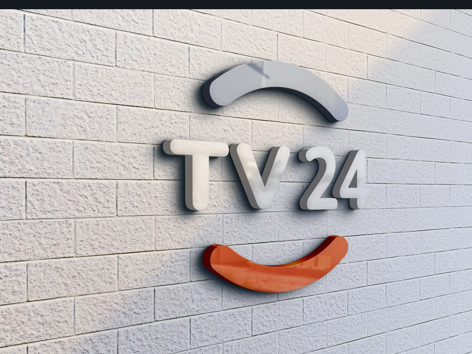
- We drew TV24 inside a broken ring: grey arcs like a clock face, and an orange smile under the letters, the colour the app then uses for its buttons and the active tab.
One system for phone and tablet, dark and light
- Found
- Reminders, channel rows and sponsored cards appear on almost every screen, on two platforms, two device sizes and two themes. Drawn differently each time, the guide would feel like several apps.
- Decided
- One design system: channel and programme rows, sponsored cards, sheets, toggles and the tab bar, each with its states, in dark and light, used across phone and tablet.
The same reminders block, wherever you are
Automatic reminders are one component: on a series they follow new episodes and repeats, on a match they follow the sport, the league and each team.
-
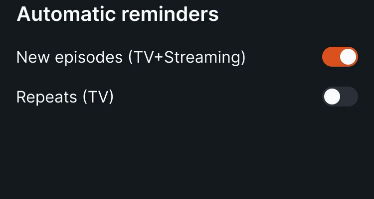
On a series: New episodes and repeats. -
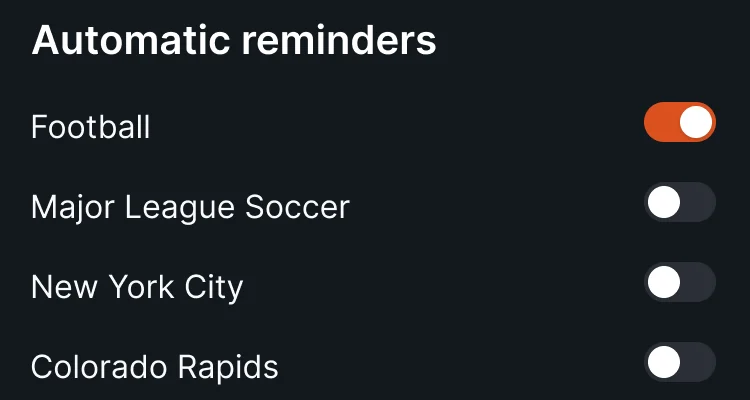
On a match: The sport, the league, each team.
When something goes wrong
A wrong password, a postcode the guide can’t use, a reset sent: each says what happened on the screen where it happened.
-
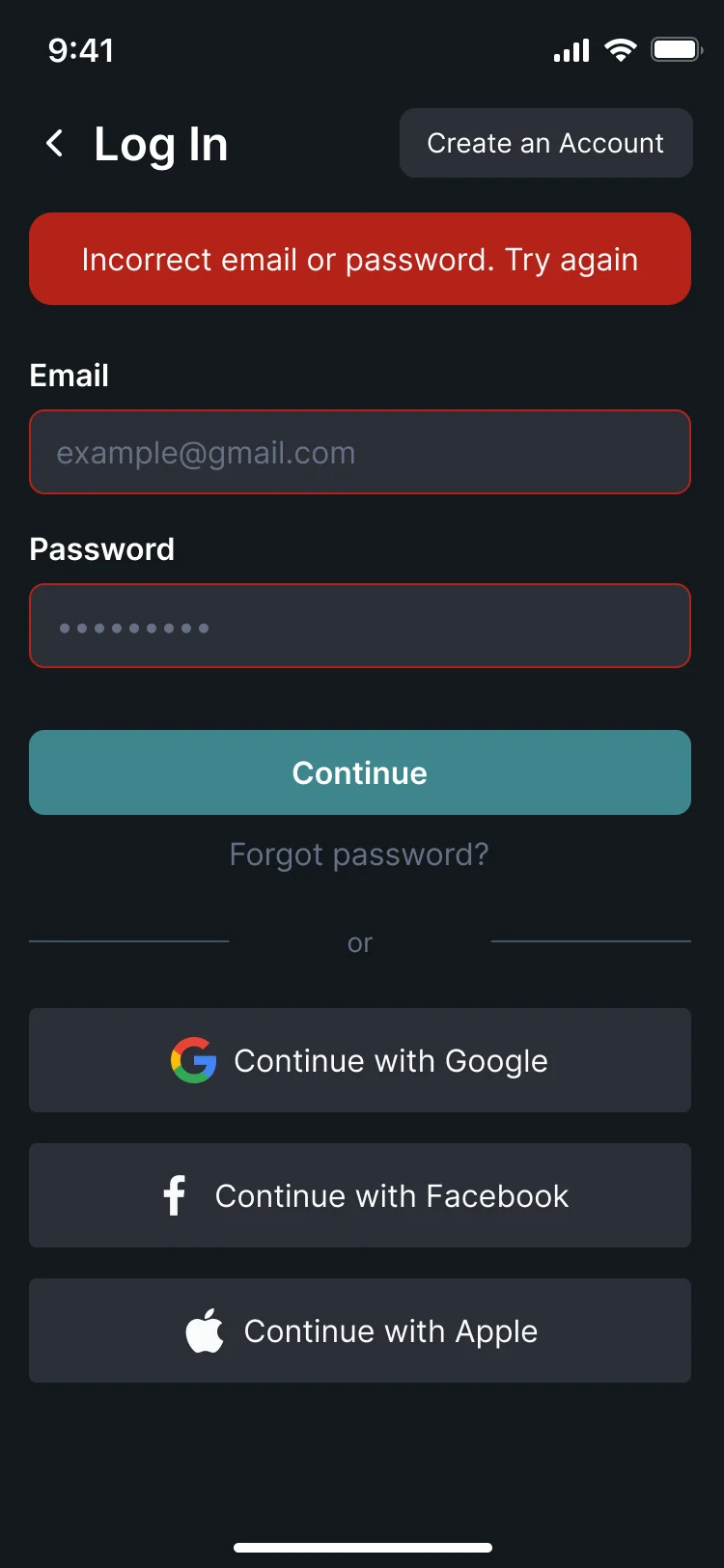
Wrong password -
Postcode not found -
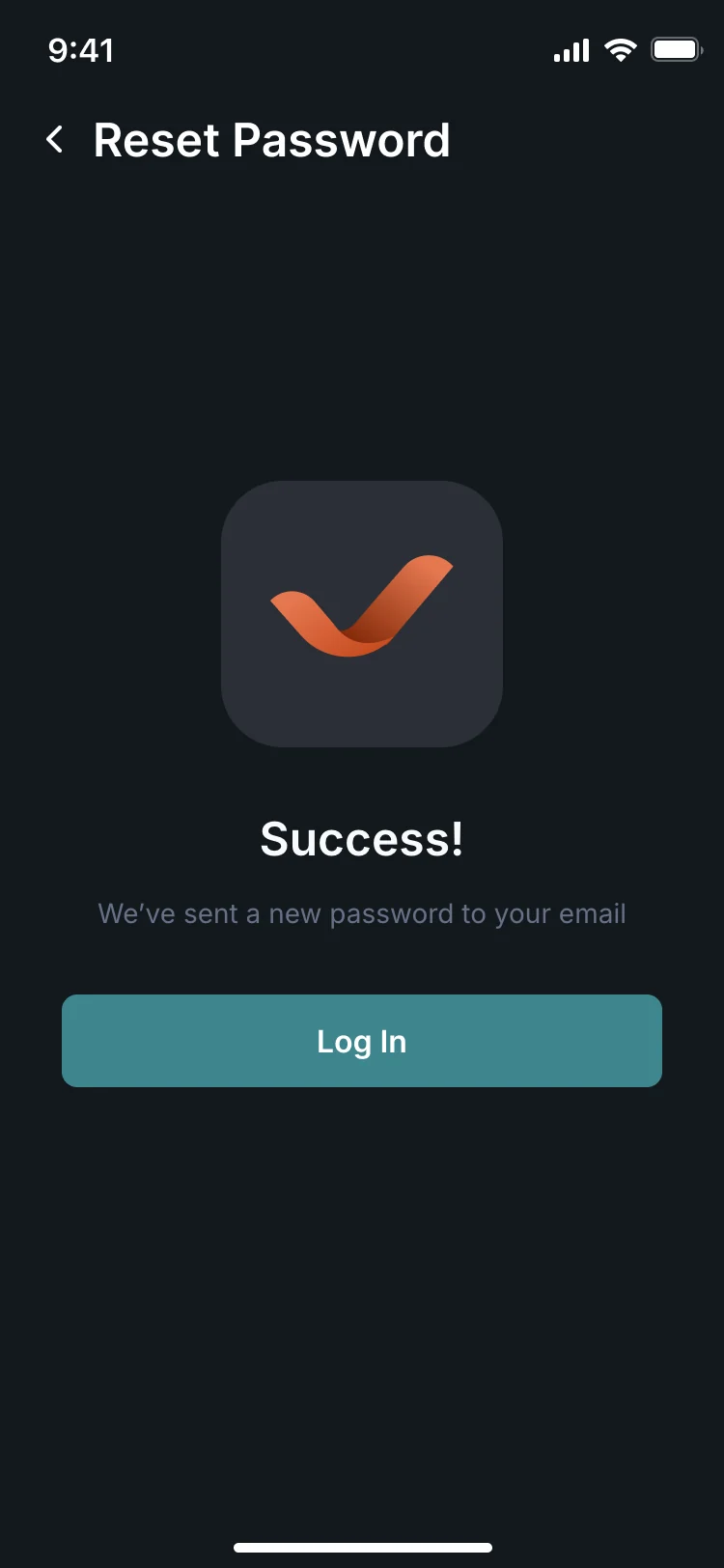
Reset sent
The same guide on a phone and a tablet
- Kept
- The rows, the sport filters, the sponsored card and the tabs stay the same, so nothing has to be learned twice.
- Changed
- The tablet shows three days of sport side by side instead of one, and names every tab instead of only the active one.
Where the product ended up
A TV guide redesigned for iPhone, iPad and Android phones and tablets: set-up by postcode, provider and channels, schedules for any hour and day, programme and match pages that say where to watch, search and filters, reminders with a personal calendar, and room for sponsors and an ad-free subscription.
All of it on one design system in dark and light, with a new logo, a clickable prototype and a screen map for the client’s developers.
- screens in the design
- 79+
- experts on the team
- 3
Adding a feature that could bury what people open your app for?
TV24 had to stay the fastest way to find tonight’s TV while sponsors, streaming and reminders moved in around the schedules. Show us what you are adding, and we’ll show you where it fits without pushing out the core.
More work like this
More consumer apps we designed, from first screen to handoff.
-
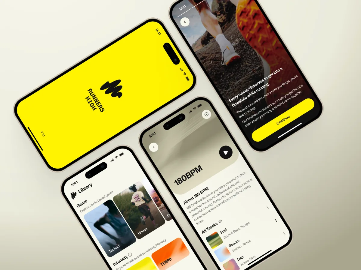
Fitness · Music · iPhone
Runners High
Designed a music app for runners and built its website and partner voucher flow in Webflow.
- 86 Unique screens
- 5 Experts on the team
-
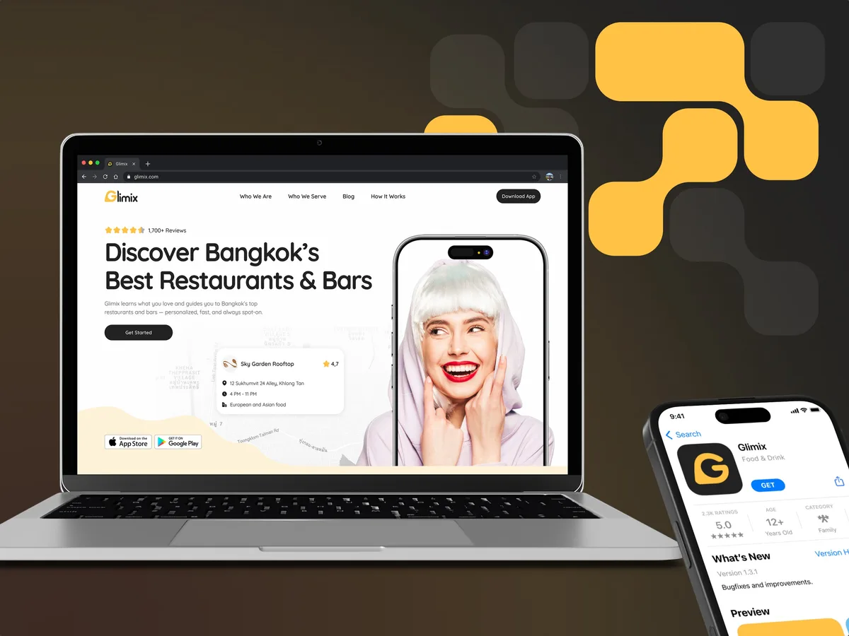
FoodTech · SaaS
Glimix
Redesigned a two-sided hospitality app for diners and venue owners, with an AI assistant, a new brand and the landing page.
- 200+ Screens designed
- 5 Experts on the pod
-
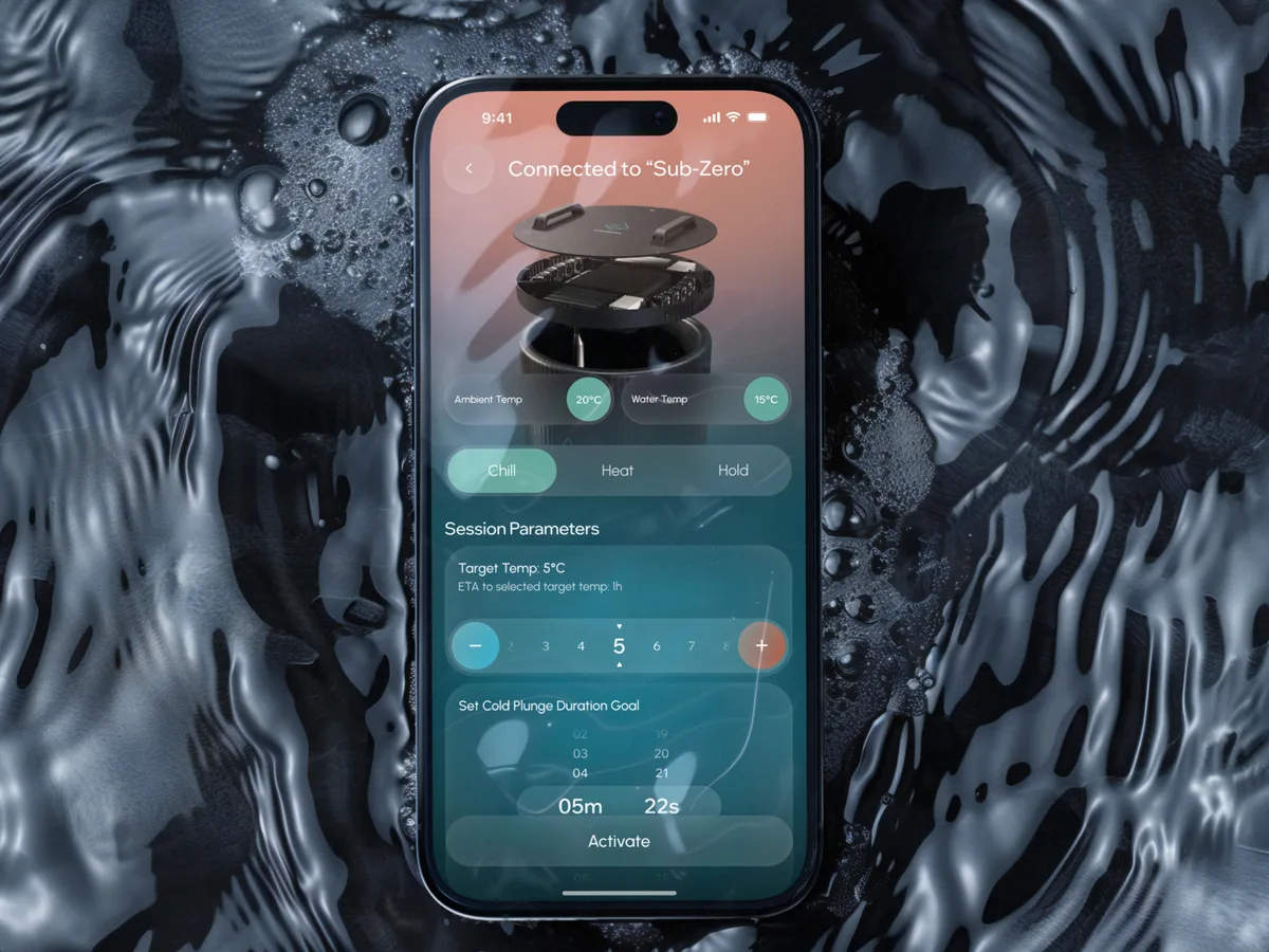
Wellness · Healthcare
Clearwater Wellness Co.
Designed a cold-plunge wellness app from scratch: bath control, session tracking and a community around the ritual.
- 306 Screens designed
- 4 Experts on the team