
Private club, hard to join, easy to live in
YP Club is a private network for founders.We redesigned its member app inside its existing brand and designed its admin panel.
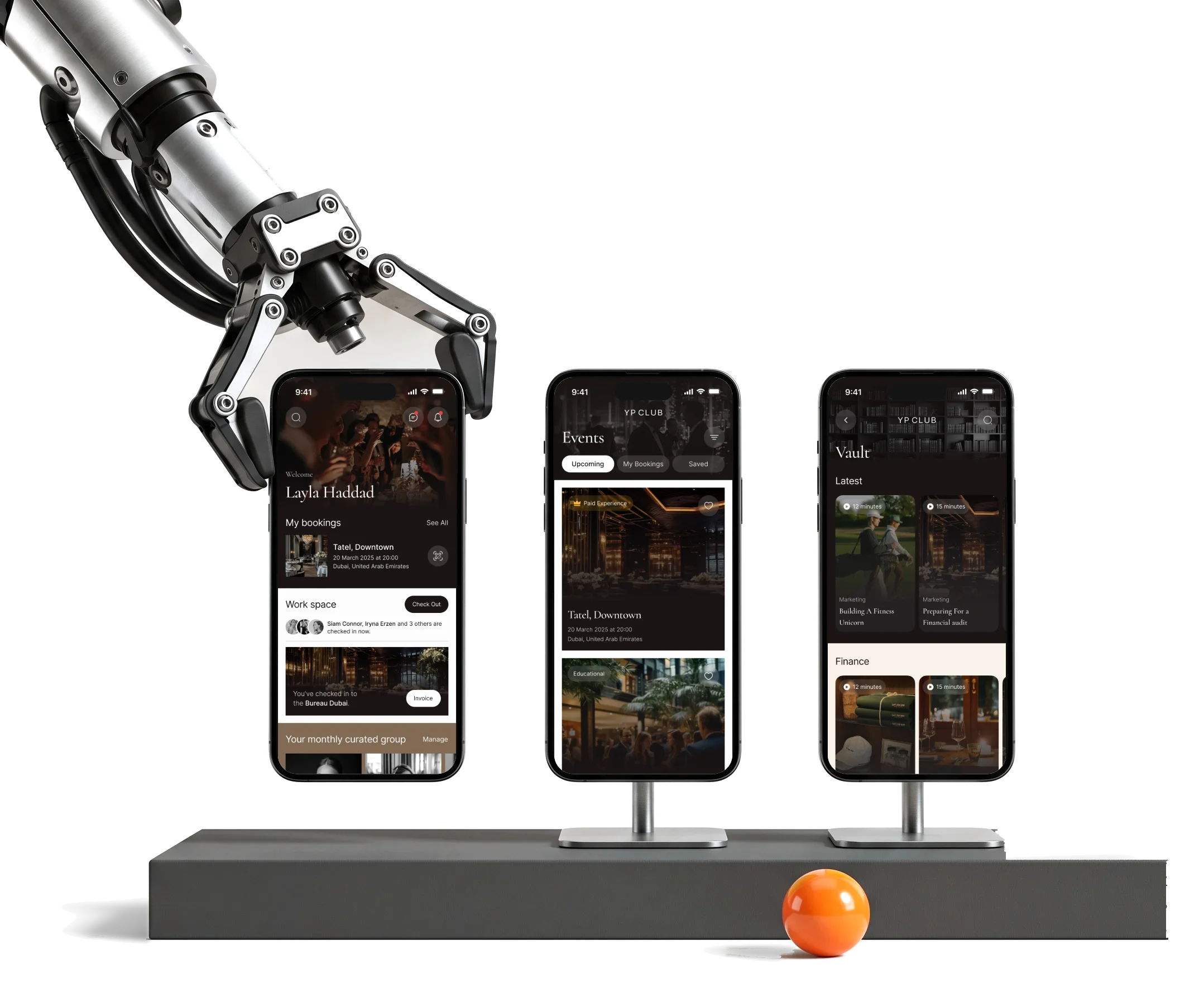
- Member
- app applying, events, perks, community and payments
- Admin
- panel members, events, content and communications
- Brand
- applied the club’s own brandbook, carried into every screen
Project summary
YP Club is a private network for founders and business professionals. Its app already worked, but it looked corporate, a list of features rather than a club. We redesigned the member app inside the brandbook the club already had, then designed the admin panel its team uses to approve members, publish events and content and follow payments.
How the work ran
- Scope
- The cross-platform member app, then the web admin panel.
- Brand
- The client’s own logo, identity and brandbook. We applied and refined them in the product.
- Rhythm
- Two milestones, then rounds of change requests, each approved by the client.
- Delivered
- Unique screens, a UI kit with connected components, a clickable prototype and the developer handoff.
- Outside it
- Development, store release and a dark mode.
Everything a membership holds, in one app
From the application to the renewal, in the order a member meets it, and the panel behind it:
-
Apply
- Waitlist and plan
- Referrals
- Approval and profile
-
Meet
- Events and tickets
- Attendees
- Curated groups
-
Go
- Places and perks
- Co-working check-in
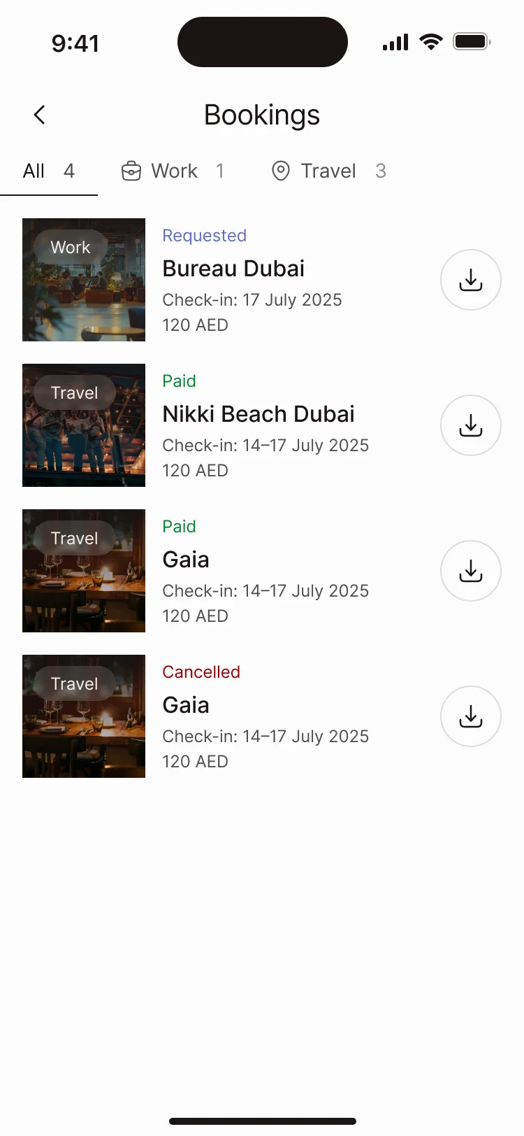
- Bookings
-
Talk
- Messages
- Forums
- Club news
-
Stay
- Subscription
- Wallet and invoices
- Support
-
Run the club
- Members
- Events and content
- Emails and notifications
- Exclusive and Clear
- A selective way in that still tells people exactly where they stand.
- Premium and Playful
- Dark photography and serif headlines with room for a lighter touch, inside a brandbook that already existed.
- Many services and One club
- Events, places, community and payments that read as one membership, not six apps.
Home, in the order a member’s week needs it
- Found
- A member opens the app between meetings. They want what is booked, where to work today and who to meet, not a menu of everything the club offers.
- Decided
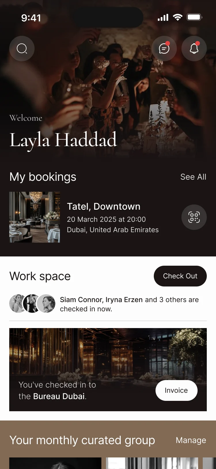
- One order down the screen: the welcome and search, the next booking with its QR one tap away, today’s co-working space, then the month’s curated group. Everything else sits in the tab bar.
- For the user
- The next event, today’s desk and this month’s introductions are on the first screen, without opening a section.
-
Whose club
The welcome, with search, messages and notifications above it.
-
What’s booked
The next event with its date and place, and its ticket one tap away.
-
Where to work
Today’s co-working space, who is checked in, and Check Out.
-
Who to meet
The month’s curated group, members matched to you.
-
Everywhere else
Home, events, forums, places and account in the tab bar.
How the work progressed
From a review of the app the club came with to a UI kit its developers could build from, one question closed at a time.
-
Discovery
Where the existing home and onboarding lost people, and what the club meant by premium
Artifact A UX review of the existing home and onboarding, and the brandbook read against the product
-
User Flow
Every section of the old app mapped, and what the new scope added to it
Artifact Information architecture and user flows for the member app and the admin panel
-
Wireframes
What each unique screen holds before photography and type
Artifact Wireframes and screen maps across the contracted scope
-
Moodboards
What premium and playful look like inside the club’s own brand
Artifact Moodboards, then two visual styles on the key screens
-
UI & Design system
One system for every screen, including the ones added by change requests
Artifact The final UI, a UI kit with connected components and the reusable states
-
Delivery
What the developers needed to build without guessing
Artifact A clickable prototype, screen notes and the handoff file
The old app mapped before the new one was drawn
- Found
- The club’s app had grown section by section, and its admin panel had grown the same way, with the same data in different places.
- Decided
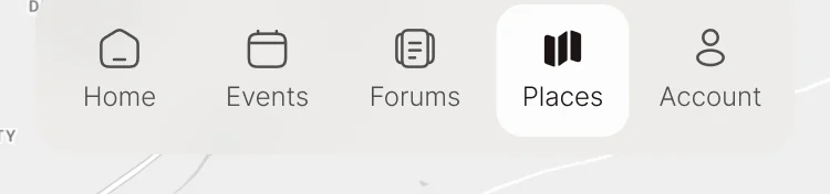
- Every screen of the existing app and panel laid out by section first, then a new structure for both: five tabs for members, and a panel organised around the member, the content and the club’s messages.
Seven jobs the member app does
In the order a member meets them: getting in, then the club’s events, places and people, then the membership itself.
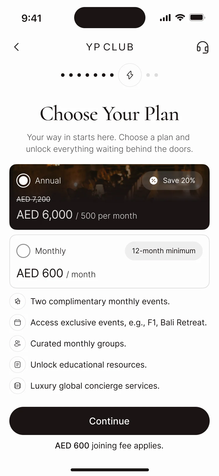
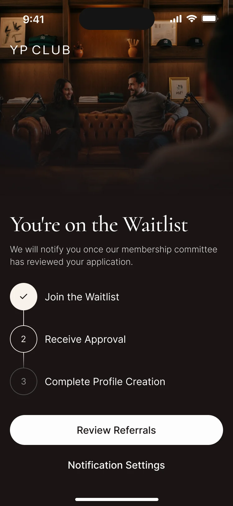
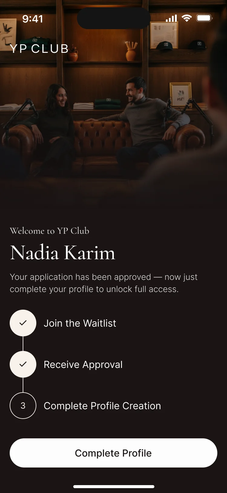
An application that still feels selective
- Found
- Getting in is part of the club’s value, but a waitlist nobody explains feels like a rejection before anyone has said no.
- Decided
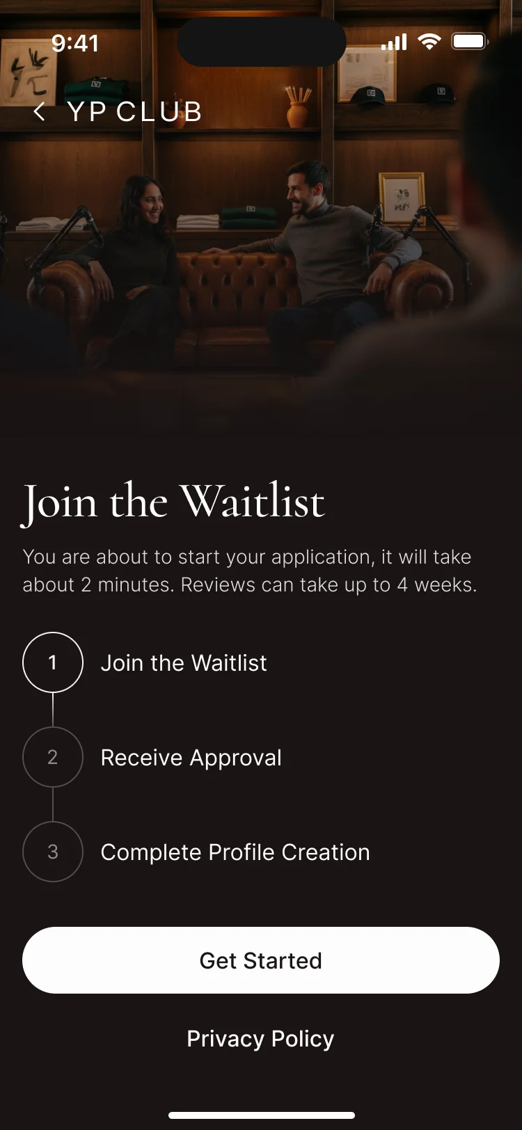
- Three steps stated up front, a plan chosen before applying, and a status screen for every point on the way: on the waitlist, approved, and what is left to do.
Events that end at the door
- Found
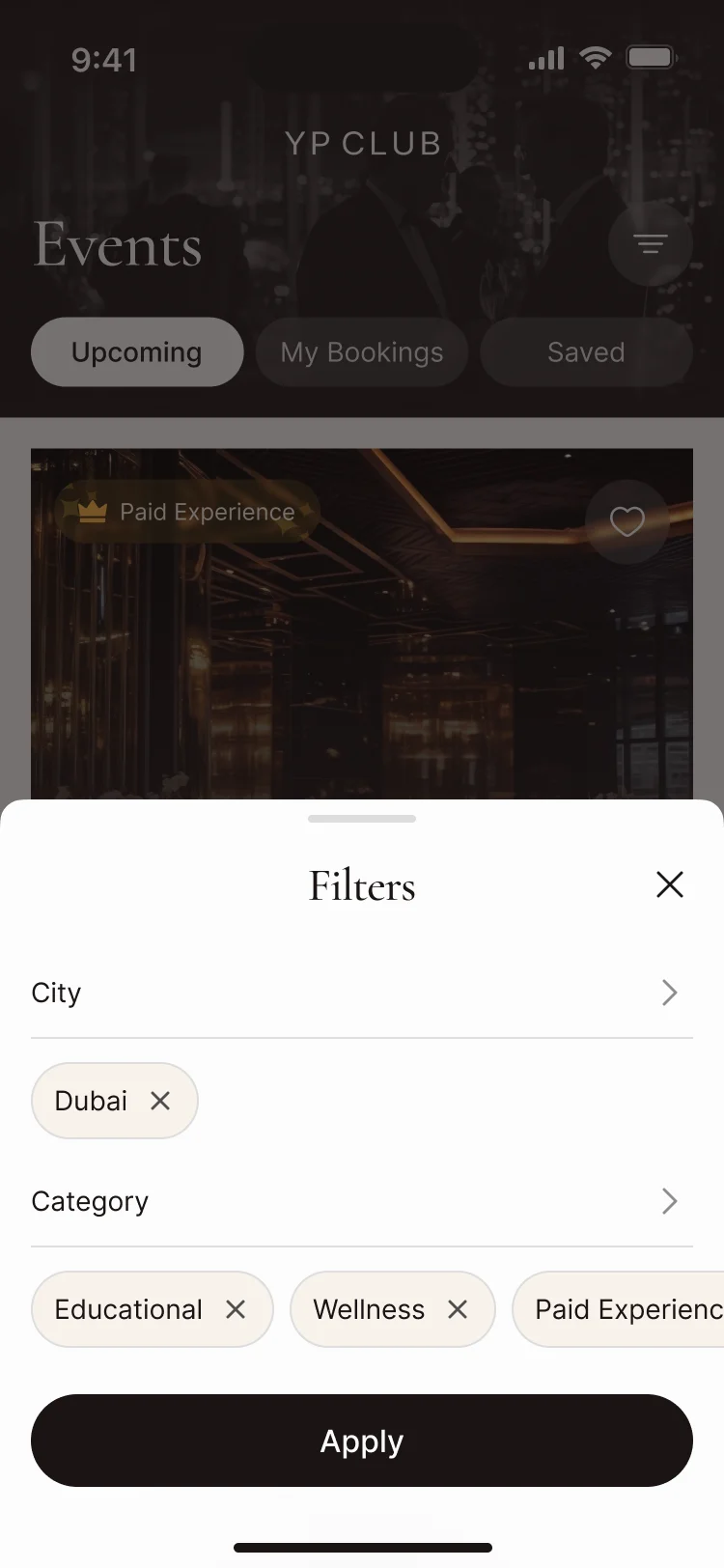
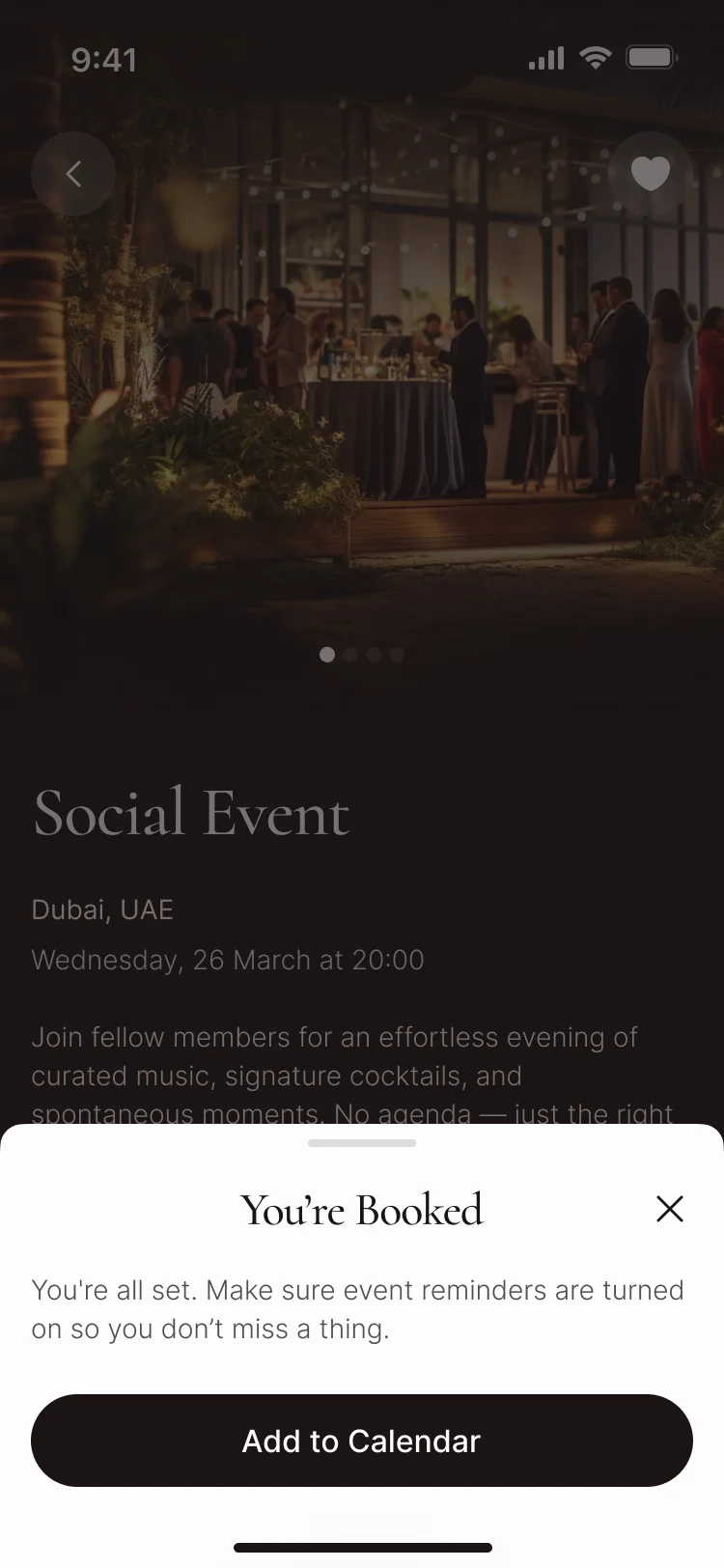
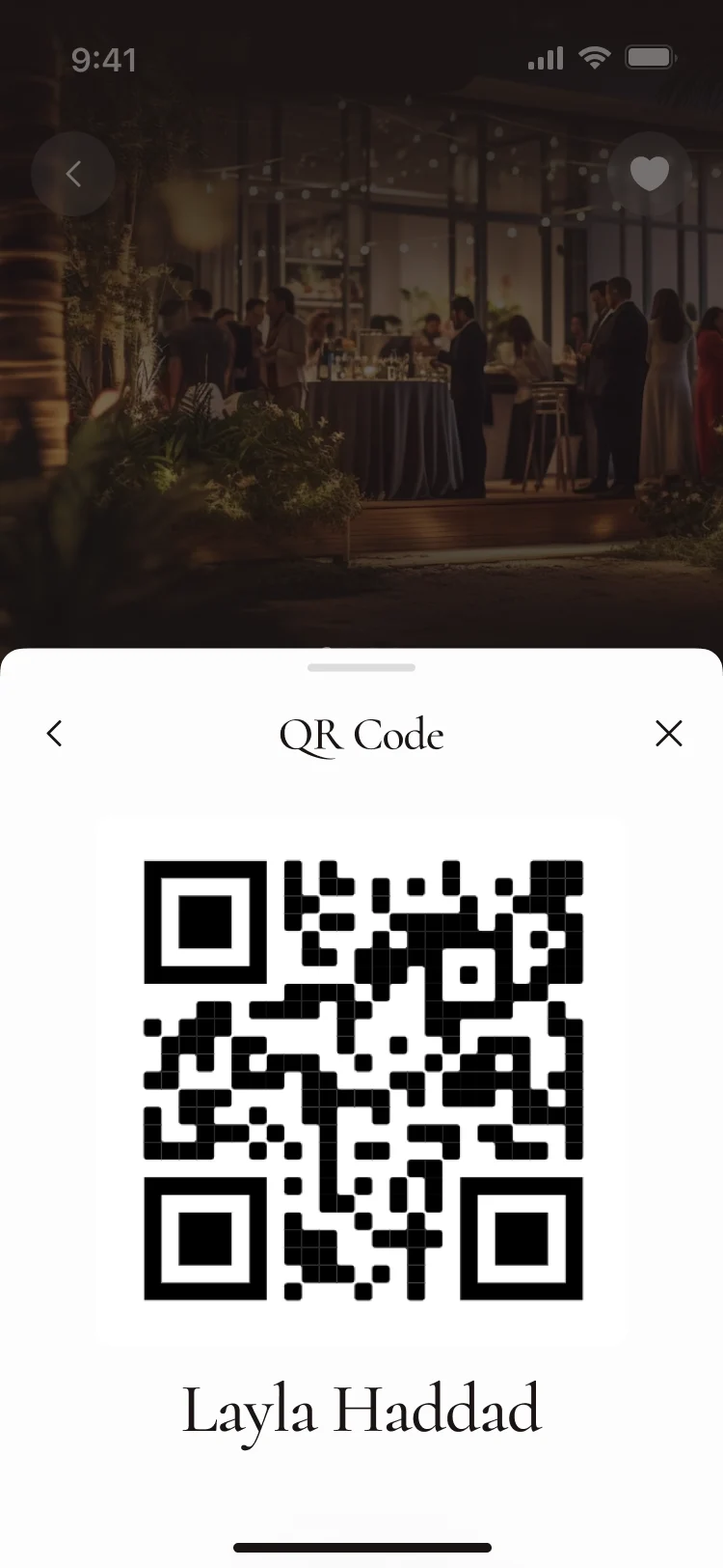
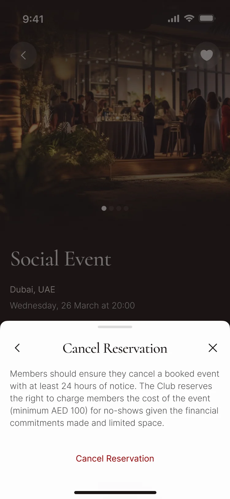
- A club event is booked in the app and checked at the venue; every step between the two has to hold, including changing your mind.
- Decided
- Filters by city and category, a booking confirmed in a sheet, the ticket as a QR code with the member’s name, and cancellation terms shown before anyone cancels.
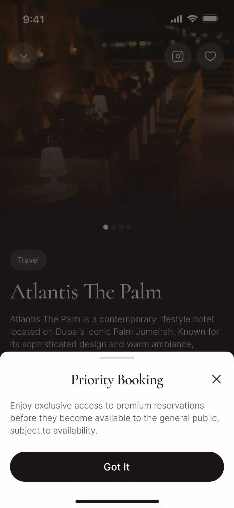
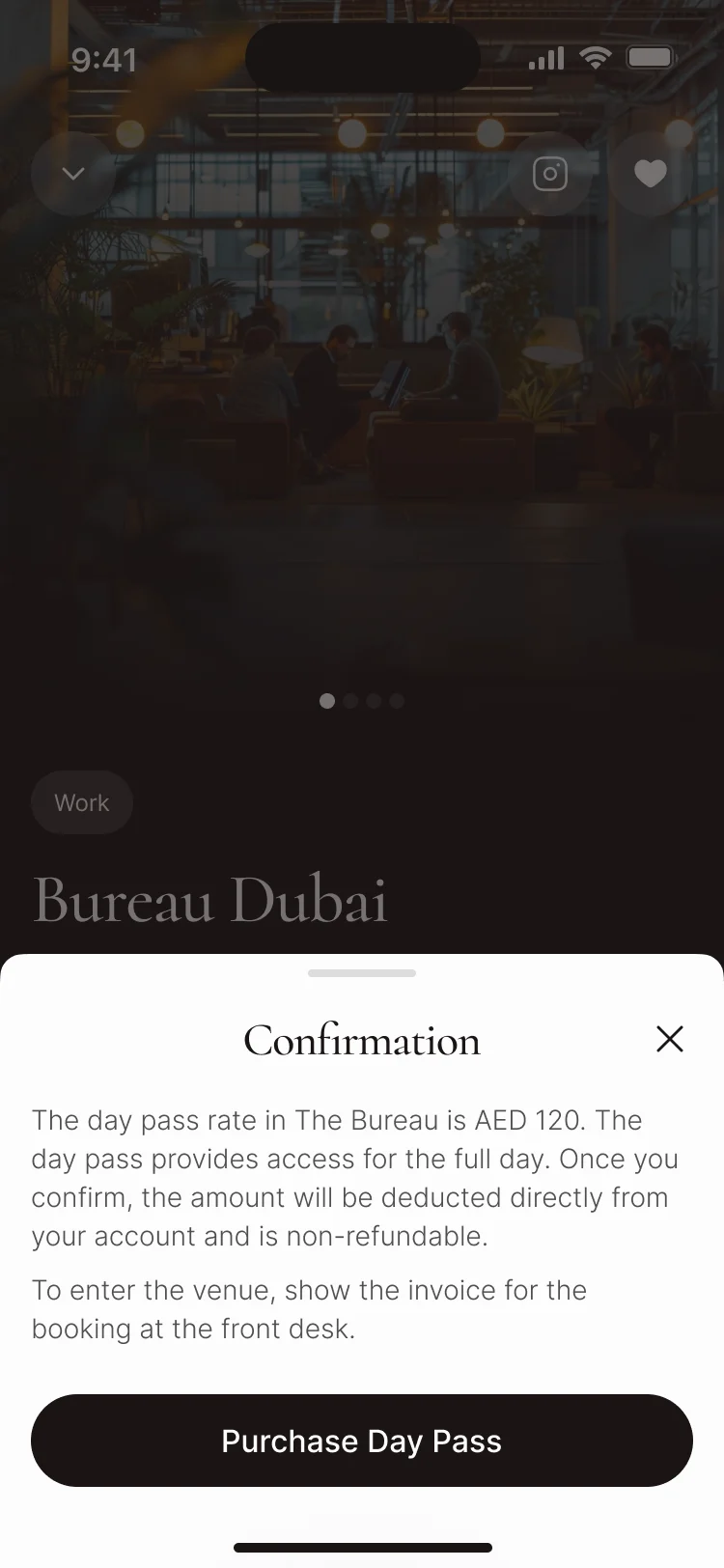
Places and perks on a map
- Found
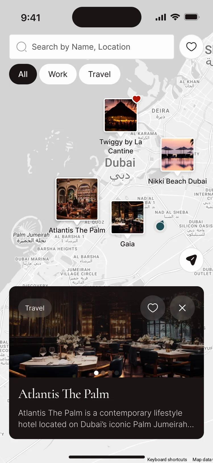
- Hotels, beach clubs and co-working spaces each come with different benefits, and a list alone doesn’t say which one is near.
- Decided
- A map with Work and Travel filters and saved places, a card for each partner, its perks spelled out, and a co-working day pass confirmed before it is charged.
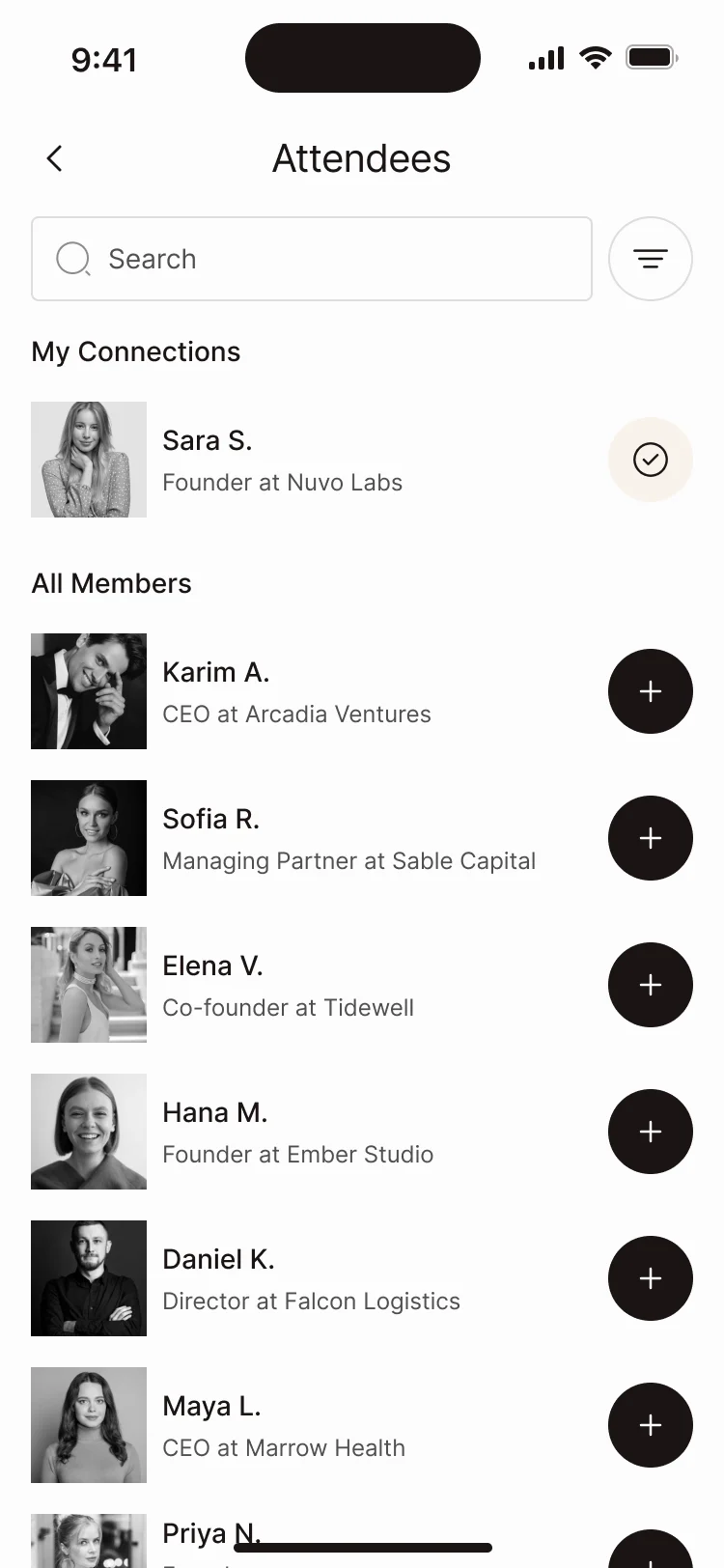
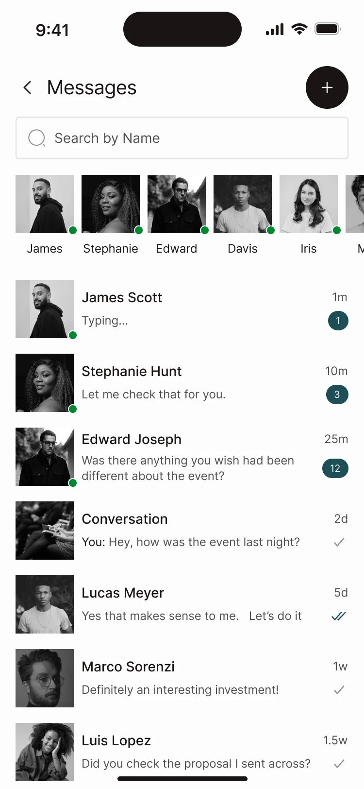
Members worth meeting
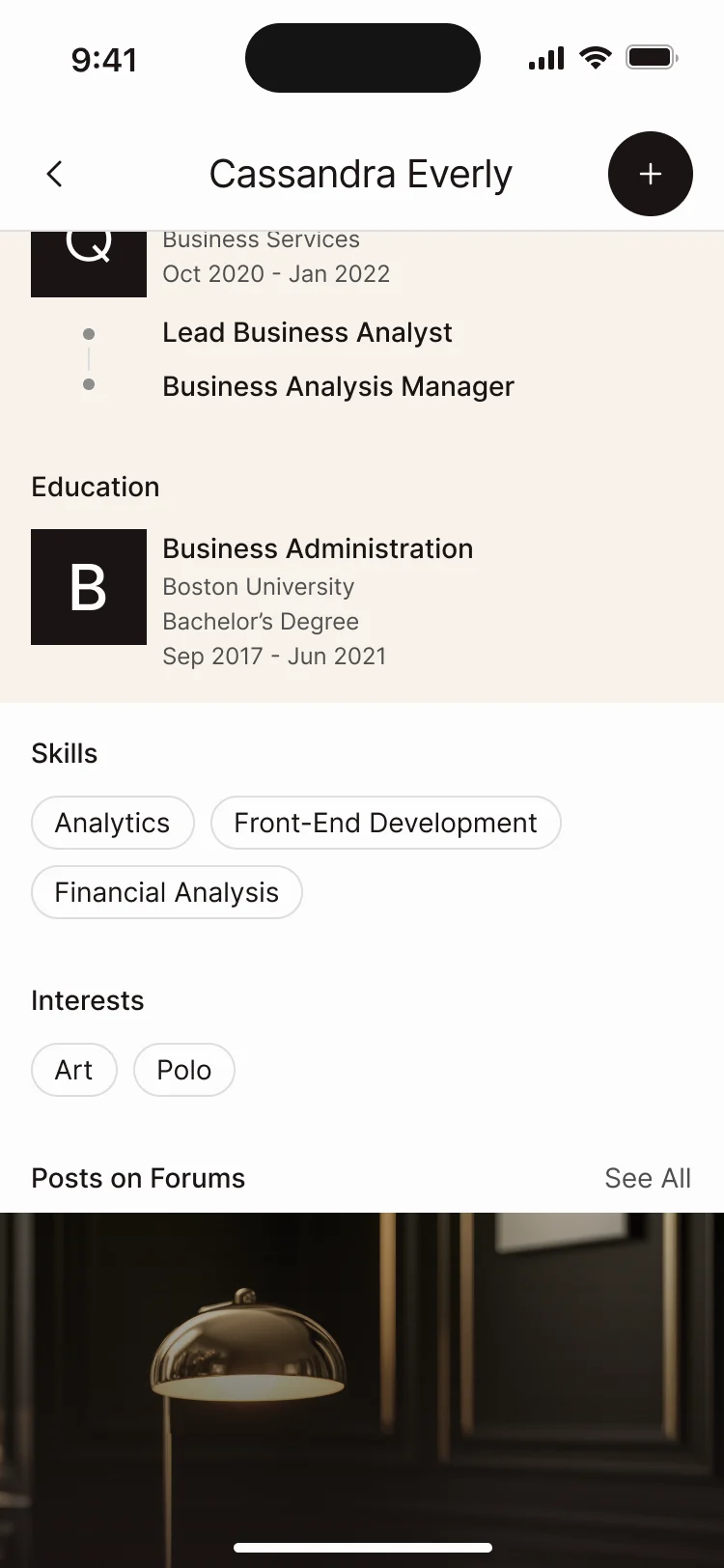
- Found
- The network is the product, but a directory of names doesn’t say who someone is or why you should talk.
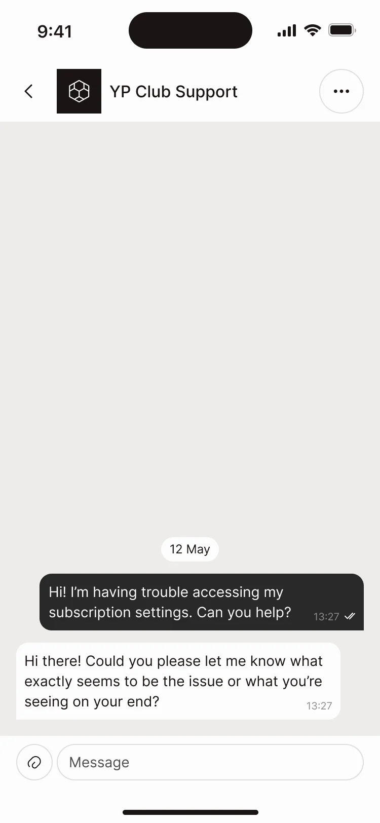
- Decided
- A profile built around experience, education, skills and interests, who is going to an event, conversations with members, and the club’s support in the same inbox.
Community between the events
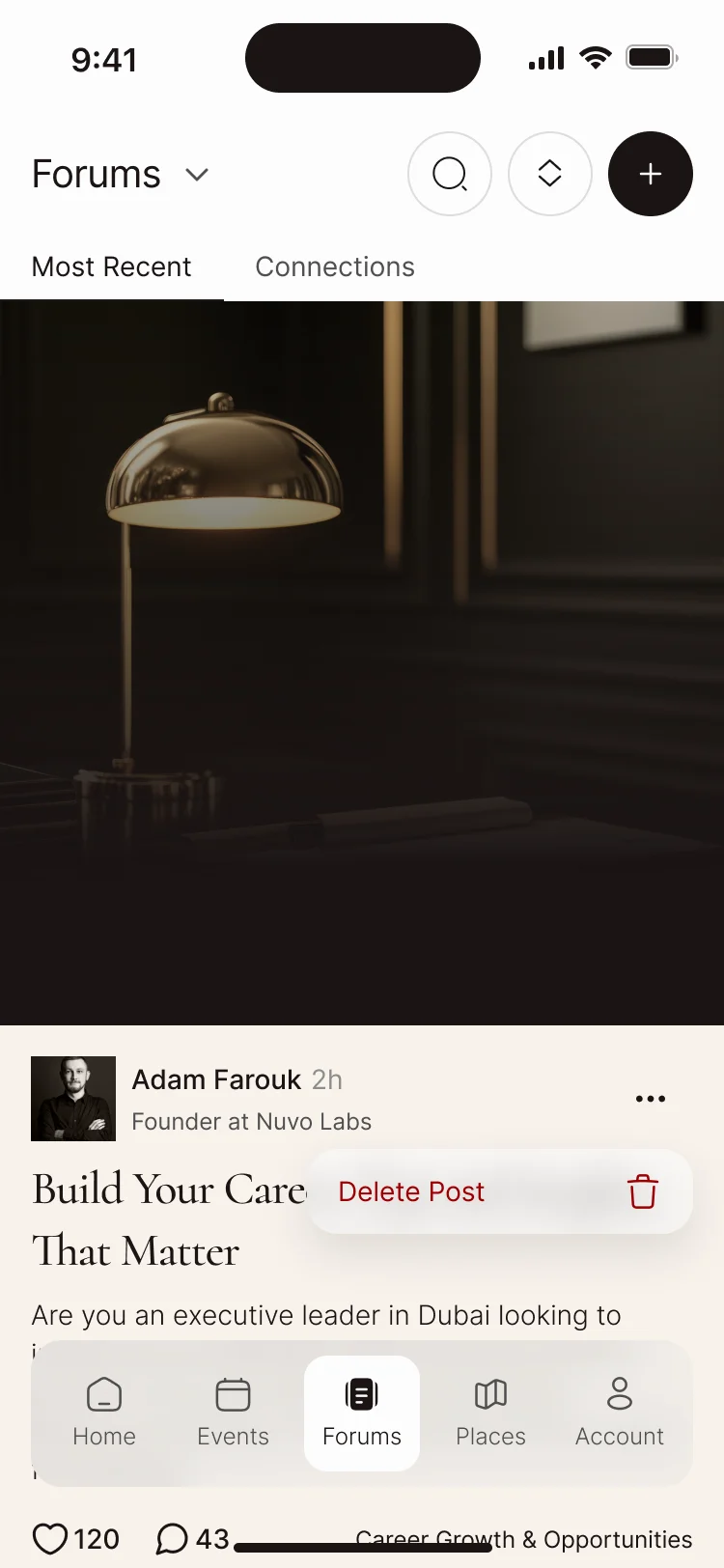
- Found
- Forums, articles and club news could each become a feed nobody reads; members need a reason to post and a way to find what matters.
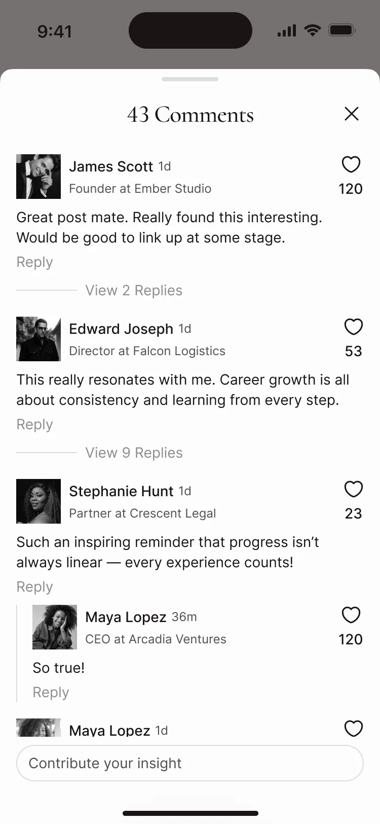
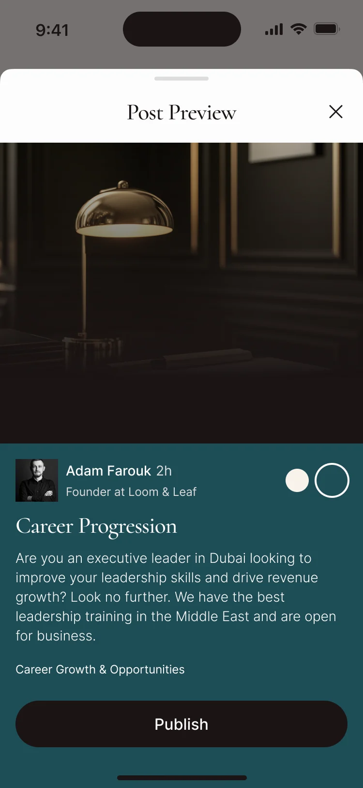
- Decided
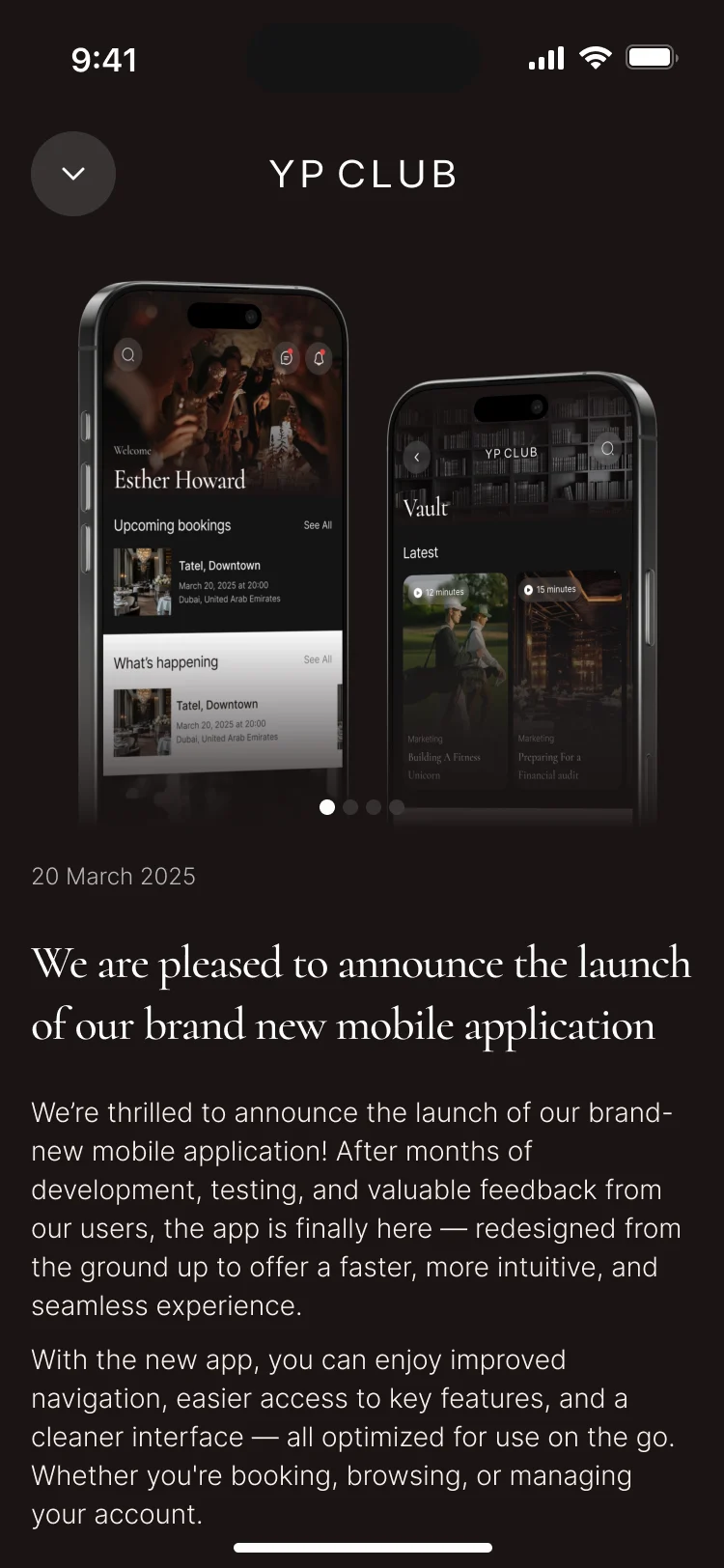
- Forums sorted by most recent or by connections, threaded comments, a preview before a post is published, and club news written like an editorial page.
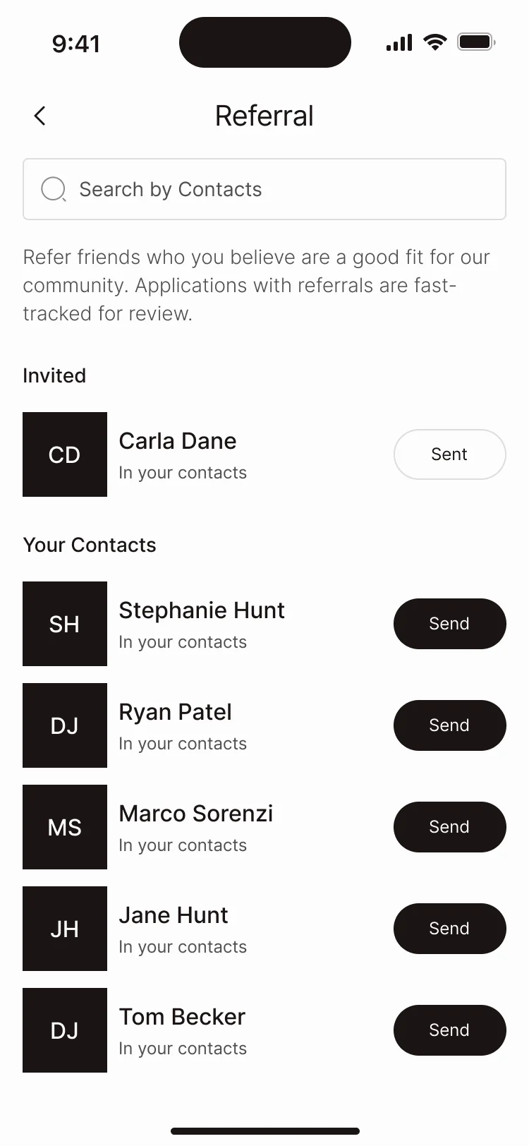
Referrals and introductions
- Found
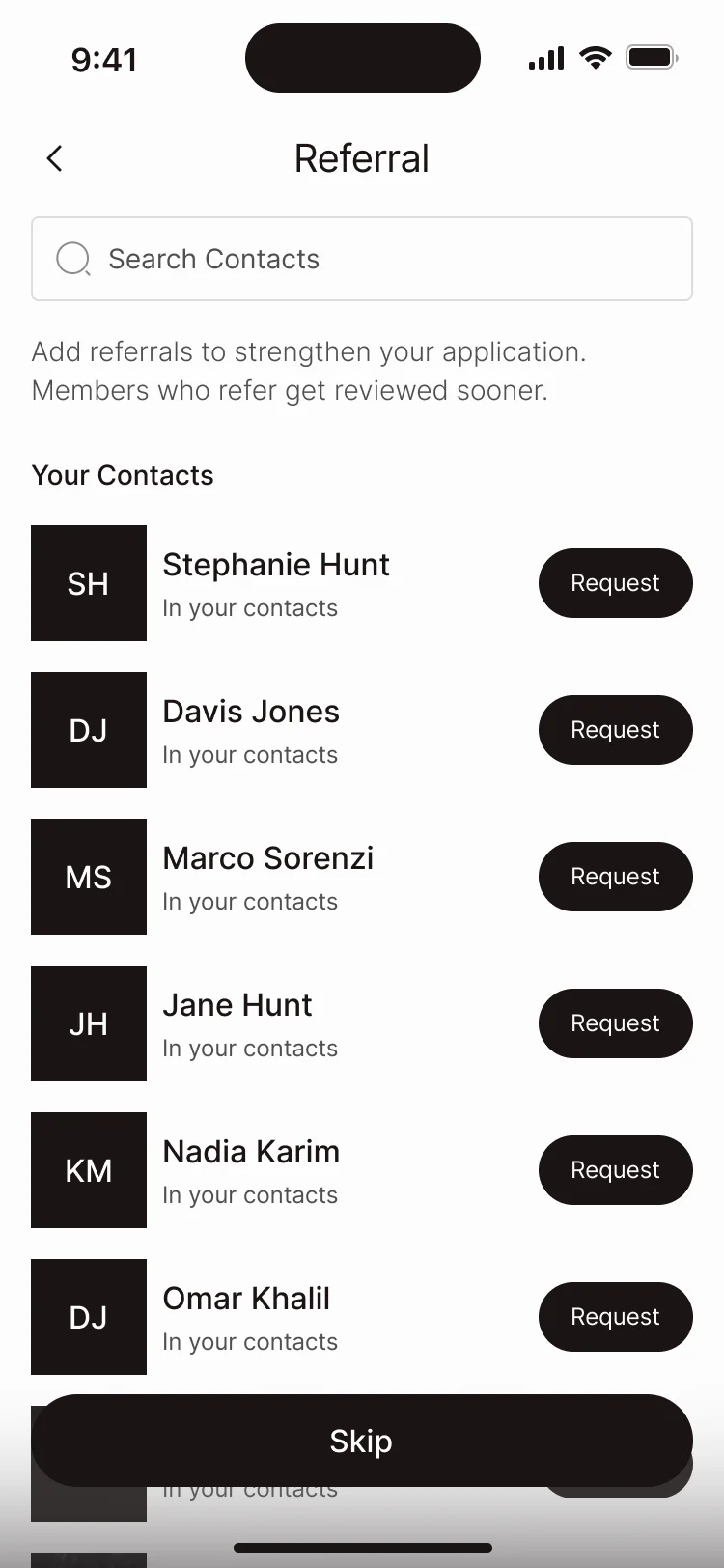
- Referrals help an applicant get in and bring the club its next members, but invitations are limited and the logic changed during the project.
- Decided
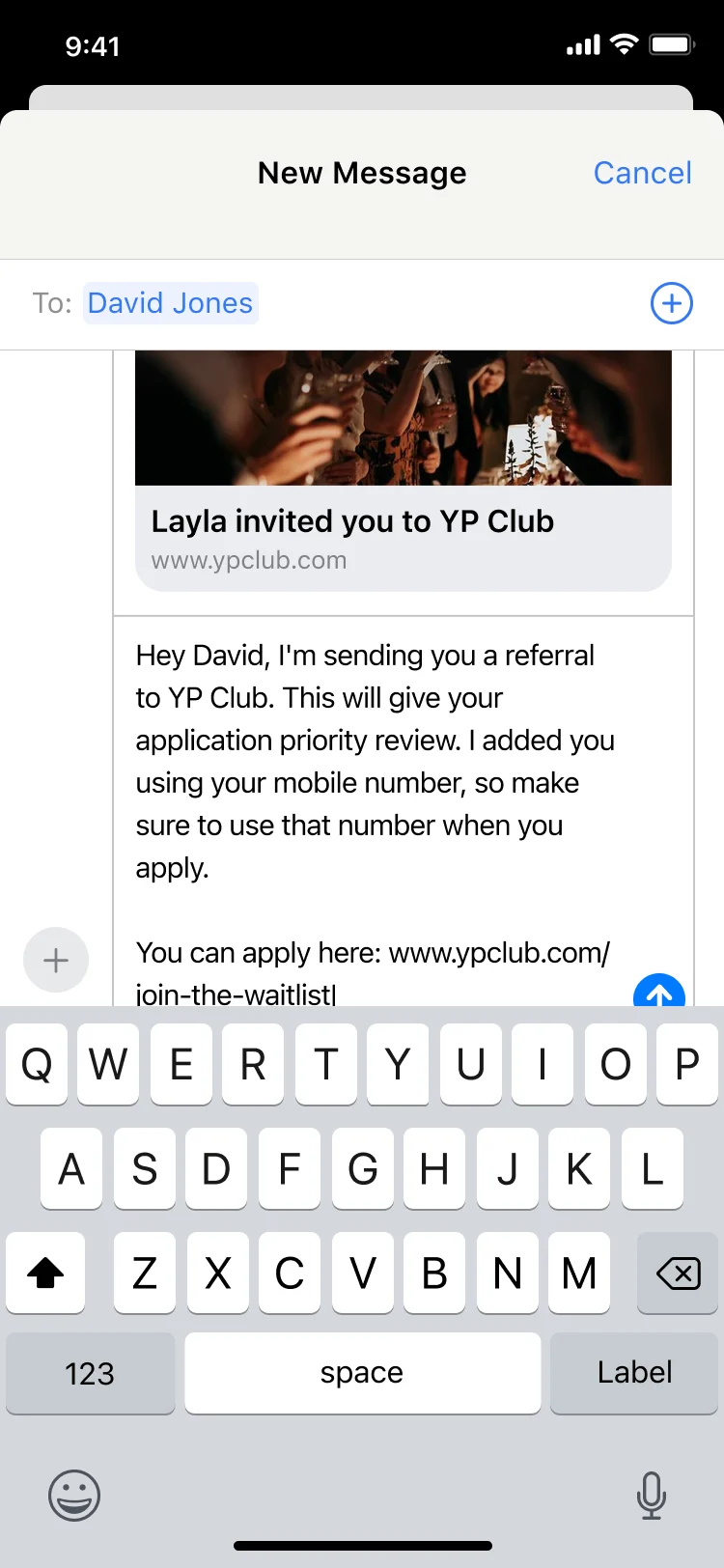
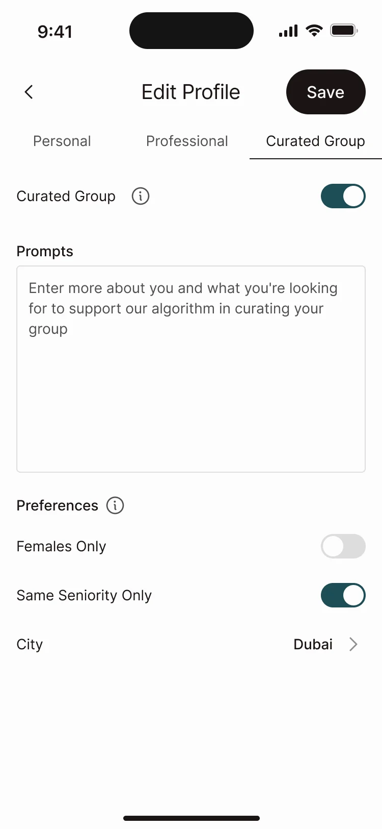
- Referrals requested from the contacts list while applying, a member’s invites with what was sent, a ready invitation message, and curated groups tuned from the profile.
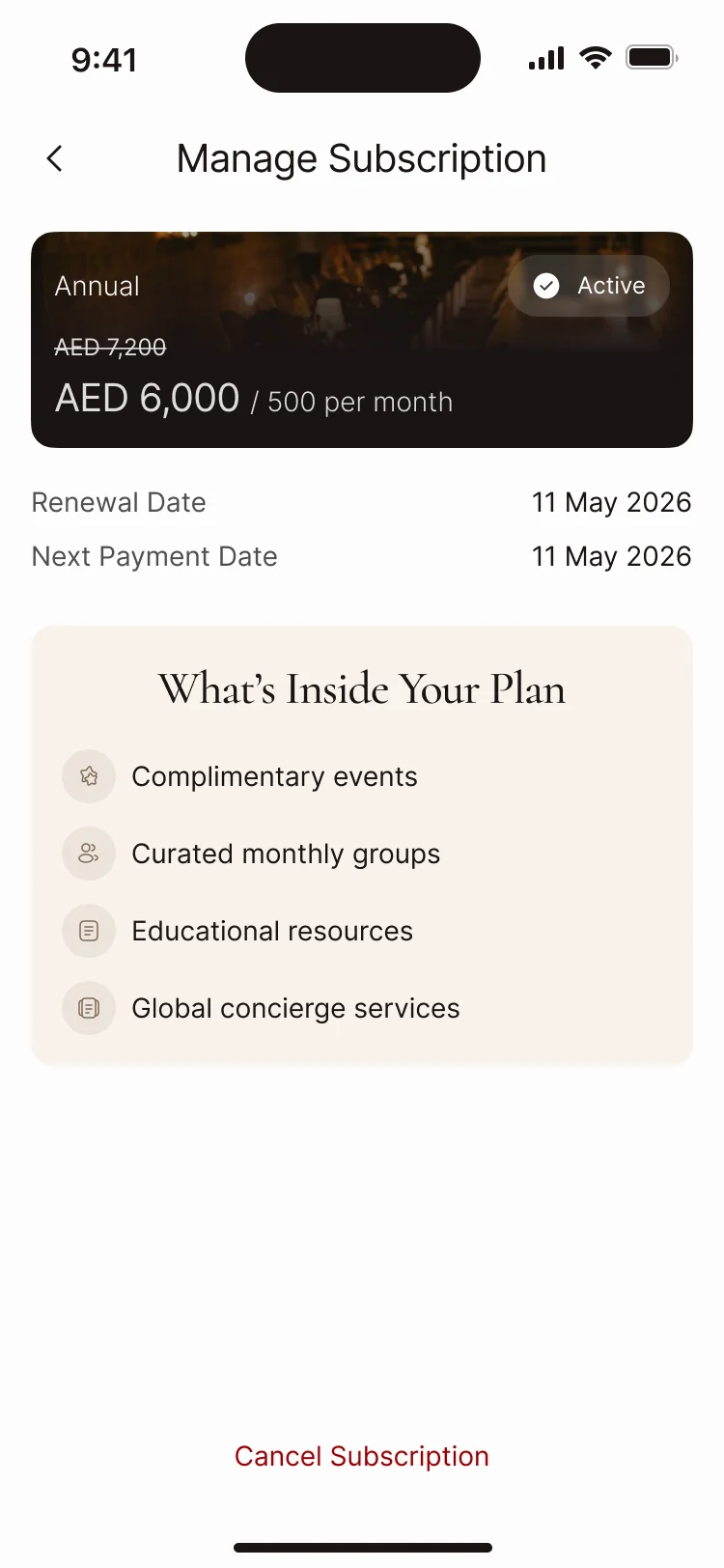
A membership that bills with care
- Found
- A premium membership still fails payments, refunds and cancels; each of those screens can undo the trust the rest of the app builds.
- Decided
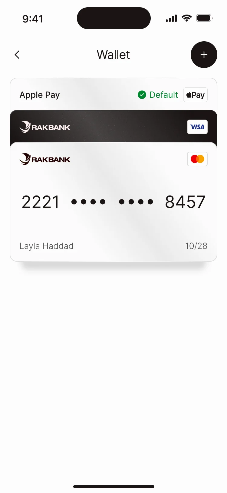
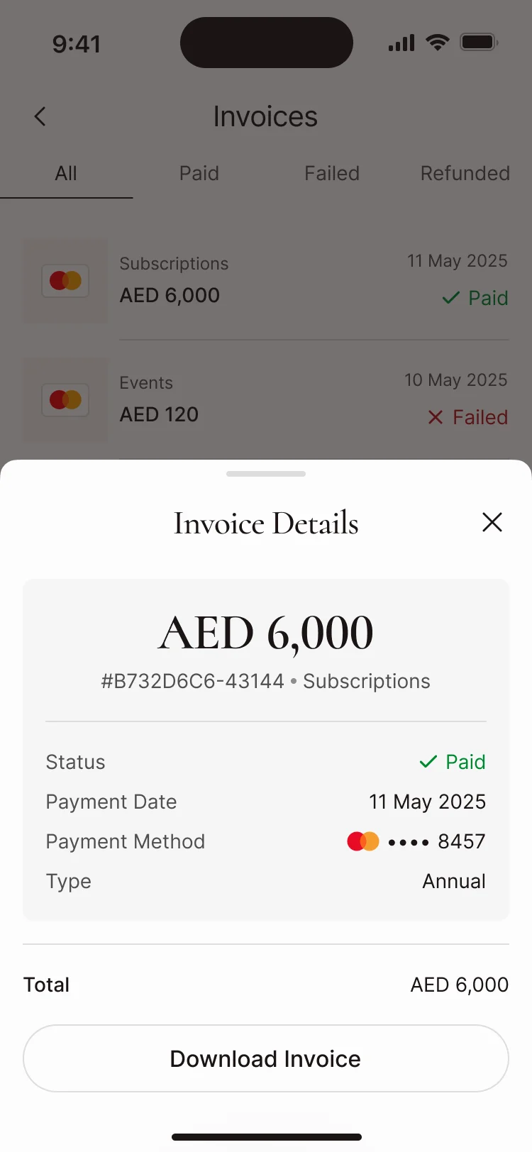
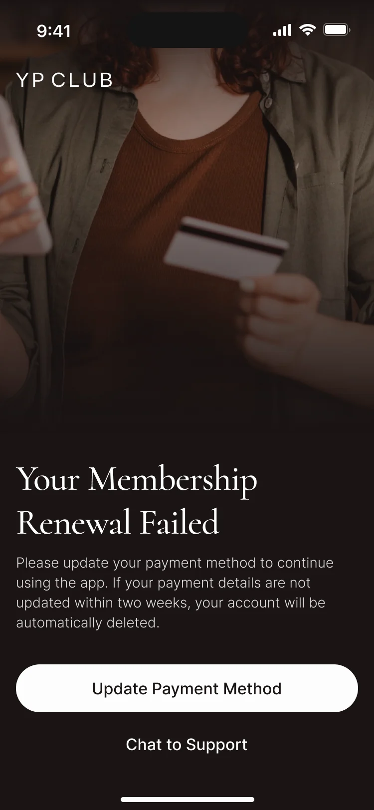
- The plan and its dates on one screen, cards in a wallet, every invoice with its status, and a failed renewal that says what happens next and how to fix it.
One kit for a club that kept growing
- Found
- The original scope covered unique screens only, and change requests kept adding sections; without one system, every round would have drifted a little further.
- Decided
- The repeatable states lived in the UI kit as connected components, so a new section reused the same cards, sheets and status screens.
One status screen for every membership moment
The same dark screen, headline and single action whether a membership is paused or cancelled.
-
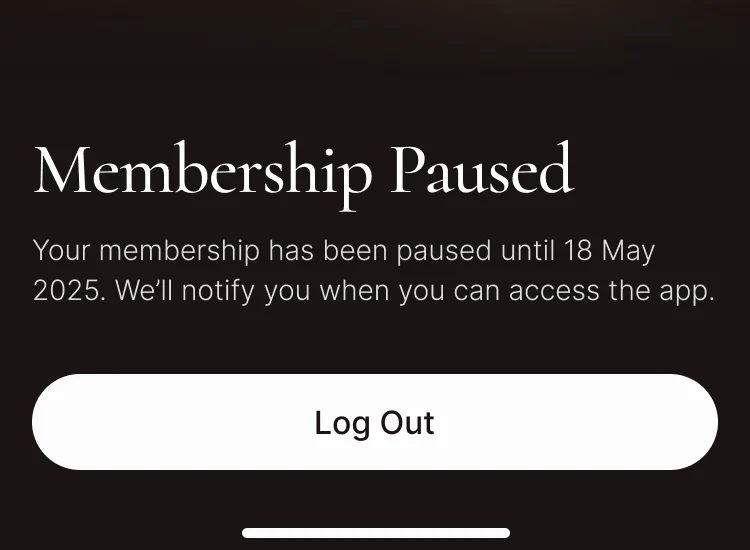
Paused: When access comes back. -
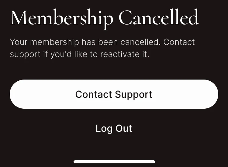
Cancelled: The same pattern for the end of a membership.
Drawn for the moments that go wrong
Nothing found, nothing booked, a card that fails: each says what happened and what to do next.
-
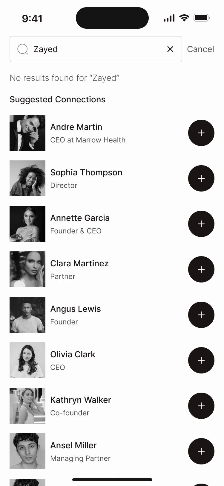
Nothing found -
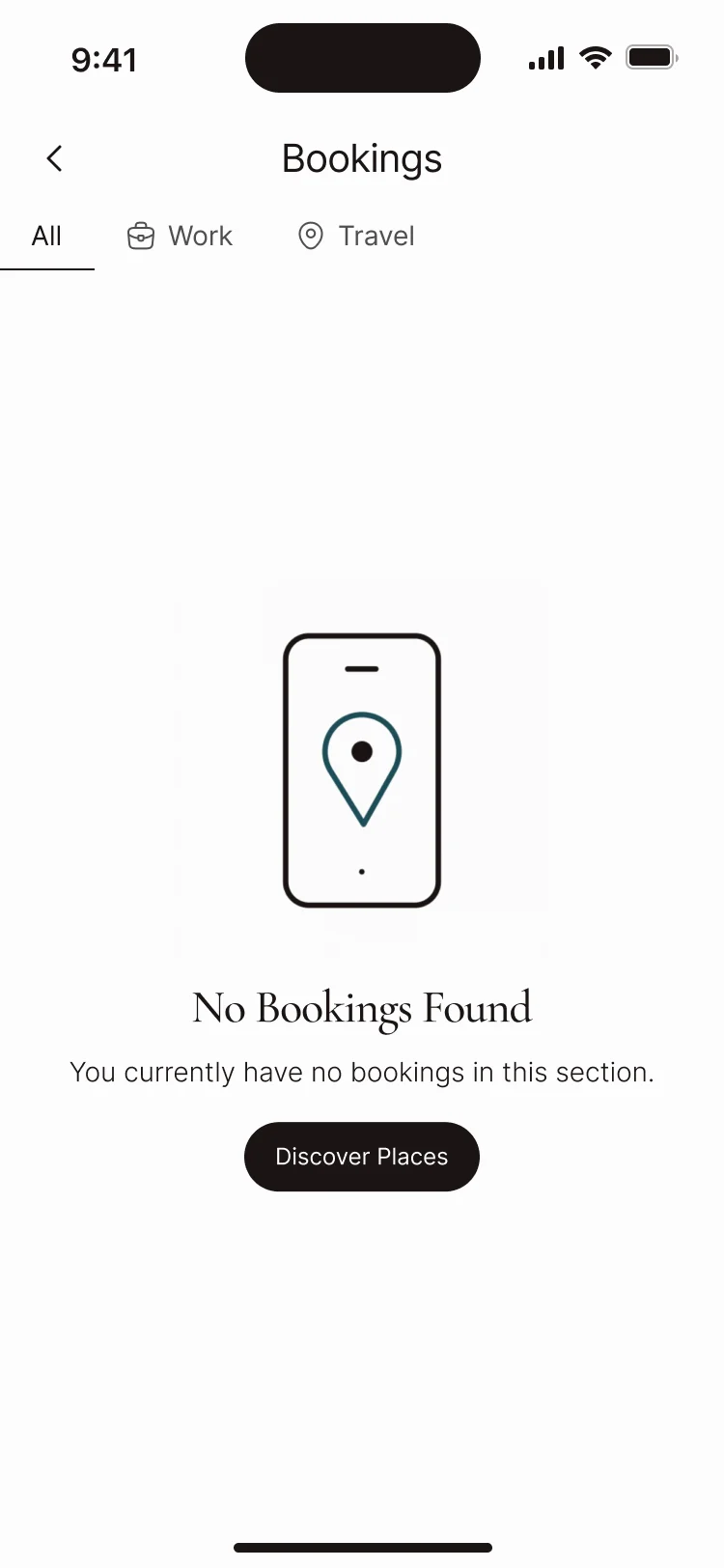
No bookings yet -
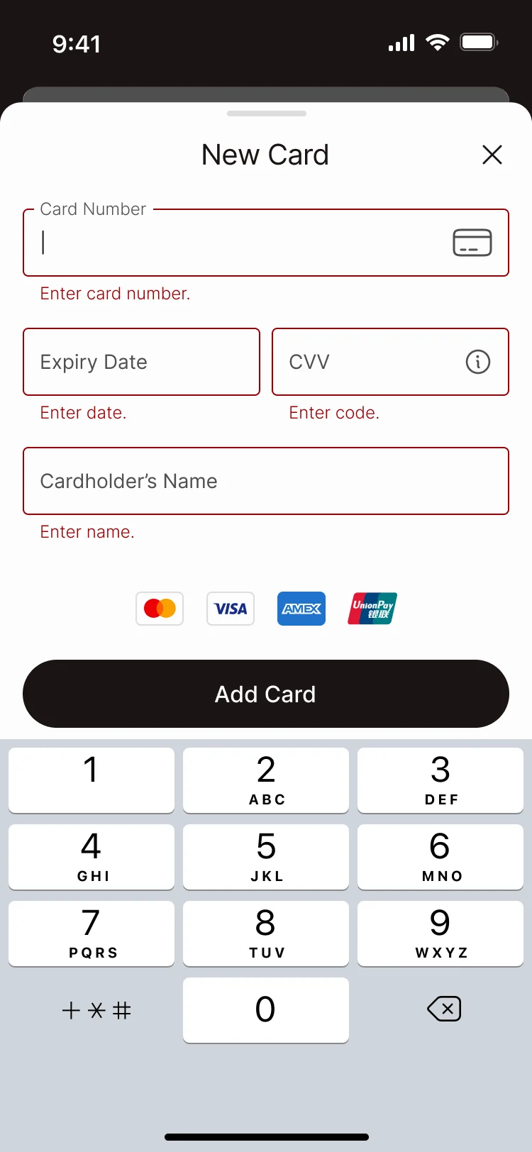
A card that fails
Where the product ended up
One design for the whole membership: an application that stays selective and clear, events from filter to QR ticket, places and perks on a map, members, messages and forums, and payments that explain themselves when they fail, all inside the brand the club already had. Behind it, an admin panel for members, events, content and the club’s messages.
Delivered as a UI kit with connected components, a clickable prototype and a developer handoff; the club’s team built the product.
- the member app, redesigned section by section
- App
- the admin panel the club runs it from
- Panel
- a UI kit with connected components and states
- Kit
In the client's words
The design direction brought the club’s core experience into a consistent set of screens. We appreciated the connection between the member-facing information and the proposed journeys, with a visual language that could support further product discussions.

Is your app the least premium thing about your club?
In YP Club, the member app was redesigned inside the brand the club already had, and the panel behind it with it. Show us yours, and we’ll show you where it stops feeling like the membership people pay for.
More work like this
Three more consumer apps built around venues, a community, or the staff tools behind them.
-
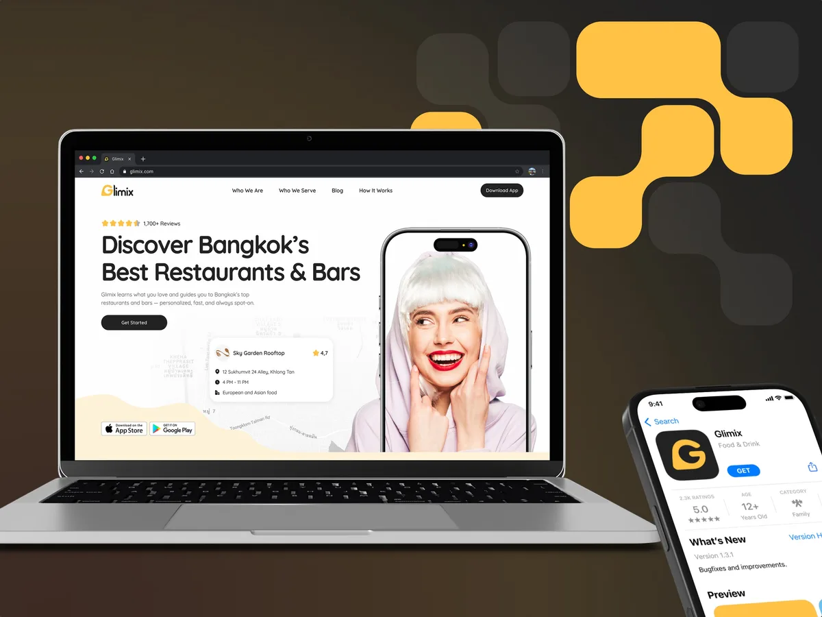
FoodTech · SaaS
Glimix
Redesigned a two-sided hospitality app for diners and venue owners, with an AI assistant, a new brand and the landing page.
- 200+ Screens designed
- 5 Experts on the pod
-
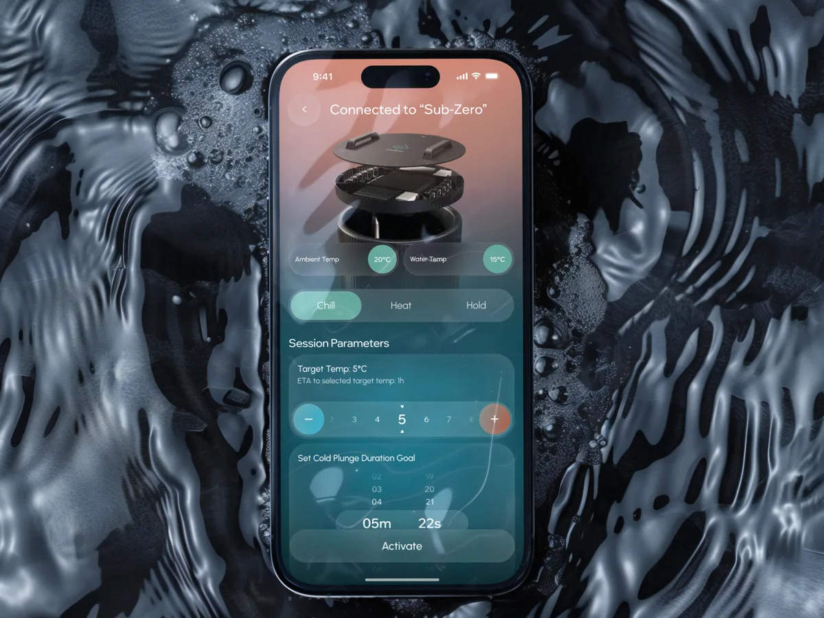
Wellness · Healthcare
Clearwater Wellness Co.
Designed a cold-plunge wellness app from scratch: device control, session tracking and a community around the ritual.
- 306 Screens designed
- 4 Experts on the team
-
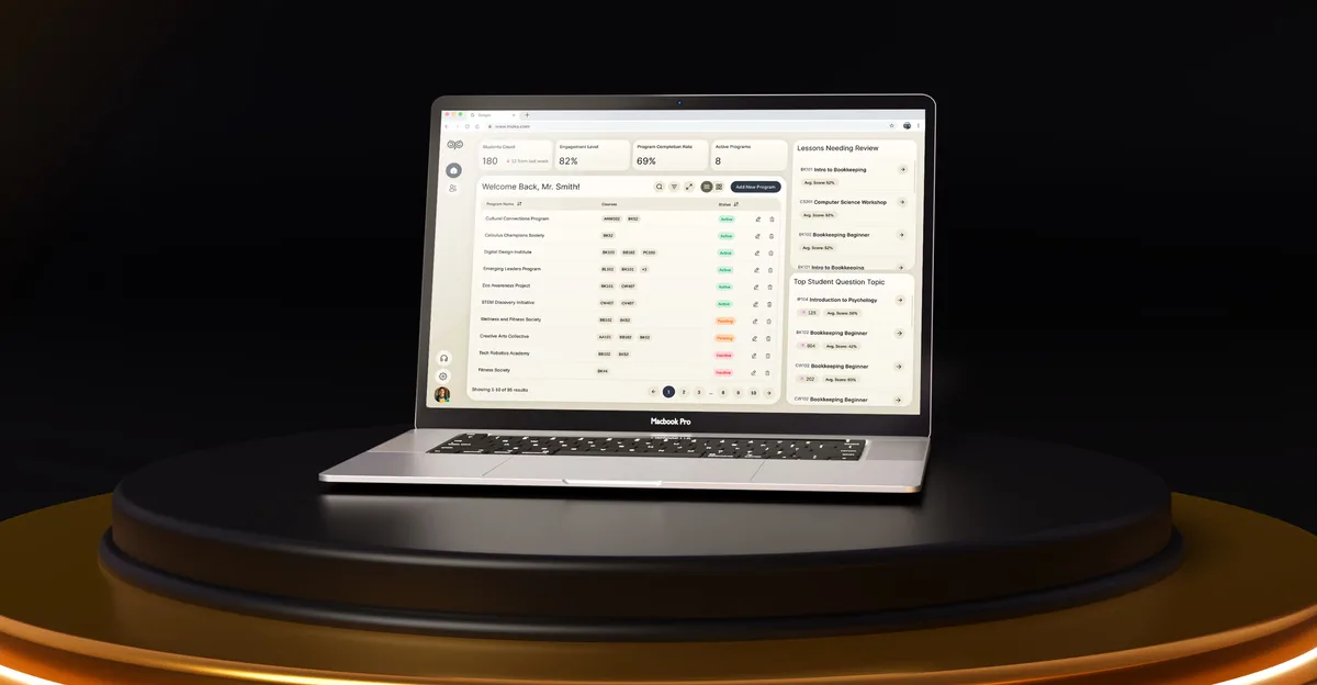
EdTech · SaaS
Moka
Designed an AI study assistant for students and the web tools their instructors and schools run it from.
- 200+ Screens designed
- 4 Experts on the team