
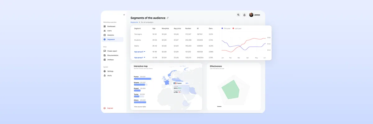
The Ultimate Guide to Dashboard Design UI: Best Practices and Principles
Learn the best dashboard UI design practices to enhance user experience. Improve data visualization and usability. Get expert insights at ANODA UX Agency today!
Design dashboards around the decisions people make with them — which numbers each role sees first, which chart or table answers the next question, and what the screen shows when the data is late, empty or wrong.

Dashboards built around the decision each role makes, then the charts, tables and filters that support it.
Designs the whole product's workflows and screens.
Dashboard Design
Designs the views where people read data and act on it.
Not included
Every view traces back to a role and a question, so nothing sits on screen out of habit.
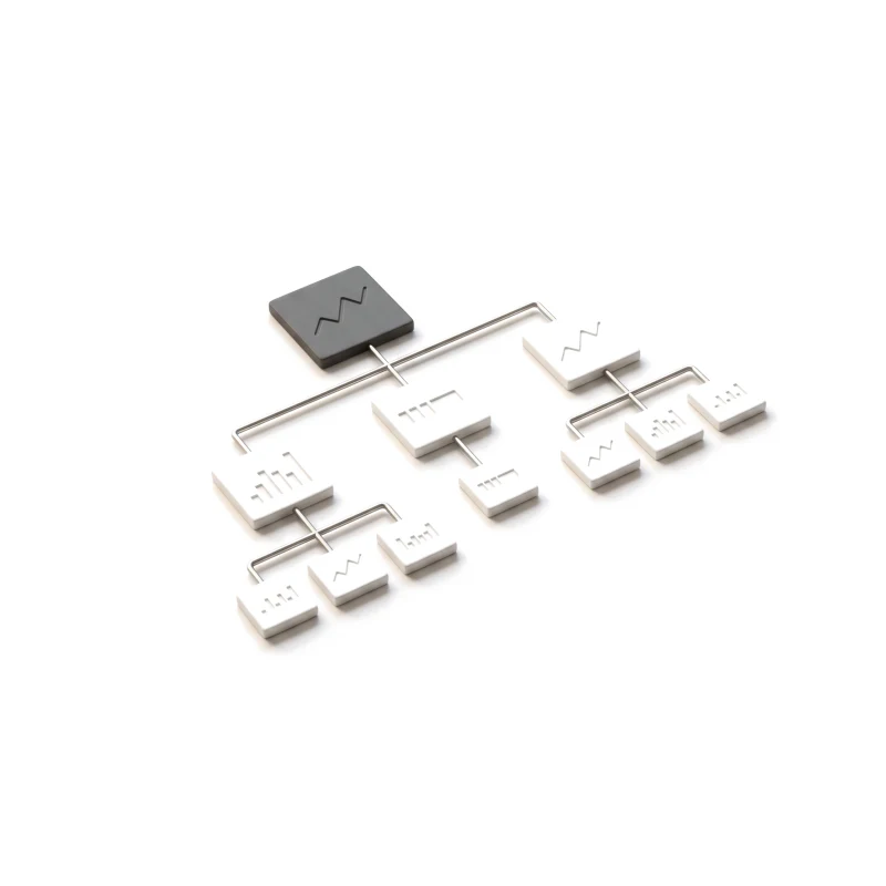
Each role, its decisions and the numbers behind them.
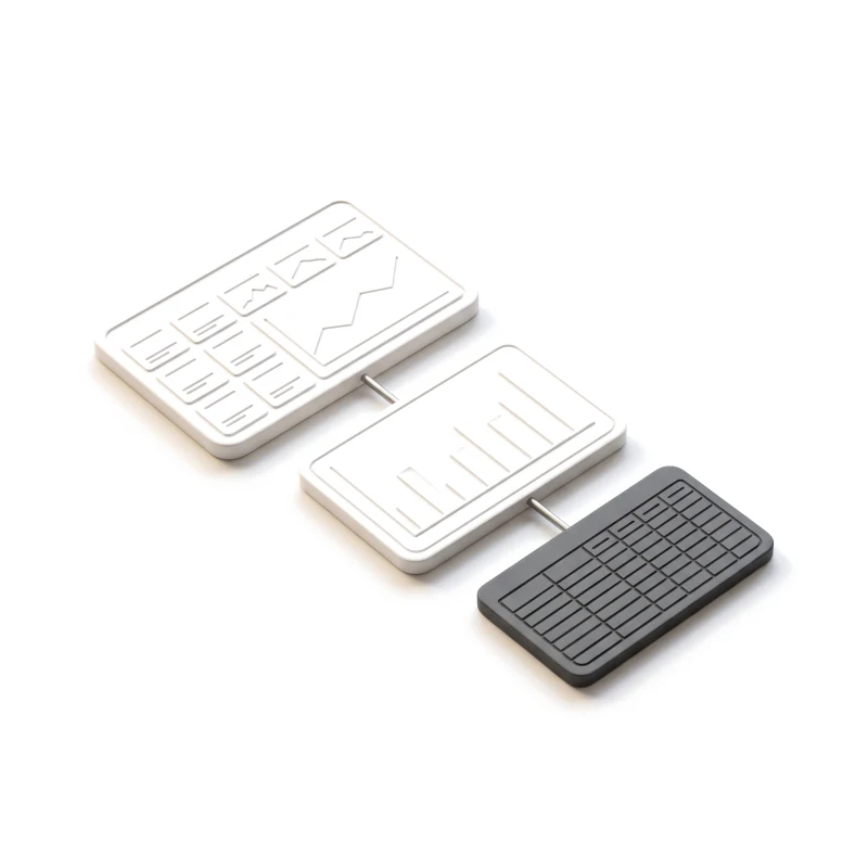
From the overview to the row behind a number.
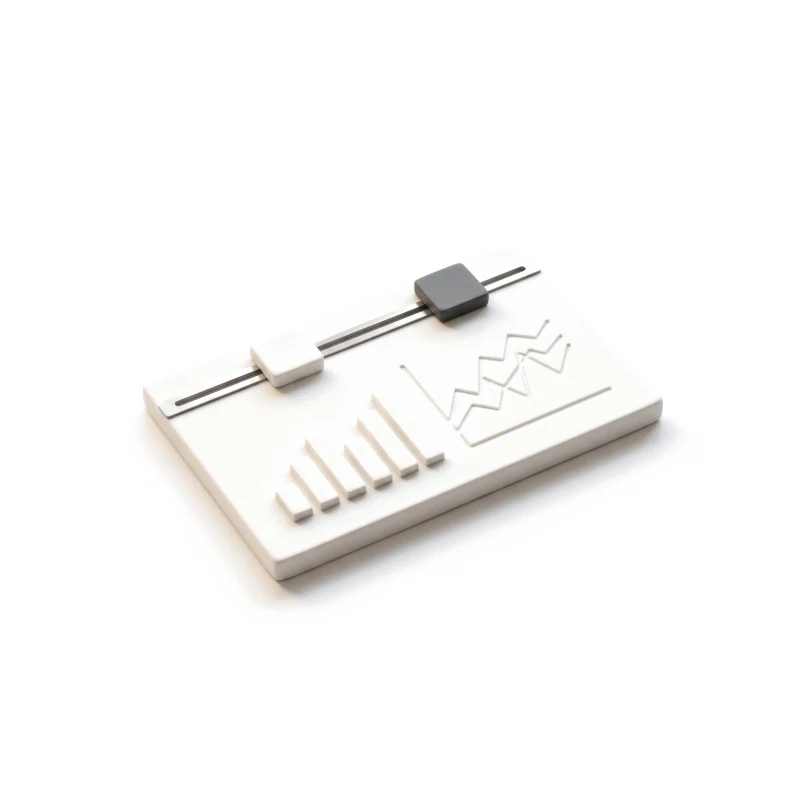
Filters and comparisons, clicked through on your figures.
Screens, chart rules and every data state, ready to build.
You receive
A dashboard is judged on its bad days: a source that fails, a filter that returns nothing, a number nobody expected.
Ads analytics, warehouse operations, attribution and software assets — dense data, read every day.
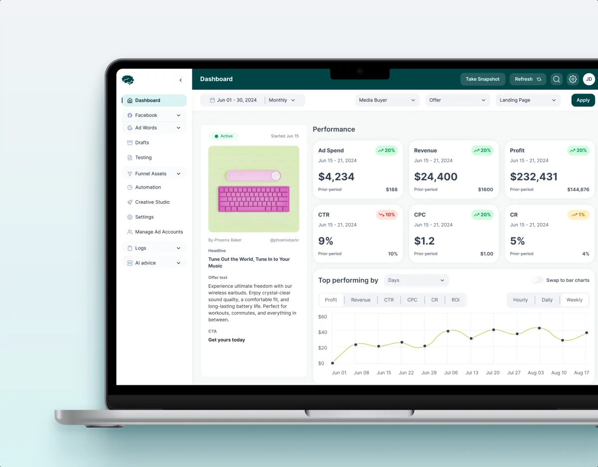
MarTech · Ads analytics · Web SaaS
Audited a live ads-analytics platform module by module, then redesigned 11 modules on one set of metric cards, charts, filters and tables.
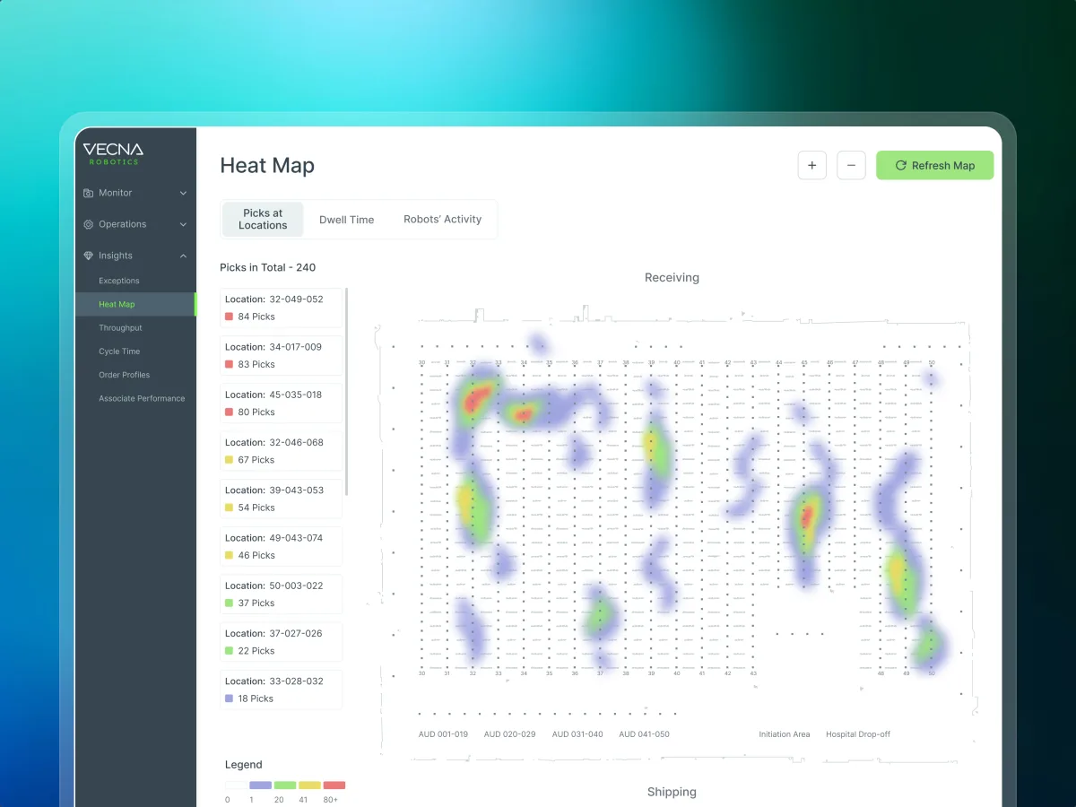
Robotics · Warehouse ops · Web SaaS
Redesigned a warehouse robotics console — heat maps, a live floor map and shift charts in one chart language, checked at tablet width.
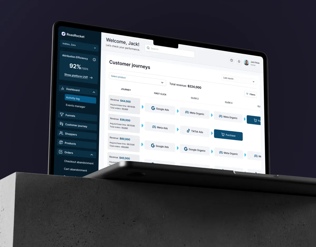
Marketing · Analytics · Web SaaS
Designed an attribution CRM whose funnels, journeys and tables serve a thirty-second morning check and an hour of drilling into one funnel.
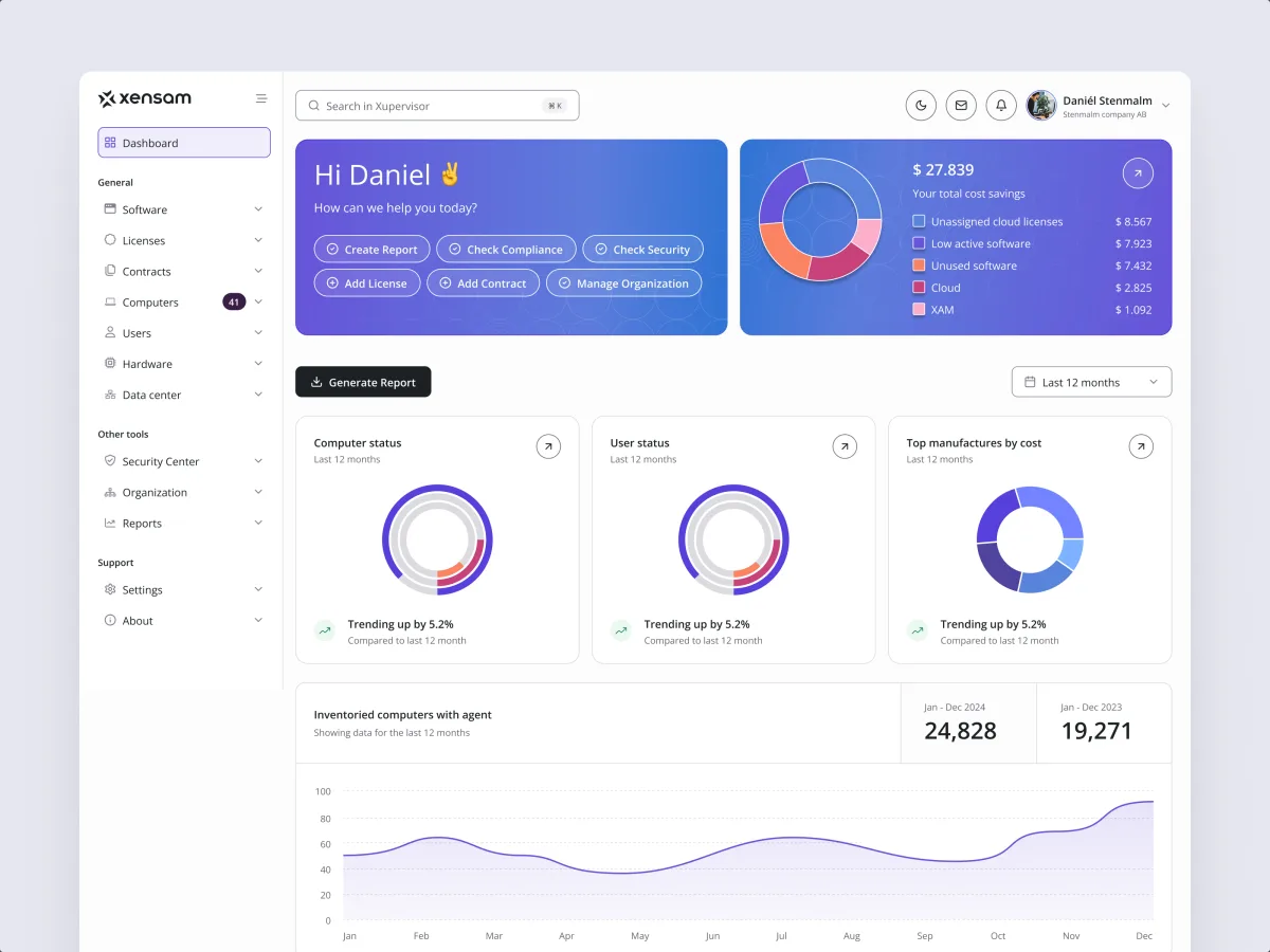
AI · SAM · Web SaaS
Redesigned a software asset platform so an IT or license manager reads the summary before the tables beneath it, with one chart language throughout.
It fits when the data exists and people still struggle to act on it. Four signs it is the right step now.
Managers, analysts or operators open the product to decide what to do next.
People export to spreadsheets or ask an analyst to find what they need.
An executive, an analyst and an operator all get the same view.
A person can explain each number, where it comes from and how often it updates.
A different starting point

Tell us who uses the data and what they need to decide. We will come back with a useful scope and a realistic next step.
Scope, deliverables and the review rhythm are agreed before we start.
ANODA helped organise a dense analytics product into a design we could review module by module. The comparative views and shared interface patterns gave us a clearer basis for discussing how the platform should present complex marketing information.
Tell us who uses the dashboards, what they decide from them, and what exists now — a live product, exports or a BI tool.
Message received.
Within 15 minutes, we’ll email you initial feedback and follow-up questions.
Learn the best dashboard UI design practices to enhance user experience. Improve data visualization and usability. Get expert insights at ANODA UX Agency today!
Learn how to design a management dashboard around executive decisions, useful KPIs, clear context, and action paths instead of a wall of charts.
Ask to see dense, real products rather than polished concept shots. A strong team can show which role each view was designed for, the table or drill-down behind a headline number, and what the screen does when data is missing, late or broken. Ask who on the team did the work and how the charts were checked with real users and real figures. Our Concussion Media, Vecna Robotics, ROAS Rocket and Xensam cases show that work in ads analytics, warehouse operations, attribution and software asset management.
We start from the decision, not the chart. For each role we list what they decide, how often and how fast, and which numbers they compare to decide it. A trend over time becomes a line, a comparison between a few items a bar, and anything someone needs to sort, scan or act on row by row stays a table. Filters follow the questions people really ask, with sensible defaults so the first view is useful without setup. Drill-down goes from the summary to the records behind it, and back, without losing the filters on the way. A manager may need three numbers and a trend; an analyst the same data as a table they can slice. Both are designed from one metric map, so the numbers always agree.
A decision and metric map for each role; the views and drill-down paths from overview to detail, first as wireframes; a clickable prototype of the key views on sample data; and the UI with chart and table rules, filter behaviour and every data state — empty, loading, partial, late, failed and restricted. Layouts are designed from a wide monitor down to a tablet, and a phone where the product needs one. Accessibility is part of the work: colour that does not carry meaning alone, readable contrast, keyboard access and text alternatives for charts.
Choose dashboard and data visualization design services when the product's data views are the problem and the rest of the product works. If the whole product needs its workflows and structure designed, start with UI/UX & Product Design; dashboards will be one part of it. If the views and metrics are already decided and only the interface needs work, UI Design fits better. If it is unclear why people avoid the dashboards you have, a UX Audit comes first, and if it is not yet known which decisions the product should support, Product Discovery.
Access to the live product or current reports, and sample data — real or anonymised exports, including the messy, empty and extreme cases, because a chart designed on neat demo numbers breaks on real ones. We need the metric definitions, or the person who can explain them; a product owner who can settle trade-offs; and a few of the people who use the dashboards — an analyst, a manager, an operator — for short interviews and prototype reviews. Early contact with your engineers and data team helps too, so refresh rates, query limits and permissions shape the design.
An organised design file with every view, component and data state; chart and table rules — which chart shows what, axes, scales, number formats and colour; filter and drill-down behaviour; responsive and accessibility notes; a clickable prototype; and walkthrough sessions with engineers and data owners to settle questions before a sprint starts. The design belongs to your team at handoff.
By the number of roles and views, how many data sources and metrics are involved, whether it is a new product or a redesign of live dashboards, the widths and devices to cover, and the review rhythm. We set a custom scope and estimate in the proposal, fixed or phased, and agree the timeline once scope, access and dependencies are clear. There is no fixed package price: two dashboards with the same number of screens can differ a lot in the states and data they must handle.
Data engineering — pipelines, warehouses and APIs — setting up a BI tool, and development of the dashboards. We do not invent metric definitions your team has not agreed, though we flag where they conflict. Nor do we promise revenue, adoption or conversion figures; the dashboard is one part of those. Each of these can be scoped separately, with us or with your own partners.