Personality-based dating app, beyond the photo
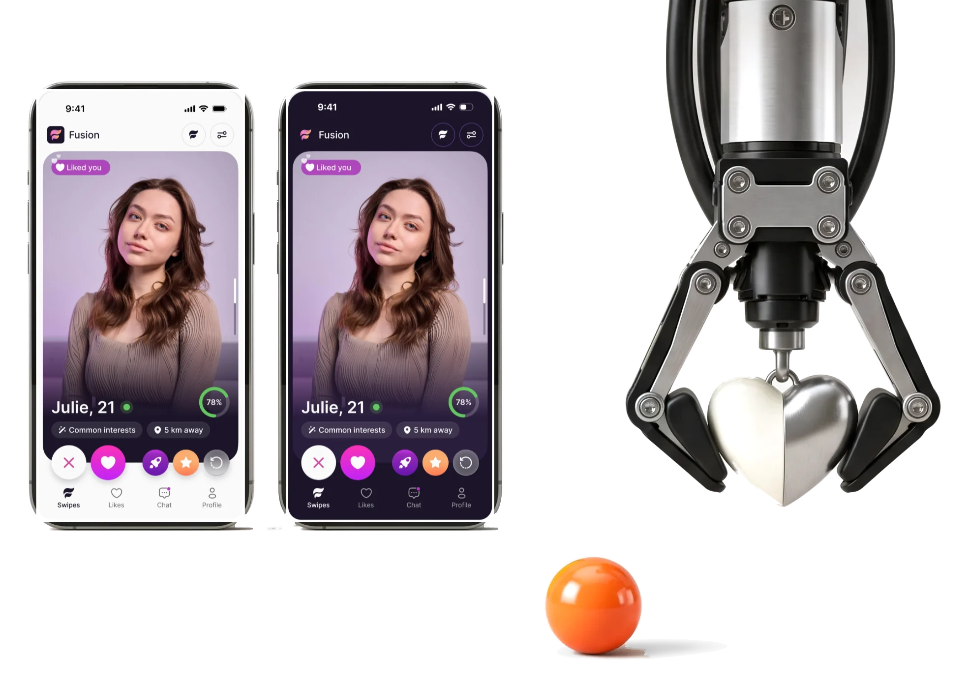
Fusion is a French dating app that matches on MBTI type, zodiac sign or both.We designed it for phones, from first screen to handoff.
- 4
- experts from discovery to developer handoff
- 16
- types a member can pick, filter by and be matched on
Project summary
Fusion is a consumer dating app built around personality rather than photos: members are matched on MBTI type, on zodiac sign, or on a blend of both. We designed the whole product for phones , from discovery and user flows to the developer handoff, and gave it a logo and app icon and a design system , in light and dark. Development and the matching algorithm were outside our scope.
How the work ran
- Our part
- Product design: discovery and requirements, information architecture and flows, wireframes, logo and app icon, moodboards, the complete UI in light and dark, the design system, the prototype and the handoff.
- Boundary
- Design only. We did not develop the app or its backend, and we did not build the matching algorithm.
- Room to grow
- The system was built so that more matching modes can be added later without restructuring the product.
What a member goes through
One chain, from a first screen to a conversation:
-
Account
- Welcome
- Phone number
- Code
-
Identity
- Birth details
- Personality
- Who to see
-
Profile
- Photos
- Questions
- Description
-
Discovery
- Mode
- Filters
- Like or pass
-
Matches
- Match
- Likes
- Chat
-
Safety and plans
- Report and block
- Boosts
- Settings
- Value and Data
- Say what the app is for, then ask what it needs and why.
- Score and Doubt
- A compatibility number that helps a choice without pretending to prove anything.
- Open and Safe
- Filters that respect every identity, and ways to leave, report or block.
One card, read in one glance
- Found
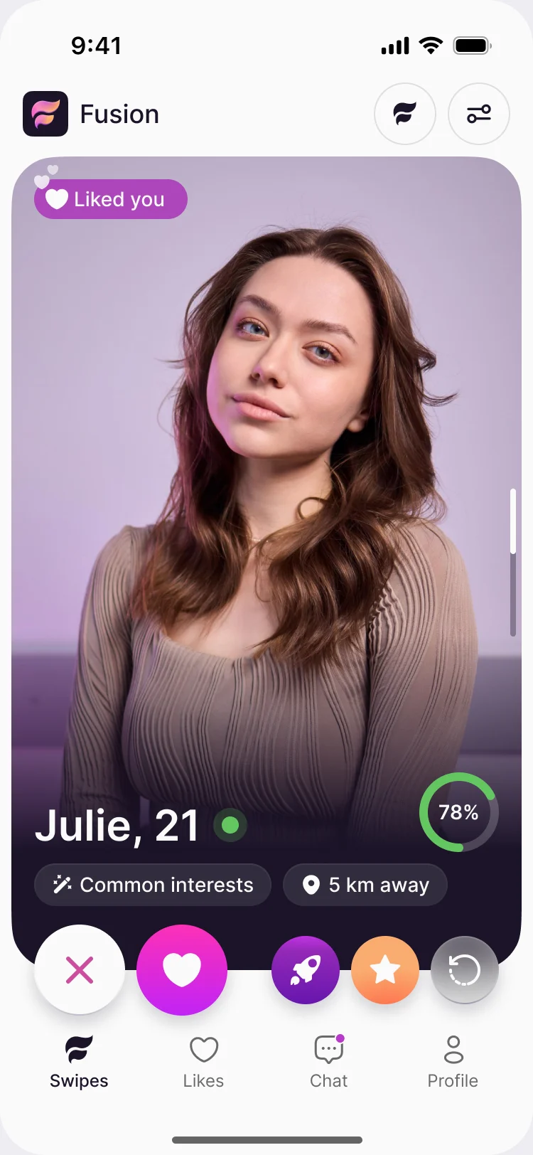
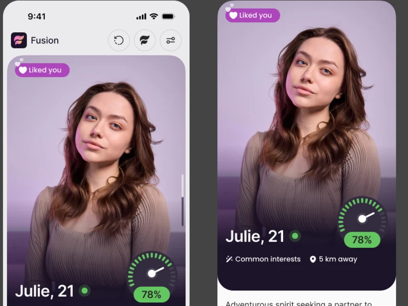
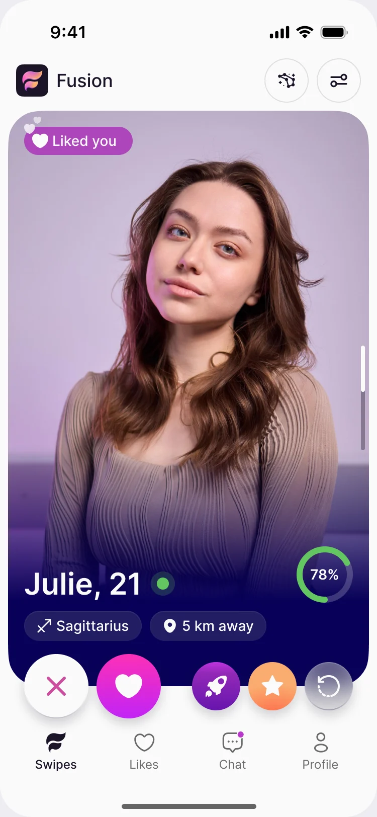
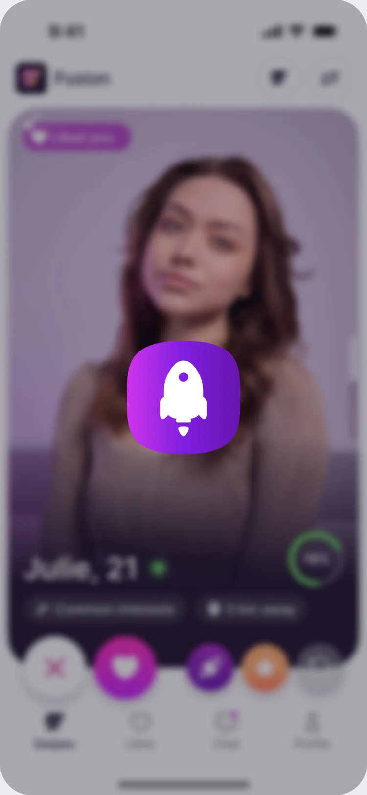
- A card in discovery has one job: help someone decide. It carries a photo, a name, a score, a mode and the shared ground, and any of them can crowd out the rest.
- Decided
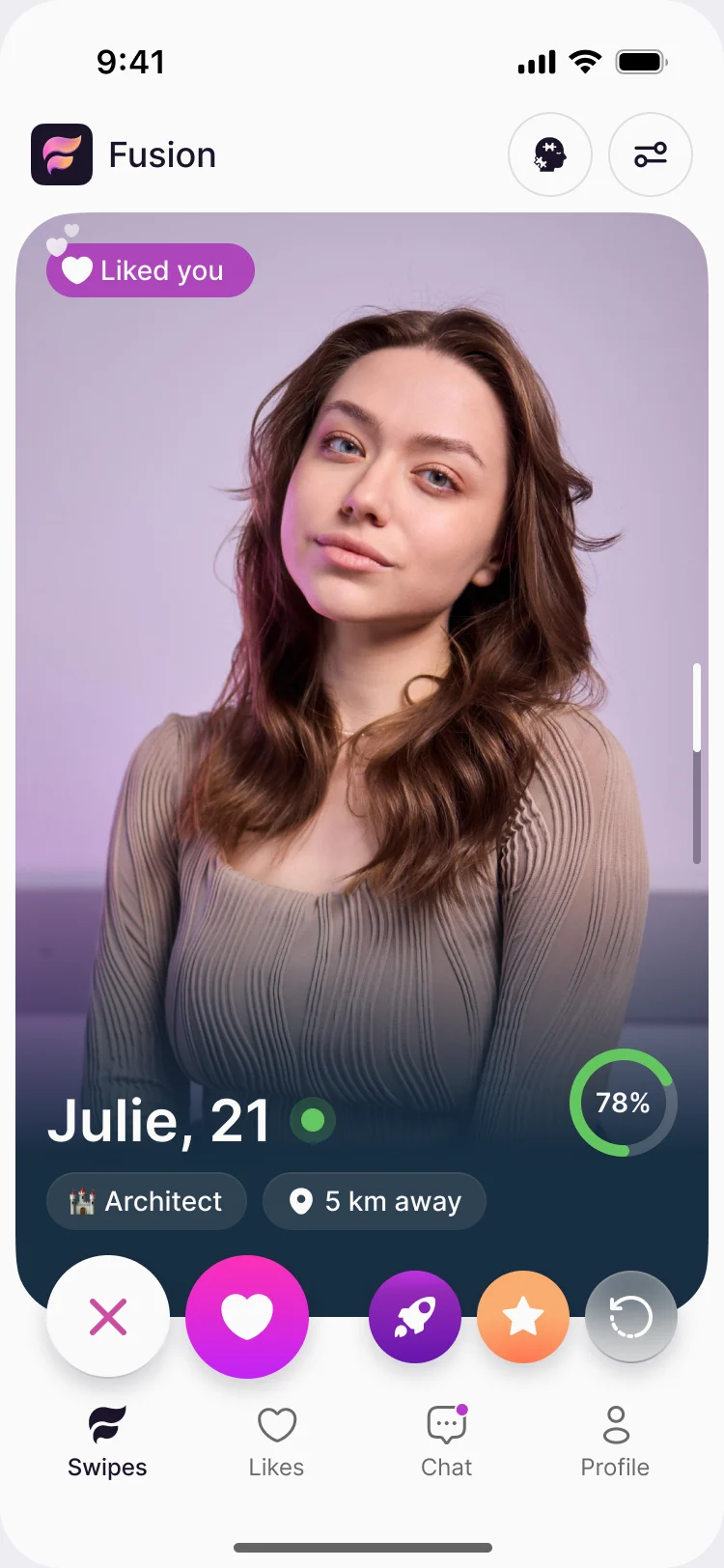
- The photo leads. The name and the score sit on it, the shared ground sits under them, and five actions run in one row: pass, like, boost, super like and rewind. The mode and the filters are one tap away in the header.
- For the user
- A member sees who this is, how well they match and what to do next, without opening the profile.
-
Mode and filters
Switch the matching mode and open the filters from the header.
-
Who, and what you share
The name and the compatibility ring on the photo, then common interests and distance in one line under it.
-
Five actions
Pass, like, boost, super like and rewind, always in the same row.
How the work progressed
151 hours of design across seven stages: what the product had to explain, how it flows, how it looks and what developers needed.
-
Discovery
What the product has to explain and to whom: three matching modes, the identity and birth data behind them, and what members pay for
Artifact Requirements and a product map
-
User Flow
Every path from a first launch to a chat and a purchase, before any layout
Artifact Information architecture and user flows for each area
-
Wireframes
Where each step, hint and button sits, before any colour
Artifact Mobile wireframes for every flow
-
Branding & Logo
A mark, an app icon and the rules for using them
Artifact Logo, iOS and Android app icons, brand guidance
-
Moodboards
How a product about personality should feel, and which look fits it
Artifact Moodboards and several visual directions
-
UI & Design System
Every screen and state in light and dark, from one set of components
Artifact Complete mobile UI, design system, UI kit and component library
-
Delivery
What developers needed to build without asking us
Artifact Screen map, clickable prototype and the handoff file
Every path drawn before any screen
- Found
- Fusion has three matching modes, a filter for every trait and a paid layer on top. Without a map each screen invites another exception.
- Decided
- Each area got its own flow first: sign-up, profile creation, the tutorial, swipes, history, chat and profile, with every action’s states, its errors and its empty cases.
-
Sign-up and log-in
The splash, the welcome screen and the phone-number step with its error states, and the developer notes beside them.
Open the full map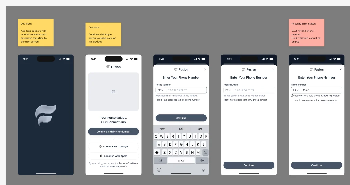
-
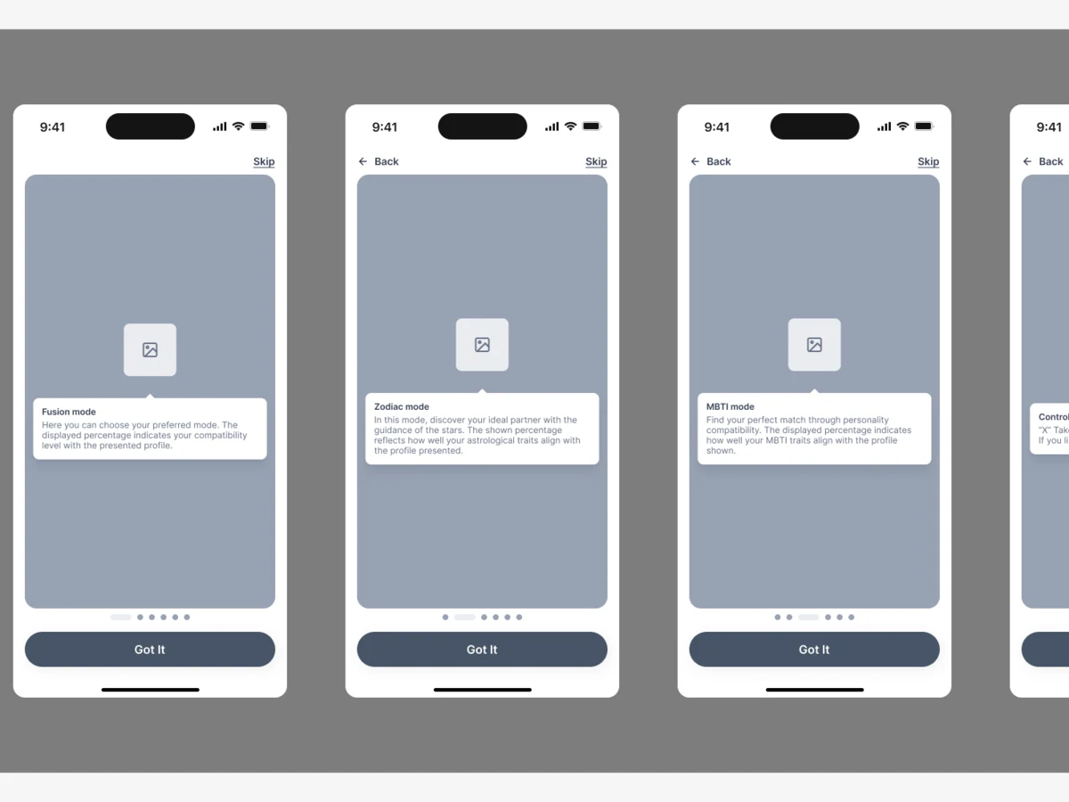
The tutorial
Six steps that teach the three modes and the swipe controls on top of a real profile.
Open the full map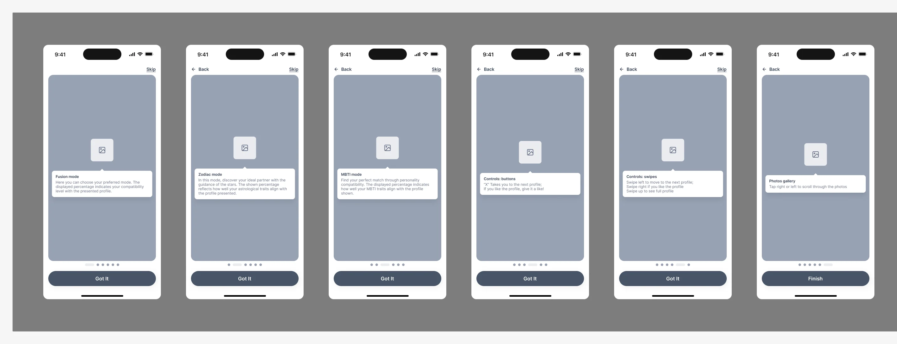
Seven jobs a personality-led dating app has to do
Explain first and ask second. Then make every score, filter, report and purchase say what it does.
Asking for data, and saying why
- Found
- An app that opens with a birth date, a personality type and a location looks like a form. A member who can’t see the reason leaves before the first profile.
- Decided
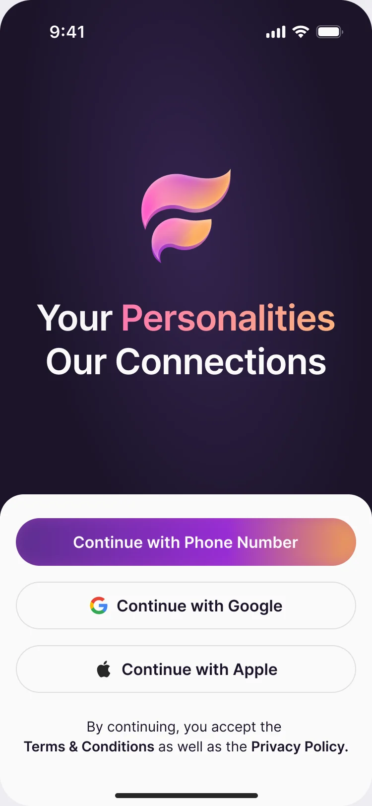
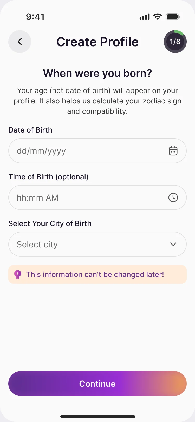
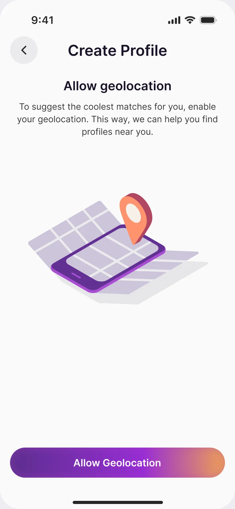
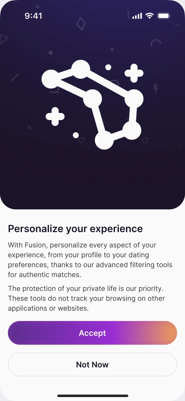
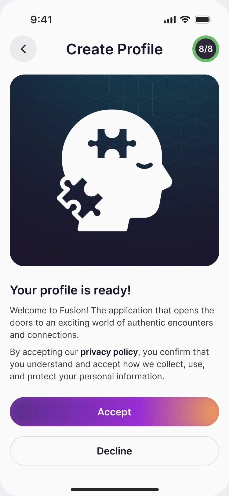
- The welcome screen states the idea before anything is asked. Each request then carries its reason: the birth date builds the zodiac sign and the compatibility, the time of birth is optional, the location suggests people nearby, and what stays private is said in plain words.
Personality and zodiac, chosen or looked up
- Found
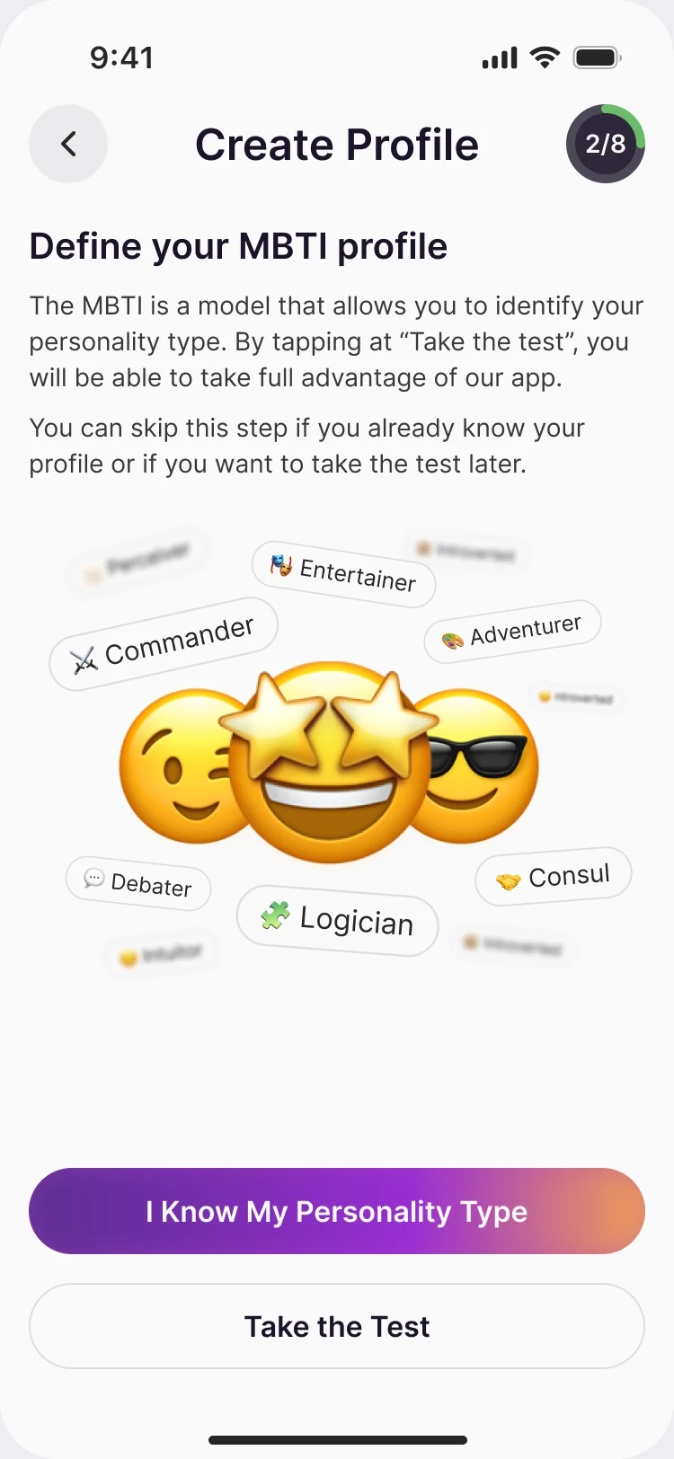
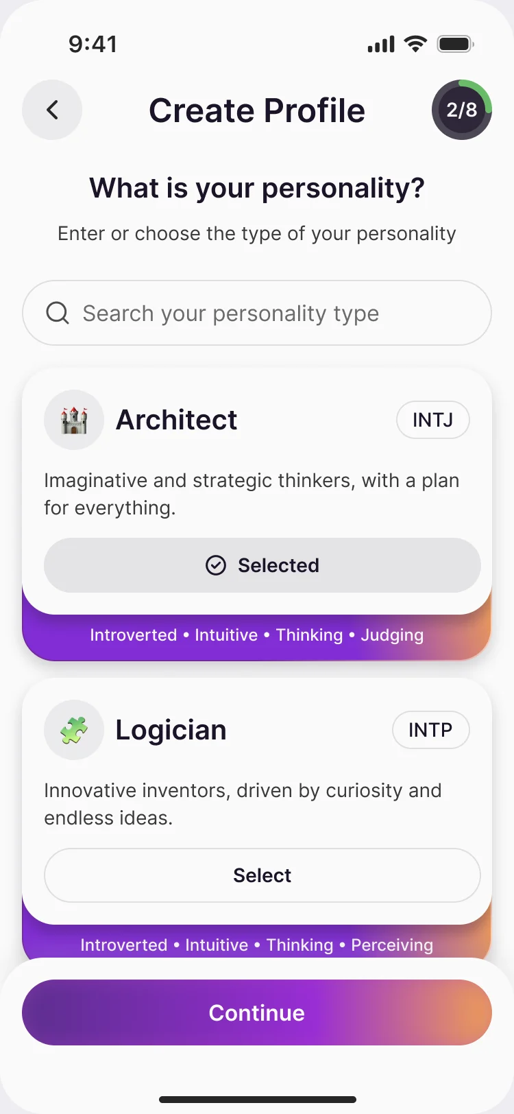
- Not everyone knows their MBTI type, and sixteen four-letter codes read like an exam.
- Decided
-
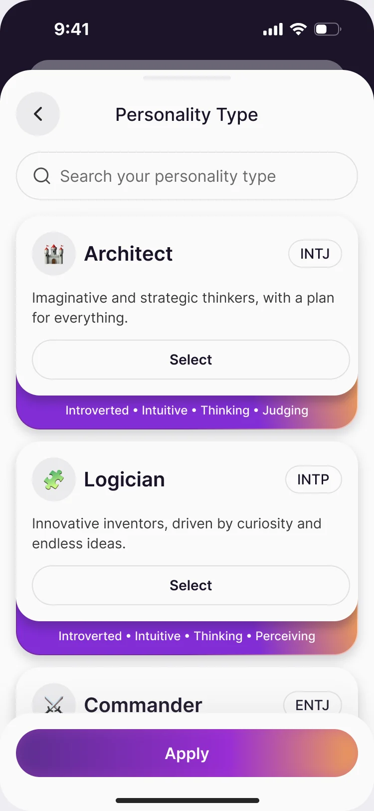
Two ways in on one screen: pick a type you know, or take the test. Each type is a card with its name, a line about it and its four traits, and the same list becomes the personality filter later.
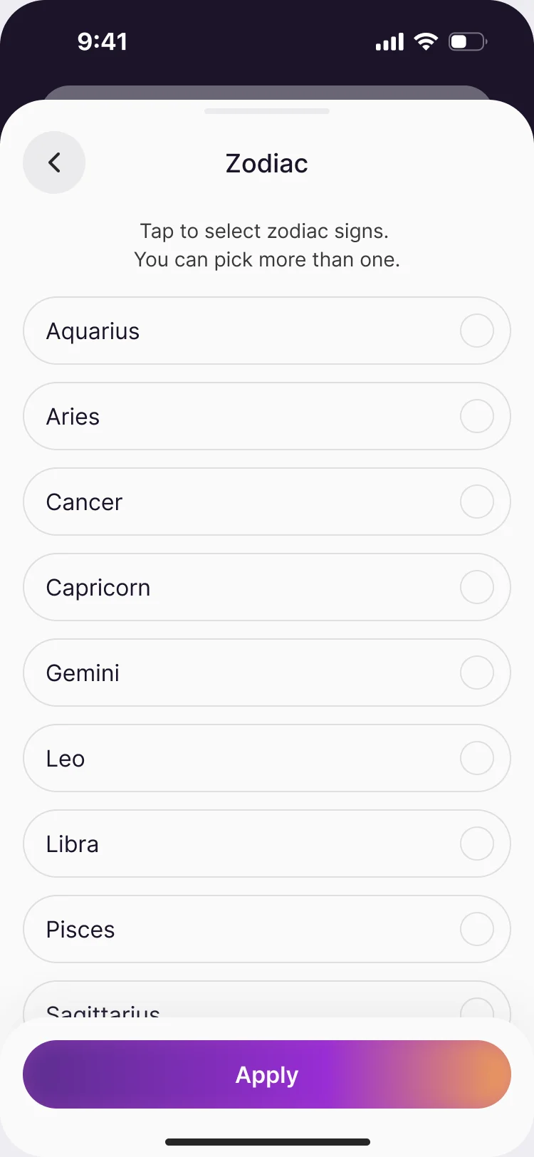
Zodiac works the same way, as a plain list.
Identity and preferences, without an interrogation
- Found
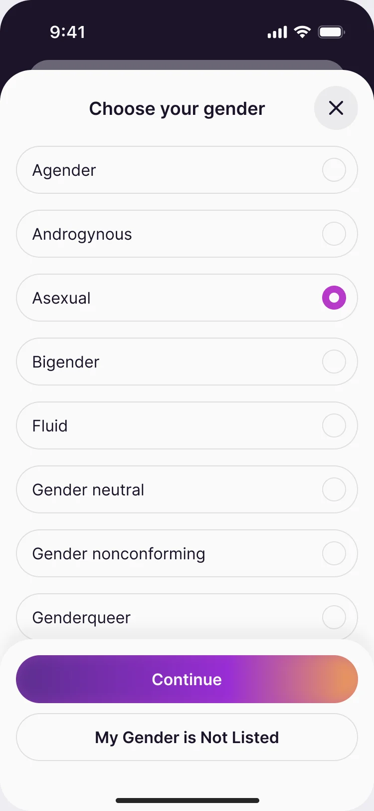
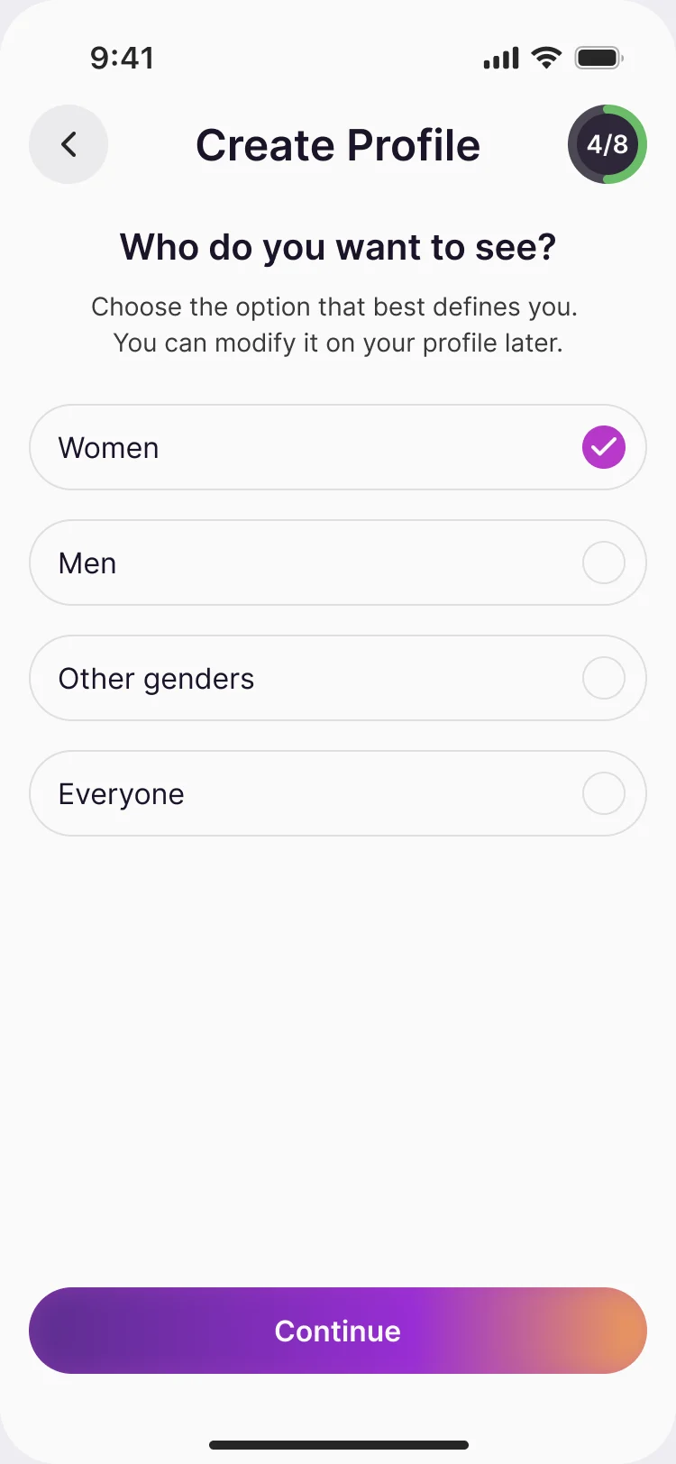
- A profile has to be complete enough to match on and short enough to finish, and it asks about gender and who a member wants to see.
- Decided
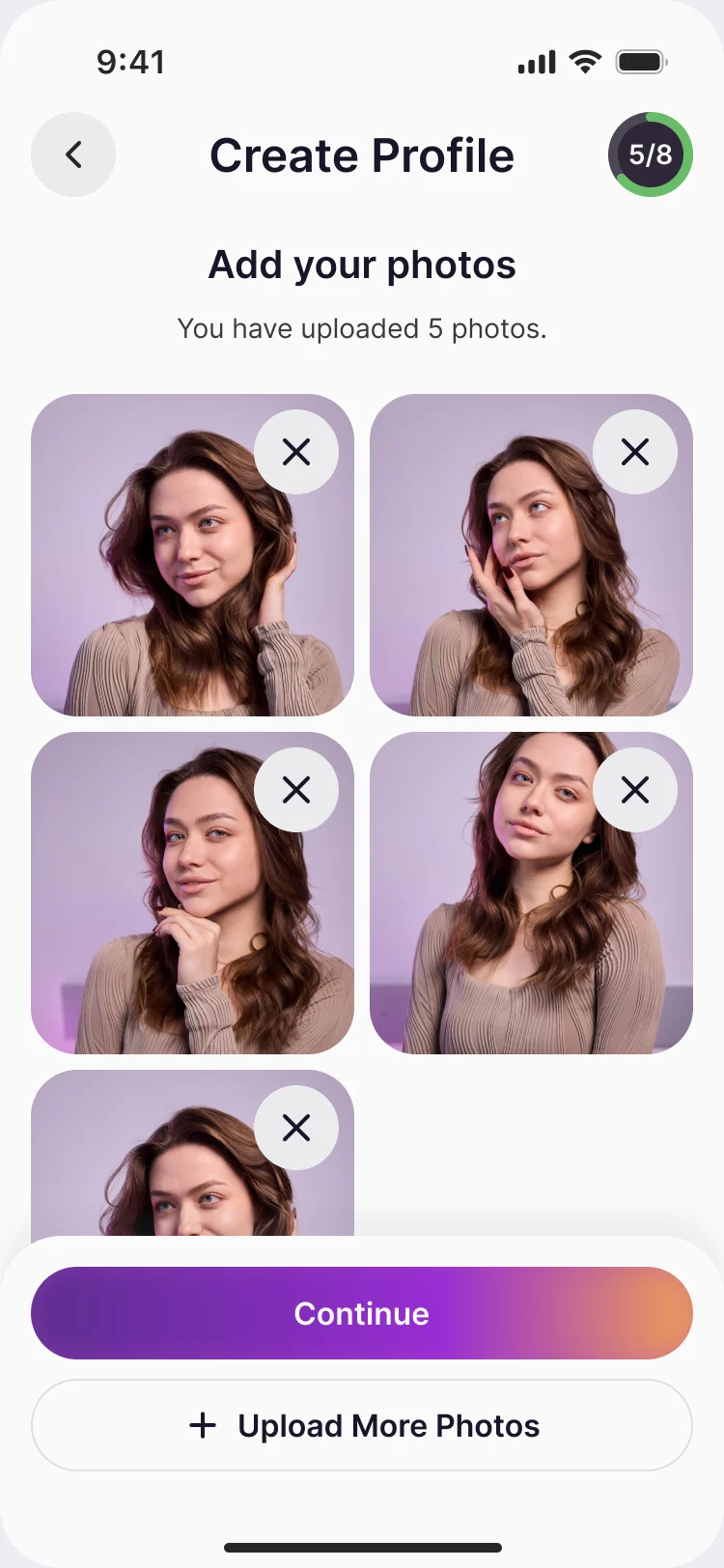
- One question per screen with a progress ring that counts eight steps. Gender is a long, respectful list with an exit for anyone not listed, and who to see takes women, men, other genders or everyone, editable later.
Three ways to read a match
- Found
- Zodiac, MBTI or both: three scores for one person can read as three verdicts, and none of them proves anything.
- Decided
-
One profile, three modes. The card keeps its shape and swaps the reason under the name: a zodiac sign, a personality type, or the blend shown on the card above.
The percentage is a ring beside the name, an aid to choosing and never a promise.
From a like to a first message
- Found
- A match can end in silence: two people and no reason to speak first.
- Decided
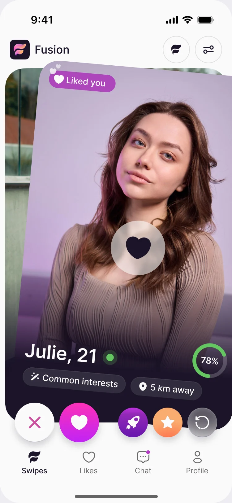
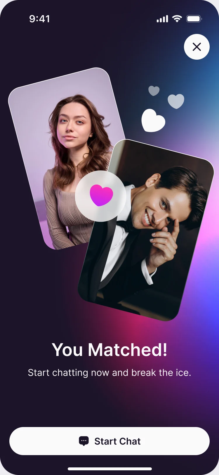
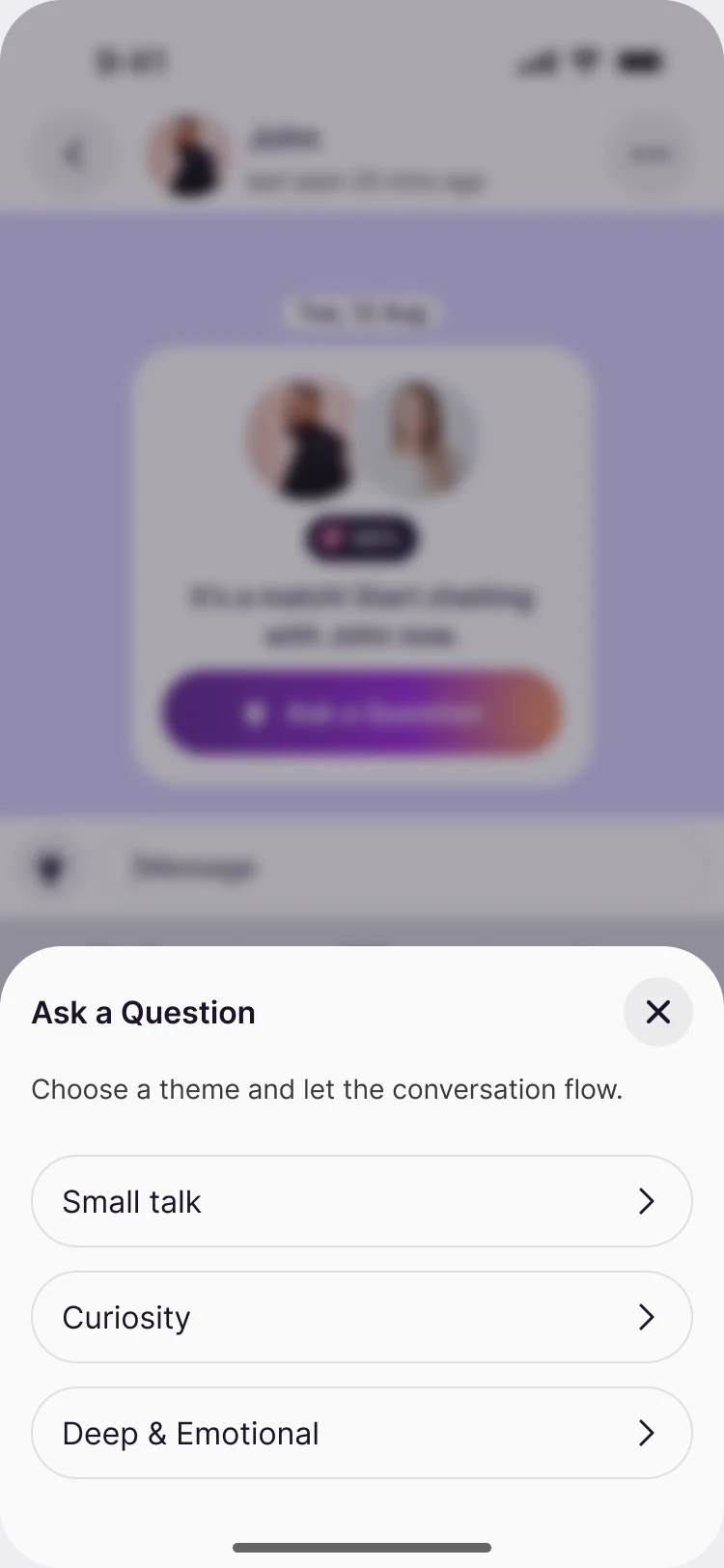
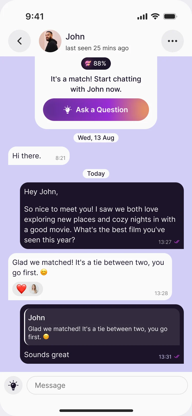
- A like and a match get their own moments, the match screen goes straight into a chat, and the chat offers themes to open with, so the first message isn’t a blank field.
Safety a member reaches in two taps
- Found
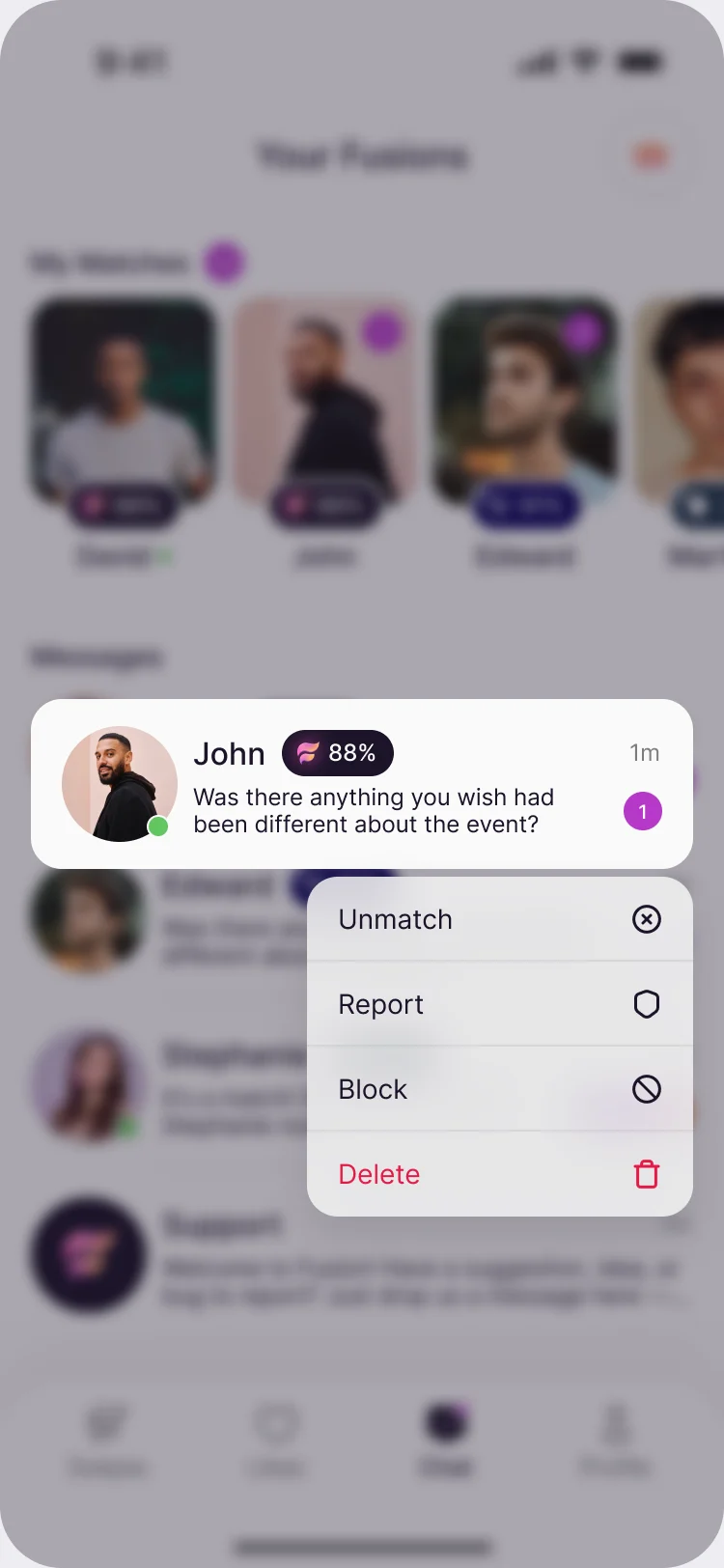
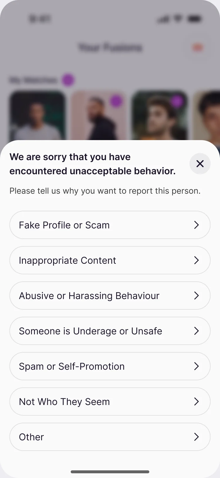
- A dating app is judged by its worst conversation. Leaving, reporting and blocking have to be easy to find and clear about what they do.
- Decided
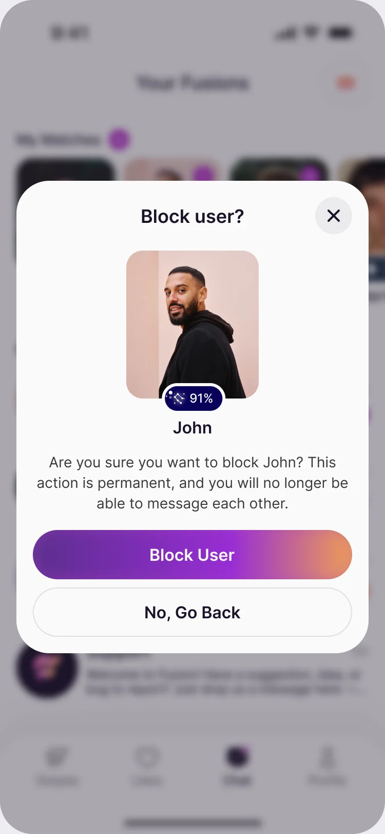
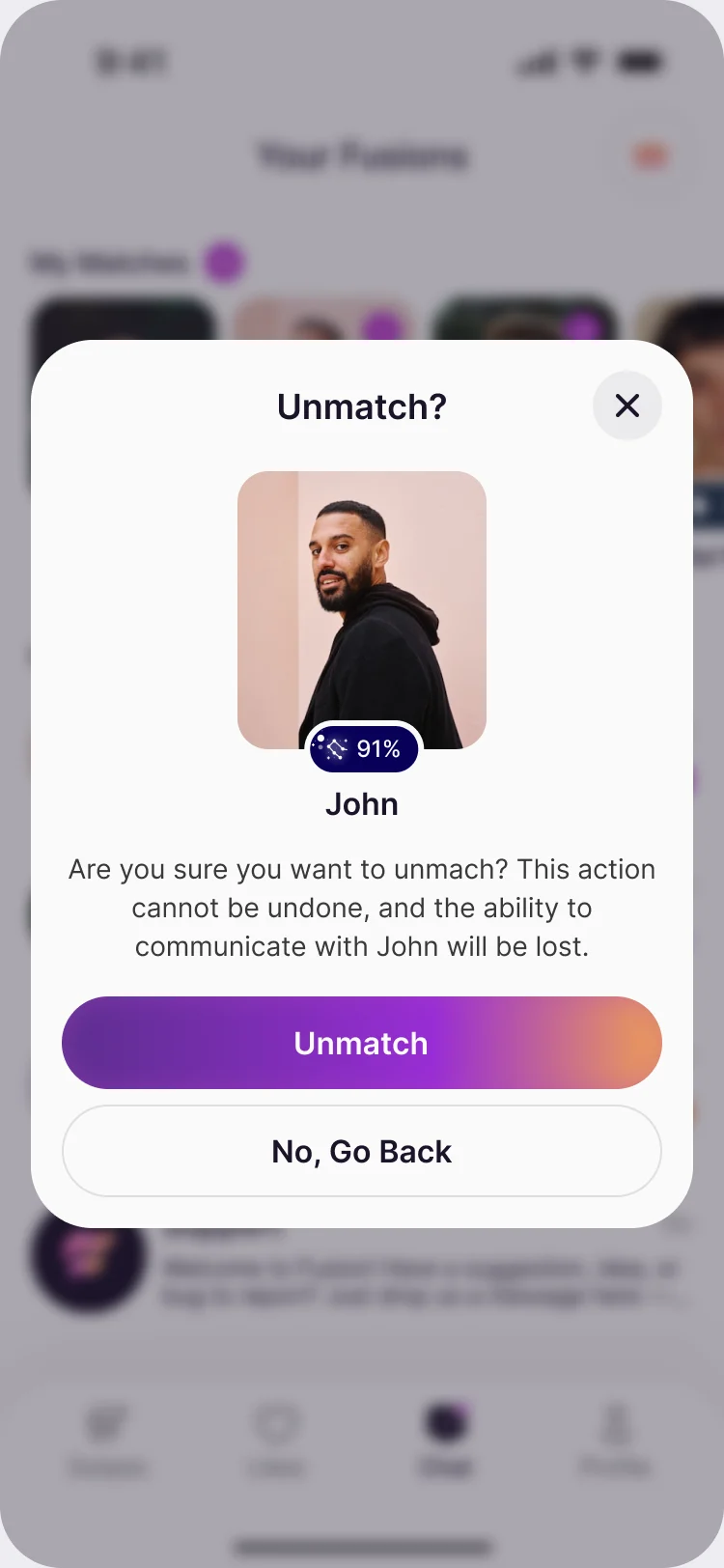
- Every chat row opens a menu with Unmatch, Report and Block. Each ends in a confirmation that says what will happen and can’t be undone, a list of reasons for a report, and a toast when it’s done.
Paid places that say what they open
- Found
- Subscriptions and one-time purchases pull against each other, and a wall on every screen ends the conversation before it starts.
- Decided
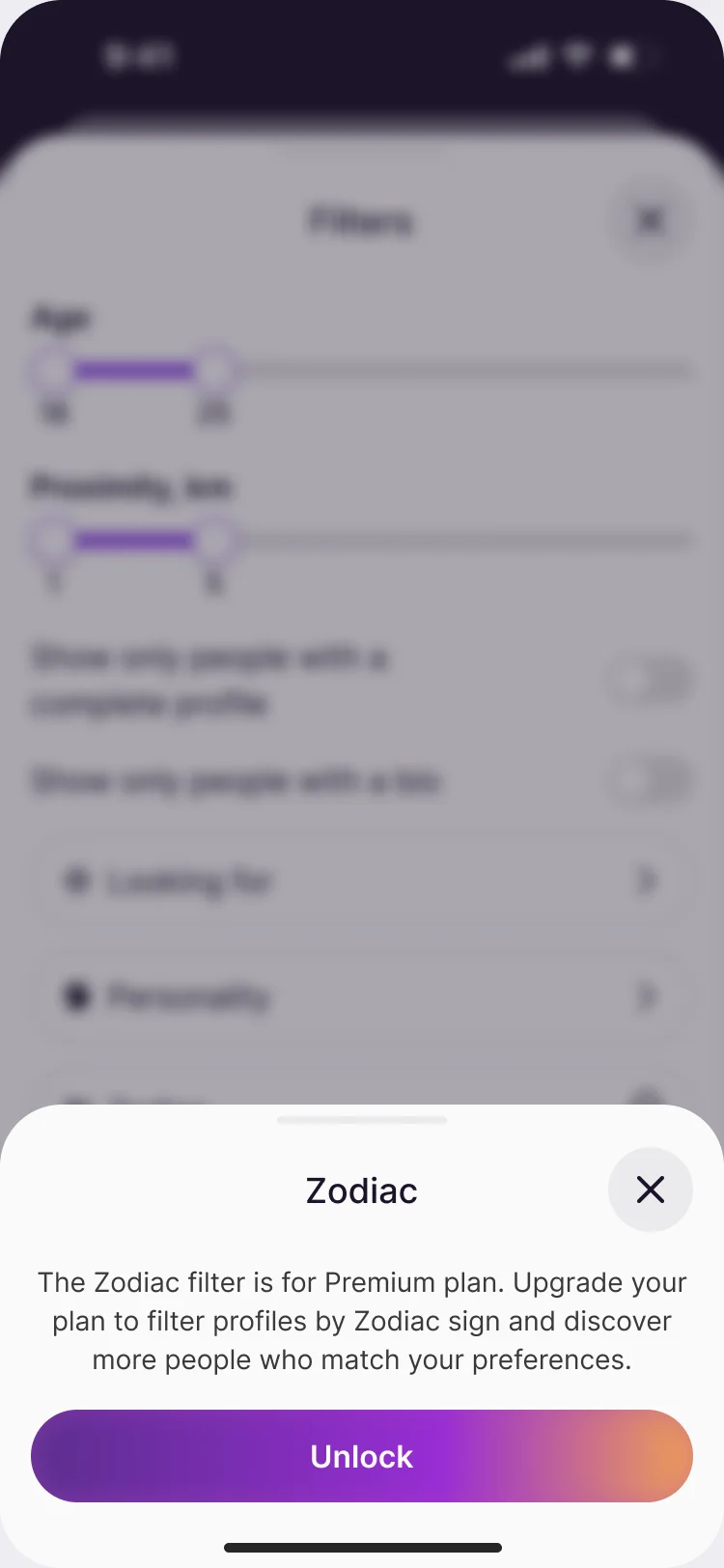
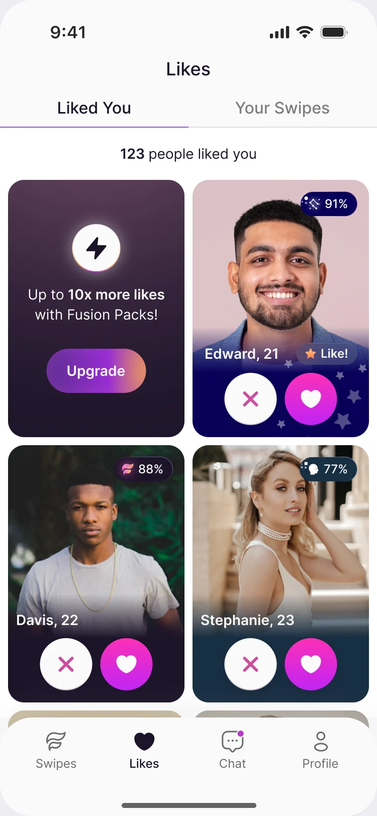
- Boosts and Super Likes are one-time purchases a member tops up when they want them; a subscription sits beside them. A locked place says what it opens instead of hiding it.
A mark and an app icon, with the rules for using them
- Found
- The app needed a mark that works as an app icon, on light and dark, and a team that could apply it without asking us each time.
- Decided
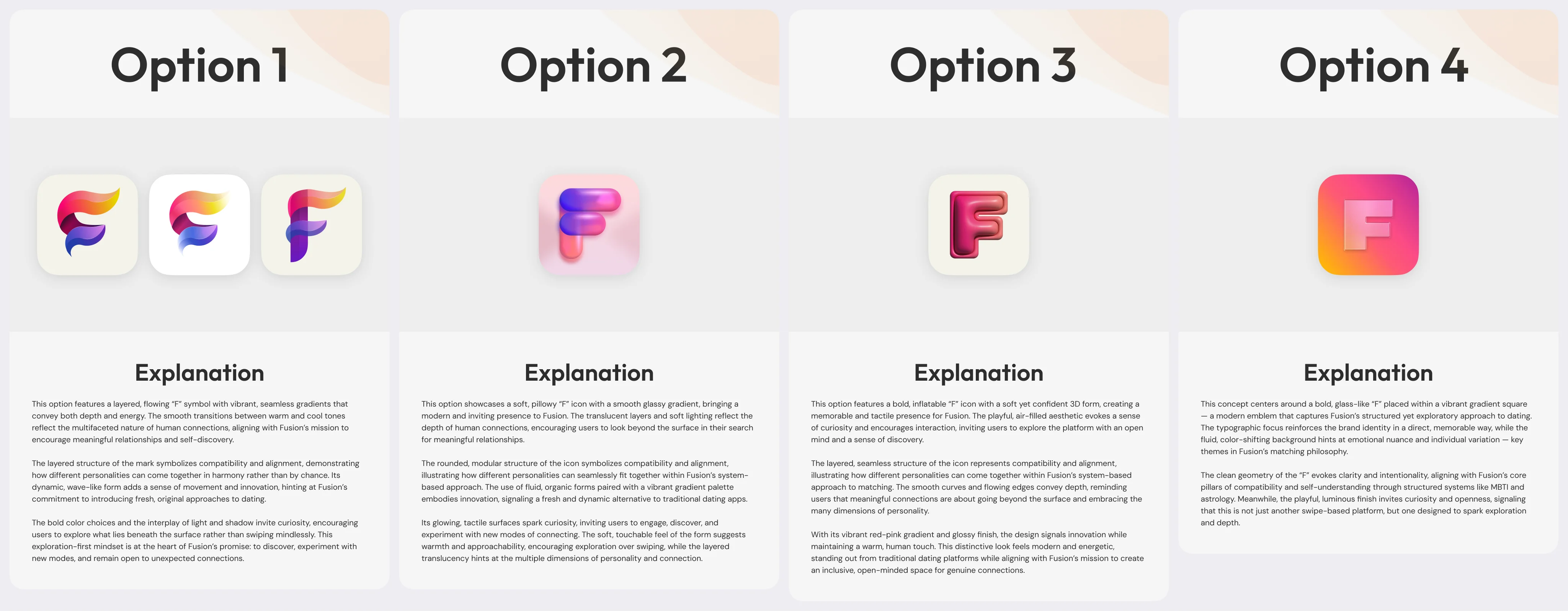
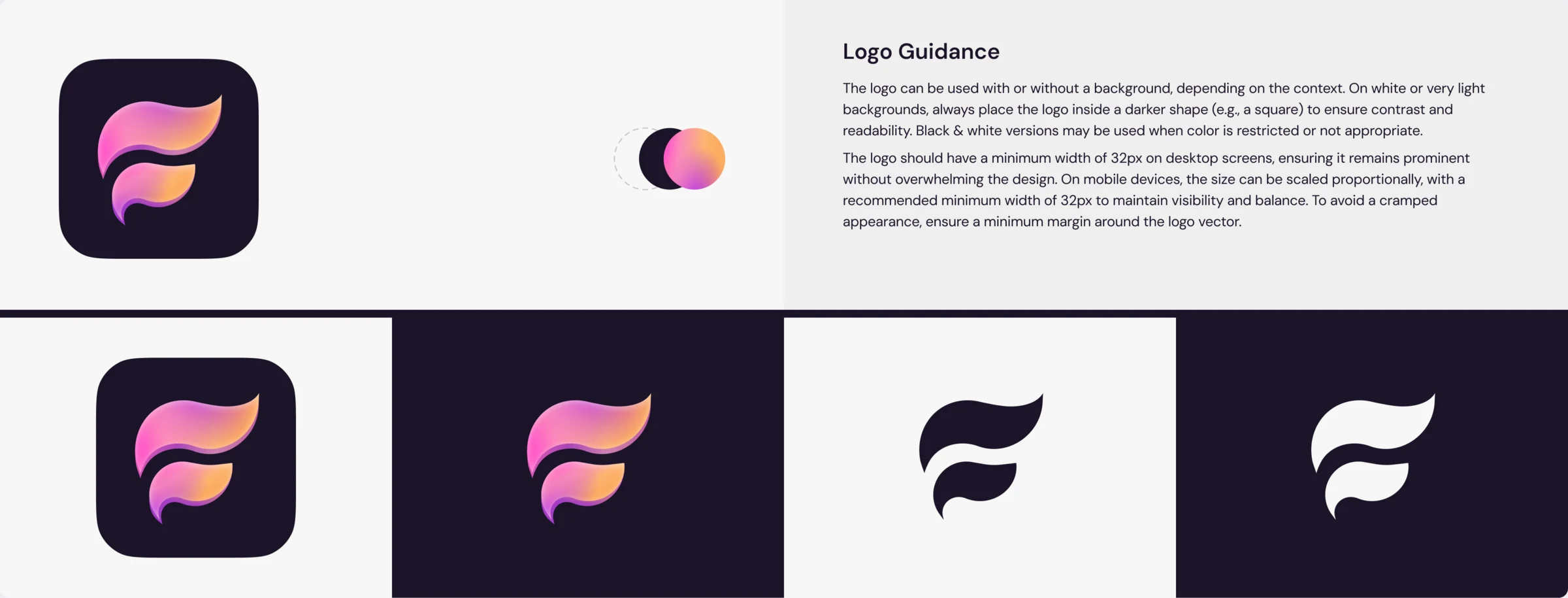
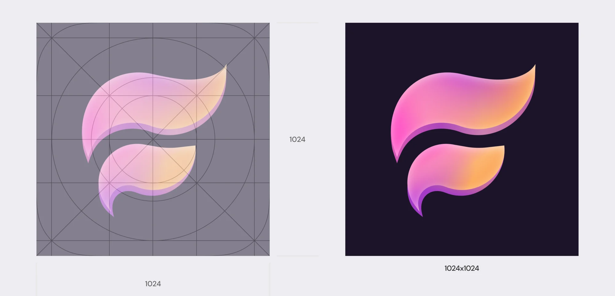
- A two-shape F in the app’s pink-to-orange gradient, chosen from four directions. It comes on a dark square for light backgrounds, in gradient, dark and white for the rest, with guidance on size and margin and icon grids for the App Store and Google Play.
One kit for every state
- Found
- A dating app is mostly repeated things: buttons, cards, chips, inputs and chat bubbles. Drawn one by one they drift, and each new matching mode would restart the work.
- Decided
- A kit built on one violet-to-orange gradient and one type scale, with every component in every state, so a new mode is one more chip and one more card, not a new design.
The same buttons, in the kit and on the card
The kit’s five reaction buttons, and the same row in place on the discovery card.
-
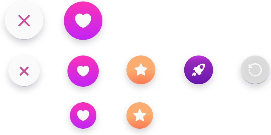
In the kit: Pass, like, super like, boost, rewind, and the smaller pair. -
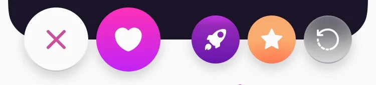
On the card: The same row, in place.
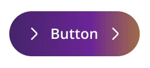
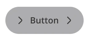
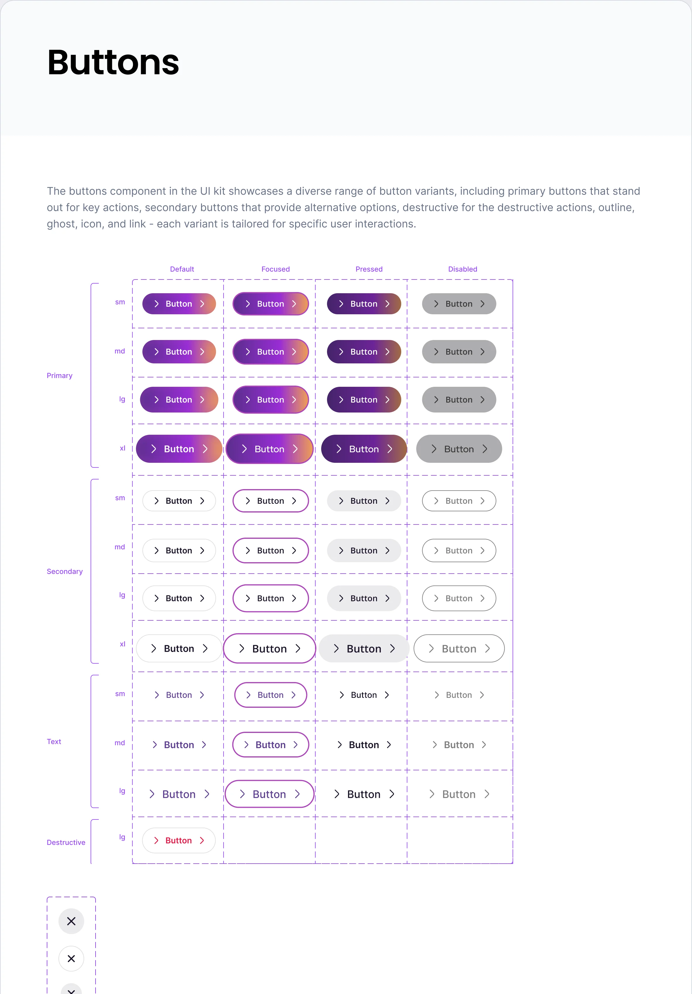
One button, in each of its states
Default, focused, pressed and disabled: the same gradient, darkened, outlined or greyed.
-
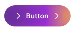
Default -
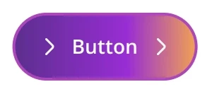
Focused -
Pressed -
Disabled
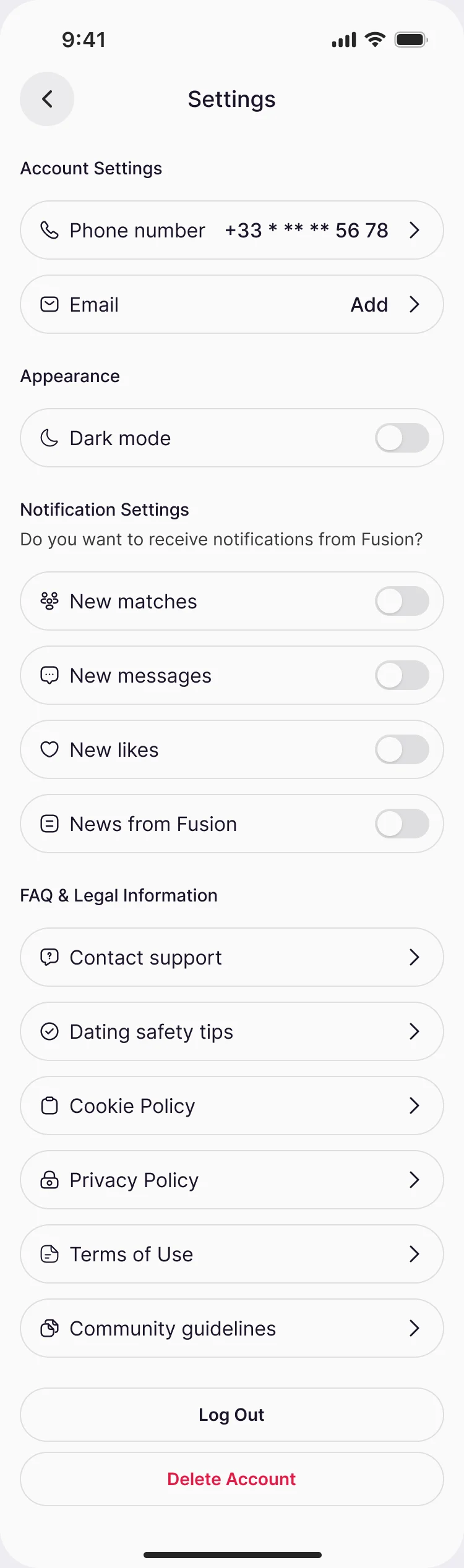
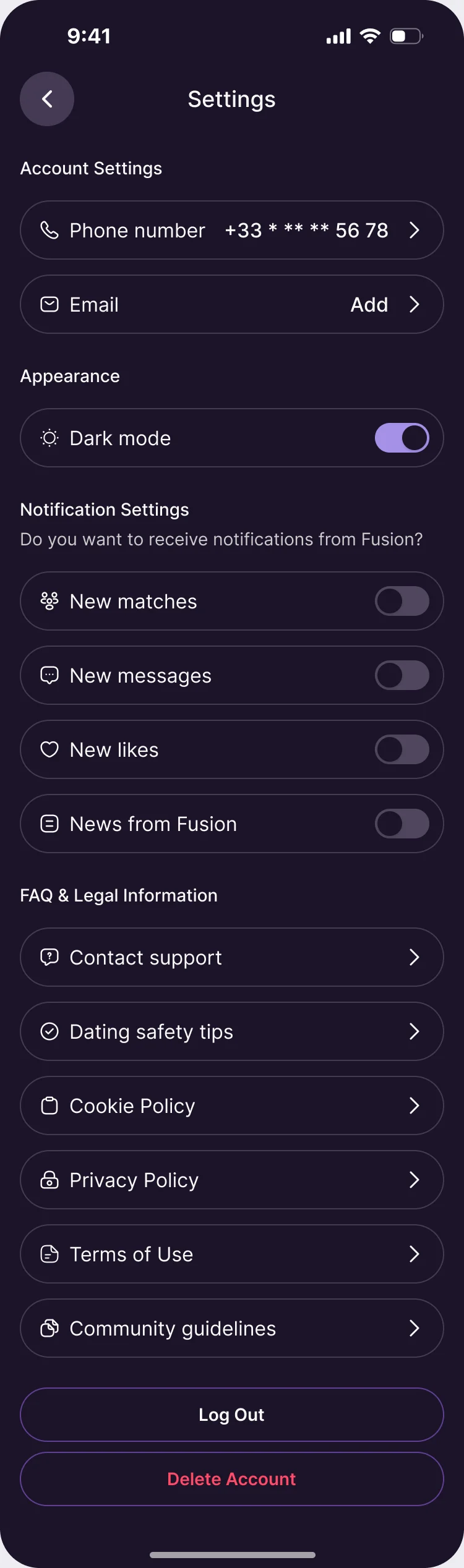
Light and dark, from the same tokens
Dark mode is a switch in Settings and covers every screen of the product.
What the developers received
One Figma file to build from: the flows, every screen in light and dark, and the kit the screens are made of.
- Information architecture and flows
- Every area of the product as a flow, with its states and errors.
- Wireframes
- Mobile wireframes for every flow.
- Screens in light and dark
- The complete mobile UI, both themes.
- Design system
- UI kit and component library, with every state.
- Screen map and prototype
- The map of screens and a clickable prototype.
- Brand
- Logo, app icons and guidance.
Flows in the handoff
- Logo: word mapping, moodboards and concepts
- Logo: the final mark, revisions and delivery
- App moodboards and two style directions
- Wireframes for every flow
- App UI: onboarding, profiles, matching, chat and purchases
- Components: the UI kit with every state

Where the product ended up
A complete mobile dating product designed end to end: onboarding that explains itself, personality and zodiac profiles, three matching modes, discovery, matches, chat with its safety states, one-time purchases and a subscription, in light and dark, with a logo, a design system and a developer handoff.
- experts on the team
- 4
- personality types in the product
- 16

Asking people for a lot before they see why?
At Fusion we designed a dating app that explains its questions before it asks them, and keeps scores, filters and purchases honest. Show us your flow, and we’ll tell you where people leave.
More work like this
Three more consumer apps where onboarding, personalisation and brand had to work together.
-
FoodTech · SaaS
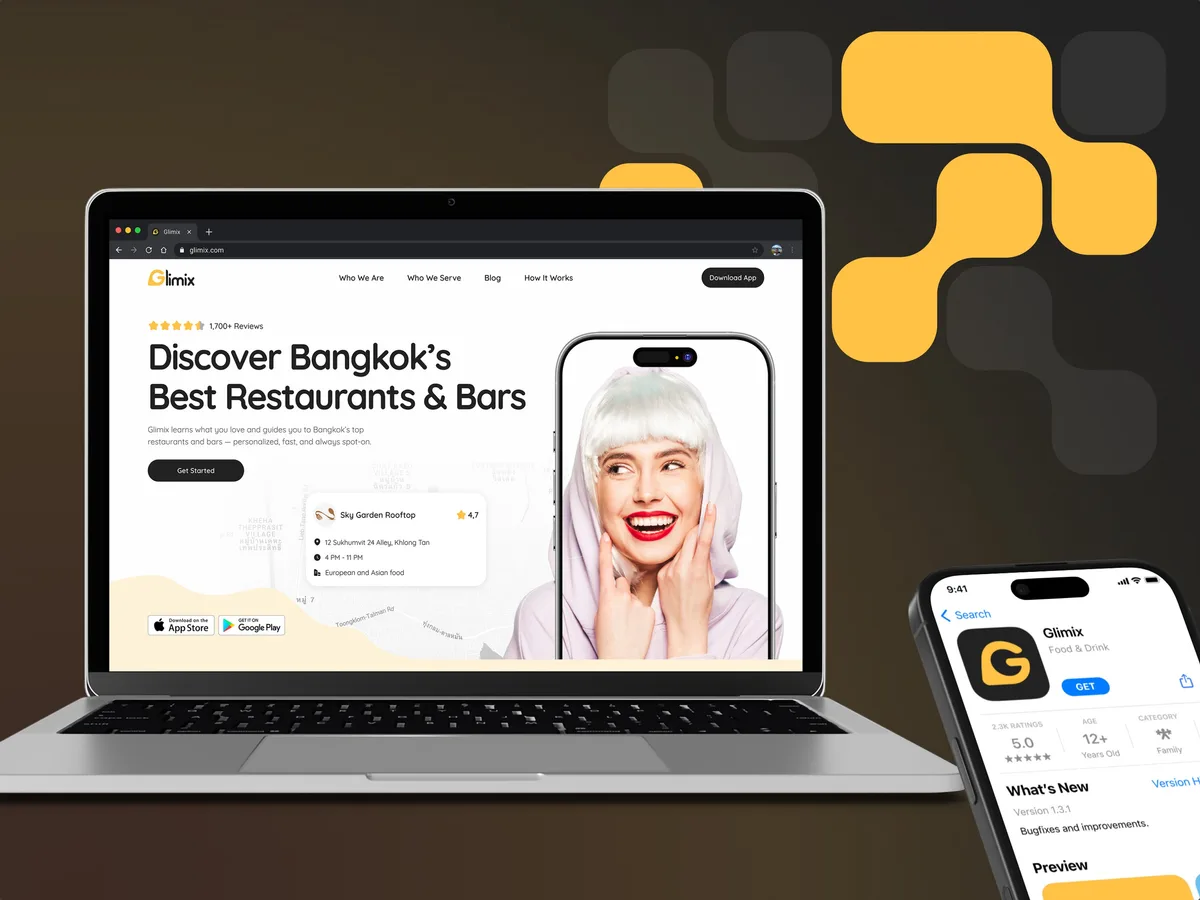
Glimix
Redesigned a two-sided hospitality app for diners and venue owners, with an AI assistant, a receipt scanner and a new brand.
- 200+ Screens designed
- 5 Experts on the pod
-
Wellness · Healthcare
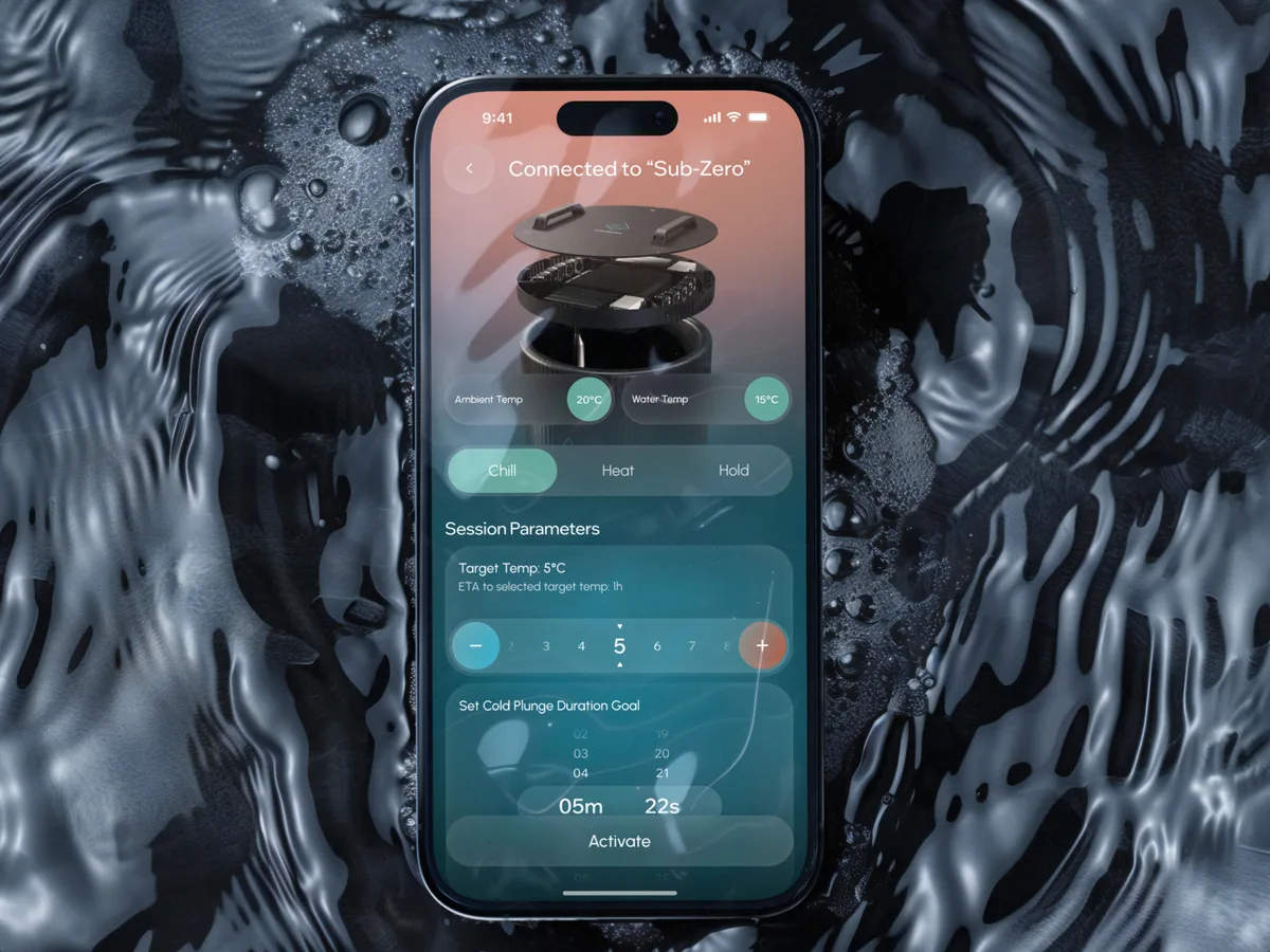
Clearwater Wellness Co.
Designed a cold-plunge wellness app from scratch: bath control, session tracking and a community around the ritual.
- 306 Screens designed
- 4 Experts on the team
-
EdTech · SaaS
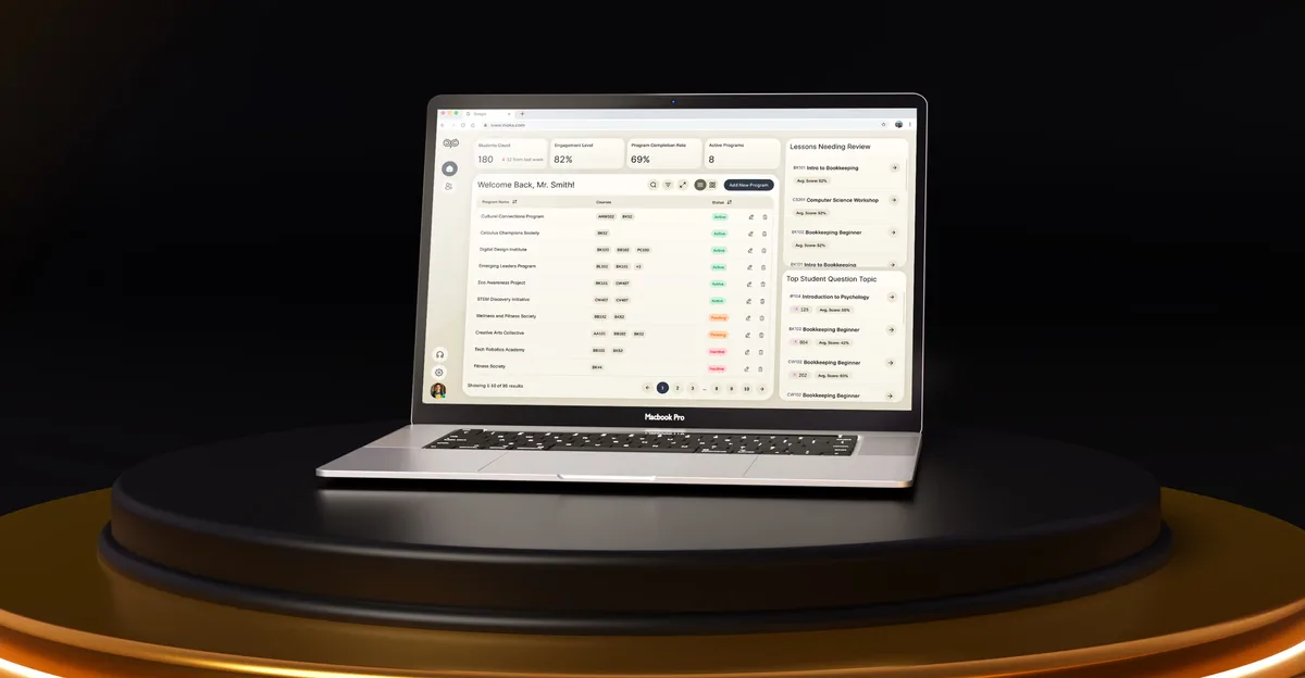
Moka
Designed an AI study assistant for students and the web tools their instructors, curriculum teams and schools run it from.
- 200+ Screens designed
- 4 Experts on the team