
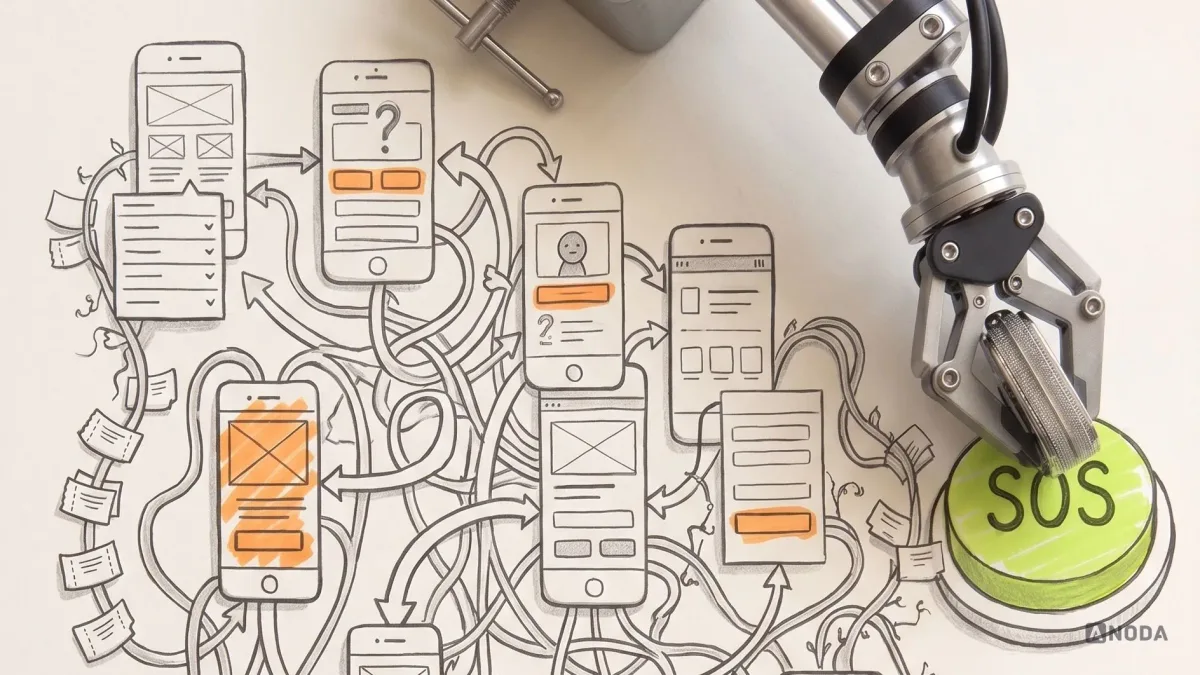
How to Conduct a UX Audit
Learn how to conduct a UX audit, gather evidence, prioritize usability problems and turn findings into an actionable product roadmap.
Design the dating app two strangers trust enough to say hello in — onboarding, profiles, preferences, matching, chat and premium — with safety, privacy and reporting built into every step.

Dating apps that get two people talking, and keep both of them safe while they do.
Members, groups and networking around a shared interest.
Dating App Design
Two strangers deciding whether to meet.
Not included
Onboarding that feels like a questionnaire, cards that hide why to swipe, chats with no way out, a live app nobody has audited — our answer to each.
Photos, preferences and personality collected without the questionnaire feel.
Compatibility, video and prompts readable on the card itself.
First moves, messages, reporting and blocking designed as one journey.
Every screen rated by priority, then flows, premium and chat redesigned on top.
You receive
Dating app UX is decided in awkward moments — a photo held for review, a filter that finds nobody, a conversation that turns unpleasant. We design each one so members stay safe and still reach the next conversation.
A personality-led app designed for phones, started from what other dating apps ask of people.
Dating · Social · Mobile app
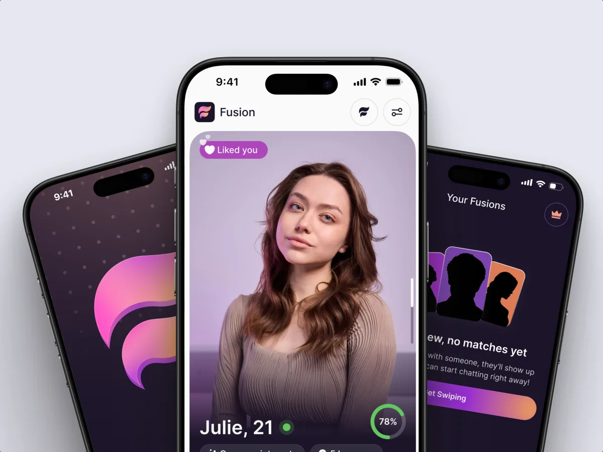
Designed an app that matches on personality type, zodiac and identity — onboarding, a compatibility-led feed, chat — with its logo and app icon.
It fits when two people decide through your app whether to meet, and the points below describe your members.
Every screen either builds trust between two people or spends it.
Photos, verification, reporting and blocking must work on a bad night.
Matches happen; conversations stall before they start.
Free limits, boosts and plans decide whether the app survives.
A different starting point

Tell us where people stall — onboarding, the feed, the first message or the paywall. Our reply names the first thing we would fix and the service that covers it.
Which flows we take on, and when your trust-and-safety lead reviews them, is agreed in the chosen service's proposal.
Tell us about the app — live or pre-launch — and where people drop between sign-up, match and conversation.
Message received.
Within 15 minutes, we’ll email you initial feedback and follow-up questions.
Learn how to conduct a UX audit, gather evidence, prioritize usability problems and turn findings into an actionable product roadmap.
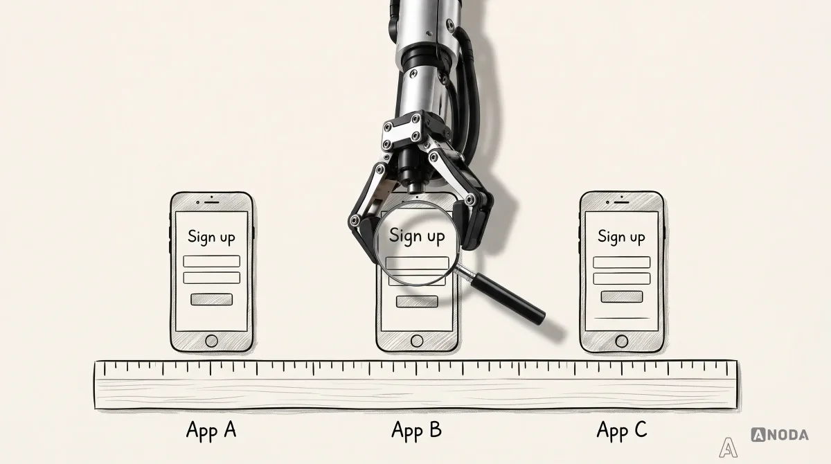
Learn how to scope a UX competitive analysis, compare the same user flow across products, capture evidence, and turn observations into product decisions.
A pretty swipe screen is not a dating product. People who have done this before can show onboarding members finish, the states a clean demo skips — a photo held for review, a filter that finds nobody, a report mid-chat — and where premium sits — it is where many dating apps spend their members' goodwill. Ask which work was pre-launch and which was a live app, and who designed it. Fusion was designed from the first screen to handoff, and its case page says so.
Sign-up and onboarding, profiles, preferences, the feed and matching, chat, premium and settings, including awkward states such as a held photo or an empty feed, alongside a numbered screen map, a prototype to test with real daters, the UI and a documented component library. Video or voice, the number of flows, an audit of a live app first, and a new brand all add to it. An audit on its own, or a single flow like onboarding or premium, is lighter than a full redesign. Cost and dates are then set in the proposal.
New members signing up and building a profile; regulars browsing, filtering, liking and chatting; paying members with extra features; people taking a break or leaving; and the moderators and support staff behind them. Journeys start at sign-up and verification and continue through matching and the first message to reporting, blocking, pausing and deleting an account. Some apps also serve matchmakers or event hosts; their tools follow the same rules for what each side may see.
A pre-launch app gets every flow designed in UI/UX & Product Design. For a live app where members drift away, begin with a UX Audit; UI Redesign often follows. The phone app is designed through Mobile App Design, the moderation console through Web App Design. When the product is really about groups or professional networking, Community Platform Design is the better frame. Brand Identity Design fits a pre-launch app that still needs a name and a face.
Inside the design, never as a compliance stamp. We design what a profile shows and hides, how location is blurred, how photos are reviewed, how reporting and blocking work, how consent is asked, and how an account and its photos are deleted. Dating app UX can make these rules clear and hard to misuse; it cannot confirm your product meets privacy, age or store rules. Your trust-and-safety and legal advisers make that call, and the flows are built around it.
A product lead with the final say, a test build filled with test profiles — never real members' photos or chats — and your moderation policy. Share store reviews, analytics or support themes, and give us an early hour with engineering on matching, verification and messaging, because they limit what a profile or chat can do. If verification or moderation runs through vendors, we need their flows too.
Fusion, a French dating app that matches on MBTI type, zodiac sign and identity: we designed its onboarding, put compatibility on the card, designed chat and its logo and app icon. We describe the design work, not match or retention results.
Yes. Many dating apps are live, with members mid-conversation. Your design files and system stay the base; we work next to your designers, engineers and moderators, keep what members rely on where they expect it — if the swipe already works, we keep its feel and give it more to land on — and hand over every file. Before a change reaches members, we agree with your team how the app will explain it.