
Healthcare UX Design for Patients and Clinicians
Learn healthcare UX design principles for safer, clearer patient and clinician journeys, from research and accessibility to workflows, trust, and testing.
Design the workspace a care team runs every day and the apps patients and providers open between visits — intake, assessments, guided programs and messages — so both sides see the same care.

Care products that stay clear on both sides, for the people giving care and the people receiving it.
Records, pipelines and tasks for any team.
Healthcare & Patient Experience Design
The care team's tools and the patient's app as one loop.
Not included
Missed alerts, abandoned intake, a patient app and a staff tool that disagree — and what we design to fix them.
Patient lists, care gaps, alerts and tasks, sorted by what needs a person today.
Booking, messages, readings and records — one journey, seen from both sides.
Intake that feels short, then a plan people can follow day after day.
Web, phone and in-room TV, built from shared parts and rules.
You receive
Healthcare UX design is tested on bad days — a device that has not synced, an answer left blank, a reading someone on the team must see. For each one we draw what the patient sees and what lands on the care team's list.
A care-team CRM with its apps, a hospital TV prototype and a foot-health service.
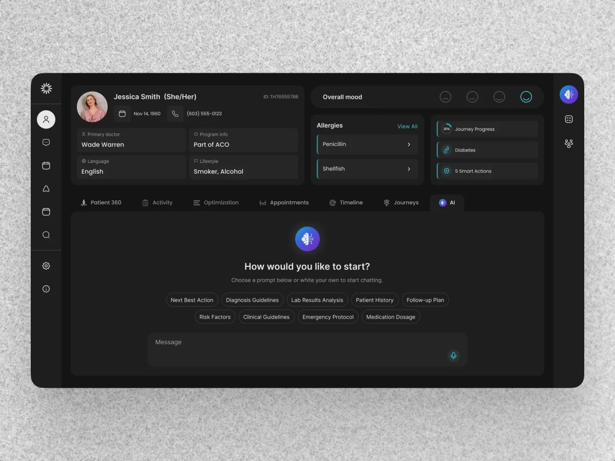
HealthCare · AI SaaS · Web + Mobile
Audited and radically redesigned a live care-team CRM, then designed the nurse and patient apps from scratch on the same design system.
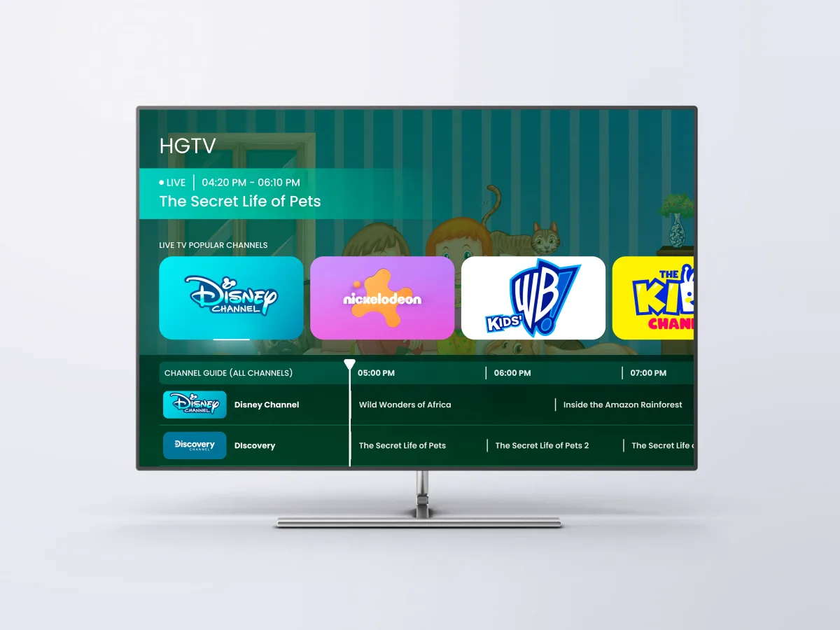
Healthcare · Streaming · TV app
Designed a clickable prototype of a hospital TV system — Adults, Kids and High-Accessibility modes, every screen driven by a D-pad remote.
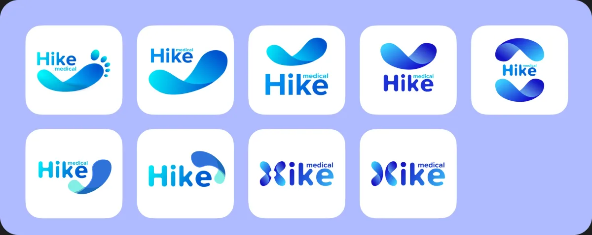
Workplace foot health · Branding · iOS app + HR admin
Branded a workplace foot-health service and designed its employee scanning app and the company's admin portal.
It fits when care passes between people and screens. Check your product against these signs.
Patients, clinicians and coordinators share one record or one journey.
People open it tired, in pain, in a hurry, or from a bed.
A live tool runs the shift, so change must not break the day's work.
Your clinicians or advisers decide what counts as a flag or a reminder.
A different starting point
Tell us who gives care in your product and who receives it. We'll suggest where to begin and what that first piece of work would cover.
You pick the service; its proposal fixes the scope and when clinicians and your product lead review the work.
ANODA made the TV-interface concept tangible through a prototype. The different audience modes and remote-control navigation gave us specific screens and journeys to discuss before committing to implementation.
Patients, clinicians, coordinators: say who is involved and where they stall, repeat work or give up.
Message received.
Within 15 minutes, we’ll email you initial feedback and follow-up questions.
Learn healthcare UX design principles for safer, clearer patient and clinician journeys, from research and accessibility to workflows, trust, and testing.
Look past polished screens to how care actually moves. An agency that has done this work will walk you through one journey from both sides — what the patient sees and what the care team sees — the states behind them, and how clinicians took part in the reviews. Check which projects reached real patients and which stopped at a prototype, and ask who from their side will sit in your reviews. Our Clay, HyperSign and Hike cases cover that range, and HyperSign is marked as the clickable prototype it is.
The care journey for every role, flows that cover the awkward states, a prototype clinicians can try, the UI, and files your engineers can build from. The effort grows with the number of roles and apps, whether a live tool is being redesigned while staff use it, how much research exists, and how many people must approve each step. Price and schedule are fixed once we know which service comes first.
Patients and the family or caregivers who act for them; nurses, doctors and coordinators; and the admins who run accounts and access. The workflows are onboarding and intake, assessments, booking, readings from devices, messaging, care gaps and alerts, guided programs and reminders — each designed for the person on both ends of it.
A product that has not launched usually starts with UI/UX & Product Design, so both sides of care are designed together. If patients already use it and drop off, a UX Audit finds where first. A care team's workspace belongs to CRM Design or Web App Design. For wellness app design that lives on a phone — programs, sessions, habits — Mobile App Design. Design Systems keeps several apps consistent, and Branding helps when a clinical service needs to feel approachable.
We design how those rules show up on screen; we do not certify the product. We design consent steps, what each role may see, what shows on a lock screen or a shared TV, and how access changes when a patient moves to another clinician. Good healthcare UX design makes these rules hard to break by accident. Whether the product is lawful in your markets is for your legal, privacy and clinical advisers to judge and sign off, and the screens follow what they decide.
Someone with the authority to decide, a staging copy filled with made-up patients — never real records — and a login for each kind of user. Add the person who owns the clinical rules, whatever support tickets or analytics you have, and an early call with engineering about the record, device and messaging systems, so their limits are known before screens are drawn.
Clay, a care-team CRM redesigned end to end, with a patient app designed from scratch — 342 screens and states across both products. HyperSign LifeVue, a clickable prototype of a patient TV system with an accessibility mode, not a deployed hospital product. And Hike, a foot-health service with its brand, employee app and admin portal.
Yes. Most care tools we meet are already live, and a shift depends on them. We pick up your design files and component library, sit with your designers, engineers and clinical advisers, and leave every file with you. Changes that land mid-treatment or mid-shift get a rollout plan agreed with your team, so nobody meets a new screen at the bedside unprepared.