
Charity property marketplace, empty space matched
SpaceBridge is a web marketplace where property owners offer free or discounted space and charities find it.We designed both sides and refined its logo.
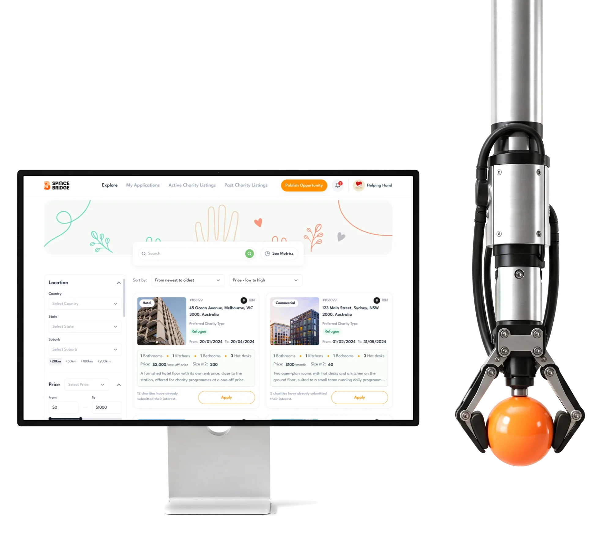
- 64
- screens designed for both sides of the platform
- 2
- roles property owners and charities, each with its own product
- Q&A
- instead of chat answers an owner can compare and shortlist
Project summary
SpaceBridge connects property owners who have free or discounted space with the charities that need it. We designed both sides of the marketplace , from information architecture and user flows to the final desktop web UI , refined the logo the client came with, and built a project UI kit on Untitled UI . Our part was design; building and launching it was outside our scope.
How we worked together
- Their team
- Two reviewers, who agreed their comments between themselves before sending them to us
- Scope
- One milestone: logo, user flows, wireframes, moodboard and styles, UI kit and UI, each approved by the client
- Platform
- Desktop web, for both roles
- Delivery
- The client file with a screen map, a clickable prototype and the UI kit, handed over for development
- Tools
- Figma, FigJam, Jira
- Build
- Not ours: development, launch and running the platform are outside this case
What moves through SpaceBridge
One chain, from an empty room to an agreement:
-
Listings
- Property type
- Causes it suits
- Dates it’s free
-
Search
- Location radius
- Price or free
- Rooms and access
-
Interest
- Owner’s questions
- Charity’s answers
-
Applicants
- Pending
- Shortlist
- Active
- Archive
-
Agreement
- Letter of intent
- Contract
-
Requests
- Charity listings
- Owners’ offers
- A cause and A property
- Listings lead with the causes a space suits, then its rooms, price and dates.
- Structured and Personal
- Set questions instead of chat, with Contact one click away.
- Template and Own face
- Untitled UI underneath; SpaceBridge’s colour, type and illustration on top.
A space a charity can judge before applying
- Found
- A charity has little time to spare, and a listing that hides the dates or the price until the third screen spends it on spaces that were never going to fit.
- Decided
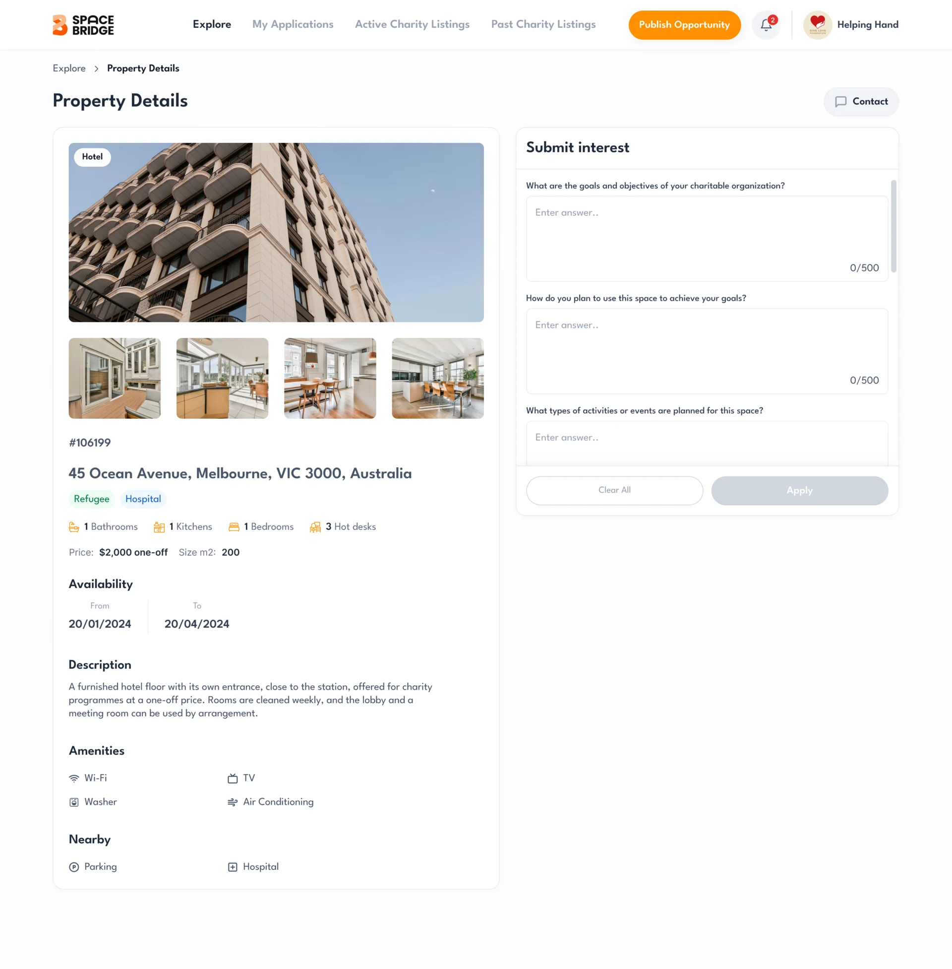
- One page that reads in the order a charity decides: the photos, the address with the causes the space suits, rooms, price and dates, then the details. The owner’s questions sit beside it, so applying never means leaving the listing.
- For the user
- A charity rules a space in or out at a glance, and applies from the same page.
-
The space
Photos first, before any detail.
-
Where, and for whom
The address, the listing number and the causes it suits.
-
Rooms, price and dates
What’s inside, what it costs and when it’s free.
-
The details
Description, amenities and what’s nearby.
How the work progressed
Roles and flows first, then wireframes in grey, the logo and a visual direction, then the final screens and the kit they are built from.
-
User Flow
Who does what: property owners and charities, and every path from sign-up to an agreement
Artifact Information architecture and user flows for both roles
-
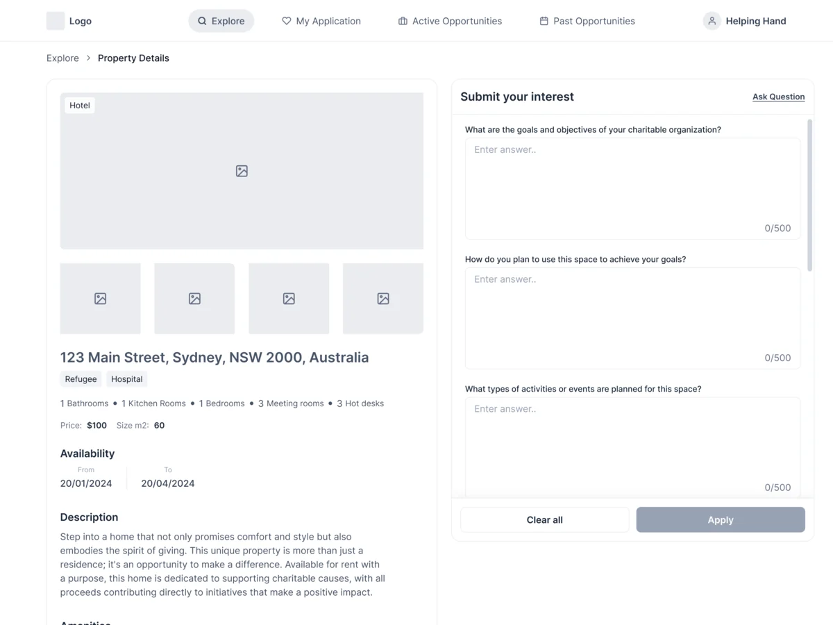
Wireframes
What sits where on each page, agreed in grey before any colour
Artifact Desktop wireframes for both roles
-
Branding & Logo
How the logo the client came with becomes a mark that holds up in the product
Artifact Moodboards, sketches, logo options and rounds of revision
-
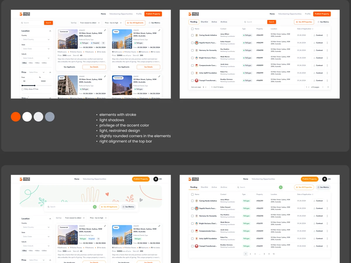
UI & Design System
Which visual direction the product takes, tried on the same screens before choosing
Artifact Style directions, the final screens for both roles and a UI kit on Untitled UI
-
Delivery
What the developers need to build it without guessing
Artifact The client file, a screen map, a clickable prototype and the UI kit
Two roles, two products, one platform
- Found
- Owners and charities do opposite jobs: one publishes and chooses, the other searches and applies. A shared dashboard with relabelled buttons would serve neither.
- Decided
- Each role’s paths were mapped in FigJam first, then each got its own menu: an owner’s home is their properties and the charities’ requests; a charity’s is the search, its applications and its own requests.
-
Property owner: from applicants to a contract
The applicant list, one applicant’s details, then the contract to upload and sign.
Open the full map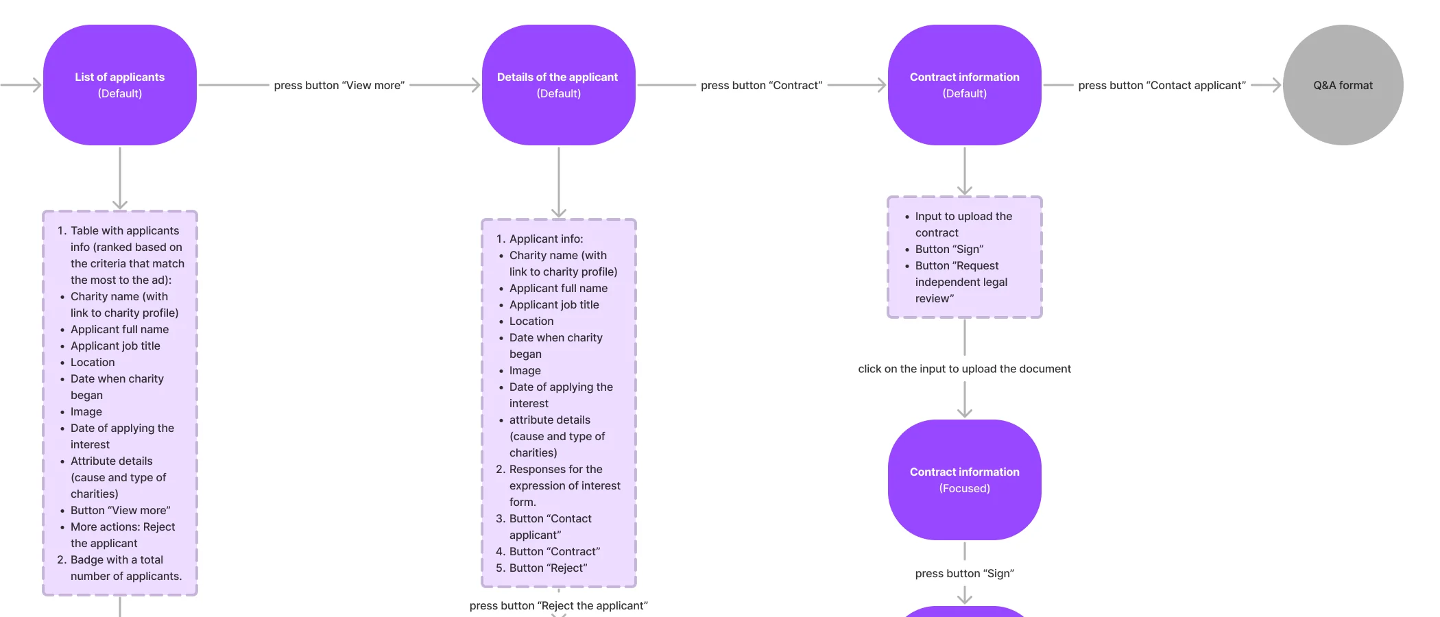
-
Charity: from a search to an application
Search, the listings it returns, one property, then the owner’s questions to answer.
Open the full map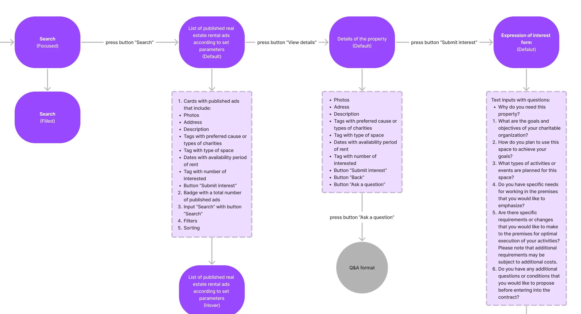
-
Charity: its own requests
The list of its requests, editing one, deleting with a confirmation, and each request’s details.
Open the full map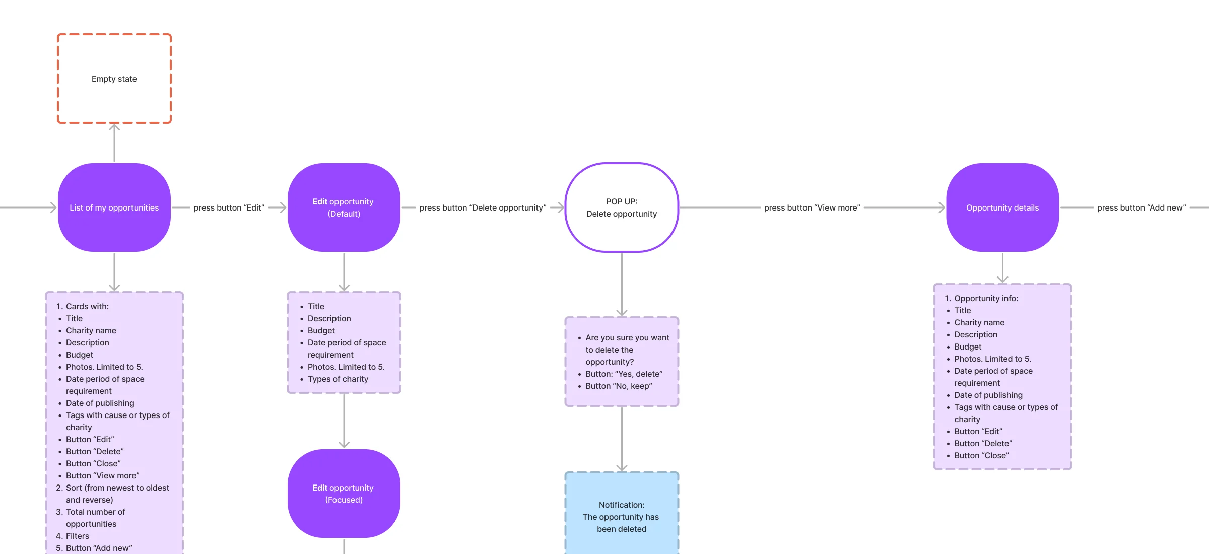

Five jobs, from a search to an agreement
The charity’s search first, then the owner’s side of an application, then requests that go the other way. Addresses, prices and names on these screens are example data.
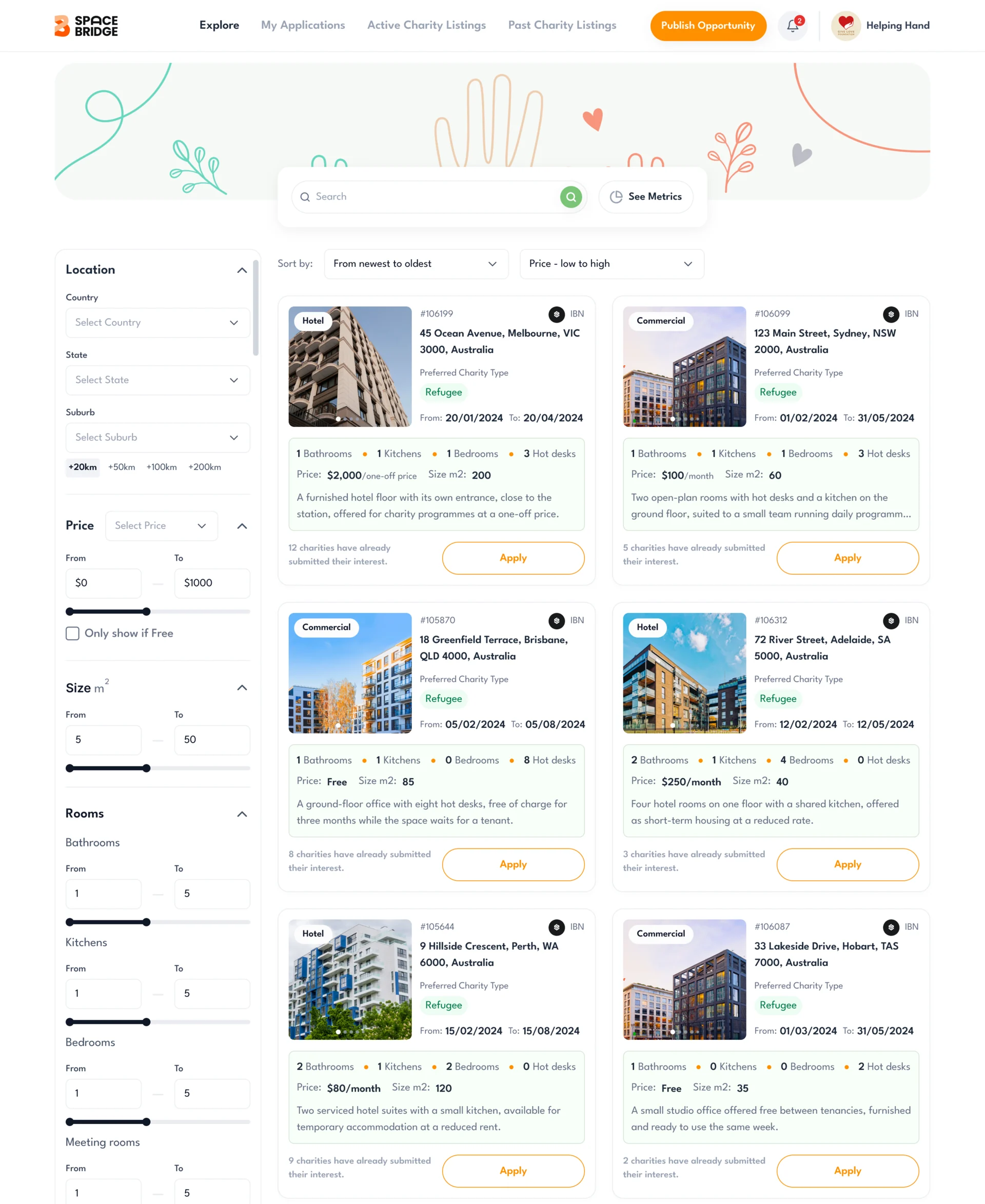
Space a charity can filter by its needs
- Found
- A charity needs somewhere specific: near its people, within budget, with the right rooms and step-free access. A plain list of addresses makes it open every one.
- Decided
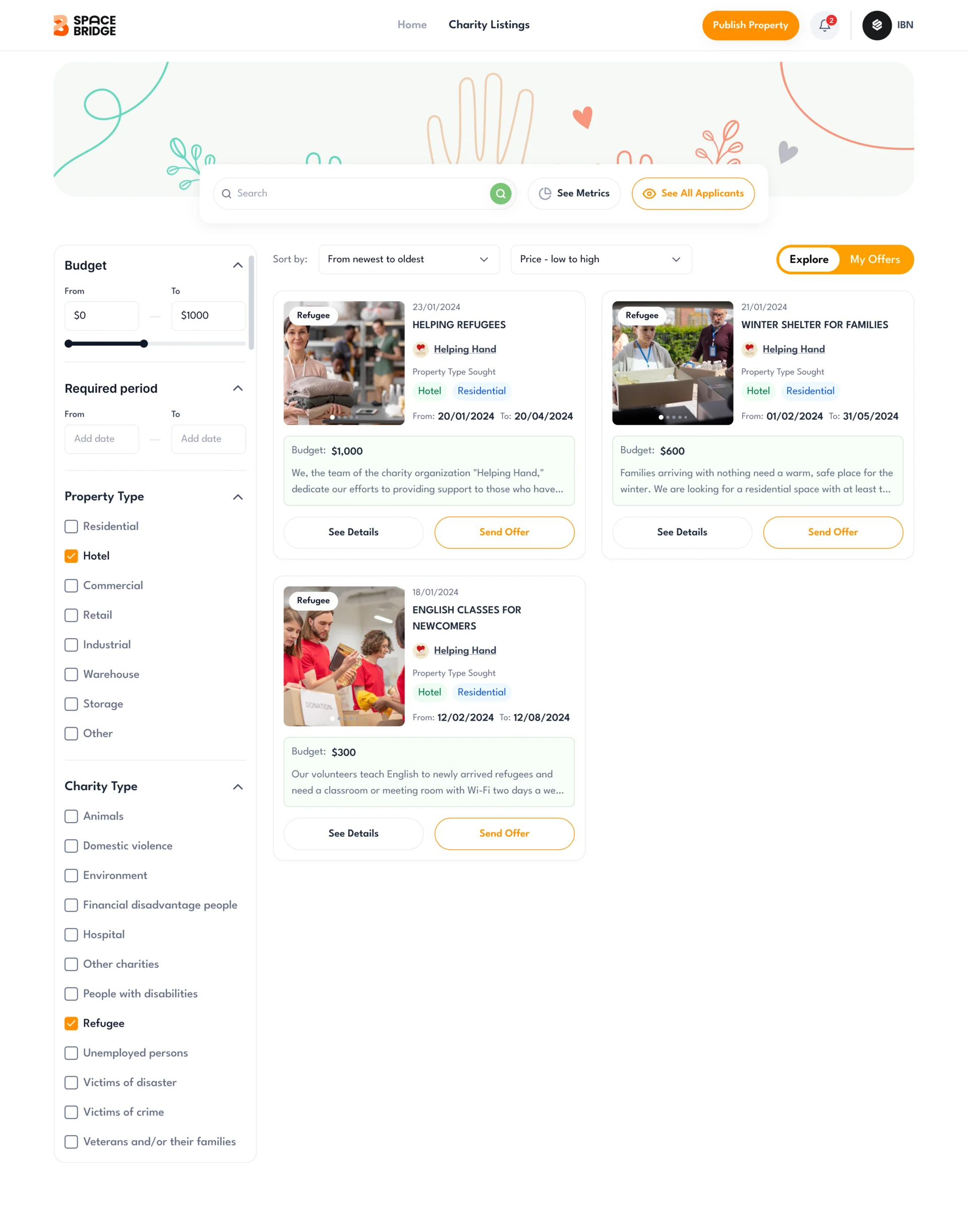
- Filters for location radius, price with a free-only switch, size, rooms down to hot desks and meeting rooms, property type, amenities, nearby services and step-free access. Every card shows the causes it suits, its dates and how many charities have applied.
The owner’s questions instead of a chat
- Found
- Chat was cut from the scope, and without it an owner would get free-text messages that can’t be compared side by side.
- Decided
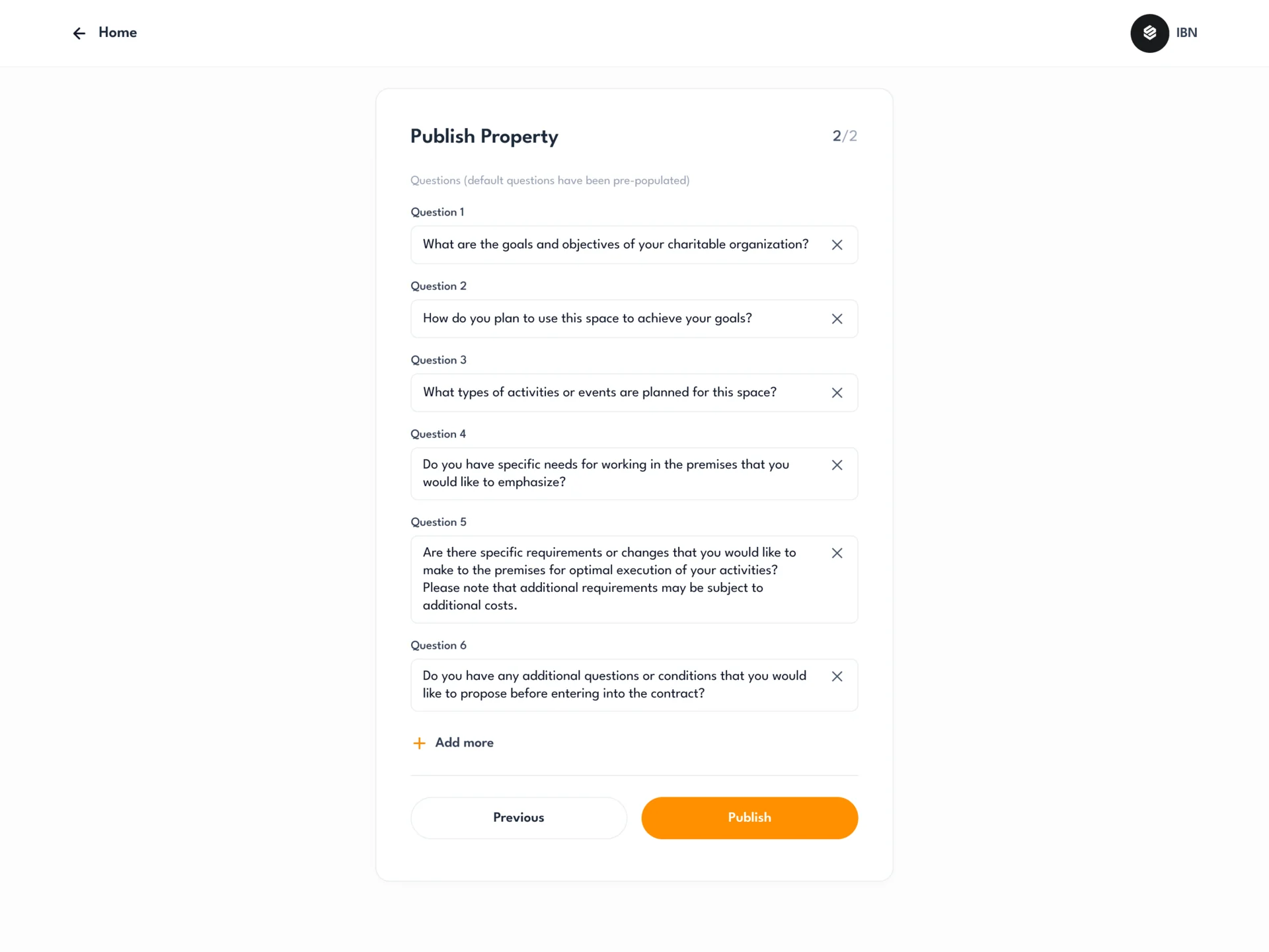
- Publishing a property ends with the questions every applicant answers: six defaults, each editable, and more can be added. Charities answer them on the listing page; Contact stays for anything else.
Applicants an owner can compare
- Found
- A popular space draws many charities, and an inbox of messages hides who is serious.
- Decided
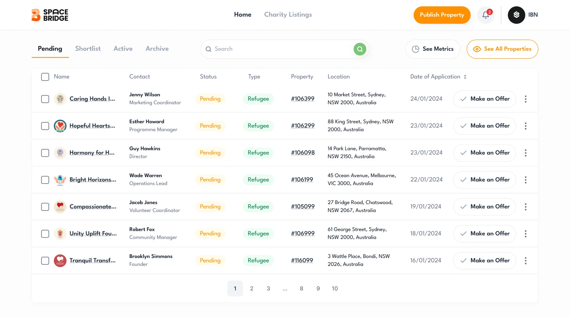
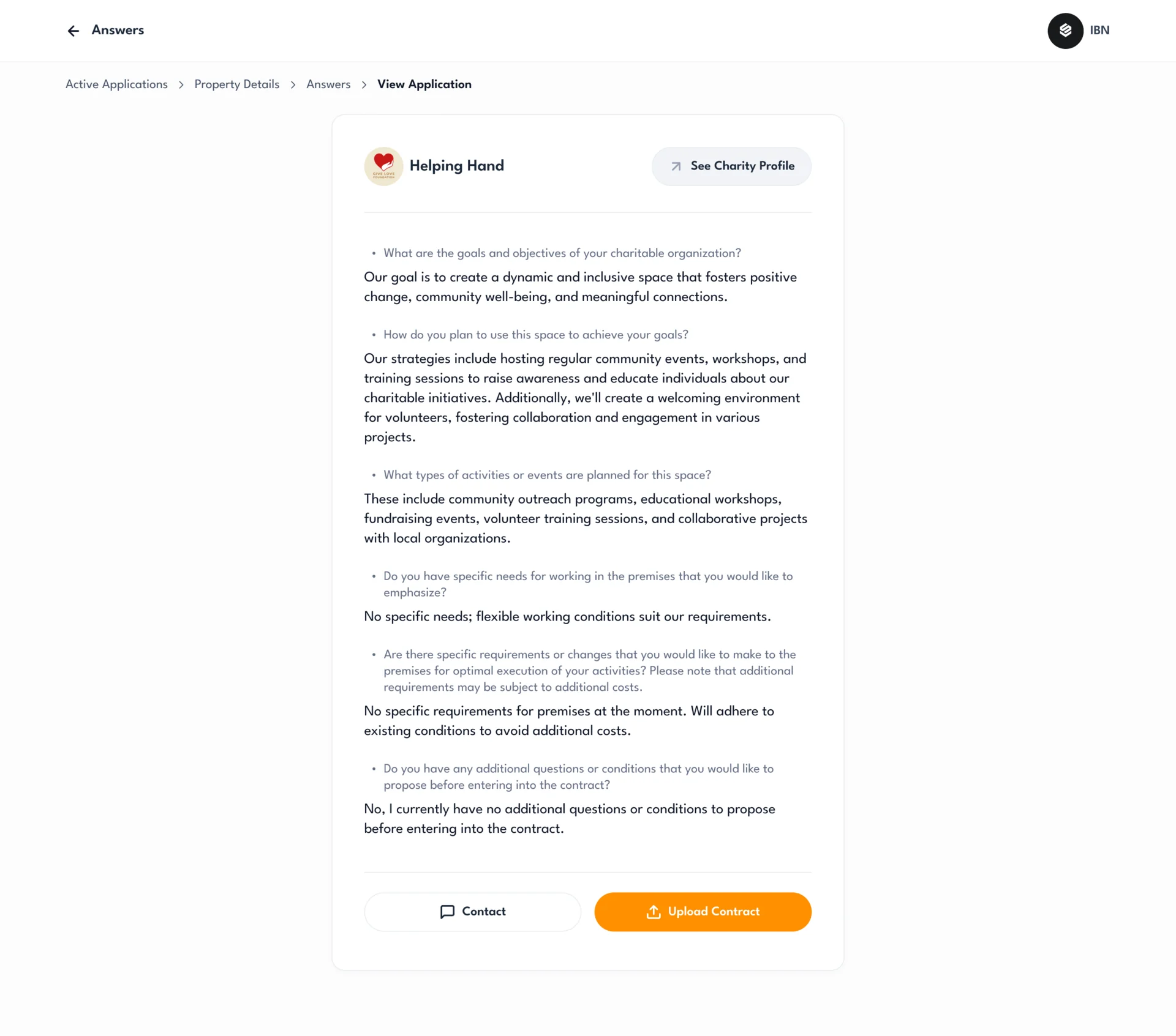
- A table for each status (Pending, Shortlist, Active and Archive) with each charity’s contact, cause, property and date, and an offer from the row; then every application’s answers on one page, beside the charity’s profile.
An application a charity can follow
- Found
- A charity applies to several spaces at once and needs to see which applications wait for an answer and which have moved on.
- Decided
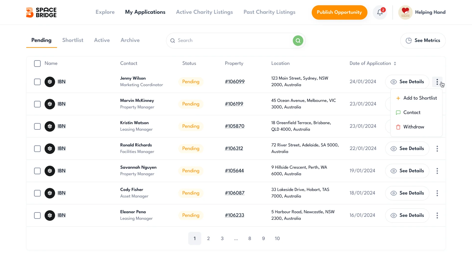
- My Applications, with the same four tabs the owner works in: each row with the property, its owner’s contact and the date, and shortlisting, contact or withdrawal from the row menu.
Requests that go the other way
- Found
- Some charities know exactly what they need before any listing fits it.
- Decided
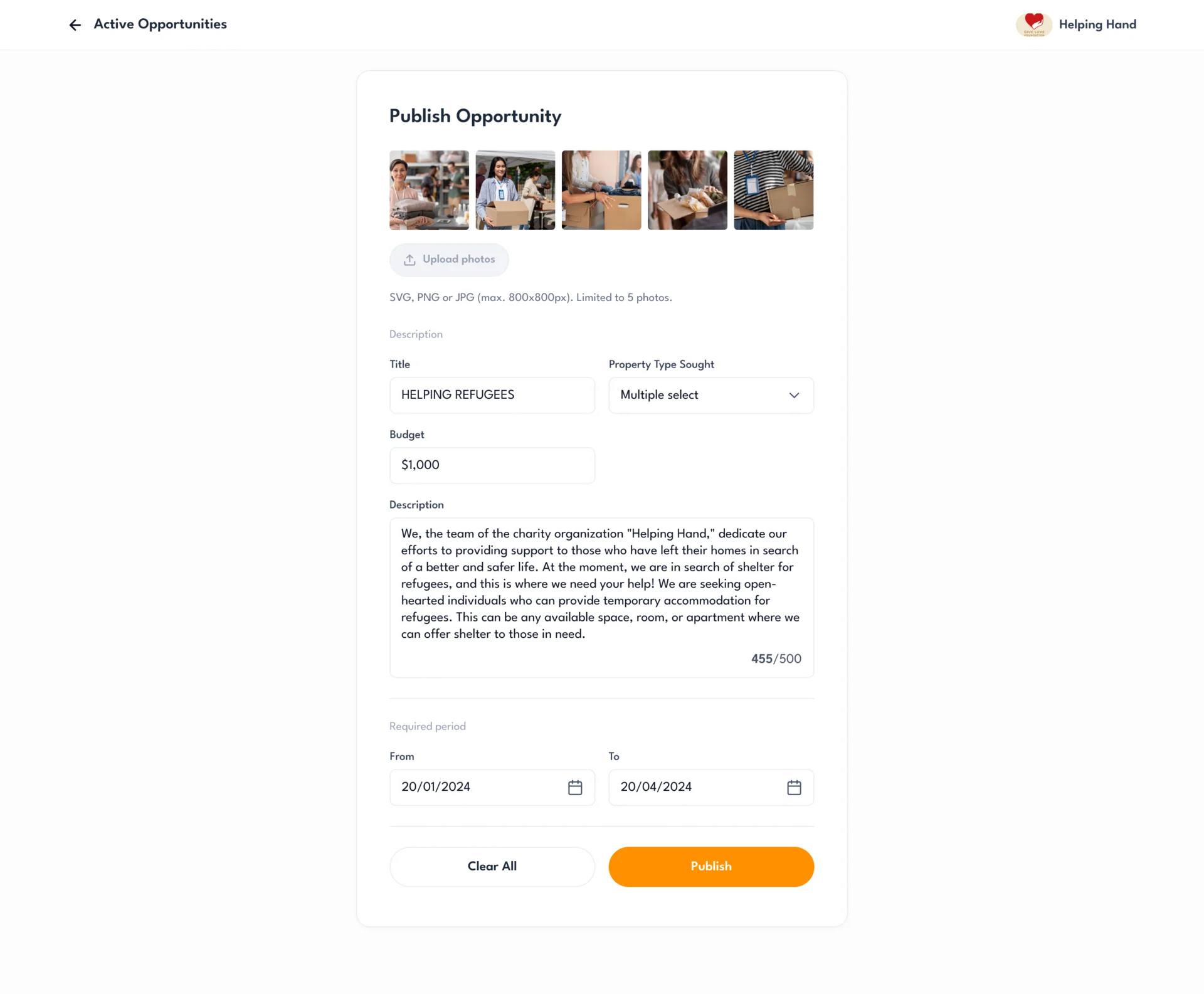
- A charity publishes its own request (photos, the property type it seeks, a budget and dates), and owners browse these requests by budget, period, property type and cause, then send an offer.
A logo refined from the one the client brought
- Found
- The client came with a logo of their own, and it needed to become a mark that works inside the product, from the header to a small icon.
- Decided
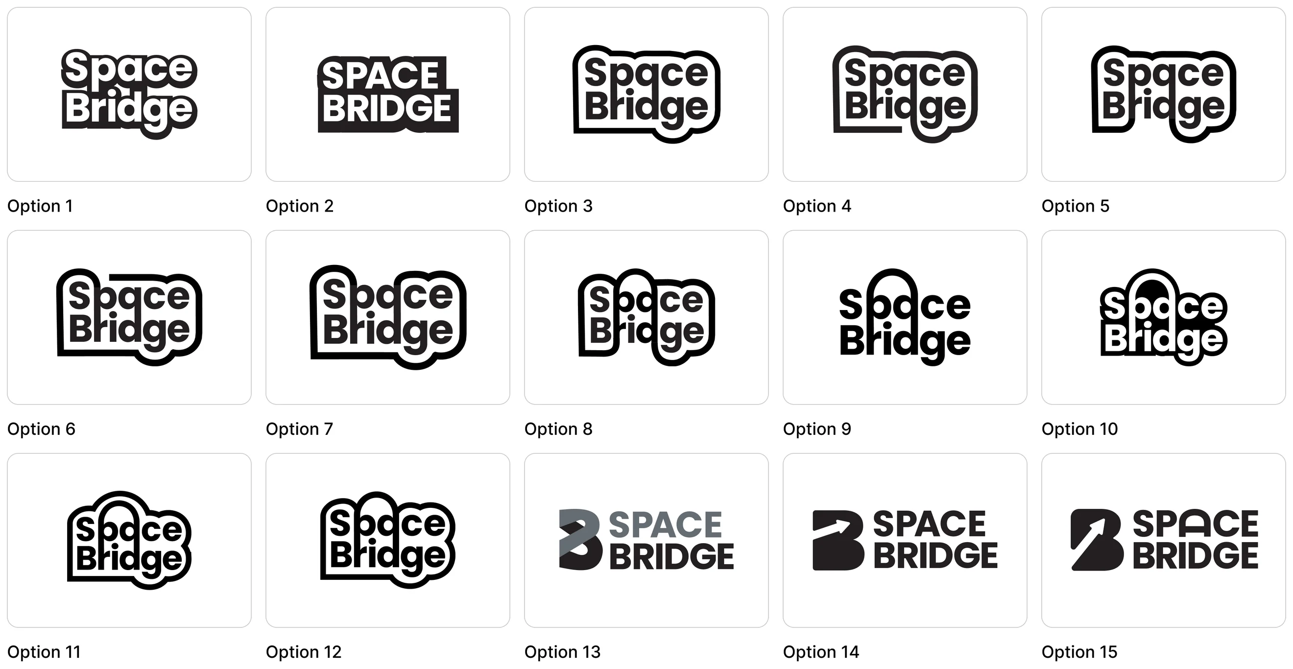
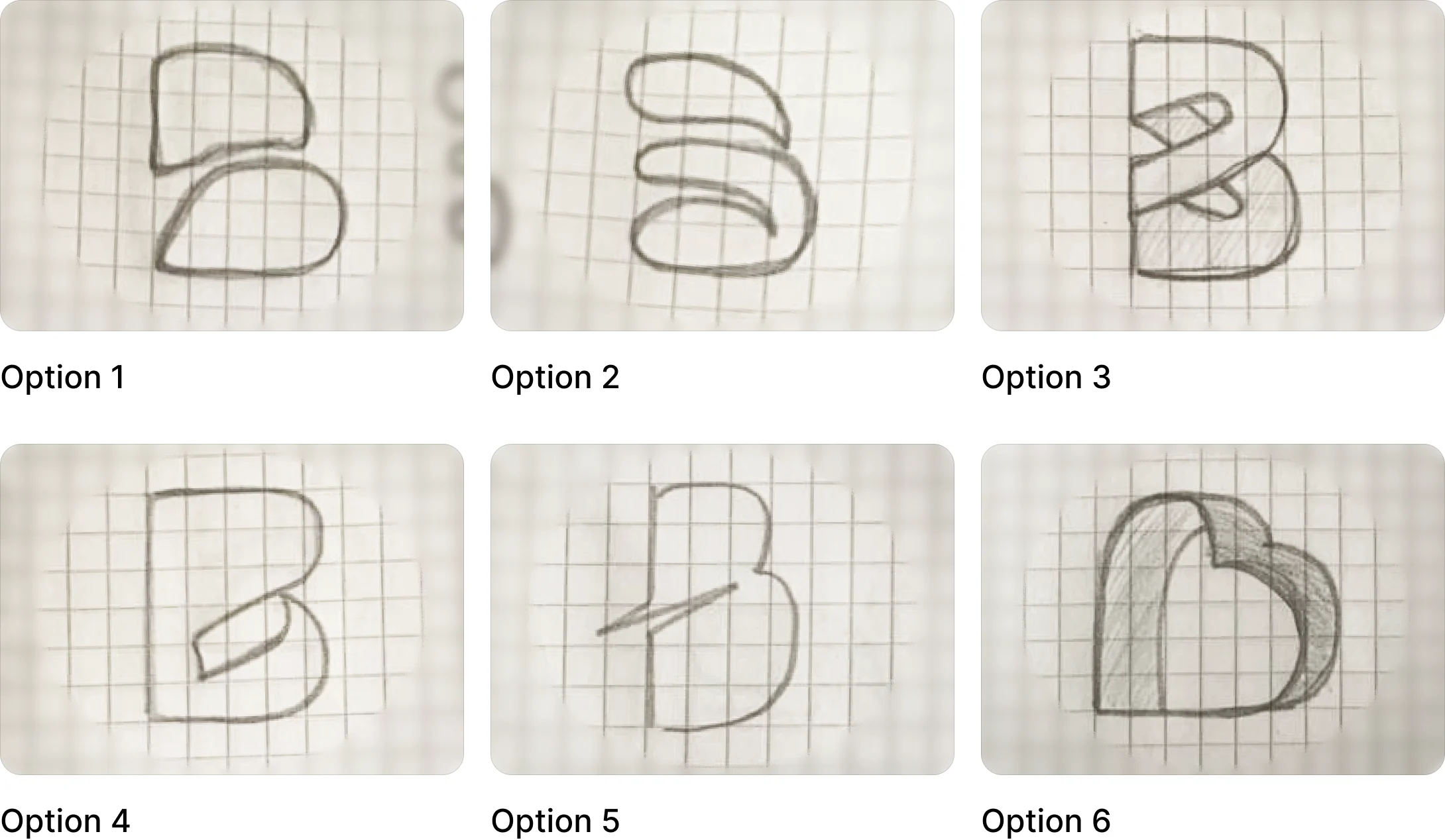
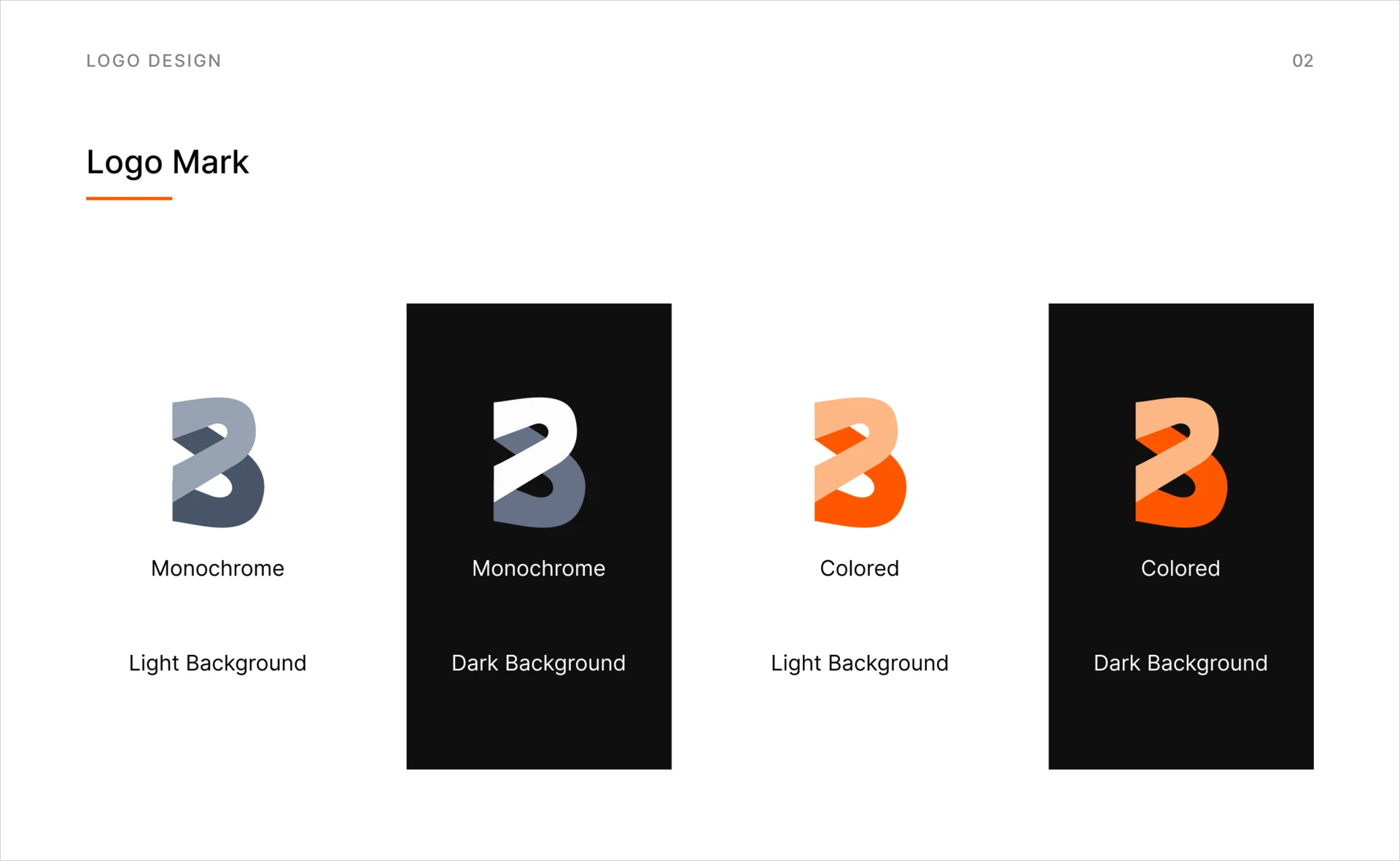
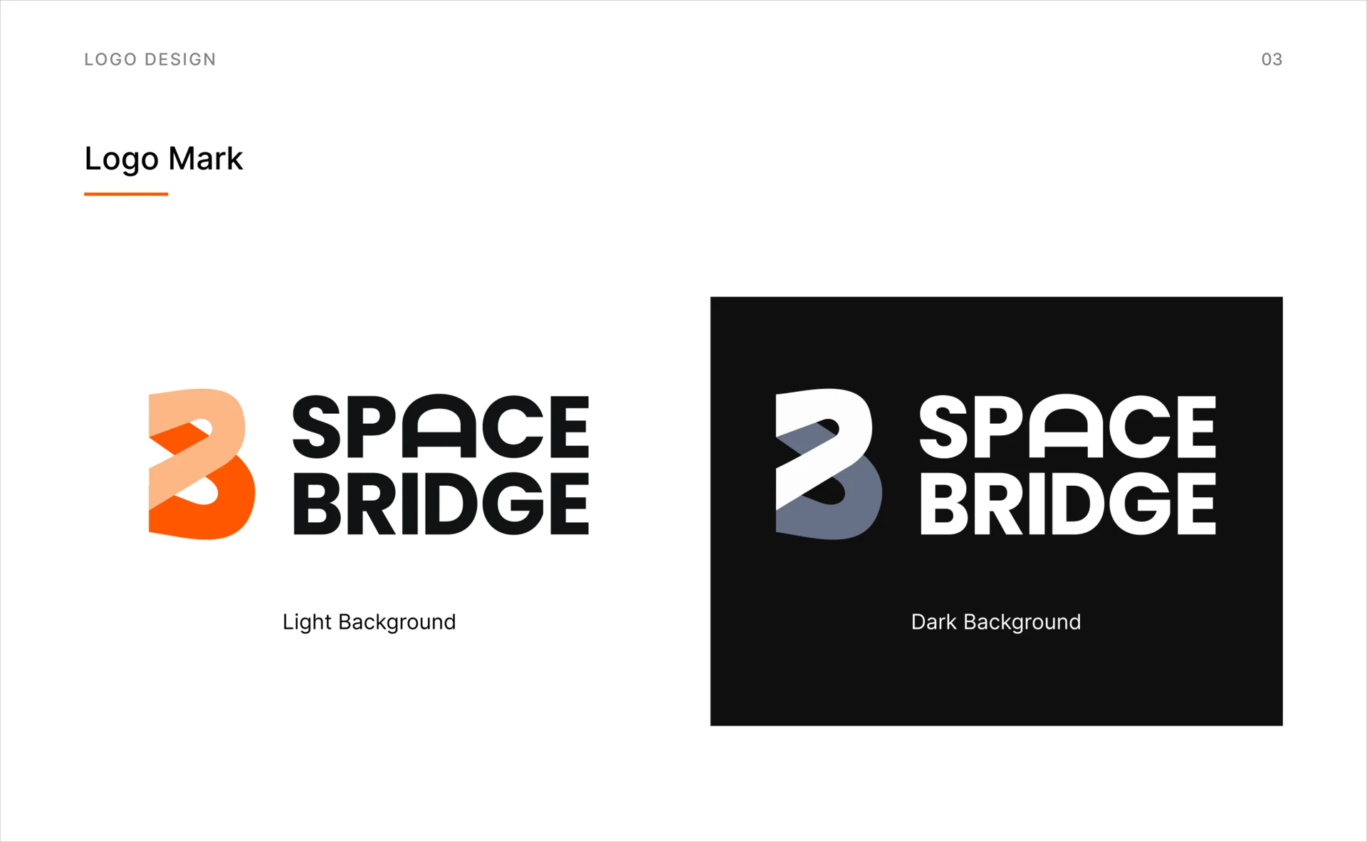
- Hand sketches of the letter B first, then wordmark options in Figma and rounds of revision, until the B became a mark of its own beside the wordmark. The colour and type the product uses were set in the UI kit.
Untitled UI underneath, SpaceBridge on top
- Found
- The budget ruled out a system drawn from zero, and a template left as it was would make a charity platform look like everyone else’s.
- Decided
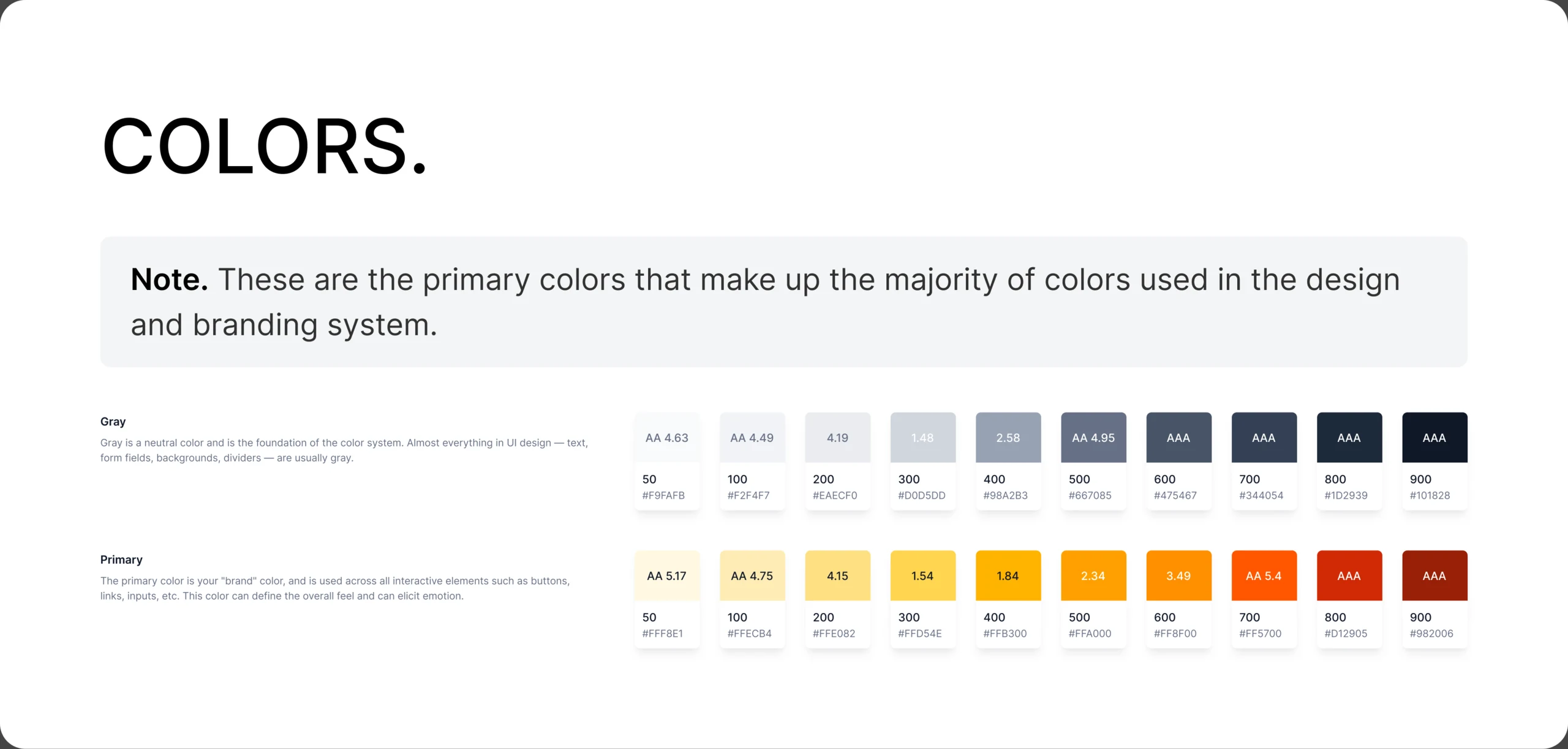
- Untitled UI adapted into a project kit: its grid, inputs and tables kept; SpaceBridge’s colour, type, illustration and cards added; every screen built from it.
One card, read from both sides
A charity sees a listing with Apply and the interest so far; its owner sees the same card with an edit pencil and a way to the applicants.
-
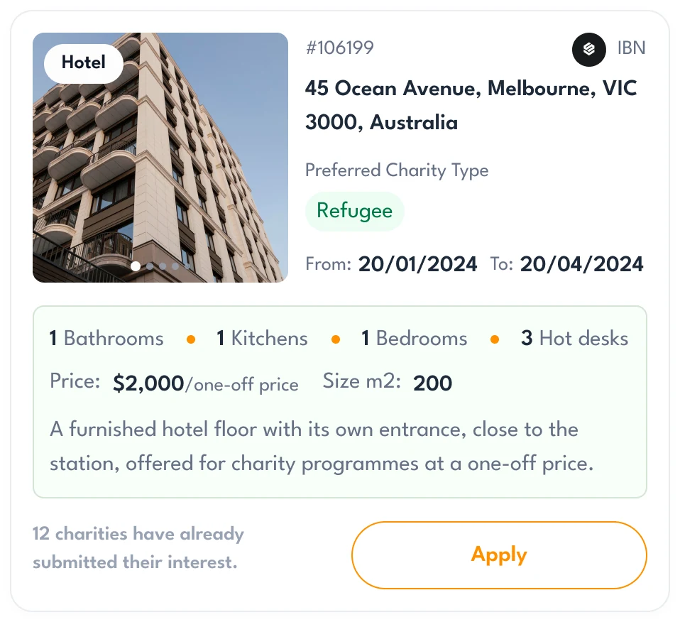
Charity: A listing to apply to. -
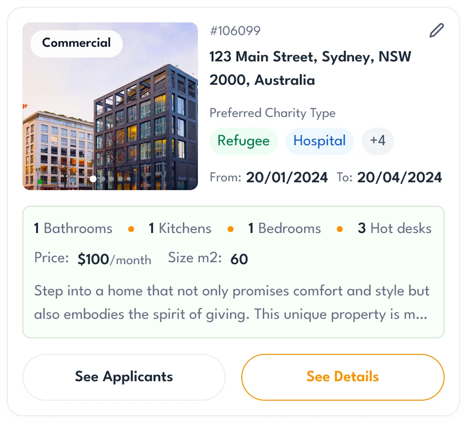
Property owner: Their own listing, with See Applicants.
A request, open and then closed
While it runs, owners see a charity’s request with Send Offer; once its period ends, the charity sees it closed, with the date.
-
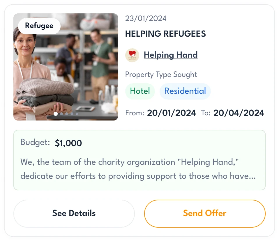
Open -
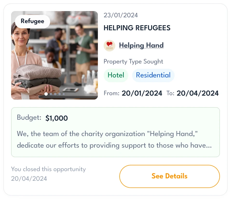
Closed
A handoff developers could build from
The work ended in one organised client file rather than a folder of screens.
- UI kit
- Grid, buttons, inputs, cards, tables, colour and type, adapted from Untitled UI.
- Screen map
- Every screen and state laid out by role and area, in the order a user meets it.
- Clickable prototype
- The flows of both roles, linked end to end.
- Development handoff
- The client file, with wireframes and style directions kept beside the final UI.
Flows in the handoff
- Wireframes for property owners and charities
- Style directions
- Charities: search, applications and their own requests
- Property owners: listings, applicants and agreements
- UI kit: grid, components, colour and type
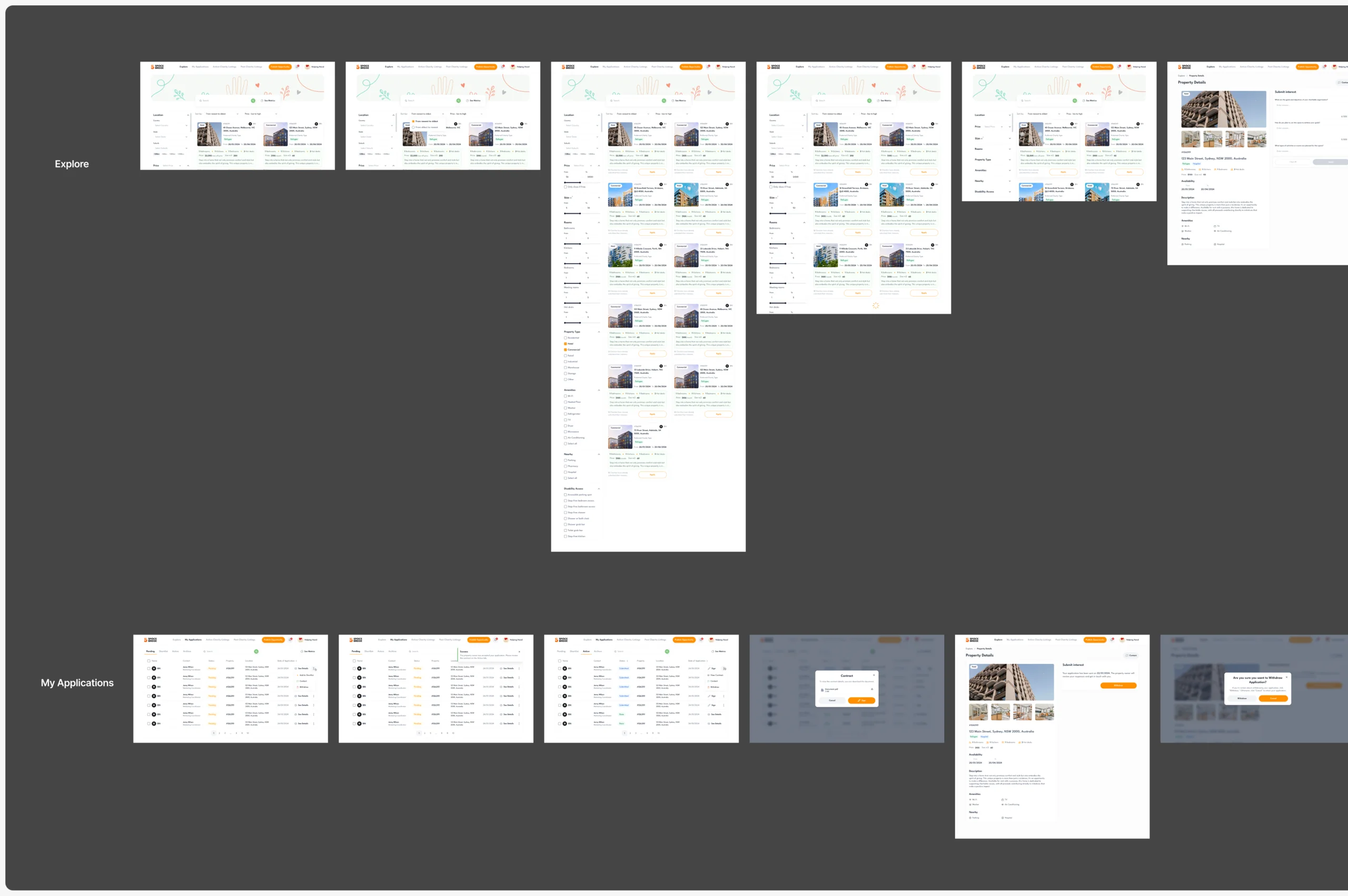
Where the product ended up
Both sides of SpaceBridge designed for desktop web: a charity’s search, listing pages and applications; an owner’s listings, questions, applicants and agreements; and requests charities publish for owners to answer.
Built on a project kit adapted from Untitled UI, with the client’s logo refined, and handed over with a screen map and a clickable prototype.
- screens across both roles
- 64
- roles, each with its own product
- 2
- set questions in place of chat
- Q&A

Afraid your marketplace will turn into an inbox?
In SpaceBridge, set questions replaced chat, so owners compare charities in a table instead of reading threads. Show us both sides of yours, and we’ll design how they meet.
More work like this
Three more products with two sides, several roles, or listings to search.
-

FoodTech · SaaS
Glimix
Redesigned a two-sided hospitality app for diners and venue owners, with an AI assistant and a new brand.
- 200+ Screens designed
- 5 Experts on the pod
-
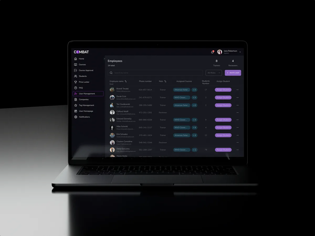
Sales training · Desktop web platform
Combat Sales
Reworked a sales-training platform for five roles, keeping the look its users already knew.
- 80+ Final desktop screens and interaction states
- 5 Roles in one platform
-
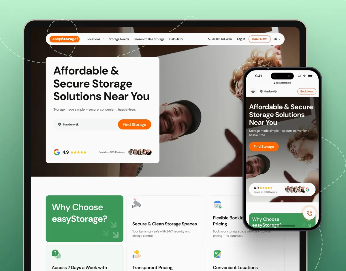
E-commerce · Website
easyStorage Netherlands
Designed and built a self-storage website and redesigned its booking app, from a map pin to a booked unit.
- 300+ Screens designed
- 880+ Project hours