
Warehouse robot command center, desk to aisle
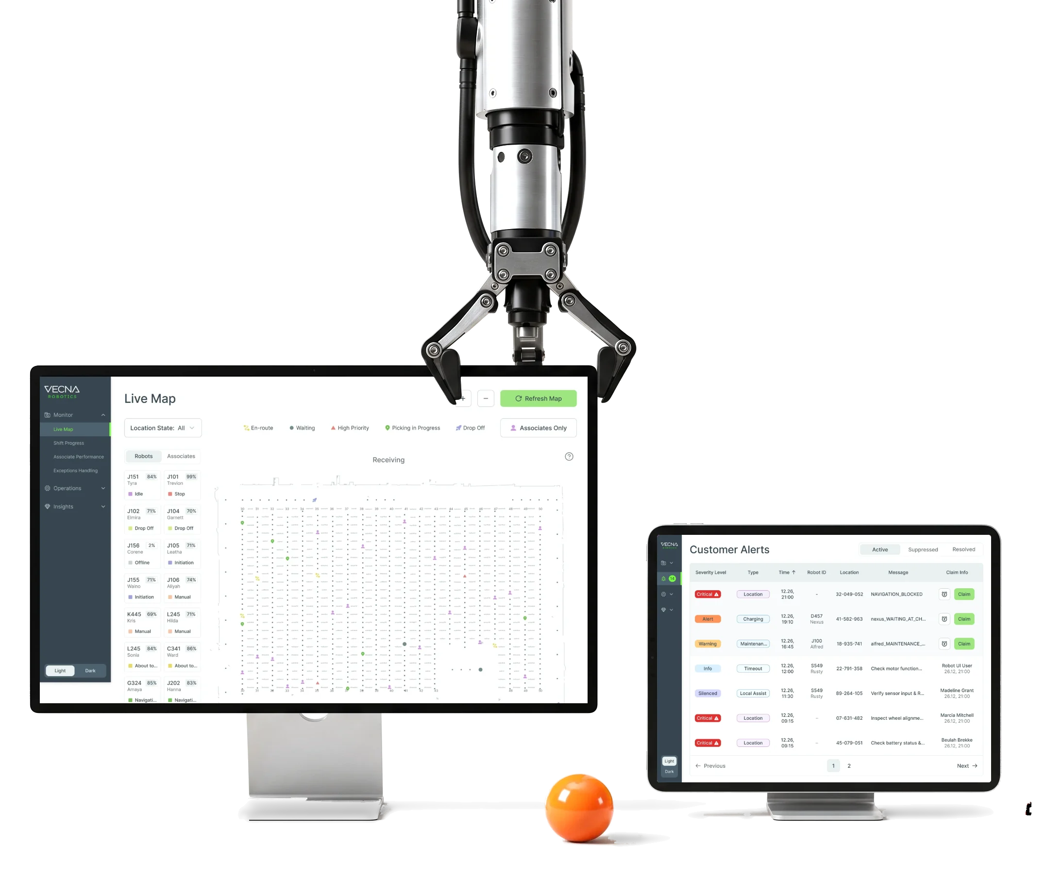
Vecna Robotics puts autonomous robots to work beside people in warehouses.We designed its CaseFlow Console, handheld app and Customer Alerts.
- 192
- screens across the Console, the handheld and Alerts
- 3
- products the Console, the WS50 handheld app and Customer Alerts
- 3
- people from ANODA on the project
Project summary
Vecna Robotics runs warehouse picking with autonomous robots and people working the same orders. We started with a UX and UI audit of the existing CaseFlow Console and went on to redesign it , with its live monitoring and analytics . Then came a dark update of the Associate app on a Zebra WS50 handheld and a new Customer Alerts module, all built on UI kits and a custom icon set .
What runs through CaseFlow
One chain, from setting up a shift to closing an alert:
-
Setup
- Shifts and times
- Associates
- Robots
- Demands
-
Operations
- Robots
- Demands
- Associates
-
Monitor
- Shift progress
- Associate performance
- Exceptions
- Live map
-
Analytics
- Exceptions
- Heat maps
- Robot activity
-
Handheld
- Sign-in and location
- Scan the robot
- Pick and confirm
- Report a problem
-
Alerts
- Claim and release
- Snooze
- Reassign
- History
- Everything and Readable
- Every robot, mission and picker in view, without a wall of numbers.
- Right now and Over time
- The live shift in Monitor, its patterns in Analytics, never mixed.
- Desk and Aisle
- The full picture at a desk; one big, scan-first step at a time in the aisle.
A shift, read top to bottom
- Found
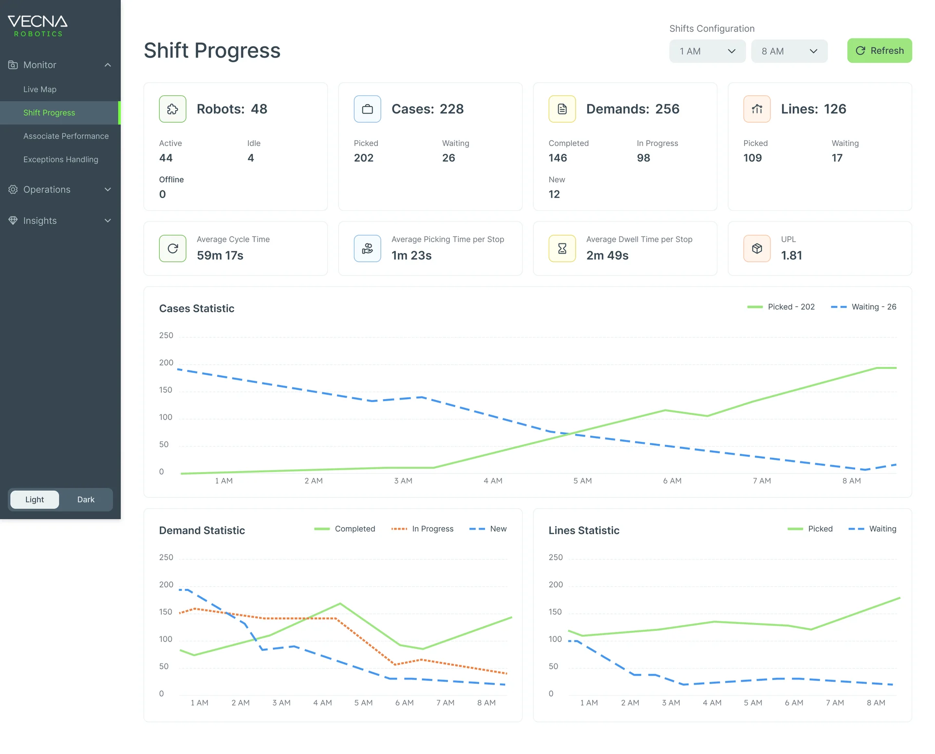
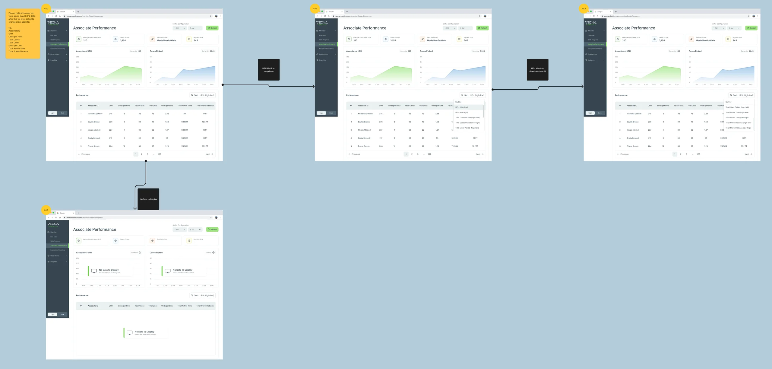
- Shift Progress holds robots, cases, demands and lines, their averages and three charts; with every number at the same weight, a site lead can’t tell at a glance whether the shift is on track.
- Decided
- Four counts first, each split into its parts; then the pace of the shift; then its hours as charts, cases on their own, demands and lines below.
- For the user
- A site lead sees whether the shift keeps up, and where it doesn’t, before opening a single table.
-
Which shift
The page, the shift hours and a refresh.
-
The shift in four counts
Robots, cases, demands and lines, each split into its parts.
-
Pace
Cycle, picking and dwell times, units per line.
-
Cases, hour by hour
Picked against waiting across the shift.
-
Demands and lines
What’s done, in progress and new.
How the work progressed
The existing console and the people on the floor first, then the flows, then grey boxes, then the final screens and a file engineering could build from.
-
Discovery
What in the existing console got in the way, and who actually works the floor
Artifact A UX and UI audit of the Console, and warehouse-associate personas and context of use
-
User Flow
How shifts, robots, demands and alerts connect, and what the handheld asks at every step
Artifact Information architecture and user flows for the Console, the Associate app and Customer Alerts
-
Wireframes
Where each list, map and chart sits before any colour, over several iterations
Artifact Wireframes of setup, live monitoring and analytics
-
UI & UI kits
One visual language for the Console in light and dark, and a handheld that reads in the dark
Artifact Final Console, Associate and Alerts screens, UI kits, reusable components and a custom icon set
-
Delivery
What Vecna’s team needed to build each screen and state
Artifact A screen map, clickable prototypes and a client-ready Figma handoff
Three places, one set of paths
- Found
- One task passes through a handheld, a web console and an alert queue, and a path that works in one place breaks in the next.
- Decided
- Each path was mapped before a screen was drawn: the picker’s sign-in to the first task, the check that the right robot has arrived, and who may act on an alert. Then each place got the menu its user needs.
-
Handheld: sign-in to the first task
Badge or credentials, a location, then the tasks, or an idle home when there are none.
Open the full map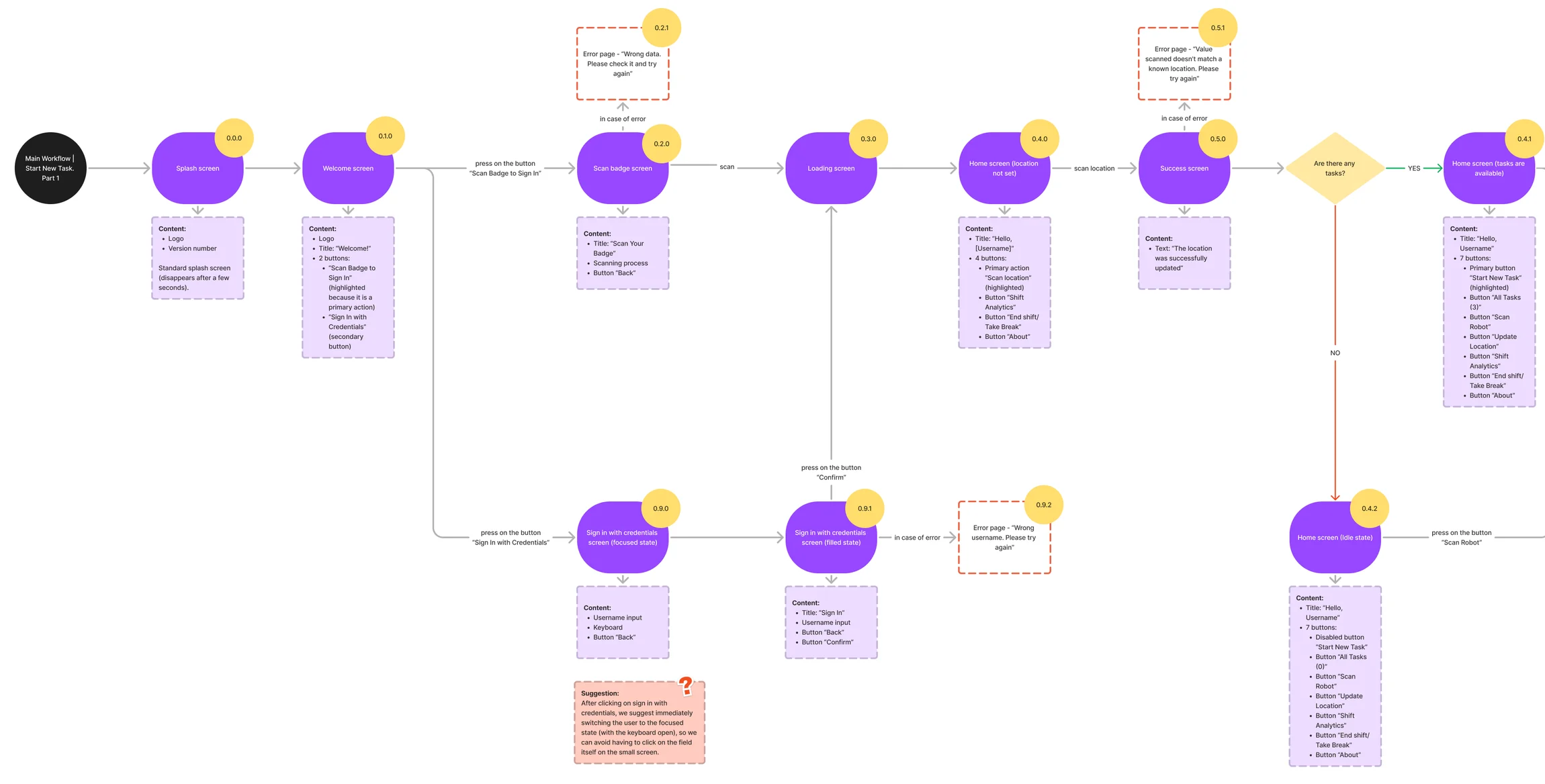
-
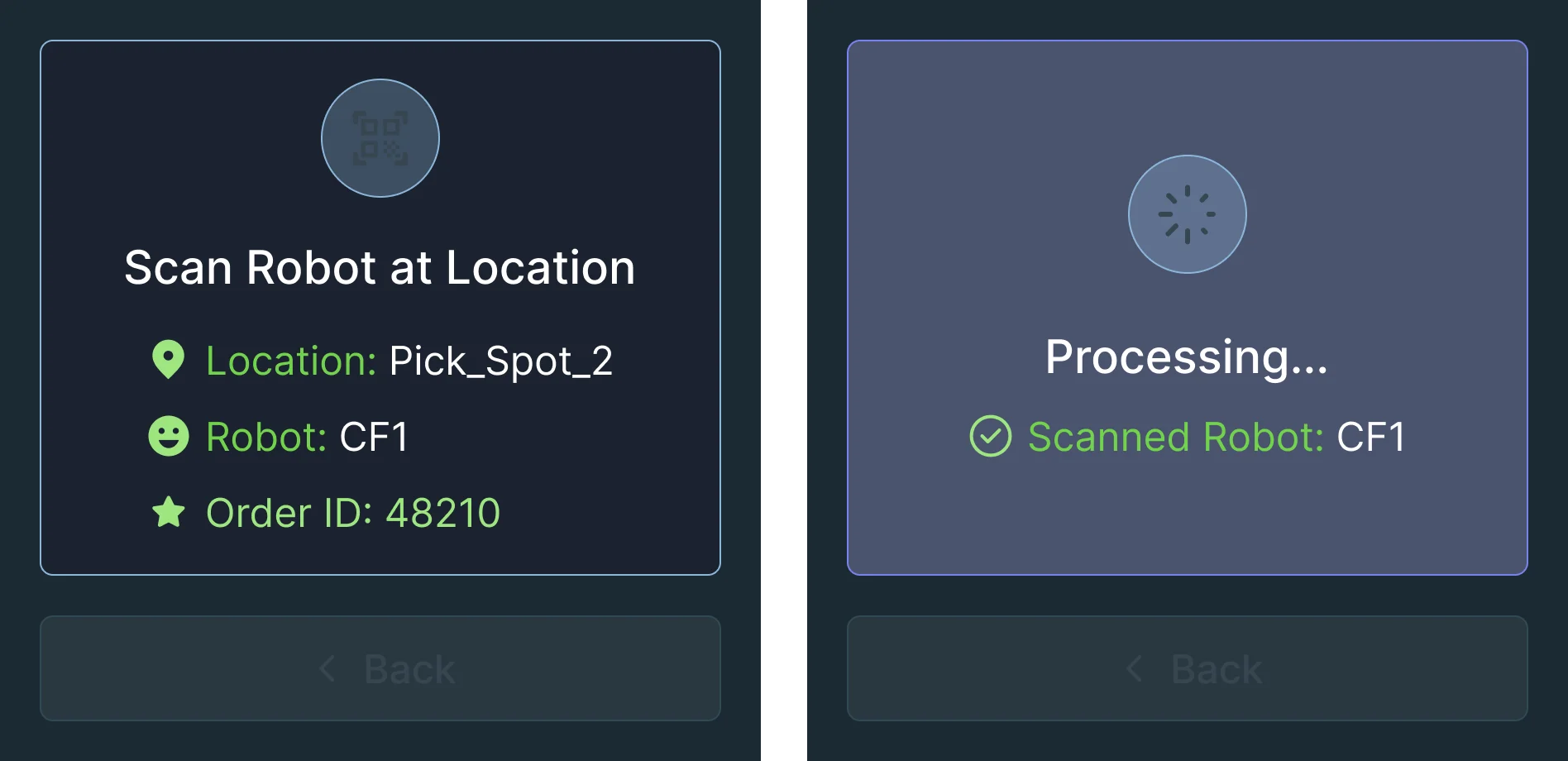
Handheld: is this the right robot?
A mismatch checks whether the picker may take that robot’s tasks, then offers a retry or a typed ID.
Open the full map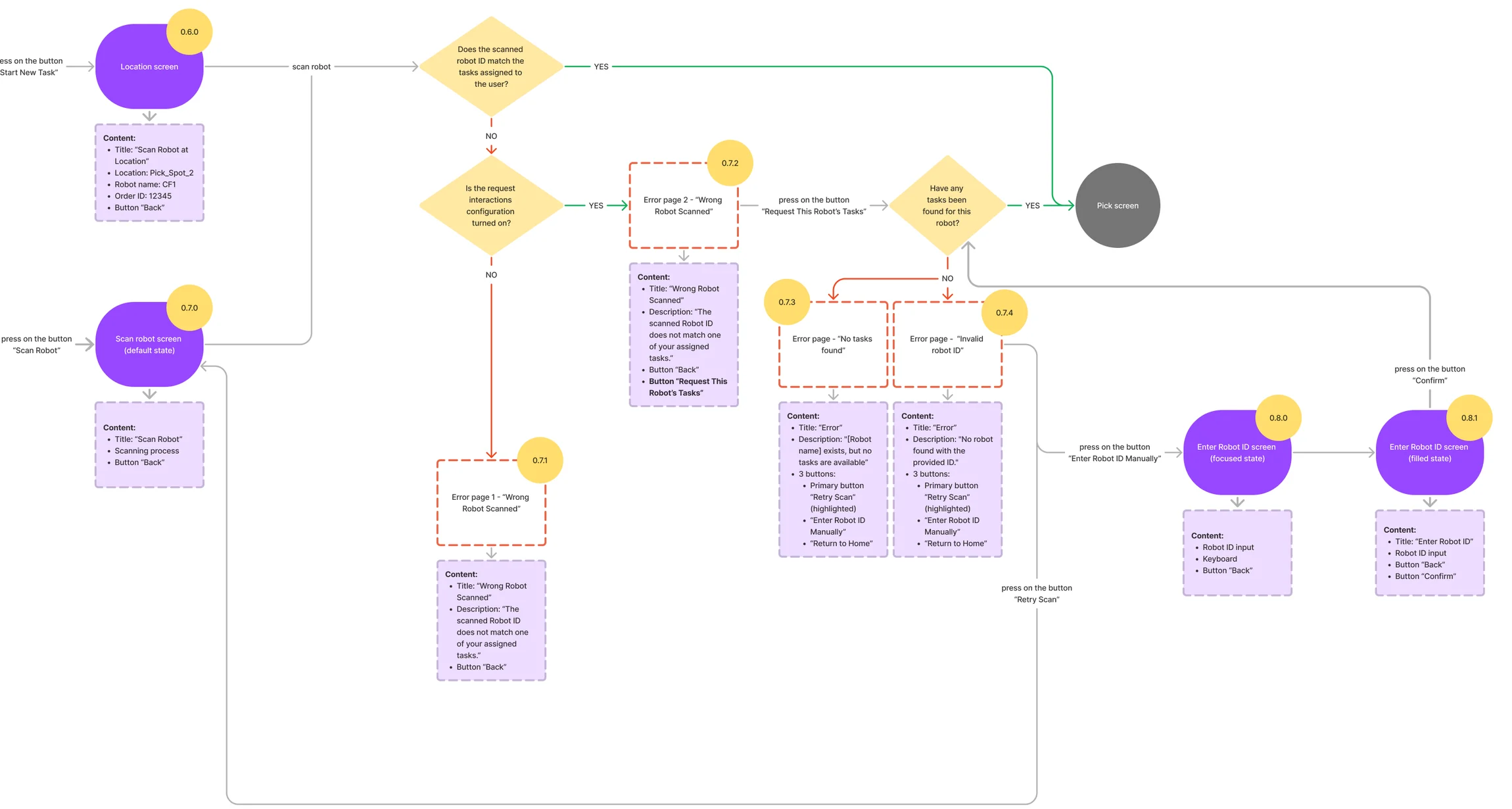
-
Alerts: who may act
Claim, release, a collision with someone else’s claim, and a request to reassign.
Open the full map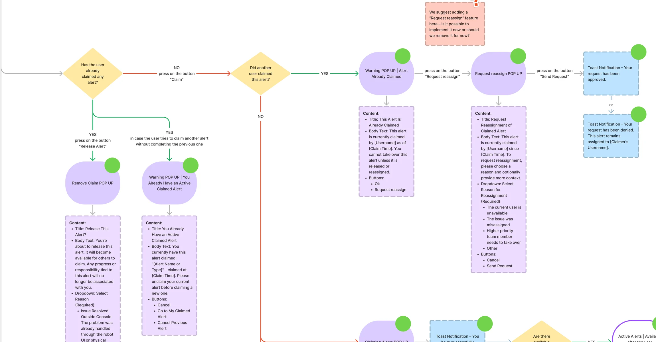
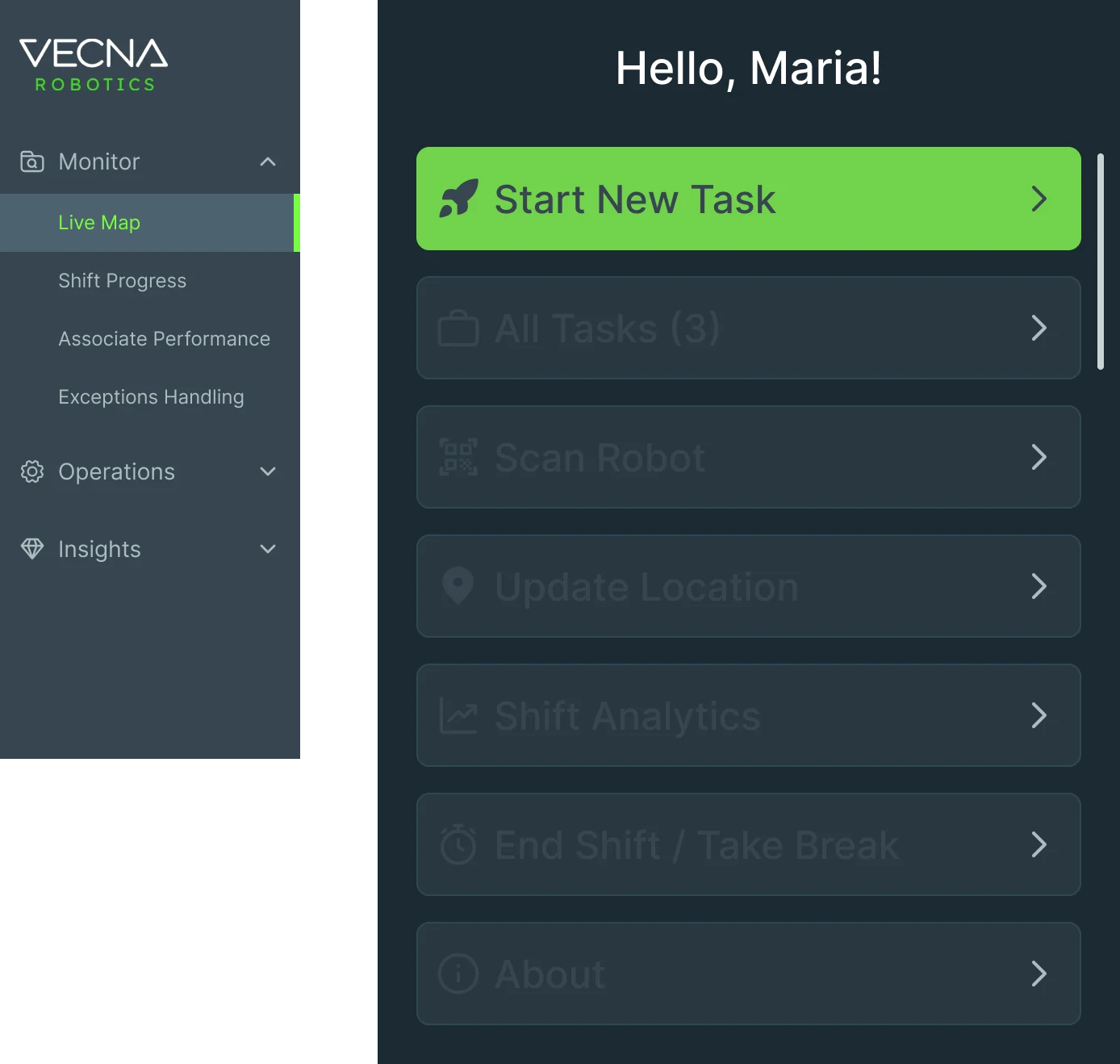
Ten jobs, from the aisle to the command center
The picker’s handheld first, then the Console a manager watches, then the alerts between them. Every name and figure on these screens is example data.
A task a gloved hand can finish
- Found
- A picker has to meet one robot at one spot, often in gloves and sometimes with little English; a screen full of options loses them.
- Decided
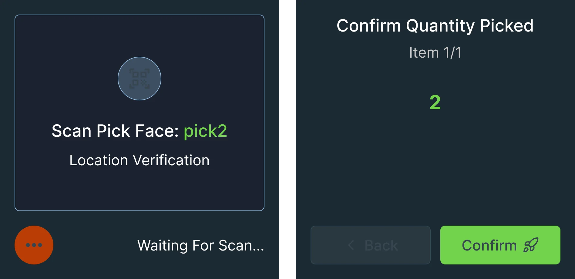
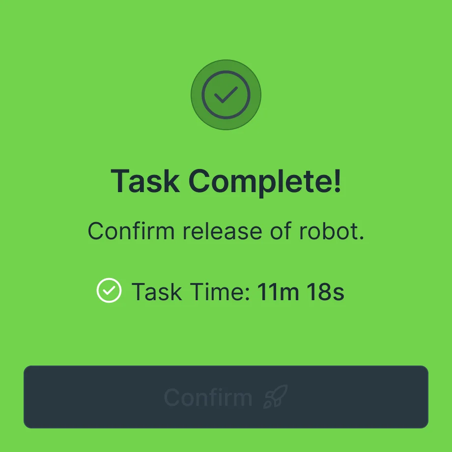
- One step per screen on the WS50: where to go, which robot to scan, what to pick and how many, then done. Each step has a big label, a scan-first action and a colour that says whether it worked.
When a scan doesn’t match
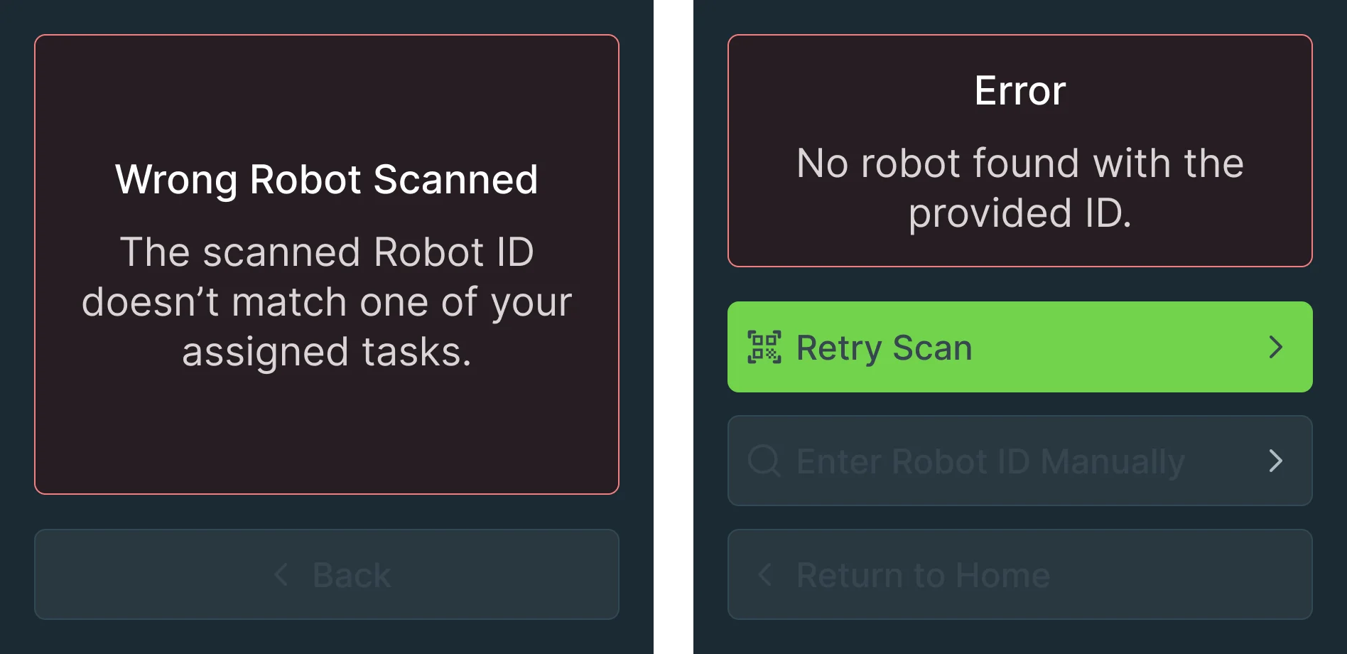
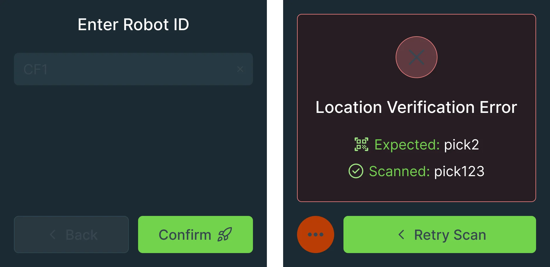
- Found
- A wrong robot or a wrong pick face stops both the picker and the robot, and a vague error leaves the picker guessing.
- Decided
- Every error says what went wrong in plain words and offers the way back: scan again, type the robot ID or go home. A location error shows what was expected next to what was scanned.
Problems reported from the aisle
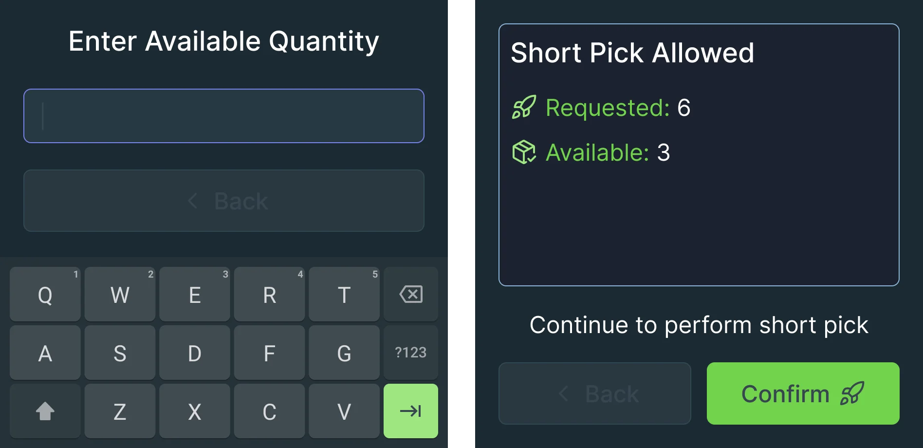
- Found
- A full pallet or fewer items than requested: the picker finds out first, and the Console needs to know at once.
- Decided
- The problem is reported from the pick itself: the reason, the quantity actually there on a stepper or the keypad, and a clear answer on whether a short pick is allowed.

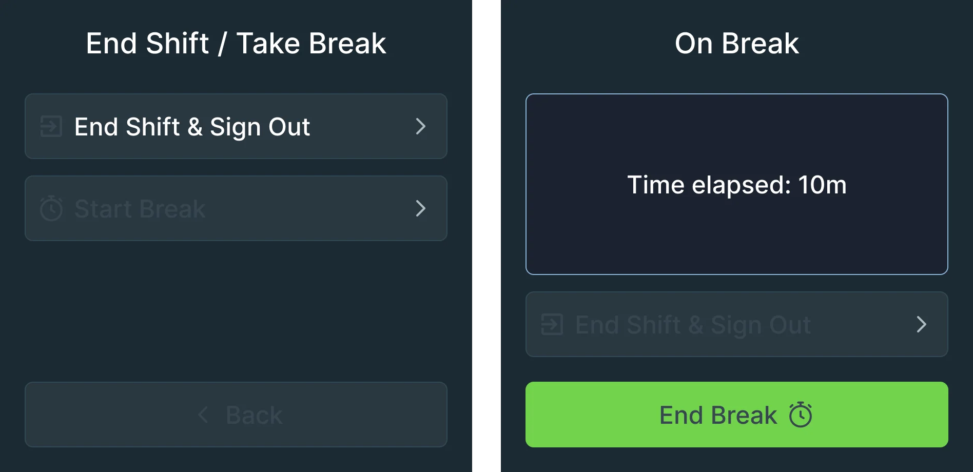
Breaks that don’t lose the shift
- Found
- Picking is physical work; a break or the end of a shift shouldn’t leave a task or a robot hanging.
- Decided
- Ending the shift and taking a break are two separate choices, and the break screen shows the time away with one button to come back.
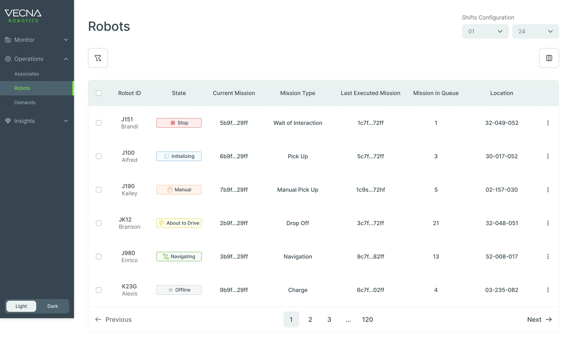
Every robot, and what it’s doing
- Found
- A manager needs to spot the robot that’s stuck, and what it was doing, in a fleet of dozens.
- Decided
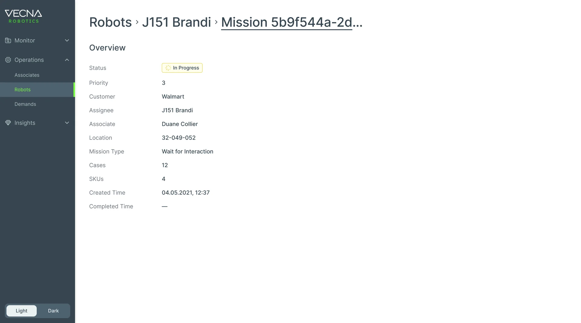
- State as a coloured chip on every row, current and last mission side by side, the queue as a number; each robot opens to its mission: status, customer, robot, associate, location and cases.
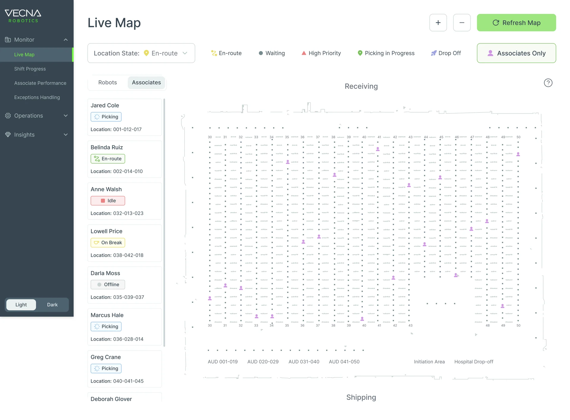
Robots and pickers on one map
- Found
- When an aisle is blocked, where robots and pickers are right now matters more than any table.
- Decided
- A live map of the warehouse with robots and associates on two tabs, each listed beside the map with its state and location, and a filter by location state.
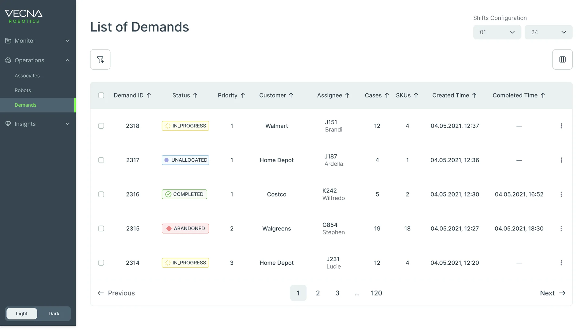
Demands in the order they matter
- Found
- Orders arrive by priority and customer, and a list sorted only by time hides the urgent ones.
- Decided
- One demands table: status, priority, customer, the robot assigned, cases, SKUs and times, with sorting and filters for priority and customer.
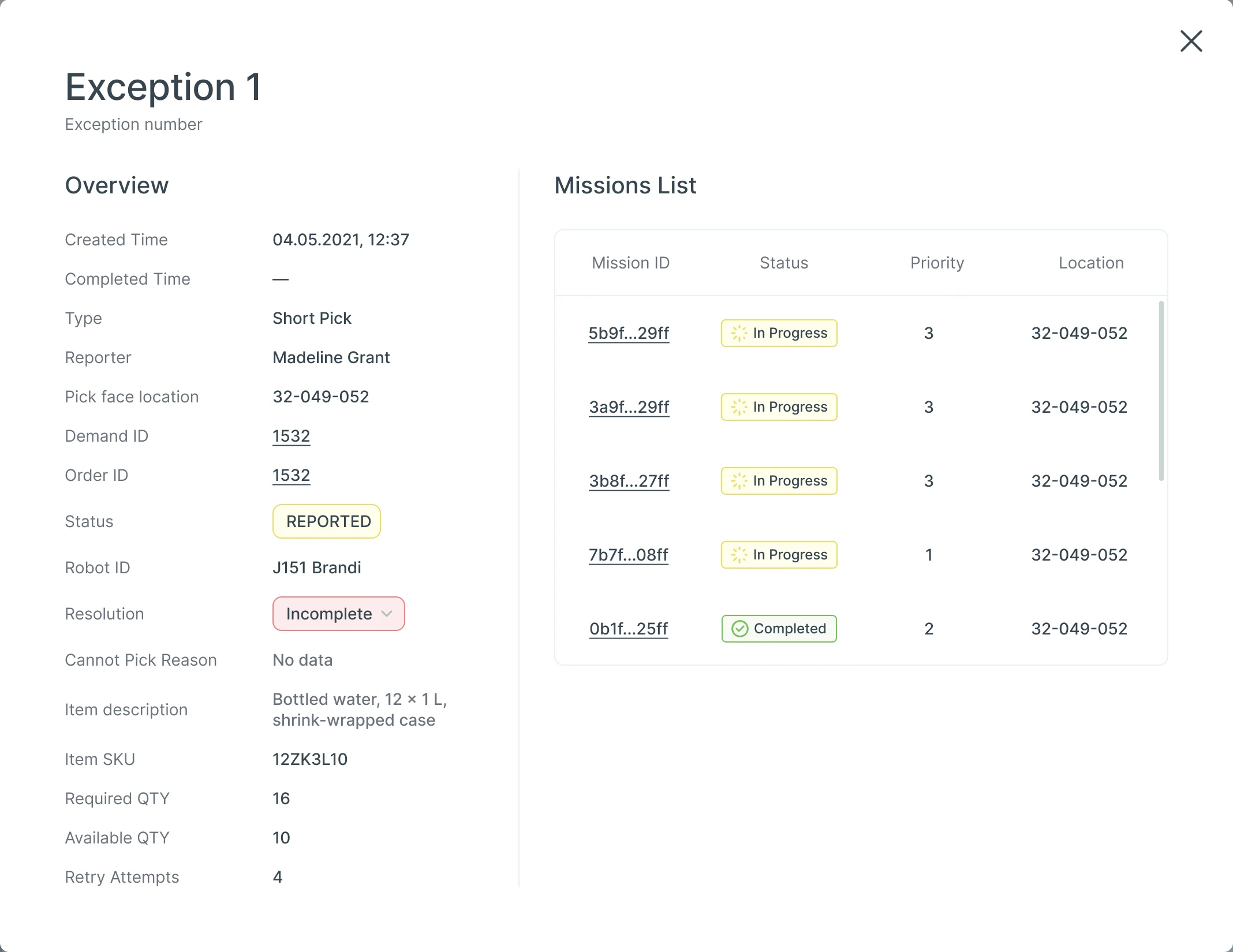
Exceptions handled while the shift runs
- Found
- A short pick or a full pallet reported from the aisle is useless if the Console shows only a code.
- Decided
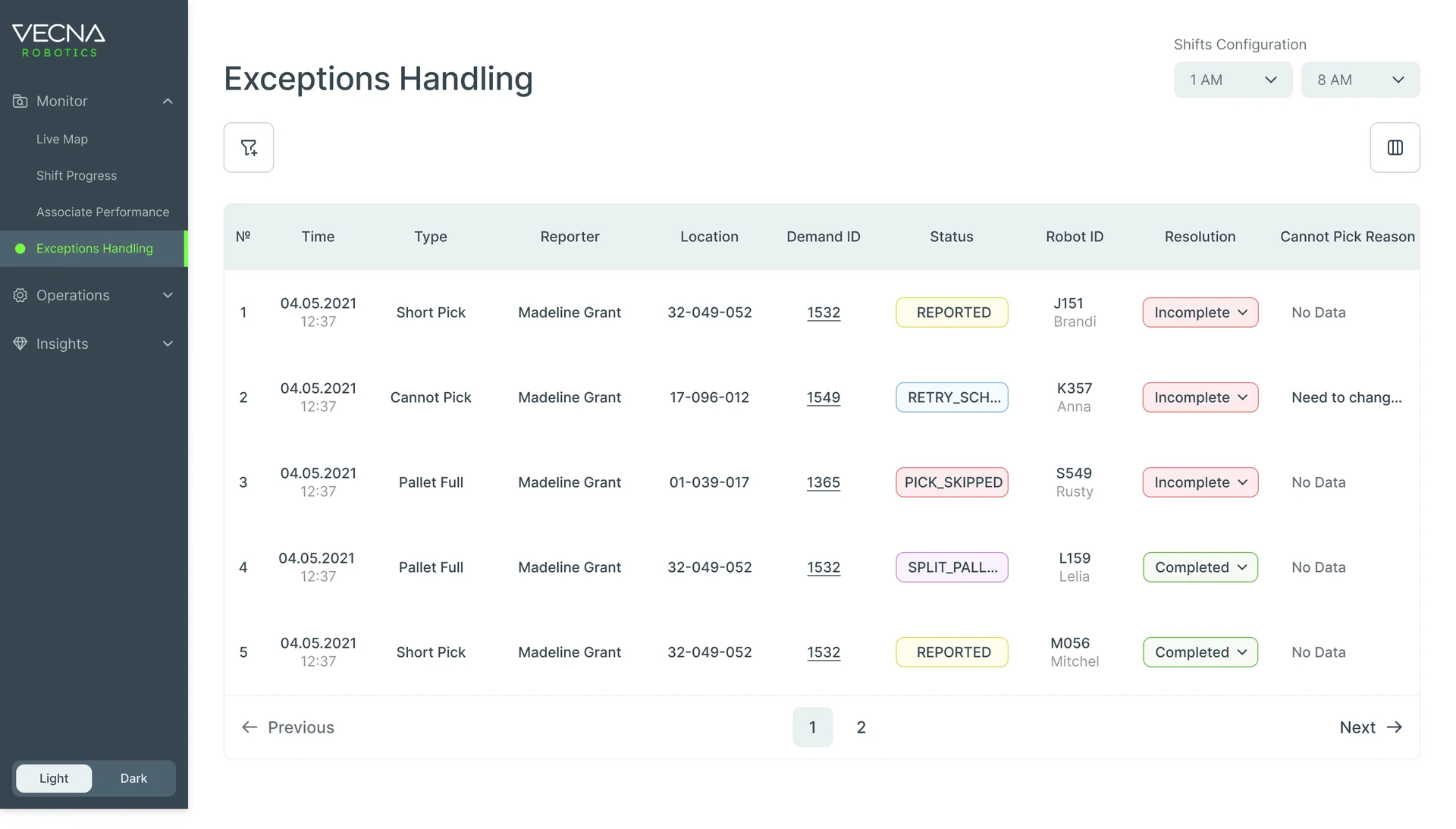
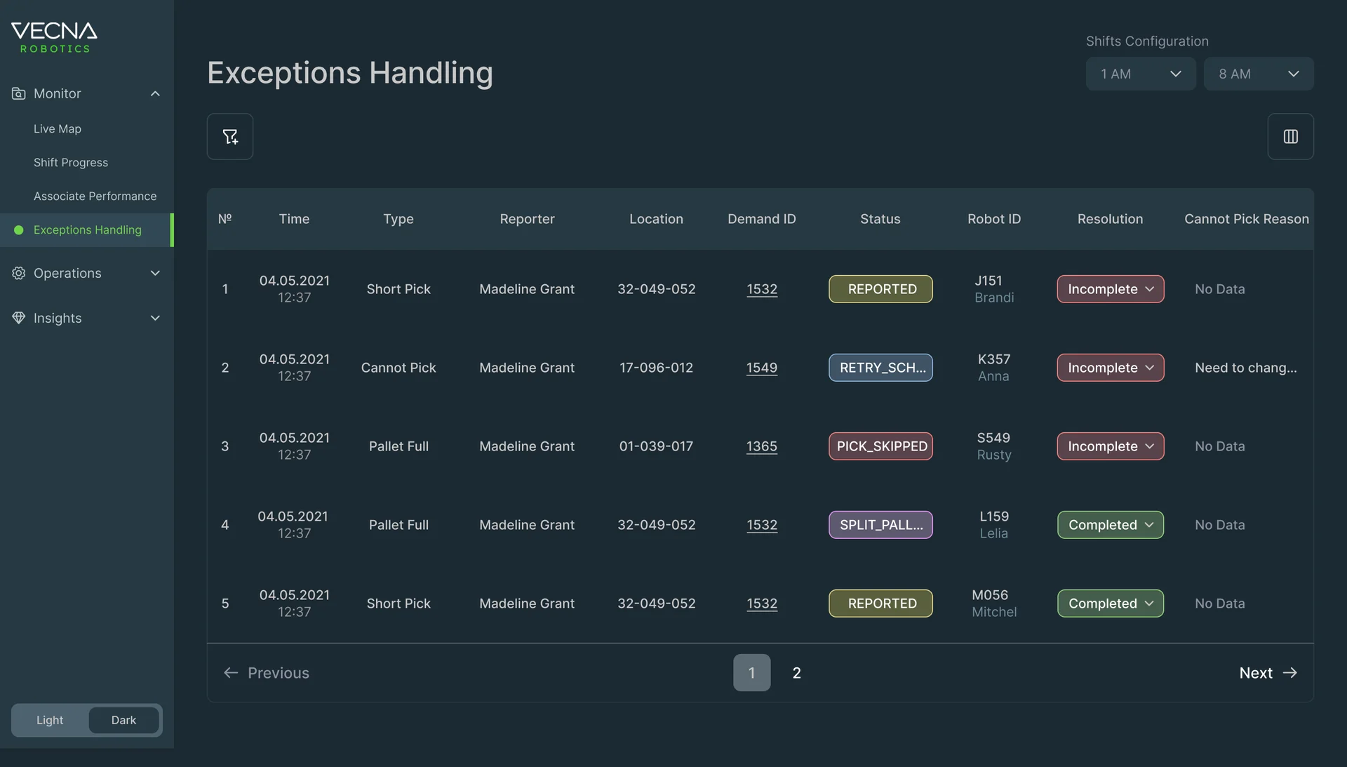
- Each exception opens with what’s needed to act: type, reporter, pick face, demand, robot, resolution and the item, beside the missions it touches.
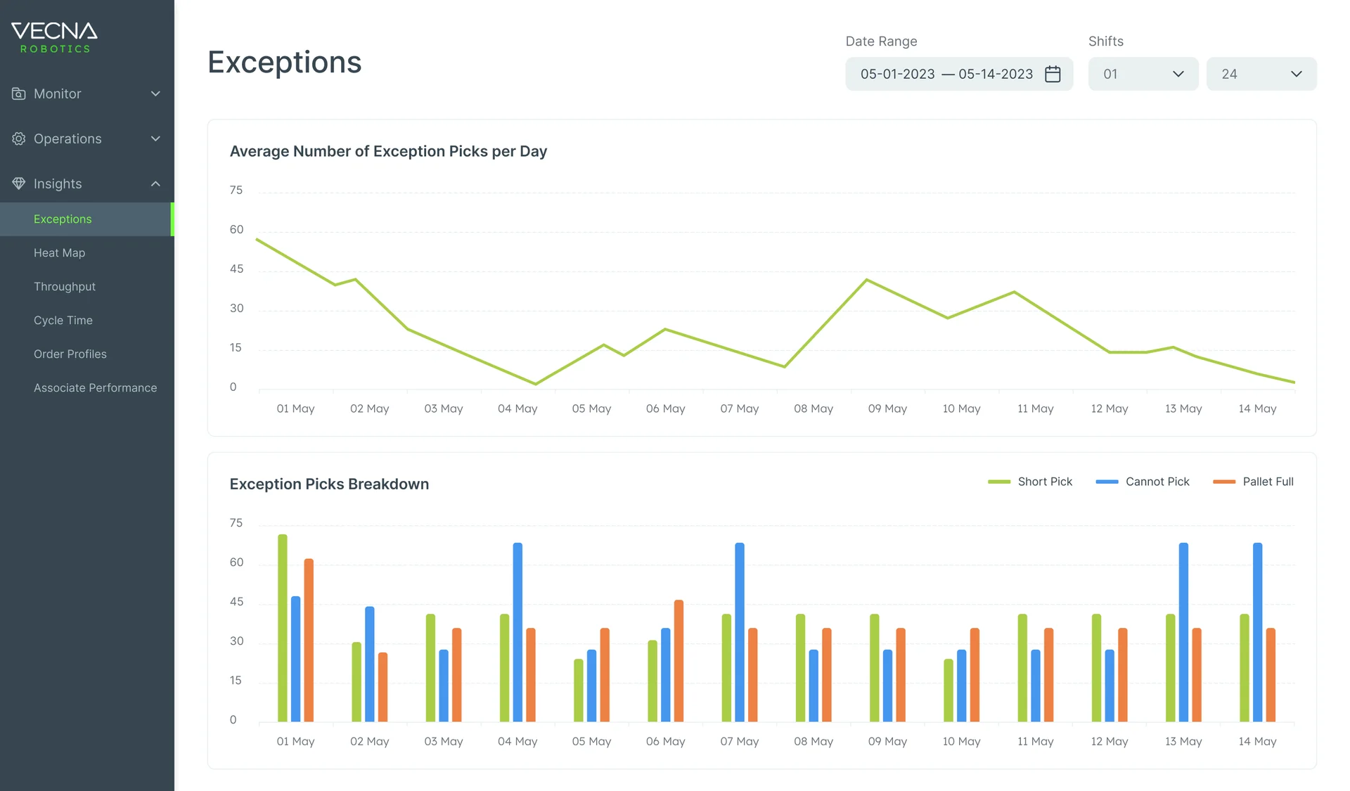
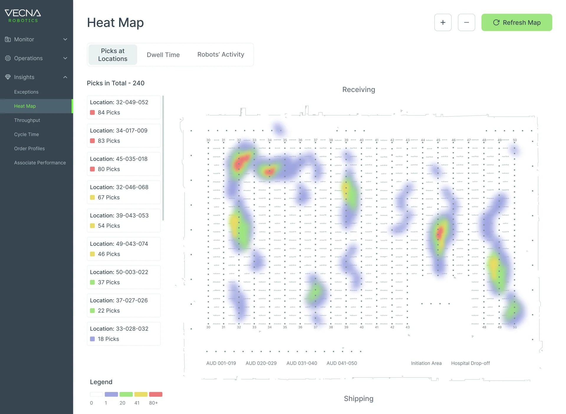
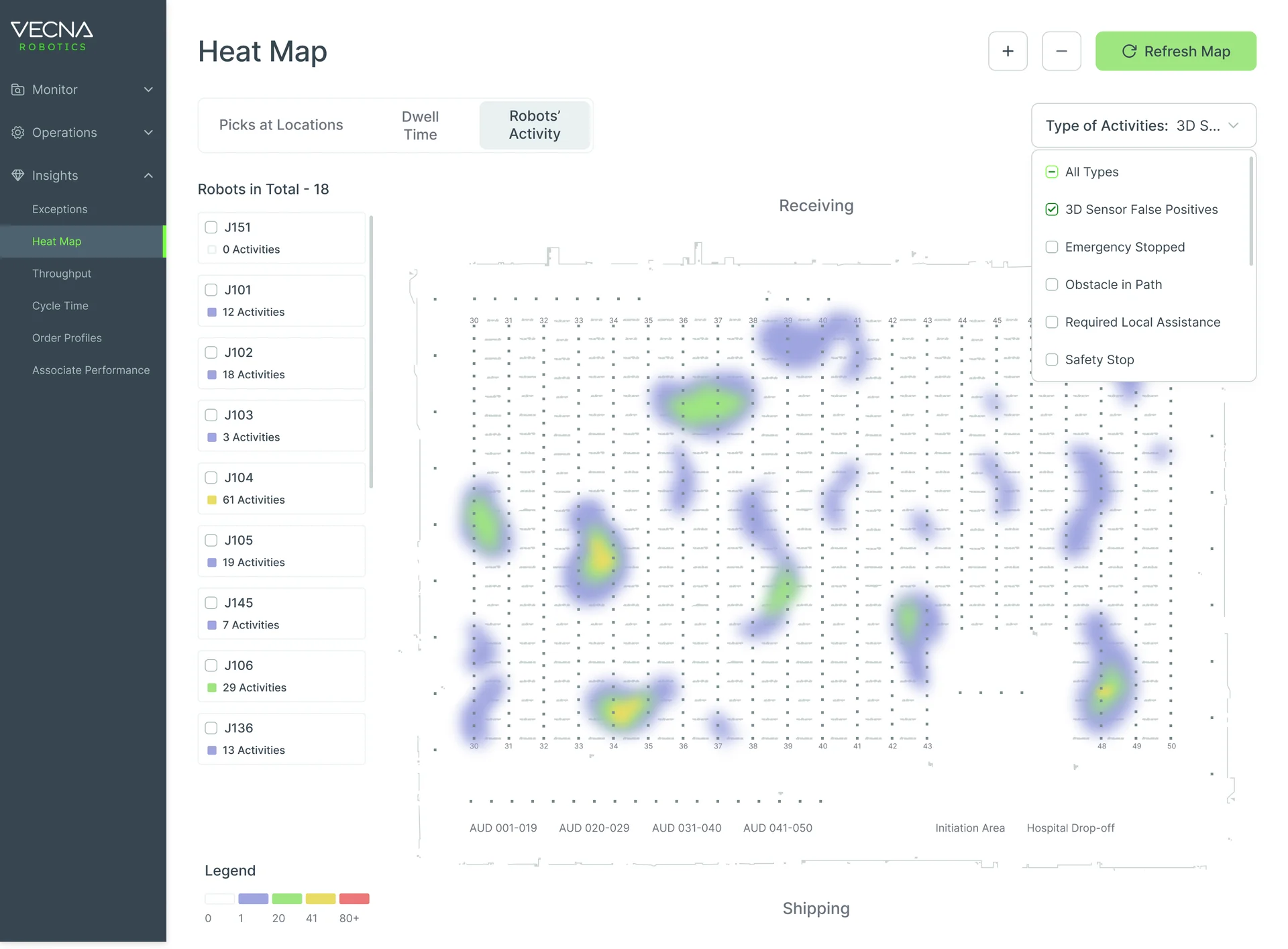
Patterns after the shift
- Found
- What went wrong once is an exception; what goes wrong every day is a pattern, and it hides in the live view.
- Decided
- Analytics kept apart from monitoring: exceptions by day and by type, and heat maps of picks by location and of robot activity across the floor.
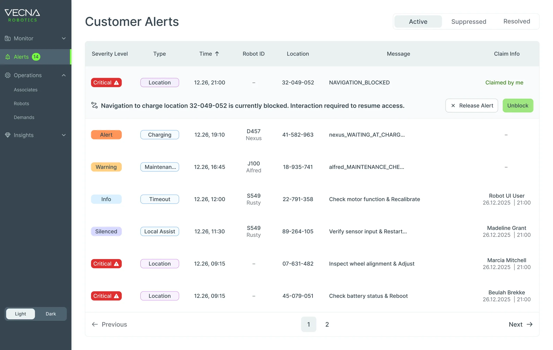
Alerts one person owns
- Found
- An alert two people act on at once gets handled twice, or not at all.
- Decided
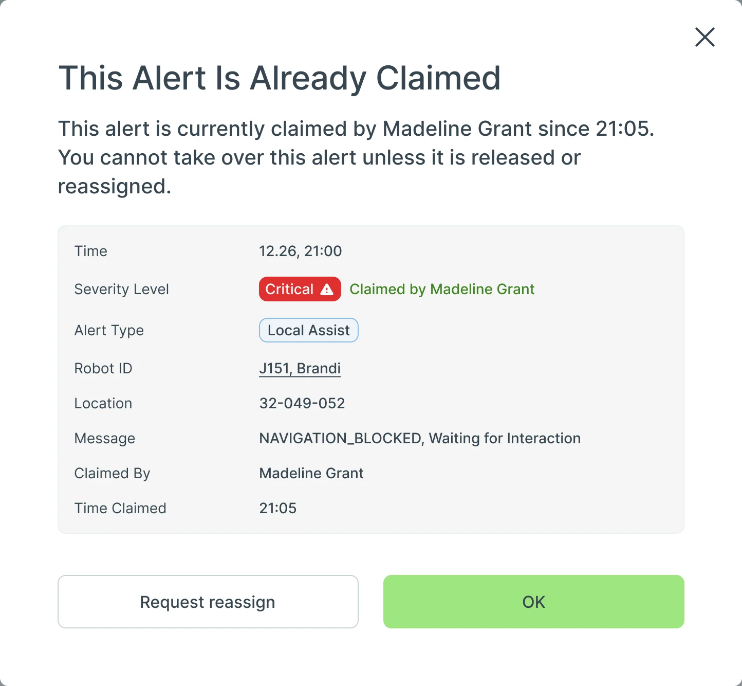
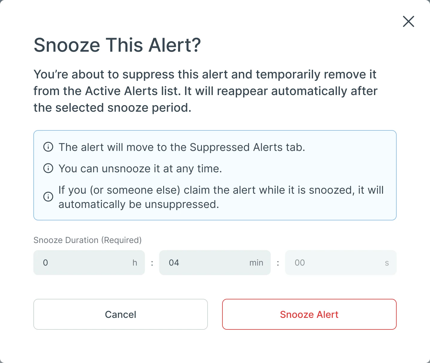
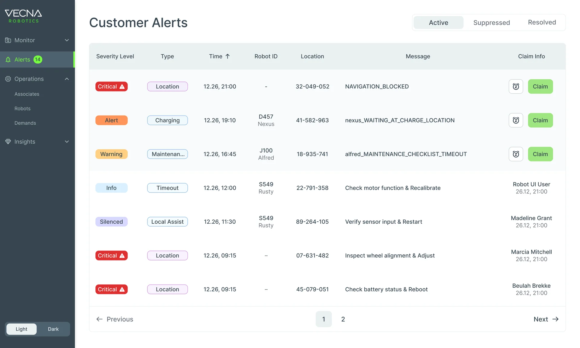
- Claim before acting: a claimed alert unfolds into its message and actions; someone else’s claim stops you with who and since when, and a way to ask for it; and snoozing says what will happen.
UI kits, not a design system
- Found
- Three places, light and dark at the desk, dark only in the aisle, and every screen needed the same answers for statuses, empty data and loading.
- Decided
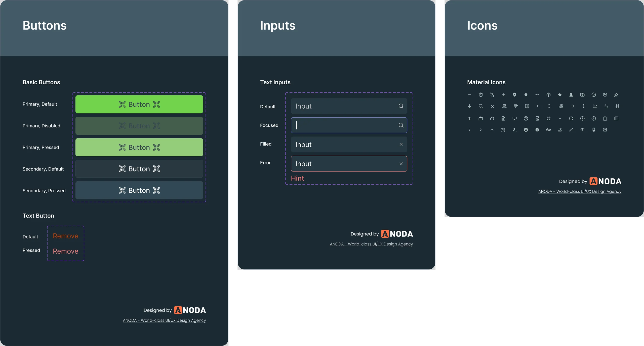
- UI kits for the Console and the handheld, reusable components and a custom icon set, not a full design system: enough that a new screen was assembled, not drawn again.
One empty state, every module
When there is nothing to show, each module says so the same way, and says why.
-
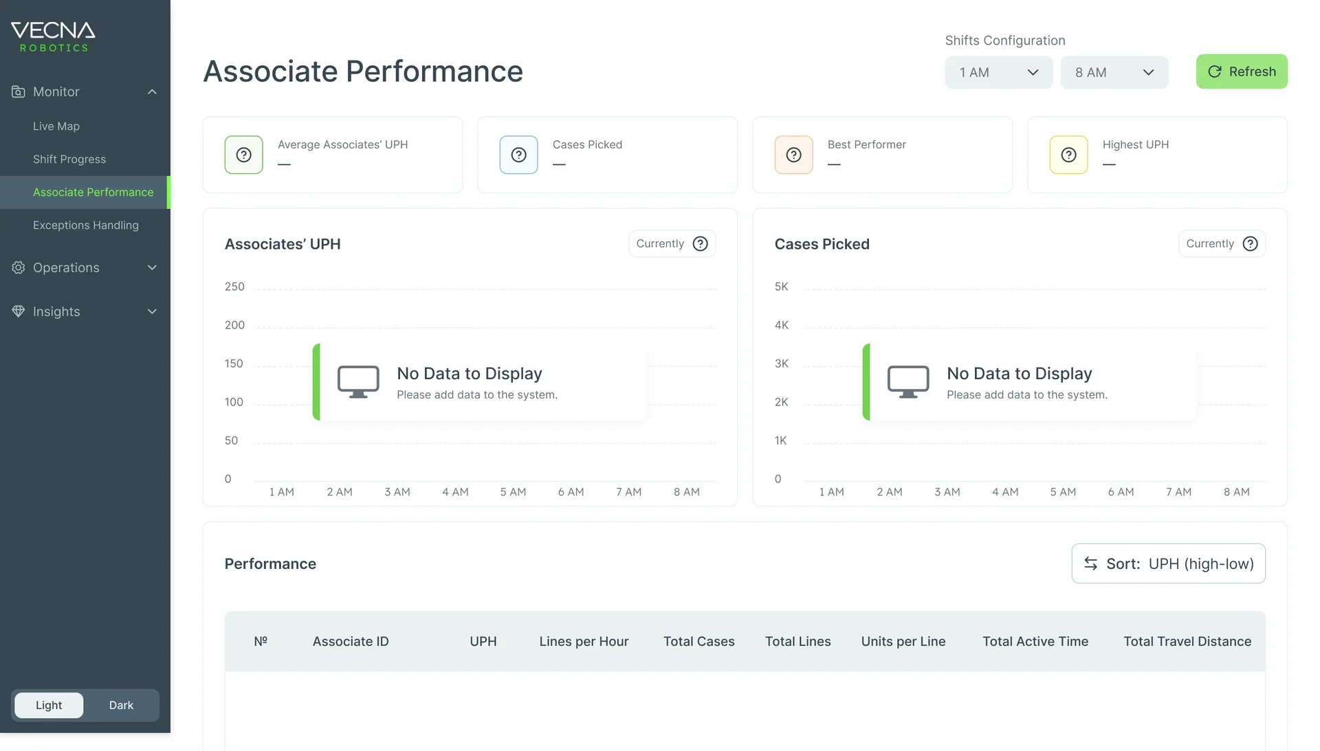
Associate Performance: No data yet for this shift. -
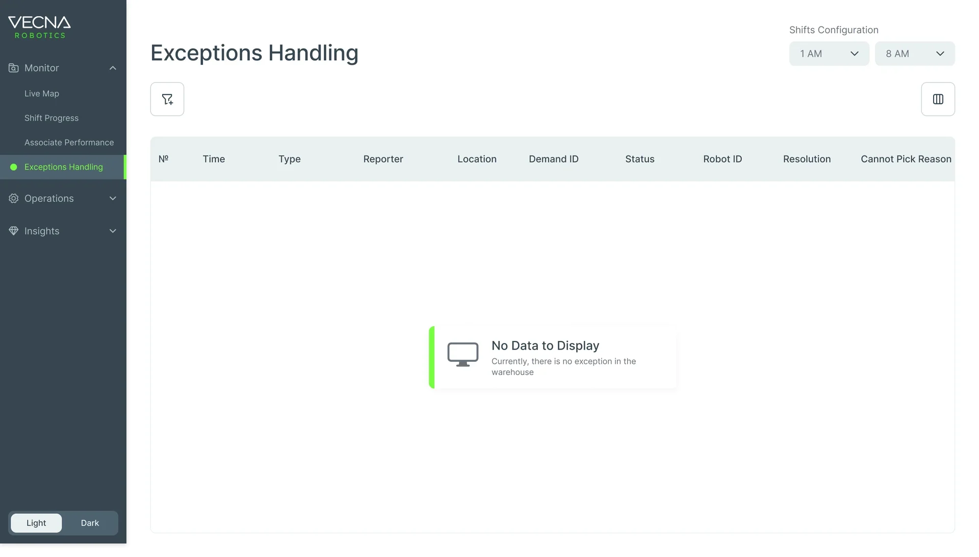
Exceptions Handling: No exceptions in the warehouse.
Shift Progress while it loads
The screen from the top of the page before its data arrives: placeholders in the shape of what’s coming, so nothing jumps when it lands.
-
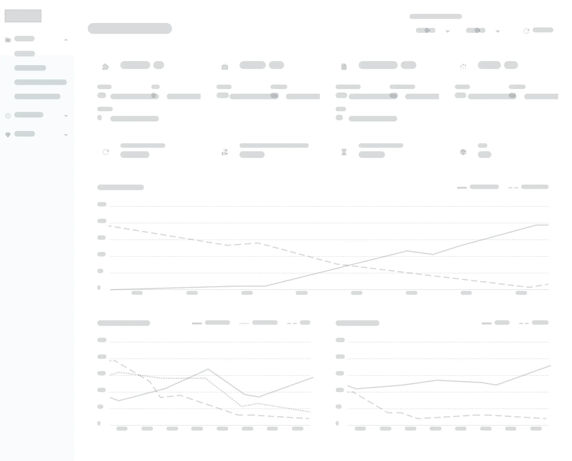
Loading
Light and dark Console
Console modules were drawn in both themes; the handheld runs dark only.
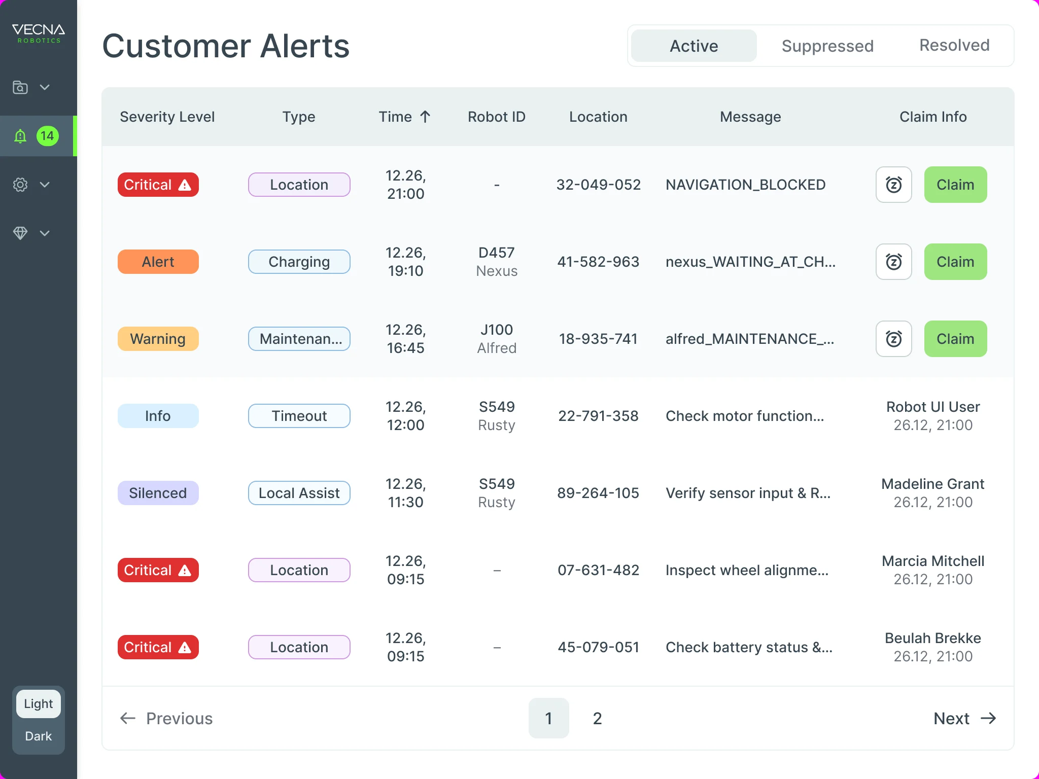
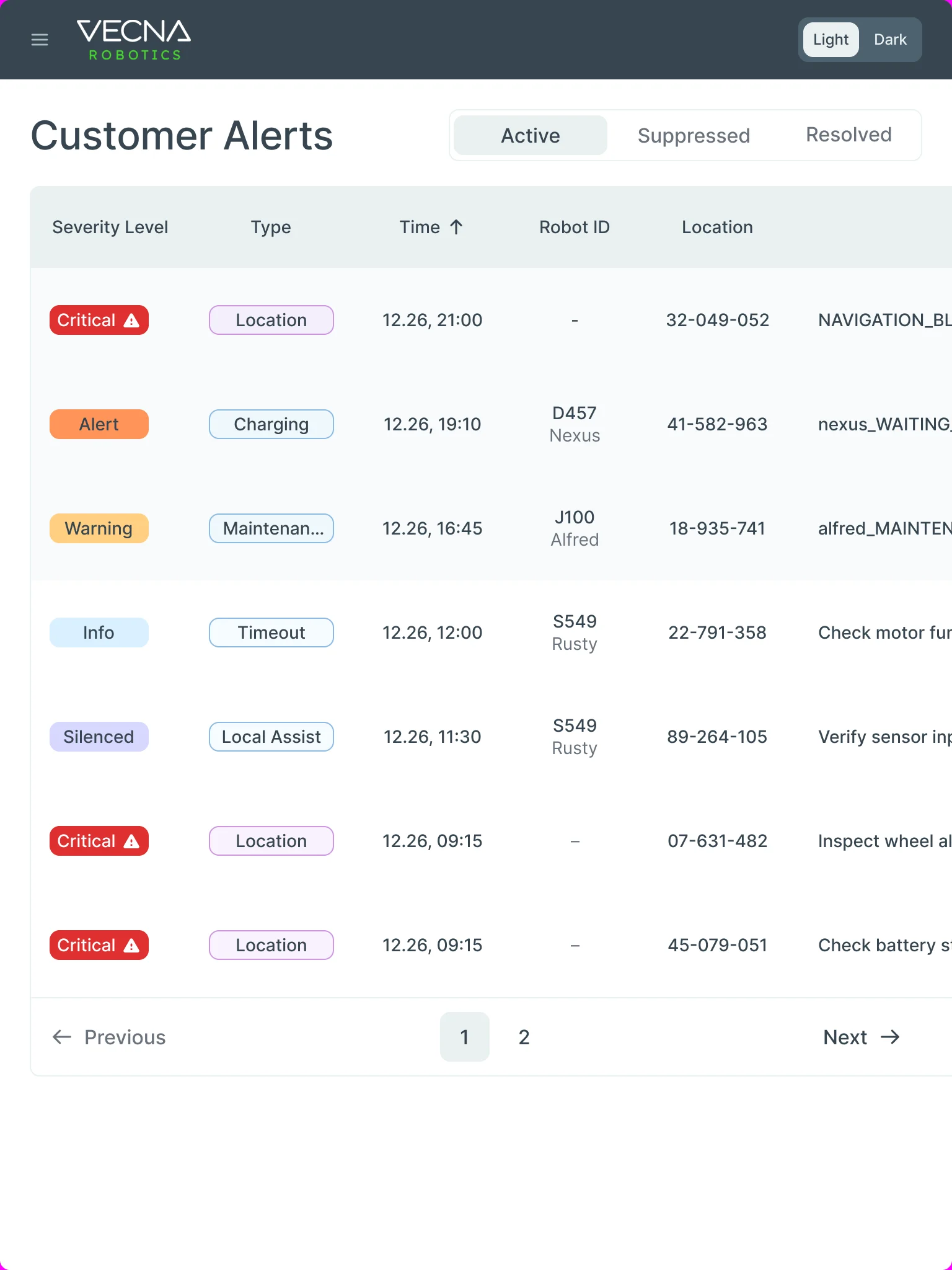
Customer Alerts from desk to tablet
- Kept
- The table’s order: severity, type, time, robot, location, message and who claimed it, and the Active, Suppressed and Resolved tabs.
- Changed
- The side menu folds to icons at 1024 and behind a menu button at 768; the table keeps its columns and scrolls sideways instead of squeezing them.
A handoff Vecna’s team could build from
Each product ended in organised client files rather than a folder of screens.
- UI kits
- Colours, type, buttons, inputs, messages and states for the Console and the handheld.
- Custom icon set
- Icons drawn for the Console’s menus, tables and maps.
- Screen map
- Every module’s screens and states laid out in order and linked.
- Clickable prototypes
- The Console flows and the handheld flows, clickable end to end.
Flows in the handoff
- UI audit of the existing Console
- Wireframes
- Console dashboard: robots, pickers, demands and exceptions
- Associate performance: patterns after the shift
- Customer Alerts: who may act on each alert
- Screen map and clickable prototype
- Text styles
Where the product ended up
CaseFlow redesigned as one product across three places: a Console that sets up the shift, shows robots, demands, pickers and exceptions live and reads the patterns afterwards, in light and dark; a dark, scan-first handheld on the Zebra WS50 that walks a picker through each task, error and break; and Customer Alerts that one person claims, snoozes, hands over and resolves, with its history, on desktop and tablet.
Delivered to Vecna’s own team as UI kits, a custom icon set, a screen map and clickable prototypes; we didn’t design the robots’ own interface, and we don’t claim results for the warehouse.
- screens across the three products
- 192
- connected products: Console, handheld app, Customer Alerts
- 3
- people on the ANODA team
- 3
- Console themes
- Light + dark
Afraid your people and your robots will drift out of step?
We designed CaseFlow so a manager at a desk, a picker in gloves and a robot fleet work from the same state of the shift. Bring us your product, and we’ll show you where the handoffs between them break.
More work like this
Three more products with dense data, many roles, or one system to keep consistent.
-
AI Hi-Tech · SaaS
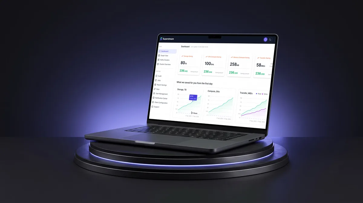
Superstream
Turned a Kafka management platform’s dense technical data into one calm, consistent interface for DevOps teams.
- 3000+ Screens designed
- 1500h+ Design hours
-
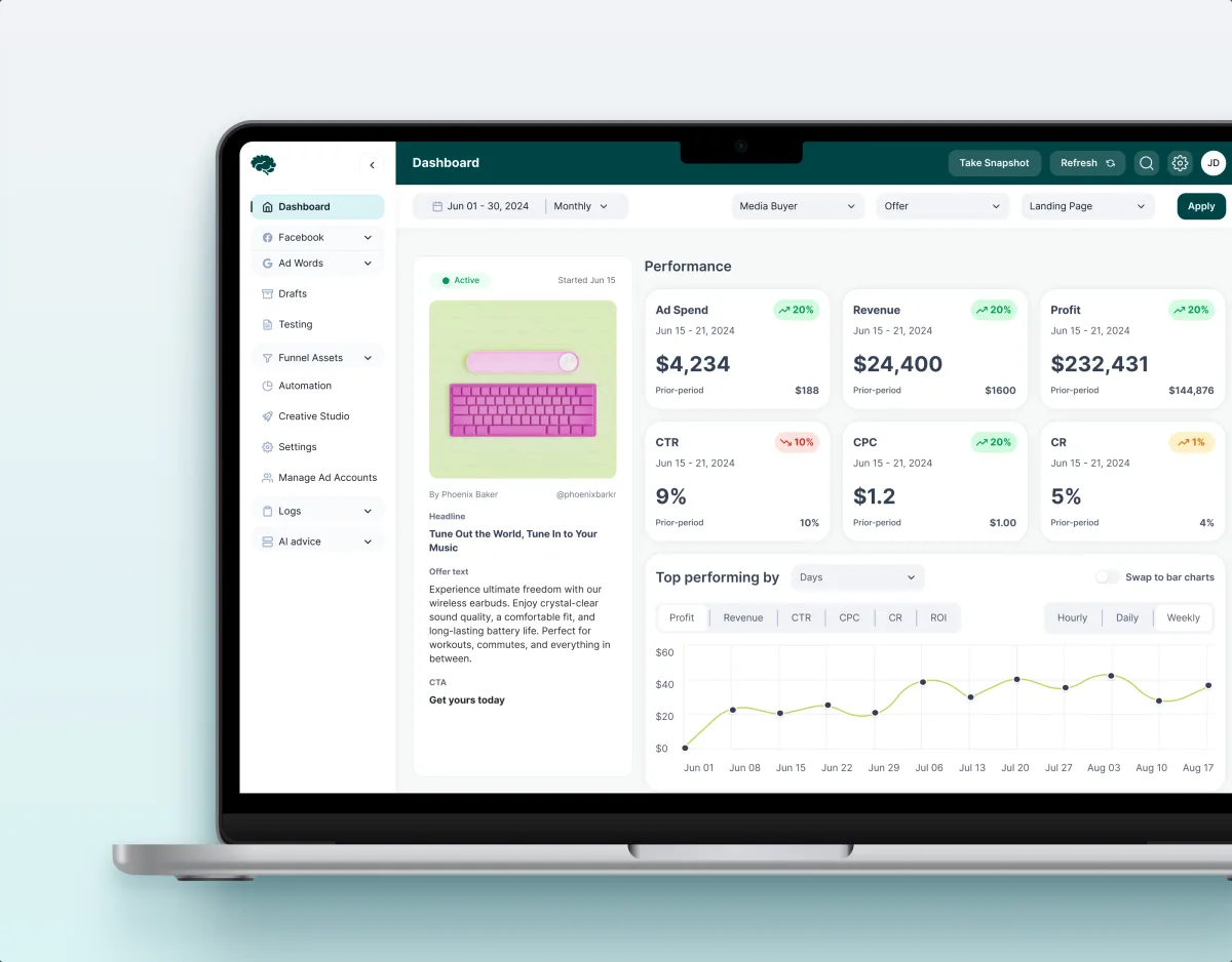
MarTech · Ads analytics · Web SaaS
Concussion Media
Redesigned a paid-traffic analytics SaaS, from dashboards and funnels to automation rules and creative approval.
- 400+ Screens and states
- 11 Modules designed and approved by the client
-
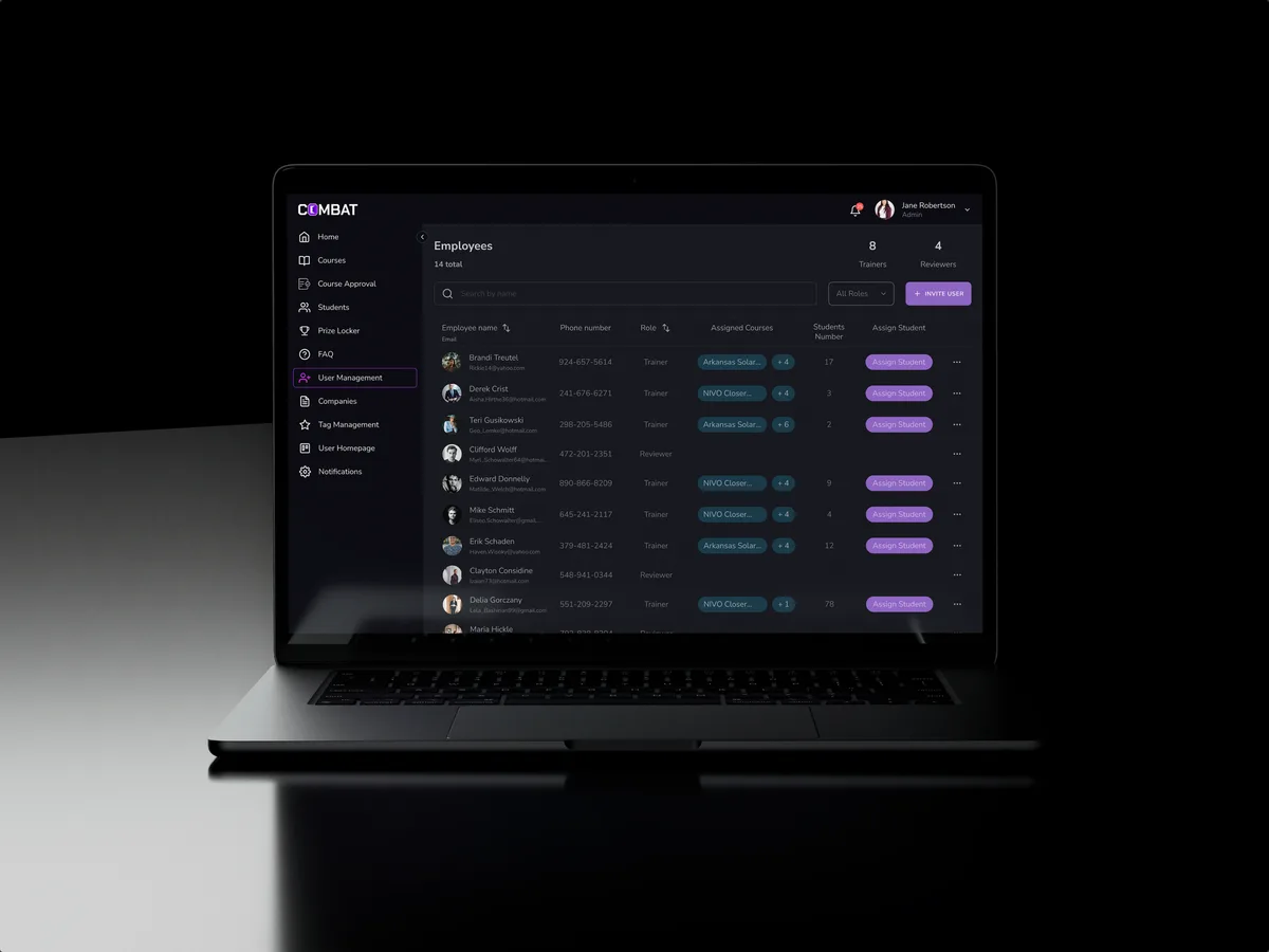
Sales training · Desktop web platform
Combat Sales
Reworked a sales-training platform for five roles, keeping the look its users already knew.
- 80+ Final desktop screens and interaction states
- 5 Roles in one platform