
Vineyard mapping, from the office to the vine
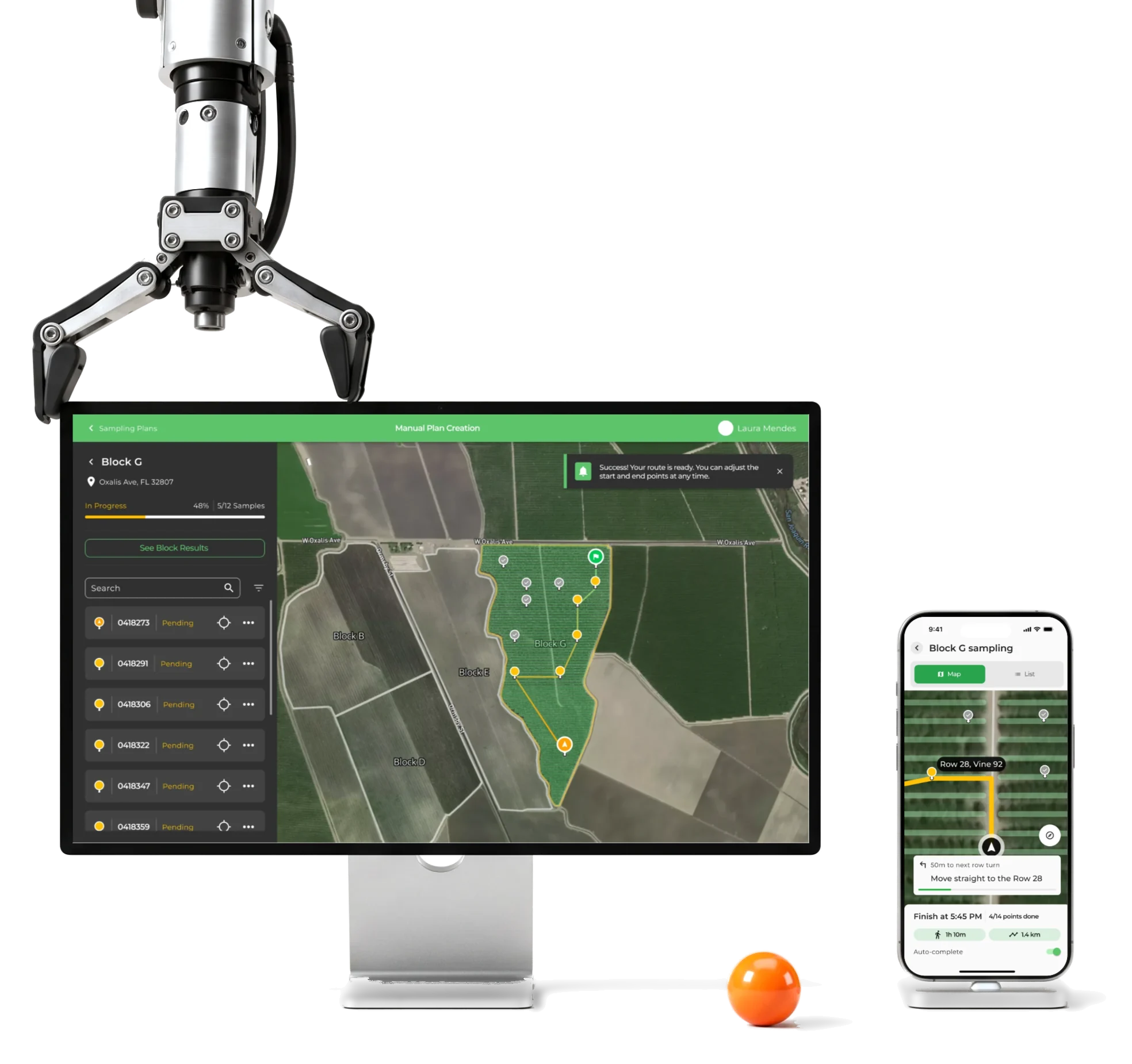
VineView turns aerial imagery into crop data on a map for vineyard teams.We designed new features for the desk and the field.
- 150+
- screens and states, desktop and mobile
- 4
- features yield, history, paths and polygons
- Web + mobile
- planning at the desk, work in the rows
Project summary
VineView is a precision-viticulture platform: aerial imagery of a vineyard and the crop data behind it, on a map used at a desk and in the rows. Over one continuing relationship we designed new features into the existing product, as desktop web app design for planning and mobile field screens for the work itself, with components for the new scope .
How the work ran
- Start
- A paid UX audit of the existing product.
- Shape
- One continuing relationship, one feature engagement after another.
- Each feature
- Requirements and domain questions, flows, wireframes, final screens, handoff.
- Our part
- Design and handoff. Development, imagery and the routing and yield calculations are VineView’s.
What the product holds
One chain, from the picture taken above the vineyard to a sample taken in it:
-
Property
- Fields
- Blocks
- Rows and vines
-
Imagery
- Aerial layers
- Vine counts
- Crop zones
-
Yield
- Productive vines
- Yield data
- Adjustments
-
History
- Earlier estimates
- Uploaded data
- Reuse
-
Sampling
- Plans
- Points
- Paths
-
Field
- Route
- Data entry
- Polygons
- Known and New
- New tools in the look and logic viticulturists already use.
- Desk and Row
- Planned on a big screen, carried out on a phone with one free hand.
- Calculated and Understood
- The route and its time come from VineView; the screens explain the order and the time.
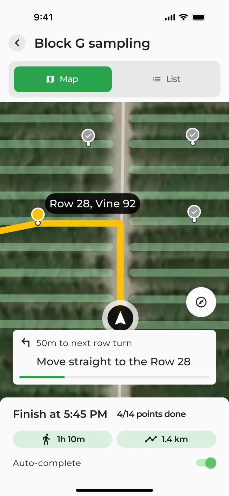
The next vine, read at a glance
- Found
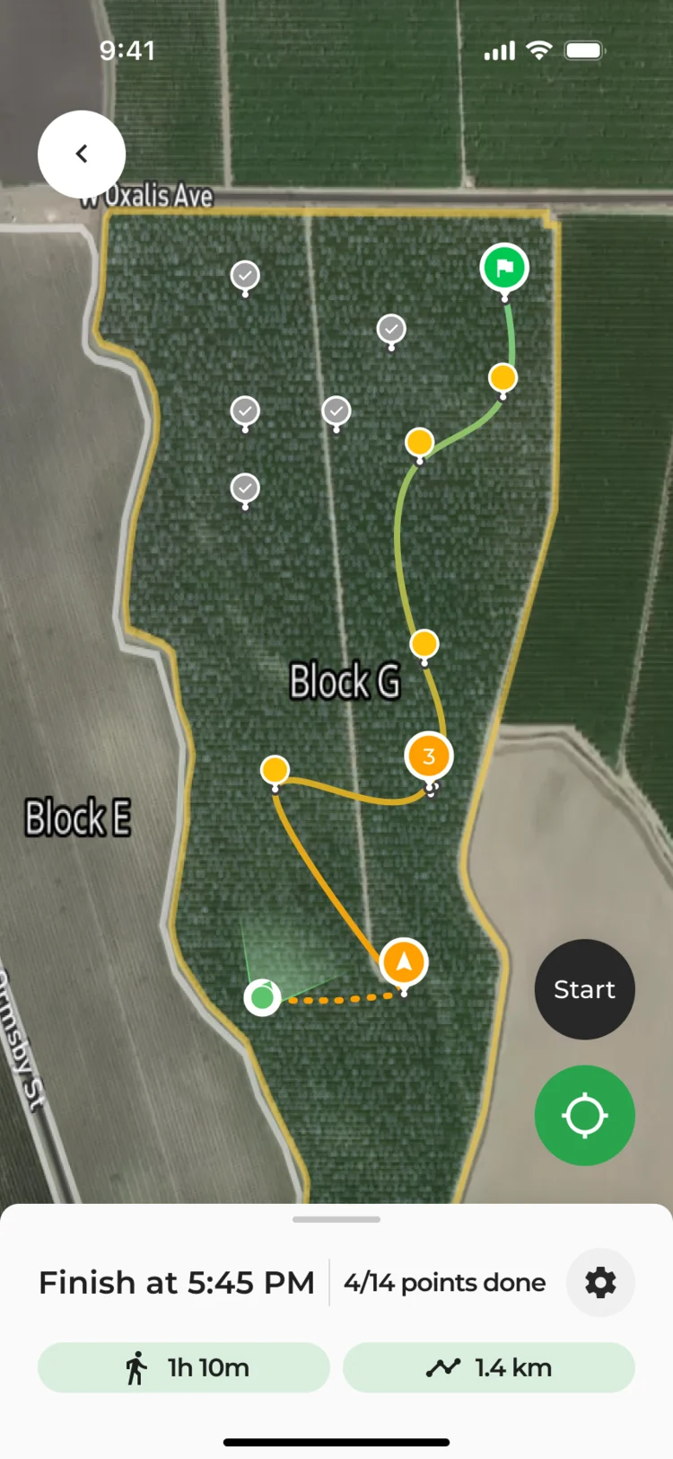
- In the rows a collector has one hand free and a few seconds per look, and a map full of points doesn’t say where to walk next.
- Decided
- One screen read top to bottom: which plan, the target vine on the map, the next turn, then the finish time and what’s left.
- For the user
- A collector knows where to go and how much is left without opening the list.
-
Which plan
The plan’s name, and the switch between map and list.
-
The next vine
The target named on the map, the path drawn to it.
-
The next turn
How far, and what to do there.
-
What’s left
Finish time, points done, time and distance.
How the work progressed
Feature by feature: the domain and the requirements first, then flows and wireframes, then final screens and the handoff.
-
Discovery
How growers estimate a harvest, sample a block and walk it, and where the existing product got in the way
Artifact A UX audit, requirements questions and a competitor review
-
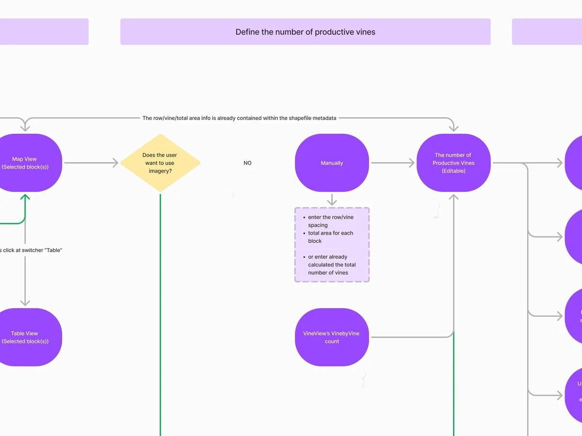
User Flow
Every branch of yield estimation, from choosing blocks to adjusting the result
Artifact User flows and the information architecture
-
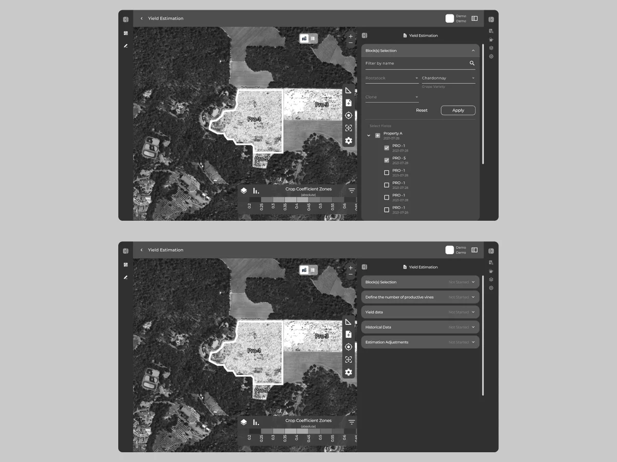
Wireframes
The estimation steps, tested on real aerial maps before any styling
Artifact Desktop and mobile wireframes
-
UI
Paths, polygons and the field route in the platform’s own look
Artifact Final desktop and mobile screens, their states and components
-
Delivery
What VineView’s developers needed for each feature
Artifact Screen maps, a clickable prototype and handoff files
Three paths, from the desk to the row
- Found
- Planning happens on a desktop and the work happens on a phone, and every feature added its own branch to a product people already knew.
- Decided
- Each feature’s flow was mapped before its screens: the office path to an optimized route, the field path from a plan to the last sample, and drawing a polygon with its errors.
-
At the desk: from a plan to a route
Pick a block, see its points, optimize the path, adjust the start and end.
Open the full map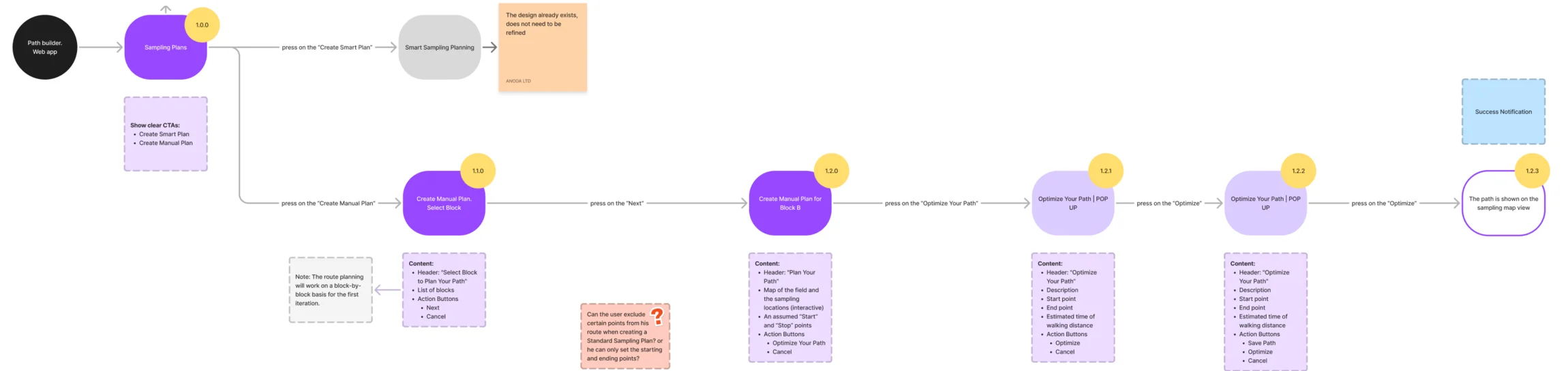
-
In the row: walking the route
Start the route, follow it, pause, get back on track, finish.
Open the full map
-
In the row: drawing a polygon
Points come from the field device; the app shows the shape and stops a broken one.
Open the full map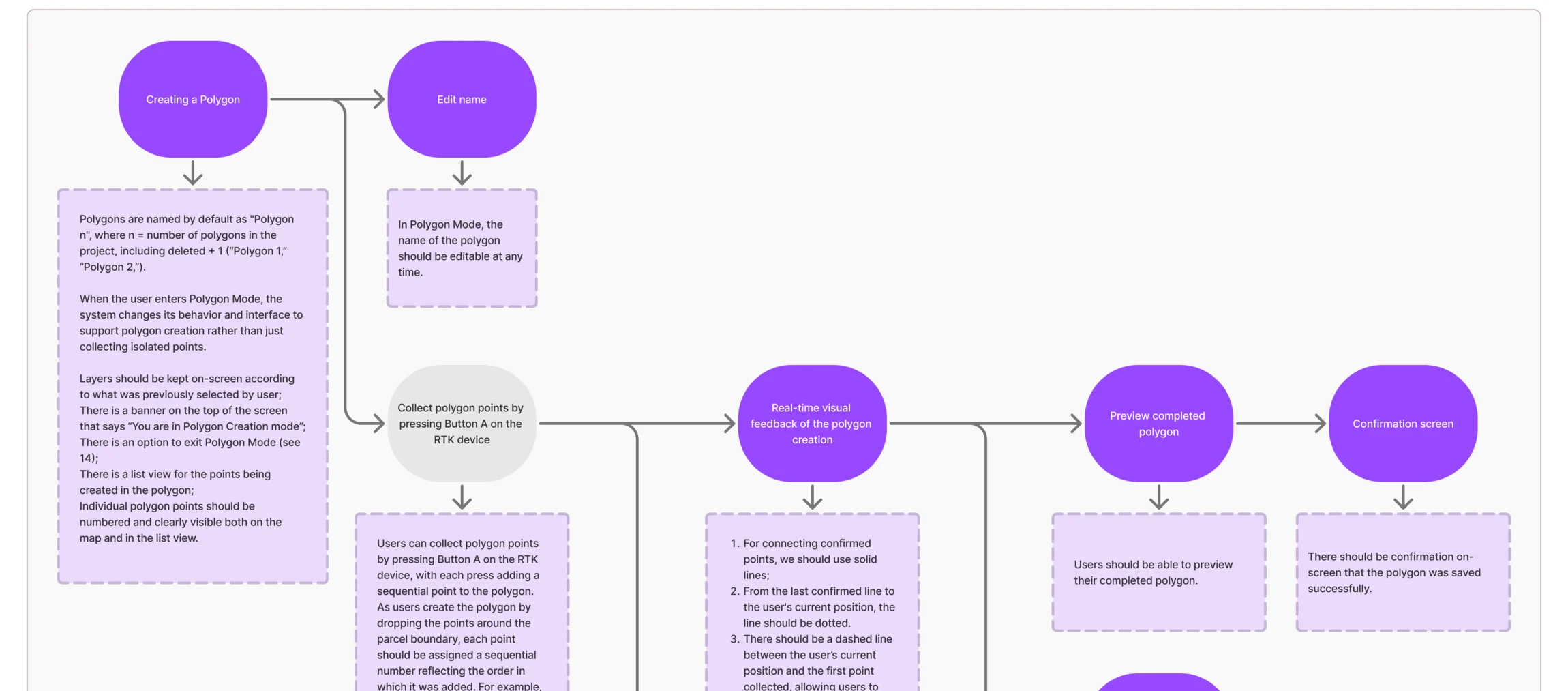
Eight jobs, from the forecast to the row
The desk first: the yield forecast and the sampling plan. Then the field: the route, the samples and the polygons. Every figure on these screens is example data.
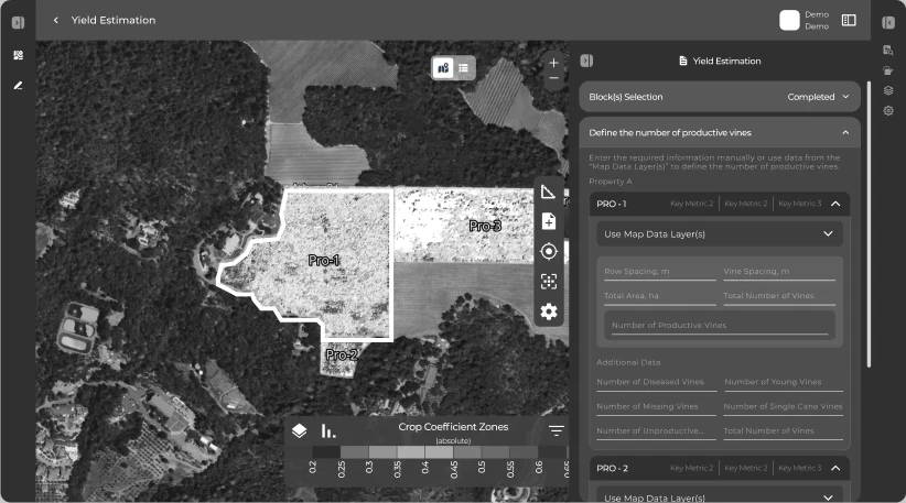
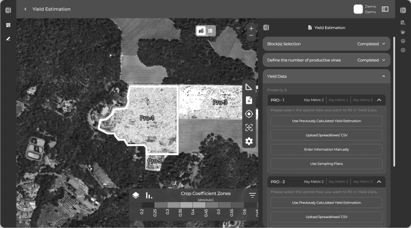
A yield forecast as steps
- Found
- A harvest forecast needs blocks, productive vines, yield data and adjustments, and growers have different parts of it at hand.
- Decided
- A step list beside the aerial map, each step with its status: vines counted by hand or taken from the imagery, yield data entered, uploaded or reused. Designed to wireframes.
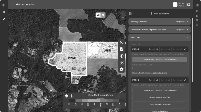
Earlier work, reused
- Found
- Last season’s estimates and sampling plans already hold much of what a new forecast needs, and typing them in again invites mistakes.
- Decided
- Earlier estimates and sampling data offered as a source right inside the step, next to manual entry and uploads.
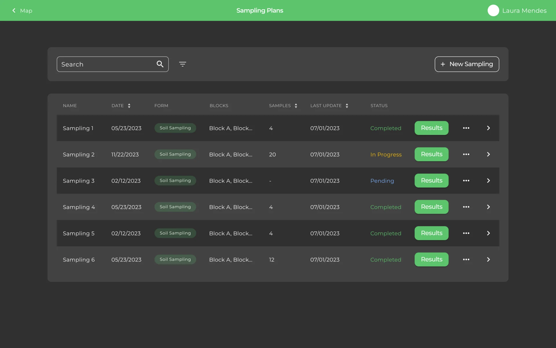
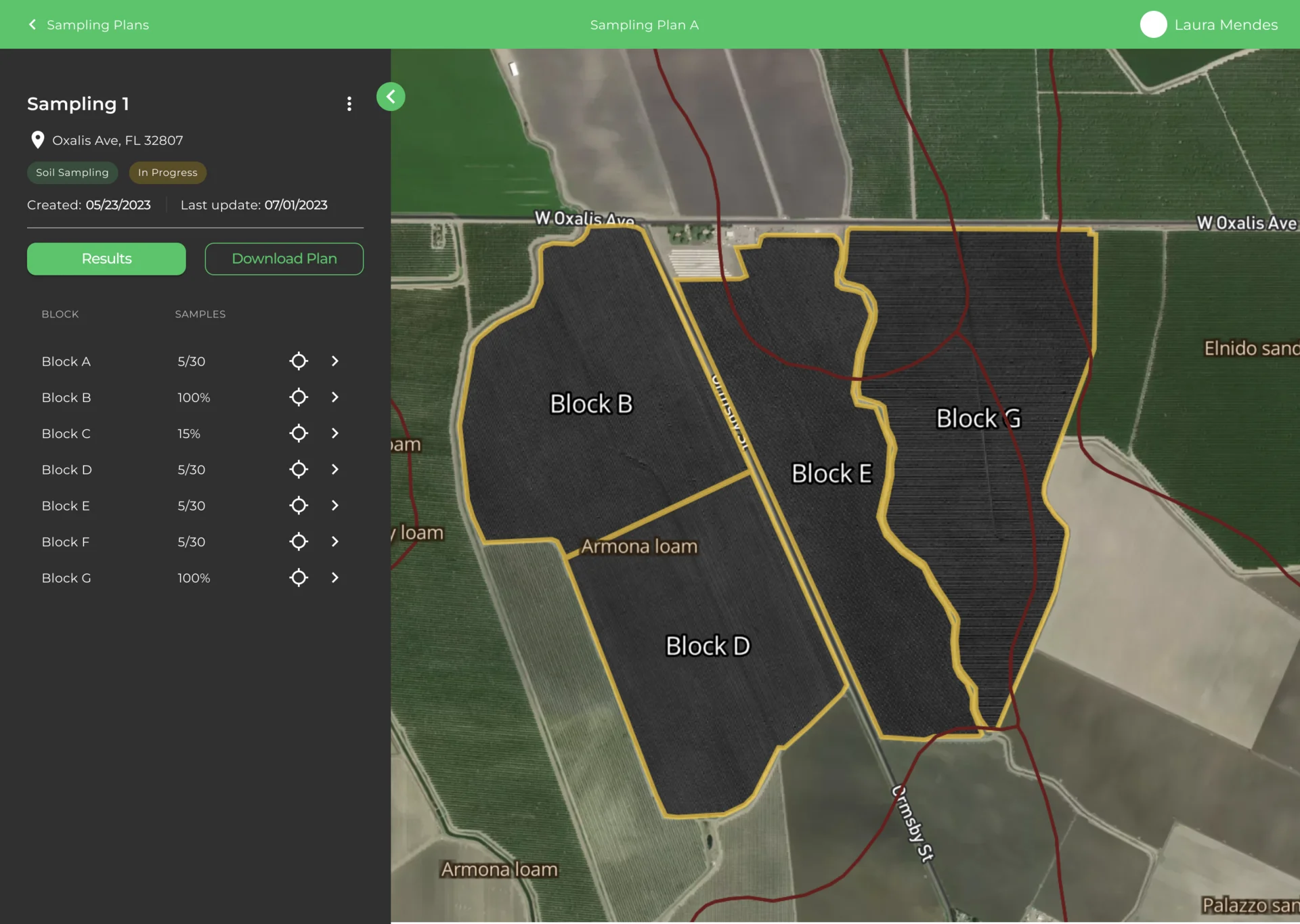
Sampling plans and their blocks
- Found
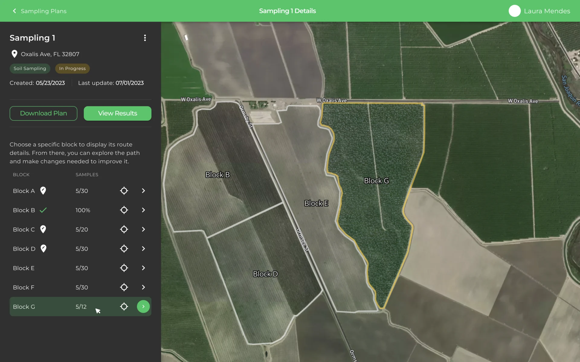
- A sampling plan covers several blocks, and a table of names doesn’t show where the work is or how far along it is.
- Decided
- Plans in one table with their form, blocks, samples and status; a plan opens onto the map with its blocks outlined and each block’s progress.
A path through the block
- Found
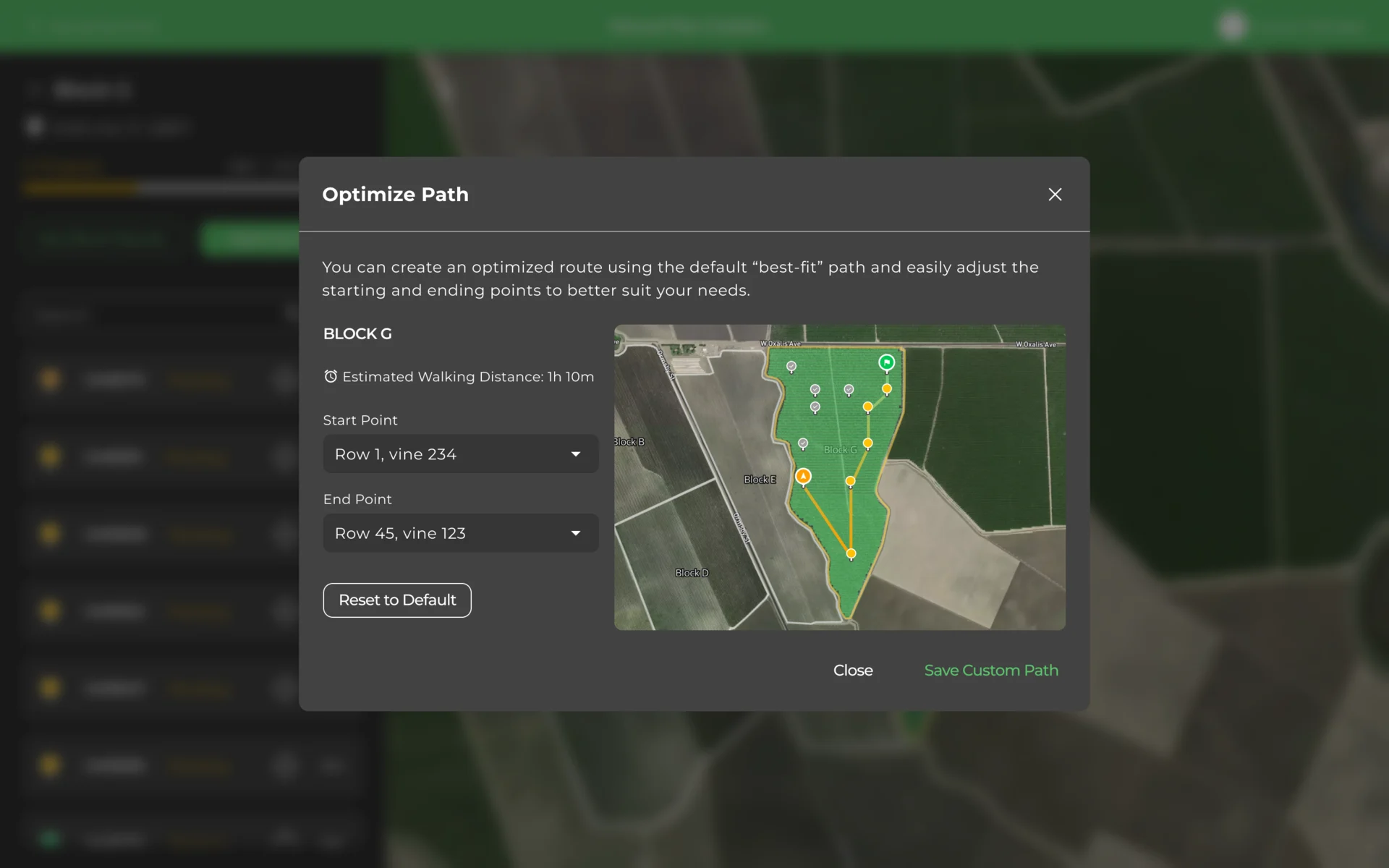
- Collectors lose time walking a block in the wrong order, and a route drawn by the system means nothing if nobody can see why it goes that way.
- Decided
- Pick a block, then optimize: the best-fit path with its walking time, start and end points to change, and a way back to the default.
The plan, on the phone
- Found
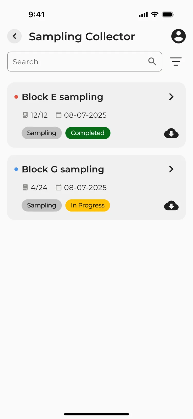
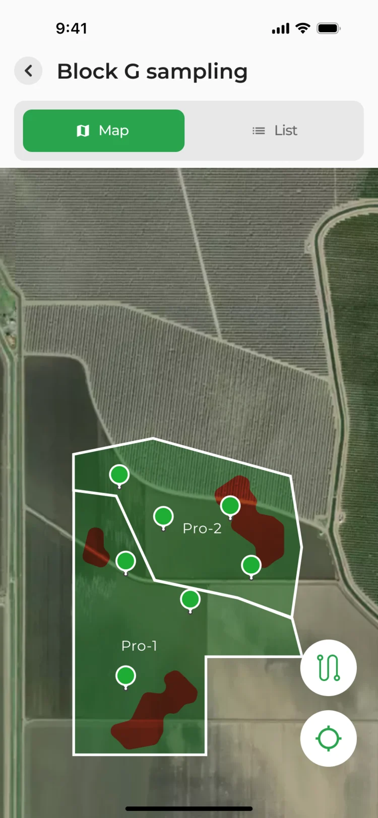
- Collectors start from the plan made in the office, and rebuilding it on a phone in the field is where mistakes creep in.
- Decided
- The phone opens the same plans with their progress, the plan’s blocks on the aerial map, and the route ready to start.
Samples taken on the spot
- Found
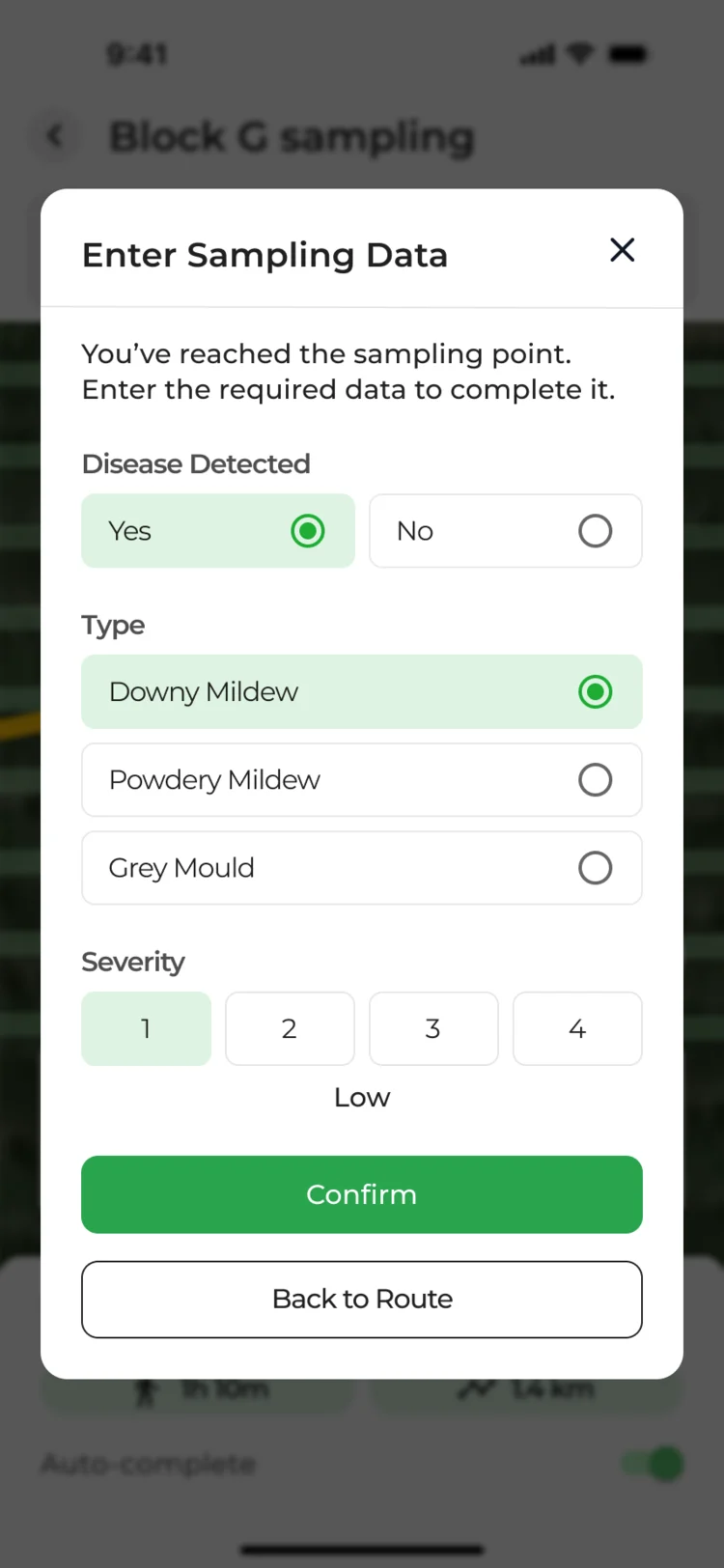
- At each point the collector records what they see, and a long form with gloves on is how data gets skipped.
- Decided
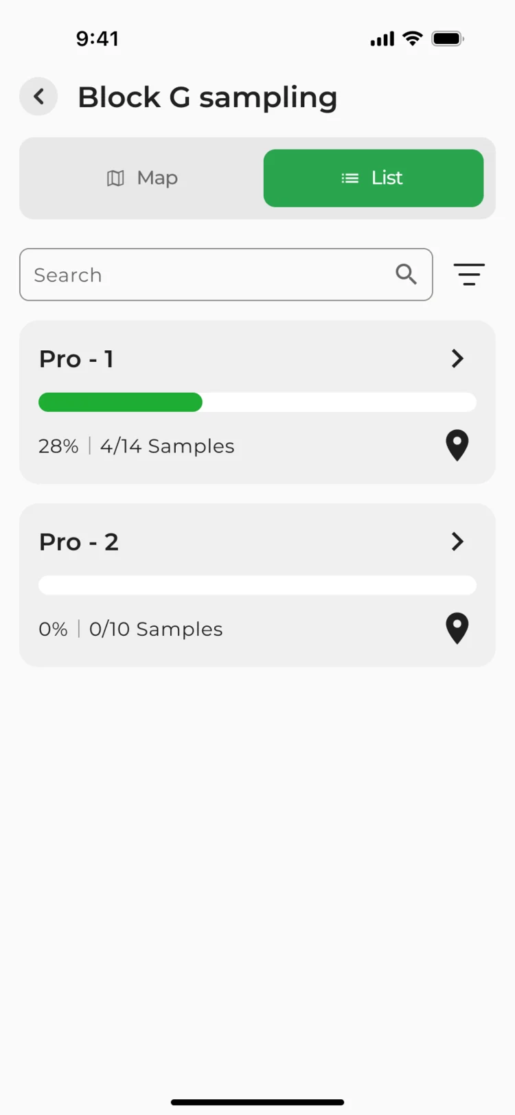
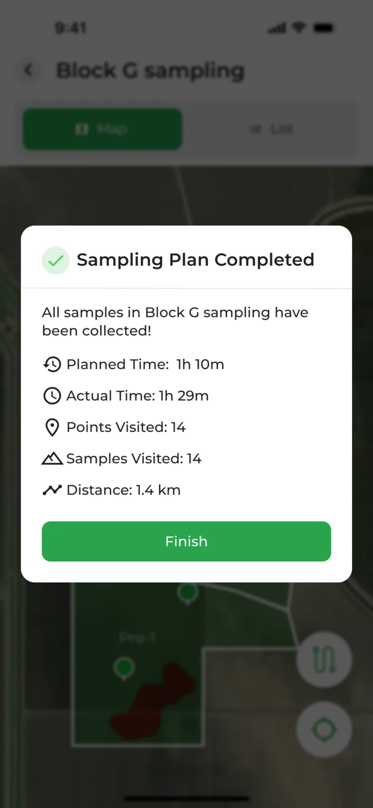
- At the point, a short form: disease detected or not, its type, a severity scale; the plan’s blocks list progress; the end shows planned against actual time.
When the field gets in the way
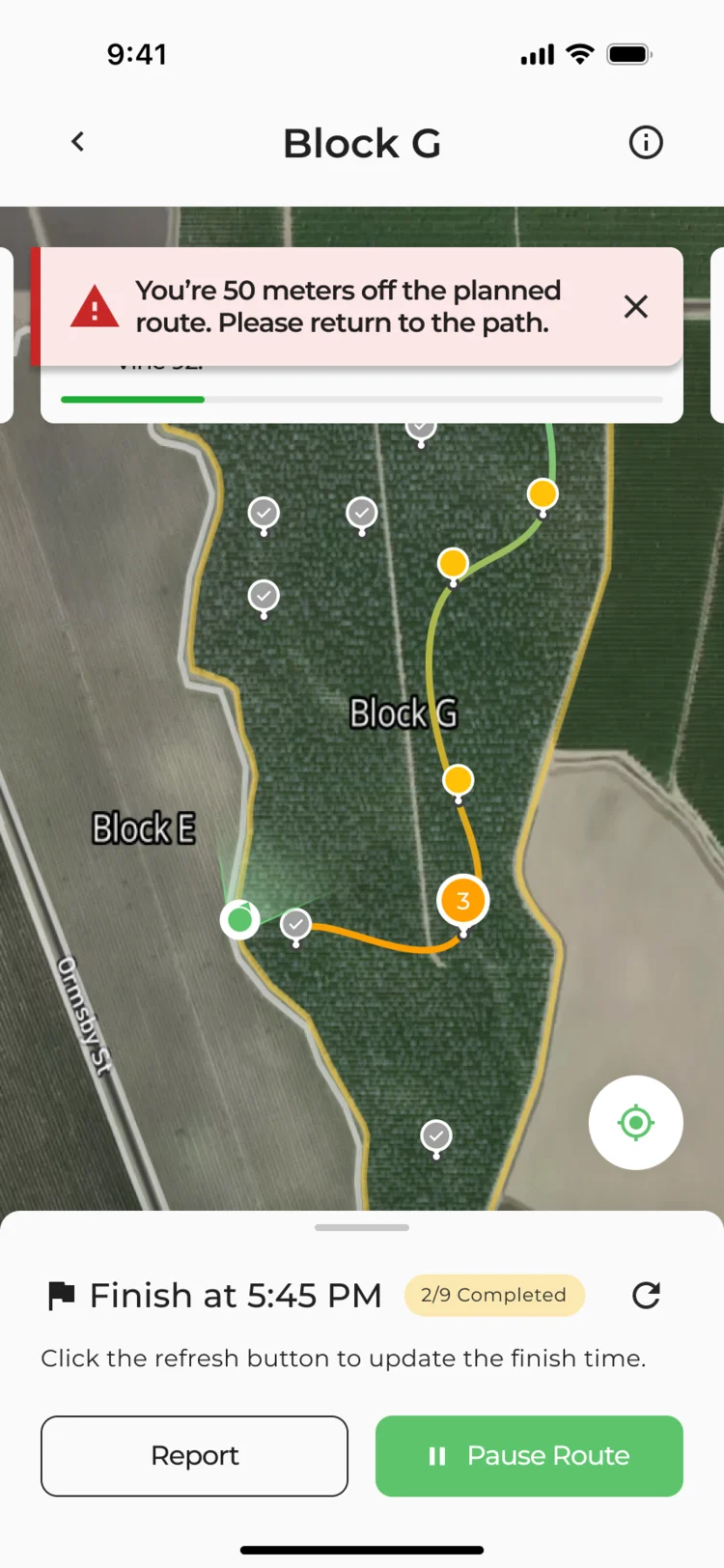
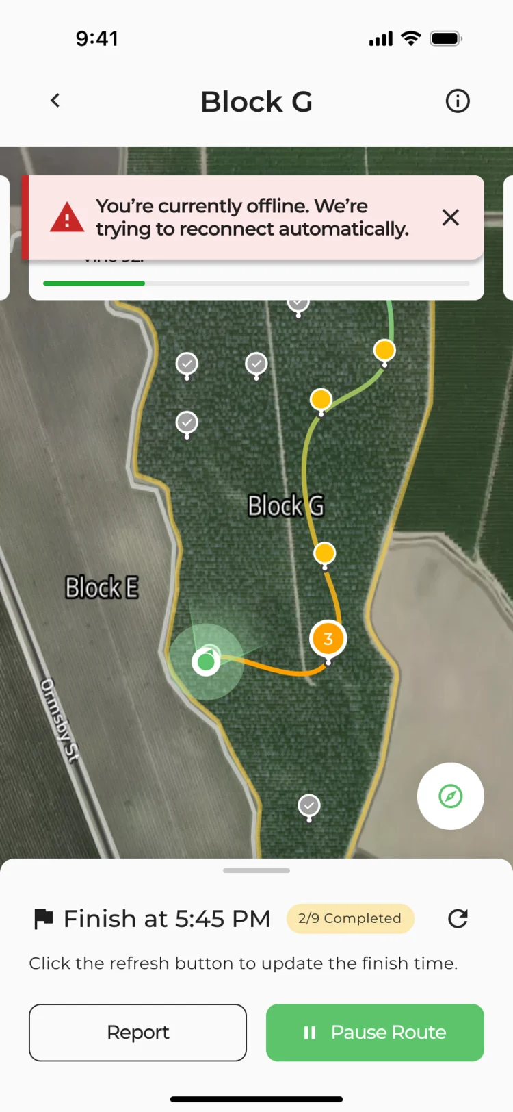
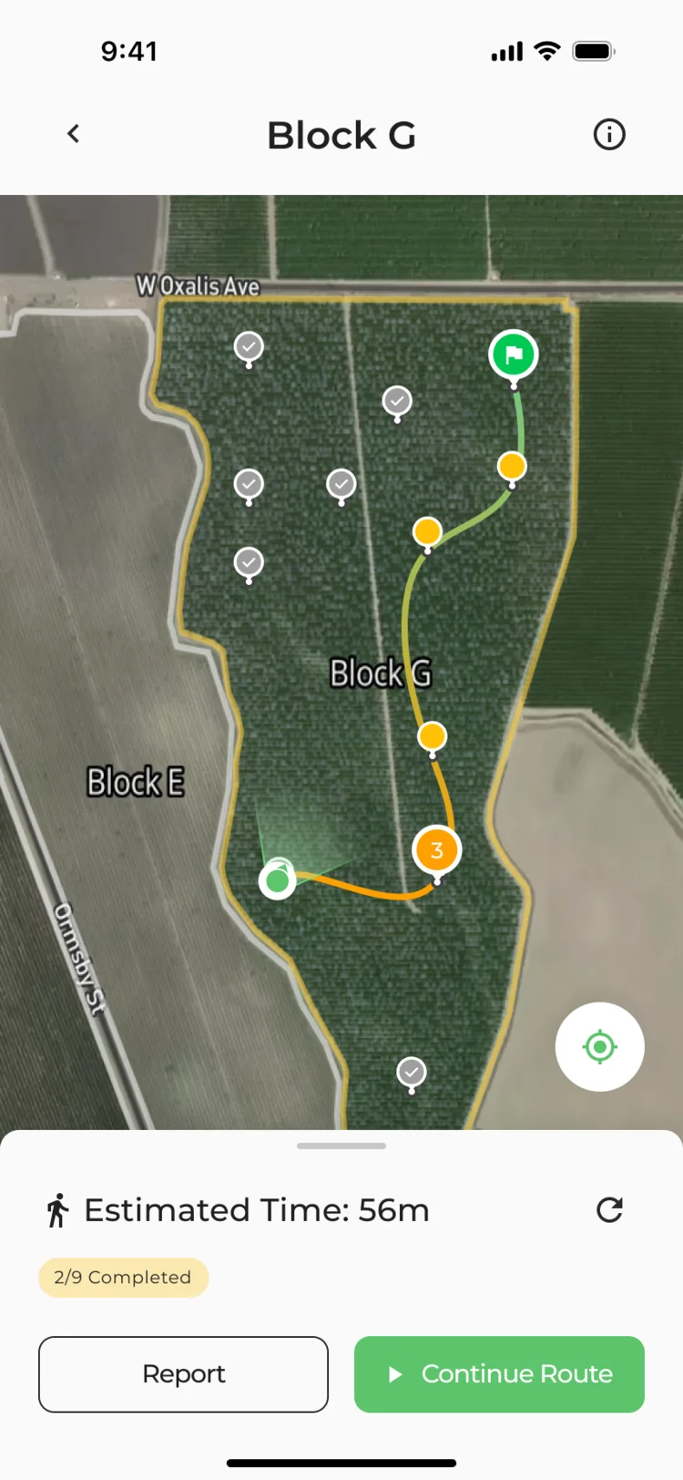
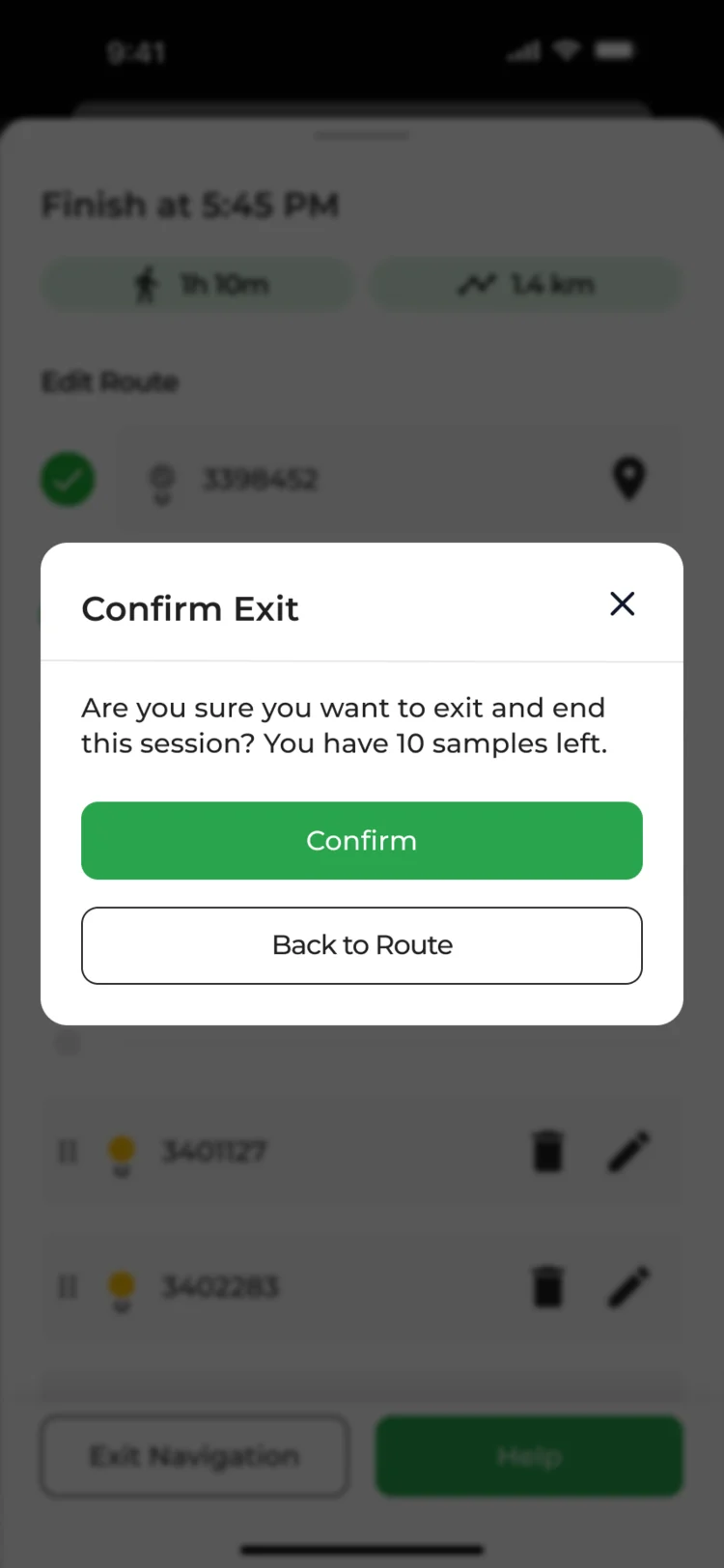
- Found
- Collectors wander off the path, lose signal, stop for a break or leave early, and a route that just breaks loses the work done so far.
- Decided
- Each case has its own state: a warning off the route, an offline notice while it reconnects, a paused route, and a confirmation before leaving with samples left.
A polygon drawn in the field
- Found
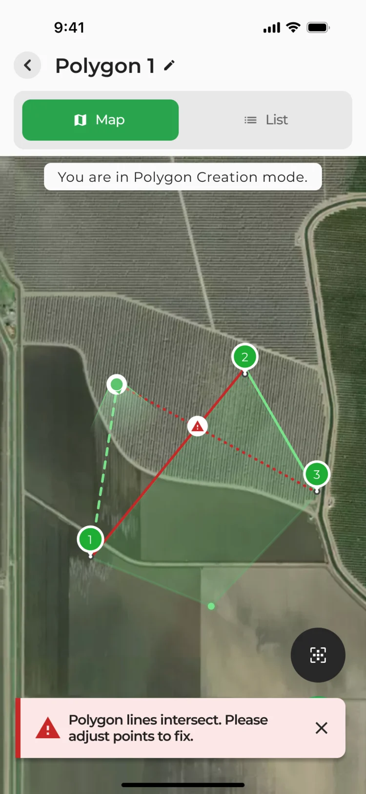
- Irregular areas are traced point by point on the ground, and a shape whose lines cross is useless data that nobody notices until later.
- Decided
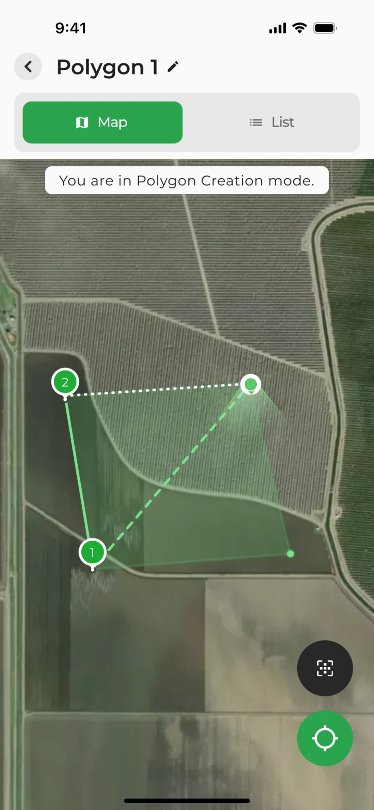
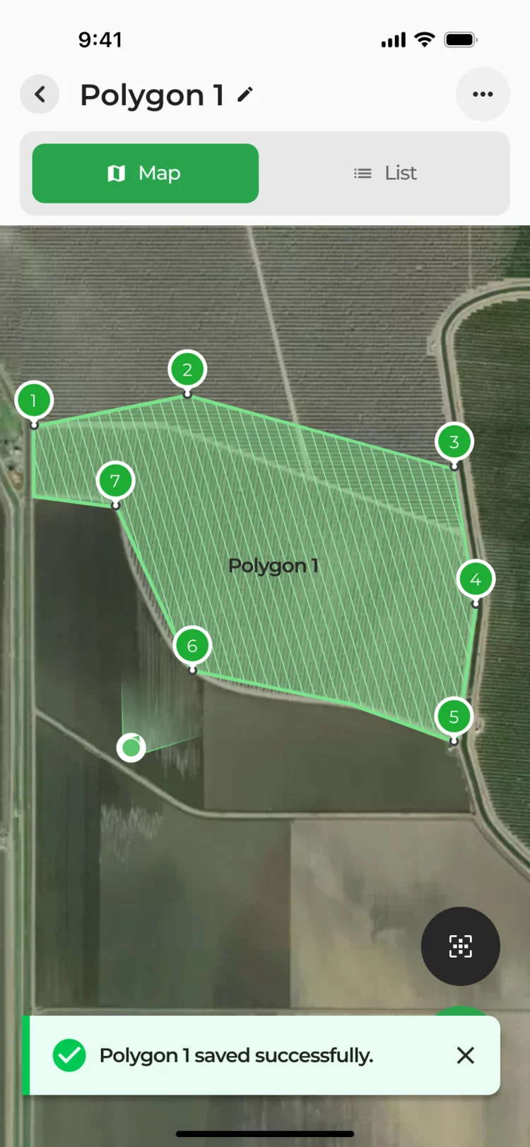
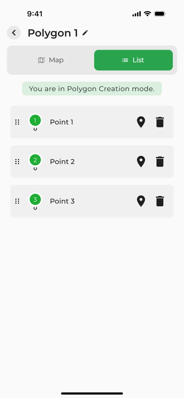
- Creation mode on the map: each point from the field device appears as it’s taken, crossing lines turn red with a message, and the points are also listed in order.
Polygons kept in order
- Found
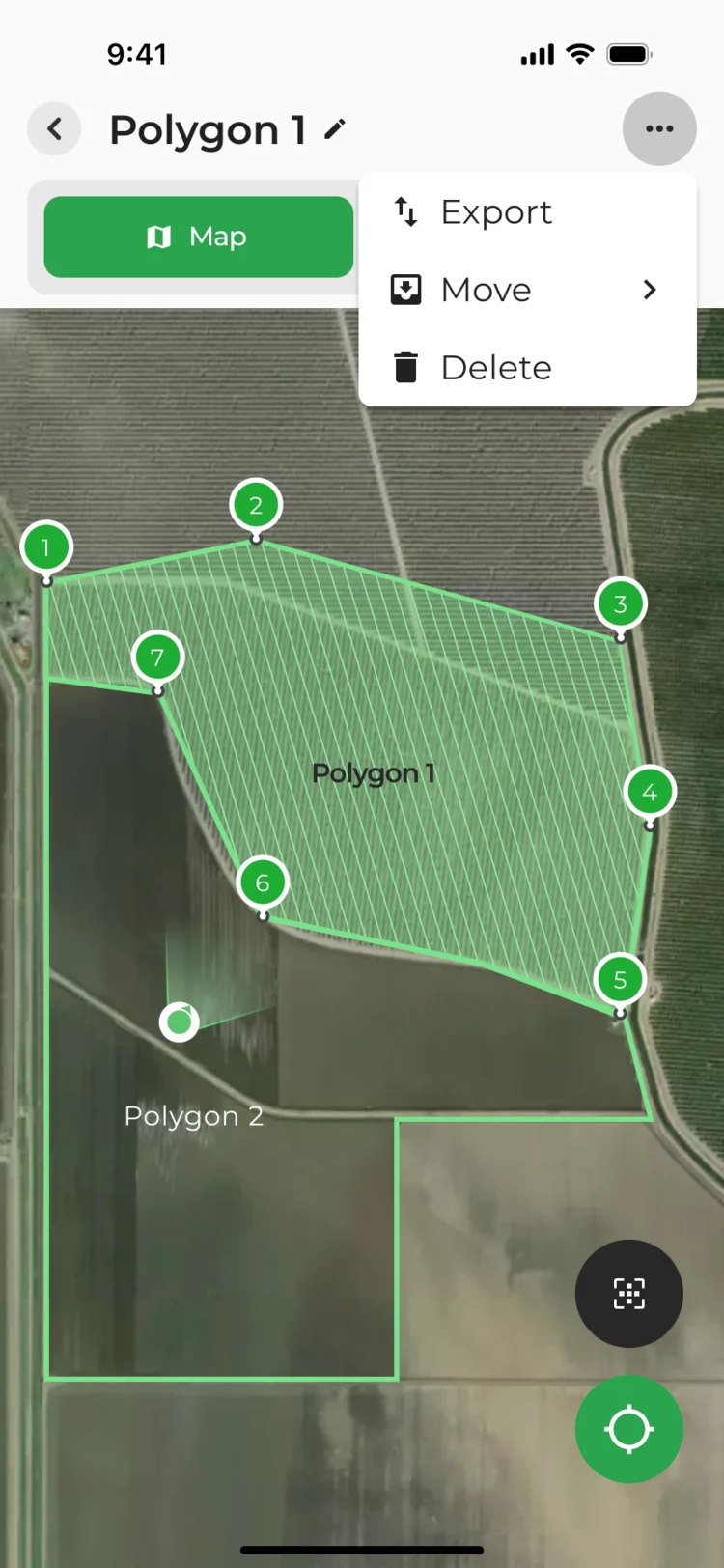
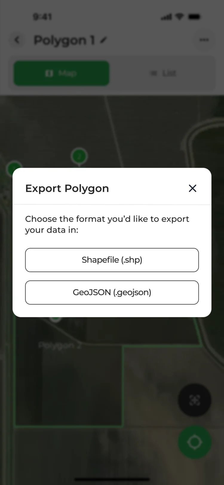
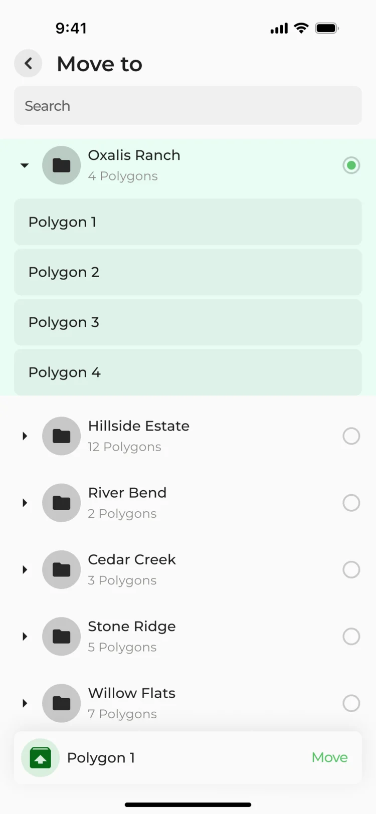
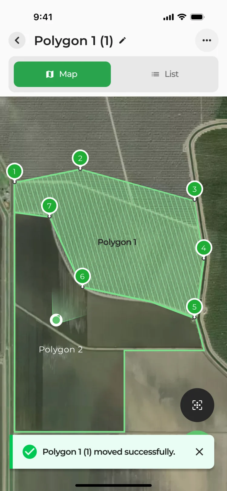
- Polygons pile up across projects, and one that can’t be renamed, exported or moved ends up redrawn.
- Decided
- A polygon’s menu holds export, move and delete; export offers Shapefile or GeoJSON; moving picks a project from a searchable list.
Components for the new features
- Found
- The new features needed parts the platform didn’t have, such as map points, pop-ups, folders and field lists, and each had to sit in the platform’s own look.
- Decided
- A component set for the delivered scope, each part drawn with its states, then reused across the desktop and the phone instead of drawn again.
One error, shown where the user is
Crossing lines are flagged in the list with what to do next, and on the map where they cross.
-
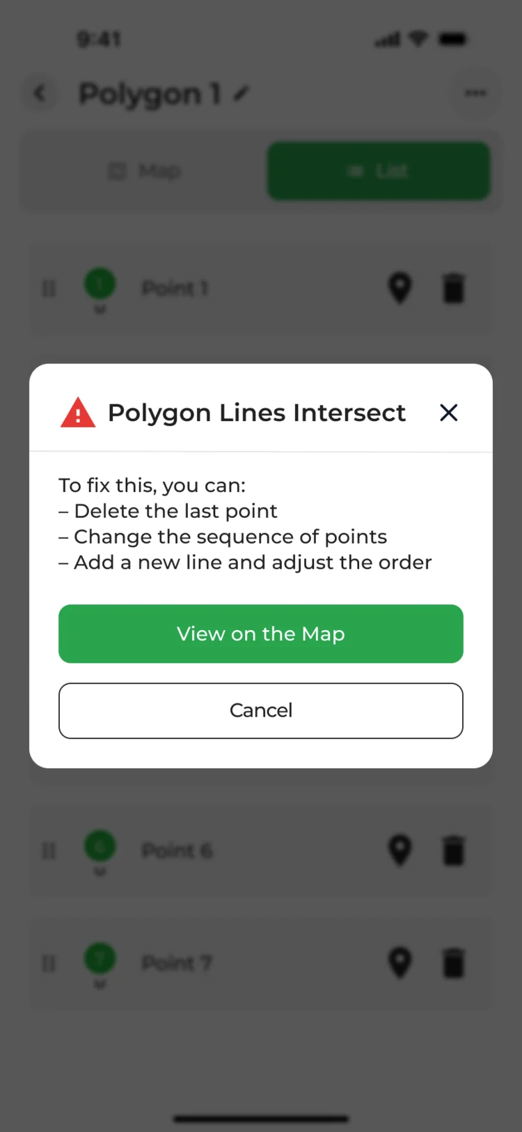
List: A pop-up with the ways to fix it. -
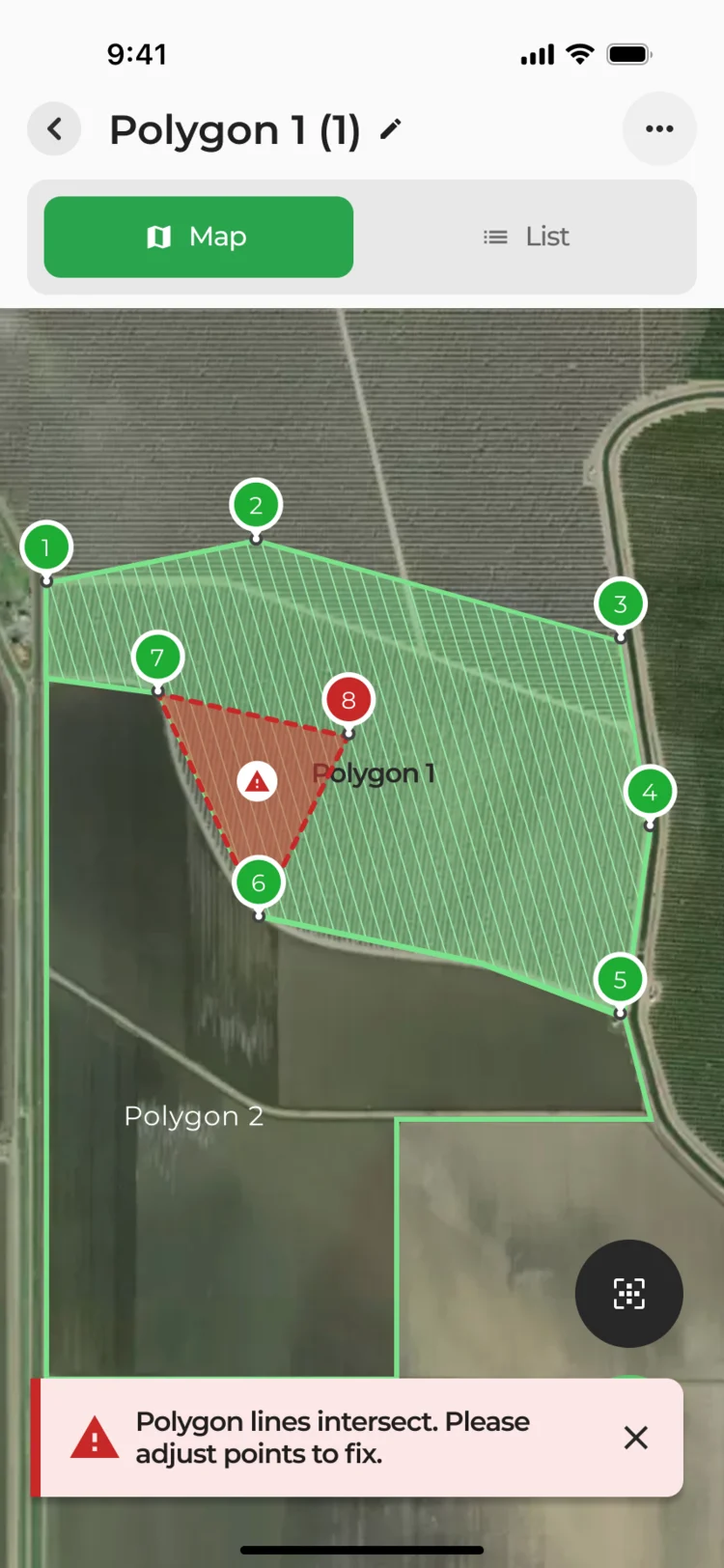
Map: The crossing, in red.
One list of points, three filters
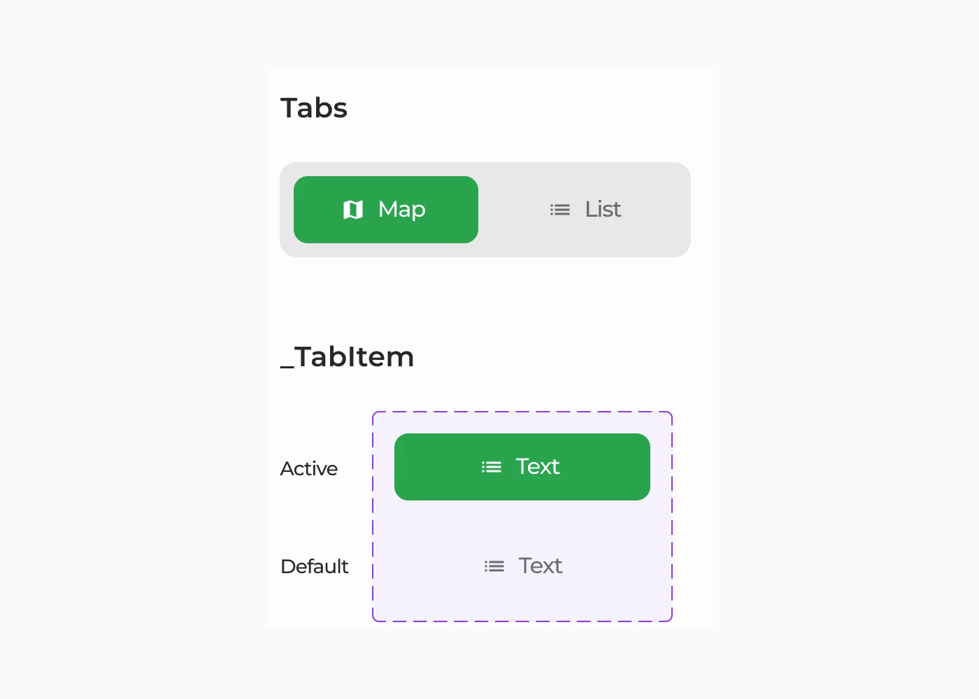
All points with the walk to the next one, only the pending ones, only the ones done.
-
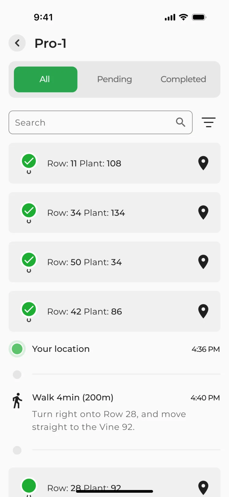
All -
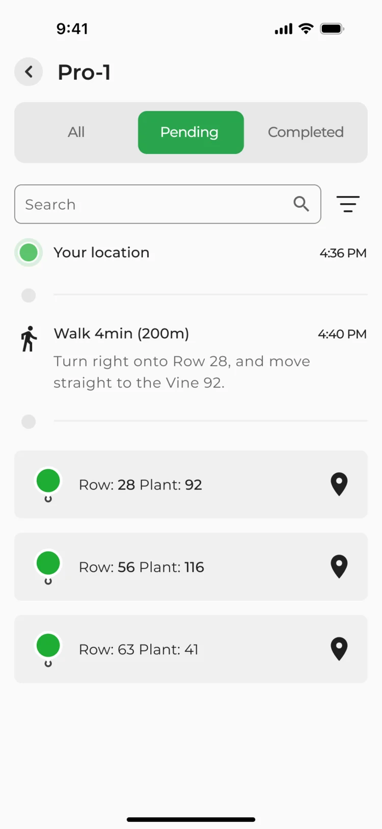
Pending -
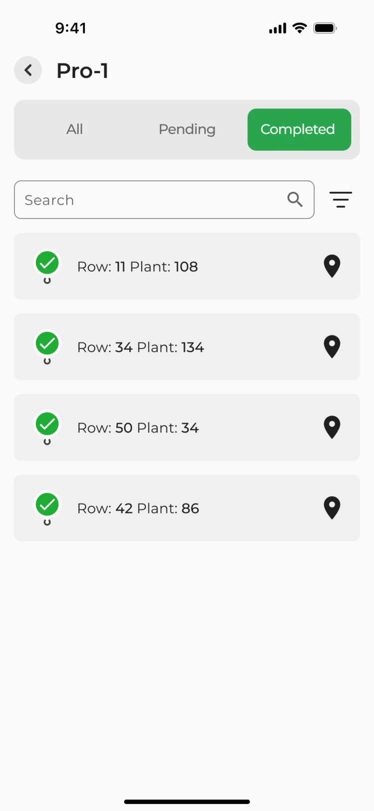
Completed
Where the product ended up
Four features designed into VineView’s existing product: a yield forecast in steps, earlier data reused, sampling paths planned at the desk and walked on a phone, and polygons drawn and kept in the field.
Each was delivered with flows, screen maps, a clickable prototype, components and handoff files. Development was not part of our work.
- screens and states across desktop and mobile
- 150+
- features: yield, history, paths and polygons
- 4
In the client's words
The design work helped organise the vineyard information into a consistent interface direction. We appreciated the attention to how imagery, field context and proposed actions appear together, so the team could review the product through specific workflows.

Afraid new features will break what your experts know?
In VineView, yield estimation, sampling paths and polygons went into a platform viticulturists already used, in its own look and logic. Show us yours, and we’ll tell you where new work fits.
More work like this
Three more products with expert users, dense data, or work done away from a desk.
-
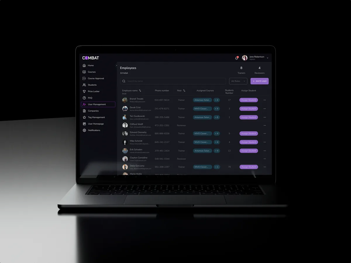
Sales training · Desktop web platform
Combat Sales
Reworked a sales-training platform people already used and designed new features into it, for five roles.
- 80+ Final desktop screens and interaction states
- 5 Roles in one platform
-
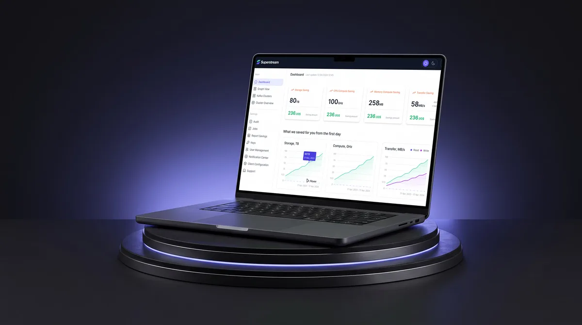
AI Hi-Tech · SaaS
Superstream
Turned a Kafka management platform’s dense technical data into one calm, consistent interface for DevOps teams.
- 3000+ Screens designed
- 1500h+ Design hours
-

FoodTech · SaaS
Glimix
Redesigned a hospitality app for diners and venue owners, with its brand, from a new logo to the store listing.
- 200+ Screens designed
- 5 Experts on the pod