
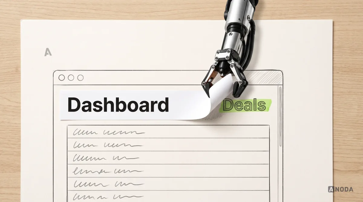
What Is a Website Dashboard? Types, Design, and Examples
Learn what a website dashboard is, which dashboard types fit different decisions, and how to design useful data views without overwhelming users.
Design the tools that turn aerial imagery and field data into the day's work — estimating a harvest at the desk, planning where to sample, drawing zones and walking the rows with a phone in hand.

Farm data turned into the day's work, at the desk and between the rows.
Geospatial & Map Interface Design
Map interactions any product can reuse.
AgriTech Product Design
The grower's season: estimate, sample, zone and walk.
Not included
Four places where field data fails to reach the person in the row, and the design that closes each gap.
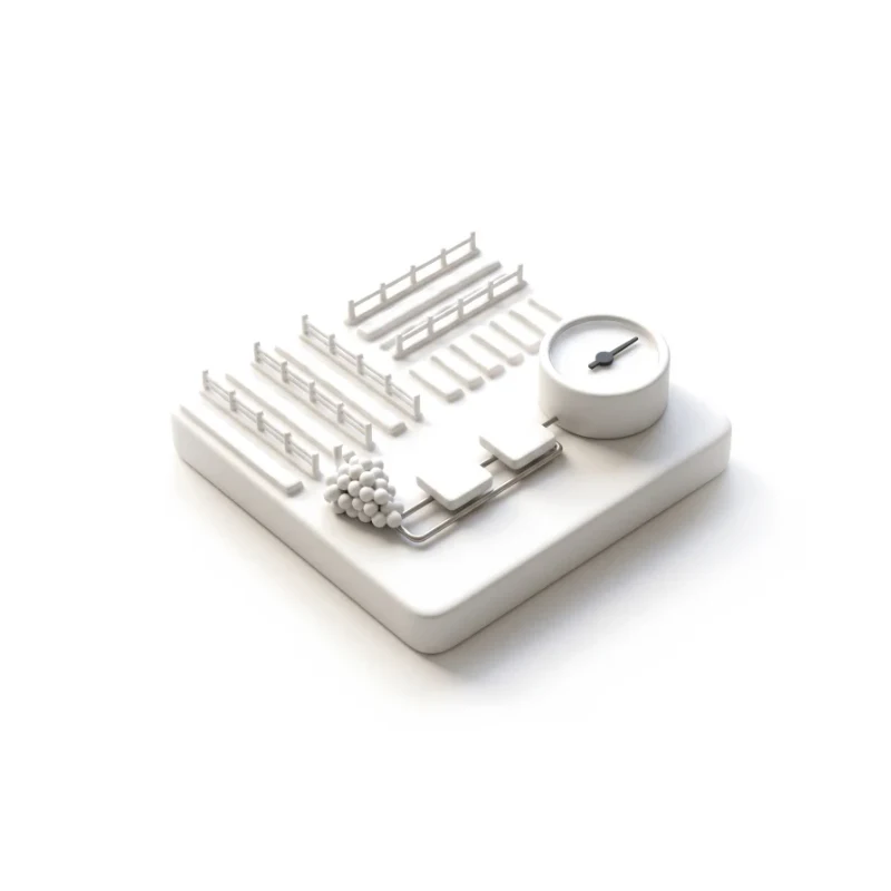
Imagery, vine counts and formulas as a guided path, not a spreadsheet.
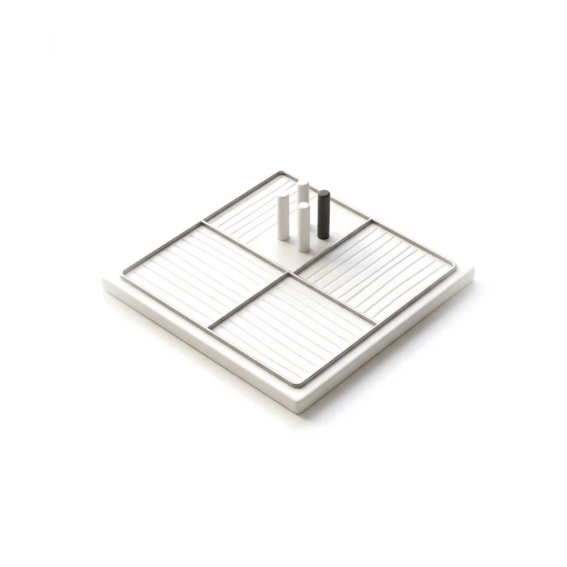
Blocks, polygons and sampling points drawn and edited on aerial imagery.
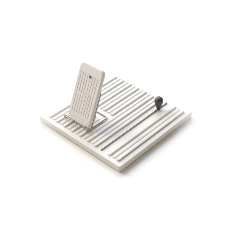
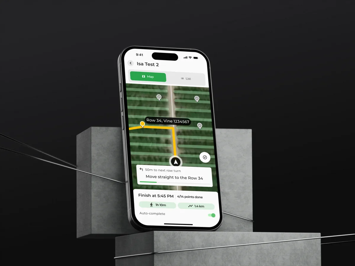
Turn-by-turn navigation between vines, with big targets for muddy hands.
Blocks, estimates and finished samples compared across fields and years.
You receive
Agritech UX design is tested in the field: imagery a week old, a block with missing vines, a phone that loses its connection halfway down a row. Each state gets a screen for the grower at the desk and one for the worker outside.
A vineyard platform that turns aerial imagery into estimates, sampling plans and routes through the rows.
AgTech · SaaS · Web + Mobile
Designed four features into a live vineyard platform — yield estimation, data storage, path building and polygon tools — with in-field navigation on mobile.
It fits when farm data has to become work someone does in the field. Growers, agronomists and field staff will recognise the signs below.
Imagery, counts or sensors produce more than a grower can read.
Someone walks rows or fields with a phone, often with poor signal.
New features must land without breaking habits built over seasons.
Your team can say how estimates are made and when to trust them.
A different starting point
Tell us who uses your product, at the desk and in the field, and where the data stops helping. We will name one feature to design first, and the service for it.
Each feature is designed under one service, with scope and review rhythm in its proposal.
Tell us about your growers, the fields, the data you collect, and the step that goes back to paper.
Message received.
Within 15 minutes, we’ll email you initial feedback and follow-up questions.
Learn what a website dashboard is, which dashboard types fit different decisions, and how to design useful data views without overwhelming users.
Expand your native app to the web with ANODA UX Agency. Discover strategies to reach new users, enhance functionality, and boost engagement. Contact us today!
Ask for agriculture work that reaches the field, not only a tidy dashboard. The right partner can explain how imagery becomes an estimate a grower follows, how sampling and zones are drawn on real maps, how a route through the rows works on a phone with poor signal, and how every state was written down for engineers. Ask, too, which decisions they left to agronomists; design is not agronomy. Our VineView case shows that work.
Domain research, the roles and their jobs, flows with every map and data state, wireframes tested on real imagery, a clickable prototype, UI and a handoff feature by feature. Cost and time grow with the number of features and platforms, the complexity of estimates and map tools, and landing features inside a live product; good access lowers them. The first service's proposal gives the figures.
Growers and farm managers, agronomists and consultants, field workers and samplers, and the admins who set up farms, blocks and users. The workflows are reading imagery, estimating a harvest, planning sampling, drawing and editing zones, navigating to vines or points in the field, and comparing a block across seasons. Agritech UX design has two first screens: the map at the desk and the route in the row. A grower looks at the whole farm; a worker only ever needs the next vine.
Browser tools for estimating and planning belong to Web App Design; field navigation and sampling on a phone go to Mobile App Design. When the question is how a season reads on one screen, Dashboard Design. A new product or feature set gets UI/UX & Product Design, first sketch to handoff; a live tool growers struggle with starts with a UX Audit. Many teams begin with one feature, then add the next once the first is in growers' hands.
No — we design how advice and rules appear, not what they say. We design how an estimate shows its inputs and adjustments, how old the imagery is, who may edit a block or a sampling plan, and what a worker sees when data has not synced. Models and formulas belong to your agronomists, and your team signs off on data, land and privacy rules. We do not promise better yields or lower costs — a clearer estimate is not a bigger harvest.
Sample fields and imagery on staging, a login for grower, sampler and admin, and a product owner who can settle questions quickly. The formulas and rules as they stand — how estimates are made, how sampling points are chosen — plus where growers fall back to paper. With engineering in the room early, the imagery pipeline, map provider and field connectivity set the design's limits before we draw. Imagery from a recent flight, even a rough export, lets us test layouts on the actual terrain before any styling.
VineView, a platform that turns aerial imagery of vineyards into decisions — yield estimation on the desktop, and a mobile app that guides workers row by row, vine by vine. We design it feature by feature inside the live product: 150+ unique screens across web and mobile. It is our one agriculture case so far, and we do not show field trials or yield results as our work.
Yes. Growers use agritech products all season, so new work lands in a live product. We design in your files and system alongside your designers, agronomists and engineers, and every file comes back to you. On VineView every new tool matched the platform's look, feel and logic from day one, so growers met new features without relearning old ones.