
Importance Of Mobile App Engagement
Discover proven mobile app engagement strategies with ANODA UX. Learn to boost retention, improve metrics, and foster lasting connections. Get started today!
Design the app people understand on the first visit and choose again on the thirtieth — a first session that shows its value, a habit worth keeping, and plans people can start, change or cancel on their own.

A consumer product that earns the second visit, from the first screen to the plan people keep paying for.
The marketing site that brings people to the product.
B2C & Consumer Product Design
The product they sign up for and come back to.
Not included
Consumer products are lost in the first minute or in the second week. The work covers both, and the account screens in between.
Sign-up, permission requests and the first useful result, with every skip.
What brings people back: reminders, progress, saved state and streaks.
Trials, upgrades, plan changes, restored purchases and cancellation.
Every screen and state wired together and specified for the build.
You receive
Good B2C UX design works without a training session or an account manager. People decide alone, in seconds, and leave without saying why — so every state they can meet is designed before it ships.
Live apps redesigned for the people already in them, and new ones built for a first release.
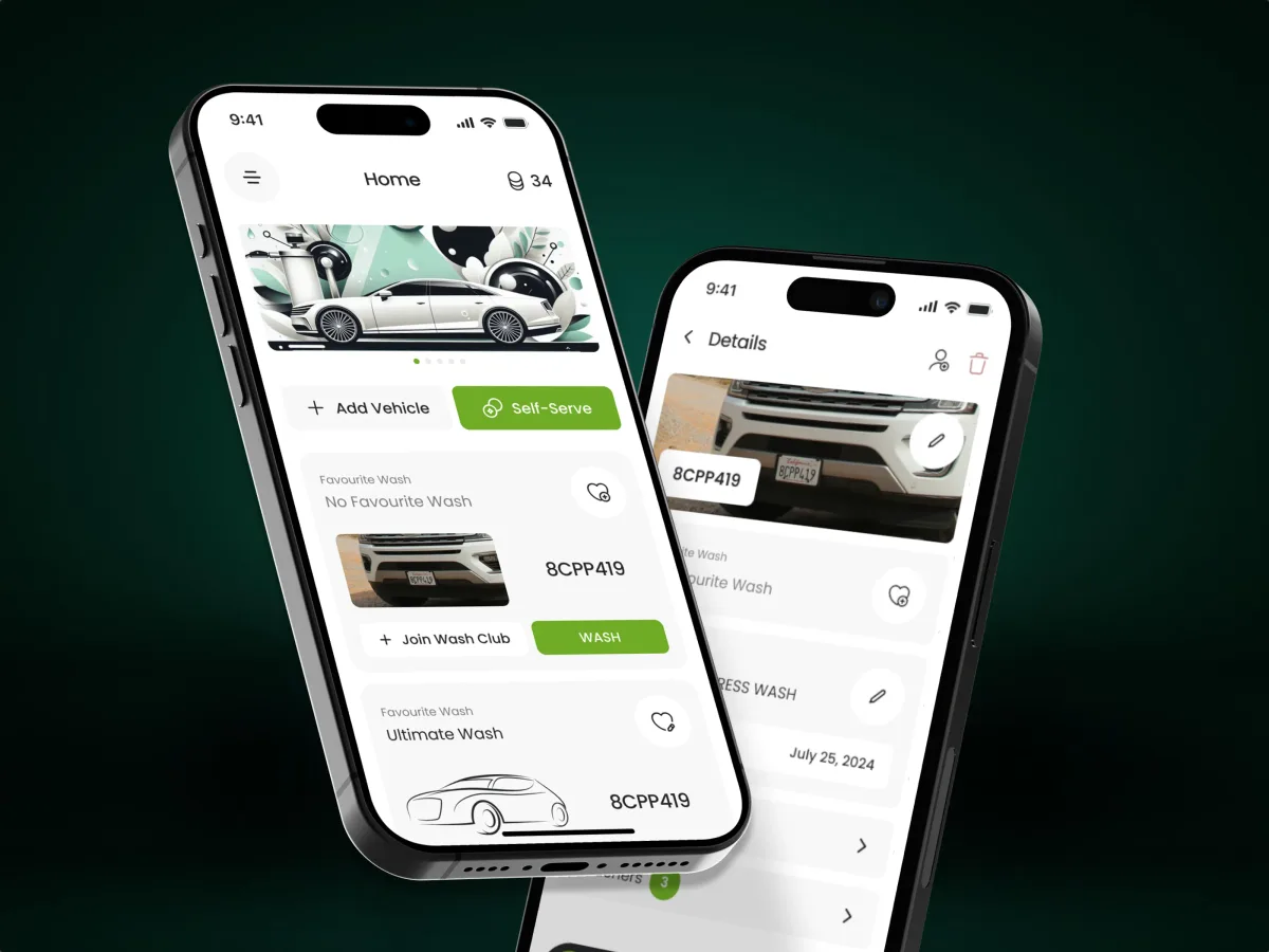
Automotive · Subscriptions · Mobile app
Opened a car-wash operator's platform to drivers — self-serve subscriptions, several vehicles on one account, and a self-serve bay started from the phone.
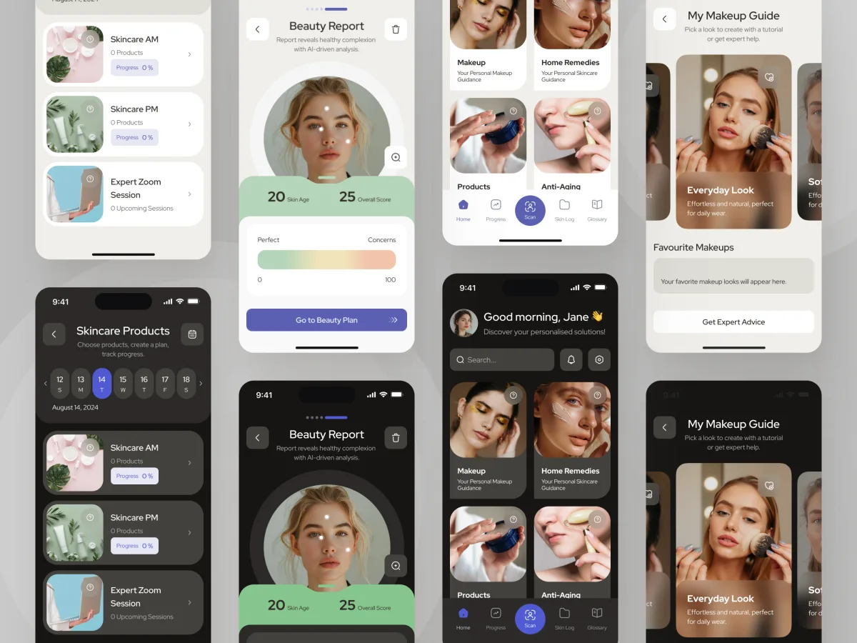
Beauty · Wellness · Mobile app
Audited and redesigned a live AI and AR beauty app whose screens had drifted from its designs — new structure and onboarding, on the backend it already had.
It fits when one person decides alone, in a few seconds, whether your product is worth their time.
No sales call and no training: the product has to explain itself.
The payoff comes on the fifth visit, so people have to reach it.
Trials, subscriptions, in-app purchases or a paid tier.
An in-house or partner team will develop the product from the design.
A different starting point

Tell us what your product does and where people leave. We will come back with the service that fits and a realistic next step.
Which service we start with depends on where the app is: an idea, a first release or already in the stores. Its proposal sets the terms.
The design brings subscription management and the proposed wash visit into one mobile journey. We appreciated the attention to what a customer needs to see before, during and after a visit, with account controls kept in the same visual language.
Tell us what the product does, who it is for, and where sign-ups stall or people drift away.
Message received.
Within 15 minutes, we’ll email you initial feedback and follow-up questions.
Discover proven mobile app engagement strategies with ANODA UX. Learn to boost retention, improve metrics, and foster lasting connections. Get started today!
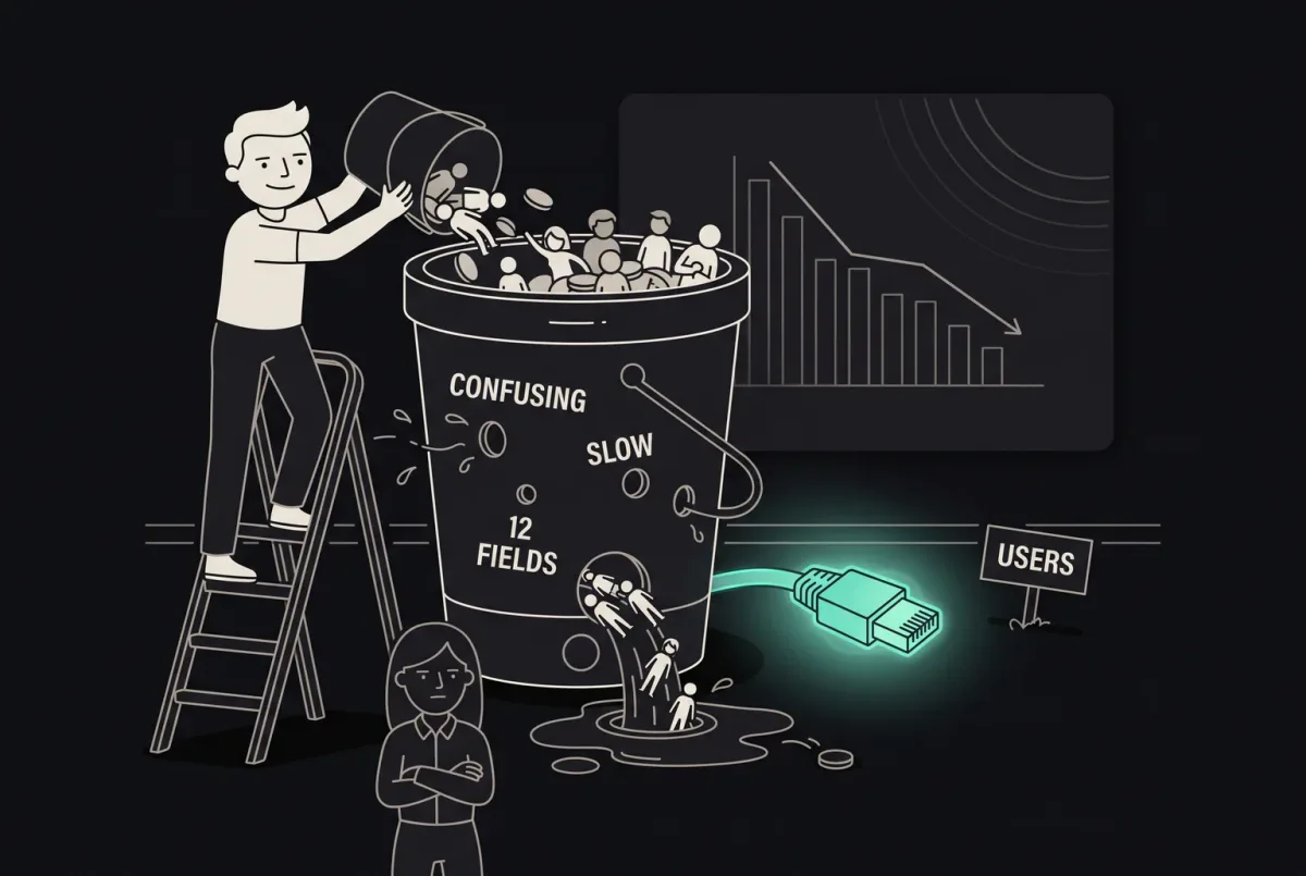
Boost mobile conversions with top UX design practices. Improve usability, user retention, and engagement. Learn how at ANODA UX Agency. Start optimizing today!
Look past the finished screens. A team that knows consumer products can show its onboarding decisions, what a person sees after refusing notifications, how a trial ends, and how someone cancels without writing to support. Ask which apps were live, which were redesigns and which were concepts, and what was handed to engineers. Our Pulse and Forever Beauty cases show that range.
Shorten the road to the first useful result: ask only for what that result needs, and ask for the rest — data, permissions, payment — at the moment it makes sense. Then design the return on purpose. A reminder tied to something the person started, progress that is saved and visible, and a home screen that opens where they left off do more than a generic push. Every decision is checked against your analytics and store reviews, and against a prototype that real people try when the answer is not obvious.
First-time visitors, new users on a trial, regular users, paying subscribers, people coming back after a break, and family members or friends sharing an account — plus the support staff and admins who run the product behind them. The journeys run from the store page or the website to sign-up, onboarding, the core action, reminders, sharing and referrals, and the account: buying, changing and restoring a plan, cancelling, and deleting an account with the data that goes with it.
It depends on where the product is. Product Discovery when the audience or the reason to pay is still unclear; MVP Design for a first release around one core loop; UI/UX & Product Design for the whole product. For a live app, an Activation Audit or a UX Audit finds where people leave, and Product Redesign rebuilds what has been outgrown. Mobile App Design takes the phone, Web App Design the browser, and Design Systems stops a growing app from drifting apart. A B2C marketing website is a Website Design project.
With the flows, not after them. Every screen is drawn for no data yet, a missing connection, a refused permission, a trial about to end, a failed renewal, a restored purchase and a deleted account. Before the system asks for notifications, location or the camera, the product explains why in its own words, so a refusal is not a dead end. App Store and Google Play rules on subscriptions and cancellation shape the paywall from the start. What data is collected, and why, is shown where it is asked for; the legal review of your privacy terms stays with your team.
A product owner who can decide, access to the live app or test builds with a test account on a paid plan, and the evidence you already have: analytics funnels, store reviews, support themes and the reasons people cancel. Early contact with engineering matters too, so the platforms, the subscription provider and the analytics tools you use shape the design rather than surprise it.
Pulse, a driver app for car-wash subscriptions — 84 unique screens in one design for iOS and Android. Forever Beauty, a live AI and AR beauty app — audited, then redesigned on its existing backend, with 3 visual styles explored. Each case study follows a person through the app, from the first screen to the flows they come back for, with the states behind them.
Yes. Forever Beauty was a live app, and the new flows had to respect what its users already knew. The work happens in your own files and components, reviewed step by step with your designers and engineers. Where there is no system yet, we set up the parts a consumer app repeats — onboarding steps, paywalls, empty states, settings — and hand over everything we make.