
Equipment rental marketplace, boards by the hour
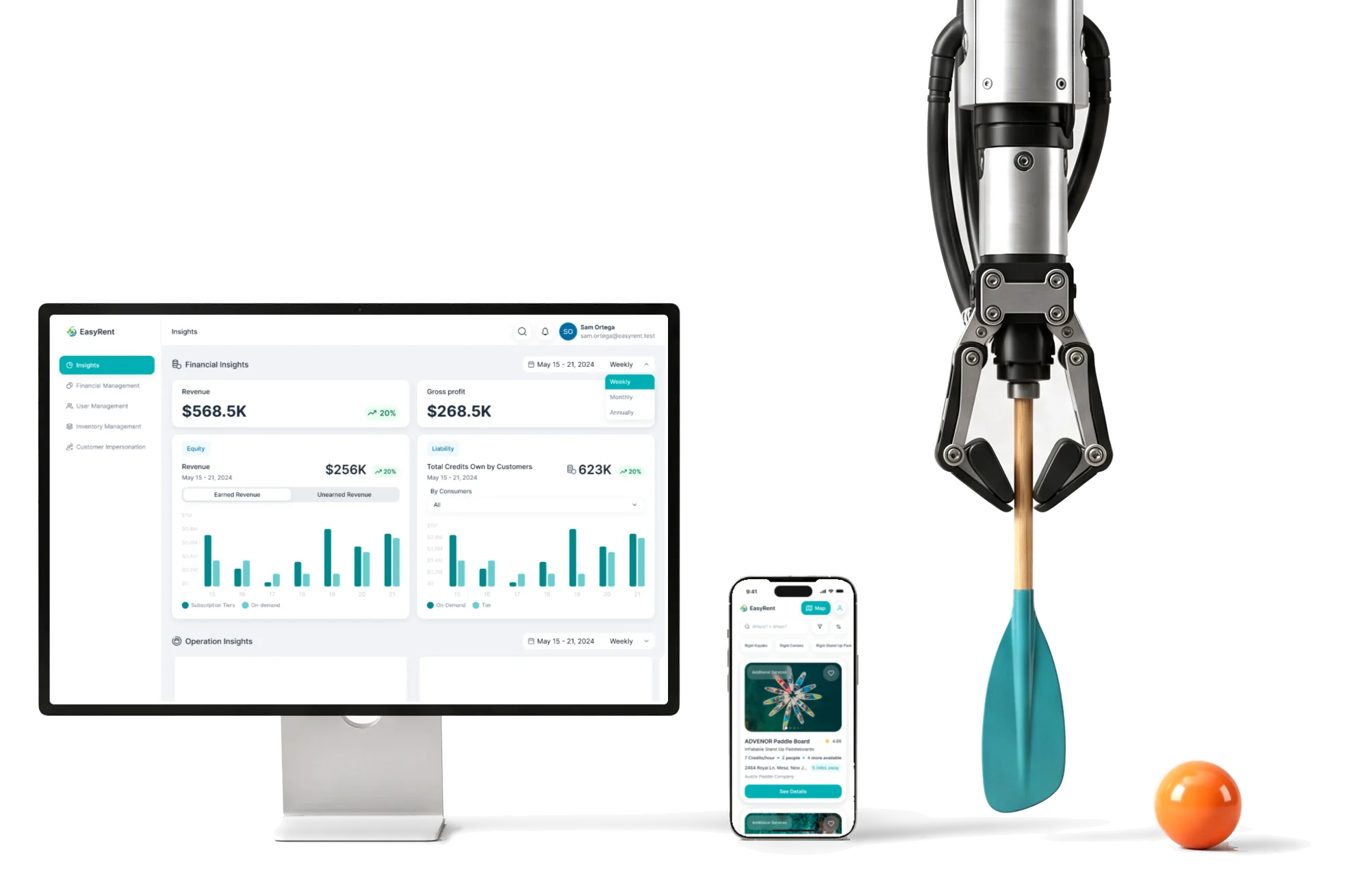
EasyRent lets people rent kayaks, paddle boards and other outdoor gear from local suppliers.We designed and built it, brand included, through to launch.
- 3
- roles renters and suppliers on phones, the team on desktop
- research, design, design system, brand, then the no-code build
Project summary
EasyRent started with water-sports and outdoor gear: kayaks, canoes and paddle boards rented by the hour or the day from local suppliers. We started from zero: we designed the marketplace for renters, suppliers and the team running it, drew the brand , then built the landing and the product in Webflow with Wized and took it live.
How the work ran
- Start
- From zero: research, personas, the architecture and the flows before any screen.
- Two streams
- Product design and the Webflow build ran in parallel, so the landing and the product took shape together.
- Our part
- Research, UX and UI for all three roles, the design system, the logo, email templates, the Webflow and Wized build and the integrations.
- Stack
- Webflow and Wized, with Stripe, Memberstack, Make, Airtable, SendGrid, Google Maps and Finsweet.
- Where it is now
- The marketplace launched with our build. This page records that delivery, not how the product runs today.
What a rental goes through
One chain, from a guest looking around to a board back on the rack:
-
Browse
- Guest mode
- Map
- Filters
-
Book
- Time slot
- Add-ons
- Credits
-
Pick up
- Check-in
- Scan
- Status
-
Return
- On time
- Late
- Damaged
-
Settle
- Evidence
- Charge
- Review
-
Operate
- Suppliers
- Moderation
- Reports
- Open and Protected
- Guests can look around before signing up, without the whole catalogue being there to copy.
- Quick sign-up and Verified supplier
- A renter signs up in a few fields; a supplier is verified before listing a single board.
- Phone and Desk
- Renters and suppliers act on the beach; the team moderates and reports from a desktop.
One board, read before it’s booked
- Found
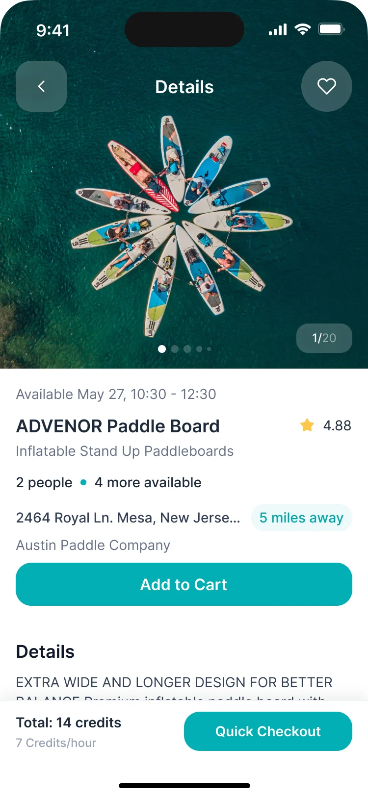
- A renter standing at the water wants to know three things fast: is it free when I need it, what will it cost, and who am I renting from.
- Decided
- The equipment page answers in that order: the photos, the free slot and the capacity, the price in credits per hour, the supplier with the distance, then the details and the add-ons.
- For the user
- A renter books from one screen without calling the supplier to ask.
-
Is it free
The slot the renter searched for and how many people the board takes.
-
Who and where
The address, how far it is, and the supplier behind the listing.
-
What it costs
The total in credits and a checkout that stays on screen while you scroll.
How the work progressed
From research to a working marketplace, with the design and the Webflow build running side by side.
-
Discovery
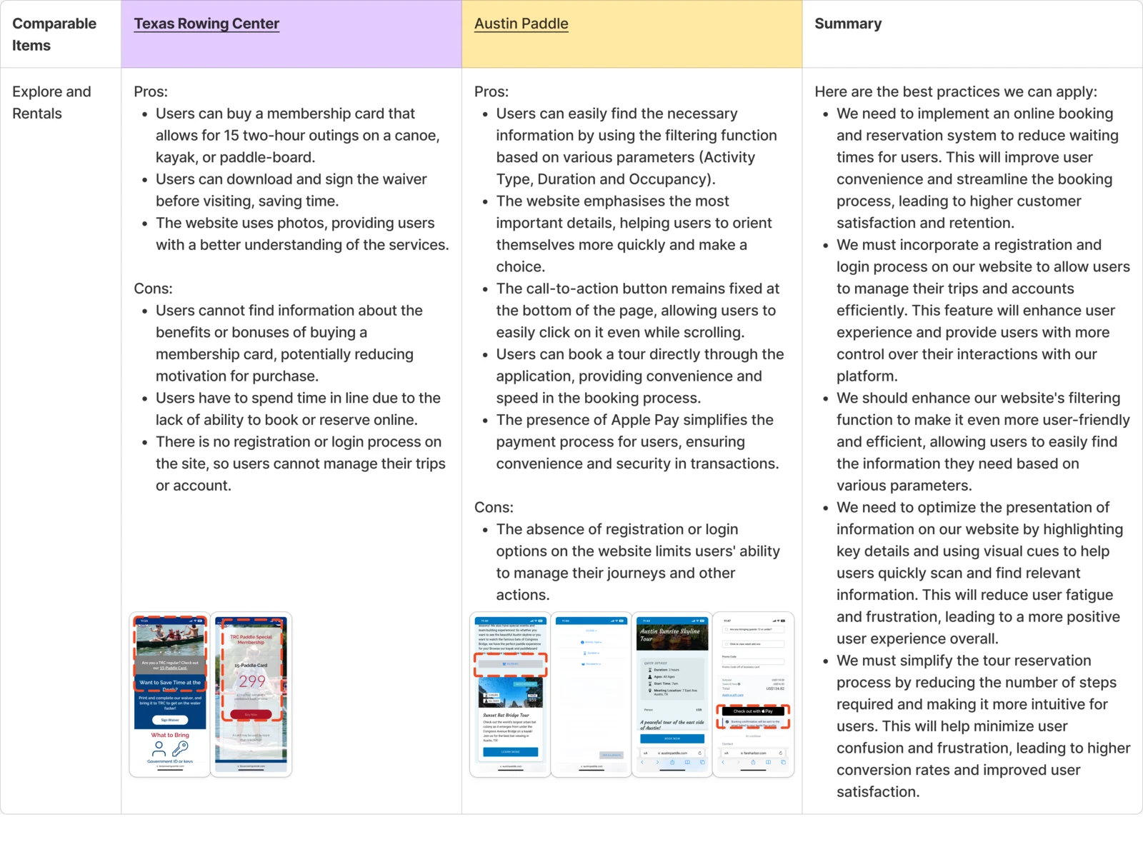
What rental marketplaces already do well, and what each of the three roles needs
Artifact Competitor research and personas for renters, suppliers and admins
-
User flow
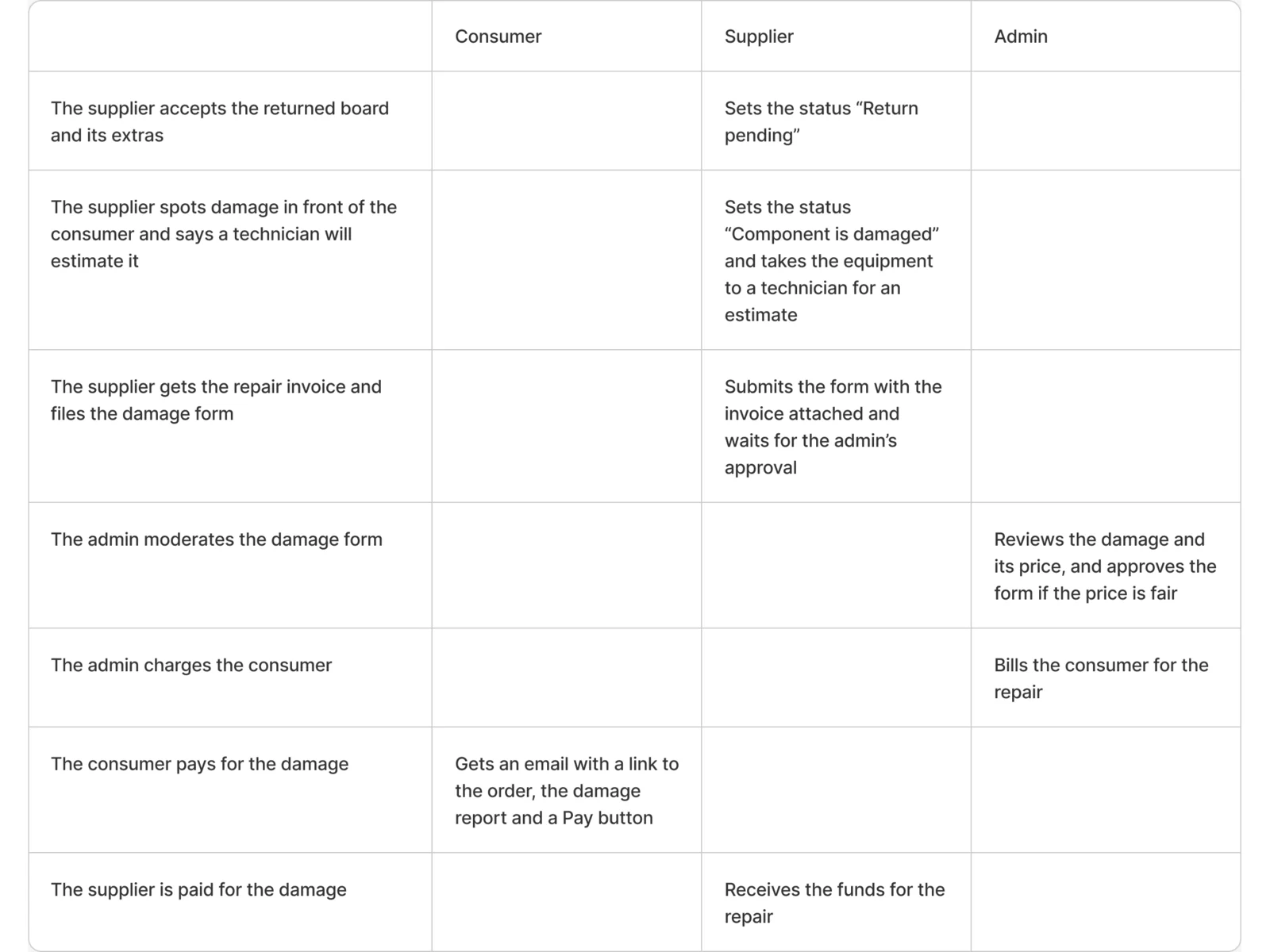
Every path of a rental for each role, including the late, damaged and disputed returns
Artifact Information architecture and user flows
-
Wireframes
Where search, the listing, the cart and the supplier’s tools sit, before any style
Artifact Wireframes for the renter, supplier and admin surfaces

-
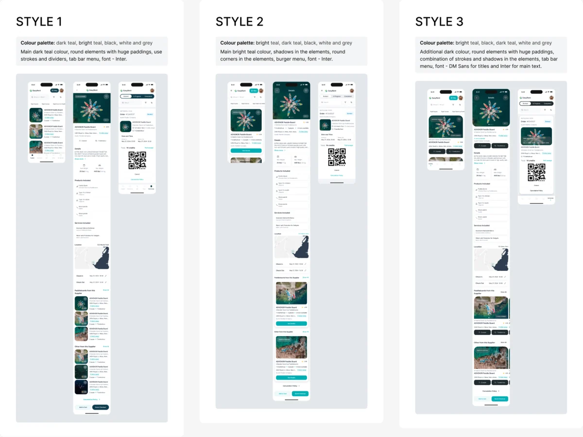
Moodboards
How a rental app should feel next to the water
Artifact Moodboards and visual directions
-
Brand & logotype
A name that needed a mark before it needed a website
Artifact Logo exploration and the final logo files
-
UI & Design system
Every screen and state for three roles, from one set of components
Artifact High-fidelity UI, the UI kit and components with their states
-
Mobile adaptation
The landing on a phone as well as a desktop
Artifact Responsive landing layouts
-
Landing page
What a first-time visitor sees before the app
Artifact The landing, designed and built in Webflow
-
Delivery
The screens turned into a working build, not a Figma file
Artifact The Webflow and Wized build, the integrations, email templates and the launch
Every rental drawn to its last state, before a screen
- Found
- A rental has more endings than a checkout: the board comes back late, broken, or not as the supplier remembers it. Leave one ending undrawn and the build stops there.
- Decided
- Each role got its flows first: a renter’s search to return, a supplier’s onboarding to a first listing, the admin’s moderation, and every return path with its evidence and charge.
-
A renter’s booking, from the listing to the pickup reminder
One listing opened, a check for an account, then the order, its confirmation email and the reminder the day before.
Open the full map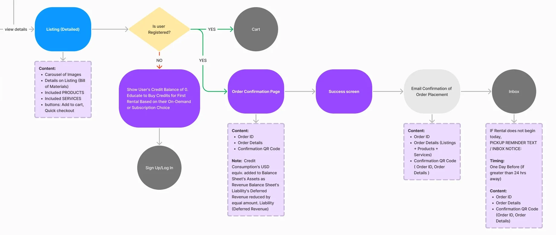
Six jobs across three roles
The renter first, where a booking is won or lost. Then the supplier who owns the gear, and the team that keeps both honest.
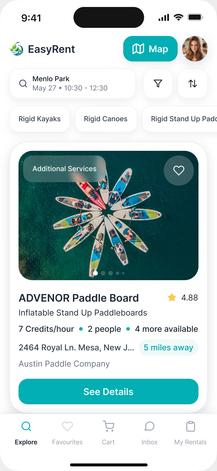
Search by place and time
- Found
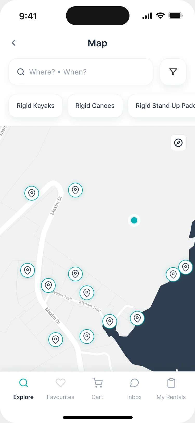
- Gear is only useful where and when you are. A list of every board in the country answers neither question.
- Decided
- Search starts from a place and a time slot, with categories, filters and a map of suppliers nearby. A guest can look around; booking asks for an account.
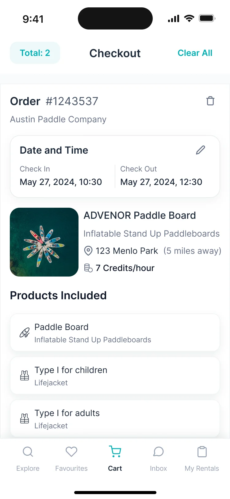
Credits instead of card math
- Found
- Hourly and daily prices, add-ons and memberships add up to a sum nobody can check at the counter.
- Decided
- Prices read in credits per hour, the cart adds add-ons and services on top, and the checkout shows the total.
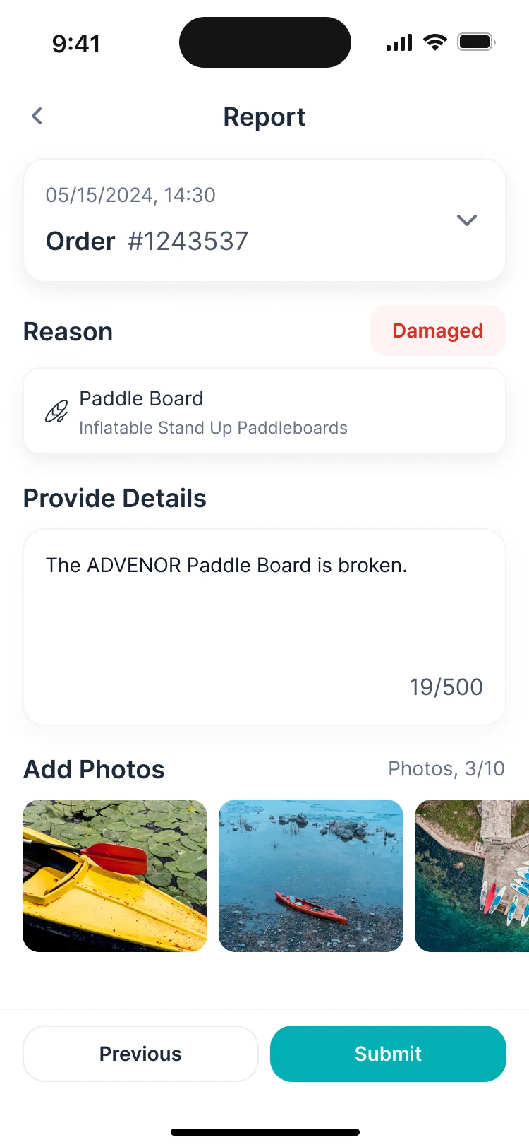
A return with evidence
- Found
- A board comes back with a crack, and it’s the renter’s word against the supplier’s.
- Decided
- Either side reports an issue with a reason, the damaged item, a description and photos. The admin reviews it before any extra charge.
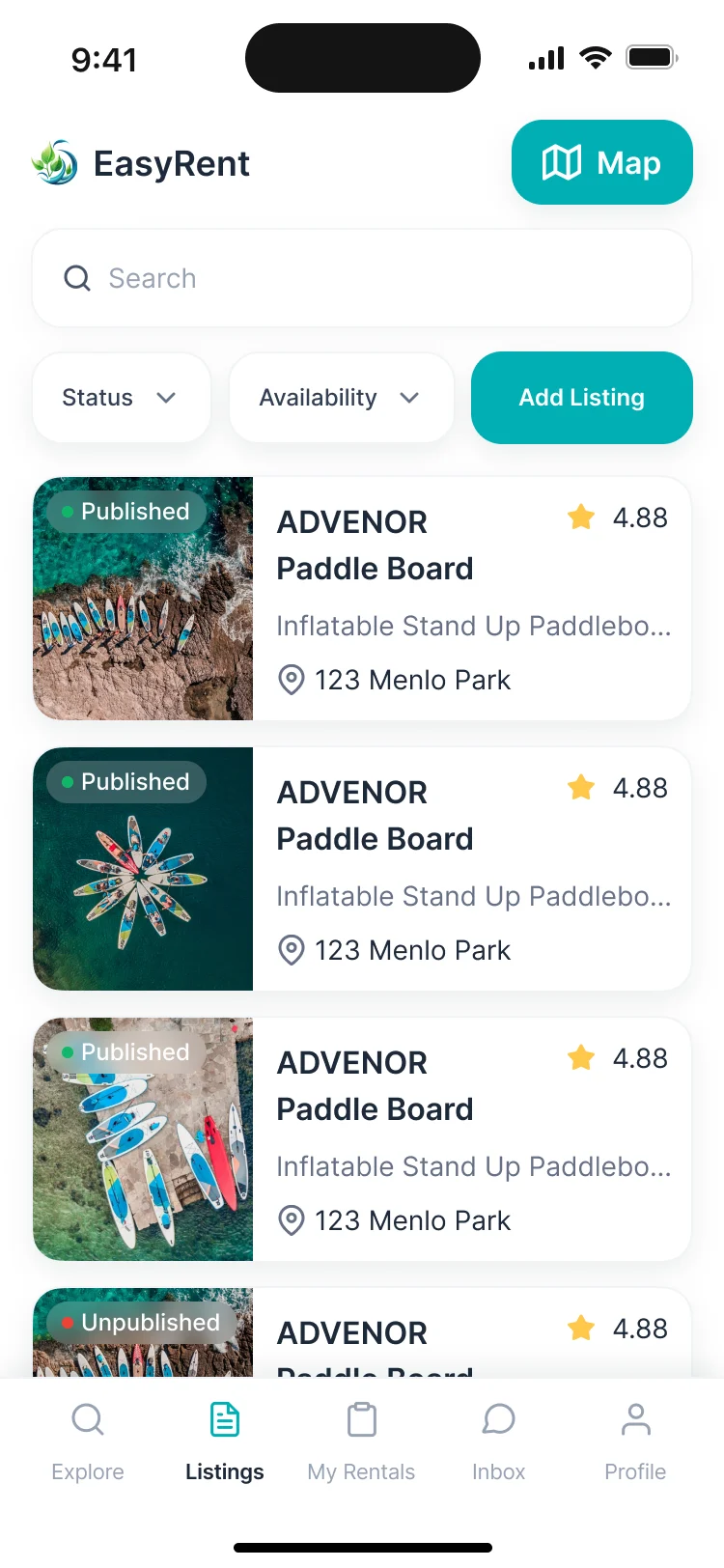
Listings with everything a board comes with
- Found
- A board comes with a paddle, a leash, a life jacket in two sizes, and a slot calendar. A plain product form can’t hold that.
- Decided
- A listing holds its variants, sub-products, services and add-ons, its location and its availability, so the renter sees one thing to book.
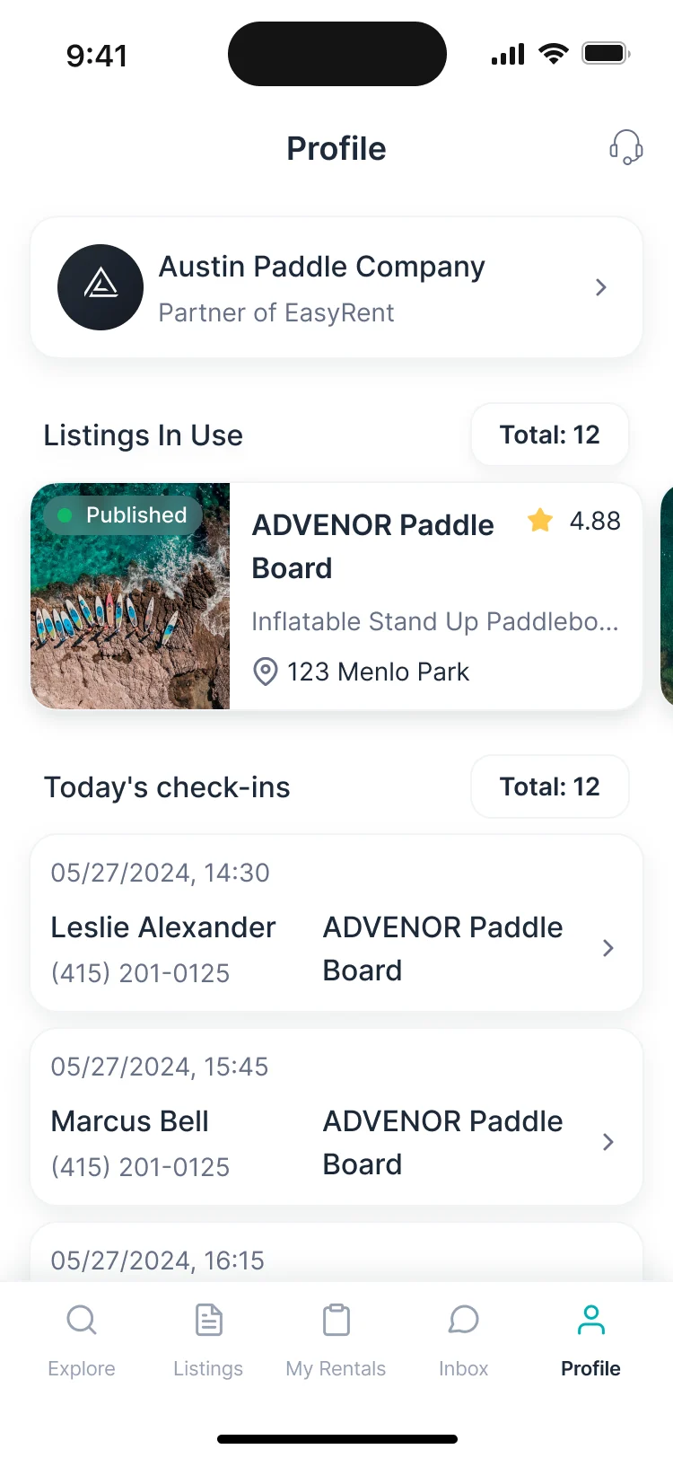
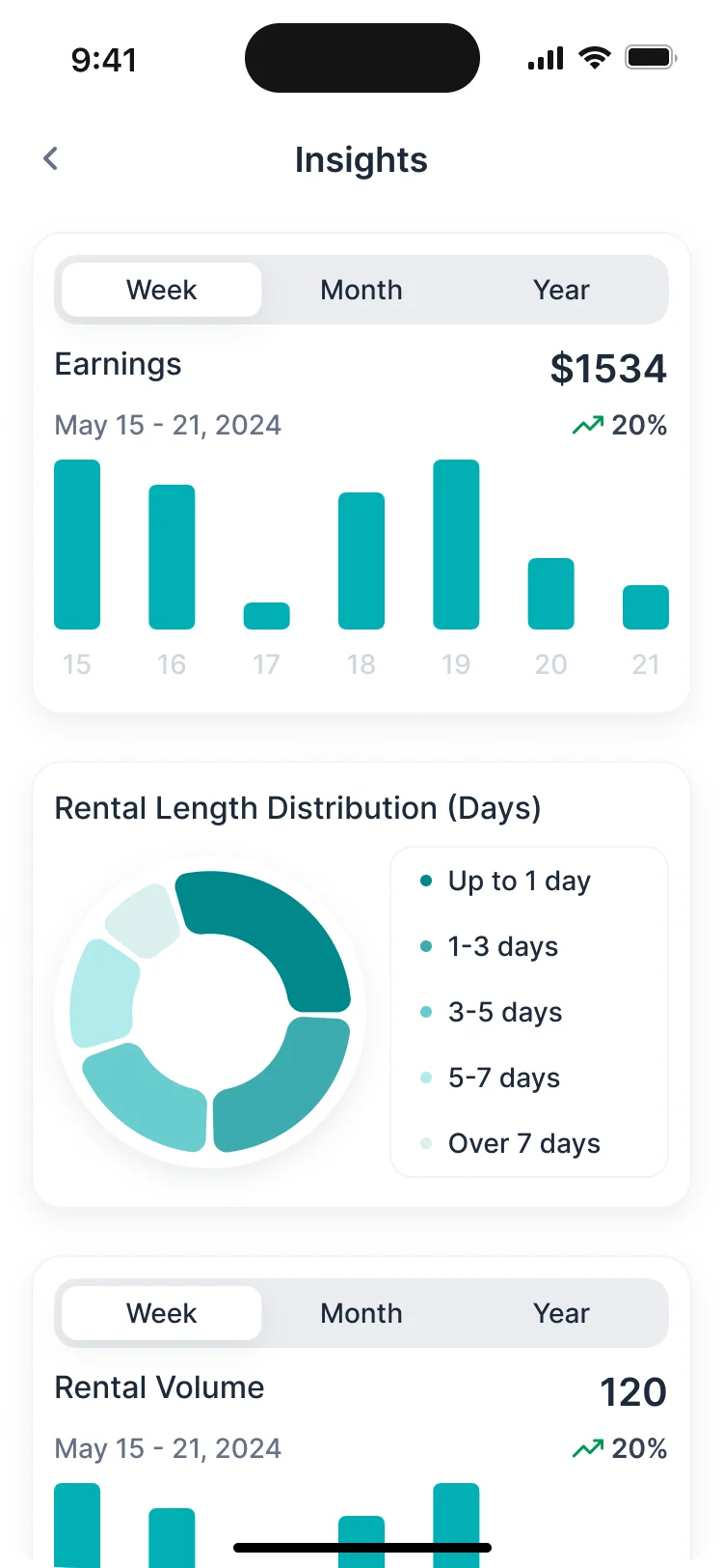
Earnings a supplier can read
- Found
- A supplier wants to know what earns, not a ledger.
- Decided
- Insights by week, month and year: earnings, rental length and volume, and the top listings and locations.
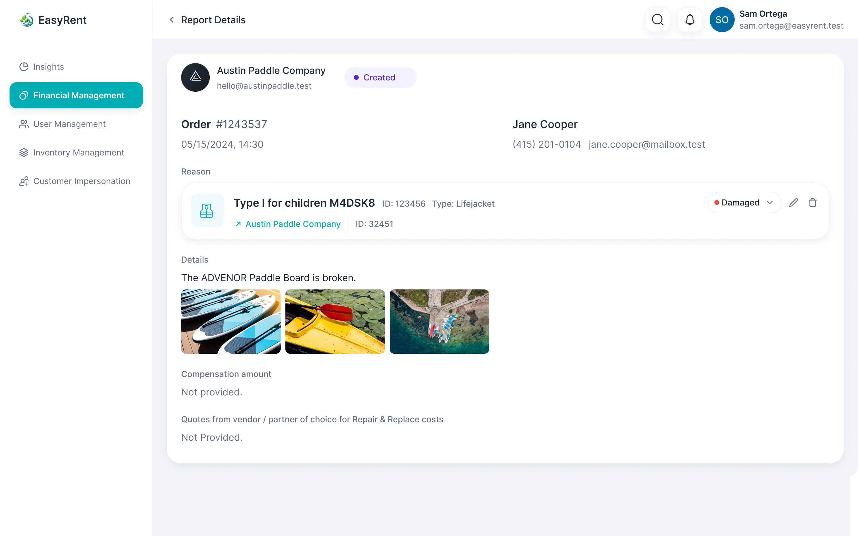
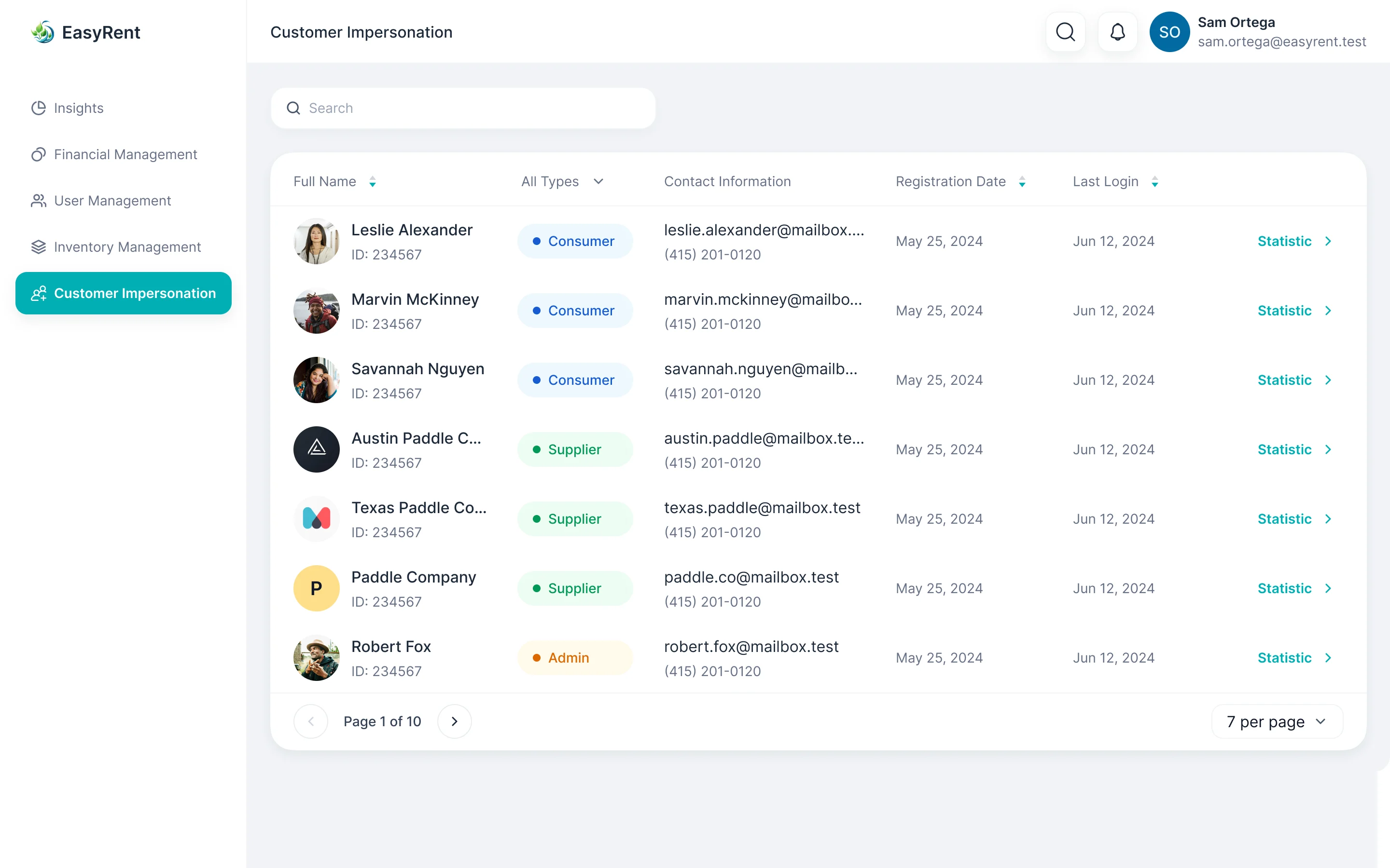
A console that can see what the customer sees
- Found
- When a renter says the app won’t let them book, support can’t guess what’s on their screen.
- Decided
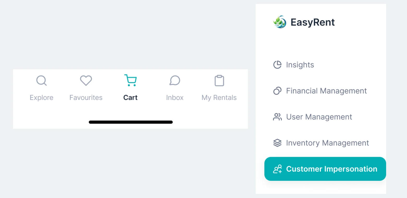
- The admin console covers insights, finances, users and inventory, and an admin can open the product as a given customer to see the problem first-hand.
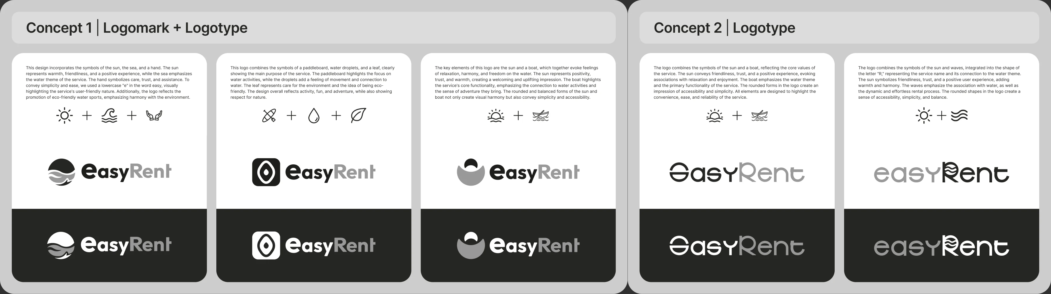
A mark before a website
- Found
- A new name had to read on a phone’s header, on a landing page and at the top of every email, before anyone had heard of it.
- Decided
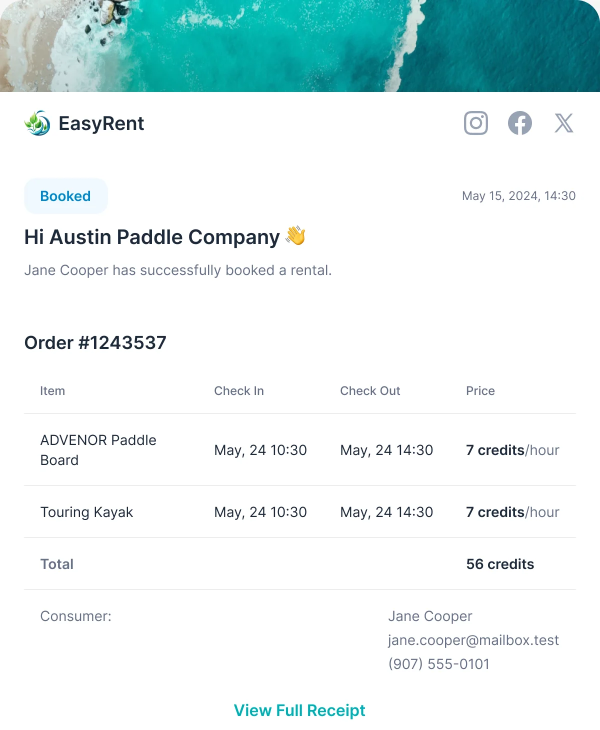
- Each logo direction was drawn with the idea behind it and tried on light and dark. The final mark then carried into the product, the landing and the emails renters and suppliers receive.
One kit for three products
- Found
- Three roles drawn apart drift apart: a rental card or a status reads one way to the renter and another to the supplier.
- Decided
- One UI kit with styles, grids and components, every card and control drawn in each state it takes, used by the renter’s app, the supplier’s app and the console.
The same rental, seen by both sides
One order card from the kit: the renter sees the supplier, the supplier sees the renter.
-
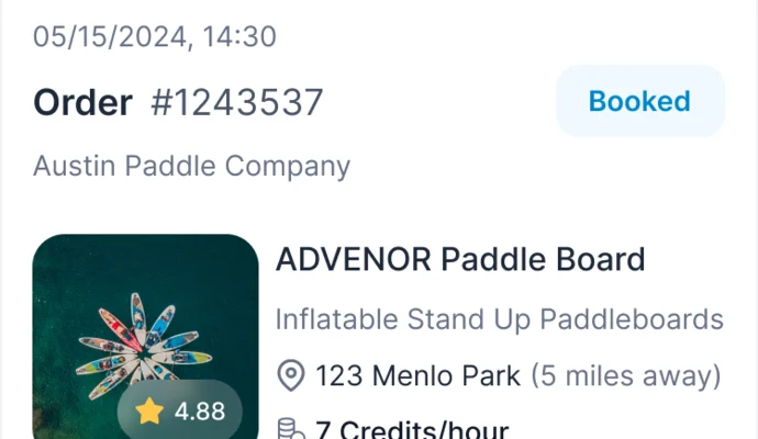
Renter: In rental history. -
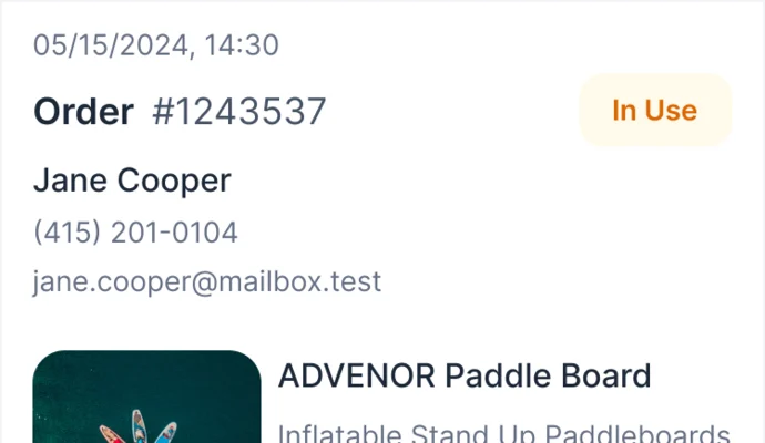
Supplier: In the rentals list.
A rental in each of its states
Booked, in use and damaged: the same marker on every screen.
-

Booked -

In use -
Damaged
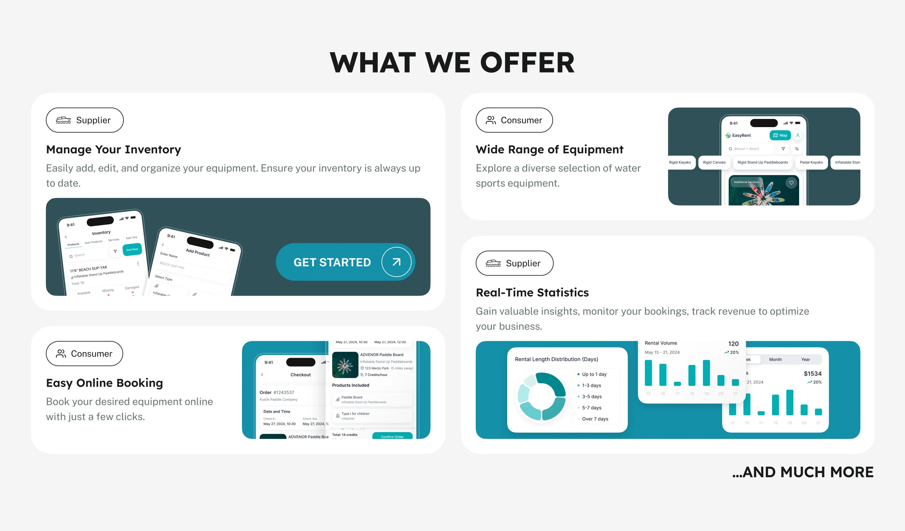
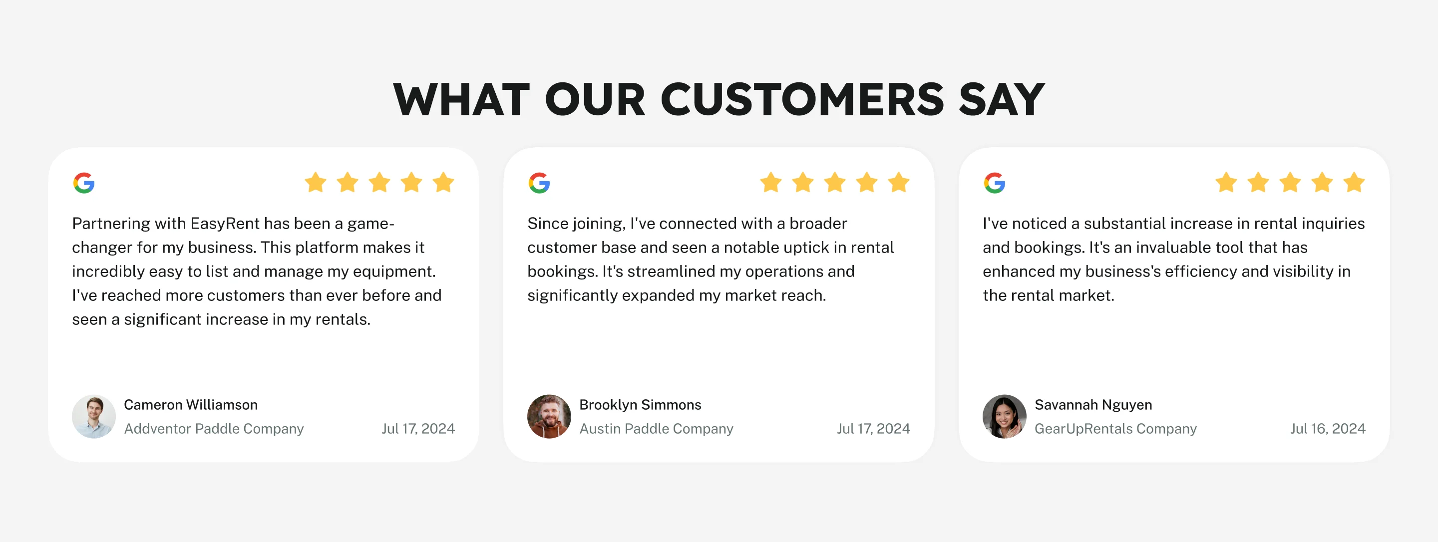
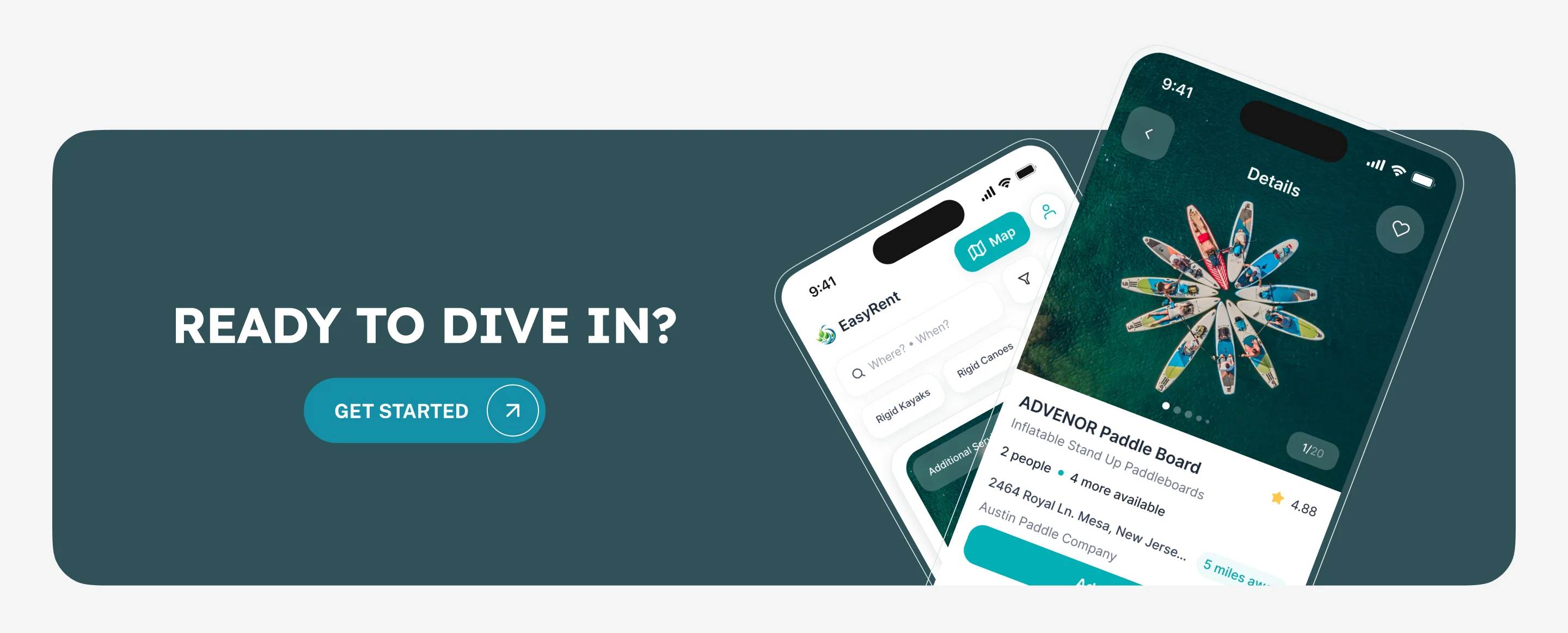
A landing that shows the product
- Found
- First-time visitors meet EasyRent on its website, not in the app, and the page had to work as well on the beach as at a desk.
- Decided
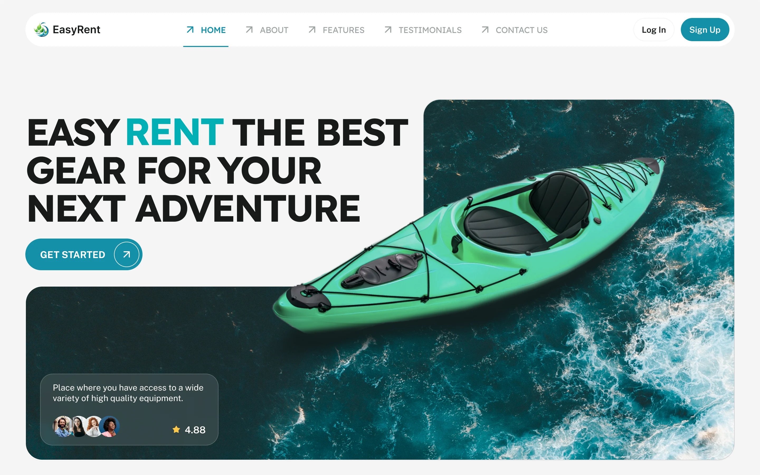
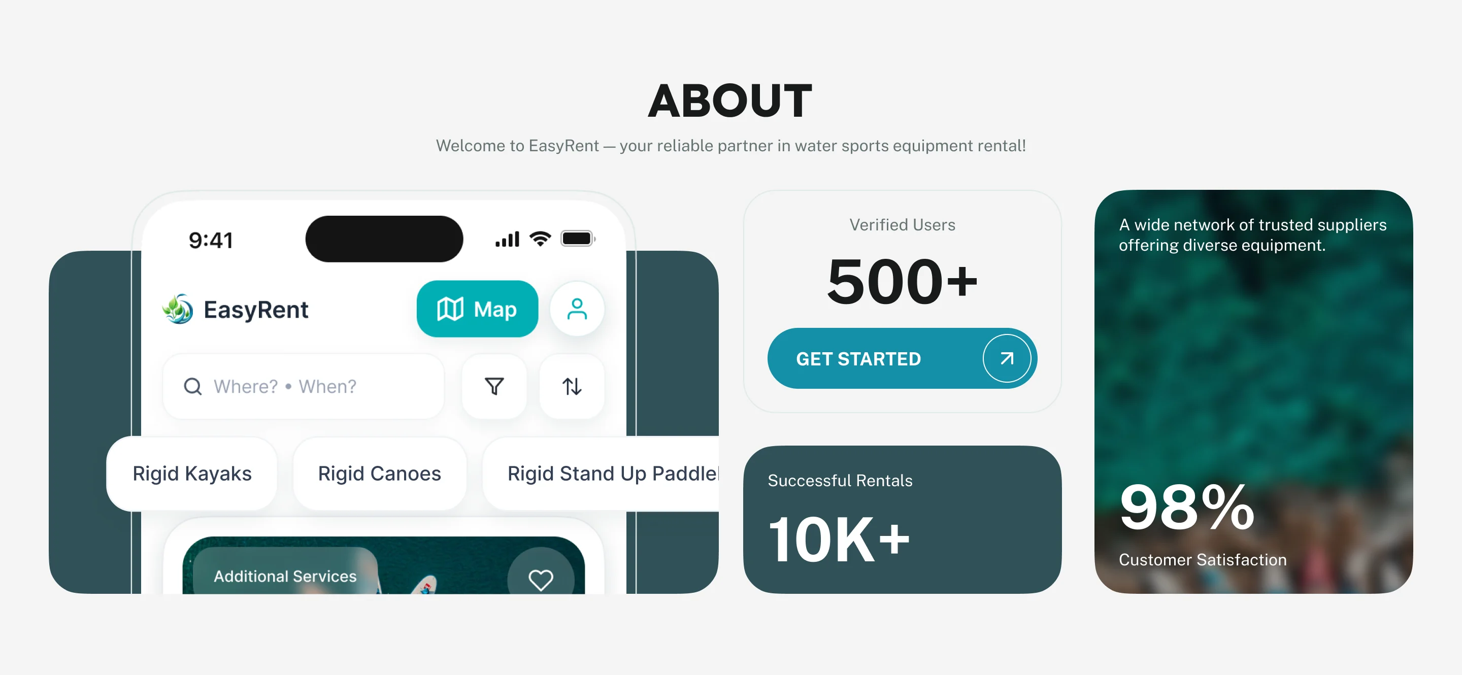
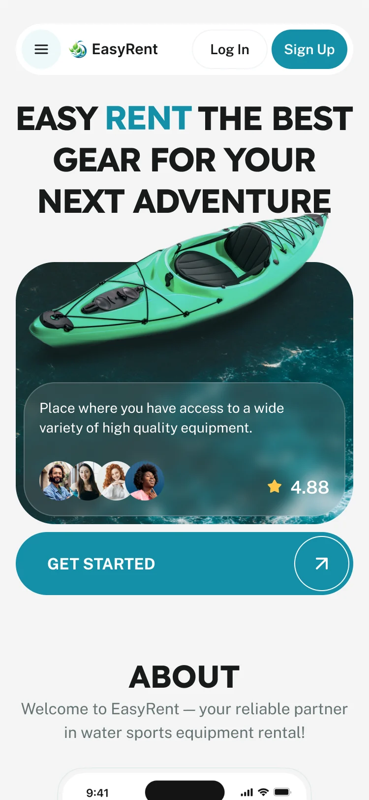
- A responsive landing, designed for desktop and phone and built in Webflow, leads with the gear and one call to start, then shows the app itself.
-
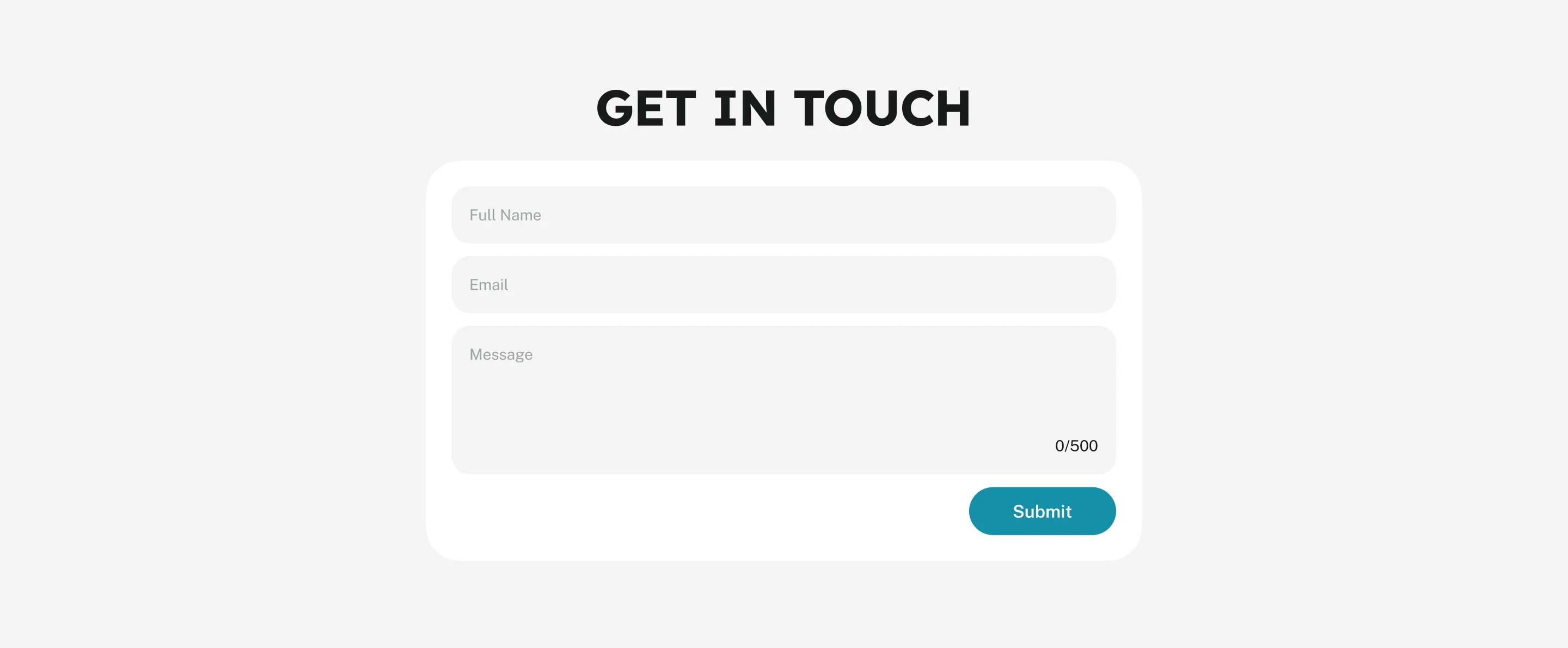
Contact form states
Every field state, the errors and the sent message.
-
Legal pages and a 404
Terms of use, the privacy policy and a missing page, on brand.
-
Email templates
Booking, return, report, survey and status emails for renters and suppliers.
What we delivered
A rental marketplace designed end to end, with the landing and the product built in Webflow and Wized, and launched. The launch is a historical delivery fact; nothing here speaks for how the product runs today.
- roles, each with its own product
- 3
- streams in parallel: design and the Webflow build
- 2
In the client's words
ANODA took our marketplace from the initial idea through design and development, including the landing page. They understood how the experience needed to work for customers, suppliers and our internal team, and carried that understanding through the whole product. We appreciated having one team take responsibility for both how it looked and how it worked. From introducing the service on the landing page to navigating the marketplace and completing a booking, they made the experience feel connected and straightforward.

Will your marketplace feel like one product, or a chain of tools?
At EasyRent we designed the three roles and built the Webflow, Wized and payments stack ourselves, so no seam opened between the design and the build. Bring us your roles and your rules, and we’ll show where they collide.
More work like this
Three more products where people book, bid or rent.
-
E-commerce · Website
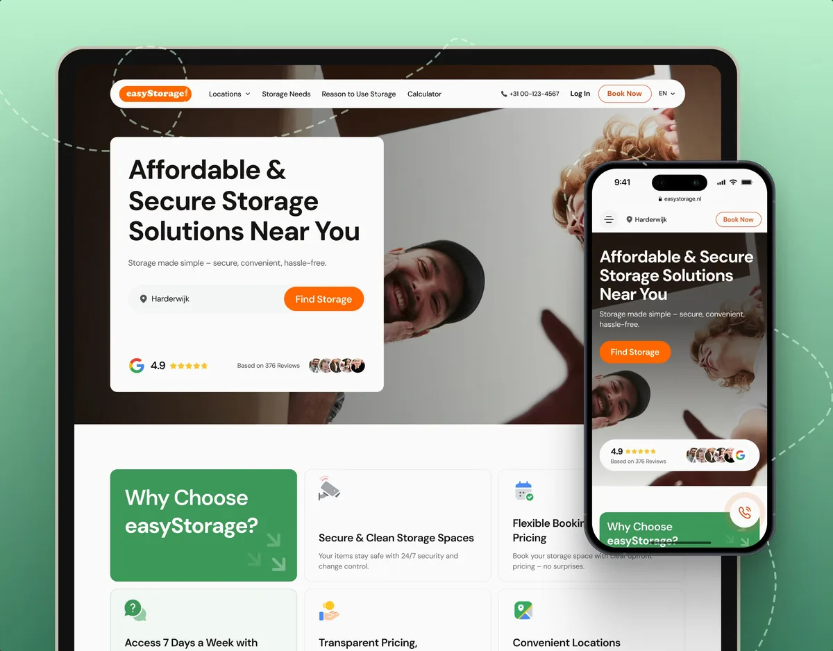
easyStorage Netherlands
Designed and built a self-storage website and redesigned the booking app behind it.
- 300+ Screens designed
- 880+ Project hours
-

Automotive · Marketplace · Web platform
Autodice
Redesigned a used-car marketplace where the buyer names the car and sellers send offers, for buyers, private sellers and dealers.
- 3 Roles: buyer, private seller, dealer
- 2 Ways to search: AI or make and model
-
FoodTech · SaaS
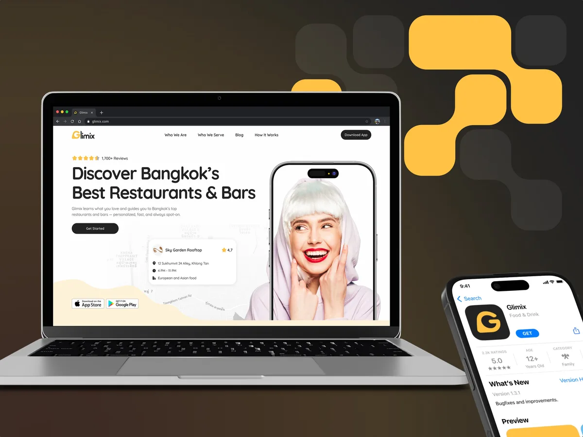
Glimix
Designed a food app for diners and venue owners, with a logo and brand book drawn from scratch.
- 200+ Screens designed
- 5 Experts on the pod