
Boat rental booking, every charge on the table
Sailo is a global marketplace for renting boats, yachts and other watercraft.Over seven releases we designed its iOS app, web product and destination site.

- 1,000+
- screens and states across the app, the web product and the site
- 7
- releases one product, refined release by release
- 3
- surfaces iOS app, responsive web product, public site
- 2
- sides of the market renters and boat owners, plus visitors
Project summary
Sailo is a two-sided marketplace where people rent boats, yachts and watercraft from owners and charter operators around the world. We audited the product, mapped it for renters, owners and visitors, and designed the iOS app , the web product at desktop, tablet and phone sizes, and the public site with its destination guides, on one design system , across seven releases.
What a boat rental asks of both sides
The renter’s path from a search to the dock, then the owner’s side that answers it:
-
Find
- Place, dates and guests
- Filters
- Map
-
Choose
- Boat page
- Extras
- Owner
- FAQ
-
Book
- Trip length
- Captain or bareboat
- Paid now or at the boat
-
Wait
- Inquiry
- Free reservation
- Owner’s answer
-
Talk
- Inbox
- Special offers
-
Host
- My boats
- Bookings calendar
- Payouts
- Pay now and Pay at the boat
- Two bills for one trip, and the renter should never meet the second one at the dock.
- Owner in control and Renter wants a yes
- Owners approve renters, set prices and make private offers; renters still need to know where they stand at every step.
- Phone and Browser
- The same boat, price and booking status on the iOS app, a desktop browser and a phone browser.
A boat page that answers the questions in order
- Found
- A renter deciding on a boat wants the look of it, what it is, who owns it and whether they can ask first, and a long listing buries the answers.
- Decided
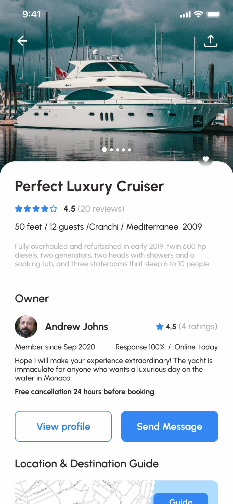
- Photos first, then the boat in one line of facts, then the owner with their rating, response rate and the free cancellation window, then two ways to ask before booking. Where it sails, extras and reviews follow below.
- For the user
- A renter who has never chartered anything knows in one scroll what the boat is and whom they would be dealing with.
-
The boat
Photos you can swipe, and a way to share or save it.
-
What it is
Name, rating, length, guests, make and year, then a short description.
-
Who owns it
The owner’s rating, how fast they reply, and the cancellation window.
-
Ask first
The profile and a message, before any booking.
How the work progressed
From an audit of the product Sailo had to seven releases of one design, one question closed at a time.
-
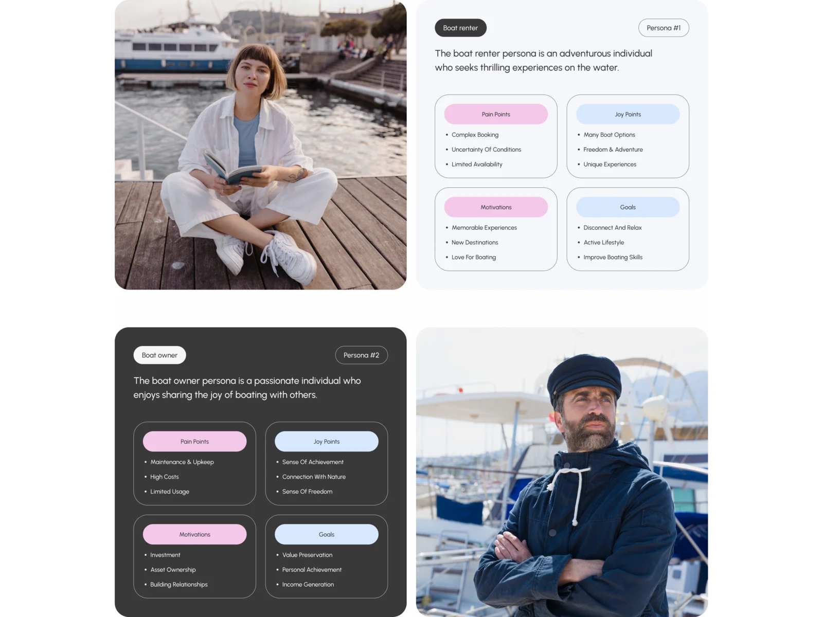
Audit and research
Where renters and owners lost their way, and what other rental marketplaces had taught them to expect
Artifact An audit with a redesign plan, product and competitive analysis, and personas for renters and owners
-
Architecture and flows
Who can do what, in which order, for renters, owners and visitors who haven’t signed up
Artifact A multi-role information architecture, user flows, wireframes and screen maps
-
iOS app
Search, the boat page, booking, reservations, payment screens, messages and offers for both sides on the phone
Artifact The complete iOS UX and UI with its states and clickable prototypes
-
Web product and public site
The same booking at a desk and in a phone browser, and destination pages that bring renters in
Artifact Responsive web UX and UI at desktop, tablet and phone sizes, and the public site with destination guides
-
Design system and releases
One kit behind every surface, kept consistent through seven releases
Artifact A full design system, UI kit and components with states, and a developer handoff for each release
Three roles, mapped before they were drawn
- Found
- Renters, owners and visitors who haven’t signed up see different things, and one person can be a renter today and an owner tomorrow.
- Decided
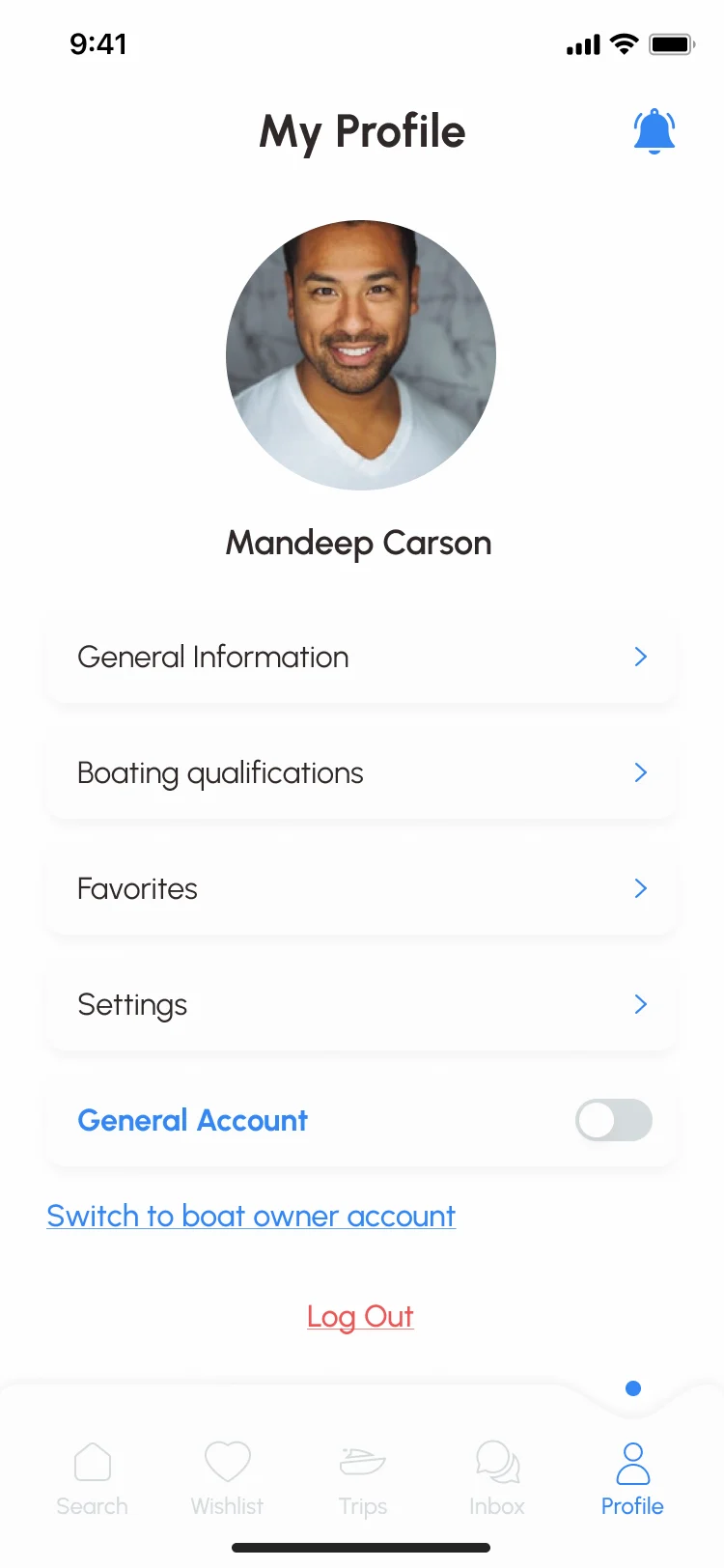
- The whole app was mapped by role first, from onboarding to both accounts, and the renter’s way from a search to a booking was wireframed in grey before any colour. One profile holds both sides: an owner switches accounts rather than signing up again.
-
The app by role
Onboarding, sign-up, search, the boat card, trips and inbox, and the renter’s, owner’s and visitor’s accounts, with how each connects.
Open the full map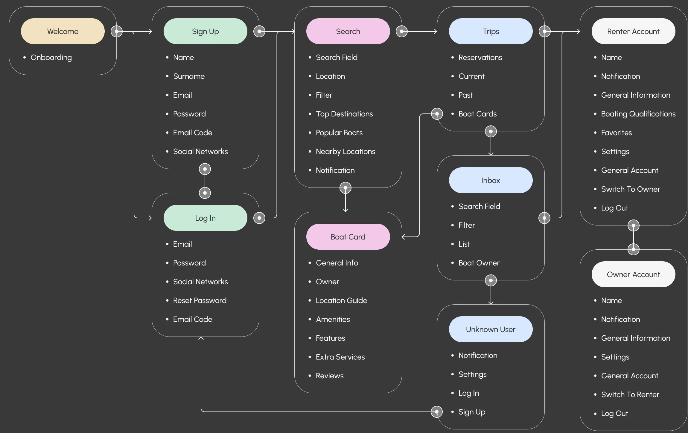
-
From a search to a booking
Featured boats, results for a place, the filters and the boat with its payment plan, linked screen to screen in grey.
Open the full map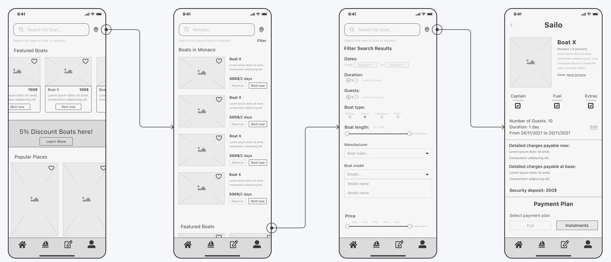
What renters and owners get done
The renter’s way from a search to a confirmed trip first, then the owner’s side, and the same booking on the web.
Finding a boat worth the day
- Found
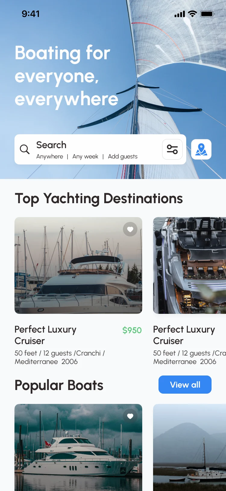
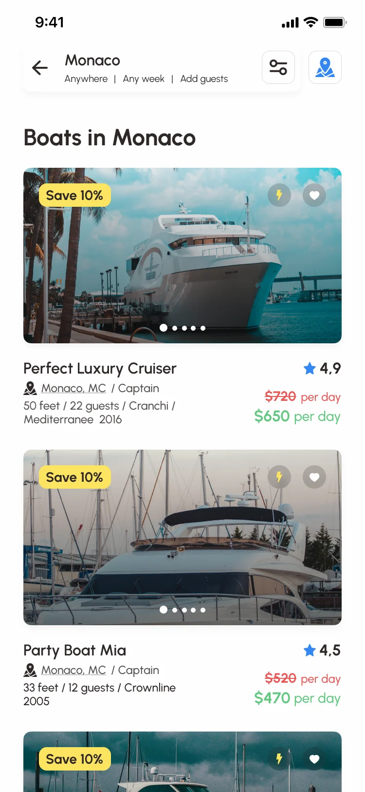
- People often start from a place and a date, not a boat type, and a list of look-alike yachts doesn’t tell them which one fits their group.
- Decided
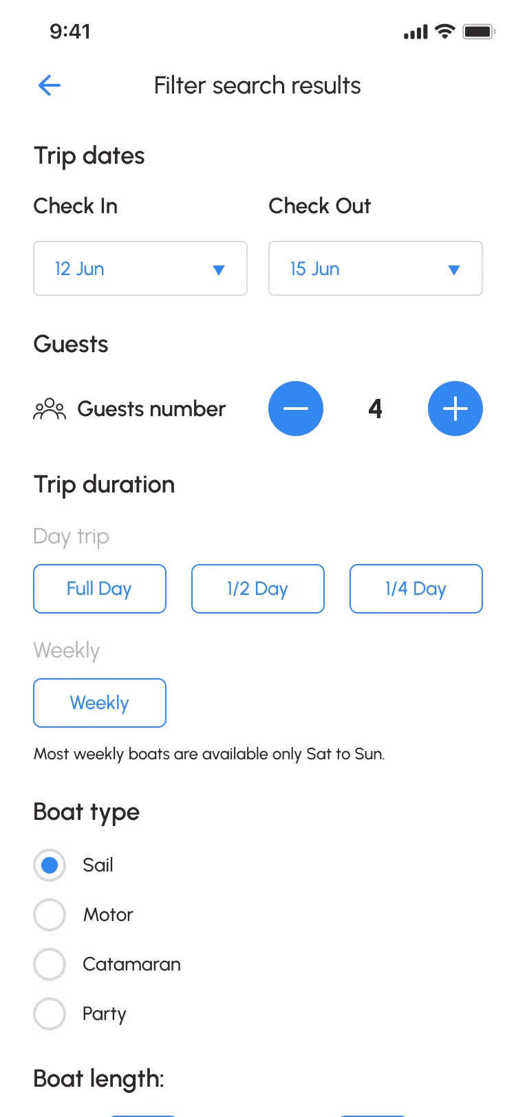
- Search starts from a place, dates and guests. Results show price per day, the saving, size, guests and whether a captain comes with the boat, and the filters follow how people choose: trip length, boat type, length, price, captain and facilities.
The whole price before the request
- Found
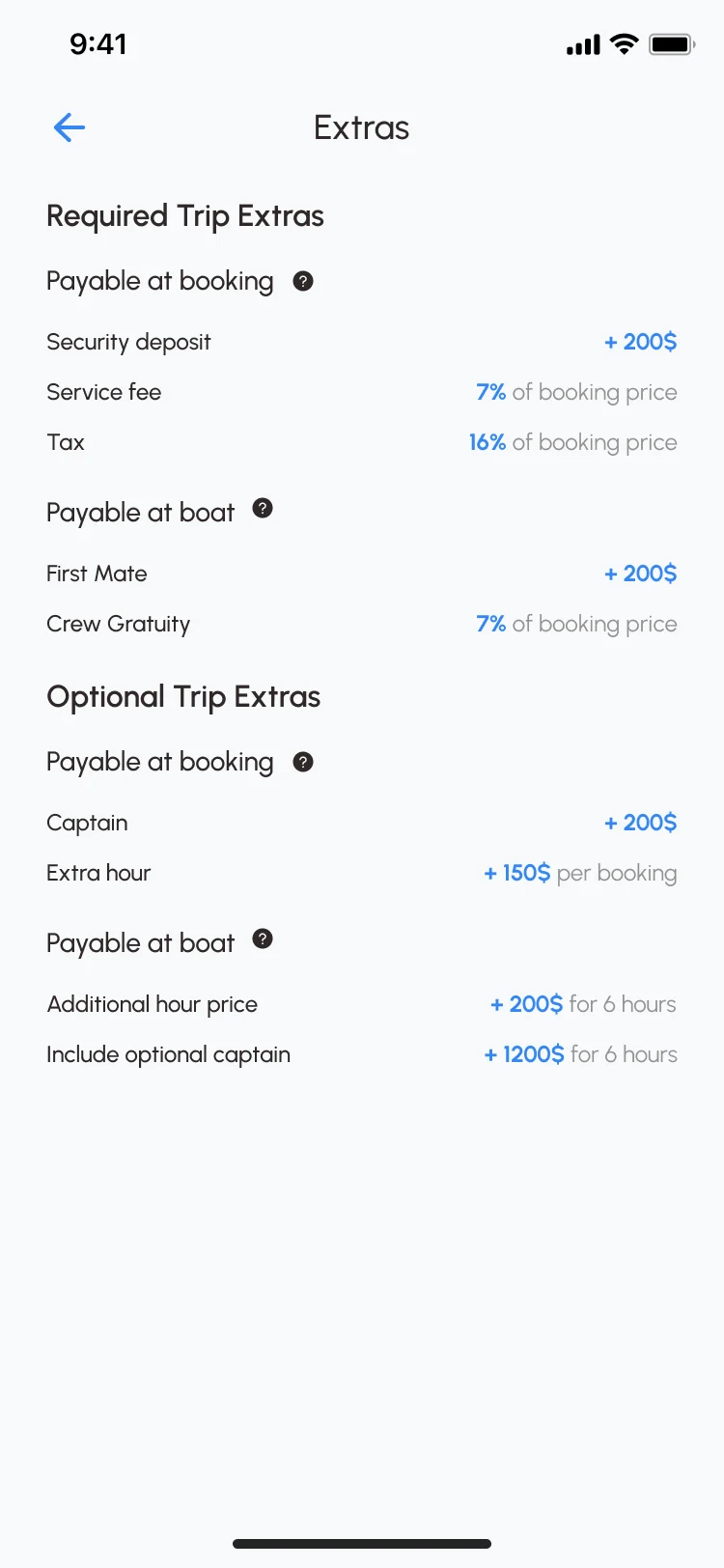
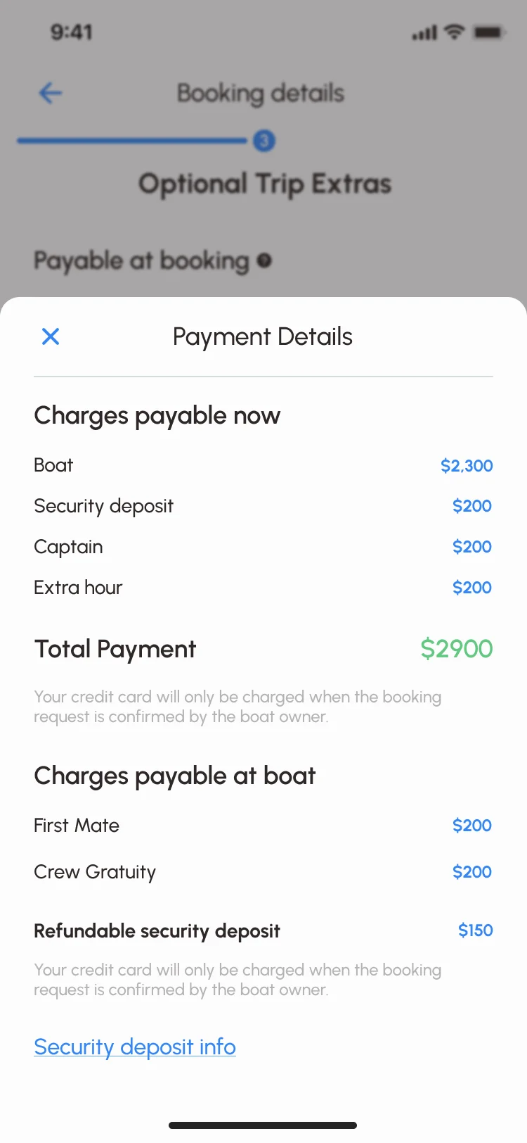
- A charter is paid in parts: some at booking, some to the crew at the boat, plus a refundable deposit. Renters who meet the second bill at the dock feel tricked.
- Decided
-
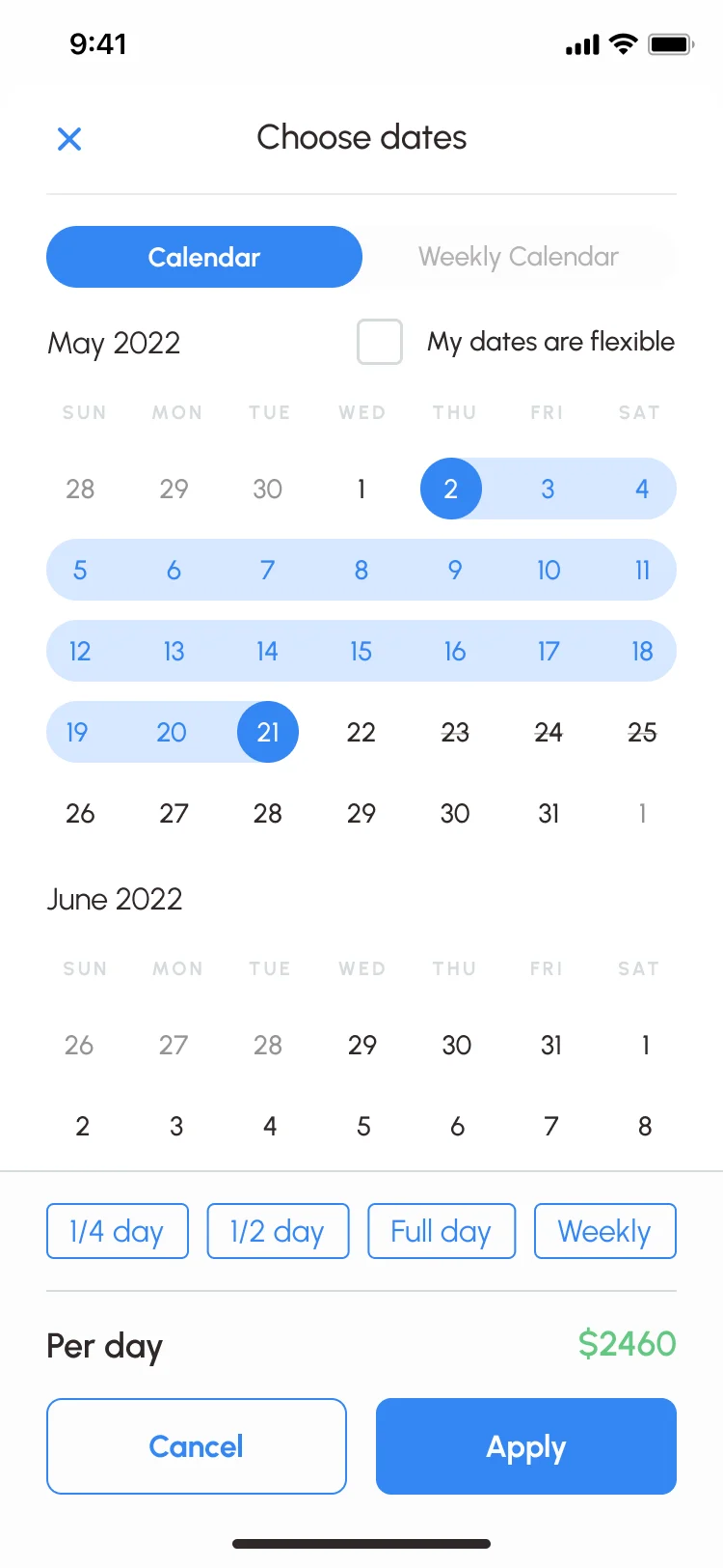
Trip length sets the base price in the calendar.
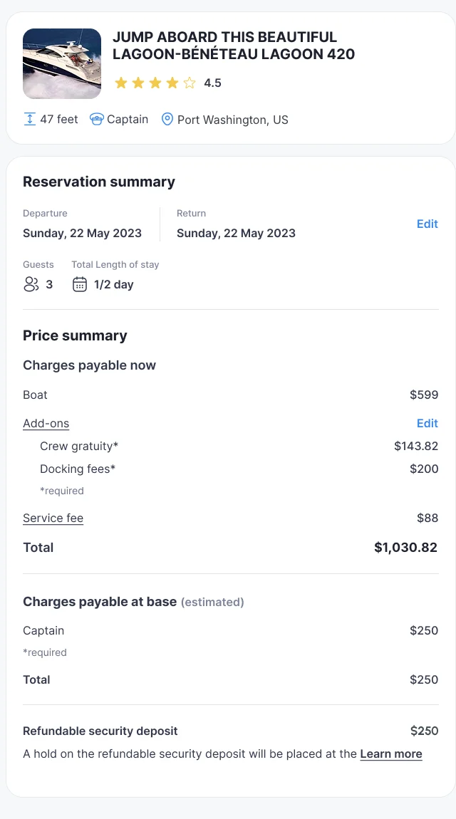
Extras are split into required and optional, each marked as payable at booking or at the boat, and the payment details repeat that split with its totals, with a line that the card is charged only once the owner confirms.
Captain or bareboat
- Found
- Some renters can skipper a boat and want to; most can’t and don’t know how to say so. Owners need to know who will be at the helm before they say yes.
- Decided
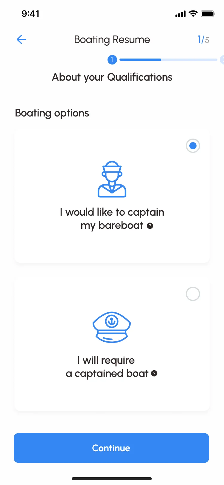
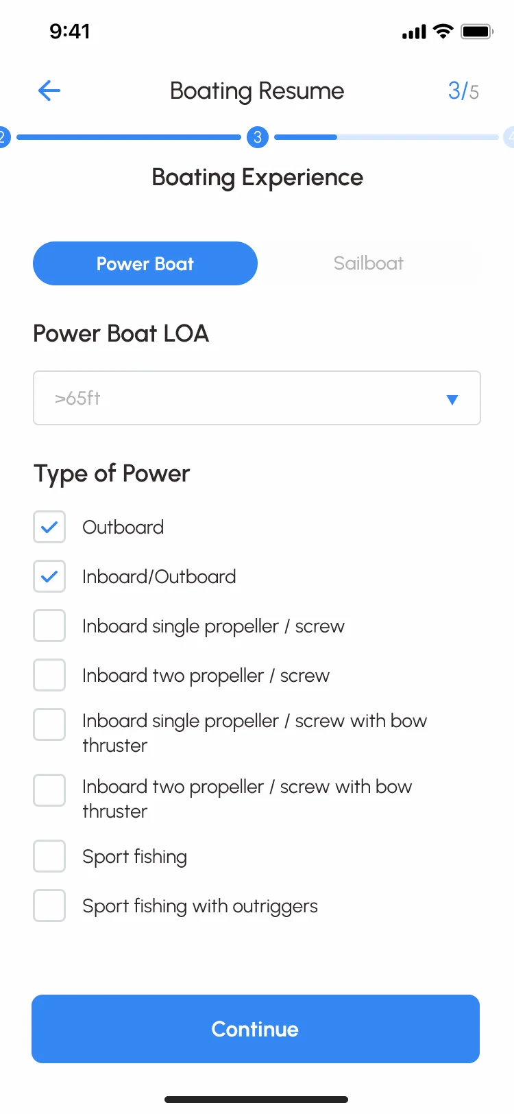
- A short boating resume in five steps: first the choice between skippering the boat yourself and having a captain, then experience by boat type and propulsion, then an optional captain’s licence and its scan. Owners read it with the booking request.
A status for every stage of a booking
- Found
- An inquiry, a boat held for free, an owner’s acceptance and a paid trip are different promises. If they look the same, renters show up for trips that never existed.
- Decided
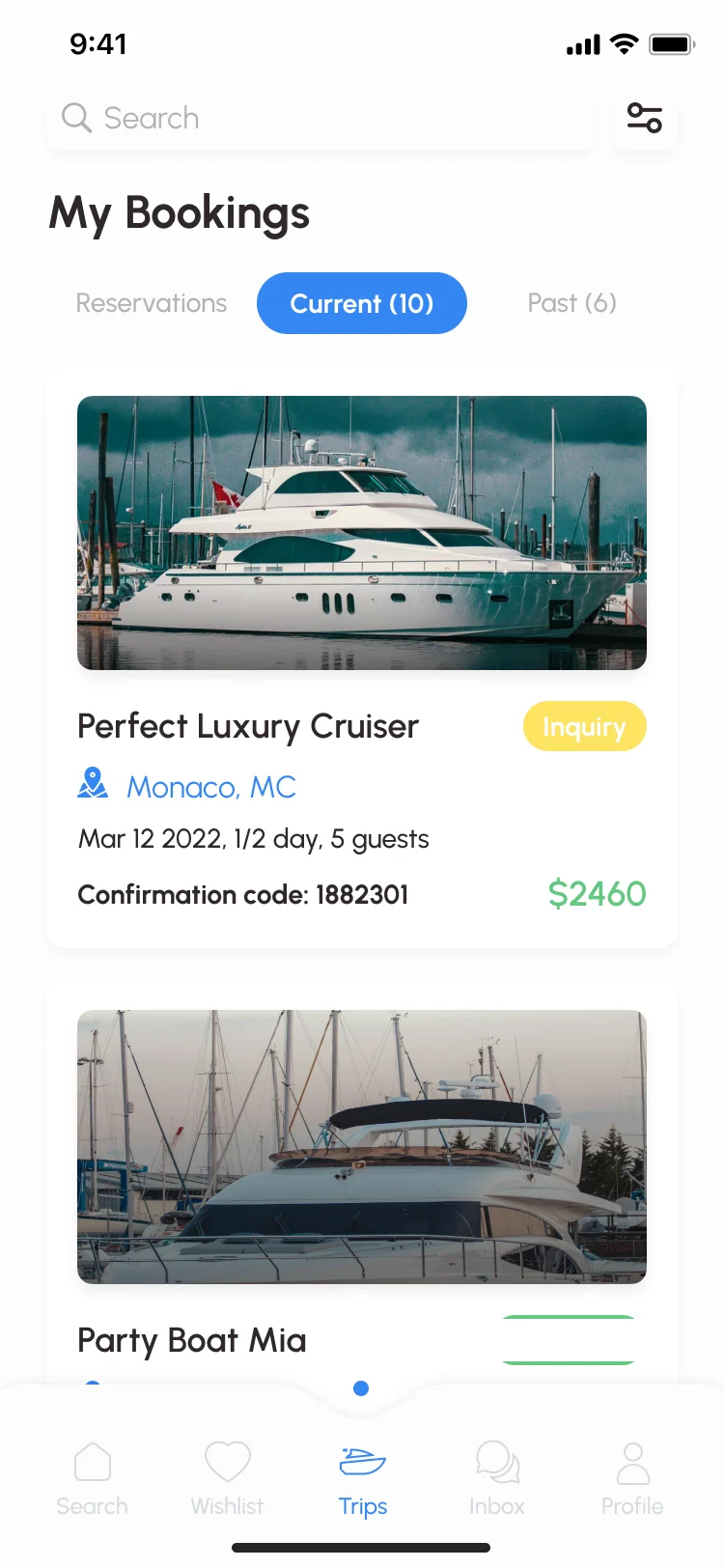
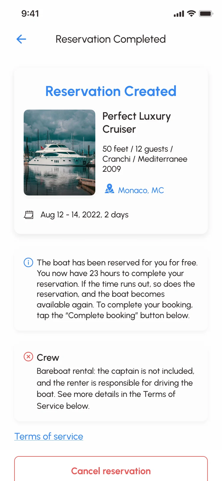
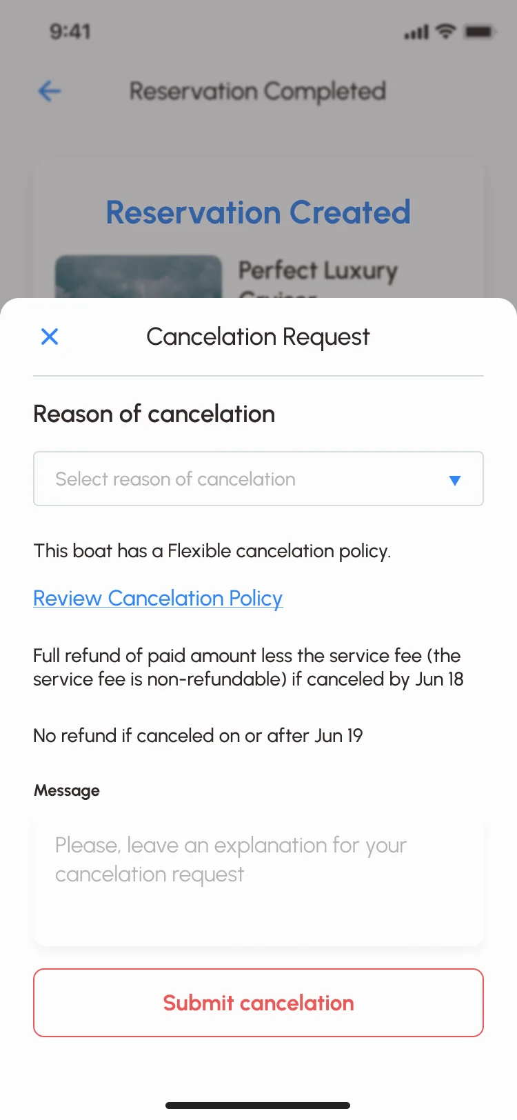
- Every booking carries its own label, from inquiry to accepted, reserved or rejected. A free reservation says how long the boat is held and what happens when time runs out, and cancelling states the refund before anything is sent.
Offers made in the conversation
- Found
- Renters ask about dates and discounts before they book, and owners want to answer with a price of their own without leaving the chat.
- Decided
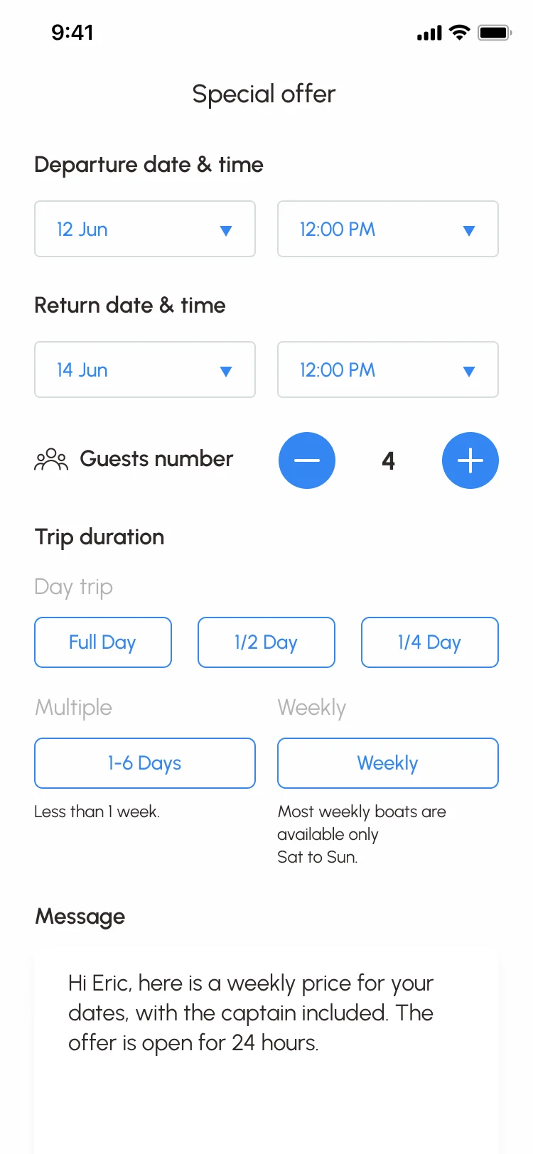
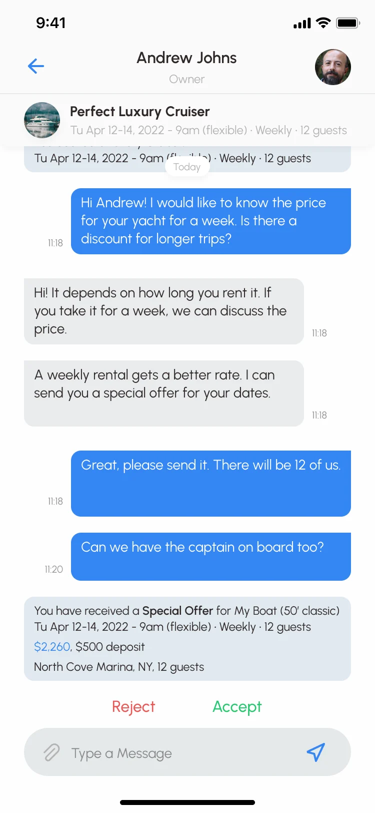
- The owner builds a special offer, with dates, times, guests, trip length and a message, and sends it into the conversation. The renter sees it as a card with the price and deposit, and accepts or rejects it there.
The owner’s side
- Found
- Owners run several boats and many requests, and want to see who pays what before accepting a renter.
- Decided
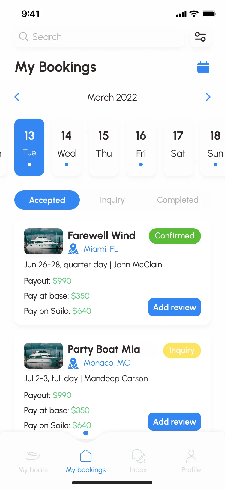
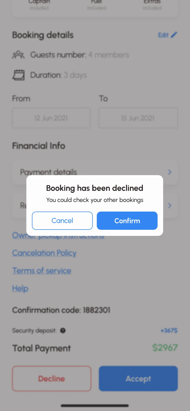
- Bookings on a calendar, sorted by accepted, inquiry and completed, each with the payout split into what is paid at the boat and what comes through Sailo. The owner accepts or declines a request from its details, and a decline asks for confirmation.
The same booking in a browser
- Found
- Many renters plan a charter at a desk, and the web had to tell the same story as the app, not a second version of it.
- Decided
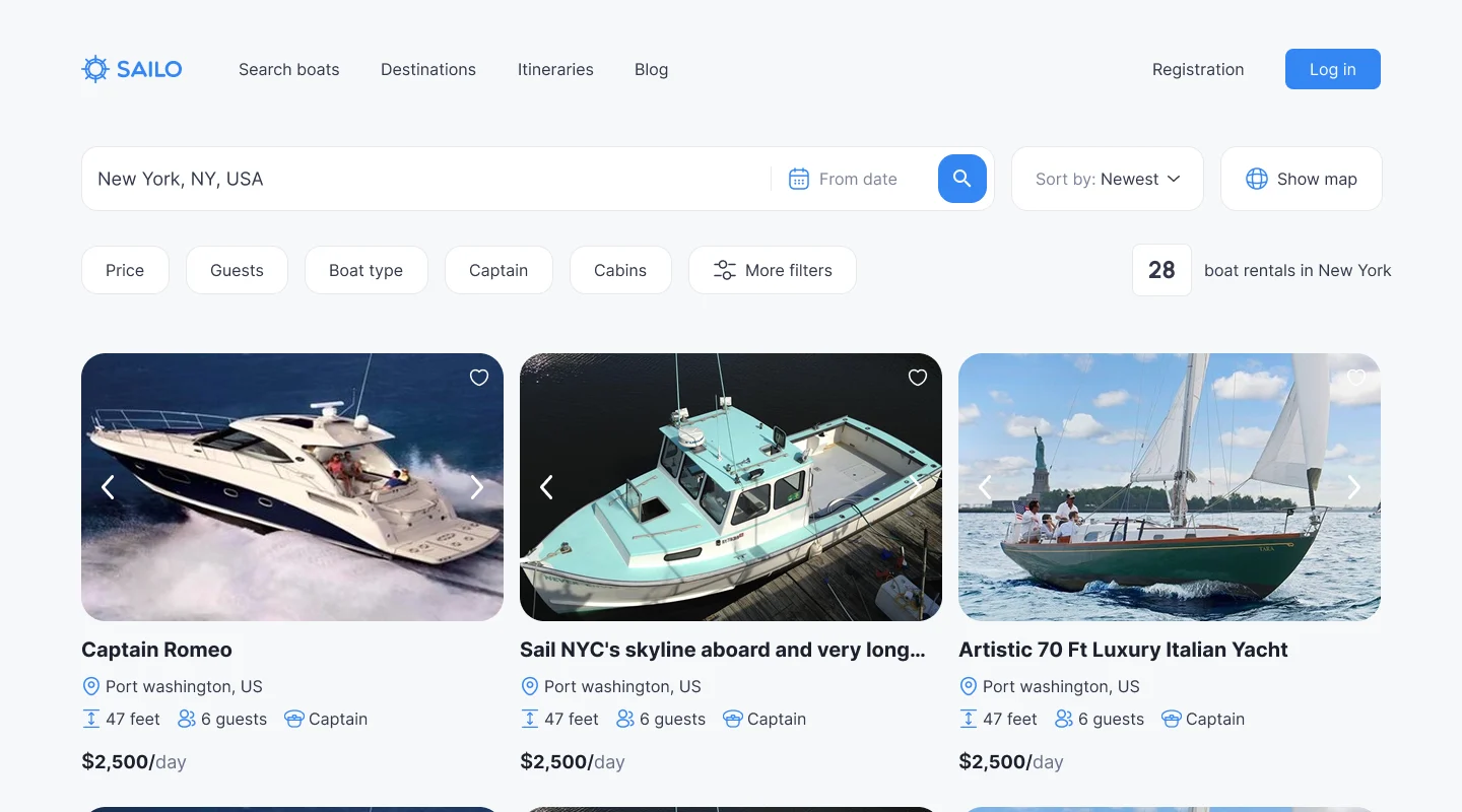
- The web search shows the same facts per boat, and checkout keeps the app’s split: charges payable now, charges payable at the base, and the refundable deposit, each with its own total.
One system for the app, the web and the site
- Found
- The same boat appears in the app’s results, on a web page and in an owner’s list; if it looked different in each, nobody would trust they meant the same boat.
- Decided
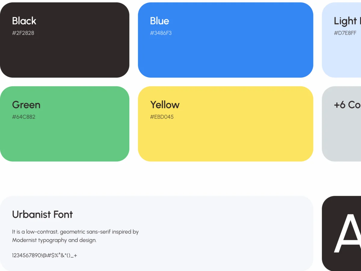
- A full design system and UI kit: one palette, the Urbanist type scale in the app and the same boat card logic on the web, with components drawn in every state, from empty lists to errors.
A boat reads the same everywhere
Photo, name, place, size, guests, captain and price per day, in the same order on the phone and on the web.
-
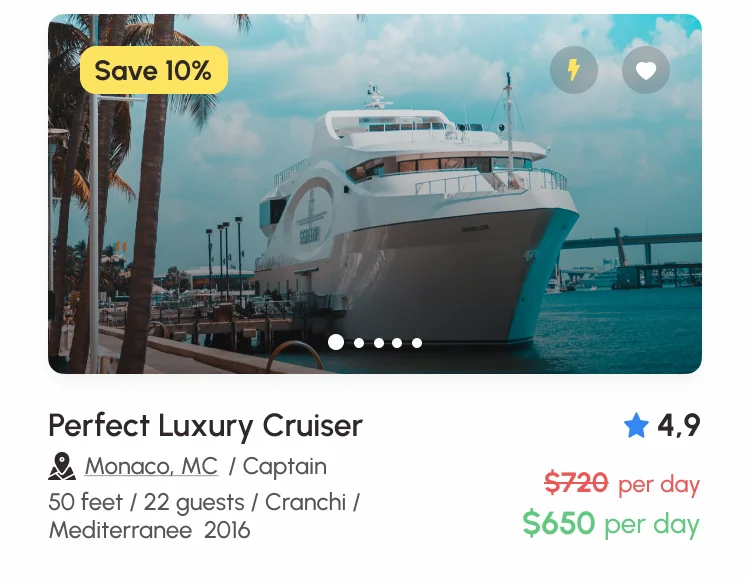
iOS: The boat card in the app’s results. -
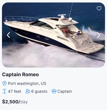
Web: The same card in the web search.
Drawn for the moments in between
A place with no boats, an owner with no listings, a wrong email: each says what happened and what to do next.
-
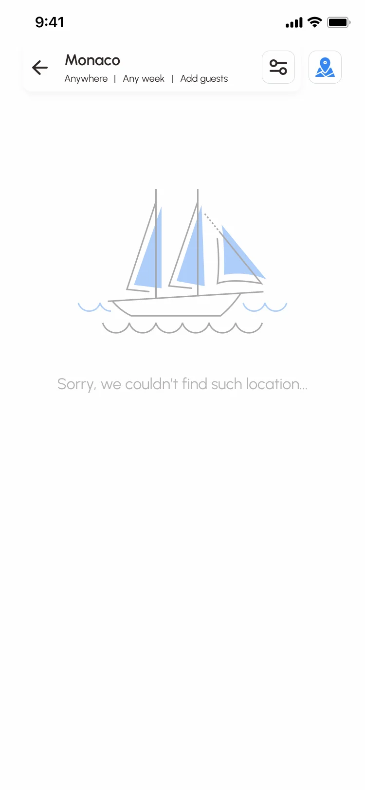
No such place -
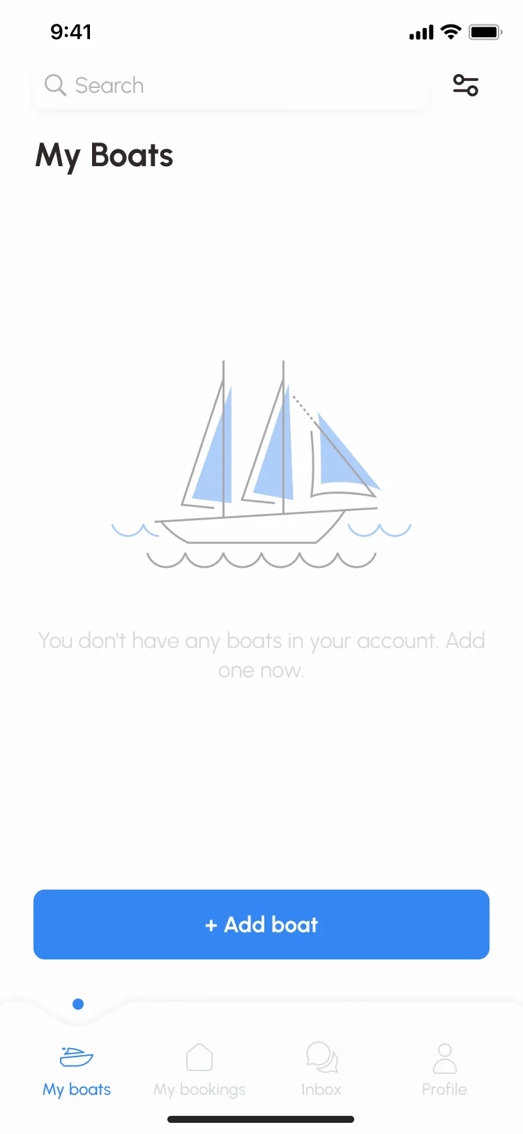
No boats yet -
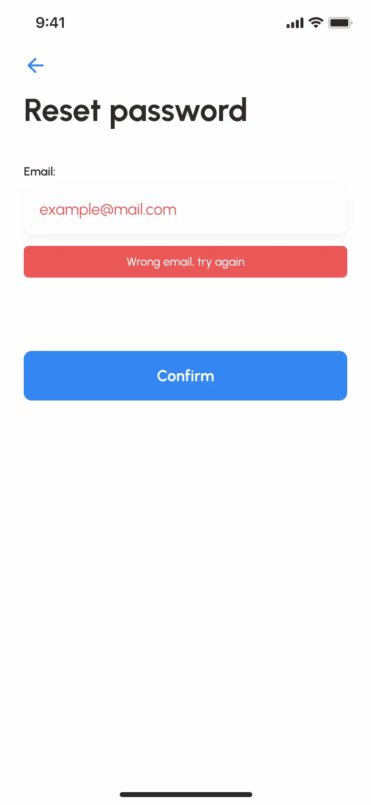
Wrong email
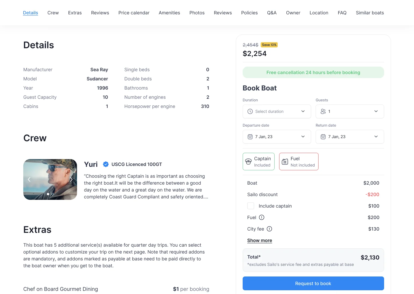
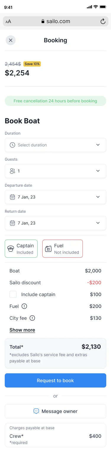
The same booking card at every size
- Kept
- The price with its saving, free cancellation, duration, guests and dates, captain and fuel, the itemised price and the total, and Request to book.
- Changed
- On a desktop the card sits beside the boat’s details and follows the scroll; in a phone browser it opens as its own screen, with Message owner and the charges payable at the base below.
The site that brings renters in
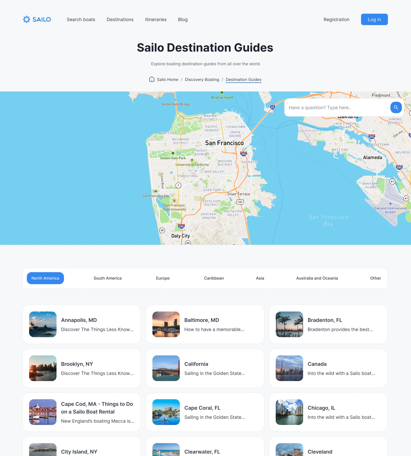
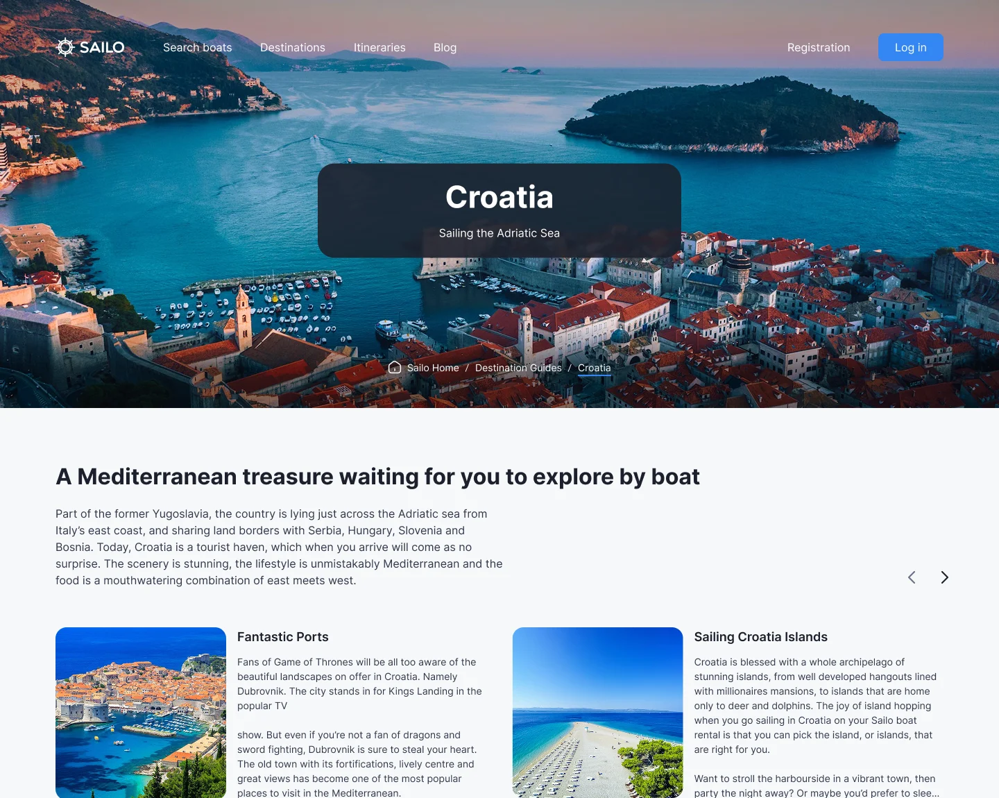
- Found
- Most charters start with a place, not a boat, and people search for where to sail before they look for what to sail.
- Decided
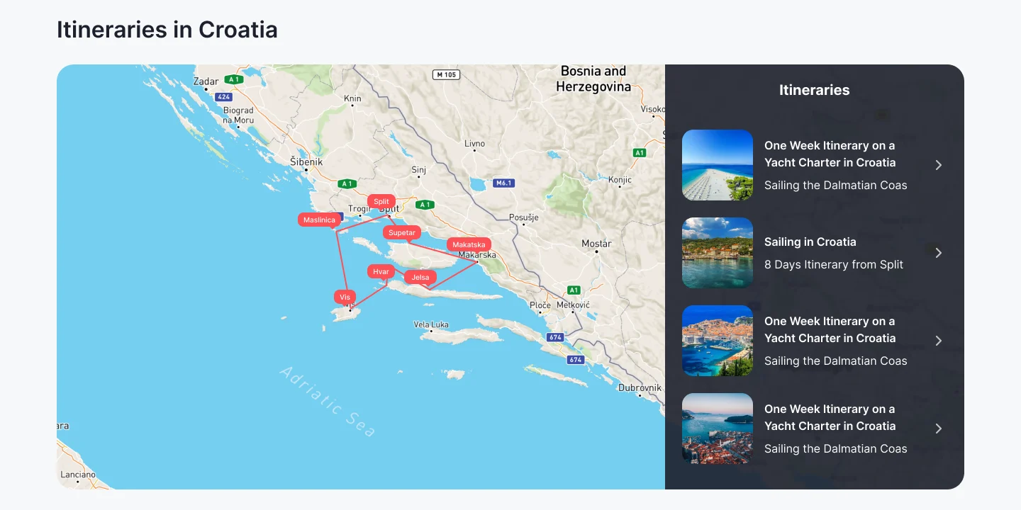
- Destination guides with a map and regions, then a page per country with the reasons to go, itineraries on a map and boats to book there, all in the web product’s look.
-
Clickable prototypes
The flows of each release, tappable end to end.
-
Screen maps
Every screen and state of each role, in the order they are used.
-
Developer handoff
The design system, the UI kit and the screens of each release, ready to build.
Where the product ended up
One design for the whole marketplace: renters find a boat, see the full price split between booking and the dock, choose a captain or skipper it themselves, and follow each booking from inquiry to confirmation; owners answer in the chat with their own offers and run their bookings and payouts.
Development was not ours, and no business figures are claimed here.
- screens and states
- 1,000+
- releases
- 7
- views of the case on Behance
- 13.6K

Afraid your customers only see the full price at the dock?
In Sailo, every charge says when it is paid: at booking, at the boat, or held as a deposit, on the phone and on the web alike. Show us how your product charges, and we’ll show you where the total stops adding up for the people paying it.
More work like this
Three more products where booking, renting and paying had to read the same for everyone involved.
-
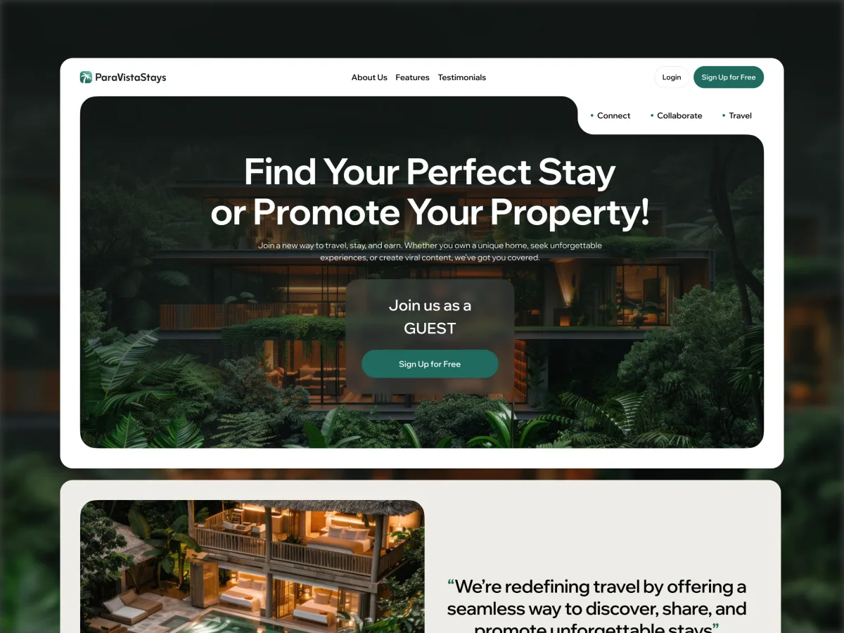
Travel · Marketplace · Mobile-first web + Admin + Landing
ParaVistaStays
Designed a vacation-rental marketplace for guests, hosts and creators, with a desktop Admin portal and a brand from scratch.
- 347 Unique screens
- 5 Experts on the team
-
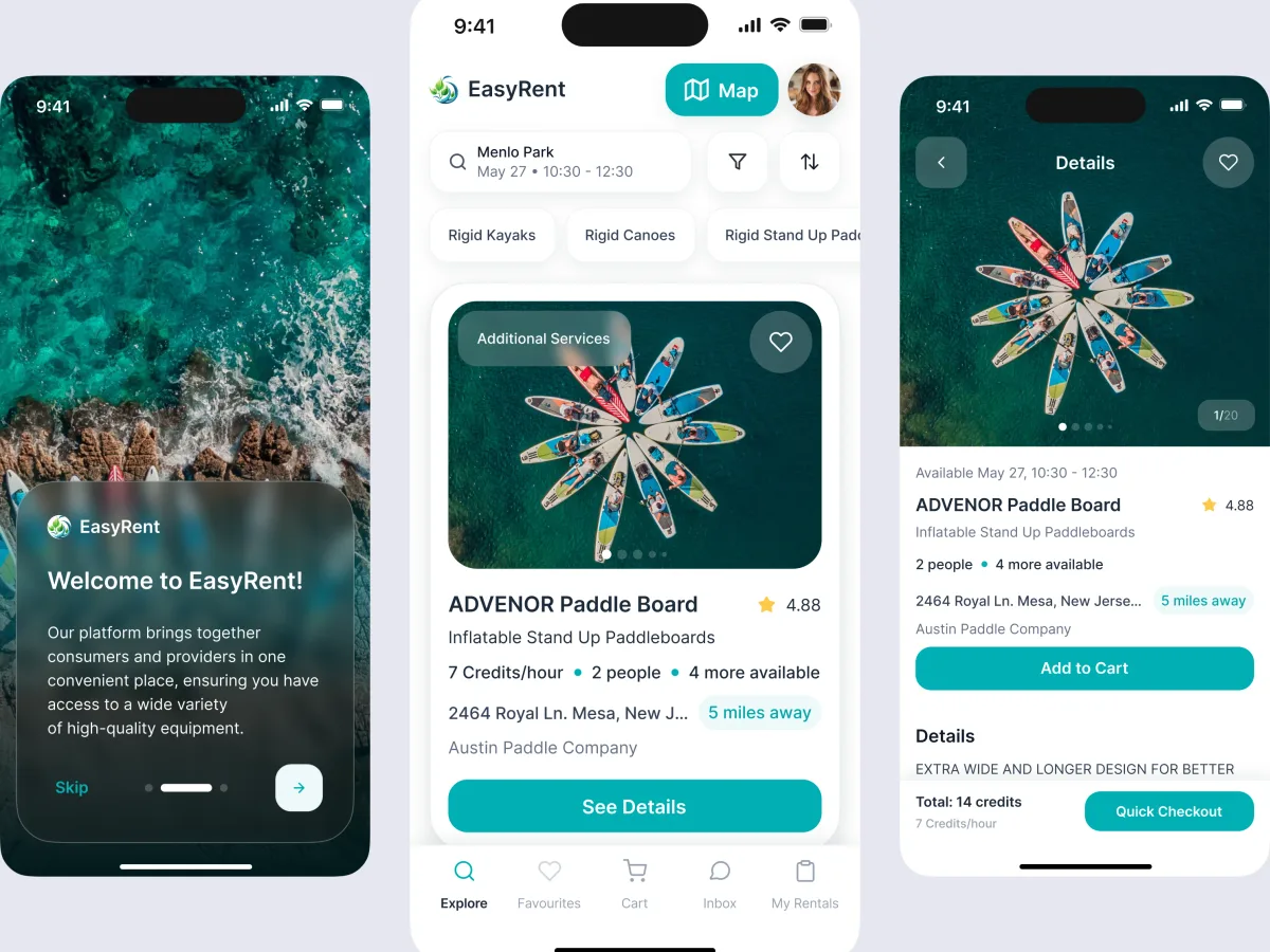
Marketplace design · Water sports
EasyRent
Structured an equipment-rental marketplace for renters, suppliers and its own team across mobile and web.
- 3 User roles — renters, suppliers and administrators
- Mobile + web Consumer journeys and marketplace management
-
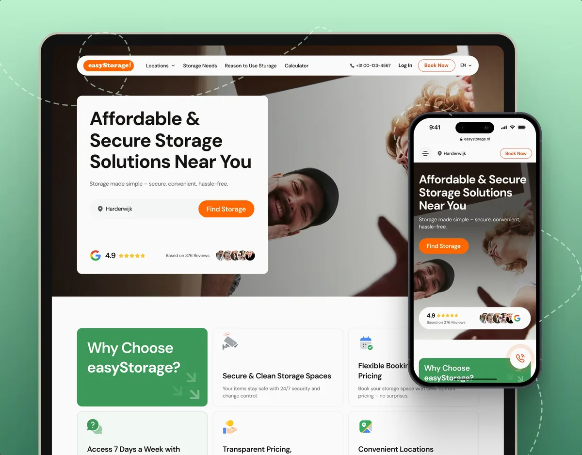
E-commerce · Website
easyStorage Netherlands
Designed and built a self-storage website and redesigned the booking app behind it, from a pin on the map to a booked unit.
- 300+ Screens designed
- 880+ Project hours
What we brought to Sailo
The product
- Marketplace design Renters and owners in one product, each with their own way through it.
- Booking app design Search, prices split by when they are paid, statuses and cancellation.
- Mobile app design The complete iOS app for renters and owners.
- Web app design The web product at desktop, tablet and phone sizes.