
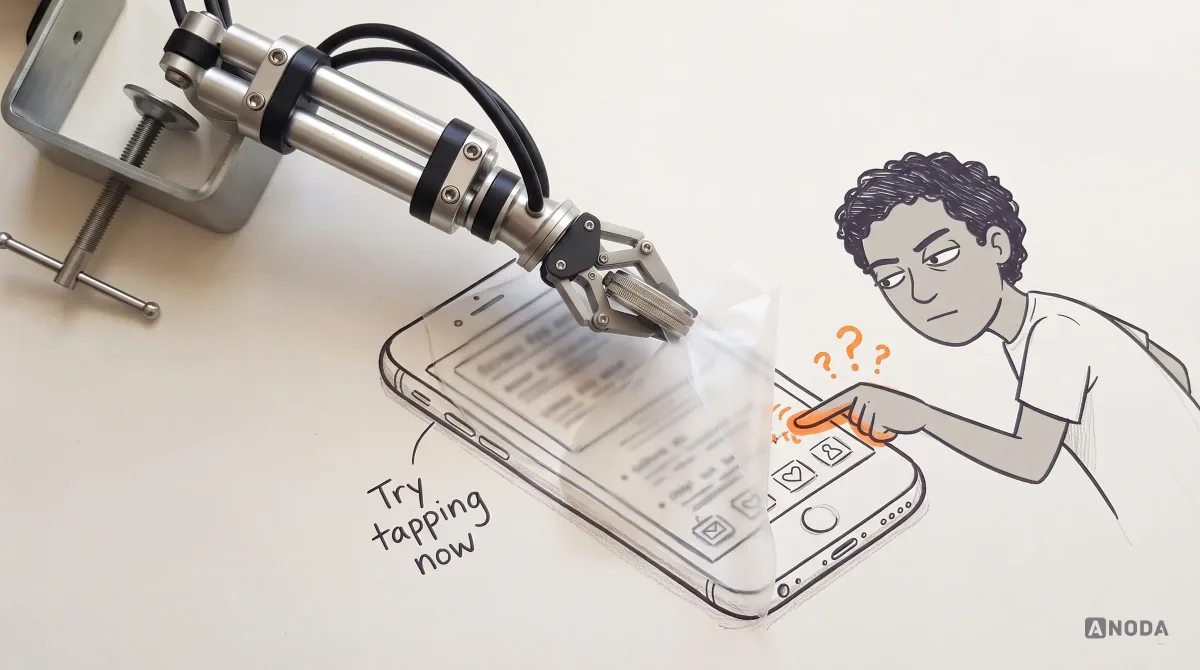
Accessibility in UX Design: How to Build It Into the Product Process
Learn how accessibility fits UX research, interaction design, content, handoff and testing—and how product teams can prioritize and verify barriers.
Design public services people finish the first time — information they can find, forms that ask only what applies, and a clear status once they press submit — for residents and for the businesses that file with you.

Public services people finish the first time, as a resident or a business, on any device.
Software a company uses to meet the rules.
Government & Public Sector UX
Services the public uses to deal with government.
Not included
Four points where residents and businesses give up on a public service, and what the design changes at each.
Topics and search in everyday words, with the answer before the detail.
Eligibility, application and documents in short steps that work on a phone.
Company details, returns and attachments checked before they are sent.
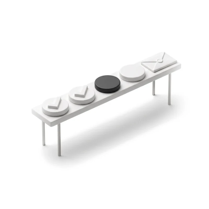
What happens next, when, and what is still needed from them.
You receive
Government UX design is tested by people who use a service once, under stress, on an old phone or in a second language. Each of these states gets a screen that tells them where they stand.
It fits when the public must complete something, and the rules behind it are already set.
Residents and businesses meet the service rarely and get no training.
Eligibility, documents and deadlines decide who gets through.
Status questions fill your phone lines and inboxes.
A service owner can bring policy, legal and IT into decisions.

Tell us who uses your service and where they stop or call. Our reply will name one step to fix first and the service to do it with.
Public-sector work is bought one service at a time, and the proposal for that service carries the terms.
Tell us who the service is for — residents, businesses, staff — and which step causes the most repeat contacts.
Message received.
Within 15 minutes, we’ll email you initial feedback and follow-up questions.
Learn how accessibility fits UX research, interaction design, content, handoff and testing—and how product teams can prioritize and verify barriers.
Improve user flow with ANODA UX Agency. Discover principles, tools, and strategies to design seamless, intuitive UX. Start improving your user experience today!
Yes, we have worked on government products. Because it is not a published case study, this page gives no name, scope or figures, and our work page has no government case yet. We can walk you through it on a call. The published cases show the same kind of work in other sectors — multi-role portals, long forms and status views — and each names the sector it comes from. Put one question to every team you compare: which part of a public service did you design, and did it launch?
Ask for a real service, not a set of screens. A team that can do government UX design should show a form with conditional questions, what happens when a document is rejected, the status view after submitting, and the refusal and appeal states nobody puts in a portfolio. Ask how they design for screen readers and keyboard use, and who tests it; how they worked with policy owners; whether the service went live; and which designers would be assigned to yours.
Residents, applicants and people acting for a relative; business owners and the accountants or agents who file for them; and the caseworkers and editors who run the service. Citizen portal design covers finding information, checking eligibility, applying, uploading documents, paying a fee, tracking status and answering requests. G2B portal design covers registering a company, filing returns and reports, and managing several users on one account. Staff need a queue of cases and a clear view of what is missing. The two sides differ: G2C UX design is for someone who comes once and needs every step explained, while a business may file every quarter and wants speed, saved details and several people on one account.
A new digital service begins with UI/UX & Product Design; Web App Design for citizen and business portals; Mobile App Design when people apply and check status on a phone; Website Redesign when the problem is public information people cannot find. If a live service sheds applicants, begin with a UX Audit. Software that helps companies meet regulation belongs to Compliance & RegTech Design, and legal help to LegalTech.
Your team and its specialists are; our part is the design. We work with contrast, focus order, labels, error messages and keyboard paths in every state, write plain-language drafts of on-screen text for your team to approve, and mark where legal wording must appear. Testing with people who use assistive technology, formal accessibility audits and legal review stay with your team or a specialist. We use test accounts and sample data, never real personal records. Where a rule decides who may see or change an application, your team sets it and we design how it shows on screen.
A service owner with authority to decide, a test account per audience on staging or the live service, and the rules behind the form: eligibility, documents, deadlines and who owns each. Support contacts and drop-off data help most — the questions people phone about show exactly where the service fails, and the letters or emails that send people to the service show what they expect to find when they arrive. If engineering joins early, the case and registry systems inform the forms instead of forcing late changes.
Typically a service map per audience, the information structure, form logic and status views with every state between them, a clickable prototype and the UI. Cost and time rise with more services and audiences, more rules behind each form, more platforms, a live service to redesign, and a longer chain of approvers. Public-sector projects get a custom proposal rather than a package price, with dates fixed only after access, approvals and supplier dependencies are clear.
Yes, and we follow it rather than working around it. We design with its components and patterns, flag where a new one is needed and why, and give you every file we make. We work alongside your designers, engineers, policy owners and content editors, and when the service is live, we keep the addresses and paths people already know.