
A custom orthotics app, from HR invite to insoles
Hike brings custom orthotics to people on their feet all shift, through their employer.We designed its brand, employee iOS app and HR admin.
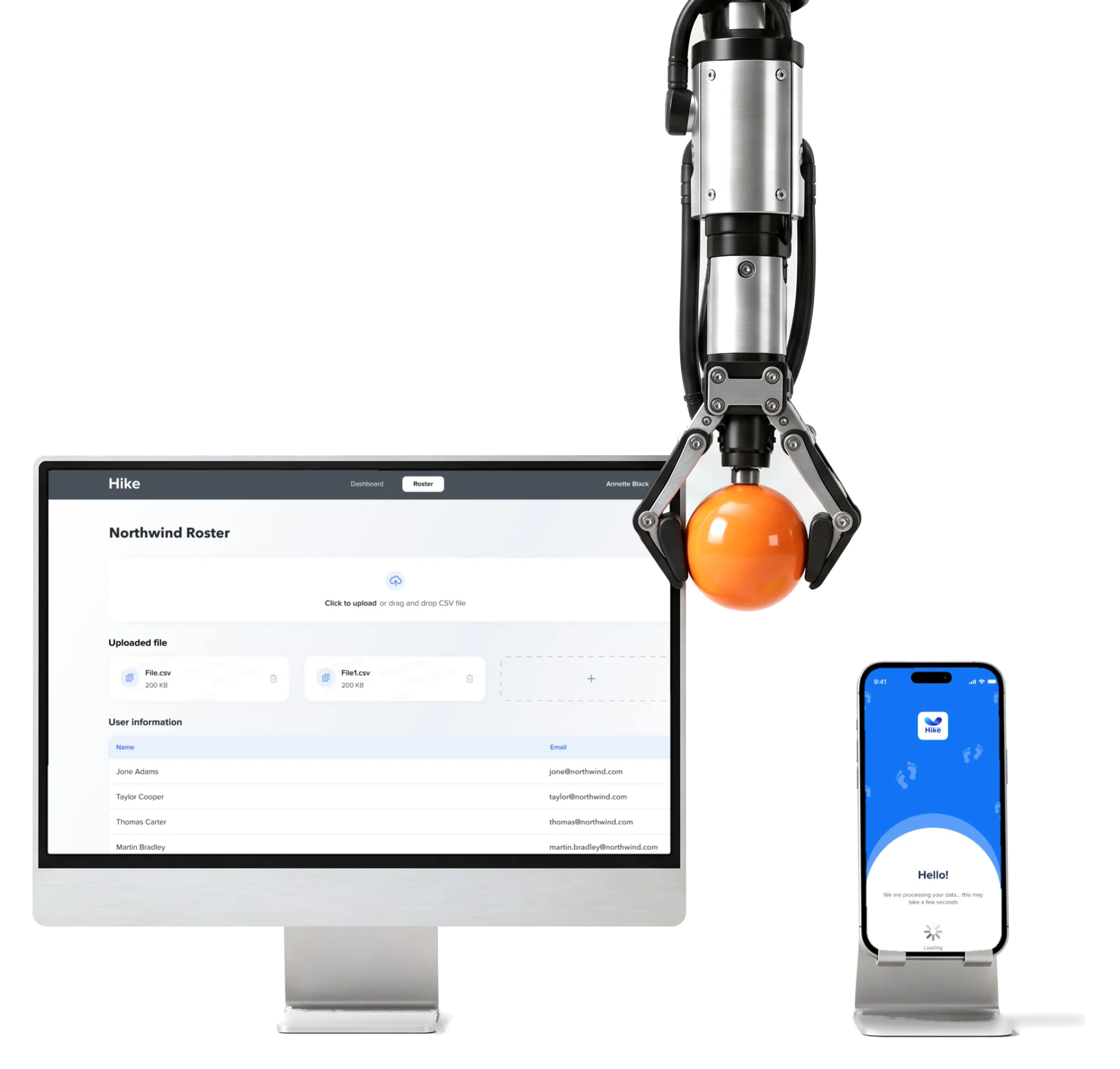
- iOS
- app installed from the App Store, onboarding to the order
- 3D
- foot scan guidance, permissions, capture, checks and retries
- Desktop
- admin the employer’s roster and invitations
- Brand
- from zero the logo, the visual language and a trade-show booth
Project summary
Hike is a new workplace foot-health company that brings custom orthotics to employees through their employer. We gave Hike a brand from zero and the product design : the employee iOS app with its LiDAR foot-scan journey, a desktop HR admin and the design system under both, then carried the brand onto an exhibition booth.
How the work ran
- Scope
- The brand from zero, then the employee app, the scan journey, the HR admin, the design system and an exhibition booth.
- Relationship
- One continuing engagement, with follow-on releases after the first version of the app.
- Platforms
- An iOS app installed from the App Store and a desktop HR admin, in light mode.
- Development
- Design only. The LiDAR engine, 3D reconstruction, app build, App Store release and orthotics were not ours.
What happens between an invite and a pair of insoles
The employee’s path from HR’s invitation to the order, and the employer’s side that starts it:
-
Invite
- HR’s roster upload
- Invitation email
- App Store download
-
Explain
- What the programme is
- What happens next
-
Tell us
- Name and job
- Body and shoes
- Delivery address
-
Where it hurts
- One condition a screen
- Anything else
-
Scan
- Pain map
- Sizing guide
- Permissions
- Capture
- Checks and retries
-
Order
- Processing
- Order status
- Feedback
- HR’s rollout and Each person’s pace
- The employer invites everyone at once; each employee installs, answers and scans alone, and should never need to call HR.
- Clinical detail and Plain words
- The orthotics need precise answers about pain and a usable scan; the questions have to read like a conversation.
- A new company and Enterprise buyers
- Hike had no history to point to, so the brand, the app and the booth had to look like one established company.
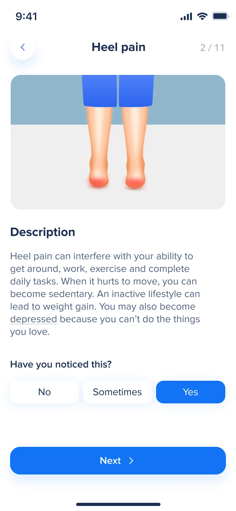
One pain question, read top to bottom
- Found
- Asking people to rate conditions they may not have names for, like plantar fasciitis or bunions, loses them on the first word.
- Decided
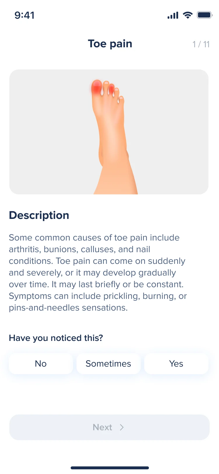
- Each condition gets a screen of its own in the same order: where you are in the questions, a picture of the foot with the painful area shown, a few lines in everyday words, three answers, and Next, which unlocks once one is chosen.
- For the user
- An employee recognises the pain from the picture before reading the name, answers with one tap and always knows how many questions are left.
-
Where you are
The condition’s name and the question’s number.
-
The picture
The foot, with the painful area marked.
-
In plain words
What the condition feels like and where it comes from.
-
The answer
No, Sometimes or Yes, one tap.
-
Next
Unlocks once an answer is chosen.
How the work progressed
From a brand for a company that didn’t exist yet to an app, an admin and a booth, one question closed at a time.
-
Discovery & user flows
Who does what between HR’s invitation and the order
Artifact User flows for onboarding, the foot scan and orders, reworked from a first version into a second
-
Wireframes
The order of the form, the questions and the scan before colour
Artifact Greyscale wireframes of the employee app
-
Branding & Logo
What a new healthcare company looks like to an employer
Artifact Moodboards, logo directions, the final mark, colour and an illustration style
-
UI — iOS app
An app a first-time user can finish alone
Artifact Onboarding, the form, the pain questions, the scan journey and orders, redesigned again in a follow-on release
-
UI — HR admin
How the employer brings a whole team in
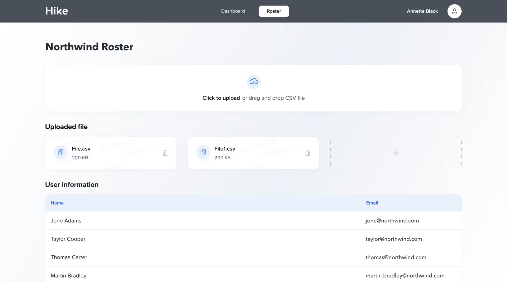
Artifact Sign-in and a roster built from uploaded employee files
-
Exhibition booth
The brand in front of enterprise buyers at a trade show
Artifact A backdrop, stand banners and an overhang
-
Delivery
What the developers needed to build it without guessing
Artifact The design system and the screens, organised by flow
Three journeys, mapped before they were drawn
- Found
- Onboarding, the foot scan and orders each branch: a shoe size that needs other instructions, a photo to retake, a second order that has to wait.
- Decided
- Every journey was mapped end to end in FigJam, then reworked into a second version. The app keeps a short tab bar, and the employer works in a two-tab desktop admin.
-
Onboarding
From the splash screen and the login link sent by the employer to general information, the pain questions, shoe details and the delivery address, then on to the scan or home.
Open the full map
-
The foot scan
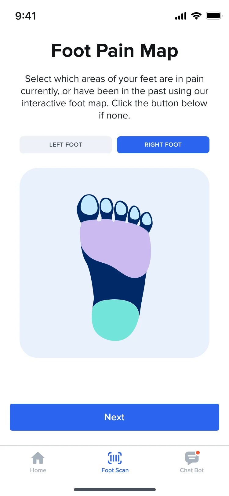
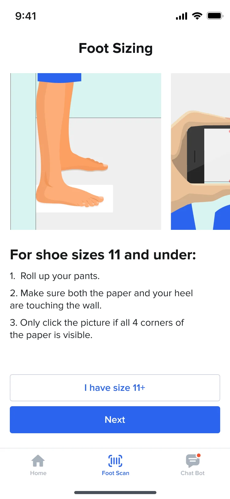
The pain map, a branch for shoe sizes over 11, the reasons for camera and sensor access, the photo and its check, then the video and its check, each with a way back.
Open the full map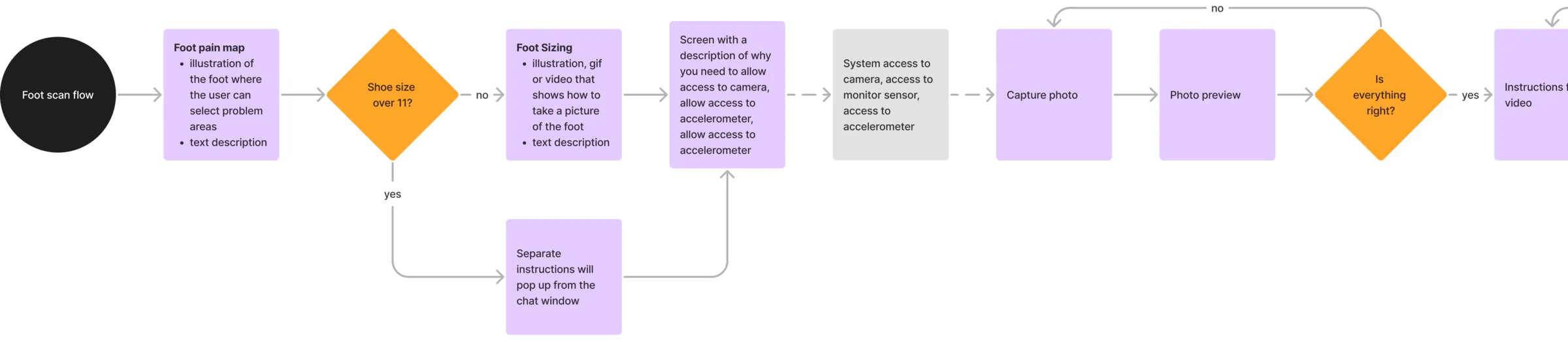
-
Orders
Orders in progress and received, each with its details, feedback after delivery, and a new order that waits twelve months after the last one.
Open the full map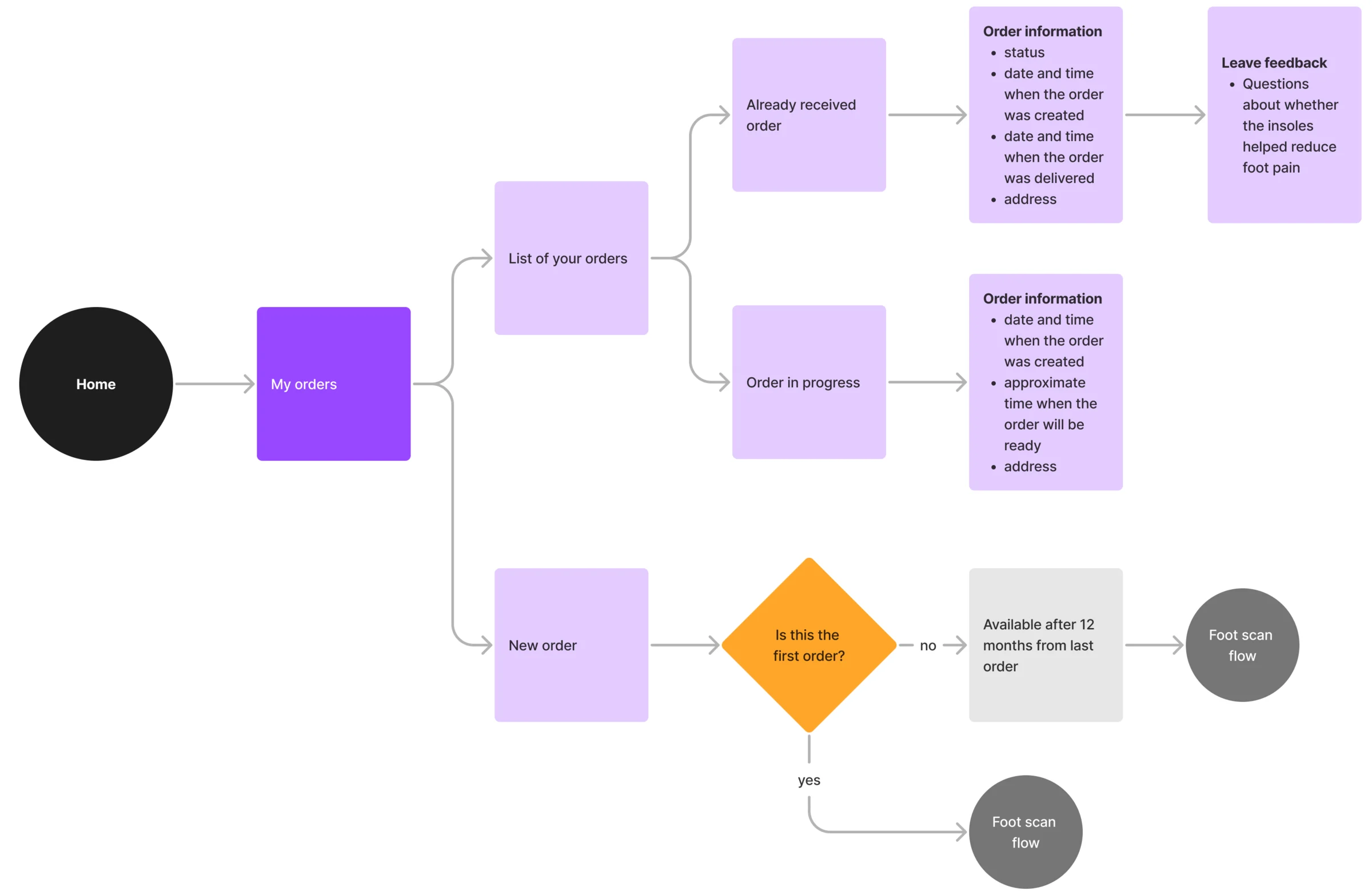
What each step asks of the employee
From the invitation to the order, each in the words and size a first-time user needs, then the employer’s side.
An invitation that explains itself
- Found
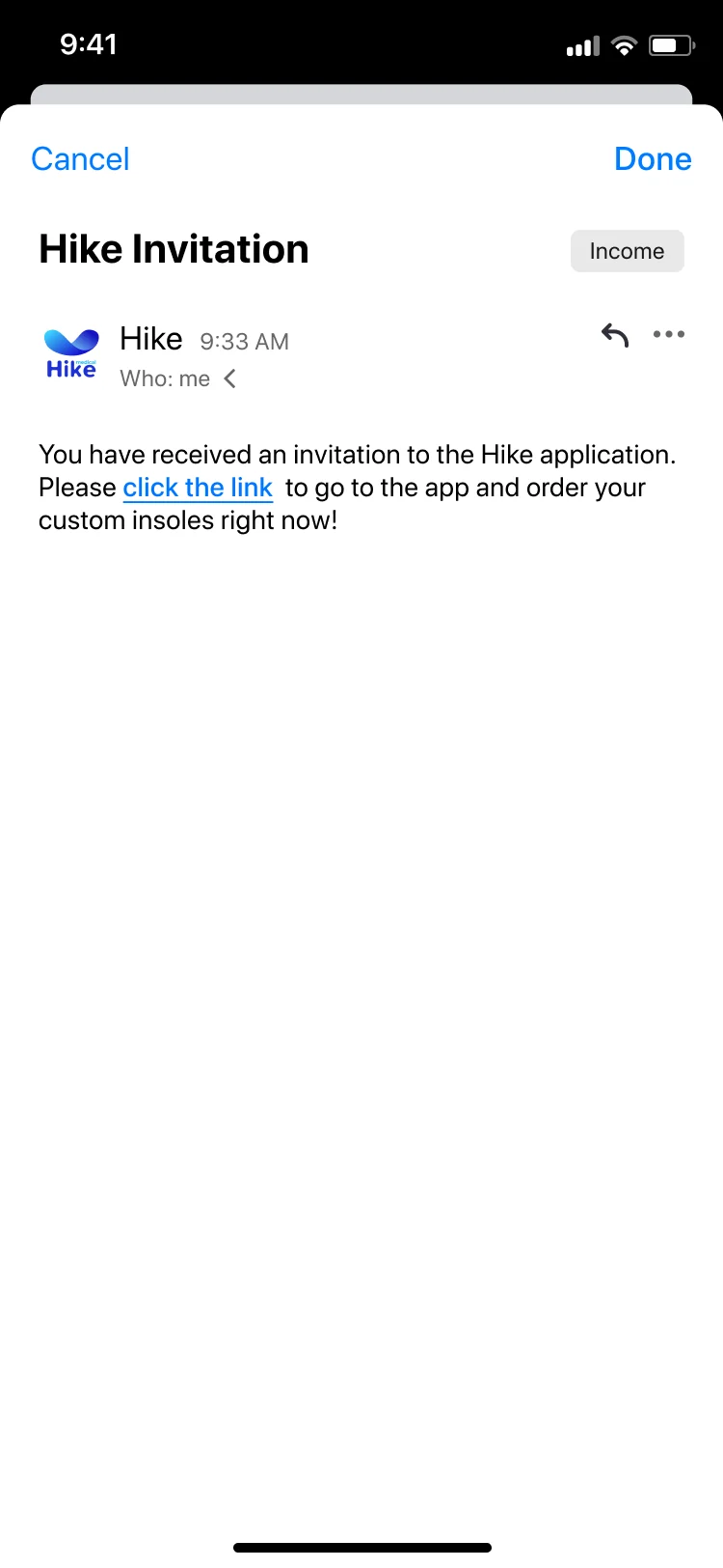
- The employee didn’t choose Hike; the employer did. The first message and screens have to say what this is and what to do next.
- Decided
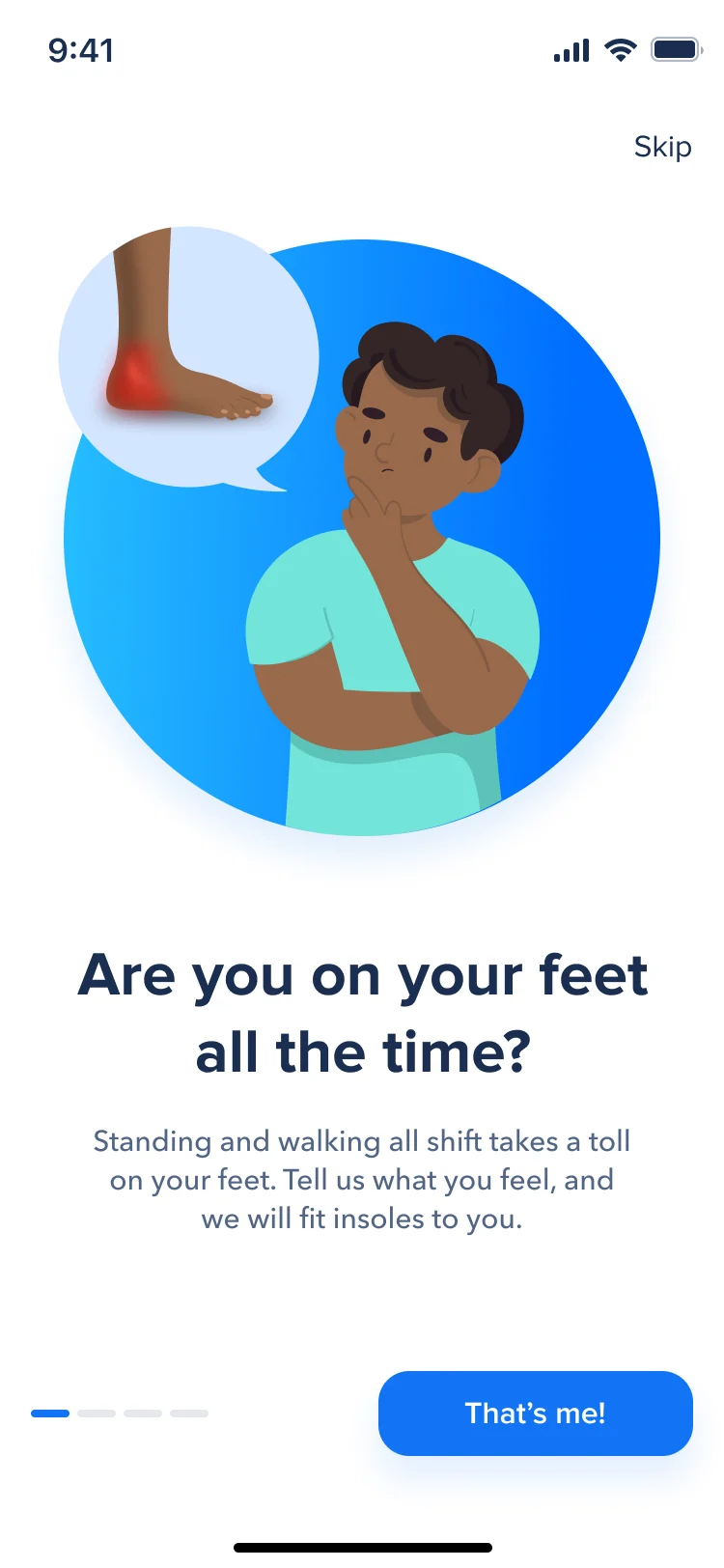
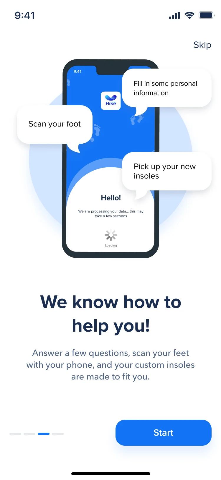
- The invitation email carries one link. The first screens ask a question the reader recognises and show the whole programme in three steps: fill in some information, scan your foot, pick up your insoles.
A form with nothing extra
- Found
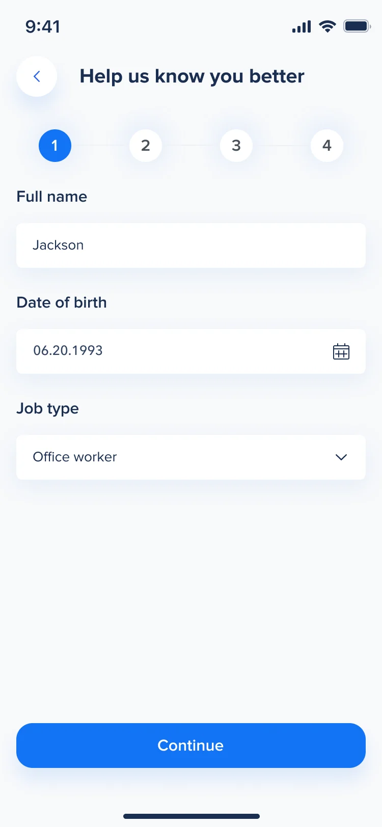
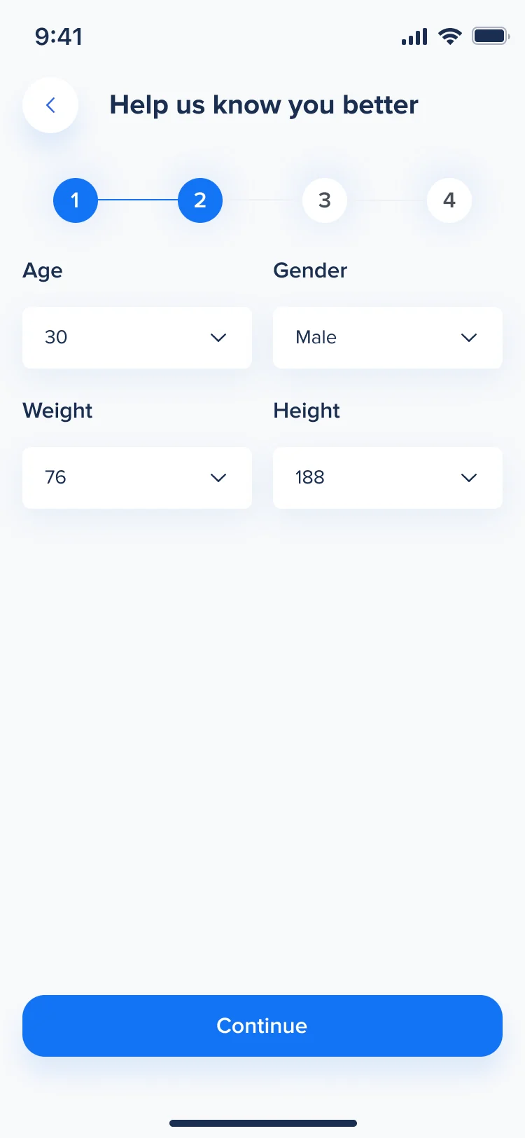
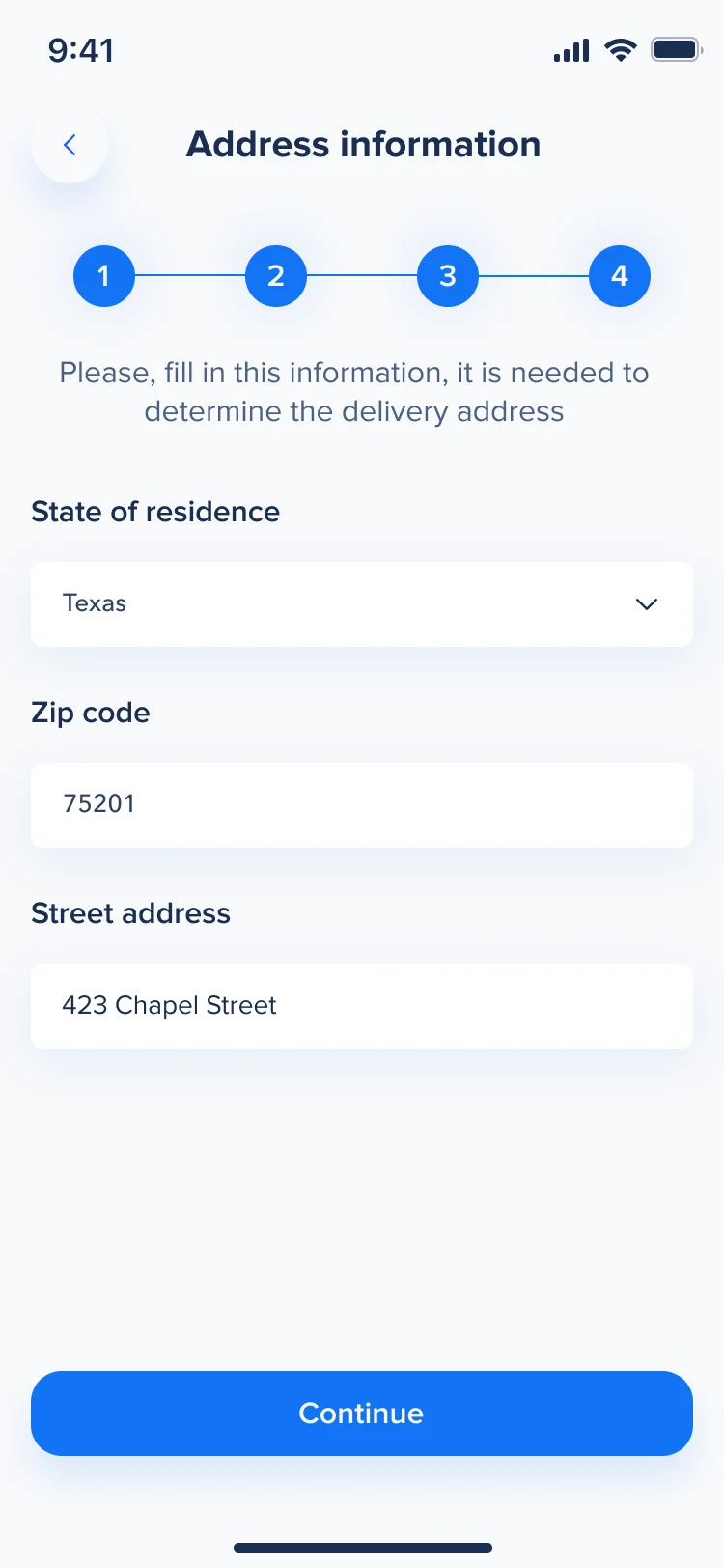
- Orthotics need a name, a body, a job and an address, and a long form on a small screen is where first-time users give up.
- Decided
- Short steps with a numbered progress line, pickers instead of typing wherever a list will do, and Continue that stays grey until a step is complete.
Where it hurts, one condition at a time
- Found
- A checklist of medical terms asks people to diagnose themselves.
- Decided
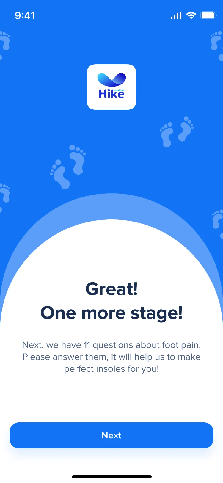
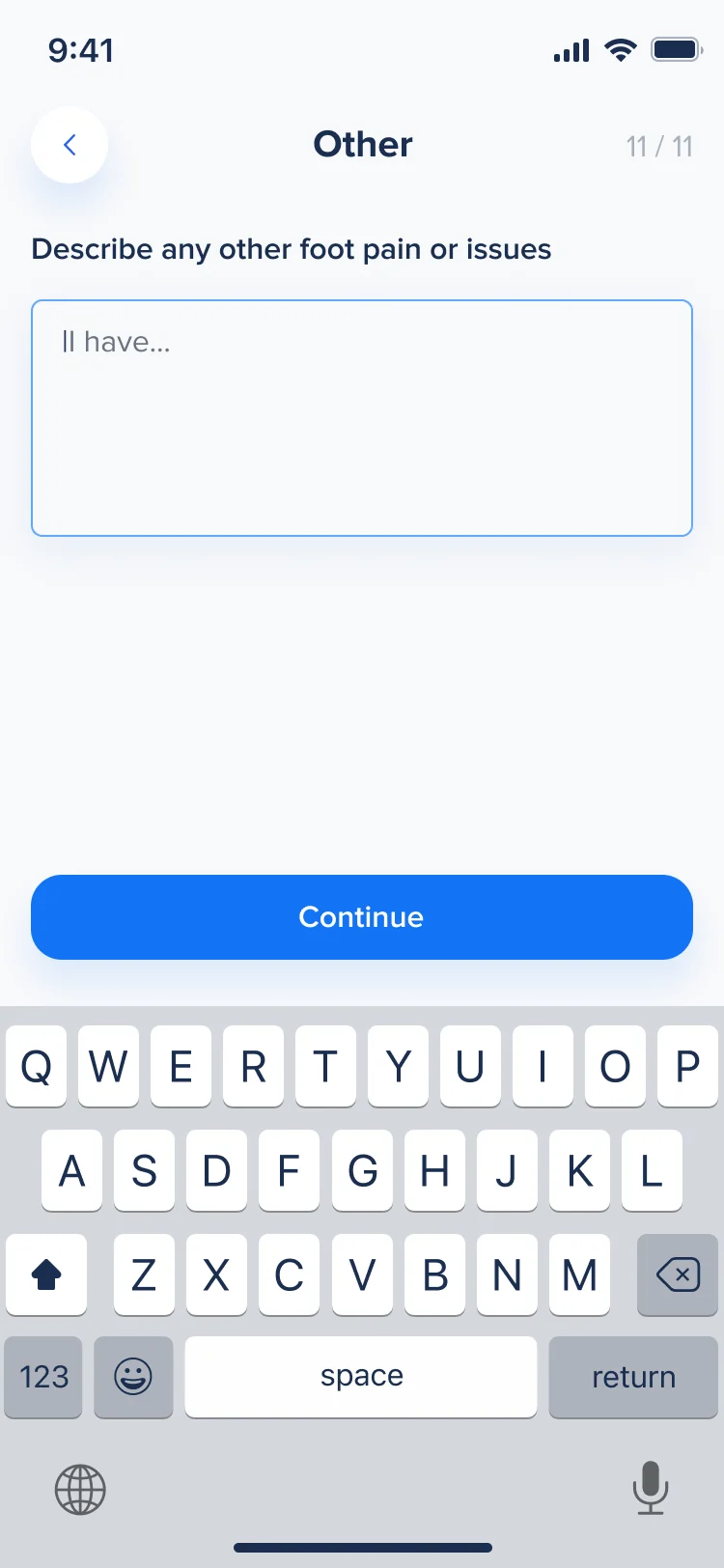
- A short break says how many questions follow and why. Then each condition has its own screen with a picture and plain words, and the last one lets people describe anything else in their own words.
Getting ready to scan
- Found
- A foot scan fails before it starts if people don’t know where it hurts, how to stand or why the app wants the camera.
- Decided
- A tappable map of each foot first, then an illustrated sizing guide with a separate path for large sizes, and the reason for camera and sensor access before the system asks.
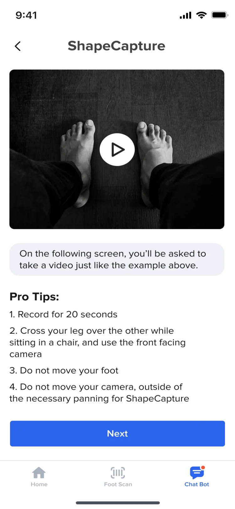
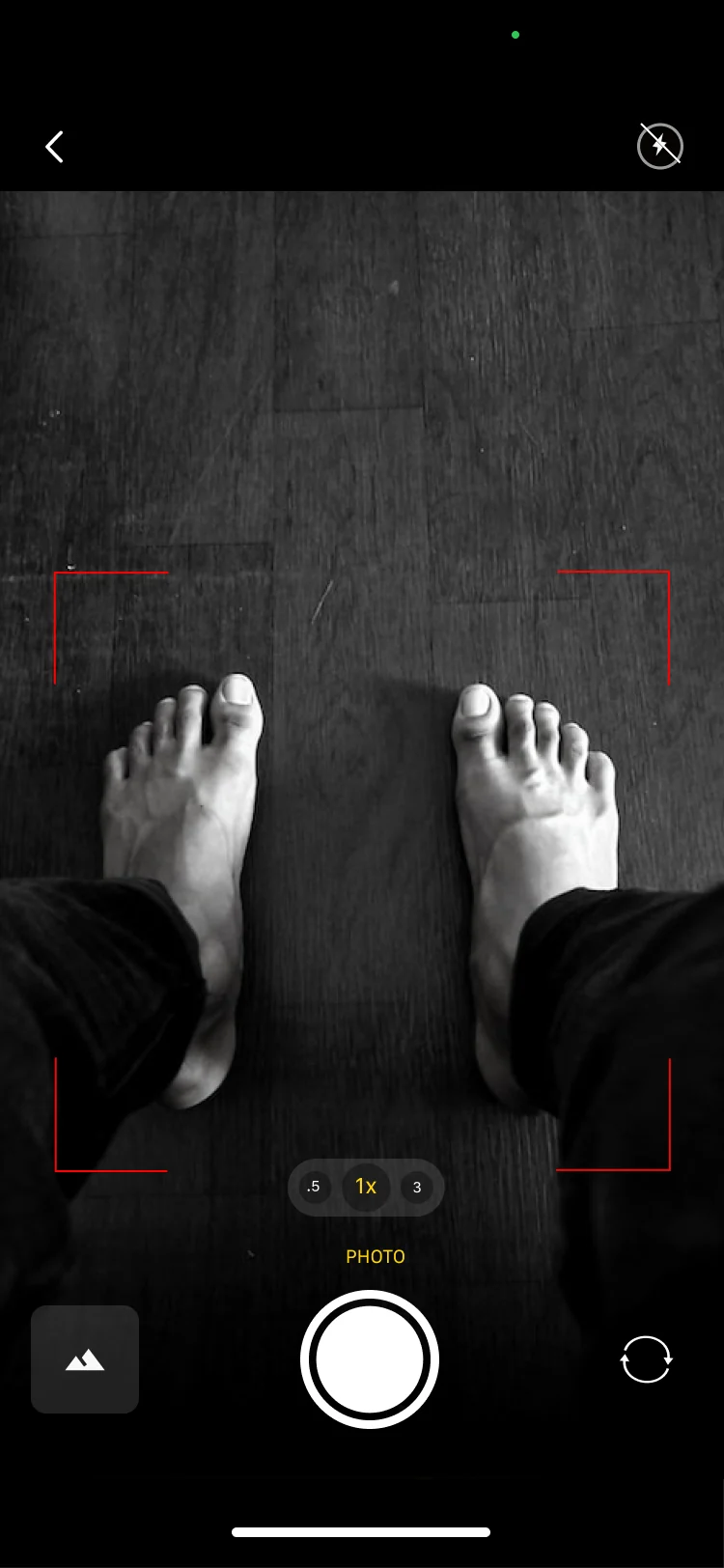
Capture, check, retry
- Found
- A blurred photo or a foot out of frame only shows up later, when the order is already on its way.
- Decided
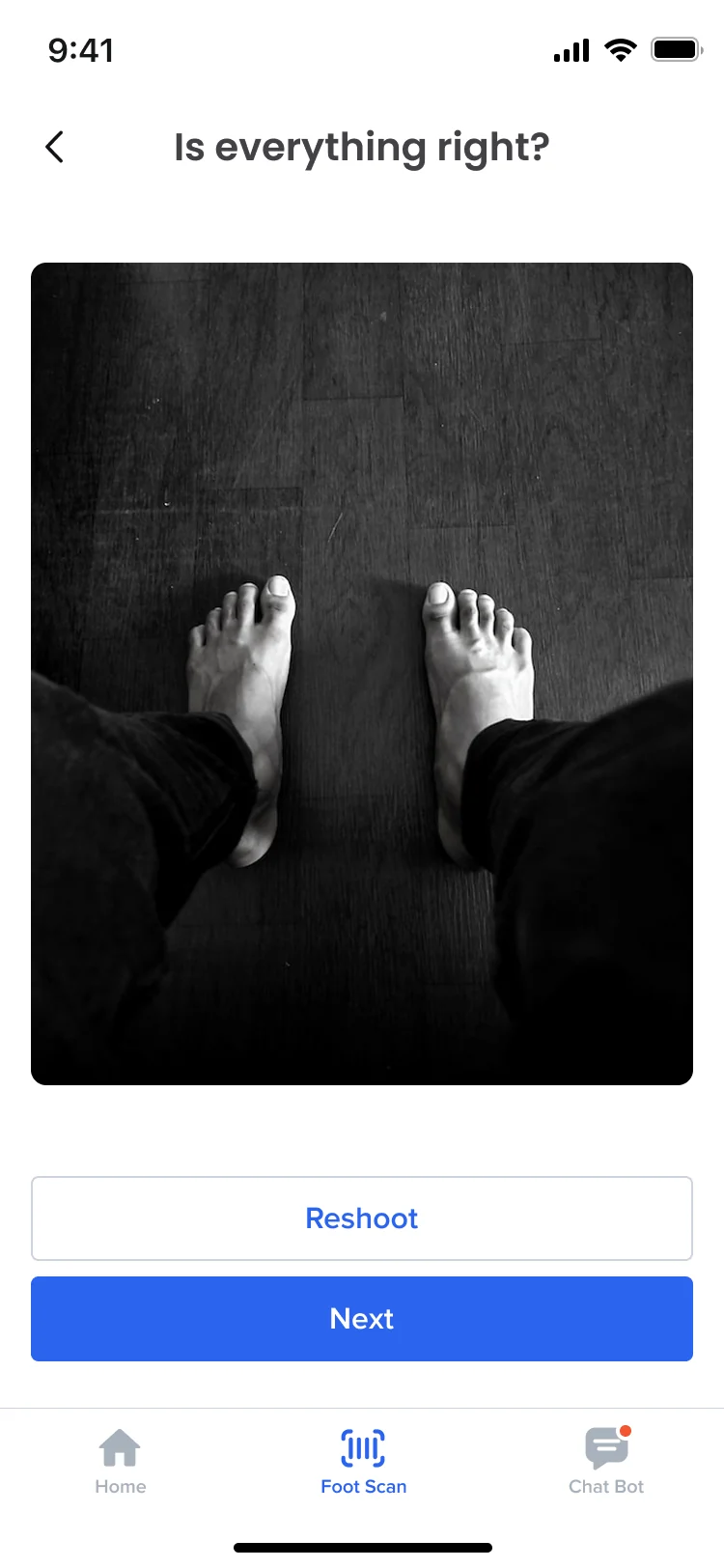
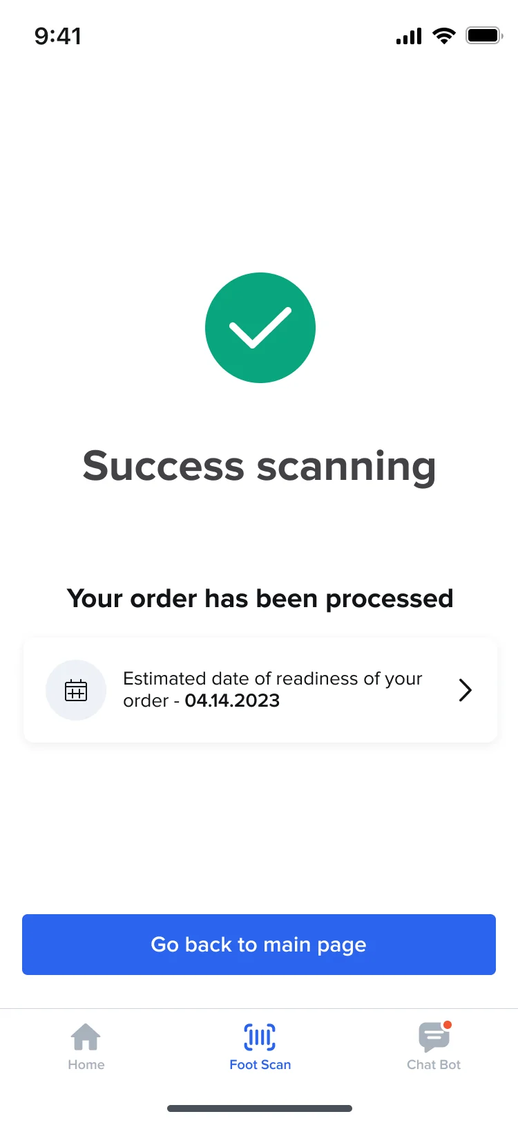
- The camera frames the feet with corner guides, every capture comes back as Is everything right? with Reshoot beside Next, and the end of the scan says what happens next and when the insoles should be ready.
After the scan
- Found
- Once the scan is sent, people want to know where their insoles are, and Hike wants to know whether they helped.
- Decided
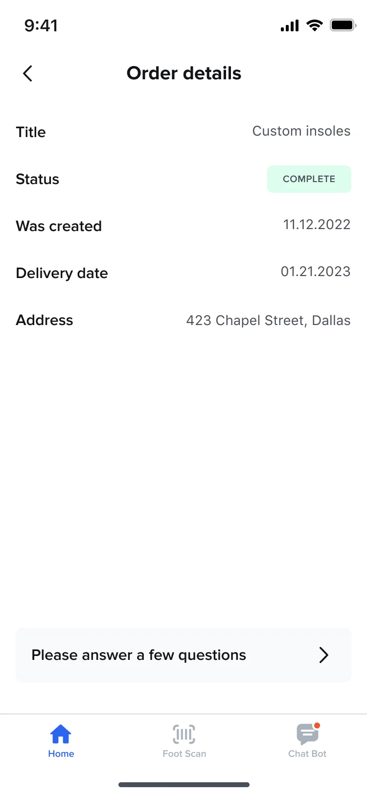
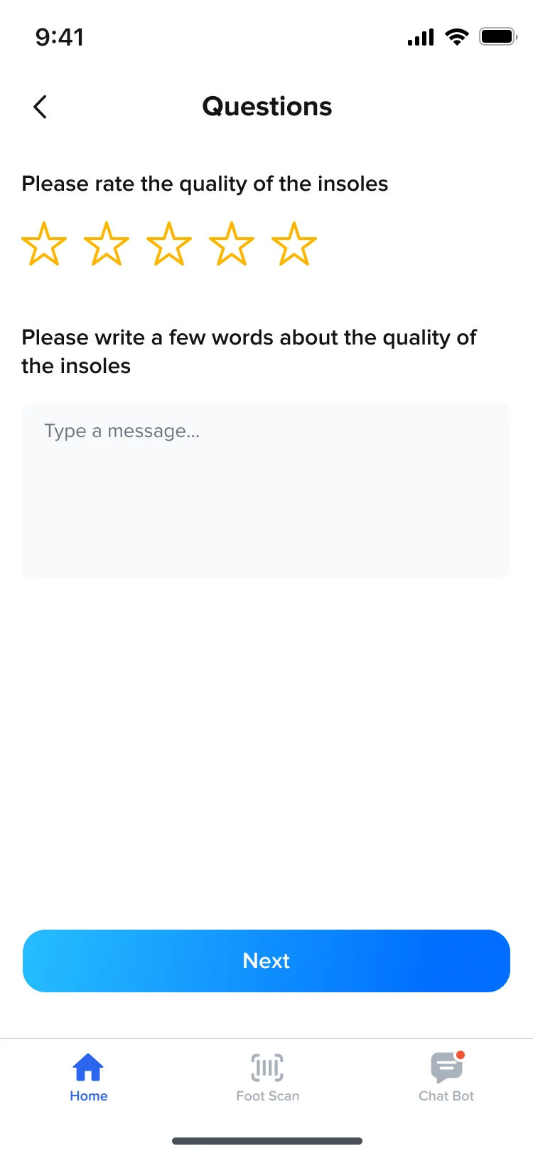
- Each order has a details page with its status and dates, and after delivery a few questions with stars and a free-text answer.
The employer’s side
- Found
- HR has to bring in a whole team without typing every name, and see who is on the programme.
- Decided
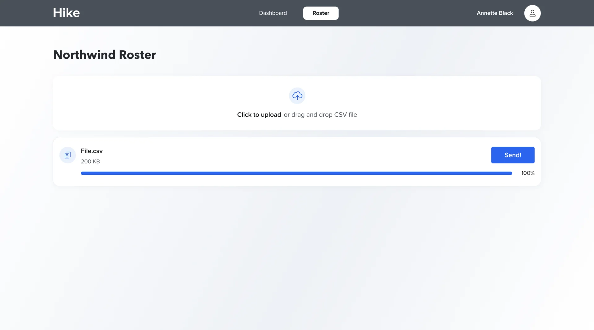
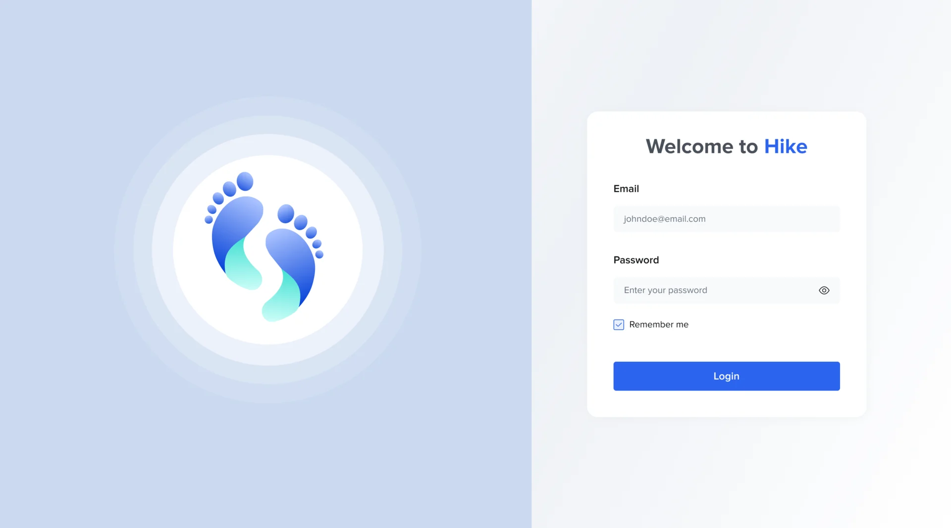
- A desktop admin where HR signs in, drops the employee file into the roster and sends the invitations once the upload finishes.
A brand for a company that didn’t exist yet
- Found
- Hike had to look like an established healthcare company to the employers buying it and like something friendly to the people on the shop floor using it.
- Decided
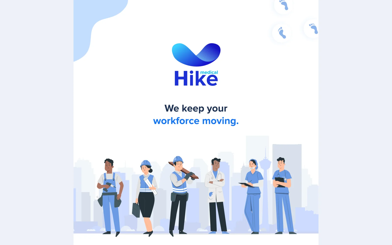
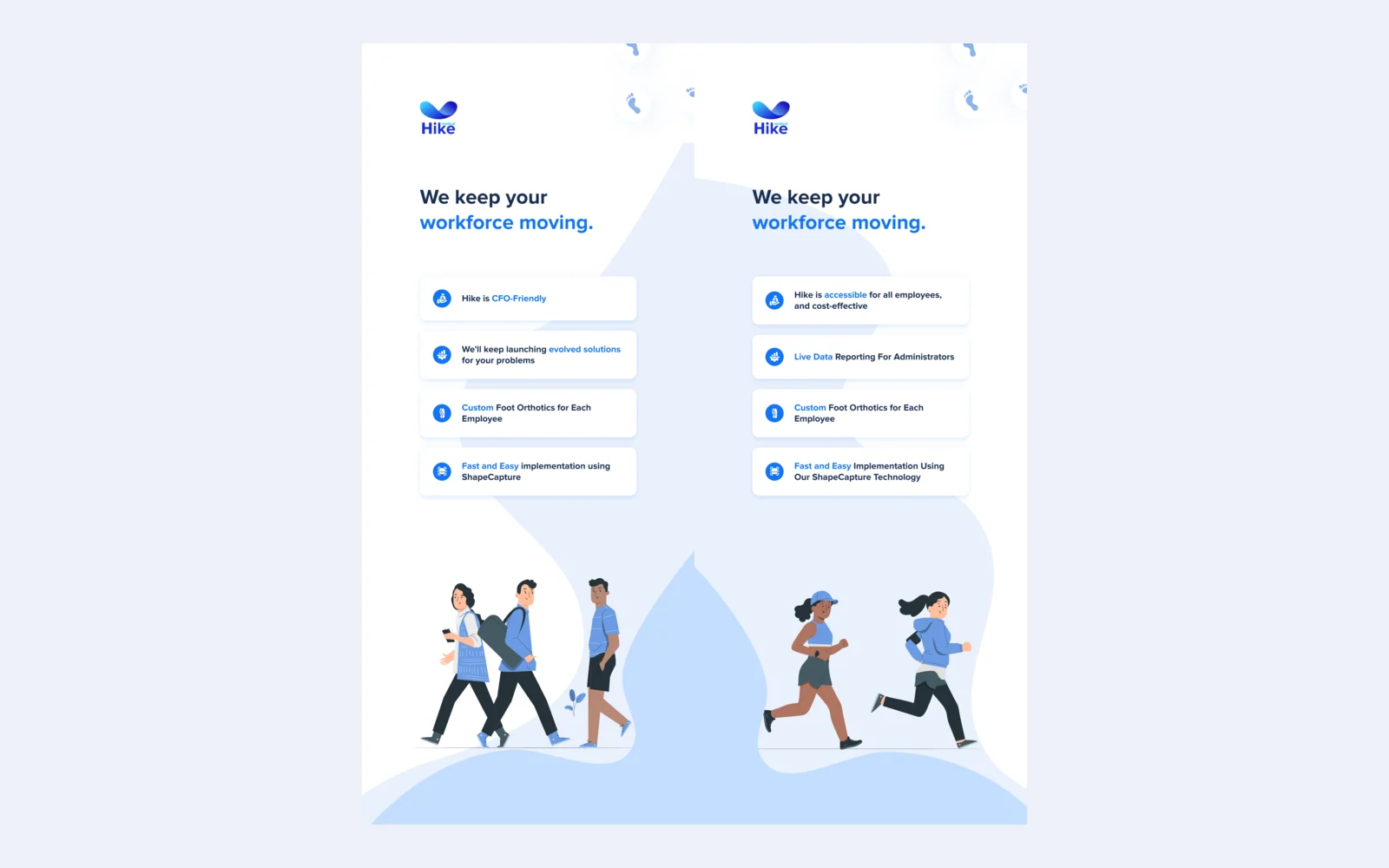
- Logo directions from footprints to abstract waves and bold wordmarks, each tried as an app icon. The final mark is a soft wave in the medical blues over the Hike wordmark, and it carries from the app’s splash screen to a trade-show booth.

One system from the question to the scan
- Found
- Pain questions, a pain map, a scan and an admin, designed over more than one release, could easily drift into different apps.
- Decided
- One UI kit for the app and the admin: the same foot illustrations, buttons, pickers, dialogs and progress, each drawn with the states people meet when something needs explaining or waiting for.
A foot drawn the same way everywhere
Every condition uses one illustration style, with the painful area in the same red, so the pictures read as a set.
-
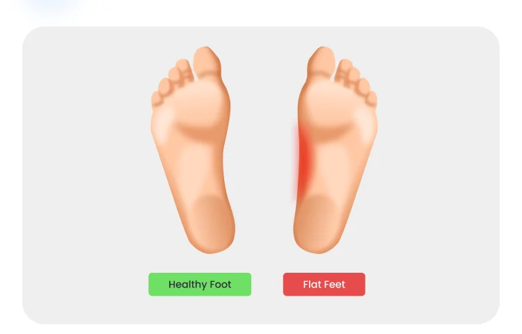
Flat feet: A healthy foot beside a flat one. -
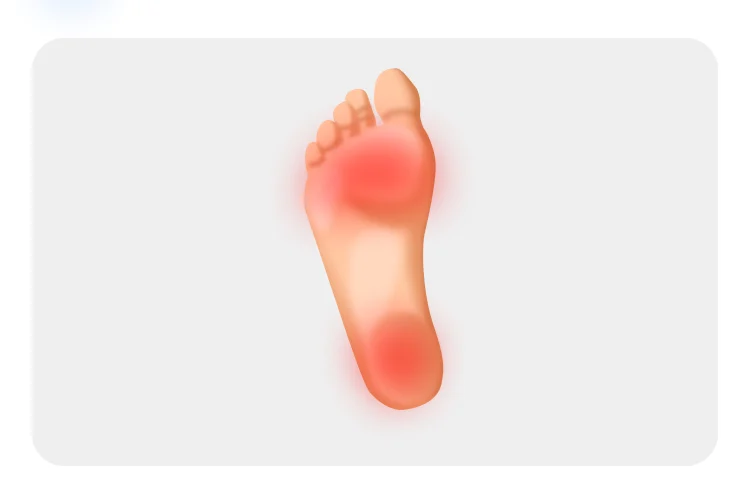
Plantar fasciitis: The same sole, marked where it hurts.
Drawn for the moments in between
A word that needs explaining, an order that has to wait, a scan being processed: each says what is going on and what comes next.
-
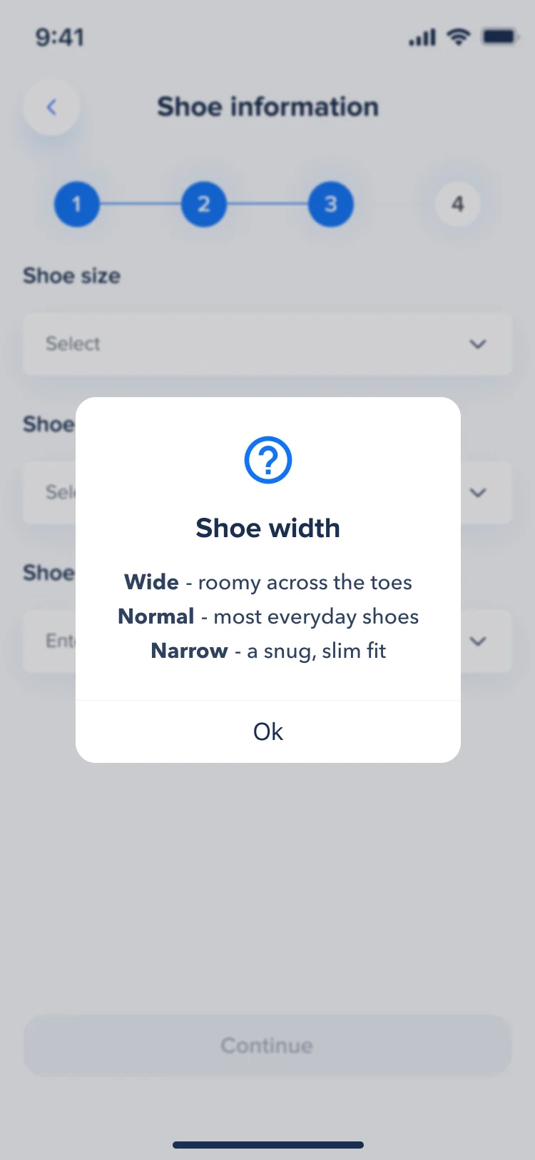
What a word means -
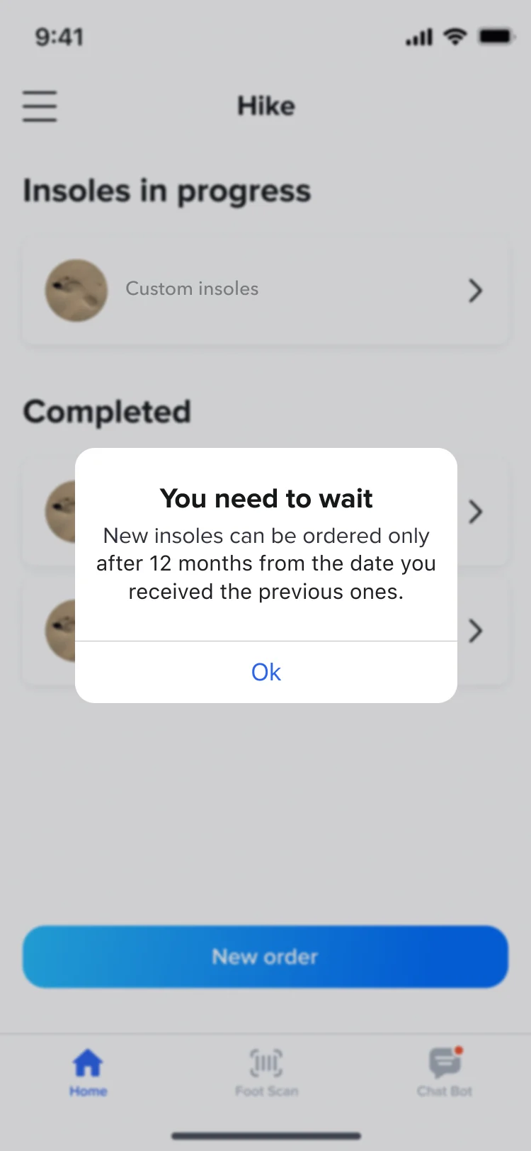
Too early for a new order -
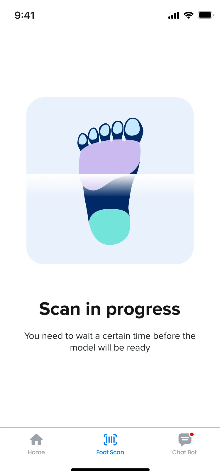
Scan in progress
Where the product ended up
One design for Hike’s whole journey: an employer uploads a roster and invites the team; each employee reads a plain invitation, fills in a short form, answers the pain questions one at a time and scans both feet with guides, checks and retries, then follows the order.
Around it, a brand from zero and an exhibition booth in the same look, with a design system under the app and the admin. ANODA designed it; the scanning technology, the app build and the insoles were built by others.
- employee app, from the invite to the order
- iOS
- HR admin for the employer
- Desktop
- from zero to the booth
- Brand
In the client's words
As a startup, we needed to move quickly and bring the whole business to life. ANODA helped us do that across our brand identity, app, website and even our exhibition booth. They understood what we needed to get started, helped us prioritise, and kept everything moving without losing attention to detail. Having one team connect all those pieces made a real difference—we could focus on building the business while they gave Hike a cohesive, professional presence from the start.
Afraid your rollout will turn HR into a help desk?
In Hike, an employer uploads one file, and every employee goes from the invitation to a finished foot scan on their own: plain words, one question at a time, and a way back from every failed capture. Tell us who has to get through your onboarding without help, and we’ll show you where they’d stop today.
More work like this
Three more products for health and everyday wellbeing, each designed from the first screen.
-
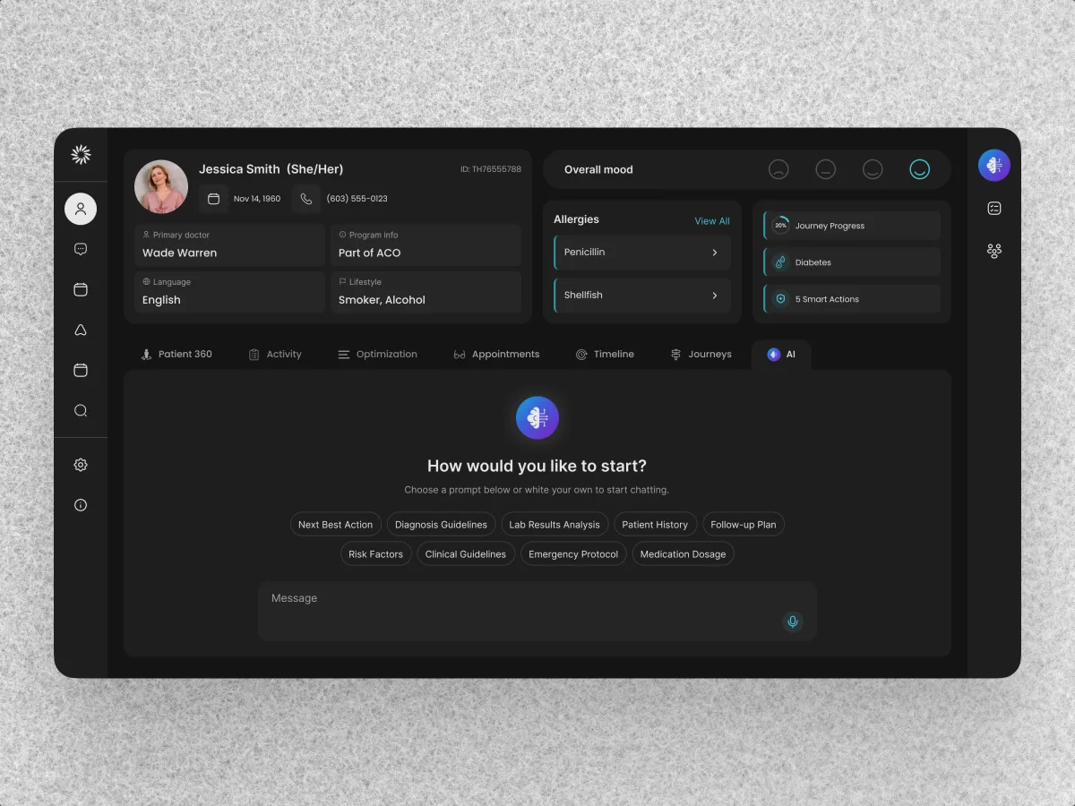
HealthCare · AI SaaS · Web + Mobile
Clay
Redesigned a care team’s CRM around dense patient records and designed a patient app for phone and desktop on the same system.
- 342 Unique screens
- 5 Experts on the team
-
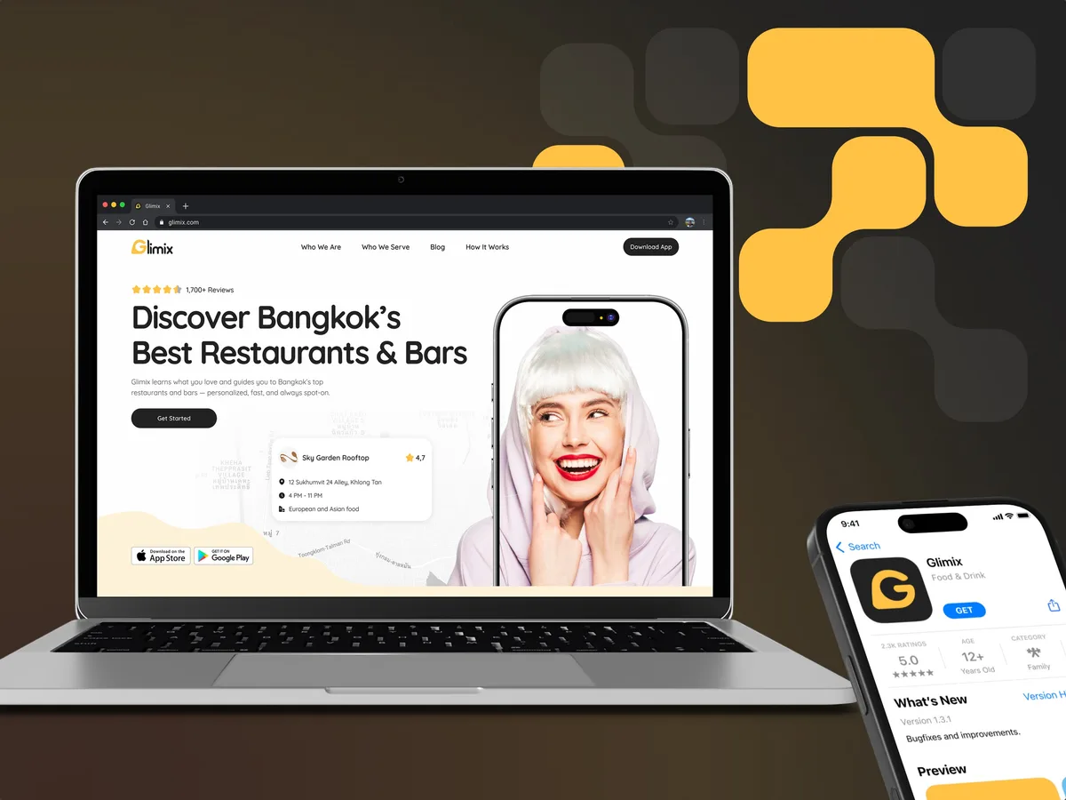
FoodTech · SaaS
Glimix
Redesigned a two-sided hospitality app for diners and venue owners, with an AI assistant, a receipt scanner and a brand from scratch.
- 200+ Screens designed
- 5 Experts on the pod
-
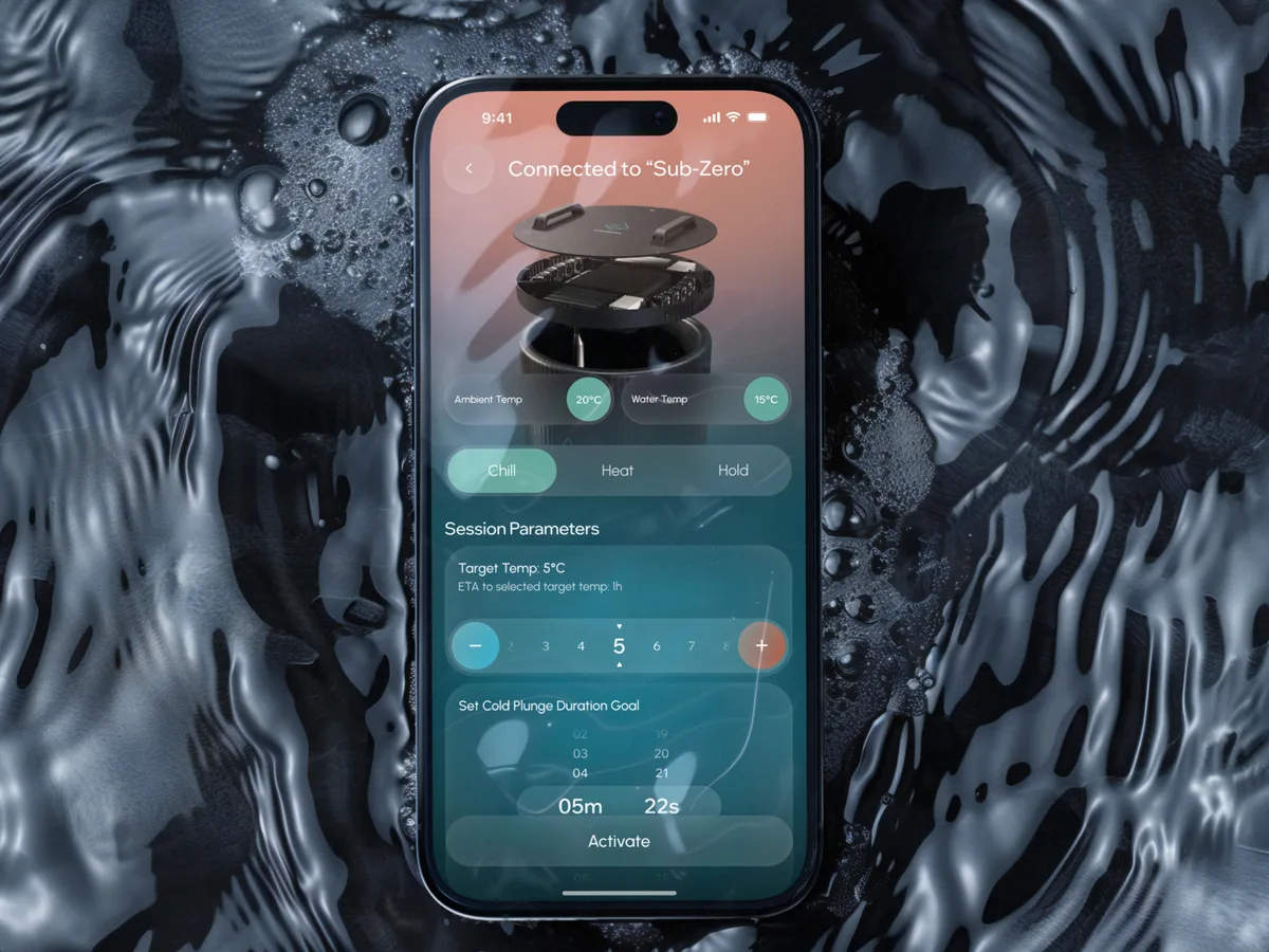
Wellness · Healthcare
Clearwater Wellness Co.
Designed a connected cold-plunge app and the schedules, challenges and crews that keep people coming back.
- 306 Screens designed
- 4 Experts on the team