
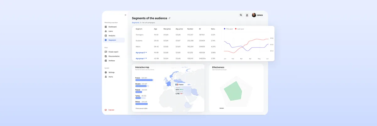
The Ultimate Guide to Dashboard Design UI: Best Practices and Principles
Learn the best dashboard UI design practices to enhance user experience. Improve data visualization and usability. Get expert insights at ANODA UX Agency today!
Design the screens where marketing money gets judged — channels, campaigns and conversions with their source, their model and how fresh they are, so a team can move budget and still explain why.

Marketing numbers a team can act on, with the reasoning shown beside them.
One screen of metrics, for any kind of product.
Marketing Analytics & Attribution Design
Where marketing numbers come from, and how far to trust them.
Not included
Marketing dashboard design starts from the decision — move budget, pause a campaign, report the month — and works back to the numbers, definitions and caveats that decision needs.
Every channel and metric with its source, its definition and when it last updated.

One conversion credited by first, last or shared touch, with the model named on screen.
Periods, channels and cohorts side by side, with the difference that matters called out.
Segments and spend decisions made from the same numbers, before the money moves.
You receive
Two platforms rarely report the same conversion. A marketing analytics dashboard has to say which source said what, how fresh it is and how sure anyone can be — before a budget moves on it.
Attribution and paid-traffic platforms, where every number has to explain itself.
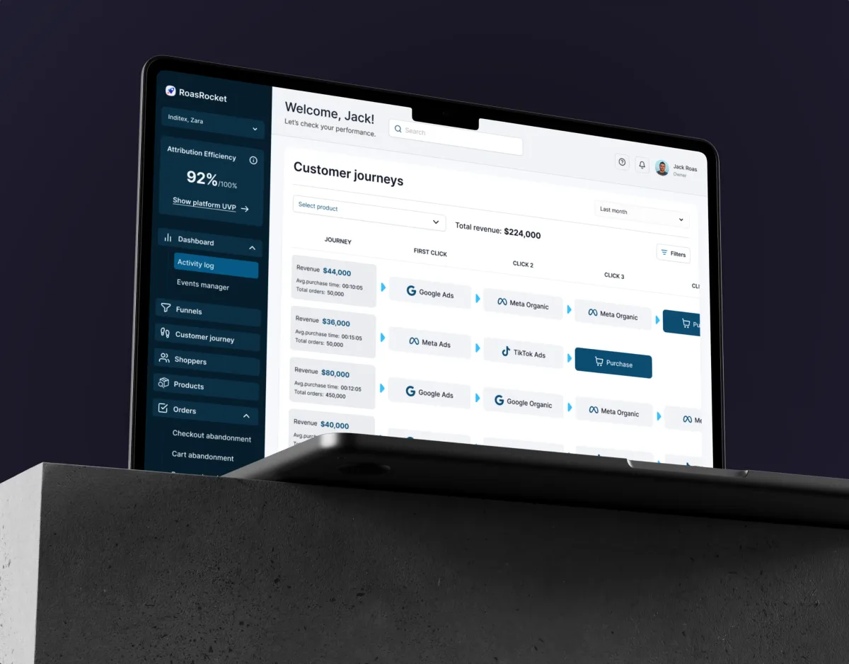
Marketing · Analytics · Web SaaS
Designed a marketing attribution CRM that brings Facebook and Google into one place and follows each customer journey click by click, from the ad to the order.
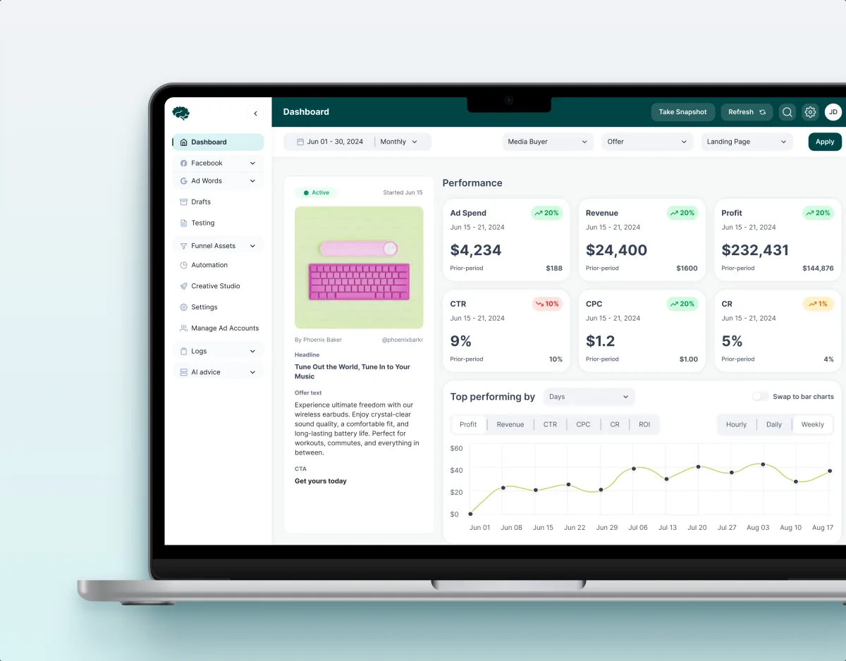
MarTech · Ads analytics · Web SaaS
Reviewed a live paid-traffic analytics SaaS and redesigned 11 modules — performance, funnels, lead attribution and creative approval — on one component system.
It fits when people move money on what the screen says, and the data behind it comes from more than one place.
Marketing, sales and finance each quote a different figure for the same month.
Ad platforms, the CRM and the store each count conversions their own way.
Spend is shifted from what the screen says, so it must say how sure it is.
Clients or agencies log in to read their own results and report them upward.
A different starting point

Tell us where the data comes from and which decisions it has to carry. We will come back with the service that fits and a realistic next step.
Analytics design usually moves one module or one budget decision at a time, under the service you start with. Its proposal sets the terms.
Tell us what the product measures, where the data comes from, and who acts on it.
Message received.
Within 15 minutes, we’ll email you initial feedback and follow-up questions.
Learn the best dashboard UI design practices to enhance user experience. Improve data visualization and usability. Get expert insights at ANODA UX Agency today!

Learn dashboard design with ANODA UX Agency. Craft functional, stunning dashboards with intuitive layouts, dynamic features, and clear visualizations.
A team that has designed attribution itself, not only charts. Ask how it showed one conversion credited in different ways, how it named sources and definitions on screen, and what the interface did when platforms disagreed. Our ROAS Rocket case follows each customer journey click by click, from the ad to the order; Concussion Media carries lead attribution and forecasting across 11 modules.
Out loud, next to the number. Each figure carries its source, its model and its window, and when it last refreshed. Data still syncing looks different from data that is final; a conversion outside the window is explained rather than dropped; a comparison with too little data says so instead of showing a confident arrow. When the model changes mid-period, the view marks where.
Media buyers who check campaign health every morning, analysts who dig into why a funnel leaks, marketing leads who move budget, clients and agencies who read their own results, and admins who connect sources and set definitions. The workflows run from connecting data to comparing channels and periods, crediting conversions, building segments and planning spend, and exporting the monthly report.
A UX Audit shows where analysts lose time in the current product. UI/UX & Product Design takes a new analytics product to handoff, Product Redesign renews one that has outgrown its screens, Web App Design covers the dense views in the browser and Mobile App Design the quick check from a phone. MarTech Development builds the result, with connectors and pipelines.
With the views, not after them. Every screen is drawn for data still syncing, a disconnected source, platforms that report different totals, a conversion outside the window, too little data to compare, a model changed mid-period, spend with no conversions yet, a client whose data you may not see, and the export. Permissions follow clients, teams and roles, so an agency sees only its own accounts.
Access to the product or staging with realistic data and a test account per role. The list of sources, metric definitions and attribution models, and how often each one refreshes. Time with media buyers, analysts and whoever reads the reports to move budget, a product owner to decide, and the data team that knows each pipeline and its delays.
ROAS Rocket, an attribution CRM that brings Facebook and Google data into one place — 148 unique screens across 13 workflows. Concussion Media, a paid-traffic analytics SaaS — 400+ screens and states across 11 modules designed and approved by the client. Both case studies show the flows and states behind the charts; neither claims a ROAS or revenue result for its client.
Yes. Concussion Media's redesign began with a module-by-module audit of the live platform, and every module was drawn for empty, filtered-out and broken data too. We design in your files and components with your product, data and engineering teams, and hand over the metric glossary with the screens.